Co-founder of GGK Basel; theorist; author of Designing Programmes (1964) Basel
Instead of solutions for problems, programmes for solutions.
Biography
Born 2 July 1930 in Basel. After a preparatory year at Allgemeine
Gewerbeschule Basel he apprentices as a typographer with advertising designer Fritz
Bühler (1944–48) — in the same studio, as an older colleague, works Armin Hofmann.
At the same time he studies photography under Hans Finsler in Zürich; in Paris he meets
Cassandre, in Basel Jan Tschichold. From 1949 he works freelance for the chemical
company Geigy. At twenty he tries to found "Bureau Basel" on his own — an interdisciplinary
studio modelled on the Bauhaus — the attempt fails. At 25 (1955) he edits and
designs a themed issue of the magazine Werk, which presents Swiss graphic design
for the first time as a logical modernist development, not as a style.
In 1959, with the writer Markus Kutter, he founds the advertising agency Gerstner+Kutter
in Basel; the same year, with Emil Ruder, he coins the term "integral typography",
published in TM 6-7/1959 (the cover of that issue was designed by Ruder — see his
note). In 1962 the architect Paul Gredinger joins and the agency
becomes GGK (Gerstner, Gredinger + Kutter), one of the most influential European
advertising agencies — it later handles the Ford account and expands to Düsseldorf. He writes
kalte Kunst? (1957, a critical text on "cold" concrete art),
Designing Programmes / Programme entwerfen (1964), Kompendium für Alphabeten
(1972), and later Der Geist der Farbe (1981) and Die Formen der Farben (1986).
He designs his own typeface Gerstner-Programm (1964–67, Berthold Diatype).
Around forty (~1970) he withdraws from agency work — in his own words,
GGK becomes "too commercial" — and devotes himself to painting. In February–March
1973 MoMA gives him a solo exhibition, "designing programs/programming
designs". In 2006 he donates his complete archive to the Swiss National
Library in Bern. He dies on 1 January 2017 at the University Hospital in Basel,
at the age of 87.
Influences
Studied with
Fritz Bühler — advertising designer, Basel, apprenticeship as a typographer 1944–48 (documented, with Armin Hofmann as a senior fellow apprentice in the same studio)
Allgemeine Gewerbeschule Basel — preparatory year before the apprenticeship (documented)
Emil Ruder — listed as a teacher in one secondary source (to verify; other sources cite only Bühler and the preparatory year, not formal instruction under Ruder)
Borrows from
Hans Finsler — photography, Zürich (early training)
Cassandre — met in Paris; Jan Tschichold — met in Basel, early influences
Swiss concrete art (Zürcher Konkrete: Bill, Lohse) — critically examined in his own book kalte Kunst? (1957), not accepted uncritically
morphological analysis (Fritz Zwicky) — structurally identical to the "morphological box" method; a direct citation of Zwicky in Gerstner's work is not confirmed in the sources reviewed, only a coincidence of name and procedure
Constructivism — his own critical text on Piet Zwart's typography, held at MoMA ("Piet Zwart: Typographie", 1960)
Influenced
the lineage of flexible/dynamic identity — from Boîte à Musique (1957/59) to MTV and today's "dynamic identity" systems (difference: Gerstner's flexibility has intent, MTV's is stylistic)
parametric and generative design as a whole — Designing Programmes described as a theoretical ancestor of parametric design, written before the machine that would execute it
today's tools like Cavalry literally execute the program he described in 1964
Contemporaries
Emil Ruder — collaborator at TM, together they coined the term integral typography (TM 6-7/1959)
Armin Hofmann — senior colleague from Bühler's studio, same Basel generation
Fritz Bühler (apprenticeship, 1944–48, documented); Allgemeine Gewerbeschule
Basel (preparatory year). One secondary source (Medium) also names Emil
Ruder as a teacher — this is not confirmed in more reliable sources (Wikipedia,
Eye Magazine), which mention only Bühler and the preparatory year; treat as
unreconciled (see Notes on sources).
What he steals
Hans Finsler's photography; early encounters with Cassandre and Tschichold.
He engages critically with Swiss concrete art (Bill, Lohse) in
his own book kalte Kunst? (1957) — this is not uncritical borrowing but
polemic. His "morphological box" is structurally identical to the "morphological
analysis" method developed in the 1930s–60s by Swiss astrophysicist
Fritz Zwicky — a direct citation by Gerstner is not confirmed in the sources
reviewed, only a coincidence of name and procedure (see Notes on sources). He also writes a
critical text on the constructivist typography of Piet Zwart (the manuscript is
held at MoMA, 1960) — evidence of direct, first-hand reading of
constructivism, not only through his Basel teachers.
Who he influenced
His identity study for Boîte à Musique (late 1950s, exact year
unreconciled in the sources — 1957 versus 1959) is considered a forerunner of
"flexible" or "dynamic" identity — a lineage running all the way to MTV and
today's generative/variable visual identities. The distinction the Speak Up
article draws: Gerstner's flexibility carries intent (it communicates a specific
"personality"), MTV's is stylistic trend-following. More broadly, Designing Programmes
is read as a theoretical ancestor of parametric design — written in 1964, before
the machine that could execute that programme existed. Tools like Cavalry today
literally do what he described in words and hand-drawn diagrams.
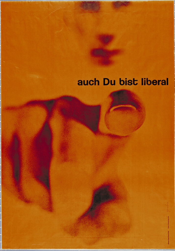
What it is — a poster for the Liberal (Freisinnig-Democratic) Party in Basel,
offset lithograph, MoMA (object 50.1960, gift of the artist).
Composition — an orange surface almost entirely filled with a large,
abstracted photographic form (a posterised/solarised photograph,
probably a human figure or part of a body — the exact motif is not confirmed,
to verify against the image); the text "auch Du bist liberal" small, along the
upper edge to the right, entirely subordinate to the image.
Colour — only two tones: orange background and a dark chestnut-maroon
for the abstracted form; no black, no grey, no third colour.
Typography — an ordinary grotesque (sans serif), lowercase, with not a single enlarged
headline — the whole hierarchy runs through the image, not through the text.
Message — the three-second test: a warm, soft, almost organic shape without
a single conventional sign of a political poster (no candidate's face, no
party symbol, no red-white-blue palette). The five-metre test:
it remains a pure orange field with a dark shape — it works as colour/signal too.
Why exactly this way — it deliberately avoids every convention of the
1959 political poster by using an industrial process (posterisation through photolithography)
to turn a photograph into a warm, personal, almost abstract sign — consistent
with the message "you too are liberal", which wants to make liberalism personal, not
institutional.
What would kill it — adding a party symbol or a candidate's face —
would instantly pull the poster back into convention and destroy the whole gesture of abstraction.
Principles:poruka-i-forma-jednoTo verify against the image: the exact motif of the photograph that was posterised.
02 · Gegen Siebenschläfer — National Zeitung (1959)
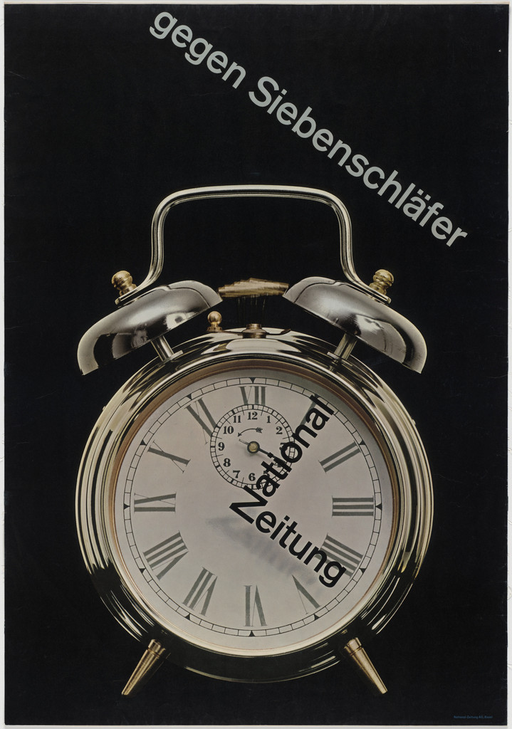
What it is — a poster for the daily newspaper National-Zeitung, photolithograph,
127 × 88.9 cm, MoMA (object 270.1965).
Composition — a photograph of a classic twin-bell alarm clock across the whole
surface on a black background; the two texts are NOT set horizontally but
follow the shape of the photographed object — "gegen Siebenschläfer" runs winding
over the arc of the bell, upper left–right, "National Zeitung" follows the circle
of the dial at the bottom centre.
Colour — entirely black-and-white: black background, chrome-grey/silver
photograph of the clock, not a single added colour.
Typography — an ordinary grotesque (sans serif), but set on a curved path that
exactly follows the geometry of the photographed object, not a straight baseline.
Message — the German idiom "gegen Siebenschläfer" (against oversleeping/
"dormice") + the name of the paper = read the news, don't sleep through the morning. The three-second
test: the image of the clock alone carries the message "time/wake up" even without reading the text.
Why exactly this way — this is the physical definition of "integral typography",
the term coined the same year with Ruder: the text is not a caption over the
image but takes the shape of the photograph itself, so the image and text become
one and the same drawing.
What would kill it — setting any lettering on a straight horizontal
line — the poster would become an ordinary captioned photograph instead of one
fused sign.
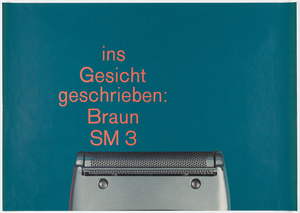
What it is — a poster for the Braun SM3 shaver, offset lithograph,
diptych (a+b), printer Wassermann A.G. Basel, whole 167.6 × 118.7 cm,
MoMA (object 529.1990.a-b).
Composition — panel a: turquoise background, the title set in a narrow, almost
square column across the upper half, the appliance photographed and cropped
at the bottom of the frame as if emerging from the text below. Panel b (announced through a
thumbnail, not seen at full resolution — probably a close-up of a face).
Colour — a single flat turquoise background + orange-red text over
it, the product photograph in natural chrome/grey tones.
Typography — a humanist grotesque (sans serif), centred, set at a narrow measure
so the title itself becomes an almost geometric block, not a line for reading.
Message — a play on words: "ins Gesicht geschrieben" (literally "written into
the face") is at once an idiom and a literal description of what the shaver
does to the face. The three-second test: the colour + the product silhouette immediately
signal "shaving ad".
Why exactly this way — this is the purest applied proof of integral typography
theory: the phrase is chosen because it's simultaneously an idiom about the
face AND a literal description of the product's action on the face — message
and form are one and the same statement, not text describing an image.
What would kill it — replacing the play-on-words headline with ordinary ad
copy ("new Braun SM3") while keeping the same layout and colour — the whole
theoretical point (integral typography) would vanish, leaving an ordinary ad of the period.
Principles:poruka-i-forma-jednoTo verify against the image: the content of panel b (probably a face); the exact typeface/cut.
What it is — cover of Markus Kutter's experimental novel, publisher Arthur
Niggli Verlag, 1957; object L-GERS-2 in the collection of the Museum für Gestaltung Zürich.
Composition — all four words of the title take up almost the entire cover,
each word as a separate large block of capitals, each block rotated at
a different angle so the words fit together like tilted plates, rather than
reading as a calm horizontal title; author/publisher information reduced to a thin
strip of small text.
Colour — warm cream/sand ground, only black for text — no
image, no illustration for the whole novel.
Typography — Akzidenz Grotesk bold (documented), letters
run off/bleed over the top and bottom edge of the cover, each word on its own
baseline within a hidden grid.
Message — for an "experimental novel" about a boat journey, the cover
typographically performs instability/movement (tilted, cropped, large
letters) instead of depicting a boat. Three-second test: first you see
an abstract typographic composition, only then the title.
Why exactly this way — "integral typography" applied to publishing:
the publisher (Arthur Niggli, who a decade later would also print Ruder's
Typographie) gets a cover whose typographic structure literally performs
the disorientation Kutter's prose is about.
What would kill it — aligning all four words to the same horizontal
baseline — a calm, stable result would contradict a novel
about crossing the sea.
What it is — book cover, 1968 edition (Arthur Niggli Ltd.), a copy from
Harald Geisler's library.
Composition — the cover functions as title page and table of contents simultaneously;
at the top the author's name and main title in large letters; the middle in small letters
lists six abstract categories ("Programme as morphology / logic /
grid / photography / literature / music"); below, larger, four
more concrete categories ("Programme as typeface / typography / picture /
method") — no image, no ornament, hierarchy built purely from three
type sizes.
Colour — a single dark green on natural cream paper, no black.
Typography — a plain grotesque (sans serif), three clear size steps carry the entire
information hierarchy, left alignment with a ragged right edge.
Message — the cover doesn't advertise the book with an image or slogan but
reveals its actual argument (design is a programme with these named categories)
before the book is opened. Three-second test: it reads as
a contents list/manifesto, not as a cover.
Why exactly this way — consistent with his own thesis: a cover that SHOWS
the programme instead of illustrating a "big idea" with an image is a book that performs
its own argument on its own cover.
What would kill it — adding a striking image or one punchy slogan —
the revealed content would turn back into an ordinary book advertisement.
What it is — his own typeface, published by Berthold for Diatype; the specimen
in the image is a modern digital restoration (Stephan Müller, Forgotten
Shapes, 2018), not a photograph of the original catalogue.
Composition — not applicable in the usual sense; the subject of analysis
is the letterforms, not the layout of the modern specimen sheet.
Colour — not applicable to the original (the modern specimen uses green/
black/gold for legibility; the metal/phototype original would have been black on
white — to verify against the image if an original Berthold catalogue is found.
Typography — a geometric grotesque with unusually wide spacing and
rounded terminals; the lowercase "a" is SINGLE-STOREY (bowl and stem, not
double-storey as in Akzidenz/Univers/Helvetica) — a strikingly different
choice for a Basel designer of that moment, when all his peers
worked with a double-storey "a". Typeface: Gerstner-Programm (documented).
Message — the typeface itself is a "programme": designed as parametrically
generated variants (from thin to bold, from narrow to wide) from
a single base formula — the typeface is theory turned into letters.
Why exactly this way — the single-storey "a" and wide spacing deliberately break
with the Akzidenz-Grotesk/Univers norm that every other Basel designer in
this project uses without question — here Gerstner does not reproduce his teachers'
typeface but builds his own from scratch.
What would kill it — (not applicable to an individual work) — imposing
a double-storey "a" would erase the only truly original formal decision in
the whole typeface design.
Principles:program-umjesto-artefaktaTo verify against the image: the appearance of the original Berthold Diatype catalogue (the specimen
here is a modern reconstruction, not to be confused with the archival original).
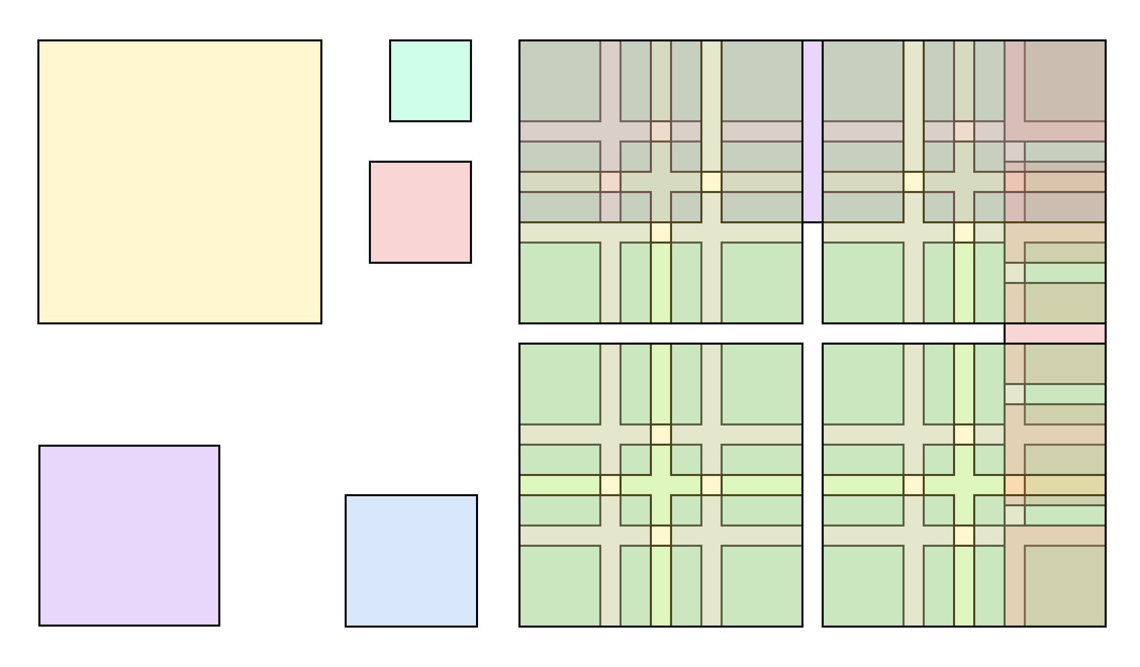
What it is — grid diagram for Capital magazine; the image is a modern
visualisation (Manuel Schmalstieg, 2018) made after the reproduction in
Designing Programmes (1964), not a photograph of the original drawing.
Composition — the grid is divided into 58 individually addressable
modules by an irregular but rule-governed lattice of verticals/horizontals
— not into equal columns — so that from the same number of units
hundreds of different valid layouts can be assembled.
Colour — the modern reconstruction uses pastel colours by module
family purely for the legibility of the diagram — not part of the original
appearance of the grid.
Typography — not applicable (grid diagram, no letters).
Message — the diagram itself embodies "design a programme, not a solution":
instead of drawing a fixed magazine layout, Gerstner built a RULE
that generates hundreds of valid layouts for Capital's changing content.
Why exactly this way — 58 modules (not a round number like 12 or 24) means
the grid was derived backwards from actual content needs (column widths,
image sizes Capital needed), not from an abstract ideal — a different
logic from Müller-Brockmann's cleaner modular grids.
What would kill it — rounding the grid to a "nice" number like 60 would
make it easier to explain, but would throw away the exact fit to content
that was the whole point.
Principles:program-umjesto-artefakta, morfoloska-kutijaTo verify against the image: the appearance of the original drawing in the book (this is a modern
reconstruction of the diagram, not a photograph of the original).
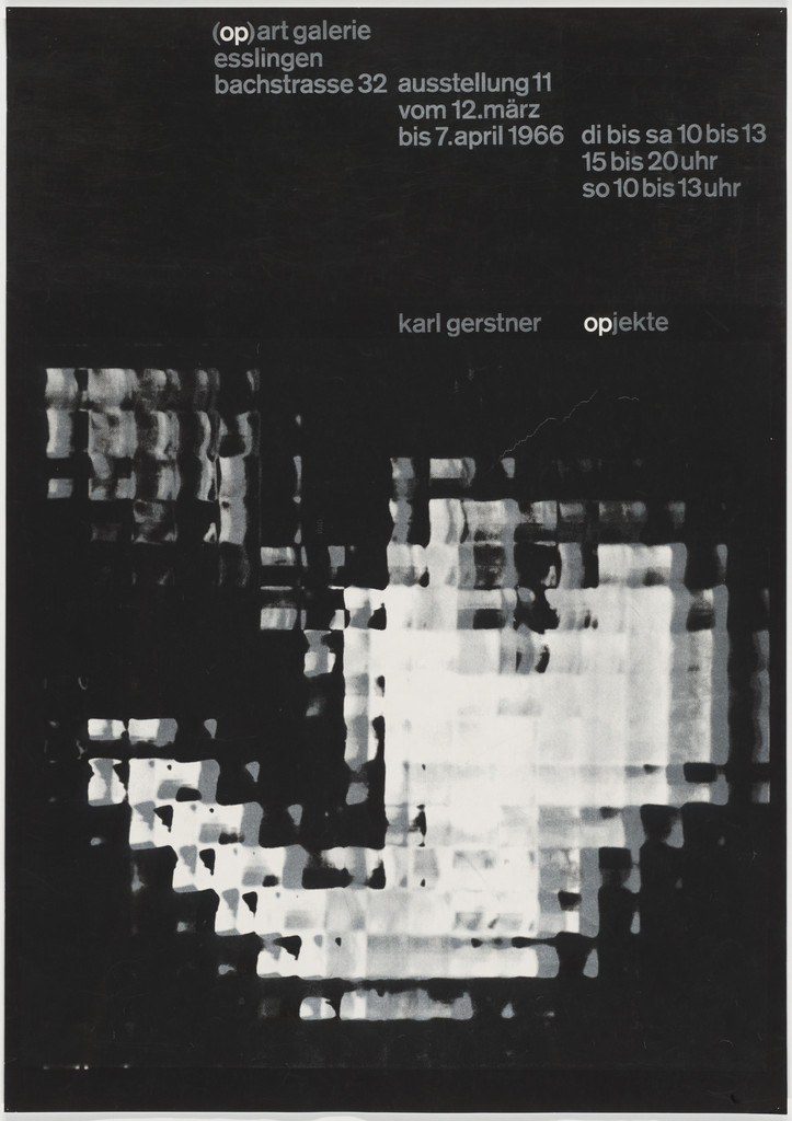
08 · Karl Gerstner: Opjekte — exhibition poster (1966)
What it is — poster for his own exhibition "Opjekte" (a play on
"Objekte"), (op) art galerie, Esslingen, 11.3.–7.4.1966, photolithograph,
85.8 × 58.7 cm, MoMA (object 337.1966, gift of the artist).
Composition — a black ground almost entirely filled with a huge
abstract white form in a coarse halftone/dot pattern (an enlarged graphic
reproduction of an object to the point of unrecognisability); exhibition
information (gallery, dates, opening hours) small in the upper third in two
blocks; the author's name and exhibition title small, right of centre, over
a darker part of the image.
Colour — pure black and white, no grey as a flat colour — all
value comes from dot density in the halftone, not from mixed ink.
Typography — small plain grotesque (sans serif) in lowercase throughout the poster,
without a single large size — the author's name is the same size as the gallery's
opening hours.
Message — a poster for an EXHIBITION OF ONE'S OWN OBJECTS doesn't show the object
but performs the same perceptual game (a recognisable image built entirely
from a coarse halftone dot) that the exhibited works themselves supposedly perform.
Why exactly this way — for a designer whose whole theory is "the programme generates
the form", announcing the exhibition with a poster where the FORM is the programme itself
(a mechanical halftone rule, pushed to a coarse extreme until the photograph almost
falls apart) is the most direct possible self-portrait.
What would kill it — returning the dot size to the usual fineness
of newspaper halftone — the image would become "just a photograph" again and the whole
point (the halftone as visible structure) would vanish. This is almost literally
what this RASTER project's aesthetic does with its dither.
Principles:program-umjesto-artefakta, citljivost-na-granici (extended
from letters to photography)
To verify against the image: the exact object visible through the halftone (an exhibited object?).
kalte Kunst? (1957) — cover of his own book of critical texts on
concrete art. Image not seen at sufficient resolution.
Kompendium für Alphabeten (1972) — cover. Image not seen at sufficient
resolution.
National Zeitung, poster (1960, PGDA) — additional work from the same series
for the same client as work 02; image not seen.
Note on "Broxi packaging" (v1 error) — the v1 harvest filed this work
directly under Gerstner; People's GD Archive names the designer
Thérèse Moll, who worked at the Karl Gerstner studio 1955–57 — a product
of the studio, not Gerstner's personal work. Removed from the list of works
(collective authorship — same type of error as Lustig/UPA).
Note on "Kunsthalle Basel, Bodmer/Hartung 1952" (v1 error) — v1 included
this poster in both Gerstner's and Ruder's roster. The work has already been
fully worked through and documented in Emil Ruder's note (work 02); no source
reviewed confirms Gerstner's authorship or co-authorship.
Removed from Gerstner's list entirely — a v1 duplicate, not Gerstner's work.
Note on "TM Typographische Monatsblätter 1959/6" (v1 error) — v1 also
filed this cover under Gerstner. The cover was designed by Emil Ruder
(already worked through in his note, work 06); Gerstner's connection to that
issue is content-based, not authorial — in it, together with Ruder, he
published the text that introduces the term "integral typography". Removed
from Gerstner's list of works, but kept in the biography as a key fact.
Note on "Making and Breaking the Grid" (v1 error) — as with Ruder, this
is a book by Timothy Samara (2003), not Gerstner's work. Removed.
Bridge to practice: poster · graphic design · motion
Poster
Before you sketch, make a small morphological box for the brief: rows are
parameters (image treatment, number of colours, typeface family, format,
grid division), columns are 3–4 possible values for each. Fill in all the
fields — only then choose a combination. You'll get a map of the whole
solution space instead of three sketches by feel.
Graphic design
An identity for a client (or for LØADERRØR) doesn't have to be one fixed
mark — write 3–4 RULES (a treatment recipe: a framing relationship, a colour
rule, a stroke rule), as Gerstner did for Boîte à Musique, and let every
application be a new instance of the rule, not just a different size of the
same logotype.
Motion
This is a designer whose theory translates almost literally into Cavalry:
Designing Programmes is parametric design, written in 1964 without a
machine that could execute it. Build one AE/Cavalry rig where ONE slider or
expression simultaneously drives several linked properties (number of
colours, rotation range, timing offset) — moving just that one parameter
gives you a whole family of valid results, exactly as his morphological box
generates a family of layouts.
Bad imitation
"Systematicness" turned into decoration — grid lines or module numbers
left VISIBLE as a decorative motif, instead of remaining a hidden rule
that generates the result. Gerstner's system doesn't show in the finished
work (see _PRINCIPI.md, sistem-kao-medij).
"Flexible identity" without a rule — a changeable look treated as
freedom to draw something completely different every time, with not a
single fixed parameter repeating. The result is visual chaos, not a
system — exactly the distinction Speak Up draws between Boîte à Musique
(flexibility with intent) and MTV (flexibility as trend).
"Integral typography" understood as "a big font over an image" — it's
not enough for text and image to touch; in Gerstner's work the text
literally follows the SHAPE of the photographed object (Gegen
Siebenschläfer) or the point is literally the same sentence as the image
(Braun SM3). If the text could be removed and the image would still
"mean the same thing", it isn't integral typography.
The brief through their eyes
First he would make a small morphological box for the intro of my YouTube
gaming-animation series: rows are parameters (length, palette, type of
motion, sound accent), columns are 3–4 variants of each — and only then
would he choose a combination, instead of drawing a third version by
guesswork. The program would be a couple of rules (one accent shape, one
transition, one sound sync-point) that repeat in every episode, while
everything else — colour, character, tempo — varies freely within those
rules. The first move wouldn't be drawing a frame but writing those three or
four sentences of rules on paper.
Exercises
Make a morphological box for the next real poster brief (rows =
parameters, columns = values) before you sketch — 30–45 minutes, paper
and pencil.
Redesign a personal mark (LØADERRØR or another) as a "program" instead
of a fixed logotype — write 3 rules (framing, colour, type of stroke) and
draw 5 applications that all differ, yet are all recognisable as the same
system, following Boîte à Musique.
Motion study
A five-second loop in AE or Cavalry: ONE parameter (a 0–1 slider, "chaos" or
"density") simultaneously drives three linked properties (number of shapes,
rotation range, delay/stagger). Goal: moving just that one slider gives you
an entire range of valid results, not one fixed one.
Rebuilding the benchmark
Benchmark: Capital grid of 58 units (07). Skeleton: measure the position of
the main verticals/horizontals from the diagram in % of the format and
rebuild the grid in Illustrator. Task: insert three different hypothetical
text/image layouts into that grid and check whether the system holds for all
three, not just one.
Notes on sources
Teaching under Ruder is not reconciled — one secondary source (Medium)
names Emil Ruder as a teacher; more reliable sources (Wikipedia, Eye
Magazine) mention only an apprenticeship under Fritz Bühler and a
preparatory year. Treated as unreconciled, not as a confirmed fact.
Year of Boîte à Musique is not reconciled — sources give both 1957 and
1959. Left unresolved; the work was not even included in the list of works
because the original image of the identity was not found at a reliable
source (only secondary descriptions and Pinterest copies without clear
usage rights).
Founding of the agency — two versions — Eye Magazine states that
Gerstner and Kutter founded a joint studio in 1959; Wikipedia states 1958.
Both are reported with source; not resolved.
Connection to Zwicky's morphological analysis — the structural overlap
of the method and the name is clear, but a direct citation or
acknowledgement of the source in Gerstner has not been found in the
sources reviewed. Not to be claimed as a confirmed genealogy.
v1 error — "Broxi packaging" — v1 harvest filed it under Gerstner; PGDA
clearly names the designer Thérèse Moll, employed at his studio 1955–57.
Removed from the list of works.
v1 error — "Kunsthalle Basel, Bodmer/Hartung 1952" — v1 harvest
included the same poster under both Gerstner and Ruder. The work is already
documented as Ruder's (see Emil Ruder, work 02); no source confirms
Gerstner's (co-)authorship. Removed from Gerstner's list.
v1 error — "TM Typographische Monatsblätter 1959/6" — v1 harvest filed
the cover designed by Ruder (see Emil Ruder, work 06) under Gerstner as
well. The connection is content-based (Gerstner's text in that issue), not
authorial. Removed from the list of works, kept in the biography.
v1 error — "Making and Breaking the Grid" — as with Ruder, this is a
book by Timothy Samara (2003), not Gerstner's work. Removed.
Panel b of work 03 (Braun SM3) — not seen at full resolution; the
alleged content (a face) has not been confirmed by direct viewing.
Works 09, 10, 11 (kalte Kunst?, Kompendium, National Zeitung 1960) —
images not seen at sufficient resolution for full analysis; left as
evidence without the seven fields.
Portrait — no photograph with clear usage rights was found among the
sources reviewed; portret.ima remains false.
Difference from its pair
Emil Ruder ↔ Karl Gerstner: collaborators on the same subject (integral
typography, TM 6-7/1959), but with different material. Ruder's system is
craft-based and time-based — the rule comes from the physical fact of
letterpress setting and the rhythm of reading, and stays within typography.
Gerstner's system is abstract and parametric — the rule (program,
morphological box) doesn't apply only to letters but to any design problem,
and explicitly looks ahead, toward a machine execution that in his time did
not yet exist.
Armin Hofmann ↔ Karl Gerstner: senior and junior colleague from the same
studio (Bühler, 1944–48), but Hofmann stays with perception and gesture (the
eye takes in the image at once), while Gerstner explicitly subordinates
perception to a rule written before drawing — in Hofmann the system is the
invisible result of discipline, in Gerstner the system is itself the subject
of the work.