the book as object — block, edge, thickness, and the production process carry the content
book designer, Irma Boom Office (Amsterdam, since 1991); Rijksmuseum identity 2012; lecturer at Yale Lochem → Enschede (AKI) → Den Haag (Staatsdrukkerij) → Amsterdam
„I compare my work to architecture. I don't build villas, I build social housing. The books
are industrially made and they need to be made very well. I am all for industrial production.
I hate one-offs.“ — Eye 88, 2014 (Miltenburg). v1 quote („The book must be an object you
cannot forget having held“) was not found in any source — removed.
Biography
Born 1960 in Lochem (Gelderland), the youngest of nine children (Wallpaper; Eye 88 says
„born in Enschede“ — likely a mix-up of birthplace and place of study, see Notes on sources). Studies at
AKI in Enschede, then works for five and a half years in the design department of the state printing office
(Staatsdrukkerij en -Uitgeverij, Den Haag) — this is where the first books MoMA holds are made
(postage stamps 1987, Best Boek 1989, annual reports of the Raad voor de Kunst 1988–89). In 1991
she opens Irma Boom Office in Amsterdam — from the start a one-person workshop, not a studio with a team (with
occasional collaborators: Julia Neller, Sanne van de Goor).
The career turning point is SHV Think Book (1991–96): Paul Fentener van Vlissingen, head of the SHV
concern, gave her a brief with no budget and one condition — „make something unusual“. Five
years, three and a half of them in archives (Utrecht, Amsterdam, Paris, London, Vienna), attending
shareholder meetings, interviews — the designer as researcher and editor, not as executor
(MoMA description; Typotheque). After SHV, by her own admission, she finds it hard to work for clients who
tell her exactly what to do („Most briefs sound so uninteresting that I get paralysed“,
Typotheque). She works seven days a week, twelve hours (Eye 88); takes jobs „on
intuition“, without looking at the calendar (Wallpaper).
The method has been constant since the 1990s: she reads the whole content, then makes small models of the book by hand — „like an
architect making scale models of buildings“ — and only then design, „in the book, not on the
computer screen“ (Designers & Books). Hence the mini editions of her own monographs (2010, 2013):
a small book is a tool for checking the distribution of text and image, not a souvenir.
Gutenberg Prize Leipzig 2001 (youngest recipient), Leipzig gold medal 2007 (Sheila
Hicks), Vermeer Award of the Dutch state 2014 (Eye 88). Since 2012 author of the Rijksmuseum's identity
(the space in „Rijks museum“, own typeface with Bold Monday) and all museum graphics;
Rijksmuseum 2022–23 exhibits more than 30 of her books alongside works from the collection (rijksmuseum.nl). MoMA
holds 46 records online; the archive is at the University of Amsterdam (Eye 88; v1 claim „archive held
by the Rijksmuseum“ not confirmed). Teaches at Yale (Eye 88, v1). Her own assessment: „It's never
art. Never, never, never“ (Eye 88).
Influences
Studied with
AKI Academie voor Kunst en Industrie, Enschede (teachers not named in the sources for this session)
Staatsdrukkerij en -Uitgeverij (SDU), Den Haag — five and a half years in the design department, before 1991 (Eye 88)
Borrows from
early internet browsing as a model for reading — "no page numbers, going in and out, the endless zapping past images" (Eye 88, on SHV)
architecture as a model for method — scale mock-ups before design, "I build the design in the book, not on the computer screen" (Designers & Books)
the content itself — she reads everything before designing, takes part in editing ("If I don't know the content I can't design", Typotheque 2001)
Rem Koolhaas / OMA — long-term collaboration (Elements 2014, Venice), not an influence but a partner
Contemporaries
sagmeister
scher
carson
brody
greiman
kruger
Who she studied under
AKI Enschede — teachers unnamed in the session's sources. The real school is the Staatsdrukkerij: five
and a half years of institutional printing, stamps, reports, catalogues (Eye 88). No designer is
confirmed as a teacher; do not attribute.
What she steals
The reading model of the early internet — SHV was, in her words, built on „no page numbers, going in
and out, the endless zapping past images“ (Eye 88). The book takes on the behaviour of the screen, not its look.
Architecture as method — scale models, „social housing, not villas“ (Eye 88;
Designers & Books). Consequence: format, thickness and binding are the first decisions, typography last.
The content itself — she reads everything, edits with the client, refuses briefs („If I don't know the
content I can't design“, Typotheque). With Treumann this leads to conflict: „Irma it's your
book“ (Typotheque).
Subject as material — smell → embossing without ink (Chanel), weaving → rough edge (Hicks),
car body → aluminium paper (Renault=Présent 2016, rijksmuseum.nl).
Note for the whole section: books, not posters. The „Composition“ field describes (a) the cover or
spread that was seen and (b) the BLOCK — edge, thickness, proportion of the closed book. There is one
screenshot per book (museum photograph of the closed or open object), so the v2 reading is
a reading of the OBJECT, not of pages. The interior is documented only where the source states so.
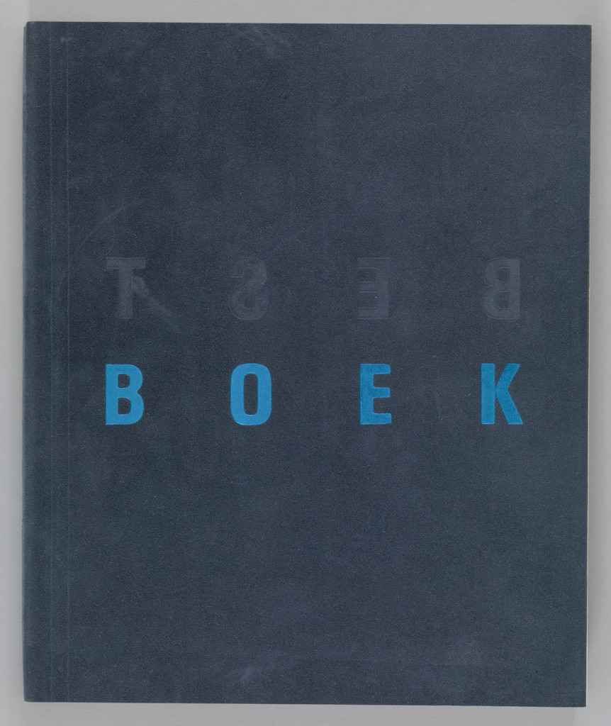
What it is — catalogue of the exhibition of the best-designed Dutch books, Stichting CPNB, 1989;
offset, Mart. Spruijt; 20.5 × 17 × 11.5 cm — so a block 11.5 cm thick at a format smaller than
A5; suede cover; per Eye an A3 folded flat to A4, „a book within a book“ with two
narratives, paper coated on one side only, pages trimmed alternately (MoMA; Eye 13).
Composition — cover (v2): dark grey-blue suede surface, the word BOEK in one line at
58% of the height, letters spaced wide across the whole width (x 12–88%); above it, at 40%, the word
BEST — but MIRRORED and without colour, only as a trace in the suede. The title is split into a visible and
a „wrong“ half; the eye enters on the blue, then looks for what's above. Block: cube-like, almost as
wide as it is deep — an object, not a notebook.
Colour — two: a dark base and one light blue for one word. Everything else is the tone of the
material. Blue is not a colour but a rank — the only coloured word is the only one that reads from five
metres.
Typography — a capitals grotesque with extreme letterspacing (typeface not confirmed); BEST
in the same cut, mirrored. The letter here works as an edge ornament: the space is larger than the letter, so the word
becomes a measuring tape the width of the format.
Message — „best book“, which shows itself as an object: three seconds gives BOEK,
five metres gives a blue line on the dark block; BEST is only read in the hand. Eye: sophisticated,
not expensive („It's sophisticated, it's not expensive“).
Why exactly this way — the content is an exhibition of books: the solution must prove the subject through the object, not through an image of the object. The constraint was budget (paper coated on one side only, offset) — so
the richness goes into trimming and binding, not into colour.
What would kill it — BEST printed normally, above BOEK, in the same blue: the cover would become
the title page of a catalogue, and the block would remain the only argument.
Principles:rijec-sjecena-rubom-formata (BEST as a mirrored trace — a word deliberately damaged by
convention) debljina-bloka-je-porukaTo verify against the image: the interior (alternately trimmed pages, double narrative) —
only Eye 13; not seen.
02 · Raad voor de Kunst 1988 — annual report (1989)
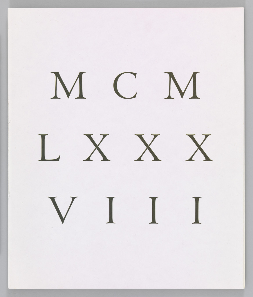
What it is — annual report of the Dutch Council for the Arts for 1988, published 1989;
offset, Drukkerij Rosbeek; 29.7 × 25 × 0.3 cm (MoMA 894.2007). Caution: Eye 13 describes
a Raad voor de Kunst report on bible paper, Japanese-bound by hand, with a gilt edge and
fold-out pages of 700+ characters per line — at a thickness of 0.3 cm this is almost certainly NOT
this copy but the 1989 report (the MoMA roster also has „Raad voor de Kunst 1988–1989“). Only
the cover seen in the session is analysed here; Eye's description goes into „Other“.
Composition — cover (v2): white surface, three lines of Roman numerals MCM / LXXX / VIII in
grey serif, aligned as a block at 25–70% of the height, almost the full width of the format; the
bottom third empty. The year 1988 is BROKEN into three lines by the Roman system (thousands–hundreds /
tens / units), so it reads as three words, not as a number. The eye goes top to bottom as if
reading an inscription on a monument.
Colour — one grey on white. No blue or gold on the cover; the tone is official,
„legal document“ (Eye: the annual report is not read, it is a legal document and PR).
Typography — a capitals roman serif with wide spacing (Trajan/Times class; typeface
not confirmed). A classic typeface for an institution — but used as an image: the Roman numeral
instead of an Arabic one is the only „idea“ of the cover, and it is enough.
Message — a state institution, one year, nothing else; from five metres three lines of grey
letters, from three seconds „1988“ only once you translate it. Deliberately slowed reading on the title page.
Why exactly this way — the report's text is legally mandatory, no one reads it; so Boom
shifts the value from reading to leafing through and holding (Eye 13). The cover announces this:
a number that demands translation.
What would kill it — „Jaarverslag 1988“ in grotesque top left and the Council's logo: it would become
a report like a thousand others.
Principles:program-umjesto-artefakta (Eye 13, second RvdK report: text size
calculated mathematically from text length, „no layouts required” — DOCUMENTED, but for a different copy;
the tag applies to the series of reports, not to this cover) rub-bloka-je-stranica (Eye 13: gold-
brushed edge, French fold — same caution)
To verify against the image: which exact copy is from Eye; the interior of this one (0.3 cm).
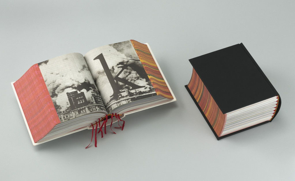
What it is — book for the SHV Holdings concern's centenary, Utrecht; 2,136 pages, two
volumes (white and black), each 22.5 × 17 × 11 cm, ca. 3.5 kg; offset, Drukkerij Rosbeek; 4,000
English + 500 Chinese copies (Typotheque); five years of work 1991–96, of which 3.5 in
archives; no page numbers, table of contents or index; chronology BACKWARDS from 1996 to 1896; block
edge printed — flipping left to right reveals a field of tulips, right to left
verses of a Dutch poem (MoMA); holes printed without ink as „unknown future,” progressively
fewer the further back in time (Typotheque). Original idea 4,000 pp. (Typotheque).
Composition — v2 (MoMA photograph: white volume open, black closed): open spread
— left page nearly empty, right page carries a huge number „1” (height ~40% of the page) and a sepia
photograph without a frame; three red ribbons hang from the block (the only orientation device in the book, which has no
numbers). Closed black volume: a cube 22 × 17 × 11, spine as wide as half the cover; block
edge light with a warm tone — that is the printed edge from the MoMA description. Constant across the series of two volumes:
same block, opposite cover colour.
Colour — two volumes = two non-colours (white/black); inside sepia and photographic tone, one
red as ribbon. Colour appears only ON THE EDGE (tulips) — the strongest colour in the book is
at the place where a book usually has none.
Typography — number as image (v2: „1” dominates the page); typefaces not confirmed — Boom
otherwise holds to 2–3 typefaces per project (Typotheque). For this book no specific typeface is claimed.
Message — a company history that cannot be searched, only wandered through: „a journey not from A
to B but from K to D” (Typotheque). Three-second test: a brick; five-metre test: two blocks, white and
black. The message is not in the text but in the relation of hand to block — and in the fact that NO ONE
commissioned it to be useful (v1, confirmed by MoMA: the boss only asked for „something unusual”).
Why exactly this way — the constraint was not budget (there was none) but the client's philosophy:
„It's more important to discover things for yourself rather than giving instructions”
(Typotheque) — so the book abolishes every instrument of instruction (numbering, contents, index). The deadline (May
1996) is the only hard limit.
What would kill it — page numbers. One small number in the corner brings back „retrieval” and the whole
object becomes a fat corporate monograph.
Principles:bez-navigacije-citanje-je-lutanje (benchmark) rub-bloka-je-stranica (tulips /
poem) debljina-bloka-je-poruka (3.5 kg) oduzimanje-kao-autorstvo (the convention of pagination
abolished — the verb acts on the convention, not on the image) postupak-je-poruka (holes without ink =
future; „printed with a scent” and images visible when the paper is wet — v1 only, unconfirmed)
To verify against the image: the scent and „images on wet paper” (v1) are not confirmed by any
source in this session; the pink „shocking pink” binding (Wallpaper) versus the white/black volume in MoMA —
probably different copies/editions.
04 · Otto Treumann: Graphic Design in the Netherlands (1999)
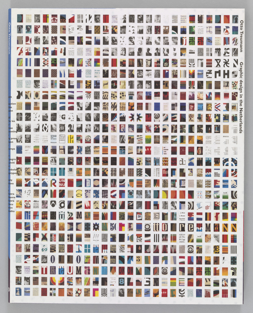
What it is — a monograph on designer Otto Treumann, Uitgeverij 010, Rotterdam; offset,
Veenman Printers; 24 × 19 × 9.5 cm (MoMA 902.2007) — a block almost 10 cm deep. Typotheque
(2001) dates the book to 2001; MoMA to 1999 — MoMA taken as the source, see Notes on sources.
Composition — cover (v2): the entire front is a GRID of tiny reproductions, ca. 20
columns × 30 rows, each the size of a postage stamp, no margin to the edge; the title and author's name
run vertically, small, along the right edge (x 93–97%). There is no hierarchy among the small images — the only hierarchy
is quantity. The eye finds nowhere to enter: it slides. The block: heavy, an almost cube-shaped spine.
Colour — all of Treumann's colours at once, each small; the overall tone is a coloured grey.
Boom does not choose a colour — she chooses not to choose: the palette is a sample of the body of work.
Typography — small grotesque set upright (typeface not confirmed). The letter sits right at the edge;
the cover is an image, not a title page.
Message — „this is the whole man, everything he made, in a single glance”; from five metres
texture, from three seconds a carpet, in the hand — individual works. Typotheque: Boom shows
the works „near-actual size” inside, but shrinks them to stamp size outside — two extremes of scale.
Why exactly this way — a conflict between author and subject: Treumann wanted an archive, she
„stayed myself”; his reply, „Irma it's your book” (Typotheque). The cover is her answer: everything his, but
under her rule (grid, no rank).
What would kill it — one large Treumann poster on the cover: the monograph he wanted, and not a single
decision by the designer.
Principles:korice-su-katalog (benchmark)
To verify against the image: the interior (reproductions at actual size — Typotheque only).
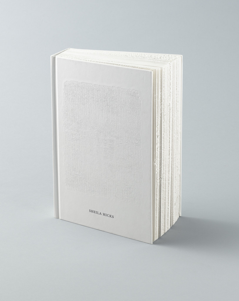
What it is — a monograph on textile artist Sheila Hicks, Yale University Press for the Bard
Graduate Center; 155 × 220 × 59 mm, 416 pp., Munken Print White 150 g (also the flyleaf), binding
Butterfly off-white 150 g; offset and letterpress (MoMA); sewn hardcover, the block edge
roughened with a circular saw to evoke the unravelled edges of Hicks's weavings (DBVB; Eye 88:
„hacked with a circular saw”); Rosbeek, binding by Van Waarden; typeface Plantin; gold medal
„Best Book Design from all over the World,” Leipzig 2007. Four years of work, 50 dummies,
in collaboration with the artist (Eye 88). Boom considers it her best work (Eye 88).
Composition — v2 (MoMA, closed book): a white block almost 6 cm tall, a format smaller than
A5; cover white with a fabric pattern embossed across the whole surface (tone on tone, visible only
under raking light); the name SHEILA HICKS small, in a single line, at ~72% height, centred — less than
1% of the surface. Front edge: rough, irregular, like cut cloth — the only „event” on the
object is at the edge. Inside (DBVB jury): „clear and sober,” large areas of white around the works.
Colour — white on white outside; the colour is in the reproductions of the weavings inside. The 150 g paper is
a colour decision: the weight and matte tone carry the textile better than gloss would (jury).
Typography — Plantin (DBVB) — a Renaissance serif, quiet; „unusual letter size” on the
cover (jury) — small where anyone else would go large. The typeface serves the text, the cover serves the
edge.
Message — a book about weaving that BEHAVES like a fabric: the edge frays, the cover is
embossed cloth. From five metres a white brick; from three seconds — nothing; in the hand — everything. A work that
refuses to be read from a distance is deliberate: the monograph is for the hand.
Why exactly this way — the subject (weaving = edge, thread, touch) dictates the process (saw, embossing,
matte paper); the constraint is industrial production at scale — she found the solution in
MECHANICAL damage to the block, not in handwork. „Social housing,” not a villa.
What would kill it — a straight-cut edge. It would remain a nice white monograph; the metaphor from
the title would stay only in the title.
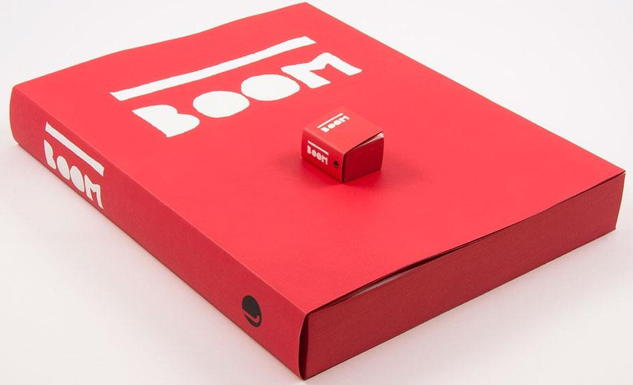
What it is — the author's own monograph in TWO formats with identical content of 800 pp.:
mini 43 × 55 × 28 mm (5,500 pcs, Elementa Opaque 60 g, Skivertex cover) and XXL 345 × 450 × 58 mm
(150 pcs, Munken Polar 120 g, Malmero Vermillion 300 g laminated cover), in a grey cardboard
box with a thumb-hole; Lecturis, Eindhoven; typefaces Neuzeit Grotesk and Linotype Plantin; binding
Patist / Geertsen (DBVB). Predecessor: mini Biography in Books 2010 (704 pp.) alongside a
retrospective in Amsterdam; MoMA 784.2014 holds the large red + mini red + mini blue under the
year 2010 (see Notes on sources). Author's plan: with each new edition the mini grows 3%, the XXL
shrinks 3% per year (Designers & Books).
Composition — v2 (MoMA photograph: large box with the mini book on top of it): red
surface; the lettering BOOM in white, constructed from straight bands (letters as a stencil), width
~55% of the box, placed in the upper third; the same lettering, the same proportions, on the
mini book — the only difference is scale. Thumb-hole bottom left as the only opening in the
surface. The XXL block almost 6 cm thick, the mini almost a cube (43 × 55 × 28).
Colour — one vermilion + white; the second mini is blue (MoMA .2b) — colour as edition, not
as decoration. Inside, black-and-white and colour per reproduction.
Typography — Neuzeit Grotesk + Plantin (DBVB): geometric grotesque for labels,
serif for text — the same pairing in both sizes, so in the mini the setting drops below 4 pt. The
lettering BOOM on the cover is not from a font but constructed (specific typeface not confirmed).
Message — jury: „tiny clarifies the relationship between book and postage stamp, the
megalarge that between book and poster“. Same content, two objects: one for the pocket, the
other for the table; the author's name as a mark. Three-second test: a red box; five metres:
a red box with a dot on it.
Why exactly this way — the mini is her working tool (mock-ups for checking structure, Designers &
Books) issued as a product; the XXL is the same file pushed to the other extreme. Constraint:
nothing changes in the content — all the design is in the FORMAT.
What would kill it — a "normal" edition 17 × 24 cm between them. As soon as a middle size
exists, the extremes become versions, not a thesis.
Principles:format-je-prva-odluka (second author after April Greiman — content fixed,
what changes is what the object IS) debljina-bloka-je-poruka (28 mm at 43 × 55)
To verify against the image: spreads; drop in legibility in the mini.
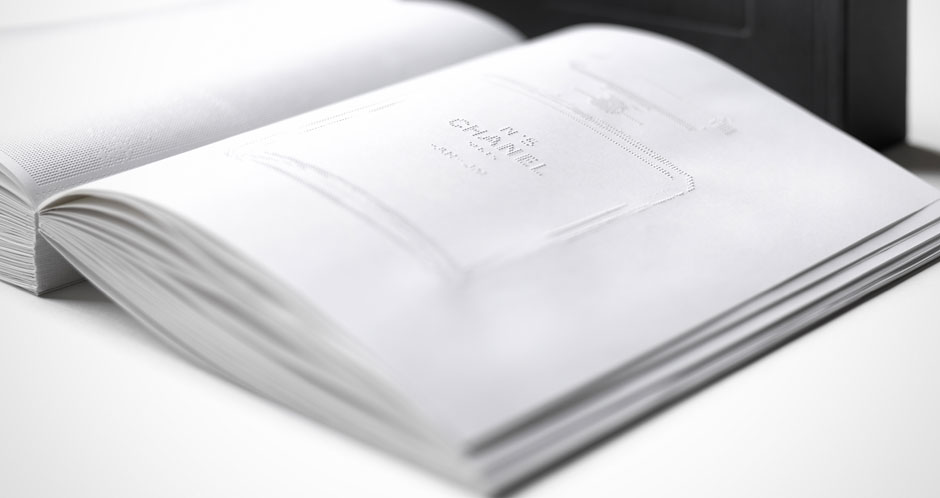
What it is — a book for the exhibition N° 5 Culture Chanel at the Palais de Tokyo, Paris,
2013, client Chanel; 27 × 22 × 5 cm (Boijmans V 2887 a-b, gift of Chanel 2014); entirely
blind-embossed, without ink (DDA: „geheel in blindpreeg gedrukt“), on an old letterpress machine
without colour (book-as-exhibition); drawings and quotes about Gabrielle Chanel, hand-drawn for
each page; a white block in a black box. Page count disputed: 300 (book-as-exhibition, Wallpaper) /
500 (DDA) / „600“ (title of Philadelphia Magazine) — not to be asserted. Thickness 5 cm = the
number 5 (book-as-exhibition). Dutch Design Award 2014; Design Museum London „Designs of the
Year“. MoMA 792.2014 is a DIFFERENT Chanel book (Livre d'Artistes, 2014, 26.4 × 22 × 4.8, also
embossed) — not to be confused with this one.
Composition — v2 (DDA photograph, open book, at an angle): white spread, on the right-hand
page an embossed outline of the N° 5 bottle with its label, centred, height ~45% of the page;
the left page empty (or the emboss invisible under that light); a thick block, pages white to
the edge; behind it — a black box. Everything visible depends on the angle of light: the
composition is conditional, the viewer must light it themselves.
Colour — none. White on white; the black box is the only contrast and it stands OUTSIDE
the book. Colour has been relocated into the shadow of the emboss — that is, into the light of
the room.
Typography — quotes in emboss, hand-drawn per page (book-as-exhibition); the typeface
cannot be asserted. Letters without ink: read with a finger and under raking light, like an
inscription on stone.
Message — scent: „intense and exciting, yet invisible“ (Boom on Grasse); DDA jury: the
sense of smell captured and made tangible through the other senses. Three seconds: a white
book; five metres: a white cube in a black box; in the hand — text you feel. Boom: „something
almost nonexistent yet very present“ (Designers & Books).
Why exactly this way — the subject is invisible (perfume), so the only means of
visibility in a book is eliminated — ink. The constraint is technical: the emboss must be deep
to carry the text, so the paper must be thick, so the book becomes a 5 cm block; the mini
catalogue copy has a shallower emboss due to a different technique (Designers & Books) — the
process chooses the format.
What would kill it — a single black word. Any ink imprint, and a title on the cover, sends
the book back to being an exhibition catalogue.
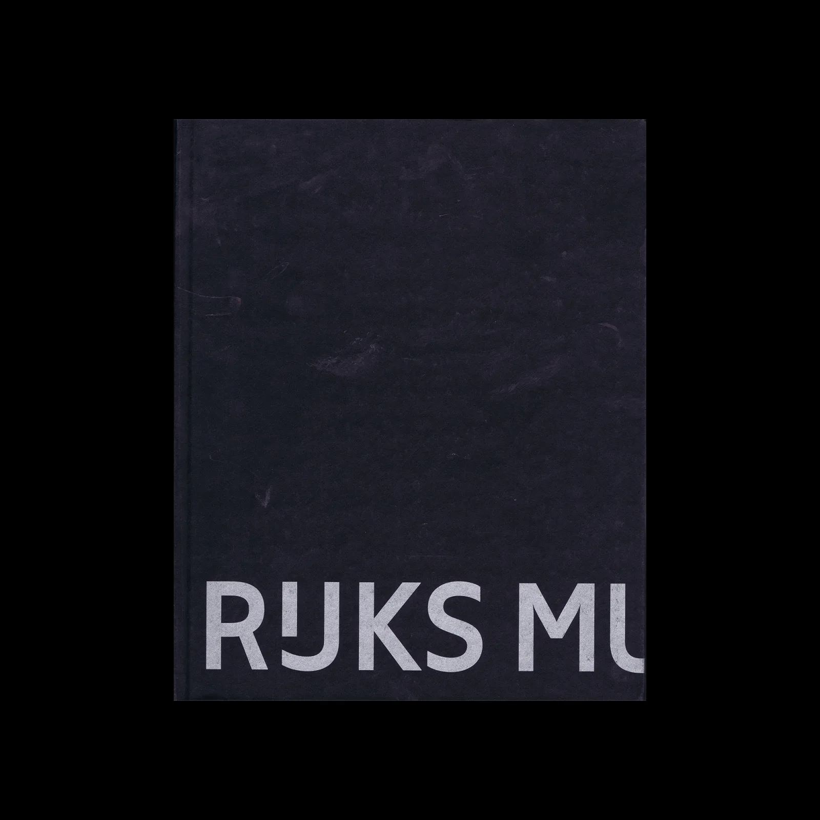
What it is — a photographic book by Wijnanda Deroo about the renovated Rijksmuseum,
to mark the 2013 reopening; Rijksmuseum + nai010, Rotterdam; concept Irma Boom, execution with
Sanne van de Goor; 233 × 290 × 23 mm, 226 pp., Munken Polar 150 g, black Butterfly endpaper
170 g, cover Wibalin Natural 570 Black on 1 mm grey board; offset Lecturis; sewn, front edge
uncut, "trimmed" by signature; typeface Rijksmuseum (Boom with Bold Monday / Paul van der
Laan); print run 4,000 (DBVB). Photographs arranged by colour, volume and light, not by room
(DBVB).
Composition — cover (v2): a black cloth surface; the lettering RIJKS MU in grey, large
(letter height ~12% of the cover), in a single line at 80–92% of the height, starting at ~5%
from the left edge and RUNNING OFF the format to the right — the word "museum" is cut off
after MU. The top 75% empty. The eye enters bottom left, exits the book to the right — the
direction of reading is the direction of opening. The join RIJKS MU quotes the 2012 logotype
(the space between "Rijks" and "museum", rijksmuseum.nl).
Colour — black + grey letters; colour is inside (Deroo arranged by colour). Cover: the
institution's tone, without "ceremonial self-promotion" (DBVB) — zero colour on opening day.
Typography — the Rijksmuseum typeface: a wide grotesque with an IJ ligature (visible in
v2: IJ as a single character). The typeface is part of the identity, so the cover needs
neither logotype nor image: the letter IS the mark. The cutting of the word by the edge is a
typographic move, not a mistake.
Message — „this is the Rijksmuseum, the rest of the name is inside“; from five metres a
black book with a grey band of letters at the bottom; from three seconds, RIJKS. Restrained to
the edge of cold — DBVB: „restrained individuality“.
Why exactly this way — the constraint: the client is the institution's own identity, so
the only decoration allowed is the identity itself (typeface, spacing). The uncut edge by
signature gives the block a rhythm that matches the sequence of images by light — the edge as
content, again.
What would kill it — the whole word RIJKSMUSEUM squeezed into the format, or a photograph
of the building on the cover. The typeface would stop being a mark.
Raad voor de Kunst annual report (second, cca 1989–90) — bible paper, Japanese hand
binding, edge brushed with gold, foldout pages with lines of 700+ characters, quotes from
Dutch writers as illustrations; the following report: text size calculated from text length,
„no layouts required“ (Eye 13). program-umjesto-artefaktarub-bloka-je-stranica
Nederlandse Postzegels 1987; Dutch Butterfly Postage Stamps 1993; Rekenkamer Postage
Stamps 1997 — state stamps from the SDU period and after (MoMA 110956, 111021, 111038).
Every Thing Design — The Collections of the Museum of Design Zürich 2009 — 15.6 × 12.7 × 7 cm,
offset, MoMA 781.2014: the museum's collection as a cube; debljina-bloka-je-poruka.
Irma Boom: Biography in Books 2010 — mini, 704 pages, alongside the Amsterdam retrospective;
precursor to work 06 (Designers & Books; MoMA 784.2014).
Knoll Textiles 1945–2010 2011, Yale UP (Design Reviewed); Rembrandt — flipbook of
self-portraits (Rijksmuseum, 2000s) — all self-portraits as a flip-through animation
(Princeton Graphic Arts).
1001 vrouwen uit de Nederlandse geschiedenis 2013 (with Julija Neller), Vantilt — 137 × 189 ×
70 mm, 1,556 pages, paper „Editie 1001 vrouwen rose“ 60 g made to order, Maxigloss inserts,
Replica typeface, 22,000 copies; jury: „a marvel of proportioning“; Eye 88: a successful
conversion of online content into print. debljina-bloka-je-poruka (DBVB).
Chanel: Livre d'Artistes 2014 — relief, 26.4 × 22 × 4.8 cm, MoMA 792.2014 (gift of Chanel).
Elements 2014 — 15 books for Koolhaas's exhibition at the Venice Biennale, 20.3 × 14 × 15.2 cm
as a set (MoMA 793.2014); Elements of Architecture 2018 (Taschen, v1 artic — dead link).
Irma Boom: IBO 2015, De Buitenkant (Design Reviewed); Renault=Présent 2016 — thin glossy
aluminium paper as bodywork (rijksmuseum.nl, Wallpaper). postupak-je-poruka
The v1 list of 22 items is entirely from artic.edu (dead since 07.09.) — not a single link
usable; the session roster was built from MoMA (46 online), DBVB and Design Reviewed.
Bridge to practice: poster · graphic design · motion
Poster
Edge as page → margin as content. Boom prints where the book isn't looked at (the block's
edge). On a poster: one piece of information (date, place) GOES on the trim edge, in a strip
8–10 mm wide, and only reads once you step closer — dva-rastojanja-citanja achieved through
geometry, not size.
A word cut by the edge (RIJKS MU, BEST mirrored): a title that runs off the format to the
right asks to be recognised, not read. Works only for a name the audience already knows
(festival, brand).
Thickness as a number — a poster has no thickness, but it has a PRINT RUN and a FORMAT:
„No. 5“ = 5 cm is the same logic as „five posters side by side = one word.“ Before sketching:
which number from the brief can become a measurement?
Graphic design
Dummy before Illustrator. For every printed thing — brochure, catalogue, cover — first a
paper dummy in the actual stock (or at least the right weight), then spreads. Boom: „I build
the design in the book, not on the computer screen.“ In practice: InDesign up to 30% of the
work, the rest checked on the table, because the screen lies about thickness, opacity and edge
(v1 notes, confirmed by Designers & Books).
The cover is the catalogue (Treumann): for a showreel PDF or portfolio — one page with ALL
works as thumbnails in an ungraded grid, before any single one is enlarged. The audience sees
the quantity and tone of the body of work at a glance; a single piece comes only inside.
No navigation when the goal is wandering — not for a client, but for your own sketchbook or
a LØADERRØR archive: no numbers, no index; orientation only by ribbon/edge colour.
Motion
Edge of the block = timeline offset. Tulips on one side of the flip, a poem on the other —
same time, two images depending on DIRECTION. In AE: two layers that appear only when scrubbing
forward / backward (time-remap with a condition on velocity), in MOHO the playback direction
as a switch.
Relief without ink = nothing but light. White text on white, visible only through a normal
map + moving light (AE: CC Glass or a Normal map from text, light animated). One frame, one
event: light passes, the text appears and vanishes.
Same content, two formats (mini/XXL): the same animatic rendered in 9:16 and 21:9 with no
change to the content — the design is only in the format; test for every motion piece before
delivery.
Bad imitation
Thickness without reason. The brick is copied (SHV, 1001 vrouwen), but the page count
doesn't come from the content or from a number in the theme — so blank pages and thicker paper
get added. Cause: the look of the object is copied, not the rule „the measurement comes from
the content“ (5 cm = N° 5; 2,136 pages = everything the archive has). Test: can you say WHY
exactly that much?
Edge treated as decoration. The block's edge coloured or roughened because „it looks
Boom“, while the theme has nothing to do with the edge. With Hicks the edge IS the theme
(weaving), with SHV the edge carries a second image. Cause: procedure taken as style — exactly
what Boom rejects („If I do cut holes in pages, it is always for purpose“, Typotheque).
Navigation removed in a book meant to be used. No page numbers in a catalogue, manual or
yearbook that people SEARCH through. SHV was allowed to do it because no one needs to use it —
the brief was „something unusual“, not „find the 1954 contract“. Cause: the subtraction copied
without checking who reads and why.
White on white on a screen. Relief without ink carried over as „white text 5% opacity“ on
a website or in video — no light, no material, just illegible. Cause: Chanel works because
the viewer tilts the book toward the light; on a screen that has to be done by light (normal
map, animated), otherwise it's just bad contrast.
The brief through their eyes
Current job: I AM RASTER — a vault of 40 notes that has to become a site. Boom would first ask
how much content there is and build a DUMMY of the whole site as a small book (40 sheets, one
per designer), then derive the format (grid, page length, „block“ thickness) from that quantity —
not from a template. Second move: what is the site's „block edge“ — what's visible only when
transitioning (scroll forward / backward gives a different image, like the tulips/poem). Third:
she'd remove one navigation instrument (e.g. chronology as the main menu) and let people wander
through the principles — because learning is „discover for yourself“, not „retrieval“.
Exercises
Edge as page (paper, 45 min). Take 40 sheets of A6, staple them into a block. On the
front edge of the block (not on the pages) draw with a marker one image in the „fanned left“
position (pages shifted like a fan), then a second image in the „fanned right“ position. Open
it flat — both disappear. Constraint: no page inside may have a drawing.
A word cut by the edge (Illustrator, 30 min). The name LØADERRØR into a 1:1.25 format, one
typeface, one cut: find the cutoff point where the name is still recognisable (test on three
people). Note down what % of the word is allowed to run off. Constraint: no second colour, no
image.
Same content, two formats (InDesign/Illustrator, 1 evening). One 800-word text + 8 images:
lay it out at 43 × 55 mm (8 pages) and at 345 × 450 mm (1 sheet), same typeface pairing. Ask
yourself where legibility fails and what becomes an image. Constraint: no change to content.
Motion study
„No ink“ (AE, 5 s, one frame). A white plane; text from a white relief (Normal map from the
text layer → CC Glass or shatter-free displacement); one light layer sweeping left to right over
3 s. The text appears only while the light passes, then vanishes. Forbidden: changing the text's
opacity, colour, shadow as an effect. The event is the light, not the letter.
Rebuilding the benchmark
SHV Think Book, black volume (MoMA photograph), measurements from the v2 image: block proportions 22.5 : 17 : 11 → width 100%, height 132%, depth 65%; spine takes up ~40% of the visible width in the photograph at 30°; block edge light (~85% L) with a warm band; covers matte black. White volume open: numeral "1" on the right-hand page, x 55–70%, y 25–65%; photograph below it x 45–95%, y 55–95%; left-hand page blank; three red ribbons emerge from the bottom of the block x 30–45%. Task: in Illustrator, in 45 minutes, build an isometric skeleton of the two volumes (.svg) with these ratios, then compare with the MoMA image. Whoever gets the spine/cover ratio right has understood why this is a brick, not a book.
Notes on sources
Birthplace: Lochem (v1, Wallpaper) / "born in Enschede" (Eye 88). Lochem taken; Enschede is the place of study (AKI). Unresolved without a primary source.
Archive: v1 "Rijksmuseum" / Eye 88 "University of Amsterdam". Eye 88 taken; Rijksmuseum is the client and exhibitor, not the archive.
Raad voor de Kunst (02): MoMA's 1988 copy is 0.3 cm thick; Eye's description (bible paper, Japanese binding, gold edge) probably belongs to the 1989 report. Only the covers seen in v2 were analysed; Eye's description moved to "Other" without a year.
SHV: "printed with a scent" and "images visible when the paper is wet" (v1) — unconfirmed in MoMA, Eye 88, Typotheque. Holes without ink confirmed (Typotheque). "Shocking pink" binding (Wallpaper) versus the white/black volume (MoMA) — unresolved. Weight 3.5 kg: Eye 88 and v1.
Architecture of the Book (06): DBVB 2013 / MoMA record "2010" (combines the 2010 mini and the XXL) — 2013 taken for the XXL edition; MoMA's XXL measurements (45.1 × 34.6 × 6.4) ≠ DBVB (34.5 × 45 × 5.8) — DBVB taken as the production record.
Chanel (07): page count 300 / 500 / 600 depending on the source — not to be asserted. Measurements 27 × 22 × 5 (Boijmans). MoMA holds a DIFFERENT Chanel book (2014) — v1 does not distinguish between them.
Typefaces: confirmed only Plantin (05), Neuzeit Grotesk + Plantin (06), Replica (1001 vrouwen), Rijksmuseum (08) — all from DBVB. The rest classified or "unconfirmed".
Portrait: Commons file Irma_Boom.jpg exists; not opened in this session (screenshot quota).
Influenced: empty — no name in the sources.
v1 quote dropped as unconfirmed; replaced with Eye 88.
Analytical text per work: 6 of 8 documented (Eye 13 for 01; MoMA description + Typotheque for 03; Typotheque for 04; DBVB jury for 05, 06, 08; DDA/book-as-exhibition for 07); 02 covers only.
Tool: debestverzorgdeboeken.nl works through WebFetch (en and nl) — production record per book (format, paper, typeface, binding, print run, printer, jury) = primary document for Dutch books; guessing the slug for /en/books/<slug>/ fails, search with WebSearch site:.