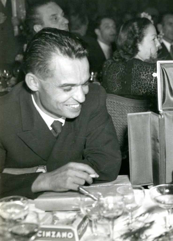
head of the Advertising/Graphics Office, Olivetti (1936–1967); art director from 1950 Tresnuraghes, Sardinia → Monza → Ivrea/Milan
Palette of the œuvre
"I am not trying to speak in the name of machines. Instead, I have tried to make them speak for themselves, through the graphic presentation of their elements, their operations and their use."
Biography
Born 14 July 1912 in Tresnuraghes, province of Oristano, on Sardinia, into
a family of dairy farmers. From 1927 he worked as a typist. At the photographic
gallery of Piero Pirari he was encouraged to apply for a scholarship — in 1930 he
wins it, together with Salvatore Fancello and Costantino Nivola (later a sculptor
and designer/artist respectively), for the Institute for Artistic Industry (ISIA) in
Monza. There he studies from 1930 to 1936, under director Elio Palazzo
(professor of descriptive geometry) and lecturers Edoardo Persico,
Giuseppe Pagano and Marcello Nizzoli — the largest number of by-name
confirmed teachers of any designer covered in this project so far. In 1934
Pagano invites him to collaborate on the exhibition Mostra dell'aeronautica
in Milan.
On graduating in 1936 he joins Olivetti's Development and Advertising Office
(Ufficio Sviluppo e Pubblicità), founded in 1931 by Renato Zveteremich; the
office is later run by the poet-engineer Leonardo Sinisgalli, with whom in 1940
he collaborates on the Olivetti stand at the VII Milan Triennale — they win the
Grand Prix. In 1950 Pintori becomes art director of the same office and stays
in that position until 1967 — a total of 31 years with a single client. During
that period he creates posters, advertisements and Olivetti's annual art
calendars (1951–1969; the first featured Henri Rousseau, the last Nanban art).
The exhibition Olivetti: Design in Industry at MoMA (October–November 1952)
brings him international recognition.
He leaves Olivetti in 1967 (according to Wikipedia, due to disagreement with
management following the death of Adriano Olivetti in 1960 — this claim
provjeriti, storiaolivetti.it does not give a reason) and opens an independent
studio in Milan, still working for Olivetti as a freelancer, alongside new clients
(Ambrosetti, Pirelli, SIRTI, Merzario). His last advertising project is the
campaign for Merzario S.p.A. (1980). After that he devotes himself exclusively
to painting on the motif of eternal motion; his only solo exhibition of paintings
was held in Milan in 1981. He dies 15 November 1999 in Milan.
Awards: Gold Medal for Advertising, Federazione Italiana Pubblicità (1950),
Certificate of Excellence in the Graphic Arts, AIGA (1955), gold medal of the
Milan Fair and first prize, Linea Grafica (1956), Grand Prize of the XI Milan
Triennale (1957), award for typographic excellence, New York Art Directors
Club (1962) and certificate of merit from the same club (1964).
Influences
Studied with
Elio Palazzo, director of ISIA Monza, professor of descriptive geometry
Edoardo Persico, critic and architecture theorist, lecturer at ISIA
Giuseppe Pagano, architect and lecturer at ISIA; in 1934 invited him to collaborate on the Mostra dell'aeronautica exhibition in Milan
Marcello Nizzoli, lecturer at ISIA and later senior designer/architect in the same Olivetti office
Borrows from
Bauhaus and Italian Rationalism geometric abstraction — reduced form, flat colour
surrealist play with scale (a small object as a large geometric sign)
mathematical/scientific diagrammatics (spirals, radial structures, number grids) as an ornamental system
Influenced
no student or successor is documented by name — he did not teach; entire career in a single office
Olivetti's Advertising Office — storiaolivetti.it: the calculating machine series 1956–1963 set the model (product secondary, abstract form, only name and logotype) from which Walter Ballmer (in the office from 1956) consciously moves away in 1968 toward photography with text — influence as the norm being departed from, not as teaching
Wieden+Kennedy, The Guardian (2007) — similarity to Tetractys noted only in a student blog (NTU, hemani001), unconfirmed
Contemporaries
Renato Zveteremich — first head of Olivetti's Development and Advertising Office, where Pintori started working
Leonardo Sinisgalli — poet-engineer, second head of the same office; collaborated with Pintori on Olivetti's installation at the VII Triennale di Milano in 1940 (Grand Prix)
Marcello Nizzoli — former professor, later colleague and senior industrial design designer for the same Olivetti
Salvatore Fancello and Costantino Nivola — fellow ISIA scholarship holders in 1930, later sculptor and designer/artist respectively
Max Huber — Italian post-war graphic design of the same period, but from the Swiss-Milanese circle, not from Olivetti
Who he studied under
Elio Palazzo (director of ISIA, descriptive geometry), Edoardo
Persico, Giuseppe Pagano and Marcello Nizzoli — all four taught at
ISIA Monza 1930–1936. Nizzoli is a special case: he was his professor, and
later a colleague and senior designer within the same Olivetti office.
What he steals
Geometric abstraction of the Bauhaus and Italian rationalism — reduced
form, flat colour, order instead of ornament — absorbed via his ISIA
professors, who were directly connected to those circles.
Surrealist play with scale — a small object or detail enlarged into a
bold geometric sign.
Scientific/mathematical diagram-making — spirals, radial structures,
grids of numbers — taken over as a decorative system, not as illustration
of real data.
Who he influenced
There is no by-name documented student — he did not teach, and spent his
entire career in one office. What the sources show is influence on the office
itself: storiaolivetti.it describes his series for calculating machines
(1956–1963) as a model — the product secondary, abstract form, only the
machine's name and the logotype — and Walter Ballmer (at Olivetti from 1956)
moves in 1968 to product photography with short text, "in sharp contrast" to
Pintori. Influence is thus the norm from which the next generation departs.
The similarity of the Wieden+Kennedy campaign for The Guardian (2007) to
Tetractys is claimed only by a student blog — provjeriti.
Contemporaries
Renato Zveteremich — first head of Olivetti's advertising office, where
Pintori began working in 1936. Leonardo Sinisgalli — poet-engineer,
second head of the same office, collaborator on the 1940 Triennale.
Marcello Nizzoli — former professor, later colleague and senior designer
of industrial products (Lettera 22, Lexikon housing) for the same Olivetti.
Salvatore Fancello and Costantino Nivola — fellow scholarship winners
at ISIA in 1930. Max Huber — Italian post-war graphics of the same period,
but from the Swiss-Milanese circle (Studio Boggeri), not from Olivetti — a
good pair for comparing two Italian paths of the same decade.
Key works — full analysis
Common key to the series (storiaolivetti.it, "Manifesti per il calcolo meccanico"):
the product is secondary, the message runs through abstract graphic form,
and the text is most often just the machine's name and the logotype. MoMA
(via Letterform Archive) passes on his rule: a page or poster must be
"rich in meaning," and the meaning must come "from the properties of the
object or function" being advertised.
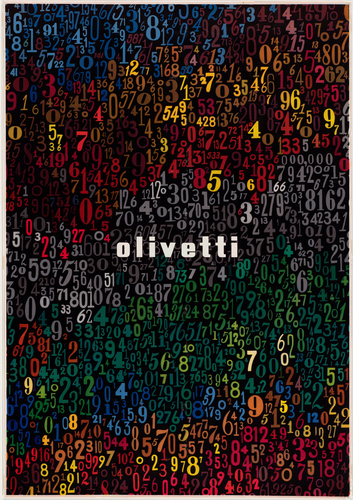
37 3/8 × 26 1/4 in (95.5 × 66.5 cm) — MoMA 249.1987, gift of the designer; Archivio Grafica Italiana also lists the format 70 × 50 cm
Type
the "olivetti" logotype — white lowercase with short serifs, letterspaced; digits in multiple typefaces (Didone serif and grotesque) and sizes; cut/weight not confirmed
What it is — poster for an Olivetti calculating-machine campaign, 1949,
offset lithograph, 95.5 × 66.5 cm (MoMA; AGI also lists 70 × 50). It does
not advertise any specific model — not even the Divisumma 14 from the
previous year (storiaolivetti.it).
Composition — the whole format is a "carpet" of digits of different
sizes and typefaces, with no grid and no border; there is no band or field.
The "olivetti" logotype sits slightly above centre, directly on top of the
digits — around it the digits are darkened (grey on black), so the logotype
separates by tone, not by frame.
Colour (measured, scan dark) — black ground 59%; digits grey, red,
yellow, green. Warm tones denser in the upper part, greens in the lower —
colour slides from top to bottom. The only white element is the logotype
(AGI).
Typography — digits in several typefaces (Didone serifs alongside
grotesques) and in about ten sizes; the logotype is a small white
lowercase with short serifs, letterspaced.
Message — Olivetti = number in general, not one machine; "everything
you need" (olivettipertutti.it: "ed è tutto quello che serve in fondo").
Why exactly this way — the multitude of typefaces and sizes turns the
digits into an image, not a piece of data; one white element in a field of
hundreds gives focus without any other device.
What would kill it — white or light digits around the logotype: the
tonal "hole" disappears and the logotype sinks in; or digits in a single
typeface — it stays a table, not a carpet.
Principles:jedan-primitiv-za-sve, kontrolisan-slucaj, logotip-tih-i-niskov2 correction (06.09.): there is no "horizontal band on black background" —
the logotype lies on top of the digits, set apart by the darkened surroundings;
the logotype is lowercase, not "geometric capitals."
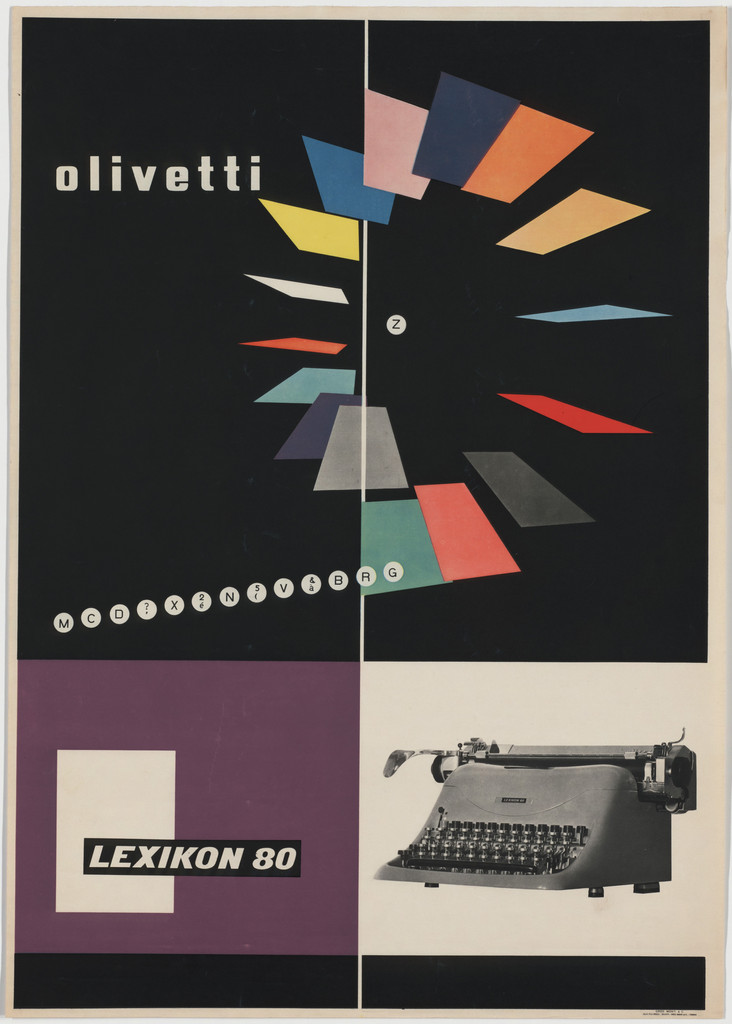
What it is — poster for the Lexikon 80 typewriter (machine design by
Nizzoli), lithograph, 69.9 × 49.5 cm, MoMA 336.1953 — gift of Olivetti, from
the time of the exhibition Olivetti: Design in Industry (MoMA 1952).
Composition — the upper two thirds black: a fan of coloured
parallelograms (letter-levers in flight) arranged around a single point,
below it an arc of small circles with letters (keys); a thin white
vertical divides the black field. The lower third: on the left a
violet-grey square with a white square and a black band reading "LEXIKON
80," on the right a photograph of the machine on a light ground.
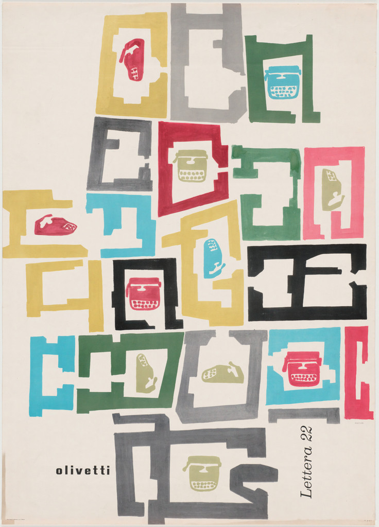
What it is — poster for the Lettera 22 portable machine, lithograph,
69.9 × 50.2 cm, printer Industrie Grafiche N. Moneta, Milano (MoMA
1527.2000). No analysis of this work found in sources.
Composition — a field of scattered large letter fragments (C, E, H,
D…) with a stepped outline, as if assembled from modules; many are
turned or tilted. Some "letters" hold tiny icons: a typewriter, a
telephone receiver, a hand. The lower part of the format stays empty.
Colour (measured) — paper 59%, ochre/sand 21%, grey 16%, turquoise;
accents pinkish-red and green — pastel, flat tones.
Typography — "olivetti" small grotesque lowercase bottom left;
"Lettera 22" serif italic rotated 90° along the right edge.
Message — the letter (script, message, telephone) as a world in which
the machine lives; the letter is both frame and content at once.
Why exactly this way — the stepped outline of the letters doesn't look
like typography but like cut paper or a mosaic — the letters are objects
that can be scattered around.
What would kill it — legible letters in a single line: the alphabet
remains, the play of frames is lost.
Principles:slovo-kao-okvir-za-ikonu, logotip-tih-i-niskov2 correction (06.09.): "olivetti" is lowercase, "Lettera 22" serif
italic (not grotesque capitals); the outlines are stepped.
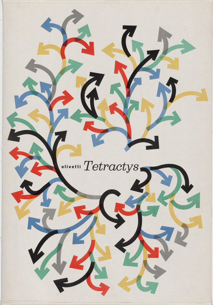
What it is — poster for the Tetractys calculator, a stronger variant
of the Divisumme 24 (1956), photolithograph, 70.5 × 49.5 cm; MoMA dates
it 1957, storiaolivetti.it and olivettipertutti.it 1956. The name is the
Pythagorean tetraktys.
Composition — two large vines of curved arrows, one from the upper,
the other from the lower part of the format; each branches into
ever-shorter arrows pointing in every direction. There is no single
point of origin — storiaolivetti: arrows that "branch into multiple
paths" as a sign of logical complexity. The inscription sits in the
passage between the vines.
Colour (measured) — paper 72%; black, red, blue, green, yellow and
grey arrows; where arrows cross, colours overlap (in the 1024 px scan a
darker tone is visible where blue and green cross).
Typography — "olivetti" small grotesque lowercase + "Tetractys" large
upright serif cut — not italic capitals.
Message — one operation gives birth to a series of further ones: a
machine that "thinks" in branches.
Why exactly this way — the arrow is the only shape (only size,
colour, direction vary), so the image is pure logic; the upright roman
gives the name a classical tone (Pythagoras) against the grotesque
logotype.
What would kill it — straight arrows: growth disappears, leaving only
a flow chart.
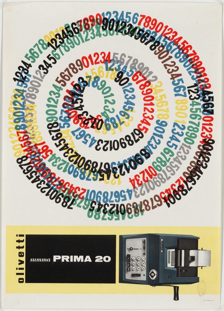
What it is — poster for the mechanical adding machine Summa Prima 20
(mechanics by Capellaro, design by Nizzoli), offset lithograph, 69.8 × 49.8 cm.
MoMA gives "c. 1957", olivettipertutti.it places the machine and poster
in 1960 — 1960 taken.
Composition — upper two thirds: a spiral of the sequence
"1234567890" from centre to edge, digits coloured in segments; lower
third: a yellow band, left a black rectangle with rotated "olivetti",
right a photograph of the machine with a strip of paper.
Colour (measured) — paper 46%, yellow 21%, grey 19%, black 15%;
digits red, blue, black, yellow, turquoise.
Typography — digits bold grotesque; "summa PRIMA 20" and "olivetti"
white on the black rectangle.
Message — addition as an unbroken sequence unwinding (like a strip of
paper from the machine itself).
Why exactly this way — a single sequence of ten digits repeated
endlessly; a spiral instead of concentric circles means the sequence is
ONE.
What would kill it — random digits: it stays work 01; the spiral is
precisely the difference between a "number" and "calculating".
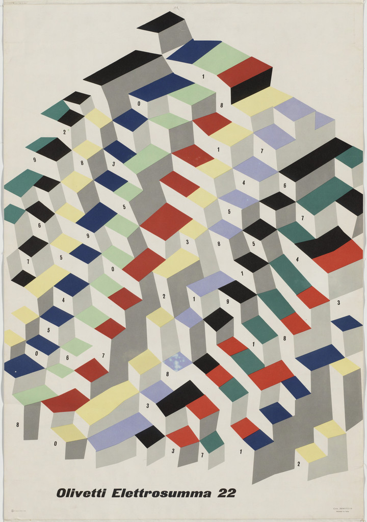
27 1/2 × 19 1/4 in (69.9 × 48.9 cm) — MoMA 141.1963, gift of the artist
Type
"Olivetti Elettrosumma 22" bold italic grotesque (not serif italic), a single line of text at the bottom; small digits alongside blocks; cut/weight not confirmed
What it is — poster for the electric adding machine, photolithograph,
69.9 × 48.9 cm, printer N. Moneta, Milan–Rome (MoMA 141.1963; date
1962). olivettipertutti.it gives 1958.
Composition — a mass of isometric blocks (like a pile of boxes or a
city seen from above) fills the upper three quarters; the mass's outline
is an irregular hexagon; tiny black digits beside individual blocks. One
line of text at the bottom.
Colour (measured) — paper 47%, light grey plane 23%, black tops,
mid grey; accents blue, red, yellow, lilac, green — three tones per
block give volume.
Typography — "Olivetti Elettrosumma 22" bold slanted grotesque — not
serif italic; bottom right a small printer's imprint.
Message — sum as construction: a body grows from individual units.
Why exactly this way — isometry has no single viewpoint, so the mass
reads as a system that can keep extending; the colours are arranged with
no visible order, but every block follows the same light logic.
What would kill it — perspective with a horizon: a scene appears, the
system disappears.
Principles:serija-kao-identitet, kontrolisan-slucajv2 correction (06.09.): the inscription is bold slanted grotesque, not
serif italic; the mass's outline is an irregular hexagon.
07 · Olivetti Lettera 22 — a ship made of typed lines (1958?)
"Olivetti Lettera 22" bold italic grotesque below the photograph of the machine; within the image — lines typed on a typewriter (alphabet, digits, x, dots); cut/weight not confirmed
What it is — poster for the Lettera 22; year 1958 only from PGDA
(student contribution, source galerie123.com) — unconfirmed.
Composition — above, a photograph of the machine, below it the name
and to the right a large black asterisk (a keyboard character). Lower
half: a sailing ship assembled from coloured strips (masts, sails,
hull) and from lines typed by the machine — the alphabet, a sequence of
digits, "xxxx", dots as ropes.
Typography — "Olivetti Lettera 22" bold slanted grotesque; within the
image the machine's own script (typed lines) used as building material.
Message — the portable machine travels; everything needed for a ship
(ropes, sails) is already in the keyboard.
Why exactly this way — the typed line is proof of the machine within
the drawing, and the asterisk is a keyboard character enlarged into a
sun/star.
What would kill it — a drawn ship without typed lines: it remains an
illustration, the link to the machine is lost.
Principles:analogija-umjesto-ilustracije, apstrakcija-gore-dokaz-doljev2 correction (06.09.): the lower construction is not a "star-shaped
mechanism" but a sailing ship made of strips and typed lines; the
inscription is mixed case (not capitals).
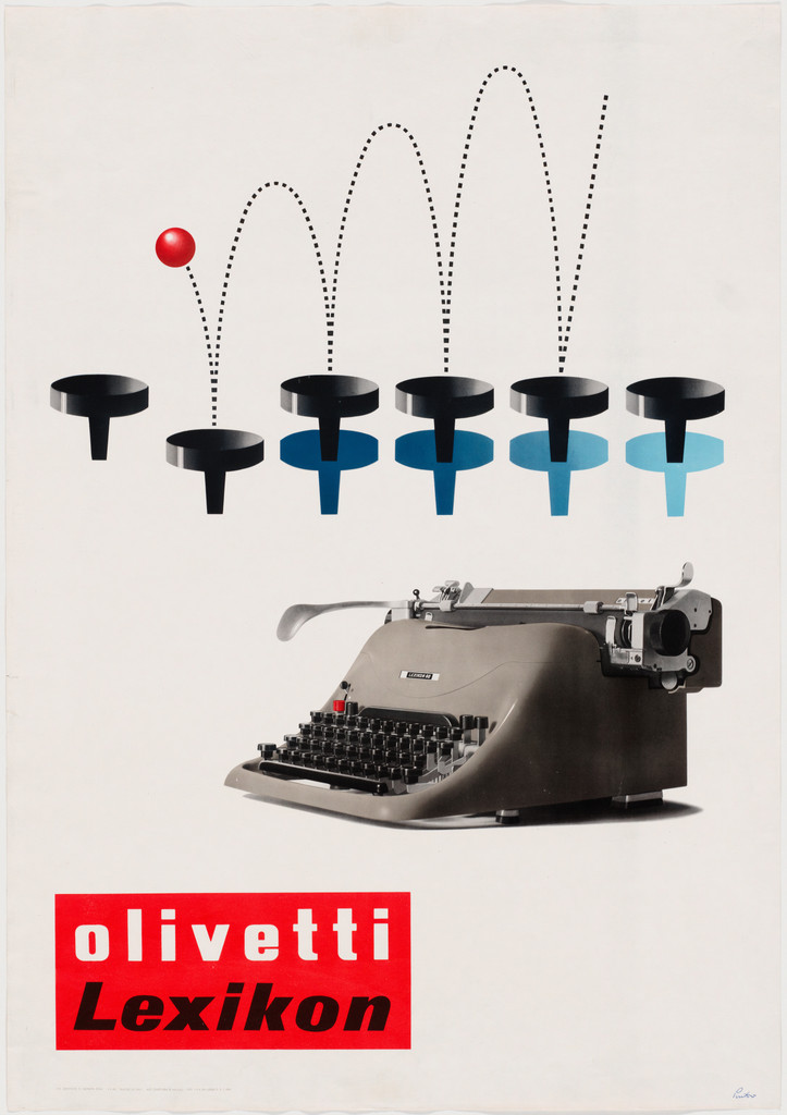
08 · Olivetti Lexikon — ball above the keys (1954)
What it is — poster for the Lexikon, lithograph, 70.5 × 49.5 cm,
printer Industrie Grafiche N. Moneta (MoMA 1526.2000). PGDA 16748 uses
the same MoMA image.
Composition — above, a row of six keys in profile (black top, below
a blue tone lightening left to right); a red ball bounces from key to
key, its path drawn as dotted arcs. Below, a photograph of the machine,
bottom left a red rectangle with the name.
Colour (measured) — paper 77%; black, blue in steps, pure red
(ball and block) — the only warm tone in the format.
Typography — "olivetti" white lowercase + "Lexikon" bold italic,
white on red — mixed setting, not capitals.
Message — lightness of the strike: typing as bouncing.
Why exactly this way — the same red links the ball and the name: the
eye moves from the ball down the arcs to the block with the name.
What would kill it — a ball without the dotted path: time disappears.
Olivetti — "Il pallottoliere" (abacus), 1947 — MoMA 7243 (492.1987),
offset lithograph, 95 × 66.5 cm; storiaolivetti.it: 1946–47, first poster
for Olivetti's entry into calculating machines — coloured abacus on dark
ground, "softened with flowers" (white flowers over the beads). Viewed 25.09.
Olivetti Lexikon, 1950 — MoMA 6334 (335.1953), screenprint, 69.5 × 49.5 cm:
black bird made of ribbons over a photograph of the machine, "olivetti" in blue below.
Attribution disputed: MoMA — Pintori; olivettipertutti.it (Poster Lexikon
80) — Marcello Nizzoli, 1950. provjeriti.
Olivetti Summa 15, c. 1950 — MoMA 6348 (337.1953), lithograph,
70.5 × 50.2 cm: purple ground with drawn hands counting on
fingers and figures, photograph of the machine, red line. Viewed 25.09.
Olivetti Lettera 22, 1953 — MoMA 8825 (1528.2000), lithograph, Moneta:
arcs in red, blue, yellow and green with letter-keys in
small circles, photograph of the machine. Viewed 25.09.
SFMoMA (gift 2008): 2008.175.1 Studio 44 (1954), 2008.175.3 Olivetti
Company (1956), 2008.175.9 Lettera 22 (1955), 2008.175.11 Olivetti (1953)
— titles from a WebSearch snippet, images not seen.
Letterform Archive — brochures from the 1950s and 60s: Lettera 22, 82 Diaspron
(1964, 1965 — "x-ray" of the machine from above), Graphika (1965), Quanta (1965 —
digits stacked one on another in 3D), Divisumma 26, Multisumma 20, Studio
44, Praxis 48 (1966), Caratteri (photograph of a hand behind ribbons with Olivetti's
typefaces).
"La rosa nel calamaio" (with Sinisgalli, for Studio 42 and 44), cover of the
book Olivetti 1908–1958 (storiaolivetti.it) — not seen.
Olivetti art calendars (1951–1969) — he chose the content, the cuts and
oversaw the colour reproduction (Rousseau 1951, Pompeii 1952, Carpaccio
1953, Etruscan painting 1954…).
Olivetti's installation at the 7th Milan Triennale (1940, with Sinisgalli) —
no record seen.
Bridge to practice: poster · graphic design · motion
Poster
Instead of a photograph of the product, draw the behaviour of the product — what it
does, not what it looks like. A number, a letter or an abstract sign can carry
a company's identity better than a realistic illustration.
Graphic design
Logotype placed small and low on the page, while the composition above it carries
all the visual weight — reliability and expense read from stillness, not from
the size of the brand name.
Motion
"Controlled randomness" (works 01, 05, 06) translates directly into particle
animation: elements that look randomly scattered but follow a hidden
density curve or path — numbers falling, but not evenly, denser toward
a given point.
Bad imitation
Noise without signal. A dense field of small elements (numbers, icons) without
a single focal point (as with him the word "olivetti" or the model name) —
without a resting point around which density is organised, the composition
becomes mere wallpaper.
Randomness without hidden structure. Scattering elements "to look
organic" without an implicit density curve or path — with him every
scatter is in fact a hand-drawn distribution; without that the result reads
as confetti, not composition.
Literal depiction of the product when the principle calls for abstraction.
Falling back on a photograph of the machine when the subject calls for showing
its logic/behaviour — with him the photograph of the machine exists (02, 05, 07, 08),
but is always smaller and below the abstraction; when the photograph takes the
top, what's left is a catalogue.
The brief through their eyes
(enter the current job here before using the exercise)
First question he'd ask: "What does this product/service do, not what does it
look like — and can I show that as an abstract sign instead of a photograph?"
Second move: pick one mathematical/geometric system (spiral,
branching, grid, isometry) that metaphorically matches that action. Third:
place the logotype small and quiet, only at the end, as a signature, not a shout.
Exercises
Behaviour instead of object. For any product or service from your
current job, make a composition that doesn't show the object itself but
its function/action as an abstract geometric system (grid,
spiral, branching). No photograph of the object. 45 minutes.
Controlled randomness. Arrange 50–100 small elements (numbers, dots,
shapes) so they look random, but follow a hidden density curve
you set in advance (e.g. denser in the bottom left corner). Check with
someone else whether they can spot the curve without you telling them where it is.
Motion study
Five seconds: small numbers or dots appear in random order,
but denser and denser toward one point of the frame (principle from work 01, applied
through time instead of through space) — at the end of the shot a single
readable sign (logotype or letter) is revealed exactly at the point of greatest
density.
Rebuilding the benchmark
Skeleton of the Olivetti Tetractys poster (work 04, 1956) as .svg: two vines
(upper and lower) as two curves with root position in % of the format, then the first
and second row of branching with estimated angles, no colour detail. Task:
rebuild it in Illustrator in 30 minutes without looking at the original, then compare
branching angles against the MoMA reproduction.
Notes on sources
Update 25.09.2026 (31st session, phase 2b): status gotovo; 7 of 8 works
dokumentovano + citanje rada (v2) (previously 0) — work 07 remains reading only
(year from a student PGDA submission). Palettes measured for all 8 + the opus
palette; portrait found (AIAP CDPG); uticao_na filled in with what the sources
give (without naming a specific student).
v2 correction from 06.09. wrong or incomplete in all 8 works — corrections written
under each work. Hardest: 07 is not a "star-shaped mechanism" but a sailboat made of
strips and typed lines; 04 does not have a single centre but two vines; 01 has no
strip — the logotype sits on darkened digits; the lettering is described in all 8 works
as "capitals", and nowhere is it — "olivetti" is always lowercase, the model names are
mixed-case setting or capitals only for the model; 06 and 07 have grotesque lettering, not
serif italic. Fourth confirmation of the lesson from Rand, Thompson and Pineles.
Work 08 moved from PGDA to MoMA 8823 — PGDA 16748 uses the same MoMA image
(hash 530370 in the URL), MoMA gives the technique, dimensions and printer.
Dates that disagree: Tetractys MoMA 1957 / storiaolivetti 1956
(1956 taken — year of the machine); Summa Prima 20 MoMA "c. 1957" /
olivettipertutti 1960, machine from 1960 (1960 taken); Elettrosumma 22 MoMA 1962
/ olivettipertutti 1958 (1962 left — MoMA record with printer);
Olivetti 1949 — MoMA 95.5 × 66.5, AGI 70 × 50 (two formats?).
The old v1 line in "Other works" was wrong: MoMA 336.1953 IS work 02,
not a "variant"; the 1950 variant is 335.1953 (6334) — a bird, which
olivettipertutti.it attributes to Nizzoli. Attribution provjeriti.
Biography — discrepancies from the text above: storiaolivetti.it: meeting with
Olivetti in 1936 via the panels for Piano Regolatore Valle d'Aosta, at the Advertising
Office from 1937; AIAP: collaboration from 1936, head of the office from 1940, 1950 art
director directly under Adriano Olivetti. Departure 1967: storiaolivetti —
"decides" to move into freelance practice (reason from Wikipedia still
provjeriti). Merzario: storiaolivetti 1981 (not 1980), annual
reports and advertisements. Solo exhibition of paintings: Fondazione Corrente, Milan.
Additions: AGI member from 1953; AGI dedicates a room to him in 1955 at the exhibition in the Louvre.
"March 1938" (Design Reviewed) still unconfirmed.
Portrait: AIAP CDPG (Fondo Giovanni Pintori) — photographer, year and
licence not given; for the public site verify the right of use.
Font: no cut is confirmed (Fonts In Use has no record for Italians of the
1940s–60s — same as with Max Huber); all font fields are class.
Text per work: there is almost no analytical text for individual posters —
storiaolivetti.it gives one sentence for 01, 04 and 05; AGI for 01; the rest is
a reading of the image. Eye has no article on Pintori (only a profile); Design Reviewed
is paywalled.
Log: 2026-09-25_LOG_pintori-dopuna.md; first log 2026-09-06_LOG_pintori.md.
Difference from the pair:Max Huber is Italian postwar graphic design from the
Swiss-Milanese circle (Studio Boggeri, rational grid, clean
typography) — Pintori is Italian postwar graphic design from a single
corporate office (Olivetti), where the same discipline of order is applied not
to the grid and typography but to controlled chaos of numbers and symbols. Both
build "order" as a value, but Huber shows it directly (visible grid),
while Pintori hides it inside apparent disorder (hidden density curve).