Independent designer in Milan; Studio Boggeri circle; creative director at Einaudi Baar (Zug, CH) → Zürich → Milan → Mendrisio
Palette of the œuvre
„Order is the ground; the event happens on top of it."
(quote carried over from v1 — source not confirmed, provjeriti before publication)
Biography
Born 5.6.1919 in Baar (canton Zug). Learns graphics at the Kunstgewerbeschule in
Zürich, under Alfred Willimann — in the same generation are Werner Bischof,
Carlo Vivarelli and Josef Müller-Brockmann.
This is an important fact: same class, opposite outcome.
In 1940 he goes to Milan, to Studio Boggeri — at the time the most serious design
office in Italy; there are Munari, Veronesi, Albe Steiner.
In 1941, with Italy's entry into the war, he has to return to Switzerland. Max Bill invites him into
Allianz, the group for concrete art (Arp, Lohse, Graeser, Leuppi); he exhibits at the
Kunsthaus in 1942.
In October 1945 he returns to Milan for good. In 1947 he does graphics for the
VIII Triennale with Albe Steiner and starts teaching. He becomes creative director
at Einaudi. In 1948 he does the poster for the Gran Premio at the Monza autodrome —
the work he is remembered for. In 1950, the identity for La Rinascente. With the
Castiglioni brothers he does installations for RAI, ENI and Montecatini. Compasso d'Oro 1954.
He teaches: Rinascita (1947), Umanitaria (1959–62), Munari's Scuola Politecnica
di Design (1970s), CSIA Lugano (1978–84). He dies 16.11.1992 in Mendrisio.
His archive is at the m.a.x. museo in Chiasso (since 2005).
Why he matters: if your image of Swiss design is cold and grey,
Huber is the correction. Systematic and loud are not opposites.
Influences
Studied with
Kunstgewerbeschule Zürich — graphics, under Alfred Willimann
Studio Boggeri, Milan (from 1940) — Antonio Boggeri
note — English Wikipedia gives Hans Williman; m.a.x. museo (his archive) gives Alfred Willimann, the museum taken as authoritative
Borrows from
concrete art and the Allianz group (Max Bill invites him in 1941/42; Lohse, Arp, Graeser, Leuppi) — series, progression, geometry without depiction
Achille Castiglioni and Erberto Carboni (joint installations — it.wikipedia; "the Castiglioni brothers" from v1 not confirmed)
Who he studied under
Alfred Willimann, Kunstgewerbeschule Zürich — Swiss foundation: structure,
typography, discipline.
Antonio Boggeri, Milan — a professional studio where the Swiss method collides
with Italian freedom.
Max Bill and Allianz — concrete art: a rule carried through to the end.
What he steals
Concrete art — geometry without depiction, series, progression.
The Milan circle (Munari, Veronesi, Steiner) — play, collage, closeness to Dada.
This is what the Swiss didn't have.
The Futurist tradition — speed, diagonal, typographic noise. In Italy this is
home-grown material, not an import.
The printing press itself — the transparent overlap. This isn't a visual but a
technological idea, and it's his biggest contribution.
Who he influenced
The whole of Italian post-war design, and anyone who treats overlap as a tool.
The most useful comparison in the whole material:
Müller-Brockmann and Huber are from the same school. One made an ethic out of the grid,
the other a ground for a fight. Same foundation, two completely different results — this is proof that
method is not style.
Class of sources. Catalogue data (MoMA, AIAP, Rinascente archive, AGI) dokumentovano;
biographical framework per m.a.x. museo; descriptions seen in the image citanje rada (v2).
All works except 07 seen (07 — installations — no photograph). Palette per work
measured on 23.09.2026 (see frontmatter).
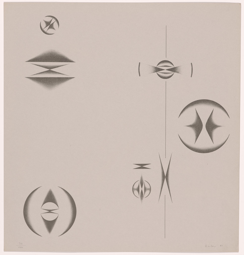
What it is — a sheet from a graphic portfolio from the time of his return to Switzerland and entry into
Allianz. Lithograph from a portfolio of four woodcuts, four linocuts and two
lithographs (MoMA). So: an abstract work, not a commission.
Composition — reading of the work (v2): six or seven small shapes scattered over an
empty plane — each is a variation on the same vocabulary: circle + inscribed spindle-
shaped form ("eye", lens, propeller), in different sizes and rotations. Through
the right third runs a single thin vertical line that pulls it all together. There's no
centre and no hierarchy: it's a catalogue of cases of one rule, not a composition
with a focal point. White space is ~80%.
Colour — reading of the work (v2): no colour — a grey graphite tone on warm paper.
The modelling is a soft gradient through the middle of the shape, so the shapes look as if they're
spinning (rotational momentum), even though nothing is drawn in motion. Here already, in
1941, is everything that will be in colour in Monza in 1948.
Typography — none; only a pencil signature and print-run mark.
Message — no message; it's a language exercise. But his entire later
commercial noise stands on this grammar — without this period the Monza posters
would just be colourful.
Why exactly this way — war, return home, no commercial work. Downtime
used for language.
What would kill it — nothing; this is a study. More interesting: what would happen without it.
Principles:varijacija-jednog-pravilagradijent-daje-rotacijuv2 correction:mreza-drzi-haos doesn't apply here — there's neither grid nor chaos, but
scattered variations of one shape on emptiness. Tag moved to where it's actually seen (03, 04).
Resolved in v2: technique (lithograph from a portfolio of 10 sheets). Remains open: the relationship to
Lohse's series.
poster, landscape format (exhibition graphics for the VIII Triennale); collaborator on the graphics uncertain — Albe Steiner (m.a.x. museo, v1) or Ezio Bonini (it.wikipedia)
Type
grotesque (sans serif), lowercase (except for the number 1947); large "T8" hand-drawn — specific typeface not confirmed
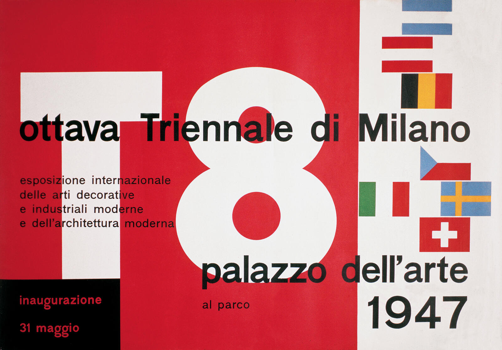
What it is — poster "ottava Triennale di Milano", Palazzo dell'Arte, opening
31 May 1947. First major public job after his return to Milan. It's uncertain with
whom the overall Triennale graphics were made: v1 and the m.a.x. museo cite Albe Steiner,
the Italian Wikipedia cites Ezio Bonini; the AGI attributes the poster to Huber alone.
Composition — reading of the work (v2): landscape format, divided into two fields —
red ~70% left, a white vertical strip on the right with layered flags
of the participating countries (the exhibition is international — the flags are a list of participants, not decoration).
Over the red, an enormous white "T8" (Triennale 8) taking up the full height;
the counterforms of the eight are red — the letter is cut out of the field. A single horizontal
line of text "ottava Triennale di Milano" cuts across both fields and ties them
together; "palazzo dell'arte" and "1947" at bottom right cross the red/white boundary.
A black rectangle at bottom left carries "inaugurazione 31 maggio" in red — the only
place where the colours are reversed.
Colour — reading of the work (v2) + measurement: red 44% / white 40% / black 9%
(+ blue, yellow and red flags in small amounts). Three colours, no overlap, solid fields.
Red + white are not accidental: a Triennale in post-war Italy, and the flags
on the right already carry all the other colours anyway.
Typography — reading of the work (v2): grotesque (sans serif), all lowercase except
the year; the title large, the subtitle (4 lines about the exhibition) small and left-aligned.
"T8" drawn, geometric. Specific typeface not confirmed.
Message — Italy after the war presents itself as a modern country. The graphics are
part of that claim, not decoration alongside it.
Why exactly this way — the landscape format and the split into field + strip give
two contents on one surface: the event itself (red, T8) and internationality (white,
flags). One title line joins them — without it this would be two posters.
What would kill it — flags scattered across the red. The division would be lost, and
the flags' clutter would eat up "T8". The flags work only because they're contained in their own strip.
Principles:mreza-drzi-haos (two fields + one line that binds them)
To verify: format and printer (AGI record without dimensions); Steiner's/Bonini's share in
the overall Triennale graphics.
What it is — documented (AIAP, Collezione Max Huber):
poster for the race of 17 October 1948 at the Autodromo in Monza, client Automobile
Club Milano, original format 100 × 140 cm, printed by N. Moneta, Milano.
(There is also a 1968 reprint, Arti Grafiche Nava / edizioni 2dimensioni,
49 × 69.5 cm, printed in four colours — mind which copy you're looking at.)
The poster is also tied to the Lotteria Italia — at the bottom it says „abbinato alla Lotteria Italia".
Composition — reading of the work (v2) + analysis (fontanesi.ch): no object
is depicted at all — no car, no crowd, no chequered flag. Everything is abstract.
The base is an ellipse tilted 45° (the track seen in perspective) and a bundle of
lines from two different vanishing points. A large red arrow-like form cuts
across the left half and pulls the eye down and to the right; the key observation
from the analysis: the sense of rotation runs against the natural left-to-right reading
direction, so the arrow forms push the gaze down the descending diagonal with their
own weight. The text sits on the same perspective lines. Below: grey-blue bands of the
track, a yellow-olive wedge at bottom right, a small stamp with a marking.
The entire geometry was drawn by hand — in 1948 there was no other way.
Colour — reading of the work (v2): transparent overlaps. Green letters, red
arrow, blue-grey track, olive-yellow field; where the planes cross a new value appears.
The analysis names it precisely: overlap and transparency create a sense of
„passing phenomena" and great speed — so colour does what motion blur would
otherwise do. On the Borsalino (1949) the same procedure is carried out on three
primary colours — a pure textbook example of subtractive synthesis.
Typography — reading of the work (v2): „Gran premio dell'Autodromo" drawn letters
in strong perspective, with two separate vanishing points (confirmed in the analysis) —
the words don't sit on one plane but flee in two directions; „Monza" at bottom left,
blue-grey, in the third corner; „17 ottobre 1948" small and red along the slant.
Nothing is typeset — everything is constructed. Specific typeface not confirmed.
Message — speed without a single car. In three seconds: something is racing and
turning. Key point: the speed is carried by perspective, transparency, and the opposite
direction of rotation, not blur and not photography. It's a graphic solution to a problem
that is photographic.
Why exactly this way — this is the printer's idea, not the draughtsman's: designed
for colour in the press, not for a sketch on paper. The overlap is free; a fifth colour is not.
What would kill it — printing the colours opaque. The third colour disappears, the depth
disappears, the focus disappears — what's left is a colourful poster.
Principles:preklop-daje-trecu-bojuukrstanje-je-fokusmreza-drzi-haosperspektiva-sa-dva-nedogledarotacija-protiv-smjera-citanjav2 correction: tag brzina-je-ponavljanje-i-pomakdoes not apply to this work — there is no
repetition of an element with a shift (that was a v1 description made from memory of a different type of work).
Here speed is perspective + transparency + direction of rotation. Keep the tag for 08.
Open: how many colours were in the original 1948 print (the 1968 reprint has four).
This work is his benchmark — and the single most useful piece in the whole body of material for
your raster/overlap language. There is also a ready-made analytical image alongside it
(fontanesi.ch): the poster with the vanishing points and the 45° ellipse marked in — use it as a
template for the .svg skeleton.
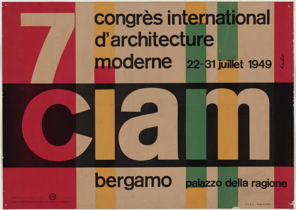
What it is — poster for the seventh CIAM congress (International Congress
of Modern Architecture) in Bergamo. Offset lithograph, 47.3 × 66.4 cm, printed by
S.E.S.A. Bergamo (MoMA 622.1981, gift of the designer).
Landscape format — a rarity for a poster and a decision in itself.
Composition — reading of the work (v2): the whole surface is a field of vertical
coloured bands running from top to bottom edge, of unequal widths — like a colour
control strip from a printed sheet. Across the middle sits a black horizontal band
(~40% of the height); on it, in enormous lowercase letters, „ciam", done so that the letters aren't
printed but rather cut out of the black — through them you see the same bands running
above and below. The letter is a hole, not a shape. Upper left a large red „7", upper
right four lines of the title, below „bergamo" and „palazzo della ragione". Three horizontal
bands (title / ciam / place) crossed by verticals — the grid is visible to the naked eye.
Colour — reading of the work (v2): the ground is a warm, almost kraft tone of paper;
the bands in red, green, orange and black. There is no overlap in the Monza sense —
here colour works as a sequence, not an intersection; the only "third colour" is the paper
left showing between the bands. Warm/cool alternation gives rhythm without a single ornament.
Typography — reading of the work (v2): heavy grotesque (sans serif), all in lowercase
(both the title and „ciam"), except for the number 7; „ciam" takes up ~35% of the poster's height.
The number and the word carry it, everything else is small and left-aligned against the bands. Do not name the typeface.
Message — a congress of architects, so a professional document, not an advert. And yet:
the vertical bands are façade, column, grid — architecture shown as a rhythm of supports,
without a single building. Analogy, not illustration.
Why exactly this way — small format, a small printer in Bergamo, few colours.
The bands are the cheapest possible print (solid fields, no screen tint and no fine registration),
yet they produce maximum effect. The letter cut out of the black costs nothing extra.
This again is a "printer's idea": the solution is derived from what the press does easily.
What would kill it — a photograph of the building. Or: printing „ciam" white over the black
band instead of cutting it out — the link between letter and background disappears, and the poster
falls apart into image and inscription.
Principles:mreza-drzi-haosslovo-kao-prozoranalogija-umjesto-ilustracijetraka-boje-kao-motivResolved v2: the landscape format is solved by bands that "hold" it vertically; the number 7 upper
left, at the entry point of reading. Open: whether the tan ground is paper or printed colour.
What it is — identity for the largest department store in Milan. The logotype la Rinascente
is his, and according to the store's official archive that mark shaped how the
public experienced the store (Archivio Max e Aoi Huber).
The archive holds 6 posters, wrapping paper and a catalogue. A rare case: an avant-garde
designer working for mass retail.
Composition — reading of the work (v2), on three dated examples:
- „lR" wrapping paper (1950) — the monogram R in two sizes and two colours,
rotated 180° in alternating rows, with a small signature „la Rinascente"
that runs sometimes upright, sometimes upside-down. The mark isn't placed onto the paper — the mark
is the paper, as a pattern, not as a stamp.
- „Coppa la Rinascente-Upim" (1952) — two cyclists, red and blue, as flat
silhouettes on a green field; sport shown through team colour, not through the race.
- „XXXI Fiera di Milano — benvenuti" (1953) — a yellow field, coloured circular
segments (fan/wheel) and a diagonal title.
Colour — reading of the work (v2): bright, solid, unmixed — red, yellow,
green, blue, all in full tone on a light ground. Here there is no overlap as in
Monza; the department store wants cheerfulness and visibility, not depth. Same author, different tool.
Typography — reading of the work (v2): hand-drawn, slanted and playful lettering on
the posters; and the mark is a single letter (R) used as a shape for repetition. Do not name the typeface.
Message — a department store that wants to look modern and cheerful at the same time.
That's a demand that kills most systems — because modernity pushes toward rigour, and
cheerfulness toward ornament.
Why exactly this way — Italy 1950: consumption is just waking up, and retail wants
to look like the future. Hence a freedom that an American client at the time would rarely have given.
What would kill it — a consistent, cold system without play. The identity would be correct
and forgettable.
Principles:znak-kao-patternravna-boja-na-daljinuserija-kao-identitetv2 corrections: here there is neither secondary colours nor overlap — those tags belong to
Monza, not Rinascente. v1 attributed the author's method to all of his work.
Resolved v2: the logotype and the wrapping paper are his; other designers at the store (e.g.
Lora Lamm) work in parallel — the archive keeps them separate.
Open: Compasso d'Oro 1954 — according to the Rinascente archive, awarded for the design of "plastic
fabric", not for graphics. To verify before publishing.
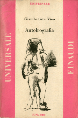
What it is — creative director at Giulio Einaudi's, Italy's most serious
publisher. A different register: quiet and strict. Example with a record:
Giambattista Vico, Autobiografia, Universale Einaudi no. 55, 1947, paperback,
240 pp., 11.8 × 18 cm — progetto grafico Max Huber, cover drawing by
Franco Francese (AIAP, CMH-CVI047).
Important: Huber builds the edition system, and commissions the drawing from
someone else — that's editorial, not illustrative, authorship.
Composition — reading of the work (v2): vertical pocket format; illustration
field in the upper two-thirds, framed; the edition name "UNIVERSALE" runs vertically
along the left edge, "EINAUDI" along the right — the two verticals hold the page
like pillars, while the author and title sit horizontally at the top. The same frame
works for any drawing and any title: the grid is the edition, the content is variable.
Colour — reading of the work (v2): one background colour (here warm pinkish-red)
+ black typography + drawing. Through the edition, by the same principle, only the
background colour changes — the cheapest possible way to give every book a face while
keeping the series a series.
Typography — reading of the work (v2): classicist serif at small size,
capitals for the names of the edition and publisher, everything calm and symmetrical.
No noise at all — the opposite register from Monza, same year. Specific typeface not named.
Message — serious literature; the design mustn't shout.
Why exactly this way — a series of books, many titles, small budget per unit →
a system is the only way. Same problem as Lustig's New Classics,
solved more strictly.
What would kill it — designing every book separately. The edition would disappear.
Principles:serija-kao-identitetokvir-je-edicija-sadrzaj-je-promjenjividentitet-je-prirucnikResolved v2: the edition is confirmed (Universale Einaudi, from 1947) and the division
of labour (Huber system, Francese drawing). Remains: how many titles went through his
frame; the series "Il timone" for De Agostini (1962–66) is entirely in the AIAP
collection, a good candidate for further work.
07 · Exhibition installations with the Castiglioni brothers — RAI, ENI, Montecatini (1950s)
What it is — exhibition installations for RAI, ENI and Montecatini, plus radio programmes. v2 correction: the Italian Wikipedia lists collaborators Achille Castiglioni and Erberto Carboni — not "the Castiglioni brothers". Pier Giacoma isn't mentioned. Don't claim two brothers until confirmed.
Composition — provjeriti uz fotografije postava.
Colour — provjeriti.
Typography — provjeriti.
Message — the industry presents itself as modern. The visitor learns through moving through space, not through reading.
Why exactly this way — the installation means the viewer moves through the composition. Here the graphics have to work at three distances: across the hall, at three metres, at half a metre.
What would kill it — poster logic transferred 1:1 onto the wall. The format changes, but so does the reading order.
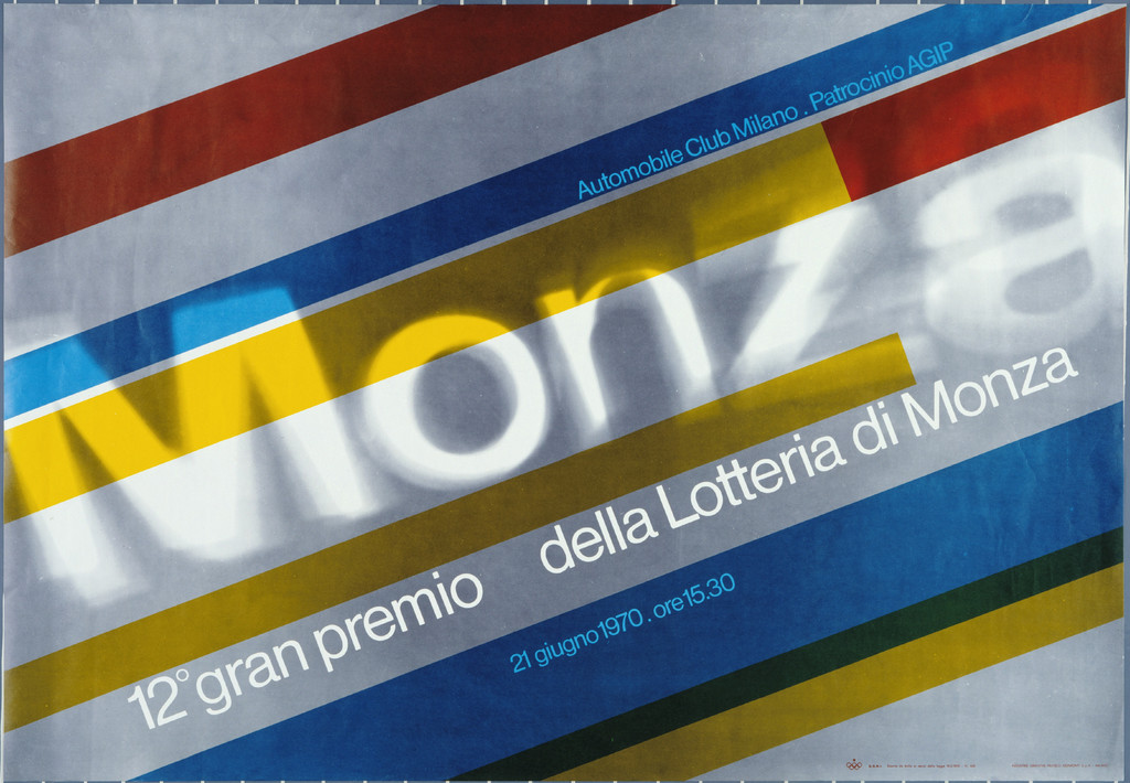
What it is — a poster for a lottery tied to the race in Monza. Offset lithograph, 79,5 × 67,2 cm (MoMA 482.1987, gift of the designer). MoMA exhibited it in "50 Years of Helvetica" (2007–08) — so the typeface is Helvetica or close to it; still, don't claim the specific typeface until confirmed.
Composition — reading of the work (v2): landscape format; a bundle of wide diagonal bands (red, blue, yellow, green, grey) runs bottom-left → top-right, like a track or a trail. Over them "Monza" in an enormous grey grotesque, in perspective — the word narrows to the right as if receding into the distance; below, along the same slant, "12° gran premio" and "della Lotteria di Monza" in white. Everything is tilted at the same angle (~20°), nothing is horizontal. There's no single focal point — the whole surface moves.
Colour — reading of the work (v2) + measurement (23.09.2026): the ground is silver-grey (~55% of the surface — probably a metallic ink, provjeriti in the print description), bands red, blue, yellow (ochre in the reproduction), green. Correction: the letters "Monza" are light and partly transparent — through the M and o you can see the yellow and blue bands, so overlap does exist after all, but letter over band, not ink over ink. The difference from 1948 stands: here speed is carried by position and perspective, overlap is secondary. Date on the poster: 21. jun 1970, 15.30.
Typography — reading of the work (v2): neutral grotesque (MoMA exhibited it in "50 Years of Helvetica"), deformed by perspective — not drawn, but placed in space. Three size steps, all three on the same slant. Don't claim the specific typeface.
Message — the race and the lottery in the same poster: two contents, one surface.
Why exactly this way — by 1970 offset is the standard, colours are cheaper, and Helvetica is the international norm. What's interesting is how much of his noise survives within that framework.
What would kill it — total conformity to the norm. If the 1970 poster is merely tidy, it's lost the thing that made the 1948 one matter.
Principles:brzina-je-ponavljanje-i-pomakpreklop-daje-trecu-bojuTo verify against the image: compare directly with the 1948 poster — that comparison
is a ready-made lesson on what a norm does to an author's language.
Other works — evidence, no analysis
Work
Year
Source
Allianz — exhibition, Kunsthaus Zürich
1942
m.a.x. museo / MoMA 19620
General Motors Suisse SA — photograph in perspective + coloured planes that
reinforce the escape
1937
fontanesi.ch (seen v2)
Borsalino — a hat in three primary colours with transparent overlap; a
textbook example of subtractive synthesis; "Borsalino" handwritten over it
Bridge to practice: poster · graphic design · motion
Poster
Plan overlaps as focal points. Work in two or three transparent colours and
decide in advance where they cross — that's the darkest spot, that's where the
information goes. In Illustrator: Multiply on flat colours, and look at the result,
not the layers.
Secondary colours look more modern than primary ones — because everyone else uses
primary colours. Orange, purple, olive.
Speed = repetition + offset + a shift in tone. Not blur. This is both cheaper and
stronger.
Grid first, then break the surface. His chaos always sits on structure.
If you don't have structure, you don't have chaos — you have a mess.
Graphic design
Design for colour, not for the sketch. Before you start, decide how many colours
go into the press and what the overlap gives you. For screenprint and risograph this is
literally applicable; for digital print, simulate the same rule to keep the discipline.
Two registers from the same author. Huber is loud for the department store and quiet
for Einaudi. That's a model for you: the same system, two intensities — not two
different systems.
Same school, different outcome. He and Müller-Brockmann come from the same class.
When someone tells you "that's not your style", it's a question of temperature, not
method.
Motion
Overlap in AE is a Multiply layer, and the same rule applies: crossings are the
focus. Animate so that shapes pass through each other, not just past one another.
Speed without blur. Instead of motion blur: repeat the element 3–5 times with an
offset and shift the tone. Graphic, cheap, and it fits your raster-based language.
(Bonus: it also works at a low frame rate, where blur doesn't help.)
The grid holds chaos in time, too. Set a time module (e.g. 6f) and then do whatever
you want inside it. Structure below, noise above.
Colour as event. In his work a third colour appears at the moment of crossing —
in animation that means a colour change can be a dramaturgical event,
not a transition.
Bad imitation
Transparency as "opacity 60%". Layers are dropped to 60% hoping it will be Huber. For him, the overlap is a planned outcome: it's known in advance which third colour appears and where. Random transparency gives mud, not depth.
Diagonal without perspective. Text is simply rotated by 30°. In Monza the letters lie on two constructed vanishing points — without that, the slant is a tilted sign, not speed.
Noise without a base. The loudness is copied, the geometry left out. He always has an ellipse, a grid or a series underneath — structure below, noise above. Without that it's a mess.
One register for everything. The same loud language stuck onto both the book and the department store. His Einaudi is as quiet as Rinascente is loud — same hand, two volumes.
Secondary colours as style. Olive and purple taken as "his palette", while Rinascente is full of pure primaries. Colour is chosen from the brief, not from the author.
The brief through their eyes
(insert current job) — First move: how many colours go into the machine and what happens where they cross? Draw that before you draw the shape. Second move: is there geometry (ellipse, series, perspective) that the job has in itself — pull that through to the end instead of adding decoration.
Exercises
Three transparent colours. Poster with exactly three flat transparent colours, no image. The crossings must fall where the most important information is.
Speed without blur. Animate one shape that "races" using only repetition, offset and shift in hue. Motion blur forbidden.
Same content, two registers. Make two versions of the same poster: "Einaudi" (quiet) and "Rinascente" (loud), with the same grid.
Two vanishing points. (new, from Monza) Place two vanishing points outside the format and construct two words fleeing in different directions. No perspective effect from software — by hand, along lines.
Motion study — "The third colour as an event" (5 s, AE)
Two flat shapes in two colours, Multiply, white background. Second 0–3: they slide toward each other diagonally, at constant speed, without blur. Second 3: they overlap — and exactly in that frame the text appears, inside the third colour (masked by the intersection). Second 3–5: they keep moving, the text disappears with the overlap. Rule: the only event in the study is the appearance of the third colour. Nothing flashes, nothing jumps.
Rebuilding the benchmark — Gran Premio dell'Autodromo 1948
Format 100 × 140 cm (1 : 1.4), portrait. The skeleton exists as a ready-made analytical image on fontanesi.ch (poster with vanishing points and an ellipse tilted 45° marked in). Task, 45 min in Illustrator: draw only the skeleton — the ellipse at 45°, two vanishing points outside the format, a bundle of lines from both, and the red arrow-shaped form pulling down-right. No letters. Then place your own title onto that skeleton, in both perspectives. Check: does your poster pull the eye against the reading direction.
Notes on sources
Teacher's name: m.a.x. museo (his archive) gives Alfred Willimann;
English Wikipedia "Hans Williman" — the museum was used. Interesting: Willimann was
also mentioned in Hofmann, where he was not confirmed.
Quote ("Red je podloga…") comes from v1 and is not confirmed — do not publish
until the source is found.
~~The 1948 poster has no museum record~~ — resolved v2: AIAP (Collezione Max
Huber) gives the race date (17.10.1948), the client (Automobile Club Milano), format
100 × 140 cm and the printer; there is also a 1968 reprint (49 × 69.5 cm, four
colours).
~~Italian literature has not been processed~~ — processed v2: AIAP, it.wikipedia,
the official Rinascente archive, fontanesi.ch. As expected, it was the
biggest source of corrections in the whole note.
v2 (06.09.2026): works 01, 03, 04, 05, 06, 08 seen; 02 and 07 supplemented with
documents, without images. v1 corrections:
03 (Monza 1948) does not have "repetition with offset" — the speed is perspective
with two vanishing points, transparency and rotation against the reading
direction (analysis by fontanesi.ch, with geometry marked in);
01 is not mreza-drzi-haos but variations of one shape on emptiness;
05 (Rinascente) has neither secondary colours nor overlap — pure primaries;
07 the collaborators are Achille Castiglioni and Erberto Carboni, not "the
Castiglioni brothers";
Compasso d'Oro 1954 is, according to it.wikipedia, for "Plastica stampata"
for Stabilimenti Ponte Lambro — that is, for printed plastic material, not for a
poster.
Open: collaborator on the VIII Triennale (Steiner or Bonini); number of
colours on the 1948 original; the v1 quote still without a source.
New local tags: perspektiva-sa-dva-nedogleda, rotacija-protiv-smjera-citanja,
varijacija-jednog-pravila, gradijent-daje-rotaciju, traka-boje-kao-motiv,
znak-kao-pattern, okvir-je-edicija-sadrzaj-je-promjenjiv.
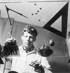
A portrait exists: a well-known photograph of Huber taken by Tomás Maldonado
in 1948 (on fontanesi.ch) — a candidate for the portret field, to verify rights.
Template (23.09.2026, session 23): frontmatter brought to the template — izvor_slika,
slika_lokalno, font, paleta for all 8 (07 empty — no photograph of the
installation); fields outside the template (saradnik, datum, izvor_analiza,
stampar) merged into tehnika/klasa_izvora; ostali_radovi removed from fm (all
already in the table); principi per work aligned with the v2 corrections from the
body. 02 seen for the first time (AGI, 1600 px) — fields 2–4, 6–7 written from
the image.
Monza 1948 — two reproductions, two palettes: the AIAP thumbnail (160 px) gives
green #295347 + red + blue; fontanesi.ch (550 px) gives dark brown #863415 instead
of green. AIAP was used in the fm (it agrees with the v2 reading), but neither is
reliable — to repeat on a larger image (possibly one of them is the 1968 reprint).
Monza 1970 — correction: the letters "Monza" partially transparent over the
stripes (overlap exists, minor); silver background. Red and green stripe below the
measurement threshold.
Rinascente 05: measured the "lR" 1950 paper — grey background + red + yellow,
without blue and green; the description "red, yellow, green, blue" in field 3 applies
to the 1952–53 posters, not the paper.
Typeface: Fonts In Use has no record for Huber (neither as designer, nor under
the tags Triennale / Einaudi) — all typefaces remain a class, not a specific cut.