Art director, Blue Note Records (1956-1967); later a photographer and
commercial director Chicago → Long Beach → New York → Los Angeles
"I got fifty dollars a cover. I did what I liked."
Biography
Born 4 July 1927 in Chicago; after the stock market crash of 1929 and his parents' separation,
he moves with his mother to Long Beach, California. After high school and
naval service he enrols at the Chouinard Art Institute in Los Angeles - by his
own admission more by chance (a girl) than artistic ambition, but then, as he
put it, "in three months" the passion truly caught fire. At Chouinard the
basic design course is taught by Bill Moore - an instructor who shaped
several generations of Californian designers.
After Chouinard he moves to New York. His first job is with John Hermansader -
a designer who (alongside Paul Bacon) was already working for Blue Note
Records before him, which directly brings Miles into that circle. From 1955
he works in parallel as a layout/paste-up artist at the Esquire magazine
editorial office, while on Saturdays he freelances for Blue Note at fifty
dollars a cover. According to one source (A Modernist) in that same period
(1956-57) he also does about ten covers for Prestige Records - work that
design historians most often skip over even though it is craftwise on the
same level. One of those early Prestige covers (Monk; Thelonious Monk with
Sonny Rollins and Frank Foster, 1954) is catalogued by MoMA as a joint work
with Andy Warhol - illustration, not photography, which shows that Miles
starts in a completely different, illustrative register before developing his
mature, typographic system.
In late 1955 or early 1956 Francis Wolff hires him as art director of Blue
Note Records. For the following eleven years (until 1967, when Alfred Lion
retires from the business) Miles runs the label's visual identity - sources
disagree on the exact number of covers (from "about 350" to "over 500"; A
Modernist gives "nearly 500 over roughly 15 years", which includes the period
before his official employment). He worked from Alfred Lion's short briefs
that summed up the character of the record, not instructions about the music
- and by his own admission he wasn't particularly a jazz enthusiast, he
preferred classical music. That distance is, paradoxically, part of the
reason the solutions are so confident: without a personal taste in the music
to get in the way, he chose purely the strongest graphic solution.
After 1967 he moves to Los Angeles and builds a very lucrative career as an
advertising photographer and director - one source states he shot Coca-Cola
adverts in the style of Norman Rockwell, earning on the order of a million
dollars a year, another cites a Clio award in 1976 for a directed TV spot. He
died on 2 February 1993 of a heart attack.
Influences
Studied with
Bill Moore - head of the basic design department, Chouinard Art Institute
John Hermansader - first job in New York, link to the Blue Note legacy
Borrows from
Saul Bass - typography as a mouldable, deformable material
Francis Wolff's duotone photography as the building material of the
composition, not illustration
Influenced
standard vocabulary of record covers - duotone photo plus massive type -
individual successor names are not confirmed in the available literature
Contemporaries
Paul Bacon and John Hermansader - predecessors at Blue Note
Andy Warhol - illustration on early Prestige covers alongside Miles's design
(1954)
Who he learned from
Bill Moore, head of the basic design course at Chouinard Art Institute, is
cited as a formative figure for the entire generation of Californian
designers to which Miles belongs. His first job in New York was with John
Hermansader, who (alongside Paul Bacon) had already been drawing for Blue
Note - a direct link through which Miles inherits the client, not just the
craft.
What he steals
The most commonly cited influence is Saul Bass - the idea of treating
typography as a mouldable, deformable material rather than a fixed alphabet
simply placed on the page (see Saul Bass). Materially, the body of work steals
the very grammar of cheap reproduction: halftone grain and graphic bands
over photography - techniques another designer would hide, Miles takes them
as raw material.
Who he influenced
The vocabulary Miles forged - duotone photography plus a massive, compressed
typographic block - became the standard vocabulary of record covers in the
second half of the 20th century and is still recognised today as "that jazz
look". Individual names of designers who directly acknowledged his influence
have not been found in the literature available for this note; it remains an
open question (see Notes on sources).
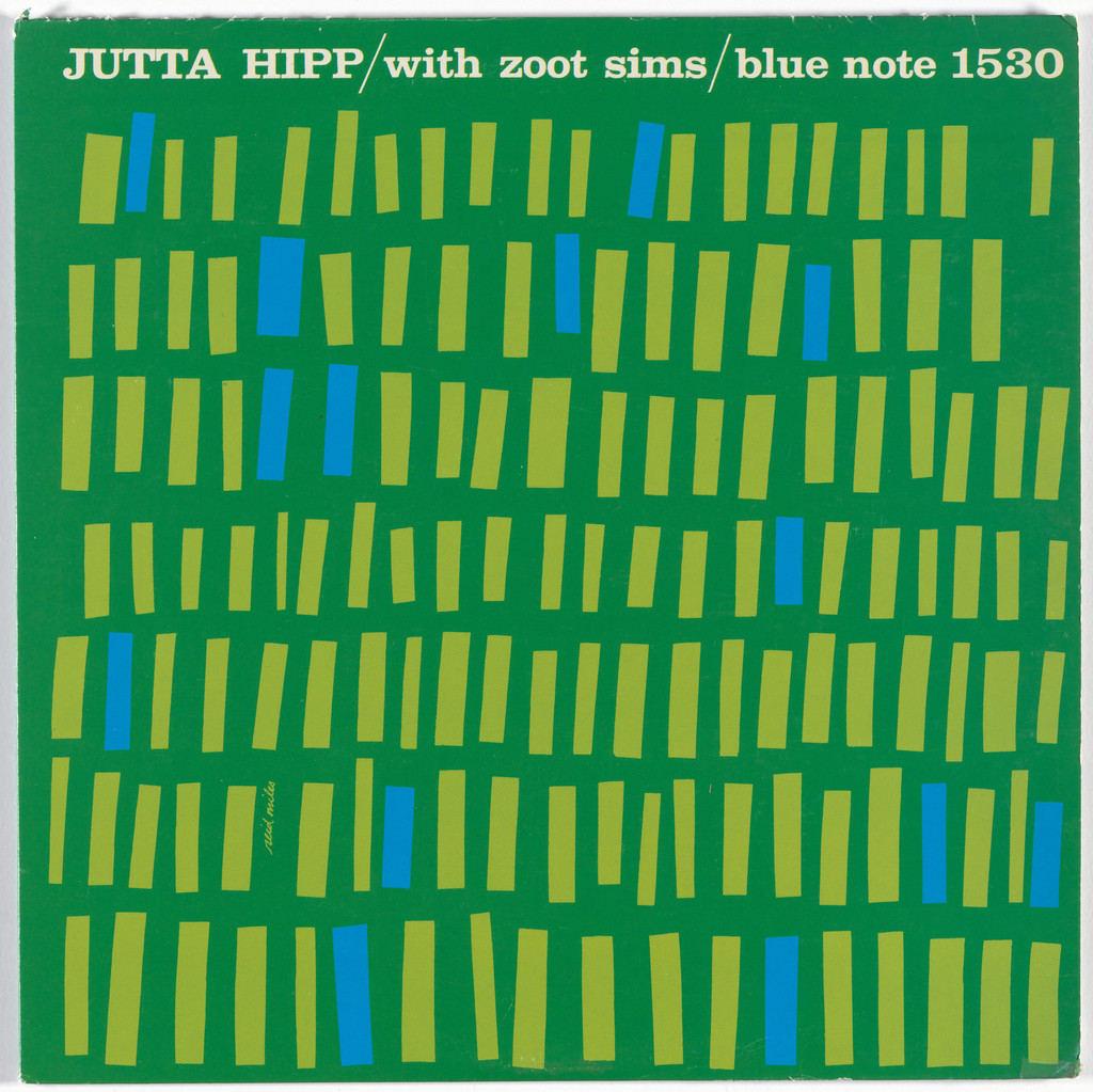
What it is - album cover, 30.5x30.5 cm, lithograph; client Blue Note
Records; no photograph - purely geometric composition.
Composition - regular grid of vertical rectangles of unequal width,
arranged row by row across the whole surface; the eye has no single point
of entry but slides along the rhythm of repetition, like a textile or a
musical score.
Colour - dark green background across the whole field; the bands are
yellow-green (lime) and carry the basic rhythm, while rare cyan-blue
accents (about ten out of over a hundred bands) are irregularly scattered
and interrupt it. The title is in cream/off-white. The hierarchy is clear:
lime is the weave, blue is the spark.
Typography - one line at the very top of the field, directly on the
green: "JUTTA HIPP / with zoot sims / blue note 1530" - bold Clarendon-type
serif, the performer's name in capitals, the rest in lowercase, slashes as
separators. Below that there is no text - the pattern carries the whole
surface.
Message - an abstract, almost textile pattern instead of a portrait
of the musician; the message is "rhythm and pattern," not "who is
playing" - a rare case where Miles avoids photography altogether.
Why exactly this way - an early Blue Note experiment: in 1957 Miles
already has the confidence that a cover can be a purely graphic sign with
no person on the front.
What would kill it - blue distributed regularly or in the same
number as lime: the flicker exists precisely because the blue is rare and
random. Also a light (cream) background instead of dark green - the bands
would become an ordinary wallpaper pattern, and the title would lose its
quiet contrast.
Principles:mreza-drzi-haosravna-boja-na-daljinuVerified against the image (MoMA 185422, 25.09.2026): colours, background,
and title position corrected according to the original; the bands are
hand-cut (unequal widths and slight tilts), not a mechanical module.
What it is - record cover for John Coltrane, Blue Note BLP 1577;
portrait shot by Francis Wolff; standard 12-inch format.
Composition - full-frame use of Wolff's photograph - Coltrane resting
his chin on his hand, gaze down, part of a trombone/another hand visible
behind him; the text is pushed into the top edge as two bands that don't
touch the face.
Colour - deep black-blue duotone across the whole photograph; the only
other colour is a yellow-green for two lines of text ("john coltrane" and
"blue note 1577") - that colour appears nowhere else on the cover.
Typography - Clarendon (documented, Fonts In Use), a bold slab serif;
"BLUE TRAIN" top left in white, smaller than the performer's name top
right - the performer's name is the visually heavier element than the
record title.
Message - a contemplative portrait, not action on stage; the
"message" is the musician's personality and inward focus, not an event of
playing. Three-second test: the face and two bands of text read instantly,
even from five metres away.
Why exactly this way - duotone printing is cheaper than full colour and
holds the contrast so the text stays legible over the photograph without a
separate background.
What would kill it - a third colour in the photograph - right now all
the weight sits on two clear zones (near-black photograph, two lines of
text), a third colour would break that clarity.
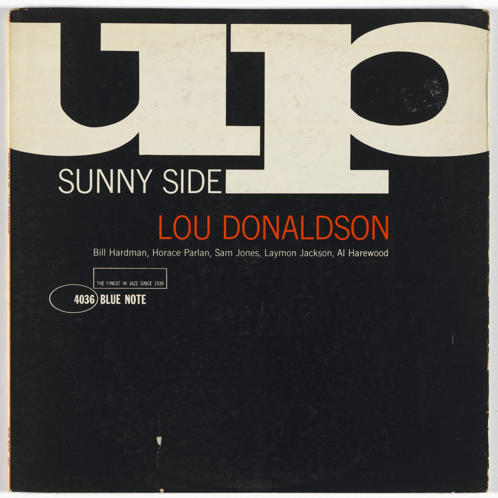
What it is - record cover, 30.5x30.5 cm, lithograph; Blue Note Records.
Composition - top half: the word "up" in enormous capitals cutting
across the top edge of the frame (not fully visible - cropped), "SUNNY
SIDE" smaller below; bottom half: a full black band with the performer's
name in white. Two clearly separated zones, light/typographic above,
dark/informational below.
Colour - only black and cream/off-white; no third tone.
Typography - a thick, condensed grotesque (sans serif) (class;
specific typeface not confirmed for this work); "up" is enlarged so much
that the letterform becomes a shape, not a legible word at first glance.
Message - a play on the title ("sunny side up" - fried egg / the
bright side) translated into physical cropping of the letters - "up"
literally runs off the frame, like a rising sun.
Why exactly this way - cropping the largest element is a cheap trick
(needs no extra colour or photograph) that still reads even from across a
record shop.
What would kill it - if "up" fit entirely within the frame - it would
lose the sense of breaking out/overflowing that carries the whole joke of
the title.
Principles:jedno-pismo-siroka-skalaslovo-glumi-znacenjeTo verify against the image: the exact typeface (class assumed to be
Franklin Gothic based on the loose style, not confirmed for this specific
work).
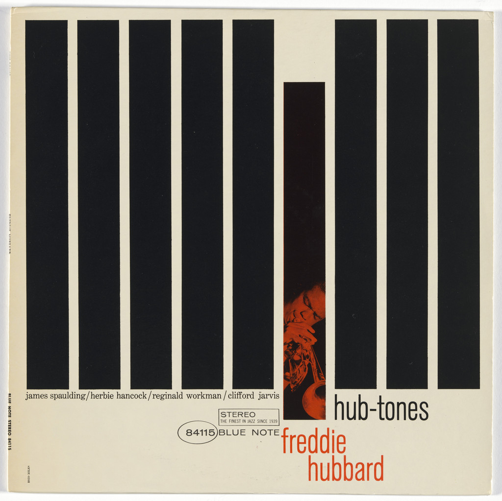
What it is - record sleeve; photography Francis Wolff, design Reid Miles;
Blue Note Records, 30.5x30.5 cm.
Composition - wide black vertical bands cover almost the entire
surface like blinds; through one narrow gap a thin vertical
strip of Wolff's photograph of Hubbard in profile against a dark background is visible. The title is
squeezed into that same gap, bottom right.
Colour - black and white (bands) plus a grey halftone of the photograph peeking through;
no additional colour.
Typography - small, italic/handwritten lettering (to verify against the image -
specific typeface not confirmed at the available resolution), deliberately quiet against the coarse bands.
Message - the photograph exists, but is almost entirely withheld from the viewer -
the message is "revelation through a slit", the musician implied, not shown.
Why exactly this way - extreme reduction is both a cheap trick (less
photo surface to reproduce) and a concept - the bands become graphics in their own right,
the photograph is material, not content.
What would kill it - a wider gap showing more of the photograph - the moment the whole face
is visible, the bands become decoration instead of the main event.
Principles:fotografija-je-layoutrez-kroz-fotografiju (local tag)
jeftina-tehnika-kao-jezikTo verify against the image: the specific typeface of the title text; whether the number of bands is a fixed
module or freely chosen.
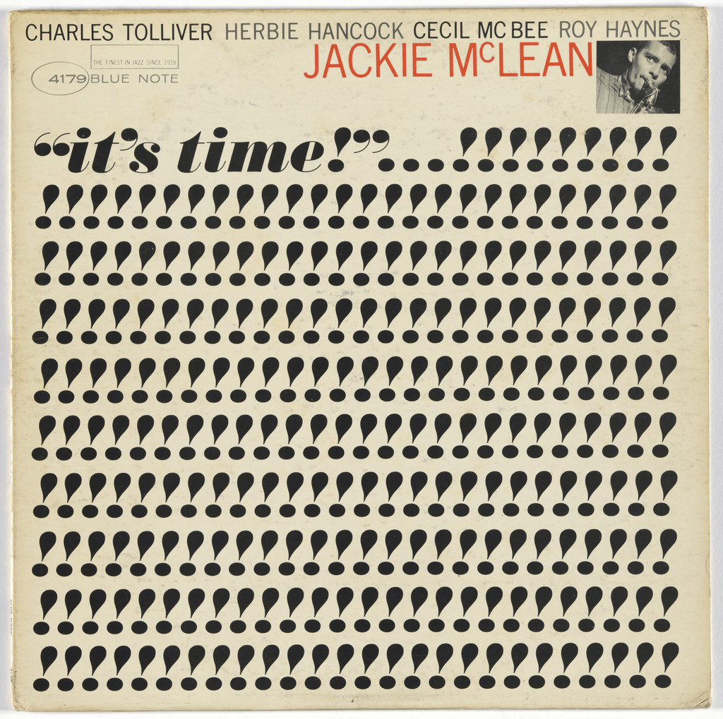
What it is - record sleeve, 30.5x30.5 cm, lithograph; Blue Note Records.
Composition - the entire surface is one enlarged halftone field of
black dots - a photograph reduced to its own print structure to the point
that the face becomes barely legible, almost abstract. Small handwritten
lettering "it's time!" sits in the upper section as the only "clean" element.
Colour - monochrome, black on a yellowed cream ground; no other colour.
Typography - Ultra Bodoni and Trade Gothic (documented, Fonts In Use)
for the small text; the title itself is handwritten, a contrast against the mechanical grid
of the dominant image.
Message - a legibility test at the limit: from five metres this is almost a pure
textural rectangle; only up close do the dots resolve into a face. The message is the medium itself -
"this is a printed photograph", not "this is a person".
Why exactly this way - enlarging the halftone grid is both a cheap trick (coarser grid =
less data for print) and a statement - Blue Note as a label that prints
cheaply and doesn't hide it but shows it.
What would kill it - a finer grid - the moment the dots shrink below the
threshold of visibility, the whole point is lost and an "ordinary" photograph remains.
Principles:jeftina-tehnika-kao-jezikmreza-drzi-haosTo verify against the image: whether the coarseness of the halftone grid was Miles's decision in the
prepress stage or a consequence of the condition of this particular printed copy.
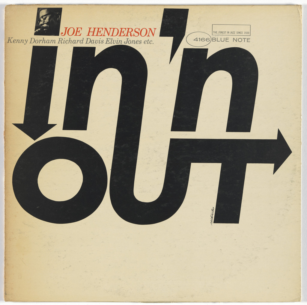
What it is - record sleeve, 30.5x30.5 cm, lithograph; Blue Note Records;
no photograph.
Composition - "in'n" in an italic/slanted mass at the top, "OUT" in upright
massive letters below, with a black arrow pointing right built into the very
lettering of "OUT" - the diagonal energy of the whole field runs from upper-left towards
lower-right, the arrow closes that motion.
Colour - only black on a yellowed cream/beige ground (paper ageing).
Typography - a bold grotesque/slab mass (class; specific typeface
not confirmed); the letters of "in'n" are slanted, "OUT" upright - the only two
registers on the whole sleeve.
Message - the title becomes a diagram of its own meaning: the arrow literally
points "out", the slant of the first part suggests "in" as something still in motion.
Why exactly this way - with no photograph, no additional colour - the title has to carry
the entire sleeve, so Miles turns the text itself into an image.
What would kill it - if the arrow were a separate graphic element instead of a part
of the letter "T" in OUT itself - the trick works because the arrow is woven into the typography, not
glued next to it.
Principles:slovo-glumi-znacenje (local tag) jedno-pismo-siroka-skalaTo verify against the image: the exact typeface; whether "in'n" is hand-drawn or
mechanically slanted (oblique cut).
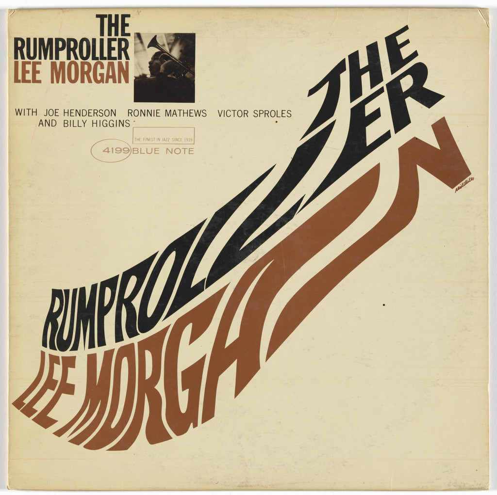
What it is - record sleeve, 30.5x30.5 cm, lithograph; Blue Note Records;
no photograph.
Composition - "RUMPROLLER" broken into two rows around the word "THE" which
sits in the centre of the upper section; the letters follow a gently wavy, diagonal
path as if rolling themselves (a reference to "roller" in the title).
"LEE MORGAN" sits calmly, upright, at the bottom.
Colour - rust-brown and black on a cream ground; the two letter colours
alternate row by row, which reinforces the sense of motion.
Typography - Franklin Gothic, Trade Gothic, Trade Gothic Extended
(documented, Fonts In Use) - multiple cuts of the same family, not different
typefaces, which justifies the tag "one typeface, wide range" even at
the level of the letter family, not just size.
Message - the title acts out its own meaning for the second time in this body of work (cf.
In 'n Out): "rumproller" literally rolls across two lines, instead of
simply standing there written.
Why exactly this way - a playful, unserious title calls for playful lettering - if it
were set calmly and centred, the joke would disappear.
What would kill it - aligning all rows to the same baseline - it is precisely the slight
offset between the rows that creates the "rolling".
Principles:slovo-glumi-znacenje (local tag) jedno-pismo-siroka-skalaTo verify against the image: whether the path of the letters was measured along a regular curve or
set by eye by hand.
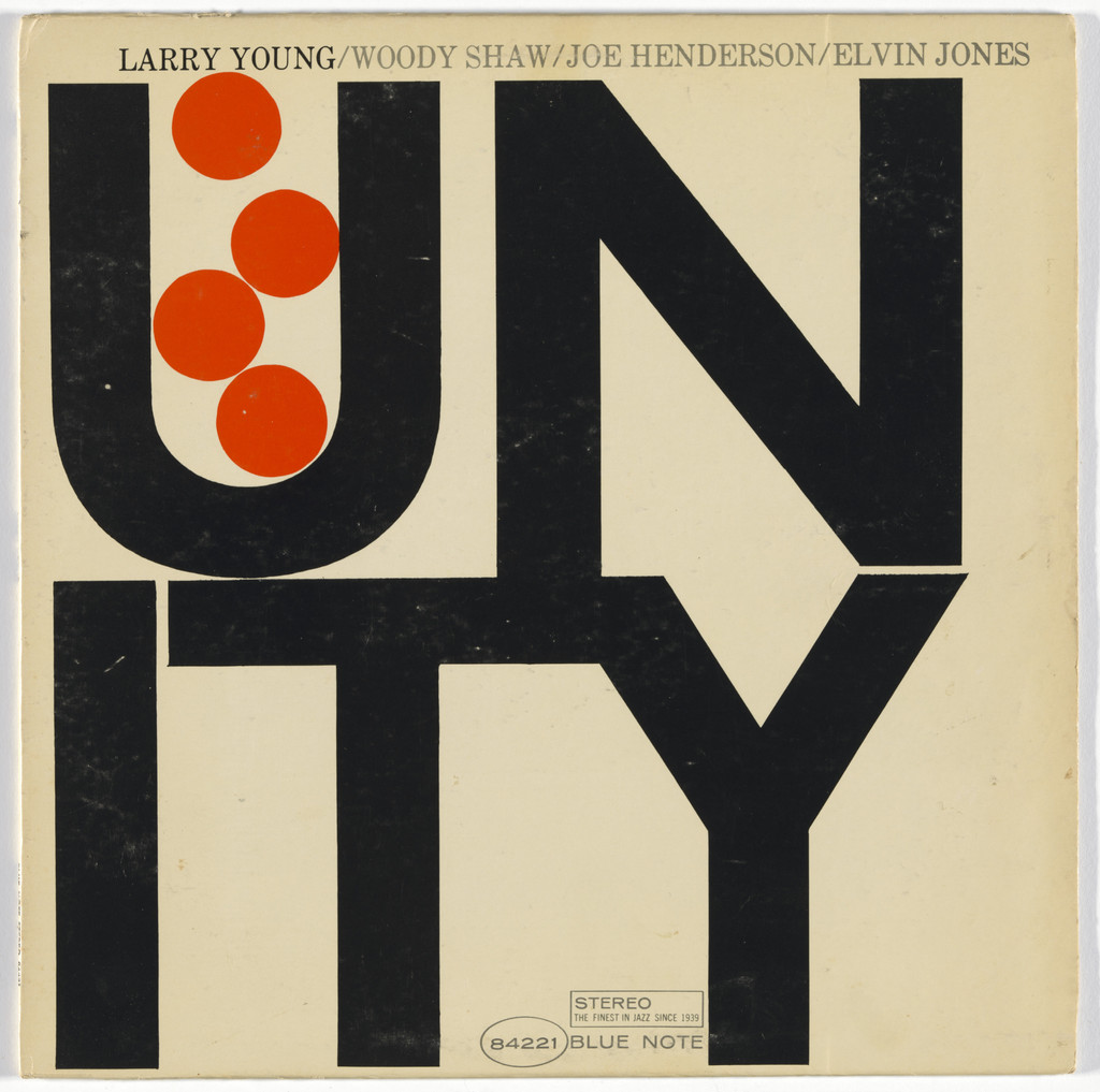
What it is - record sleeve, 30.5x30.5 cm, lithograph; Blue Note Records;
no photograph.
Composition - the word "UNITY" broken into "UN" (top) and "ITY" (bottom),
the letters so enlarged they fill almost the entire square; a diagonal row of
circles (dots) runs from the upper left corner down towards the lower right, across the gap
between the rows.
Colour - black letters, cream ground, a row of small circles in vermilion/orange-
red - the only colour on the whole sleeve, and it appears in a repeating form
(circles), not in the text.
Typography - a bold grotesque (class; specific typeface not
confirmed); the break of the word into "UN"/"ITY" is a compositional decision, not
an accidental line break.
Message - the title "Unity" broken into two parts and then joined by a row
of circles that physically bridge the break - the form literally performs the
meaning of the word.
Why exactly this way - by 1966 Miles already has the confidence for the whole sleeve to carry
only two forms (letter, circle) and one colour - the most reduced sleeve in this selection.
What would kill it - if the circles were the same colour as the letters - without the colour
contrast, they wouldn't read as a separate, deliberate move across the word break.
Principles:slovo-glumi-znacenje (local tag) ravna-boja-na-daljinuTo verify against the image: the exact number and precise spacing of the circles (measurement not
yet done - waiting on a script).
Other works — evidence, no analysis
Dexter Gordon, Go (Blue Note, 1962) - portrait Wolff, blue-white duotone,
massive "GO" in the upper corner. record
Horace Parlan, Happy Frame of Mind (Blue Note, 1963). record
Lee Morgan, Cornbread (Blue Note, 1967) - red duotone portrait with a
trumpet; the title "CORNBREAD" rotates four times around the photograph like a stamp/
windmill - seen on v2 (screenshot). record
Reid Miles, Andy Warhol, Prestige Records - Monk; Thelonious Monk with
Sonny Rollins and Frank Foster (1954) - the earliest work in this selection,
an illustration (not a photograph), joint credit with Warhol; the image is not
available in the MoMA record ("Image not available"), so it is left without
analysis. record
John Berg, Nick Fasciano, Reid Miles - Chicago (the tenth, self-titled
album) (1976) - collective credit from the late, post-Blue-Note period when
Miles was already in photography/advertising; documented directly on the MoMA record.
record
Two local candidates (not yet in _PRINCIPI.md - need a second author or
literature to enter the shared index):
- rez-kroz-fotografiju - the photograph is physically cut into regular
bands/stripes so that only a fragment stays visible; the cut itself becomes
the composition (Hub-Tones).
- slovo-glumi-znacenje - the shape or line-break of a word in the title
directly performs the meaning of that word, not through an image but through
the stroke of the letter itself (Sunny Side Up, In 'n Out, The Rumproller,
Unity - four of the eight full works in this selection, which makes it the
main signature of the whole body of work).
Bridge to practice: poster · graphic design · motion
Poster
When you're making a poster with one dominant title, try Miles's trick:
instead of letting the title just "sit" on the page, find a physical stroke of
the letter that performs the meaning of the word (arrange/break/tilt it). It's
a cheaper effect than an added illustration and it reads faster.
Graphic design
With a two-colour or limited palette, don't split colour by object but by
function: one colour carries all the informational content (name, number), the
other (or the absence of colour) carries the atmosphere. Hub-Tones and Blue
Train show that even a strict two-colour limit leaves enough room for
hierarchy if colour is assigned deliberately, not decoratively.
Motion
A band/slat that reveals only a fragment of the image (Hub-Tones) is a
ready-made recipe for a reveal transition in AE: instead of a crossfade,
animate the width of the slit that reveals the face/object - the viewer gets
the information in instalments, not all at once. Likewise, an enlarged
halftone (It's Time!) is a ready-made recipe for a title card in your
raster/glitch language - it's literally the same logic as your dither, just
from 1964.
Bad imitation
The most common mistake in modern "Blue Note pastiches" (jazz playlists on
streaming services, café posters, retro design packs): a duotone photograph
plus a bold grotesque, with the title just "placed" in a corner with no
relation to the photograph itself. Miles never places text randomly - the text
always occupies exactly the part of the frame that the photograph leaves
empty (Blue Train: two bands at the top, clear of the face). Second common
mistake: mixing several different fonts to get a "vintage" impression, while
Miles almost always stays within one type family and builds contrast from
size and weight (Rumproller: three cuts of the same family, not three
different fonts). Third: copying only the surface (grainy photograph, retro
palette) without the constraint that actually produced that surface (two
colours on cheap paper) - the result looks like a costume, not like a
solution under pressure.
The brief through their eyes
For a YouTube thumbnail of your gaming-animation series, Miles would first
ask: what has to be readable in three seconds on a small phone screen? Then
he'd take one frame from the animation, crop it aggressively (not the whole
character, but the fragment that carries the joke), and place the episode
title as a mass of letters occupying exactly the part of the frame that's
empty - not centred, but wherever the eye lands first. Colour: one, and not on
the character but on the title.
Exercises
Take any one-word title (from your own episodes, posters) and draw three
versions of the same title where the stroke of the letter itself (break,
tilt, rotation around the centre) performs the meaning of that word -
without a single added illustration.
Take one of your own photographs/frames and make a version where 80% is
covered by regular black bands (slats), leaving only a narrow gap - check
whether the composition still "works" through that gap.
Motion study
A five-second exercise in AE: a photograph/frame behind a row of vertical
black bars; the bars part and reveal the image all at once (one event, one
frame) - then they return and close it. No other movement in the frame.
Rebuilding the benchmark
Benchmark: Blue Train. Approximate (visual, not measured by script - a
measuring tool is still pending) scheme of positions in % of format: the
portrait occupies the whole surface; "BLUE TRAIN" top left, roughly 4-35% of
width and 3-10% of height; "john coltrane" top right, roughly 55-96% of width
and 3-11% of height, visually heavier than "BLUE TRAIN" even though the letter
size is similar (colour lifts it); "blue note 1577" below the name, along the
same right edge, around 13-19% of height. Task: rebuild this layout in
Illustrator in 45 minutes without looking at the original (from these numbers
alone), then compare.
Notes on sources
The number and period of covers is not consistent across sources:
"around 350" versus "over 500" versus "nearly 500 over ~15 years" (which
also includes freelance work before the official employment in 1956). No
source gives a verifiable exact number.
v1 error - wrong attribution: the v1 harvest classified "Mingus, Oh
Yeah" (Atlantic, 1962) under Reid Miles - verified through Fonts In Use: the
designer is Loring Eutemey, not Reid Miles, and the label is Atlantic,
not Blue Note. Removed from this note entirely.
v1 ambiguity - possible wrong attribution: the v1 harvest also
classified an entry about Takau Fujioki (an entirely different, Japanese
designer) under Reid Miles - an evident error in the source's original
pairing of entries, also removed.
Uncertain attribution, intentionally omitted: "Horace Silver and the
Jazz Messengers" (1956) falls exactly on the Hermansader→Miles transition;
no reliable individual credit was found, so it's left out of the list rather
than assumed. Same for "Chicago IX: Chicago's Greatest Hits" (1975) - no
confirmed design credit in the available sources (unlike Chicago X/1976,
which MoMA directly credits to Miles).
The Robert Benton connection (from v1) is not confirmed: none of the
five verified sources mentions Robert Benton in connection with Miles's work
at Esquire - all consistently name John Hermansader. Likely a v1 error
(mixing up the name of a well-known Esquire editor from roughly the same
period).
The exact typeface/cut is not confirmed for most works without an
explicit Fonts In Use entry (03, 04, 06, 07 partly, 08) - left as a class,
not as a named cut.
Influence on later designers remains a general claim without confirmed
individual names - would need a search in the literature on record cover
history (e.g. books on Blue Note design) beyond the available online
sources.
Rebuilding the benchmark is a visual estimate of percentages, not a
script measurement (the script hasn't been written yet - see
_STANJE_I_NASTAVAK.md).
Difference from its pair
Alexey Brodovitch ↔ Reid Miles: for Brodovitch the unit of montage is spread
after spread - the story is built through time, page by page. For Miles there
is no following page - everything has to fit into one fixed square of
30.5 cm, so the montage that for Brodovitch is spread across an entire issue
is, for Miles, condensed within a single frame (band, halftone, word break).