Editorial art direction, the spread as unit, white space
Art director, Harper's Bazaar (1934–1958); Design Laboratory (1936–1959) Russia → Paris → New York
Palette of the œuvre
„Astonish me." (Astonish me.)
„White space is a designer's best friend."
Biography
Born 1898 in Ogolichi, in the Russian Empire. He spends the First World War in the Russian army,
after the revolution flees to Paris, where in the 1920s he works as a graphic and theatre designer —
among other things for Diaghilev's Ballets Russes. This is not a decorative biographical
detail: out of ballet comes his feel for sequence, entering and leaving the frame, and
tempo, and that is what he will do his whole life.
1930. he moves to America (Philadelphia, then New York) and teaches.
1934. becomes art director of Harper's Bazaar and stays 24 years, alongside editor
Carmel Snow. From 1936 to 1959 he runs the Design Laboratory — a workshop in which
nothing is taught but critiqued; through it pass Avedon, Penn, Frank, Arbus, Model, Hiro,
Art Kane, Otto Storch, Henry Wolf.
1945. publishes Ballet, a book of his own photographs from Ballets Russes rehearsals.
1949–1951. with Frank Zachary he makes Portfolio — a magazine that runs for only
three issues and remains one of the most copied objects in the profession.
He dies in 1971 in Le Thor, France, poor and largely forgotten.
Discrepancy in sources: The Art Story gives the birth year as 1889.
Britannica gives 1898. Britannica is used; if you come across 1889, that is this error.
Influences
Studied with
no formal design school — learns through practice in Paris in the 1920s
Ballets Russes / Sergei Diaghilev — does set design and graphics, "absorbs the boldness and spontaneity of the ensemble"
Borrows from
Russian and European Constructivism
A. M. Cassandre and the Paris poster of the 1920s
Bauhaus
ballet and theatre — rhythm, sequence, entering and exiting the frame
film and editing — the spread as a cut, not as a page
No school. He learns in practice in Paris in the 1920s, in the circle around Ballets Russes and in
the Paris poster scene. This matters for reading his work: he has no method that can be
copied — he has an eye and a tempo.
What he steals
Ballet and theatre — sequence, rhythm, pause. For him, the spread is a beat.
Film and montage — turning the page is a cut; he laid the dummy out on the floor and
read it like a reel.
Constructivism and A. M. Cassandre — the Paris poster, the diagonal, drastic
cropping.
Bauhaus — as a framework, not a doctrine.
Grainy, high-contrast photography in motion — at a time when studio,
flawless photography was the norm.
Who he influenced
The whole of mid-century American photography: Richard Avedon, Irving Penn,
Robert Frank, Diane Arbus, Lisette Model, Hiro, Art Kane. Through Storch and
Henry Wolf, the whole American magazine of the 1950s and 60s; after him Bazaar is run
by Bea Feitler and Ruth Ansel. Penn: „svi dizajneri su Brodovitchevi studenti, znali oni
to ili ne." (all designers are Brodovitch's students, whether they know it or not.)
A direct line to today's work: every editorial and every scroll that reads as a
sequence, not as a series of pages.
Source class. Catalogue data is documented; reading of the work (v2) = image
seen (06.09. and 23.09.2026 — 01, 03, 05, 06, 08); reading of the work (v1) remains only
for 02 (image behind Cloudflare). 04 and 07 without the interior seen / image.
What it is — a poster for the International Exposition of Design in Outdoor Advertising,
Franklin Institute, Philadelphia, 1937. The archive also labels it a non-traditional
format.
Composition — reading of the work (v2, whole sheet 23.09.2026): PORTRAIT format
(LoC: 61 × 46 cm) — the earlier „landscape" reading was wrong, the panel showed only part.
On cream paper a dark brown-grey rectangle carries everything. At the top „NEW POSTER" in
cream letters across the whole width of the rectangle, a red asterisk at top right. Below,
a bundle of horizontal spectrum bands (violet → red) that exits the rectangle
on both sides, with torn, wavy ends — like a flag's streamer. Over the bands
a light-toned glove/hand with an index finger pointing DOWNWARD — straight at the
institution's name below. Below that, dates, hours, address; at the bottom, outside the
rectangle, the full name of the exhibition next to a second red asterisk. The signature „A. Brodovitch" runs
vertically, in green, along the right edge. The composition is a vertical arrow: title → spectrum → finger →
client's name. Two asterisks (top right, bottom left) close the diagonal.
Colour — reading of the work (v2): dark (violet-grey) ground + full spectrum in
bands + cream/white hand + one red asterisk. Colour here is the theme:
the exhibition is about advertising, so the poster shows all the colour print can give.
Typography — reading of the work (v2): three different registers on one sheet —
slab-serif wood type of the Tuscan / „French Clarendon" kind (reversed contrast,
serifs thicker than strokes — the typeface of circus and Western posters; „NEW POSTER"), script/calligraphic italic („The
Franklin Institute"), and small spaced-out grotesque (sans serif) for the dates and details.
The mix is deliberate: the poster quotes the language of street advertising.
Specific typeface not to be named without confirmation.
Message — a poster about posters, for an outdoor advertising exhibition. The brief is
self-referential: it must prove the exhibition's thesis by itself working on the street.
It's solved with a pointing finger — the oldest sign of advertising — and the spectrum
as proof of print's capabilities.
Why exactly this way — the American phase is just beginning; he is still a Paris
poster designer, and already working for an institution that measures ad effectiveness.
What would kill it — reducing it to one colour or one typeface. This poster is
an exception to everything he will do later: it is deliberately loud because the theme is noise.
Being tidy would be wrong here.
Principles:spektar-kao-temaruka-kao-strelicacitiranje-jezika-temev2 correction:drasticno-kadriranje does not apply here — nothing is cropped.
Resolved v2: colour spectrum, three type registers. Correction 23.09.2026: the format is
portrait, the finger points downward (not to the right); measurements 61 × 46 cm from the LoC record (WebFetch
?fo=json works). The LoC catalogue dates it 1936 — the sheet announces 1937; 1937 is used.
What it is — dokumentovano (resolved v2 via the Art Institute API, since
the page itself sits behind Cloudflare): gelatin silver print, 20.5 × 27.6 cm,
1935/37, purchased with funds from Karen and Jim Frank. Landscape format and small print —
this is a photograph for reproduction, not for the wall.
Composition — citanje rada (v1): body in motion, long exposure,
figure exiting the frame. It works as a fragment of a sequence, not as a portrait of a scene.
Addition from the museum record: he shot from the wings, using only the existing stage
light, without flash — hence "blur, lens flare, grain and contrast".
The museum explicitly calls this a break with both the conventions of art photography and
the conventions of photojournalism.
Colour — black and white, pronounced grain.
Typography — none.
Message — not "here's the ballet" but "here's what the ballet looks like while it's happening".
The blur is information, not error.
Why exactly this way — shot during rehearsals, in poor light, without flash, on 35 mm.
The limitation of the equipment produced the whole language.
What would kill it — a clean, sharp, well-lit frame. What would remain is documentation.
Principles:zrno-kao-materijalsekvenca-i-montazapostojece-svjetlo-kao-jezikResolved v2: medium, dimensions, and credit; confirmed that the method (from the wings, without
flash) is documented, not assumed.
Remains open: the image itself — artic.edu is behind Cloudflare even for the browser; the API works
(api.artic.edu/api/v1/artworks/<id>) and returns a description, but the IIIF image goes through the same
domain. To check during the harvest.
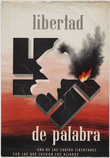
What it is — a Spanish-language wartime propaganda poster: Freedom of Speech — one of
the four freedoms the Allies are fighting for (Roosevelt's "four freedoms").
Lithograph, 101.9 × 70.8 cm; client Coordinator of Inter-American
Affairs (MoMA 91.1944).
Composition — reading of the work (v2): at the centre of the format a fractured black block
with embossed shadows — a mass breaking apart into large chunks; on the left edge of
that mass a negative profile of a human head speaking (mouth open) — the face is
a hole in the mass, not a drawn figure. From the crack on the right black smoke gushes and a
flame burns (the only bright colour). Below, the background shifts into blood red, above it's
grey-white. The composition is upright and symmetrical like a monument: title at top,
mass in the middle, title at bottom.
Colour — reading of the work (v2) — more than two: black, grey, dirty white,
red (a gradient in the lower half) and yellow-orange only in the flame. The red
doesn't signify anything literally; it is the temperature of the lower half of the image.
Typography — reading of the work (v2): "libertad" at the top and "de palabra" at the bottom,
a classicist roman with strong thick-thin contrast (thin serifs), large, lowercase, centred;
below, two lines of letter-spaced capitals with a subtitle.
So not a grotesque — for a wartime poster in Spanish he chooses a classical typeface,
which reads like a "proclamation". Specific typeface not confirmed.
Message — an abstract concept (freedom of speech) for an audience that isn't his and in a
language that isn't his. Solution: it doesn't depict speech but a wall cracking —
the head is an opening breaking through the mass. The hardest kind of task (an idea without an object)
is solved by drawing an obstacle, and freedom is what breaks it.
Why exactly this way — a wartime campaign for Latin America, large print run, small palette,
the message has to land without context.
What would kill it — a literal illustration (a speaker at a microphone). It becomes an illustration
of the word, not the concept.
Principles:figura-kao-negativ-maseprepreka-umjesto-pojmajedna-jarka-tacka-u-tamnoj-sliciv2 corrections: neither drasticno-kadriranje nor bijeli-prostor-kao-oblikhold —
the poster is centred, full and symmetrical, with no emptiness. This is the
least "Brodovitch-like" piece in the notes, and precisely for that reason useful: it shows that an art director
of a magazine, when handed a war poster, works in someone else's language (classical roman, allegory).
Resolved v2: the motif, colours and position of the text.
What it is — a book of his own photographs from Ballets Russes rehearsals and performances.
An author's project, not a commission.
Composition — photographs arranged like a filmstrip: grainy, high
contrast, often crossing the gutter. Described as one of the most cinematic
photography books ever published.
Colour — black and white. The grain is material, not noise.
Typography — to verify against the book; the typography is stripped back and subordinate to the sequence.
Message — movement isn't halted in order to be described. The book reads at the speed
pages are turned — this is montage on paper.
Why exactly this way — shot without the luxury of ideal conditions; poor light and fast
movement gave a language that was then deliberately kept and pushed further in print.
What would kill it — one photograph per page, framed and captioned.
The filmstrip disappears, leaving only an album.
Principles:sekvenca-i-montazazrno-kao-materijalDocumented 23.09.2026 (David Campany; josefchladek):landscape format (roughly
28 × 22 cm), 104 photographs in 11 sections — one per ballet; deep printing
("inky gravure") to bring out the tones; every image runs to the edge, no white border;
sometimes two images of the same scene side by side as "stolen film frames", and a pair
across the gutter forms a panorama whose join is lost in the binding. Each section opens with a page
giving the ballet's title in its own decorative, pre-modern lettering; text by Edwin Denby.
Print run unknown — consensus: under 500 copies.
Still open: the interior hasn't been seen (josefchladek spreads are behind a registration wall; the cover only
200 px — canvas with no visible design).
05 · Harper's Bazaar — the double-page spread as a unit (1934–1958)
What it is — 24 years of art direction, alongside editor Carmel Snow. He gives
photography assignments both to avant-garde authors (Man Ray, Cocteau, Chagall) and to his own
students (Avedon, Penn).
Composition — the spread is the unit, not two pages. The layout is a joint,
not a wall: a figure walks across it, the headline rides it, a sequence of images accelerates left to right
and stops in empty space. He laid out the maquette on the floor and read it like film.
Colour — introduces colour photography, but white space holds the composition.
White for him has shape, it isn't leftover.
Typography — reading of the work (v1) + documented (v2): one typeface,
an enormous range of sizes; a silhouetted figure across the whole format down to a tiny
signature. The typeface is settled by v2: DIDOT, not Bodoni.Fonts In Use speaks
of "Brodovitch's infatuation with Didot on the pages of Harper's Bazaar" and claims that
he practically made Didot the typeface of the fashion industry single-handedly. Caution: the same source
suspects that some lettering was hand-drawn in imitation of Didot, because the hairlines are too thin
for the phototypesetting of that era. So: the class of typeface is confirmed, individual lettering is not.
Message — a fashion magazine that is watched like a film. The three-second test:
a spread has one punch and one pause, never two punches.
Why exactly this way — a monthly with an enormous page count needs rhythm;
without alternating dense and empty the reader gets lost by page twenty.
What would kill it — art direction after the shoot. His spreads work
because the photography was commissioned into a rhythm already drawn. That's why they are
the hardest to copy.
Principles:dvostrana-je-jedinicabijeli-prostor-kao-oblikslika-se-narucuje-u-ritamjedno-pismo-siroka-skalaResolved v2: typeface = Didot (Fonts In Use).
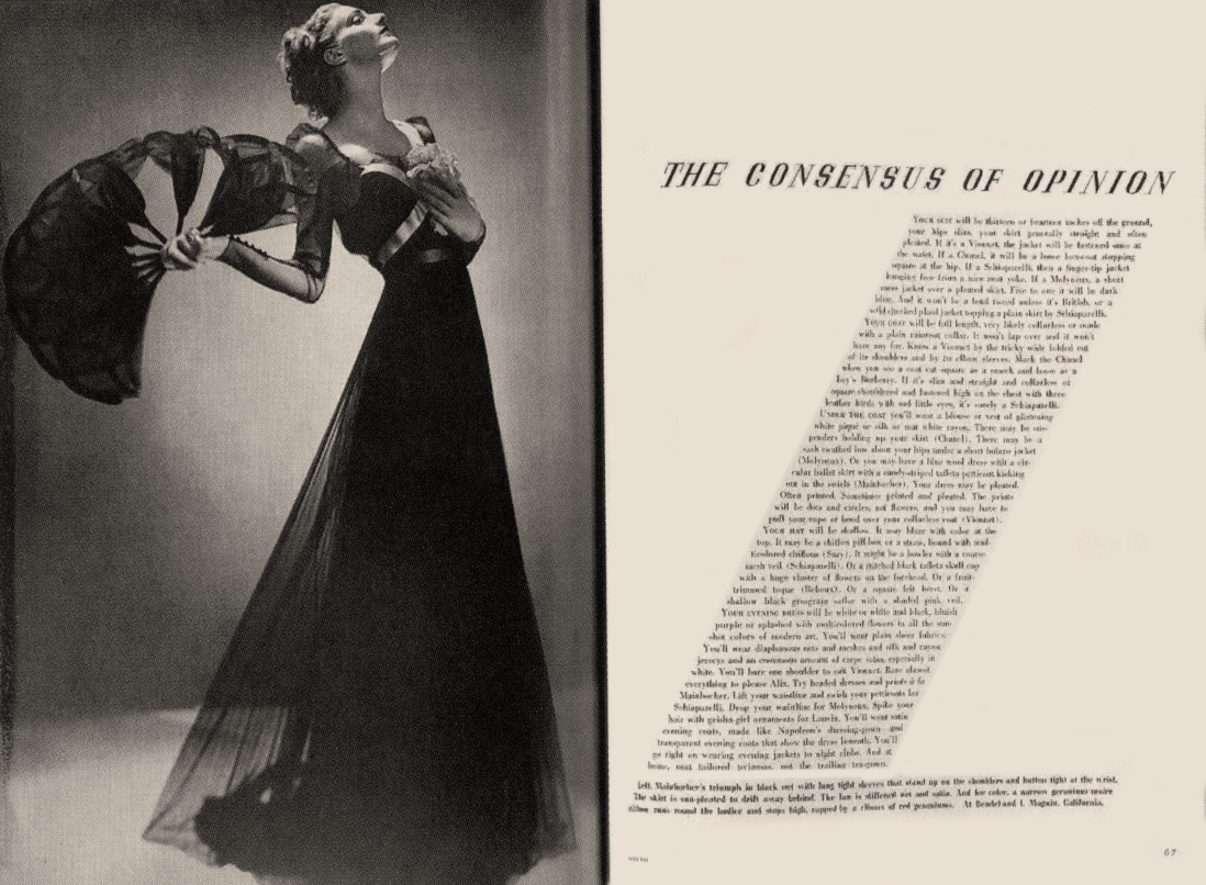
Benchmark seen 23.09.2026 — "The Consensus of Opinion", March 1936, photograph by Man Ray
(reading of the work (v2), scan from Smashing Magazine): left page photograph to the edge —
a woman in a long dark dress, body on a diagonal, sleeve spread like a fan. Right page
white: the headline in wide letter-spaced italic capitals, and the column of text set as a
slanted parallelogram repeating the tilt and spread of the dress — the text isn't a rectangle but an
echo of the silhouette on the other side of the gutter. Below, a small caption running the full width.
Palette: only paper and shades of black (no accent). This is dvostrana-je-jedinica in its
purest form: neither page makes sense without the other. (Related to zid-teksta-kao-oblik, but the shape
of the block here comes from the image, not from geometry — a candidate for a local tag, not entered in
_PRINCIPI.md.)Why the choice of typeface matters for my work: Didot has an extreme contrast in stroke weight —
hairlines that almost vanish. Such a typeface demands white around it and falls apart on grey or
coloured backgrounds. His "white space" isn't just taste but a technical consequence
of the typeface choice. If in my own work I choose a typeface with strong contrast, I've also signed up
for a certain amount of emptiness.
Still open: to pick 3–4 specific spreads with the issue's date.
editors George Rosenthal and Frank Zachary; three issues (winter 1950, summer 1950, spring 1951)
Technique
magazine, 13 × 10 in, thick textured papers, fold-out pages, embossed covers (issue 2 — cover by Charles Eames), no ads
Size
33 × 25.4 cm (13 × 10 in)
Type
cover logo issue 1 — condensed capitals, specific typeface not confirmed; Albro Alphabet (Brodovitch, Photo-Lettering 1950) per ikonographia — not confirmed on the cover
What it is — a magazine about graphic arts; editors George Rosenthal and Frank Zachary, art director Brodovitch. Three issues, 1950–1951, format 13 × 10 in.
Composition — documented (antiquarian description of copy no. 2, summer 1950): each issue is an object — thick textured papers, fold-out pages, embossed covers, and in issue 2 a bound wallpaper sample. The best print quality available in the early 1950s. Content and material are the same thing.
(The same issue also contains a 14-page feature on Charles and Ray Eames — one of the first magazine features on their work; connection to Matter, who worked at the Eames Office 1943–46.)
Colour — reading of the work (v2, cover no. 1, winter 1950): black background (≈ 3/4 of the surface), cream letters, two transparent rectangles — magenta and blue — that overlap the letters and give them a third colour where they overlap.
Typography — reading of the work (v2): "PORTFOLIO" set vertically, as one word across the full height of the cover, in condensed capitals with cuts (specific typeface not confirmed); two rotated transparent rectangles cut across the word (magenta over "RTF", blue over "OLIO"). Not Didot — the cover doesn't repeat Bazaar. Ikonographia mentions Albro Alphabet (Brodovitch, Photo-Lettering 1950) as the magazine's typeface — unconfirmed on this cover.
(The image is an ikonographia reproduction with a watermark — restored, not an archival scan. Related to providni-sloj-kao-dubina and traka-kroz-cijeli-format — not logged.)
Message — the magazine as an experience in hand, not as a carrier of texts.
Why exactly this way — confirmed v2: Brodovitch insisted that the magazine carry no advertising at all — only art and design. Expensive production with no ad revenue is both the reason for the quality and the reason the project died.
(The source is an antiquarian description that says "many state" — so a strong indication, not archival proof; leave as confirmed-with-reservation.)
What would kill it — the very thing that did kill it: economics. Worth as a lesson — not every good object is a sustainable model. For you specifically: when you make something expensive and flawless (a book, a monograph, a LØADERRØR object), the payment model is part of the design, not administration afterward.
Principles:materijal-kao-sadrzajsekvenca-i-montazamodel-je-dio-dizajnaResolved v2: three issues, format, materials (fold-out, embossing, wallpaper sample),
editors, absence of advertising. Still open: print run.
07 · Portfolio — studio memorandum, letter to Alvin Lustig (1950)
What it is — memorandum of Portfolio magazine, preserved as a letter to Alvin Lustig
(MoMA 1159.2015.1). Letterpress, 26.7 × 18.4 cm; from the
Elaine Lustig Cohen collection — so it was preserved by Lustig's widow, which
explains why it exists in the museum at all. A minor object, but it documents the identity
of the project and the link between two authors in this material.
Composition — no image in the record (MoMA: "Image not available").
Colour — no image in the record; letterpress on a memorandum = as a rule one
or two colours, not to be claimed without confirmation.
Typography — no image in the record.
Message — identity is proven on the smallest carrier. A memorandum is a test:
if the system doesn't work there, it doesn't work anywhere.
Why exactly this way — small format, one colour, one pass.
What would kill it — a logo centred at the top.
Principles:identitet-je-prirucnikStatus v2: the work is documented by data, but without an image — MoMA doesn't have it.
A candidate for replacement with some other example of the Portfolio identity if found;
until then don't describe it.
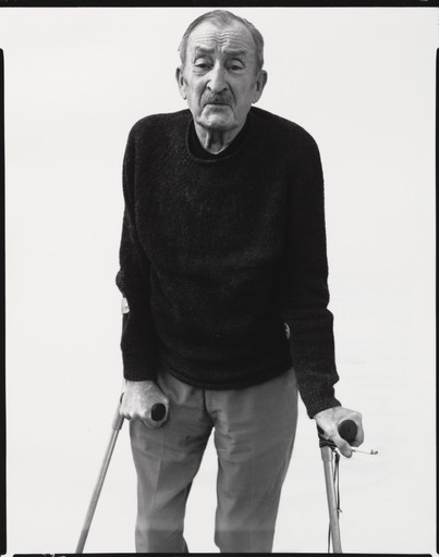
What it is — book: photographs by Richard Avedon, text by Truman Capote,
design by Brodovitch. One year after leaving Bazaar.
Composition — same principle as the magazine, but without the monthly rhythm: a sequence
of portraits in which empty space carries the tempo.
Colour — black and white.
Typography — dokumentovano (v2): Didot
(Fonts In Use) —
the same typeface as in Bazaar, carried over into the book. Note from the same source: the lettering on the
cover may have been hand-drawn after Didot, since the hairlines are too thin for phototypesetting.
Message — portrait as a series, not as a gallery.
Why exactly this way — the book is the only format where his way of working (sequence,
pause, cut) has full control — no ads in between.
What would kill it — aligning all the images to the same size. The rhythm would stop.
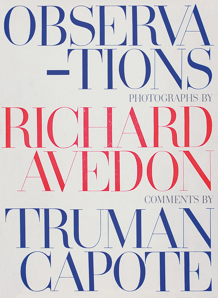
Principles:dvostrana-je-jedinicasekvenca-i-montazaCover seen 23.09.2026 (reading of the work (v2), Fonts In Use): white ground, all
Didot capitals, set as a justified block across the full width — "OBSERVA-/-TIONS"
broken with a hyphen at the end of the first line, at the start of the second, so both lines are the same
width. Three names in three lines of colour: the title and Capote blue, Avedon red; "PHOTOGRAPHS
BY" and "COMMENTS BY" in small capitals aligned right. Format 11 × 15 in. The word breaks
across the width of the block, not by syllable — the typography works as a poster, not as a title page.
To verify against the book: number and order of images, treatment of text.
Other works — evidence, no analysis
Work
Year
Source
Martini (poster, linocut, 118.1 × 154 cm)
1926
MoMA 5339 — Paris period
Harper's Bazaar — "Fine Figure of a Woman" (spread)
Nov. 1934
Smashing Magazine (scan)
Harper's Bazaar — "If you don't like full skirts" (photo. Hoyningen-Huene)
Bridge to practice: poster · graphic design · motion
Poster
White has shape. Draw the emptiness deliberately, like a figure; if the emptiness is just
what's left over, the composition is weak. Test: fill all the empty space with magenta and
see whether that shape is good on its own.
One typeface, an enormous range. Contrast from size, not from mixing fonts.
Two cuts of the same typeface at a ratio of 1:8 work harder than four different fonts.
Drastic cropping. Go into the face, go off the edge of the format. He was the first to do this routinely.
Graphic design
A spread, not a page. For every publication: print thumbnails and lay them out on the
floor. If the rhythm doesn't exist in the thumbnails, it doesn't exist in the hand either.
Commission material into a rhythm you've already drawn. The biggest difference between him and
today's layout work: most people today lay out whatever comes in. If you do both the images and the layout
(and you do), you have an advantage almost no one has — use it: mock-up first, then shoot.
Material is content (Portfolio). Paper, insert, fold — for your printed pieces
that's a cheap way to make an object unforgettable.
But: Portfolio failed. A good object and a sustainable model are not the same thing —
account for that too.
Motion
The cut is your spread. What a page turn is for him, the cut is for you. Build in
pairs of shots: hit + rest, never two hits in a row.
Animatic on the floor. His method translates directly into a contact sheet of shots:
export one frame from each shot and look at them all at once as a strip.
The rhythm is only visible that way.
Grain and blur as material, not as filter. Motion blur and grain for him are
information about speed. In AE: if you strip out the blur and the shot becomes more legible but dead,
the blur was doing your dramaturgy — keep it and push it further.
Emptiness lasts. White space in time is a pause. Most animation has
none. Insert one full second of nothing before the hit and compare.
For gaming animations: his hit/rest rhythm is literally the structure of a gag.
Bad imitation
White as leftover. Margins are left over and that's called "white space".
For him, emptiness is a drawn figure and has a size derived from the image next to it.
Test from _PRINCIPI: colour all the emptiness magenta — is that shape good on its own?
Didot without emptiness. Take a typeface with extreme contrast and put it on a grey,
busy or textured background. The hairlines disappear and a blot remains. The choice
of typeface obligates you to an amount of white.
Rhythm without commissioning the image. The look of the spread gets copied, and
the photographs are whatever arrived. His spreads work because it's first the
layout, then the shoot. This is why he's hardest to imitate, and your advantage —
you do both.
Grain as filter. A grain preset gets added to a sharp image. For him grain comes
from available light and necessity and carries information about speed. Added
grain on a calm frame is just noise.
Two hits on the same spread. Two strong images next to each other. His rule is
hit + pause; two hits cancel each other out.
Expensive without a model.Portfolio was perfect and folded after three issues.
If the object is expensive, the payment model has to be part of the project from the start.
The brief through their eyes
(insert current job) — First move: draw the layout before you shoot or draw
anything — thumbnails, on the floor, like a strip. Second: where's the pause? If
every unit hits, none hit. Third: which is the one frame allowed to break out of the format.
Exercises
Strip. Take 12 of your images and arrange them into a sequence of 6 spreads. No text.
Goal: for the acceleration and stopping to be visible without a single word.
One typeface. A poster with one typeface and a size ratio of at least 1:10.
Forbidden: a second font, a second colour.
Pause. Recompose an existing 15 s animation so it has exactly two empty spots
per second of duration. Watch what happens to the hits.
Layout before shooting. (new) Draw six empty spreads with shapes instead of
images — just rectangles and emptiness, like a score. Only then shoot or draw
the images that exactly fill those shapes. Forbidden to change the layout.
Motion study — "Hit and pause" (5 s, AE)
No music (so the rhythm is visible to the naked eye). Second 0–1: empty white frame.
Second 1: one hit — close-up, grainy, enters as a cut, not an animation.
Second 2–3: nothing — empty, but not calmly empty: let it run too long for
comfort. Second 3: second hit, smaller than the first. Second 4–5: empty.
Rule: the two hits must not be the same size, and the empty spots are longer than the hits.
Check: export one frame from each shot and look at them as a strip.
Rebuilding the benchmark — spread from Bazaar
The skeleton isn't geometric but rhythmic, so it's drawn differently too: take 6
empty spreads and on each mark only weight (black blot = image, grey = text,
white = emptiness), with no detail at all. Task, 45 min: arrange a sequence that
alternates dense and empty, with one element crossing the gutter. Check:
viewed as thumbnails from two metres away, is the rhythm visible without any content.
(Note: for this author the .svg skeleton makes less sense than for
Josef Müller-Brockmann and Max Huber — for them it's construction, here it's tempo.)
Notes on sources
Year of birth: 1898 (Britannica). The Art Story gives 1889 — an error, noted.
v2 confirmation: the Art Institute record also gives 1898–1971.
~~Art Institute 403~~ — resolved v2 via the API (api.artic.edu/api/v1/artworks/159605):
medium, dimensions, credit and curatorial description of the method (from the wings, no flash). The page and
the IIIF image remain behind Cloudflare — even for a browser.
~~Bazaar's typeface (Bodoni?)~~ — resolved v2: DIDOT, not Bodoni
(Fonts In Use).
The same source warns that some lettering may be hand-drawn after Didot.
~~Portfolio without ads~~ — confirmed v2 with a caveat (antiquarian description: "many
claim"); added: three issues 1950–51, 13 × 10 in, fold-out, embossed covers, wallpaper
sample in issue 2, editors Rosenthal and Zachary, feature on the Eameses.
v2 (06.09.2026): works 01, 03 seen (MoMA, PGDA). v1 corrections:
03 Libertad de Palabra is neither "drastic cropping" nor "white space" —
it's centred, full and symmetrical, with a classicist serif; the least his own
work in this note;
01 New Poster isn't cropping but colour spectrum + hand as arrow, and
it's deliberately loud.
New local tags: figura-kao-negativ-mase, prepreka-umjesto-pojma,
jedna-jarka-tacka-u-tamnoj-slici, spektar-kao-tema, ruka-kao-strelica,
citiranje-jezika-teme, postojece-svjetlo-kao-jezik, model-je-dio-dizajna.
Template (23.09.2026, session 25): status gotovo; ostali_radovi from fm moved
into the body table (added: Martini 1926, three dated Bazaar spreads, Portfolio 2–3,
other memoranda, Art in America 1962); portrait = Avedon 1970 (MoMA 44507).
principi per work reconciled with v2 corrections (01 and 03 were tagged drasticno-kadriranje).
01 correction: format PORTRAIT (61 × 46 cm, LoC), the finger points downward — the v2 description
from 06.09. looked at only part of the sheet. Seen for the first time: 05 (spread, March 1936, Man Ray),
06 (issue 1 cover), 08 (slipcase). 04 documented (Campany): landscape format,
104 images, 11 sections, gravure, print run < 500.
Without an image remain: 02 (artic.edu Cloudflare even for IIIF in the browser, 23.09.),
07 (MoMA has no image for any of the 8 sheets). 04 — cover only, 200 px.
Images 05 (Smashing) and 06 (ikonographia, restored reproduction with watermark)
are secondary sources — for harvesting, look for better ones (Bazaar: Barnes 2024 catalogue?).
Candidate for a local tag (not entered): a column of text shaped to the silhouette in the image
(05, "The Consensus of Opinion") — related to zid-teksta-kao-oblik.