Co-founder of HfG Ulm; director of the visual programme for the Munich Olympics 1972 Ulm → Rotis
Design is not applied art. It is the shaping of the world in which we live.
Biography
Born 13 May 1922 in Ulm, as Otto Aicher. School friend of Werner
Scholl, through whom he also meets his relatives — Hans and Sophie Scholl,
who in 1943 will be executed for membership in the "White Rose" resistance
movement. Like the Scholls, he is openly against Nazism: arrested in 1937 for
refusing membership in the Hitlerjugend, because of which he does not sit his
final exam (abitur) in 1941. Mobilised into the army, he attempts desertion
several times; in 1945 he finally deserts and hides with the Scholl family in
Wutach.
After the end of the war, in 1946, he enrols in sculpture at the Academy of
Fine Arts in Munich — not design; his graphic work is in that sense a
self-taught craft. Already in 1947 he opens his own studio in Ulm. In 1952 he
marries Inge Scholl, the older sister of Werner, Hans and Sophie. With her and
with Max Bill he founds the Hochschule für Gestaltung Ulm (HfG Ulm) in 1953 —
the postwar successor to the Bauhaus, which operates until its closure in
1968; among its teachers and students are Tomás Maldonado, Peter Seitz and
Anthony Froshaug. Through the same decades he builds a name in corporate
design — among his early clients Lufthansa and Braun — and is considered one
of the pioneers of the discipline that will come to be called "corporate
design".
In 1966 the organisers of the Munich 1972 Olympics ask him to become chief
designer of the games, tasked with aligning the visual identity with the new
stadium architecture of Günter Behnisch. Aicher consults with Masaru
Katsumie, designer of the pictograms for the Tokyo Olympics 1964, and bases
the Munich system partly on that precedent. His team develops pictograms on a
fixed grid of angles and modules, a strict "20°/45°/90°" geometry linking
sign, signage and architecture, and a palette drawn from the Alpine
landscape — blue, white, green, orange and silver — deliberately without red,
gold and black (association with Berlin 1936) and without black-and-yellow
(the traditional colours of the city of Munich); according to the official
Aicher institute, the palette had seven colours plus white, and light blue
was declared the official colour of the games — "apolitical, the colour of
peace". Just before the games began, Aicher asked for a "rainbow", a richer
layer of colour over the base palette — hence the nickname "Rainbow Games".
The games' emblem ("Strahlenkranz", a radiant wreath joining the sun and the
five Olympic rings) is developed by his team through several phases
(including an idea with the Münchner Kindl, abandoned); the final
mathematical formula for the union of wreath and spiral was worked out by
Coordt von Mannstein. Univers is used for the typography of the whole
programme. The design team produces 21 posters for the sports, using the
technique of "posterisation" (manual separation of the tonal values of a
photograph), exhibited in pairs with posters by invited artists (Hockney,
Kitaj, Wesselmann, Allen Jones). Aicher also designs the first official
Olympic mascot, a dachshund named Waldi.
After the games he returns to corporate work (from 1980 consultant to the
kitchen company Bulthaup) and in 1988 publishes his own typeface family
Rotis, named after the location of his studio near Leutkirch. He writes
several books, among them Typographie (1988) and die welt als entwurf
(1991). He dies on 1 September 1991 in Günzburg, after being struck by a
motorcycle while mowing grass in Rotis.
Influences
Studied with
No formal typographic/graphic education — studied sculpture at the Academy of Fine Arts in Munich (1946–47, documented); graphic design is practically self-taught, he opens his own studio in Ulm already in 1947.
As co-founder (with Inge Scholl and Max Bill) of the Hochschule für Gestaltung Ulm in 1953 — the institution shapes him as a teacher and organiser, not as a student; Bill brings a direct Bauhaus line into the school.
Borrows from
Masaru Katsumie — pictogram designer for the Tokyo Olympics 1964; Aicher consults him directly and partly bases the Munich system on the Tokyo precedent (documented, Wikipedia/TGDS)
Bauhaus functionalism — indirectly, through Max Bill and the pedagogy of HfG Ulm, not through a personal teacher
his own earlier corporate work for Lufthansa and Braun (late 1950s–60s) — the discipline of 'identity as rule' was developed before the Olympics, not invented for it
Influenced
DOT pictograms (US Department of Transportation, 1974) — directly derived from the Munich system (documented, Wikipedia)
AIGA symbol signs and today almost every airport/public pictogram system in the world
corporate design as a discipline — Aicher is considered one of the pioneers of the term 'corporate design' (documented)
Contemporaries
Karl Gerstner — the same decade-long moment of German-Swiss 'system instead of artefact' design, different terrain (Gerstner: agency and theory in Basel; Aicher: state/Olympic programme in Ulm-Munich)
Josef Müller-Brockmann — shares the ethic 'system is discipline, not style', but Müller-Brockmann stays in the poster and publication, Aicher builds the entire physical and information space of the host city
Who he studied under
He has no formal typographic education — he studied sculpture (Academy of
Fine Arts, Munich, 1946–47, documented), his graphic craft is practically
self-taught. As co-founder (with Inge Scholl and Max Bill) of HfG Ulm in
1953, he shapes himself as organiser and teacher, and Bill's Bauhaus line
enters his thinking indirectly, through joint work at the school, not through
personal apprenticeship.
What he steals
He directly consults Masaru Katsumie, designer of the pictograms for Tokyo
1964, and partly builds the Munich system on that experience (documented).
Bauhaus functionalism arrives indirectly, through Bill and the pedagogy of
HfG Ulm. The discipline of "identity as a set of rules" was not invented for
the Olympics — it was developed earlier, through his own corporate work for
Lufthansa and Braun.
Who he influenced
The Munich pictograms directly influenced the DOT pictograms of the US
Department of Transportation (1974, documented) and, through them, the AIGA
symbol signs and today almost every airport and public pictogram system in
the world. He is considered one of the pioneers of the "corporate design"
discipline.
What it is — the official poster of the Munich 1972 Olympics, the
first of a series of 21 posters; according to Wikipedia, it is precisely
this one that became the general/official poster of the games.
Composition — a posterised/screened photograph of the Olympic Park
(TV tower, the stretched tent-like roofs of the stadium, the lake) across
the whole surface; top left the inscription "München", the Olympic rings
and the dates "26.8.–10.9.", below them the "Strahlenkranz" emblem of the
games — all small, all dominance running through the image, not the text.
Colour — an almost monochromatic blue scale (from dark blue to almost
white) for sky and water, white for clouds/screen structure, a narrow band
of light green for the lawn/stands — no red, no black as a flat colour.
Typography — Univers, small, in the upper band, entirely subordinate
to the image.
Message — the three-second test: a cold, bright, technically
optimistic place (tower, tents, water) without a single human figure,
without a heroicised body — the opposite of the visual language of Berlin
1936.
Why exactly this way — Aicher's personal task for himself was to make
a Germany that cannot be mistaken for 1936: no monumentality, no
black-red-gold, no heroicised body. Posterising a photograph of
architecture (not the body) in a cold blue scale directly carries out that
task.
What would kill it — adding a human figure in the foreground,
especially in motion or in a pose of strength — the poster would
immediately move closer to the iconography it deliberately avoided.
Principles:paleta-po-iskljucenjuTo verify against the image: exact dimensions and print run of the first edition.
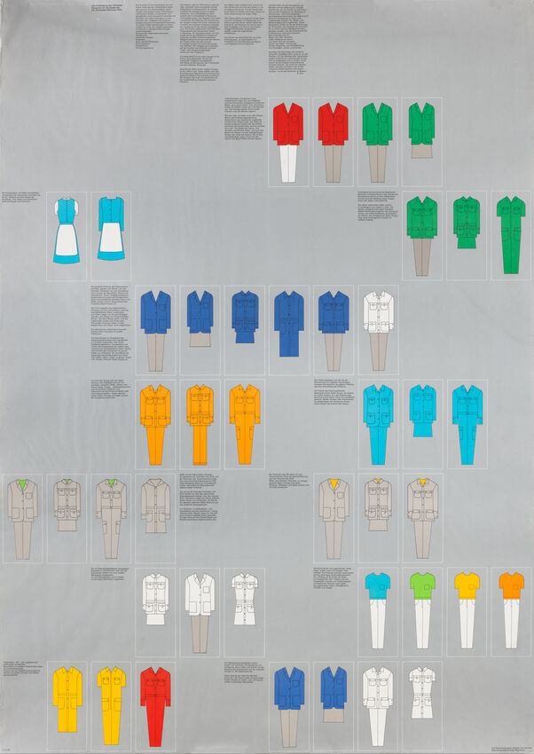
02 · Uniform system — colour table and staff roles (1972)
What it is — a reference sheet showing sets of uniforms for the
Olympic staff, grouped into rows by colour/function; SFMOMA collection
(the title of the sheet is not individually listed in the v1 harvest —
see Notes on sources).
Composition — a grid of small photographed figurines in uniforms,
each group in one colour (red, green, dark blue, orange, turquoise,
yellow, neutral beige/grey), with accompanying text blocks beside each
group (illegible at the available resolution).
Colour — seven to eight clearly separated flat colours, each
consistently tied to one group/function of staff — colour here is NOT
decoration but a functional marker.
Typography — to verify against the image (text illegible at the
available resolution).
Message — the three-second test: a visitor who does not know German
can still, by colour alone, guess which service the person they are
looking at belongs to.
Why exactly this way — consistent with the whole philosophy of the
programme: colour is not an aesthetic choice but part of the information
system — the same palette that colours the signage and maps here directly
encodes a human role on the ground.
What would kill it — assigning the same colour to two different
functions (e.g. media and technical service) — the system stops being
legible and the uniform becomes just clothing.
Principles:identitet-je-prirucnikTo verify against the image: the exact title of the sheet and the naming
of each function/colour — the text was not legible at the available
resolution of the scan.
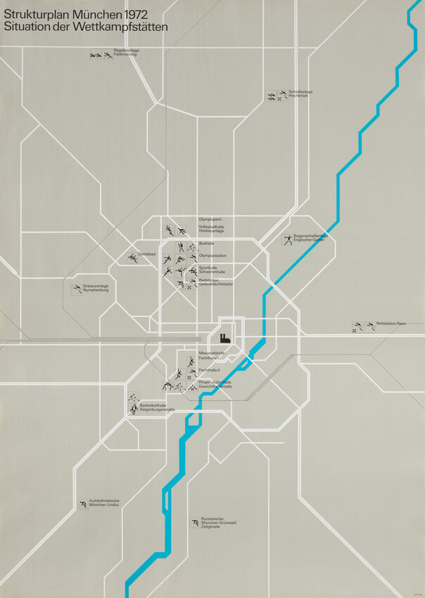
03 · Strukturplan München 1972 — plan of competition venues
What it is — the orientation map "Strukturplan München 1972 —
Situation der Wettkampfstätten" (layout of competition venues), SFMOMA
collection.
Composition — an abstracted grid of the city's streets/roads in a
white line on a beige ground; a blue band (the Isar river/canal) cuts
diagonally across the whole composition; each competition venue is marked
with a small black pictogram of the sport alongside the location name.
Colour — beige/sand ground, white road grid, one light blue band for
the watercourse, black for text and pictograms — the same "few colours,
methodically used" discipline as in the rest of the programme.
Typography — small, consistent grotesque (sans serif class; the
specific typeface not confirmed from this image) for location names.
Message — the map does not show the city's topography for its own
sake but purely for the visitor's orientation — everything not relevant
to "how to get to the competition" is left out.
Why exactly this way — the same pictogram vocabulary used on signage
and uniforms is here applied at the scale of the whole city — proof that
the system was constructed to work at every scale, from the uniform to
the urban map.
What would kill it — inserting realistic illustrations of buildings
or tourist landmarks — the map would lose its informational clarity and
become a tourist souvenir.
Principles:konstrukcija-je-prosivaTo verify against the image: exact year of the first publication of the map (SFMOMA dates it
provisionally to 1972).
04 · Pictogram construction — athletics, runner (1971)
What it is — construction diagram for an athletics/running pictogram,
preparatory drawing (1971) before application to signage.
Composition — the runner figure built exclusively from straight lines under
a fixed set of angles, over a full rhombic/triangular (45°) construction
grid; the head is a separate circle, not joined to the body.
Colour — black and white, no grey tones.
Typography — not applicable.
Message — the diagram itself IS the message: not "here is a runner"
but "here is the rule by which any athlete in motion is drawn".
Why exactly this way — constant stroke width, a fixed set of angles and
a separate circular head form a grammar that can be applied to any
sport, regardless of whether Aicher draws it himself or someone else on
the team, a decade later — that is the reason the system could become the
DOT pictograms at all in 1974, in the hands of a completely different team.
What would kill it — drawing a single figure "freehand", off the grid,
even if more beautiful — the next draughtsman in line would have no rule to
repeat and the system would collapse into a collection of individual
illustrations.
What it is — a series of information posters with the competition
schedule by sport (e.g. handball), letterpress and drawing on newsprint,
a team under Aicher's direction (PGDA credits only him, but describes the
work as team-produced — see Notes on sources).
Composition — every poster in the same format: at the top the mark
"München [rings]
1972", in the middle a row of sport pictograms, at the bottom a table of
competition dates/times; eight posters visible in the photograph, each in
a different colour.
Colour — yellow-orange, light blue, silver-grey, green, blue — each
poster carries ONE colour from the official palette as the background of
the entire sheet, not as an accent.
Typography — Univers (documented for the programme as a whole),
tabular setting of date/time figures.
Message — a three-second test, even without reading the text: the
colour of the sheet immediately says "this is the schedule for ONE
sport/day", because the colour is not repeated randomly but consistently
follows the category.
Why exactly this way — the same pictogram and the same palette seen on
the poster, the uniform and the map here do the job of a timetable —
proof that the "manual" covers even the driest, least glamorous
application of the system.
What would kill it — printing all sheets in the same colour for the
sake of "tidiness" — the system would lose the one function of colour
(distinguishing categories at a distance).
Principles:identitet-je-prirucnikTo verify against the image: exact schedule/sport on each individual sheet
(only partially legible in the available photograph).
06 · Football — posterised poster from the sports series, M72C: 0240 (1972)
What it is — one of 21 posters in the sports series; PGDA lists a team
of six named designers (Gerhard Joksch, Otl Aicher, Gabriele Pée,
Nanke Claassen, György Nagy, Henri Wirthner) — team work under Aicher's
direction of the programme, not his individual drawing (see Notes on
sources). The same motif (football/soccer) is held in the SFMOMA
collection under the title "Soccer poster, Sports Series", attributed
solely to Aicher — v1 discrepancy in credit between the two sources
noted, not resolved.
Composition — two footballers in a collision/struggle for the ball,
framed tight, filling almost the entire surface; no background other than
a flat colour.
Colour — posterisation (manual separation of tonal values from a
photograph) in green, orange-yellow and blue-turquoise — the players'
bodies reduced to flat polygons of colour, no black contour line, no grey.
Typography — to verify against the image (no text visible in the
available frame).
Message — a three-second test: "a collision in sport" is recognised,
but the bodies are so abstracted by the colour arrangement that no
player is portrayed as an individual hero — it remains a pure general
gesture of movement.
Why exactly this way — the same political discipline as in poster 01,
applied to the human body: posterisation deliberately breaks the
photographic realism of the body into abstract colour polygons, so that
the athlete remains a gesture, not a heroised figure — a direct avoidance
of the visual language of 1936, where the athletic body was the central
propaganda motif.
What would kill it — retaining full photographic detail of the face and
muscle definition — it would return exactly to the heroised iconography
that the whole programme avoids.
Principles:paleta-po-iskljucenjuTo verify against the image: exact number and names of all six credited
designers; the reason for the discrepancy in credit between PGDA (six names)
and SFMOMA (Aicher only).
What it is — a photograph of an actually installed signage sheet with
the swimming pictogram, still in place in the Olympic swimming hall; the
photograph is from 2012 (Henning Schlottmann), the sheet itself from 1972.
Composition — a square sheet, the swimmer figure (arms extended
forward into a dive) built with the same grammar as the runner (item 04)
— straight lines, fixed angles, separate circular head, constant stroke
width.
Colour — light blue background (the same "apolitical, colour of peace"
from the official palette), white pictogram.
Typography — not applicable.
Message — a three-second test, from corridor distance: "swimming is
here" is recognised without a single word of text, even under night
lighting or a poor viewing angle (visible in the photograph itself, shot
through the glass/roof structure).
Why exactly this way — this is exactly the test Aicher's principle
demands: the system is tested on the ugliest, cheapest, least glamorous
application (a signage sheet on a wall), not on a poster — and, fifty
years later, the sheet is still in place and still legible.
What would kill it — printing the pictogram in several colours or with
shading for the sake of "beauty" — at a distance and under poor light it
would lose exactly the instant legibility it exists for.
What it is — Aicher's own typeface family Rotis (1988), Semi Serif
variant; the image is a contemporary (2010) reconstruction of the full
character set, not a photograph of the original Adobe/URW catalogue.
Composition — not applicable in the usual sense; the subject of
analysis is the letterforms, not the layout of a specimen sheet.
Colour — the contemporary specimen uses a green background for
legibility; it is not part of the original catalogue appearance (to
verify against the image if the original Adobe/URW specimen from
1988/89 is found).
Typography — Rotis was conceived as a "superfamily" of four related
typefaces/cuts (Serif, Sans Serif, Semi Serif, Semi Sans) that share the
same skeleton/proportions, so that they can be mixed without visual
clash; Semi Serif is a hybrid in which some letters retain rudimentary
serifs while others remain without them — the exact distribution of
which letters keep the serif is not reliably legible in the available
image (to verify against the image).
Message — the typeface family itself is a "programme" in the
Gerstner sense: one set of rules (skeleton, proportions) generates four
different registers (from strictly serif to strictly sans serif) that
can be combined within the same document.
Why exactly this way — consistent with the whole career: even a
single typeface Aicher builds as a system with rules for combination,
not as one fixed cut — the same drive that ran the Olympic programme,
applied to typography.
What would kill it — (not applicable to an individual work) —
abandoning the shared skeleton between the cuts would turn Rotis into
four unrelated typefaces instead of one family-system; this is also the
main criticism levelled at Rotis — the shared skeleton, in the view of
many typographers, sacrificed the legibility of each individual cut for
the sake of that systemic consistency.
Principles: (none assigned — the typeface is outside the main Olympic corpus)
To verify against the image: exact distribution of serifs across letters;
the appearance of the original Adobe/URW specimen catalogue from 1988/89
(here it is a modern reconstruction).
Other works — evidence, no analysis
The remaining ~13 posters from the series of 21 sports (sailing, boxing, handball,
hurdling, running, volleyball, wrestling, archery, canoeing,
fencing, gymnastics, hurdles) — documented in the SFMOMA collection under the same
"Sports Series" title; images not individually analysed in this note.
Novum Gebrauchsgraphik, no. 7/1972 — contemporary trade coverage
of the Olympic programme; used as context literature, image not
analysed.
Note on "Sports Illustrated Olympic Edition 1972" (v1 misunderstanding) —
the v1 harvest included this item in Aicher's list of works. PGDA clearly
states that the cover was designed by the Sports Illustrated magazine team
(Sports Illustrator, Richard Gangel as art director, and six other named
collaborators); Aicher is credited solely for the "icon program" — that is,
the editorial team REUSED his pictogram system for their own cover.
Removed from the list of key works (not Aicher's design),
but kept as evidence that the system was robust enough for a completely
independent team to apply it correctly — a good example of the principle
konstrukcija-je-prosiva in practice, beyond the Olympic team itself.
Note on "HfGUlmPublication.jpg" (v1 risk, avoided) — the file
description on Wikimedia Commons clearly states that the publication was designed
by the student Margarete Kögler, while "Otl Aicher" is listed solely as
"Lecturer" (predavač). The work was NOT included in the list — the same type
of error as Broxi/Thérèse Moll with Karl Gerstner (collective/studio authorship
attributed to the principal). Kept only as evidence of Aicher's teaching practice
at HfG Ulm, not as his design.
Bridge to practice: poster · graphic design · motion
Poster
Before choosing a palette for the next poster, first write a list of what the
palette must NOT evoke (which other brand, which other aesthetic, which bad
context) — only then choose the colours that remain. Aicher's list started from
"must not look like 1936", not from "should be blue".
Graphic design
If you're working on a sign/pictogram system (for LØADERRØR or a client), write the
construction grammar first — a fixed set of angles, one stroke weight, a rule for
the head/eye/accent — as text or a diagram, before drawing the tenth sign.
Test: could someone else, reading only that grammar, correctly draw the
eleventh sign without you.
Motion
Pictogram grammar translates directly into a rigged system: build ONE "skeleton"
figure (fixed set of bones/angles, constant line weight) in Rive or
After Effects, then derive 5–6 different "sports"/actions from it by changing only
the skeleton's pose, not drawing each icon from scratch. Extensibility test:
can a colleague, looking only at the rig, add a seventh action so it looks like
part of the same family.
Bad imitation
A "system" with no worst-case test — a pictogram or mark that
looks good on a large poster but falls apart on a small signage board
or bad print hasn't passed Aicher's test (see work 07 — test on
the ugliest, cheapest application).
A palette chosen only positively, without elimination — choosing colours
purely on "what looks nice", without a single consciously excluded association,
leaves the identity accidentally similar to something the author neither foresaw
nor checked for.
Collective work presented as the work of one author — when a team of six
or more people executes a work under the leadership of one designer (as with
poster 06), it's not an error to name the lead designer/programme director, but it
IS an error to erase the other credited collaborators from the record — the v1
harvest made this mistake consistently (see Notes on sources, and the same
trap with Karl Gerstner).
The brief through their eyes
First I would make a list of what the title card of my YouTube gaming-animation
series must NOT resemble (which other well-known gaming series, which clichéd
"epic" gaming visual language) — only then choose the colour and form that
remain outside that list. Then I would write a grammar, not a drawing: a fixed
angle/shape for the main accent element that repeats in every episode, a
constant line weight if there's a mascot or mark, and one colour rule per
"theme" of the episode (as a uniform system: colour = category, not decoration).
The test would be: could I, twenty episodes later, or could someone else,
continue the series from that grammar alone, without looking at the previous
nineteen frames.
Exercises
For an existing personal mark or mascot, write the construction grammar (fixed
angles, one stroke weight, a rule for the head/accent) on paper, BEFORE
drawing; then draw three new variants according to that grammar and check
whether they hold to all the rules.
Make a list of five things your next project's palette must not
evoke, before choosing a single colour — only then choose from what
remains.
Motion study
Build one pictogram skeleton (5–6 points/bones, fixed set of angles) in
Rive or After Effects and animate a transition between two "actions" (e.g. running →
swimming) by changing only the skeleton's angles, without changing the line
weight or adding new shapes — the goal is for both actions to look like the
same family of signs.
Rebuilding the benchmark
Benchmark: the construction of the athletics pictogram (work 04). Skeleton: measure
from the diagram the exact set of angles and the module of the diamond grid,
rebuild the grid in Illustrator. Task: draw TWO new pictograms (e.g. for two sports
Aicher's team didn't do) strictly on that same grid and angles, then check
whether they read as part of the same family as the original.
Notes on sources
Credit on poster 02 (uniform system) and 03 (Strukturplan) — SFMOMA
records for the specific individual sheets were not found individually (only
the general artist page); the record (izvor_zapis) links to the general SFMOMA
page, not to an individual catalogue number. The exact title/description of each
sheet at SFMOMA is not confirmed.
Credit on poster 06 (football) — PGDA lists six named designers
(Gerhard Joksch, Otl Aicher, Gabriele Pée, Nanke Claassen, György Nagy,
Henri Wirthner) for the same motif that SFMOMA lists under the title "Soccer poster,
Sports Series" and attributes to Aicher alone. This was NOT treated as Aicher's
independent drawing — it is presented explicitly as team work under
his programme leadership.
v1 misunderstanding — "Sports Illustrated Olympic Edition 1972" — the v1
harvest included this item directly under Aicher; PGDA clearly states that
the cover was designed by the Sports Illustrated editorial team, and Aicher
is credited only for the "icon program" (reuse of his system).
Removed from the list of key works.
v1 risk, avoided — "HfGUlmPublication.jpg" — the designer was
the student Margarete Kögler; Aicher is listed only as lecturer. Not
included in the list of works.
Number of colours in the official palette — the v1 text lists four colours
(silver, light blue, green, orange); Aicher's official institute
(otlaicher.de) lists seven colours plus white, with light blue as the
official colour of the games. The more detailed (institute) version was carried
over; v1's four-colour list was treated as a simplification, not an error.
Founders of HfG Ulm — the v1 bio mentions only Inge Scholl as co-founder;
Wikipedia also names Max Bill as a third co-founder. Added to the biography.
The founding year (1953) and closing year (1968) are confirmed, not in conflict.
The exact date/year of the consultation with Katsumie and the exact course of
development of the mark (Strahlenkranz) before Coordt von Mannstein's involvement —
carried over from Wikipedia, not cross-checked against another source.
Work 08 (Rotis Semi Serif) — the exact distribution of serifs on individual
letters is not reliably legible in the available modern reconstruction;
the original Adobe/URW specimen from 1988/89 was not found.
Portrait — no photograph with clear usage rights was found in the sources
reviewed; portret.ima remains false.
Difference from its pair
Karl Gerstner ↔ Otl Aicher: both explicitly design "a programme, not an
artefact", but on different terrain and at a different degree of personal hand.
Gerstner's programme remains theoretical and largely authorial — one man writes
the book, designs the typeface, builds the morphological box for his own clients.
Aicher's programme is state-run and collective from the first sketch: the entire
physical and informational space of the host city (uniforms, signage, maps, print),
carried out through a large team whose leadership — not any single drawing — is
Aicher's real authorial contribution.
Josef Müller-Brockmann ↔ Otl Aicher: both treat system as ethic, not style, and both insist that the designer's subjective gesture should disappear behind rules. The difference is in the scale of the field of operation — Müller-Brockmann's system lives in the poster, concert season and publication; Aicher's system has to work simultaneously on the uniform, airport signage, city map and the cover of a foreign magazine that reuses it without asking — the strictest possible test of a system's extensibility beyond the author's own control.