Era 1965 · Chermayeff 1932–2017 · Geismar 1931– · studio od 1957
Chermayeff & Geismar (Ivan Chermayeff, Tom Geismar)
Abstract corporate mark and identity as programme; poster as a single found object
Studio that introduced the abstract mark into American corporate identity in 1960 (Chase) and ran the Mobil programme for 30 years London / Glen Ridge NJ → New Haven (Yale) → New York
Palette of the œuvre
Colours (described, not measured): Chase blue (hex not confirmed); Mobil red + blue on white (hex not confirmed); posters: white/red background + one photographed object
„Good design is a design that works. If it doesn't work, it's no good. No matter what it looks like." — Ivan Chermayeff (designculture.it)
„We tried to think what was the symbol of banking, and we couldn't think of anything that wasn't a dollar, or a pound sign." — Tom Geismar on Chase (Creative Review)
v1 quote („A trademark does not have to describe the business…") was not found in any source — dropped.
Biography
Two different backgrounds, one studio. Ivan Chermayeff (London, 6.6.1932) is the son
of architect Serge Chermayeff; at eight he arrives in the US (1940), first with Gropius in
Lincoln, Massachusetts; through Andover, Harvard and the Institute of Design in Chicago he comes to
Yale (BFA 1955), where Herbert Matter teaches him. The same year, an internship with Alvin Lustig and
architect Edward Larrabee Barnes, then CBS Records as assistant art director. He himself says
his mentor was Paul Rand. Tom Geismar (Glen Ridge, New Jersey, 15.7.1931)
studies RISD and Brown in parallel, then Yale (MFA graphic design) under Josef Albers, and
serves two years in the army. They meet at Yale; in spring 1957, with Robert Brownjohn
(a student of Moholy-Nagy in Chicago) they found Brownjohn, Chermayeff & Geismar in New York.
For the first three years Brownjohn was the loud, experimental pole — That New York (1960) for
Composing Room and exhibitions at Gallery 303 are typography „as texture, to the point of erasure" (Eye 4).
In the winter of 1959 Brownjohn checks into a private hospital; the partnership is dissolved in
the hospital room, and he leaves for London half a year later (Homans). Wikipedia states the departure was
1959, Logo Design Love says 1960 — hence the two dates in the literature. The firm continues as
Chermayeff & Geismar Associates.
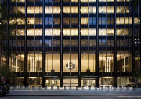
The turning point is Chase Manhattan, 1960: David Rockefeller, a collector, commissions a mark for
a bank formed by merging two houses; the studio proposes an abstract octagon — at that moment
no major American company had an abstract mark (Eye 81). Two of the three
directors reject the idea; within a few months the same people are wearing the mark on their cufflinks
(cghnyc.com). Mobil 1964 follows with Eliot Noyes — not a logotype but a programme the
studio runs for some thirty years: alphabet, Pegasus, colours, stations, pumps, canopies,
packaging, and from the 1970s hundreds of posters for Mobil's TV sponsorships (Masterpiece
Theatre, Mobil Showcase). Through the seventies Steff Geissbuhler and architect John
Grady join (exhibitions: Ellis Island, Statue of Liberty Museum), and Bruce Blackburn co-authors
most of the posters in the MoMA collection 1974–80.
The division of labour the literature repeats: Geismar analyses and reduces — „I spend a lot of
time analyzing the problem… before putting pencil to paper" (designboom); Chermayeff
cuts — „I'm more comfortable with scissors than I am with drawing" (Introspective).
The studio doesn't accept Swiss dogma: „Modernism is not a religion, it's a service"
(Heller). In 2005 Geissbuhler and senior associates leave (C&G Partners), the firm shrinks
to marks and identities; Sagi Haviv becomes partner in 2006, name in the letterhead in 2013. Chermayeff dies
in New York on 2.12.2017 (Heller; the firm's Wikipedia says 3.12). The archive of 700 works goes to SVA.
Influences
Studied with
Chermayeff — Yale BFA 1955, under Herbert Matter (Wikipedia); v1 lists Alvin Eisenman — not confirmed by another source
Chermayeff — apprenticeship under Alvin Lustig and architect E. L. Barnes in 1955, then CBS Records (Wikipedia); he himself says „Paul Rand was my mentor“ (designculture.it)
Geismar — RISD and Brown in parallel, then Yale MFA, under Josef Albers (Wikipedia); two years in the army
Brownjohn (partner 1957–59/60) — Institute of Design Chicago under Moholy-Nagy (Eye 4, Homans)
The whole of American corporate identity after 1960 — Chase is the first abstract mark of a major American company (Eye 81)
Contemporaries
Paul Rand — IBM/ABC/UPS: mark with wit, in the same city
Lester Beall — International Paper 1960, same year as Chase
Herb Lubalin — PBS P-head 1971, which C&G replaced in 1984
Eliot Noyes — architect of Mobil stations, same programme
Who he studied under
Chermayeff: Herbert Matter at Yale (Wikipedia) — v1 cited Alvin Eisenman, not
confirmed; internship with Alvin Lustig in 1955; Paul Rand as self-proclaimed mentor.
Geismar: Josef Albers at Yale (Wikipedia).
Both: Brownjohn as the third partner carries the Moholy-Nagy line from Chicago — hence the early
experimental typesetting (That New York).
What he steals
Chermayeff: Matisse (cutting), Klee, Miró, Steinberg (Heller; Introspective) —
collage from the found: envelopes, gloves from the street, pebbles from Cape Cod as eyes.
Geismar: Chinese coin (circle in a square) → Chase; „toy robots"; architecture.
Both: the photographed object as letter/word — see works 04–08.
Who he influenced
Steff Geissbuhler (Time Warner 1989), Bruce Blackburn (NASA worm 1975), Sagi Haviv.
As a standard: Chase opened the way for the abstract mark in the US; Mobil is the model for
„identity is environment" — pump, canopy, uniform before paper.
What it is — a corporate mark for Chase Manhattan Bank (merger of Chase National and
Bank of the Manhattan Company). Publicly presented 21.11.1960 (Logo Histories);
cghnyc.com and the firm's Wikipedia write „since 1961" — a difference between presentation and
full rollout, documented. Alongside the mark, a purpose-built grotesque in two cuts, condensed and
extended, so foreign subsidiaries could keep their name alongside the shared mark. In 2004/05
simplified to a solid blue octagon.
Composition — four trapezoidal wedges around an empty square; the outer outline is a
regular octagon, the inner square is rotated 45° relative to the wedges. Sketches at
cghnyc.com show the path: Chinese coin (circle in a square grid) → square in
octagon → four wedges. The emptiness is the load-bearing element: the square that no one
drew is the „vault" (cghnyc.com) and the only place the eye can rest. The wedges have a slight
offset (each is „pushed" clockwise), so a static figure gains rotation —
„motion and dynamism, even a hint of three-dimensionality".
Colour — one: blue, official; plus black and a line version for newsprint. The mark is
drawn to work in a single colour on poor paper; colour is policy, not composition.
Typography — a purpose-built grotesque alongside the mark (Logo Histories); specific typeface not confirmed.
Message — nothing literal; Geismar: they couldn't find a symbol of banking
„that wasn't a dollar, or a pound sign" (Creative Review), so they gave up on depiction. The mark is
a „blank vessel" into which the company pours meaning (99% Invisible) — and that's possible only because
Chase has the money to show it millions of times. The five-metre test: the outline reads as
one closed geometric shape; the three-second test: you recognise it without knowing why.
Why exactly this way — two cultures to be merged without favouring either (no
old emblem), an awkwardly long name to be replaced, and a scale from a cheque to a 60-storey
façade. Abstraction solves all three; abstraction without a budget for
repetition would have solved none.
What would kill it — closing the square (filling the emptiness) or adding an initial C
in the centre. Both would turn it into „just another octagon"; the rotation of the wedges disappears.
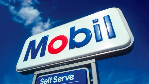
What it is — an identification programme for Mobil Oil: a logotype in a purpose-built alphabet,
a redrawn Pegasus, colour policy, integration with Eliot Noyes's station architecture;
packaging, vehicles, print, posters, signage, standards for the whole world.
Geismar: „not only the logo and a special alphabet, but also an extensive design
program that kept us very involved for some 30 years" (designboom). Eye 81: three
decades on „four basic ideas".
Composition — five letters of equal weight, geometric, sans serif; only
the O is red and a perfect circle, the rest blue. The circle in the word is the same circle as the round
canopies, round pumps and round displays at the station — „the idea of the red O
reinforces a design concept to use circular canopies, pumps, and display elements"
(cghnyc.com). The logotype is, then, a cross-section of the architecture. The Pegasus stands
separate: red on a white disc, on a blue field, large on the building itself.
Colour — two: blue and red on white. Red only on one letter and on
the horse — so red = Mobil at any distance, and blue = text.
Typography — Mobil Alphabet, purpose-built, single-weight (Eye 81). Not
Futura, though it resembles it — class of geometric grotesque (sans serif).
Message — the red O teaches pronunciation: „Mo-bil, not Mo-bile" (cghnyc.com). From the road, at
night, under the canopy: one red circle in a blue word. The word and the object say the same thing.
Why exactly this way — the client is building thousands of stations; the identity must survive
contractors, years and local regulations. Hence a rule (circle, two colours, alphabet), not
a finished drawing. This is the cleanest case of identitet-je-prirucnik after Otl Aicher.
What would kill it — a second red letter, or a gradient on the O „to make it look like
the sun". A programme stops being a programme the moment another element demands attention.
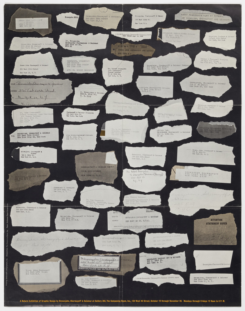
What it is — poster for their own exhibition, lithograph, 55.2 × 70.4 cm (MoMA; in the image
the format is upright, so the measurement is probably w × h — to verify). MoMA also lists
Bruce Blackburn as a co-author, which is suspicious for 1960 (Blackburn comes later) — likely
a record error, noted. Related record: A Return Exhibition… at Gallery 303, The
Composing Room (MoMA 155374, 1959).
Composition — black field; across it about 40 torn scraps of paper (white,
beige, grey), each with text (typewriter, small type, handwritten), arranged in a loose
grid of five columns. Nothing is aligned precisely; the grid reads from density, not from
edges. The title line is one small row at the bottom. The eye wanders — which is the
intent: the poster is a catalogue of fragments, not a single image.
Colour — two values: black ground, light paper. No accent.
Typography — the text on the scraps is found (memos, notes), not set for the
poster; typewriter and small-type class.
Message — "this is our worktable": the scraps of paper are what the studio actually
works with. At five metres: a dark plane with texture; at half a metre: you read sentences.
The same thing Corita Kent (Sister Mary Corita) and Herb Lubalin do with two audiences, here without a single
bold word.
Why exactly this way — an exhibition of designers who have no "style" but a method;
the poster must not resemble any of their own work, so it shows the waste of their
work. The Brownjohn line (typography as texture, Eye 4) is visible.
What would kill it — aligning the scraps flat into a clean grid. The torn edge is
the argument; a straight edge would turn it into a table.
Principles:mreza-drzi-haosjeftina-tehnika-kao-jezikTo verify against the image: what is written on the scraps (rejected drafts? client notes?) — from
the screenshot illegible; MoMA has no caption.
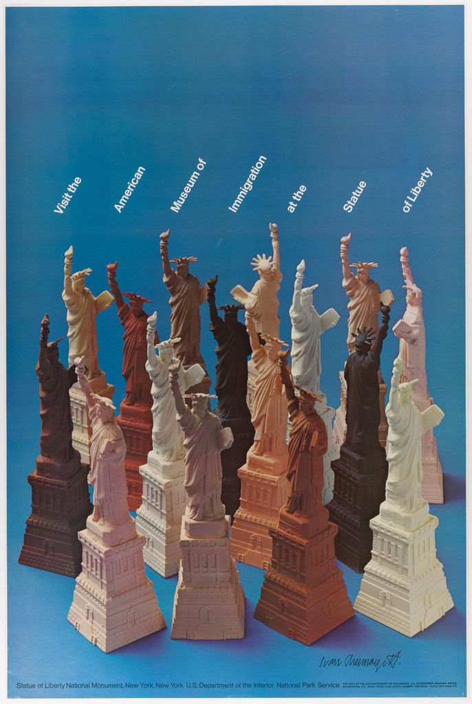
04 · Visit the American Museum of Immigration at the Statue of Liberty (1974)
What it is — poster, offset, 106.8 × 71.1 cm; Chermayeff, Geismar, Blackburn;
client National Park Service (credit at the bottom). Gift of Chermayeff to MoMA in 1977.
Composition — photograph: about 15 souvenir Statue of Liberty figurines of
different sizes and materials (copper, white plaster, pink plastic, brown, black, gold)
crammed into a mass that fills the bottom two-thirds; all raise their torch, so the mass
has one direction — up-right. The text runs in a single line along the angle of the torches, white,
small, as if the statues were holding it. The top third is empty blue.
Colour — blue ground (sky without sky: flat) and the motley of the objects. Not one
souvenir is the "correct" copper-green — all are the "wrong" colours, and that's the point.
Typography — white grotesque, one line, rotated; class only.
Message — a museum of immigration: the statue multiplied in cheap copies that
immigrants used to buy. Many colours, one gesture. At five metres: a crowd of figures waving;
at half a metre: kitsch. The message lies in the choice of objects, not in the composing.
Why exactly this way — the subject (immigration) is slippery to illustrate; found objects
from the souvenir shop are evidence, not opinion (Emory Douglas's rule, here applied for the state).
What would kill it — one statue, the real one, green. Multiplicity and the wrong colours are
the entire content.
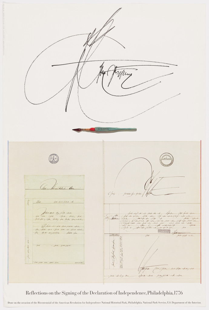
What it is — poster for an exhibition in Philadelphia for the bicentennial, offset,
106.7 × 71.2 cm; Chermayeff, Geismar, Blackburn.
Composition — white field divided into two registers. Top (~40%): one
enormous pen signature, black ink, with a flourish rising across the full width;
beneath it a small drawn quill (red tip, green shaft) laid horizontally like a rule.
Bottom (~50%): a rectangle with a thin orange-red frame — inside it, parchment
sheets, two round seals and the same signature repeated small. Below the frame
the title in a single line. The eye moves: signature → quill → document → title, top to bottom.
Colour — white, black, one warm colour (frame and quill tip), the beige of the
parchment. Colour marks only "exhibit" (frame) and "tool" (quill).
Typography — title in a small serif; the document in period calligraphy — found
material, not typesetting.
Message — "Reflections": the signature above is reflected in the document below — one
gesture and its trace. At five metres: one black calligraphic mark on white; at half a
metre: you read whose it is.
Why exactly this way — a state jubilee pulls toward flags and eagles; the studio (the same one
that did the US Bicentennial mark) takes the smallest object of the event — a signature — and
blows it up into an abstract drawing. The disproportion between the signature and the document is the
entire dramaturgy.
What would kill it — an enlarged portrait of the signer above the document. The signature is
abstract; a portrait would be illustration.
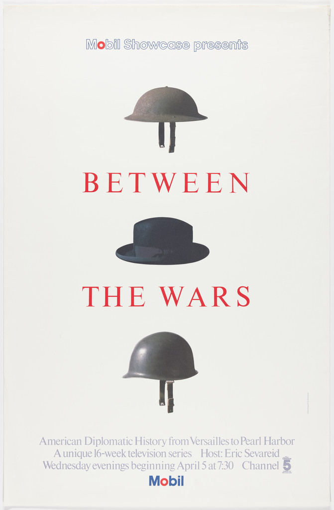
What it is — poster for a 16-episode TV series (American diplomatic history from
Versailles to Pearl Harbor, hosted by Eric Sevareid, Channel 5), offset,
116.8 × 76.3 cm; Chermayeff, Geismar, Blackburn.
Composition — white field, one central vertical: World War One helmet /
BETWEEN / civilian hat / THE WARS / World War Two helmet. Three photographed
objects and two lines of type alternate, equal spacing. A header "Mobil Showcase
presents" at top, three lines of credits and the Mobil logotype at bottom, small. The word BETWEEN sits
literally between the helmet and the hat: the sentence is also the layout.
Colour — white ground; letters red; objects in their own colours (brown,
dark grey, olive), no background, with a small shadow.
Typography — spaced serif capitals (Didone/transitional class, thin serifs),
red; Mobil Alphabet for the header. Specific typeface not confirmed.
Message — peacetime is the hat between two helmets. Without reading: three caps, the middle
one different. With reading: the title explained by the objects. One image, one sentence.
Why exactly this way — a series about history without images of events; an object from
the wardrobe is universal and needs no prior knowledge. The same recipe as Chase: find the single element
without which it can't work, and add nothing.
What would kill it — a background (map of Europe, flags). The objects work because their
ground is white like a display case.
Principles:nadjeni-predmet-kao-rijecjedna-slika-jedna-rijecserija-kao-identitet
(Mobil Showcase / Masterpiece Theatre series — fixed format: white or flat ground,
one photographed object, serif text, Mobil at bottom; the object varies)
To verify against the image: exact helmet models (Brodie / M1) — likely from the screenshot.
07 · The New York Philharmonic Phone Festival (1978)
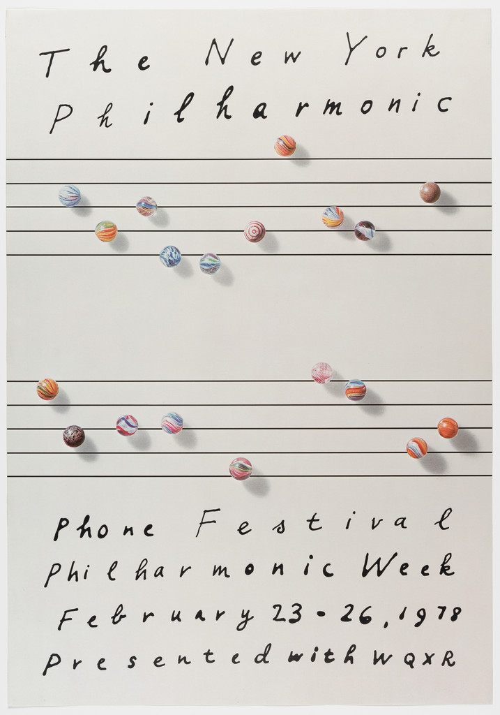
What it is — poster for a week of telephone fundraising (23–26.2.1978, with
radio station WQXR), offset, 87.6 × 61.2 cm; Chermayeff, Geismar, Blackburn.
Composition — cream sheet; four musical staves (five thin black lines each) across
the full width; on the lines, instead of notes, photographed glass marbles in
various colours, each with a small shadow — about 30 pieces, arranged like a melody (up and down,
groups of two or three). At top two lines of handwriting, at bottom four lines of handwriting, the letters
spaced as if they too were notes. Nothing else.
Colour — cream, black, and the spot colours of the marbles (blue, red, green, yellow, white).
Colour is only on the object, evenly scattered — no hierarchy, as in a melody itself.
Typography — Chermayeff's handwriting, printed letters, spaced; not typeset.
Message — children's marbles on an orchestra's staves: "play", "voluntary contribution", and
sound — glass on glass. At five metres: sheet music with colours; at half a metre: you see
that they are marbles and read the date.
Why exactly this way — a fundraising campaign must not look expensive, so handwriting and
a child's object instead of typesetting and a photograph of the orchestra. The staff is a grid (precise),
everything on it is hand-drawn or found — gest-rukom-nasuprot-rezu in its purest form
in this body of work.
What would kill it — setting the text in an actual font. The contrast between the machine lines and the hand
is the only contrast in the piece.
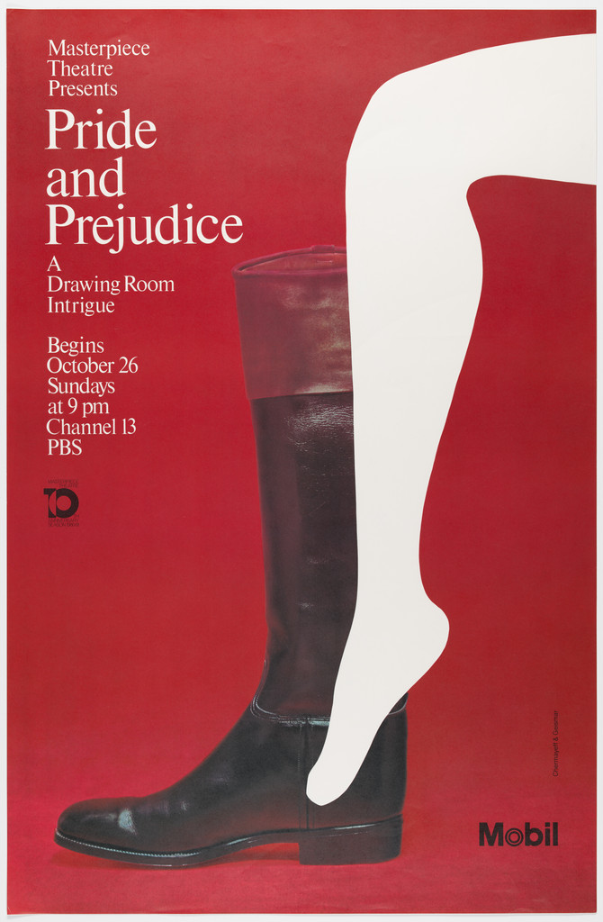
What it is — poster for a series on PBS Channel 13 (Mobil sponsor), „A Drawing Room
Intrigue", offset, 116,8 × 76,2 cm; Chermayeff, Geismar, Blackburn.
Composition — red field; right, across two-thirds of the height, a photograph of a
black men's riding boot; entering it (or exiting from it) is a white cut-out
silhouette of a woman's leg, knee bent, foot in the boot. Text top left, in a narrow
column, white, left-aligned; Mobil bottom right, PBS mark left. Eye path: white leg
(brightest) → boot → title.
Colour — three: red plane, black boot (photo, with sheen), white cut-out leg.
White is also the text, so the leg and the title belong to the same „loud" plane.
Typography — serif, mixed case, small, left; classical. Mobil logotype.
Message — a woman's leg in a man's boot = „intrigue in the drawing room" in one
object and one cut-out. From five metres: red, black, white leg. From half a metre:
you read what day and channel. The wit is in the meeting of two registers: photography
(boot) and paper (leg).
Why exactly this way — Austen without costumes and portraits: no actors to
photograph before the US broadcast, so a found object + cut-out. Same recipe as 06,
different ground.
What would kill it — the leg as a photograph. Then it's an ad for stockings.
NBC Peacock, 1986 — feathers reduced from 11 to 6, shapes regularised; colours =
the primary and secondary colours of television; the bird's body is an inverted feather
in negative; bird facing right „in the direction of reading" (cghnyc.com). bijeli-prostor-kao-oblik. record
PBS, 1984 — stylised face profile repeated three times, „putting the public in
public television" (cghnyc.com); Geismar: „everyman" (designboom). Replacement of
Herb Lubalin's P-head from 1971. PGDA has sketches (19472). record
Pan Am U.S.A., 1972 (MoMA 63.1972, offset 106,7 × 71,1) — MoMA has no image; label:
„cultural fantasies and ideals are projected through monumental imagery". Six Pan Am
posters in the collection (Eye 81). fotografija-je-layout.
Mobil Showcase — Minstrel Man, 1977 (MoMA 255.1980) — screenprint with lacquer
colour and lacquer finish, 116,8 × 76,5; the only solo Chermayeff in this series; not
viewed.
Mobil posters Whitney / Guggenheim, 1975 — text follows the Whitney's inverted
ziggurat, or the Wright building's „hat" (Heller). posudjeni-vokabular-autora for
architecture.
That New York, 1960 (Composing Room) — Brownjohn's typography as texture, to the
point of erasure (Eye 4). citljivost-na-granici.
9 West 57th Street — the red nine, 1972/74 — a numeral as a sculpture on the
pavement, „architectural joke" (Heller). nadjeni-predmet-kao-rijec in reverse
direction: a letter becomes an object.
US Bicentennial, National Geographic (1967), Xerox, Smithsonian (1999, sun instead
of 13 variants), Time Warner (1989, Geissbuhler — eye/ear) — per Eye 81 and
cghnyc.com, not viewed.
New local tags (awaiting a second author, entered in _PRINCIPI.md):
- prazan-znak-puni-klijent — an abstract mark without meaning that gains meaning
through repetition; works only with a budget for repetition (01).
- nadjeni-predmet-kao-rijec — a photographed everyday object stands in place of a word
or figure: a hat = peace, a bead = a musical note, a boot + leg = intrigue, a
souvenir = an immigrant (04–08). Difference from Herb Lubalin's slovo-nosi-ideju:
there the letter becomes an image, here the object becomes a word.
Bridge to practice: poster · graphic design · motion
Poster
Recipe 06/08: white or one flat colour, one photographed object cut out without a
background, a small shadow, text in one class. Before Illustrator — the cupboard: which
object from the subject's world says the title without reading it? For YT gaming:
controller, cable, card — not a game screenshot.
Chase test at 4 mm: shrink every mark and thumbnail to 10% and convert to a single
colour before it's shown in colour.
Graphic design
Write identity as a rule, not as a file: „circle in the word = circle in space" (Mobil).
For LØADERRØR: which element of the mark repeats in the UI, thumbnails, the title
sequence — if none does, you have a logo, not an identity.
Emptiness as an element of the mark: draw the hole first, then the body around it
(Chase, NBC).
Motion
The Chase wedges are a ready-made rotational animation: four elements, one angle,
a shift of 45° each. Study below.
A poster series = a fixed mode: build a template in AE with an empty slot for the
object; every video changes only the object and one colour (like Mobil Showcase).
Bad imitation
Abstract mark without a budget. A small studio draws „its own Chase" —
geometry without meaning — and doesn't have a hundred million appearances to give it
sense. It's the shape that's copied, not the condition (Geismar: „that exposure would
enable them to establish a more abstract mark").
Object + background. A hat between helmets, but on a sepia photograph of
trenches. The object works as a word only in the emptiness of the vitrine; the
background pulls it back into illustration.
A red O everywhere. An accent on one letter copied as „every other letter in
colour". Mobil works because the red is one letter and one horse; two accents
equal zero.
The brief through their eyes
For the LØADERRØR mark Geismar would first ask where the mark will live twenty times over
(favicon, title sequence, thumbnail, T-shirt) and would look for one geometric hole that
survives at 4 mm in black. Chermayeff, for the first thumbnail of the gaming series, would
go through a box of old cables, cut out one object with scissors and place it on a flat
field with one word. Neither would open a reference folder of other designers.
Exercises
The hat in between (45 min): the title of one of your own episodes — find three
everyday objects that say it without text; photograph on white, cut out, place
vertically with the title in between. Constraint: no background, one typeface, one
letter colour.
Hole first (30 min): draw a mark starting from an empty square; add shapes only
around it; stop when the square reads without a line. Test at 4 mm in one colour.
Beads on notes (30 min): sheet music + any small objects (buttons, screws) as
notes; title by hand. Constraint: the object must cast a shadow, the text must not be
a font.
Motion study
Chase, 5 s, AE: four wedges as shape layers; frame 0 — one square; each wedge enters with
a 45° rotation around the centre with a 6 f stagger; final frame — an octagon with the
empty square that was NEVER drawn. One shot, one event (the hole appears).
Rebuilding the benchmark
Benchmark: Between the Wars. Skeleton .svg (once the image is local): format
116,8 × 76,3; axis of symmetry x = 50%; five elements at y ≈ 17%, 30%, 44%, 57%, 70%
(estimate from screenshot, to measure); header y ≈ 8%, credits y ≈ 90–95%. Task: 45 min
in Illustrator, three photographs of hats from the internet, without looking at the
original; compare the spacing.
Notes on sources
Chase 1960 / 1961 — publicly presented 21.11.1960 (Logo Histories, Wikipedia
Geismar); cghnyc.com and the firm's Wikipedia say „1961". Here 1960, with a note.
Brownjohn's departure 1959 / 1960 — Homans (Eye 4): the break in winter 1959,
departure half a year later; both years are „correct" depending on what's being
counted.
Chermayeff's death 2 / 3.12.2017 — Heller 2.12; the firm's Wikipedia 3.12.
Chermayeff's teacher at Yale — Wikipedia: Herbert Matter; v1: Alvin Eisenman
(Eisenman ran the department, so both may be correct). Not resolved.
MoMA 6292 credits — lists Blackburn for a work from 1960; likely a record error.
MoMA 6292 dimensions — 55,2 × 70,4 entered as h × w, the image is upright.
Pan Am U.S.A. (MoMA 4902) — „Image not available", not analysed; v1 cites it with
an image — the link is probably a different work from the Pan Am series.
v1 quote dropped (not found); v1's „Chase 1960 — founding document" stands as a
judgement, not a source.
Analytical text on individual posters — not found either in Eye or with Heller;
fields 2–7 for 03–08 are a reading of the image done in this session. Main gap: the
book Identify (2011) and the 1979 AIGA medalist text (aiga.org 404).
Mobil year — 1964 (logotype) vs. the end of the programme with Noyes 1965/66;
entered as 1964.
Cooper Hewitt blog not checked for Chermayeff (a possible source for the collages).
Difference from its pair
Lester Beall ↔ chermayeffgeismar: same year, 1960, two abstract marks for major American
companies — International Paper is a letter (IP as a tree), Chase is a hole; Beall
writes identity as a regulation for the state, C&G build it as an empty vessel that the
client's budget fills.
Paul Rand ↔ chermayeffgeismar: IBM is a stripe that holds three letters together, Mobil is one
letter that becomes architecture; Rand is witty in the mark, C&G are witty in the poster but
deliberately mute in the mark.
Herb Lubalin ↔ chermayeffgeismar: Lubalin turns a letter into an image (& as a fetus), C&G
turn an object into a word (hat = peace); same PBS — Lubalin's P with a face 1971, C&G's three
faces without a letter 1984.