movement graphics — the newspaper as poster, drawing that imitates woodcut, photomontage
Revolutionary Artist and Minister of Culture, Black Panther Party (1967–early 80s); designer of all issues of The Black Panther newspaper except the first (~537 issues, 1967–1980) Grand Rapids, Michigan → San Francisco (from 1951) / Oakland
„Recognize that art is a powerful tool, a language that can be used to enlighten, inform and guide to action." — point 4 of his Political Artist Manifesto (MoMA Magazine, Adler/Gardner 2021). The v1 quote „Art is a weapon in the struggle" was not found verbatim in any source; the closest match: „Culture is a weapon" (Culture Keepers) — dropped as unconfirmed.
Biography
Born 24.5.1943 in Grand Rapids (Michigan); in 1951 the family moves to San Francisco, Fillmore. At thirteen, over street gambling, 15 months in the Youth Training School in Ontario (California) — in the reform school's print shop he does labels and sees typesetting, logotype, illustration for the first time. That is his first education, and it stayed decisive: he knew how printing worked BEFORE he knew how to draw.
City College of San Francisco, Commercial Art (Design Week: 1964–66; Wikipedia: from 1960): figure drawing, lettering, layout, pre-press, offset, basics of animation. In parallel he works in a screenprint factory and does paste-up in a department store. A teacher tells him his style is „not commercial enough"; another that his layout, modelled on Ebony, is „ten years too early". Alongside school he goes to SF State to hear Baraka, Carmichael, H. Rap Brown, makes flyers for the Black Arts Movement (Marvin X, Black House), prints his first political posters at the Marcus Books bookstore.
In January 1967 he meets Huey Newton and Bobby Seale at Cleaver's apartment; the Party has existed a few months and put out one issue of the paper, hand-set. Douglas offers what he knows — printing — and from the second issue on he designs every one: about 537 issues through 1980 (Tommasino), i.e. „the early 80s" (MoMA). Title: Revolutionary Artist, then Minister of Culture; he does the whole identity of the Party — the paper, posters, buttons, greeting cards. The paper comes out weekly; peak circulation in 1970 — MoMA says over 400,000, Tommasino/Bloom over 100,000; the figure is not agreed upon. Selling the paper was a membership obligation; distributor Sam Napier was killed in 1971 in New York distribution work — the paper was a dangerous job, not a cultural project.
Working conditions (Letterform Archive, in his own words): plain tables, plain lighting, Elmer's glue and rubber cement, non-repro blue markers, an IBM Selectric, Formatt transfer letters (not Letraset — because it has a baseline strip underneath so a word can be set without damaging the letters). One or two colours per issue (black + one), because there was no more money; tones and patterns came from transfer film instead of halftones. From the early 70s, phototype — first a paper strip from the Sun-Reporter, then Compugraphic. The rest of his life: political artist, 30+ years at the Sun-Reporter, AIGA medal 2015, SFAI honorary doctorate 2019, MoMA acquisition of 30 issues in 2019.
Influences
Studied with
Youth Training School, Ontario (California), the institution's print shop — 15 months as a 13-year-old; product labels, first encounter with typesetting and logotype (AIGA 2015)
City College of San Francisco, Commercial Art — figure drawing, lettering, layout, pre-press, offset, animation basics; years 1964–66 (Design Week 2014) or from 1960 (Wikipedia) — discrepancy
screenprint factory and department store in SF (layout, paste-up, shop windows) — internship alongside school (Design Week 2014)
Charles Bible — neighbour, painted portraits of Malcolm X serially; from him the assembly-line technique (Design Week 2014)
Borrows from
Charles White — calendar reproductions from childhood (Design Week 2014; MoMA 2021)
Elizabeth Catlett, Aaron Douglas — figurative line of African American graphic art (MoMA, Gardner 2021)
OSPAAAL and the Cuban solidarity poster — mutual: the Cubans remix his drawings, he calls it solidarity, not plagiarism (MoMA 2021; Criterion)
poster of China, Vietnam, Palestine, the anti-war movement (Design Week 2014)
woodcut as LOOK, not technique — Kollwitz, Méndez / Taller de Gráfica Popular as a tradition he imitates with marker (MoMA 2021; Culture Keepers)
Ebony magazine — a layout his teacher told him was ten years too early (Design Week 2014)
Black Arts Movement in SF — Marvin X, Baraka, Marcus Books (first political posters printed there) (Culture Keepers)
Influenced
OSPAAAL (Cuba) — remix of his drawings on solidarity posters
Basta Ya (Los Siete de la Raza, SF, 1969) — shared pages and visual language (MoMA 2021)
Akinsanya Kambon (Mark Teemer), Black Panther Coloring Book 1968 — sacramental offshoot (Tommasino 2021)
Reform school print shop (Ontario, CA) → City College SF (commercial art) → screenprint factory and paste-up. No formal mentor; he says himself he is „basically a self-taught artist with a minimum of professional training" (Design Week). Closest thing to a mentor: Charles Bible, a neighbour who painted Malcolm X serially — from him the production line, not the style.
What he steals
Woodcut as look: „I used to want to do woodcuts, but woodcuts took so long. So I began to mimic woodcuts by playing with markers and bold shapes and shadows" (Culture Keepers). MoMA ties this to Kollwitz and Méndez — that is the curatorial lineage, he doesn't name it himself.
Charles White (calendars from childhood), Elizabeth Catlett, Aaron Douglas — the figurative line of African-American graphics (MoMA).
OSPAAAL / Cuban poster — „a whole movement of posters to be in spirit with" (MoMA 2021). The relationship runs both ways: Cubans remix his drawings, he calls that solidarity.
Ebony as a layout model with lots of photographs; Black Arts Movement as audience and client before the Party.
He doesn't steal from the Swiss school, doesn't steal from Push Pin. His language comes from the print shop, not from design school — that links him to Corita Kent (Sister Mary Corita) (screen printing from advertising) and to Lester Beall (the REA poster for an audience without newspapers).
Who he influenced
OSPAAAL (direct remix), Basta Ya (SF, 1969 — they shared pages), the Sacramento chapter's Coloring Book (1968), and afterward: the entire vocabulary of the American protest poster to this day (MoMA 2021: „stylistic solidarity among the many different groups"). Bouchra Khalili (2019). In this project: no successor has been covered yet — Barbara Kruger (1985) is closest in „text + photograph + one colour", but from the opposite ideology of form; to verify once she is covered.
All the newspaper front pages share the same format: 44.8 × 29.2 cm, two-colour offset on newsprint, the masthead always the same (THE BLACK PANTHER in condensed grotesque, subhead Black Community News Service, price 25 cents, a portrait of Huey Newton in the right corner). That means Douglas designs every time within a fixed frame: the top ~15% is taken up, the bottom „INSIDE:" strip is taken up, and between them there's ~70% of the height for the image. All the analyses below refer to that 70%.
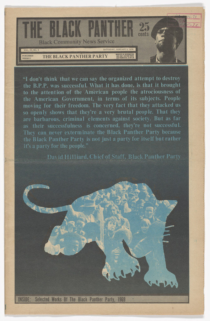
01 · The Black Panther, vol. 4, no. 5 — panther made of a crowd (1970)
What it is — front page of the January 1970 issue („Selected works of the Black Panther Party" is the issue's theme). Two-colour offset, black + light blue, newsprint, 44.8 × 29.2 cm. Publisher BPP.
Composition — the entire field below the masthead is a solid black plane. In it two elements: above, a block of David Hillard's quote set in blue type (left-aligned, ~10 lines), below, the silhouette of a panther leaping, head left, tail right, diagonal from bottom-left to top-right. The silhouette isn't a flat colour — it's filled with a photograph of a crowd (faces, raised arms) in the blue tone. The eye enters at the lightest point (the quote), falls onto the panther, then reads the faces inside it. Nothing else on the page.
Colour — two: black and one blue. Black is the ground, not a line; blue does both the text and the image. The photograph inside the panther is the same blue — so one plate carries both the word and the image, which is as cheap as possible yet looks like three layers.
Typography — masthead fixed. The quote is in a serif text cut, medium size, no headline — it reads as a statement, not a headline. Typeface name not confirmed.
Message — the panther is made of people: the Party IS the community. From five metres: a black page with a blue beast (a sign). From half a metre: faces within it (an argument). It passes the three-second test — the panther silhouette was the Party's most recognisable sign.
Why exactly this way — two colours and poor paper: the black plane hides registration and stains, the photograph inside the silhouette doesn't need fine halftone resolution because it's already masked. Douglas turned his limit (one extra colour) into an idea (one colour = one people).
What would kill it — a white background. On white, the blue panther would be a logo, and the photograph inside it noise; on black it's the only light thing, so the only thing you look at.
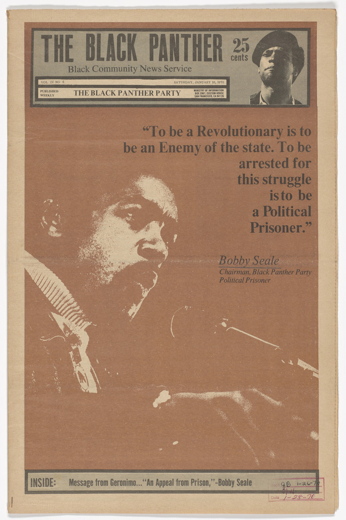
What it is — front page, 1970. Two-colour offset, black + brown (sepia), 44.8 × 29.2 cm. Theme: Seale as a political prisoner (the Chicago/New Haven trial).
Composition — the entire image zone is one photograph of Seale, three-quarter profile, head in the lower half on the left, hands and microphone below. The top-right quadrant is empty photographic tone (a wall) and holds the quote, right-aligned, in five stepped lines that narrow toward the face — the text „falls" onto the head like a speech bubble without a frame. The caption „Bobby Seale, Chairman…" in italics below.
Colour — black + brown, but the photograph is posterised: no halftone, just three values (paper, brown, black). The sepia makes it look like an old/documentary image, not reportage.
Typography — serif cut, capitals and lowercase, with quotation marks; the stepped right alignment isn't decoration but follows the gap in the photograph. Typeface name not confirmed.
Message — „To be a revolutionary is to be an enemy of the state…": the face and the sentence carry equal weight. From five metres: the portrait. From half a metre: the sentence. There's nothing third.
Why exactly this way — posterisation is the only way for a photograph to survive newspaper web printing in two colours without a halftone screen; Douglas wasn't choosing a „style", but what could actually be printed. This is Douglas when he isn't drawing: it shows that the method (posterise, one colour, text in the gap) is the same as with drawing.
What would kill it — a halftone (real screen) instead of posterisation: the face would go grey, the brown would look like a colour error.
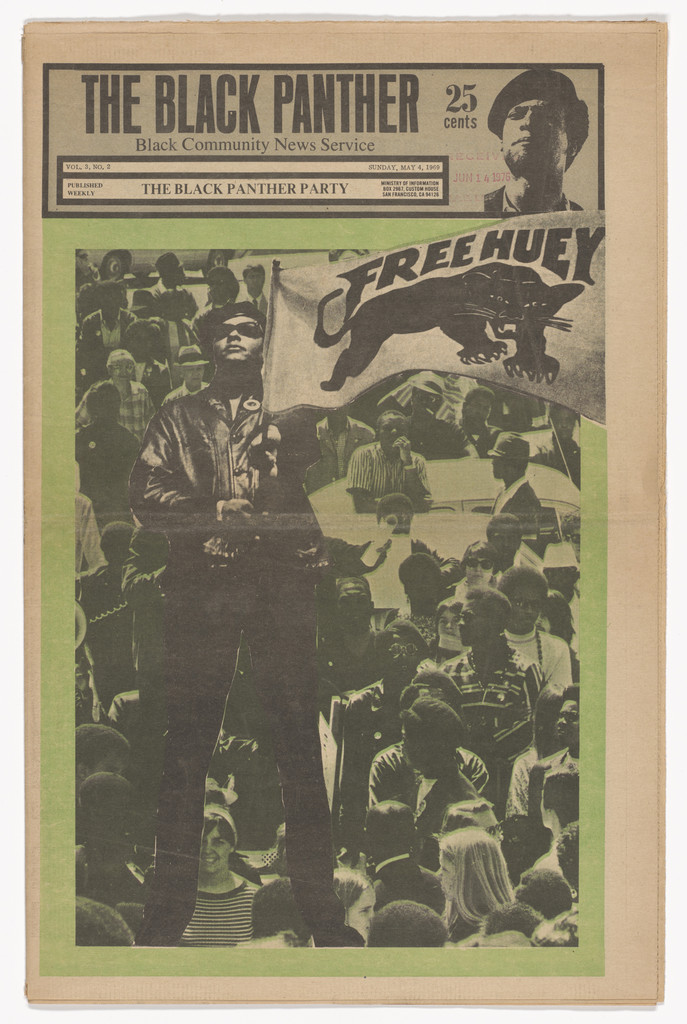
What it is — front page, 4.5.1969. (first issue in the MoMA series). Two-colour offset, black + green, 44.8 × 29.2 cm. MoMA label, 2021: Douglas "often adapted his most successful drawings for multiple formats — leaflet, posters, even greeting cards" and cites his statement about feedback from the community as key.
Composition — photograph of a rally: the crowd as a textured field across the whole area, one man in a beret stands upper left, above the crowd, in a dark jacket — the only large dark shape. Upper right a banner with hand-lettered FREE HUEY and a drawn panther. Two points (the man, the banner) hold the upper third; the lower two-thirds are a mass of faces.
Colour — green across the whole photograph (duotone effect: black plate + green plate), paper visible in the highlights. Green isn't "meaning," it's the colour of the issue — the next issue is brown, then orange. Colour by issue is edition coding, like Armin Hofmann by season.
Typography — FREE HUEY isn't typeset but lettering on the banner, within the photograph; the masthead is fixed. There's no other text in the image — the title is in the image.
Message — numbers. "We are many, and we have one man locked up." At five metres: a green mass and two words. At half a metre: individual faces — the reader looks for themselves in the crowd (v1 calls this "the people in the pictures were the readers"; accurate as description, unconfirmed as a quote).
Why exactly this way — photograph as witness (like Josef Müller-Brockmann Auto-Club and Lester Beall REA II): a drawing would be an opinion, this is proof that the rally happened. Douglas draws when he needs to show the enemy, and photographs when he needs to show us — that's consistent throughout the paper.
What would kill it — a title set in type over the photograph. The banner is already the title; a second one would double it.
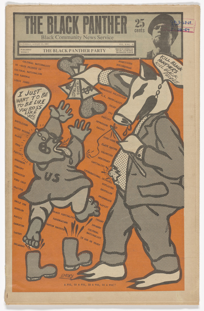
What it is — front page, August 1969. ("Kill black panther, kill black people"). Two-colour offset, black + orange, 44.8 × 29.2 cm.
Composition — an orange field; on it two pigs in clothing, left to right: a small one in a "U.S." uniform falling backward with raised arms (and a speech bubble "I just want to be… boss like…"), a large one in a suit with a pocket full of money, flies around its head, and a speech bubble upper right. Both in profile, like a comic strip; their legs hang over the bottom edge. Behind them, across the whole field, small grey text in columns — background "noise" made of words. It reads left to right as a sentence: small pig → big pig.
Colour — orange as a field (not as an accent), black as line; grey tones from transfer film (dot screen on the suit, on the coat — Letterform Archive counts up to ten different patterns in a single illustration from July 1970). There's no third colour; all the "colours" are screens of a single black.
Typography — the speech bubbles are hand-lettered, in capitals, clumsy — deliberately like a comic, not like typesetting. The background text is small type (specific typeface not confirmed) that works as texture, not as reading.
Message — the cop is a pig, the employer/politician is a bigger pig; the small one is afraid of the big one. At five metres: orange and two thick outlines. At half a metre: speech bubbles and background words. The pig as a sign for police: Culture Keepers says the original drawing was clip-art that Newton brought in — one source, to verify.
Why exactly this way — thick line + flat field + film screen = what survives poor rotary press registration (Letterform: "thick marker lines… masked imperfect newspaper press registration"). Caricature (an animal in clothing) is a language that doesn't require reading: a pig in uniform is read even by a child.
What would kill it — a realistic policeman. As soon as it's a human, the image becomes an opinion about a person; as a pig, it's a statement about a role. And: a thin line — it would disappear in plate misregistration.
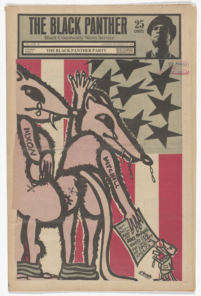
What it is — cover, September 1969 ("Panther's wanted dead for conspiracy of exposing America"). Two-colour offset, black + red, 44.8 × 29.2 cm.
Composition — the whole area is an American flag: red stripes across the full width, upper right field with black stars (not white — black on paper). Over the flag, two rats in profile, one behind the other, facing right; on their bodies the names NIXON and MITCHELL written by hand, like a tattoo. The first holds a paper (wanted poster). Bottom right, a tiny figure with a pig's head in a suit, scale 1:8 relative to the rats. The flag gives horizontal stripes, the rats a diagonal — two systems of lines, one over the other.
Colour — red only in the stripes (flat areas), black for all lines, stars and rats; grey screen tint on the bodies. The flag is "drawn" with one colour that belongs to it — red is at once a patriotic code and a warning colour.
Typography — names as lettering on the body; the wanted poster small, in the hand. No headline set in type.
Message — the government (president + attorney general) are vermin living on the flag. From five metres: flag + two silhouettes. From half a metre: names and paper. Here you see Douglas's system of signs: police = pig, politician = rat (or bigger pig), community = photograph or dignified drawing. The sign carries rank.
Why exactly this way — the flag as background is a ready-made, universally recognised pattern (stripes) that gives structure without a grid; the rat is clip-art logic — the animal is recognised from its silhouette. All of it survives bad printing.
What would kill it — white stars on a blue field (the real flag): a third colour that doesn't exist here, and realism that pulls the symbol back into the "real" flag. Black stars are a decision, not an error.
What it is — the back page of the paper and simultaneously a poster. Getty copy: lithograph on paper, 57.1 × 38 cm, 1969. The newspaper version seen in the panel (PGDA, c. 1969) is two-colour, black + brown. The Getty version is blue — same drawing, different colour in a different format (confirms the MoMA label on the drawing's adaptation across multiple formats).
Composition — a boy frontal, in the upper two thirds, mouth open (shouting), in his right hand a raised copy of the paper (cover with the panther) upper right, in his left hand a paper reading ALL POWER TO THE PEOPLE lower left. The two papers are two light rectangles framing the head; the head is the third, largest element. Triangle: paper upper right — head — paper lower left. Sleeves rolled up (Getty: work, not pose).
Colour — one colour for the background (brown in the newspaper, blue with gradation at Getty), black line, paper as white. Getty describes a "subtle gradation from light to dark" of the blue — so in the lithograph version there is a transition; in the newspaper version there is not (to verify).
Typography — ALL POWER TO THE PEOPLE hand-drawn, capitals, in three lines, as the headline of the paper the boy is holding — the text is an object in the image, not a caption on the image. The paper's masthead in miniature is the actual logotype.
Message — Getty (Smarthistory): "It's the newspaper that is the weapon." The child sells the paper and shouts the slogan: distribution is shown as a heroic act. From five metres: the face and two white rectangles. From half a metre: the headline in his hand and the panther on the cover in his hand — the image contains itself (a paper within the paper).
Why exactly this way — the back page is a poster by design: Getty says it was made for a wall, a lecture, a street corner. The v1 claim that the back page of every issue was a poster "designed to be torn out" — Getty and Letterform confirm this in a general sense (a poster for distribution), not literally "every issue". Douglas builds distribution into an artefact: the paper is bought, the back page gets pasted up, the wall advertises the paper.
What would kill it — the boy in profile or with his mouth closed. Frontality and the open mouth are the only things that make him a voice, not an illustration of a vendor.
What it is — back page of the issue from 21.8.1971. (PGDA; by then already Intercommunal News Service). Two-colour offset, black + red, photomontage + transfer screen. Dimensions not given; full page.
Composition — child in close-up, head fills the bottom two thirds, looking straight ahead. Behind the head red rays from a single point behind the crown, across the entire upper half. The hat is drawn and filled with dense dot screen; hat band with circles; on the band a badge with a photograph of Huey. Glasses — two photographs are mounted into the lenses (children at a table, presumably the free breakfast). Bottom right, in front of the shoulder, a photograph of two small children, cut out. Title one line, top, small relative to the image. Eye path: face → glasses (photographs) → badge → children below → title last.
Colour — red only in the rays; everything else black and screens of black (hat, photograph skin tone). Red is background energy, not an element — as in OSPAAAL posters (Serrano 1968, which MoMA places beside this one).
Typography — title in capital grotesque, thin, small; class (Letterform: titles Futura/Helvetica/gothics), specific typeface not confirmed. The title is barely louder than a signature — the image speaks, the text signs it.
Message — the survival program (breakfast, clinics) seen through the child's eyes: literally, in the glasses. From five metres: rays and face. From half a metre: three photographs within the image — each one is proof of the program. This is Douglas 1971: from "kill the pig" (1969) toward "we feed the children" — MoMA/Culture Keepers note the same shift.
Why exactly this way — a photograph inside the glasses is the cheapest "window" into another scene: no perspective, no second frame, no third colour. The screen on the hat gives tone without halftone, because a newsprint halftone would not have held up (Letterform: transfer film as a substitute for multiple colours).
What would kill it — rays in a colour other than red, or a gradient inside them: the sunburst works because it's one flat colour in sharp wedges; softness would turn it into a stock-catalogue background.
What it is — poster, printed in Paris, 1970s (V&A). Technique and dimensions not given. The V&A lists it as Death to the Fascist Pigs; the image carries French text: „S'ils condamnent Bobby Seale, nous retiendrons la nuit et l'Amérique ne connaîtra d'autres lumières que les flammes du brasier révolutionnaire" — thus a solidarity poster for the Seale trial (1969–70), most likely a French reprint of Douglas's drawing with new text. The V&A title and the content don't match — noted, not resolved.
Composition — a red field with white rays from a point behind the heads. Two men frontal, to the waist, filling the bottom two thirds; the first (left, with a cap) holds a rifle diagonally across his chest, the second (right) behind him, same height. Text at top in a white field, four lines, with a small black panther to the right. No perspective; the figures are flat outlines.
Colour — red, black, paper. The rays are the paper (negative) — so here too red is the field, white is the light. Three values, two plates — most likely screenprint or two-colour offset.
Typography — semi-bold grotesque, capitals, left aligned, in a "window" above the image. Class; specific typeface not confirmed. The French setting is not Douglas's — added in Paris.
Message — a threat (if you condemn Seale, America burns). From five metres: red, rays, rifle. From half a metre: the sentence. The image is Douglas's, the sentence is the French committee's — the same drawing carries a different message in a different country, which is precisely OSPAAAL logic.
Why exactly this way — outline + flat colour + rays = a drawing that survives any reproduction in any country, even when copied from a newspaper. Douglas designed for remix, before that word existed.
What would kill it — the actual title Death to the Fascist Pigs set large across the drawing: the text would kill the rays, and the rays are the composition.
What it is — back page of the paper, 1969. (PGDA). The reproduction (NYT) shows four colours: pink, purple, yellow, black — more than the paper usually carries; either this is a poster version or a later reproduction. Technique and dimensions: to verify.
Composition — woman frontal, to the waist, head upper left of centre, rifle diagonal (upper right → lower left) alongside a spear/rod; pink rays from a point behind the head. Title upper right, three lines, right aligned, in the empty wedge between the rays. The figure is large — shoulders run to the edges.
Colour — purple skin (!), pink rays, yellow headscarf, black line as thick as a woodcut. The skin colour is not realistic — it's a colour plate, not a description. Same procedure as the green rally (03): colour belongs to the issue, not the subject.
Typography — semi-bold grotesque, capitals/lowercase, three lines; class. The title is the only typeset element and fits into the gap between the rays as in 02 (text in the image's empty space).
Message — a woman with a weapon as subject, not as decoration: PGDA cites Douglas — women were "reflection of the party", ran chapters, went to prison. From five metres: rays, afro, rifle diagonal. From half a metre: title about solidarity with the world — the message is international, the image is local.
Why exactly this way — a thick black line keeps the colours in register; rays give energy without a second figure; the portrait is dignified (v1: "dignity is a compositional decision: where you put the eyeline" — as description exactly right; here the gaze is straight at the viewer, head slightly above centre).
What would kill it — realistic skin colour. Purple makes it read as a sign (woman-as-symbol), not as a portrait of one woman; realism would send it back into illustration.
From the v1 list (23 items: 21 PGDA, 1 V&A, 1 SFMOMA, 2 MoMA) and the MoMA series (30 issues, May 1969 – February 1970). Not examined in this session except where noted.
The Black Panther vol. 3, no. 13 (Avaricious Businessman), 1969 — MoMA 401439; cited by MFA Boston; pig/businessman — neprijatelj-kao-zivotinja
vol. 3, no. 14 (United Against Fascism), 1969 — MoMA 401440 (Oakland conference, July 1969)
vol. 3, no. 17 (Eldridge Cleaver's new baby), 1969, with Yolanda Lopez — MoMA 401441; inside the Ten Point Program (MoMA 2021 reproduces)
vol. 3, no. 19 (Kidnapped), 1969 — MoMA 401443
vol. 3, no. 20 (Huey Newton, Eldridge Cleaver, Bobby Seale), 1969, with Yolanda Lopez — MoMA 401444; MoMA audio 2 min; front and back reproduced together in MoMA 2021
vol. 3, no. 22 (Our fight is not in Vietnam), 1969, with Yolanda Lopez — MoMA 401446
vol. 3, no. 25, back page (Oakland 1968, Fascism, Chicago 1969), 1969 — reproduced in Tommasino 2021
vol. 3, no. 29, back page (An unarmed people are slaves…), 1969 — a fighter with a photograph of a baby pinned to his coat (MoMA 2021, Adler/Gardner) — the clearest example of fotografija-u-crtezu; MoMA compares it with Natalia Pinus
vol. 4, no. 2 (Fred Hampton Murdered), December 1969 — cited by MFA Boston; PGDA 1072 lists Hampton as "vol. 2, no. 18" — the PGDA designation is wrong (vol. 2 is 1968, Hampton was killed 4.12.1969)
vol. 4, no. 8 (Free Breakfast for School Children), 1970 — Tommasino 2021
Pig machine, 1969; Vote for survival, 1972; It's all the same, 1972; Good old American peace, 1973 — AIGA 2015 (titles, no record)
Hey, Mister, what you doing to the poor man… — PGDA 4171, undated; survival period
Free the SF8, 2009 — SFMOMA 2018.68 (the only work in SFMOMA's online collection); the v1 "o" link is this one
Reparations, 2009 — accordion-fold book with his own lettering (Letterform Archive)
Landmine, 2011; Free the land, 2014 — AIGA 2015
MoMA lists 30 works online, all 1969–70 from Patrick McQuaid's box; PGDA "Design Lecture Series with Emory Douglas" (v1 item 2) is not his work — a poster about him, excluded
Rejected from v1: "scale mismatch" (not present anywhere except the tiny pig in 05, where it's a gag, not a principle); "Zip-A-Tone/Letratone" as a name — Letterform says transfer film, brand unconfirmed, goes as "transfer screentone".
Series — what stays constant: a fixed frame (masthead + INSIDE band, ~70% of the zone) and a fixed mode (black + one colour, thick line, text into the empty space of the image); colour varies by issue number, and that's the only change the reader sees from the street — colour is the date. Type: fixed layout (like Lester Beall REA) + fixed mode (like Alvin Lustig), both at once.
Bridge to practice: poster · graphic design · motion
Poster
Colour belongs to the number, not the subject. A poster series (festival, season, YT series): one colour per piece, the black line stays the same; nobody asks why the skin is purple if the whole page is purple. Illustrator: the drawing in pure black on a separate layer, the colour field underneath as a single swatch — swapping the colour is one click, the series is done.
Text into the empty space of the image (02, 09). Image first, then find where the tone is empty, then align the text there toward the image (stepped). Don't reserve a "place for the title".
Rays as background: from one point behind the head, flat colour, sharp wedges, no gradients. Illustrator: Polar Grid Tool or one triangle + Rotate/Copy (Ctrl+D) around the point.
Thick line as a print test: if the poster is printed cheaply (riso, screenprint, copy shop), a line 3–4 pt thick on A3 can handle a 1 mm plate shift; a thinner one can't.
Graphic design
Fixed frame + free zone (01–05). For a YT channel / series: the header (logo, name, episode) locked into the top 15%, everything else changes every time. Douglas's front page is a thumbnail system before YouTube.
Photograph into a drawing's mask (01, 07): a crowd in a silhouette, a scene in the glasses. Photoshop/Illustrator: clipping mask, photograph posterized to two values, in the colour of the field — one "layer" looks like three.
A sign system with rank (pig/rat/photograph): before drawing, decide who is the sign and who is the human. For satire about gaming culture: who is the "pig" (the publisher? the algorithm?) and who is the photograph (the player)? Without that decision every character looks the same.
Motion
Posterization instead of screentone (02): Threshold/Posterize at 3 levels in AE holds up at any bitrate; halftone bleeds under compression. For documentary inserts in animation — posterize, colour with one colour, done.
Rays as motion: a radial background is already a "burst" — animate a 2–3°/s rotation and nothing else; energy without an extra element (see simetricna-os-drzi-haos in Tadanori Yokoo for the radial version).
Photograph in the glasses (07) = picture-in-picture without cutting: in MOHO a layer mask shaped like the lens, video/photograph inside; the character stays in frame, the scene changes in the eyes.
Bad imitation
The pig gets copied, not the system. Someone draws the "villain" as an animal, and the "good guys" the same, as a drawing — so everyone ends up looking like a comic strip. In Douglas the enemy is a caricature, and the community is a photograph or a dignified drawing; the rank is in the REGISTER, not in the facial expression.
Thick line as style, on screen, in 4K. The line was a response to rotary press registration; without that constraint it's just a "retro woodcut" filter. If you don't have bad printing, you need another reason (legibility at a 120 px thumbnail is legitimate).
Rays plus gradient plus texture. A sunburst works as one flat colour; the moment you add a gradient or noise "for depth", it becomes a stock-photo background. Douglas's depth is in the photograph inside the drawing, not in the background.
A large title over the image. For him the title is either inside the image (a banner, a leaflet in a hand) or in the empty space of the image; put a large block of type over the drawing and you get a poster with two messages fighting each other.
The brief through their eyes
For YT gaming animations: he'd first ask who the audience is and what they need to see in three seconds without reading — then he'd decide who in the series is the pig (a caricature, the same every time) and who is the human (a photograph or a dignified drawing). Then he'd lock the frame: the channel logo up top, one colour per episode, the same black line. The thumbnail would be the back page of the paper — something the viewer wants to stick up, not just click.
Exercises
One colour per issue. Take one drawing in pure black line. Make four versions: the field green / orange / brown / red, with the text in the empty space of the image aligned differently each time. Constraint: nothing changes except the swatch and the text position. Goal: to see that colour carries the "date", and the drawing carries the identity. (45 min)
Photograph in a silhouette. A silhouette of one figure/object, with a posterized photograph of a crowd or scene inside it, everything in one colour on a black field (work 01). Constraint: two plates, zero halftone. (30 min)
Pig and human. Draw the same conflict twice: both characters as caricatures, then one as a caricature and the other as a posterized photograph. Compare who "wins" in each version. (30 min)
Motion study
5 s, AE: black field, one outline (silhouette) in one colour; at 1 s a posterized photograph appears inside the silhouette (clipping), at 3 s the text enters the empty space beside it — without the silhouette moving. One frame, one event (the image "fills up" with people). Principle: fotografija-u-crtezu.
Rebuilding the benchmark
Benchmark: work 01 (a panther made of a crowd). Skeleton .svg: format 29.2 × 44.8; masthead 0–15% of height; quote block x 10–90%, y 18–38%; panther x 8–95%, y 45–88%, diagonal bottom-left → top-right; INSIDE band y 92–96%. Tonal zones: black field 100% of the area, blue in the quote and the silhouette, paper only in the masthead. Task: build it in Illustrator in 45 min without the original — the silhouette of any animal, a clipping mask with a photograph, then compare the position and the relationship between quote and silhouette. (Measurements estimated from the screenshot in the panel; the measurement script hasn't been written yet.)
Notes on sources
Print run: MoMA label "more than 400,000" (peak); Tommasino/Bloom "exceeded 100,000"; Culture Keepers 400,000 (1970). Unreconciled — both given in the text.
City College years: Design Week 1964–66; Wikipedia from 1960; MoMA "early 1960s".
End of the paper: 1979 (Culture Type), 1980 / 537 issues (Tommasino), "early 1980s" (MoMA).
v1 quote "Art is a weapon in the struggle" — unconfirmed; replaced with the manifesto (point 4, MoMA 2021).
Zip-A-Tone / Letratone (v1) — brand unconfirmed; Letterform: "transfer film tints and patterns", Formatt for lettering.
Pig from Newton's clip art — Culture Keepers only; to verify in Durant 2007.
Back page of "every" issue as a poster (v1) — a confirmed practice (Getty, Letterform), not "every issue".
V&A E.385-2021: title Death to the Fascist Pigs vs. the French text about Seale — the discrepancy left in work 08.
Work 06: Getty version blue lithograph; the newspaper version brown; "gradation" exists only in the Getty description.
Work 09: the number of colours (4) doesn't match the "black + one" rule — could be a poster, could be a reproduction; to verify.
Portrait: none; Commons category not found.
Gaiter (SAQ 2020; Rizzoli essay) not read — 403 / not online. The strongest analytical gap; if a PDF turns up, fill in fields 2 and 5.
MoMA audio (401442, 401444) not listened to — a possible source of Douglas's own readings of two works.
Difference from its pair
Corita Kent (Sister Mary Corita) ↔ emorydouglas: the same California, the same years, the same cheap print and text as building material — she takes someone else's slogan and gives it a quiet second message; he writes his own slogan and gives it a face. She: an advertisement turned into a prayer; he: an advertisement turned into a command.
Lester Beall ↔ emorydouglas: both for an audience that doesn't read, both one field + one figure — Beall gives orders in the name of the state (REA), Douglas gives orders against it; Beall draws the human as a type, Douglas photographs the human and draws the enemy.
Roman Cieślewicz ↔ emorydouglas: the same years, photomontage and one colour — Cieślewicz cuts the photograph to show the wound, Douglas puts it into the drawing to show evidence; for the former colour is on the wound, for the latter colour is the date of the issue.