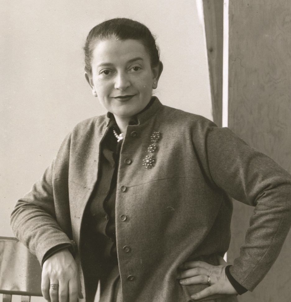
assistant to M. F. Agha at Condé Nast (from 1932); art director — Glamour (1941/42–1946), Seventeen (1947–1950), Charm (1950–1959), Mademoiselle (1959–1961); design consultant for Lincoln Center (from 1967 — the entire graphic programme, mark, Journal); Parsons — instructor from 1940, head of the Publication Design programme (1963 per New School, 1970 per RIT) until the mid-1980s Vienna, Austria (RIT, Wikipedia) / Poland (Scotford, Eye 18) → Brooklyn → New York
Palette of the œuvre
"The art director is a kind of editor with a visual vocabulary."
Biography
Born 1908 — per RIT and Wikipedia in Vienna, per Martha Scotford (Eye 18,
1995) to Jewish parents in Poland; arrives in the US in 1923, at fifteen
years old. Finishes secondary school in Brooklyn, studies commercial art at
Pratt Institute, then spends a year painting on a Tiffany Foundation
scholarship. She's turned down for jobs for years because she's a woman; her
first employment is at Contempora, Ltd, a group of émigré European designers
(promotional material, fabric samples, window displays). There Condé Nast
notices her and recommends her to his art director M. F. Agha — from 1932
she sits in the corner of Agha's office and learns typography, photography
and magazine organisation.
Art director of Glamour from 1941/42 to 1946, Seventeen 1947–1950 (there
she introduces fine artists to fiction illustration), Charm 1950–1959 (with
editor Helen Valentine turns it into "a magazine for women who work") and
briefly Mademoiselle 1959–1961, where she succeeds Bradbury Thompson. From
1967 she is design consultant to Lincoln Center — the entire graphic
programme, from letterhead to annual reports, mark, monthly Journal and
calendar. Teaches at Parsons from 1940, runs the Publication Design
programme from 1963 (New School) or 1970 (RIT) — sources disagree; from her
class comes The Parsons Bread Book (Harper & Row, 1974; AIGA 50 Books).
Agha proposed her for the New York Art Directors Club for ten years; she is
admitted only in 1948, together with Golden, as the first woman member
(Scotford). She is the first woman in the ADC Hall of Fame (1975); she
receives the AIGA medal posthumously, in 1996. Married to William Golden
(1939–1959, CBS) and Will Burtin (1961–1972); after Golden's death she
edited The Visual Craft of William Golden (1962). She died in 1991, after
sixty years of work.
Influences
Studied with
Pratt Institute (studies in commercial art from 1926/27) + a year of painting on a Louis Comfort Tiffany Foundation scholarship; no professor confirmed by name
Contempora, Ltd — a group of émigré European designers (promotional material, fabric samples, window displays); first job (Scotford, Eye 18)
M. F. Agha, Condé Nast's art director — from 1932 she sits in a corner of his office; "under Agha's tutelage" she learns typography, photography, organisation and magazine composition (Scotford, Eye 18); Agha also nominated her for the Art Directors Club for ten years
Borrows from
fine artists for fiction illustration — she wrote to museums and galleries asking who the best contemporary artists were; the only brief: the work has to be good enough to hang in a gallery (Scotford, Eye 18); Ben Shahn, Jacob Lawrence, Reginald Marsh, John Sloan, Richard Lindner, Dong Kingman, Leonard Baskin, Kuniyoshi, Doris Lee, Ad Reinhardt, Andy Warhol (RIT, Eye 18)
Agha's classical tradition of layout and typography (book-like typesetting of fiction, experimentation with display type) — Scotford explicitly contrasts it with Brodovitch's bolder approach
information illustration and design — an interest of Will Burtin's, a neighbour and family friend, introduced into Seventeen as a conceptual approach alongside collage and photography (Scotford, Eye 18)
her own life as prop — her own illustrations from a hand-painted recipe book, her own objects, furniture and house as a shooting location (Scotford, Eye 18)
Influenced
Seymour Chwast and Richard Anuszkiewicz — young artists "discovered" through Seventeen who went on to become famous (Scotford, Eye 18) — influence through commissioning, not through teaching
Janet Amendola — a Parsons student (class of the 1970s per the poster colophon), illustrator of the Parsons catalogue and posters, 1982–84, which Pineles designed (work 07; Fonts In Use)
students of Parsons' Publication Design programme — The Parsons Bread Book (1974) made as a class project; not found by name
women in the profession — Scotford: "created the role of the modern woman designer in America" (Eye 18); first female member of the ADC and first woman in the ADC Hall of Fame (1975)
Contemporaries
Alexey Brodovitch — Scotford calls him her "strong competitor"; Seventeen follows Agha's classical line as against Brodovitch's bolder one at Harper's Bazaar
Bradbury Thompson — Scotford: her „stylistic soul-brother“; she succeeded him as art director of Mademoiselle in 1959
M. F. Agha — head and mentor at Condé Nast
William Golden — first husband (1939–1959), CBS; they shared artists and used each other's work (her illustrations, his photographs)
Will Burtin — second husband (1961–1972); joint typographic cover for Lincoln Center Journal (CA)
Helen Valentine (editor) and Estelle Ellis (promotion director) — the trio that ran Seventeen and Charm for 12 years (Scotford, Eye 18)
Herbert Matter — among the artists she hired (Brower, Eye on Design)
Who she studied under
Pratt left no named teacher. She learns the actual craft under M. F.
Agha at Condé Nast (from 1932) — Scotford describes sitting in the corner
of his office as a school of typography, photography and magazine
composition, and Seventeen as a continuation of Agha's "classical
tradition" of layout.
What she steals
Fine artists for fiction. At Seventeen she writes to museums and
galleries asking who the best contemporary artists are and commissions
illustrations for stories from them; the only requirement — the work must
be good enough to hang in a gallery. The artist reads the story himself
and chooses what to draw (Scotford). The choice is often politically or
ethnically marked: Shahn (left), Lawrence (Harlem Renaissance), Marsh and
Sloan (social realism), Lindner (émigré), Kingman (Chinese-American).
Agha's classical line — book-style setting of fiction lets the
illustration dominate; the editorial and fashion sections more playful,
with early "figurative" typography (object instead of letters).
Informational illustration of Will Burtin, neighbour and friend.
Her own life as material — illustrations from a hand-painted
recipe book, her own objects and house used as a shooting location.
Who she influenced
Scotford: through Seventeen, Seymour Chwast and Richard
Anuszkiewicz were "discovered" — influence by commission, not teaching. At
Parsons: Janet Amendola, a student, later illustrator of her Parsons
materials 1982–84 (work 07). Scotford frames her wider influence as a role:
she created the role of the modern woman designer in America. No named
students of the Publication Design programme have been found.
Contemporaries
Alexey Brodovitch — Scotford calls him her strong competitor; Seventeen
deliberately follows Agha's classical line as against Brodovitch's bolder
Harper's Bazaar. Bradbury Thompson — Scotford: her "stylistic kin"; she succeeded
him at Mademoiselle in 1959. M. F. Agha — mentor. William Golden —
they shared artists and used each other's work. Will Burtin — joint
typographic cover of the Lincoln Center Journal (CA 7871).
Helen Valentine and Estelle Ellis — editor and promoter with whom
she ran Seventeen and Charm for twelve years. Herbert Matter — among the
artists she commissioned (Brower).
Vogue masthead — brush-lettered italic, white, diagonal top left (the magazine's logotype, not her lettering); line along the bottom — small grotesque in capitals; specific typeface not confirmed
What it is — the Vogue cover for 1 April 1939 (theme: brides,
imports, "a portfolio for limited incomes"), from the years she worked
under Agha. There is also an unused alternative alongside it (PGDA 218).
Composition — a black field; in the lower two-thirds a slightly
tilted rectangle: a woman holds a rectangular mirror to her face, so on
the left we see her profile in the mirror, and on the right the same face
frontally — two views of one face joined into one block. Red-nailed hands
hold the mirror and chin. The masthead diagonal upper left, a line of
text along the bottom edge.
Colour (measured) — black 69%; skin and reddish-brown (lips, nails)
about 25%; blue eyeshadow the only cool tone.
Typography — the brush-drawn masthead is the magazine's logotype,
not her decision; hers is a small grotesque in capitals as a single line
along the bottom — the text retreats before the image.
Message — the face seen twice: as the woman sees it (mirror) and as
the reader sees it — exactly the theme of a fashion magazine.
Why exactly this way — the mirror gives a second angle without
montage or double exposure; the black field isolates the face as an
object.
What would kill it — two different women instead of the reflection
of the same one; or a white ground — the mirror would drown in the
paper.
Principles:ogledalo-kao-kompozicijski-alatOpen question: how much of this is her own authorship, and how much
Agha's (during the assistantship period).
seventeen masthead — serif lowercase, black, at top; repeated mirrored upside down at the bottom as part of the reflection; specific typeface not confirmed
What it is — the Seventeen cover for July 1949; photographer
Francesco Scavullo. Scotford's caption: "Reflection in the pool – with a
twist".
Composition — a girl in a dark blue swimsuit lies at the pool's edge
under a red-and-white parasol; the lower half is her reflection in the
water — upside down, with the parasol tilted and the "seventeen"
masthead mirrored. The horizontal of the pool's edge divides the format
at the middle; the mirror is motivated (water), but it also includes
letters.
Colour (measured, scan faded) — light ground 42%, skin 18%, dark
blue 14%; red-and-white stripes are the only strong accent.
Typography — the masthead is a serif lowercase; its upside-down copy
at the bottom is the "twist" — a reflection in water cannot logically
contain the letters of the cover.
Message — summer, water, ease — without a single cover line on the
page.
Why exactly this way — a reflection is natural for a pool, but once
the logotype enters it too, the photograph becomes a cover, not merely a
shot.
What would kill it — if the reflection didn't contain the masthead:
what's left is a nice photograph with a logotype over it.
Principles:ogledalo-kao-kompozicijski-alatv2 correction (06.09.): the masthead is not "handwritten italic" but a
serif lowercase; the mirror is a reflection in water (Scotford), not an
abstract Rorschach axis.
03 · Go Fly a Kite — spread, Seventeen, April 1950, pp. 104–105
title in Chinese (calligraphy, top left, with an asterisk) + translation „*Go fly a kite“ in serif type at the bottom of the second column — the asterisk links the title and the translation; text in two serif columns; specific typeface not confirmed
What it is — an editorial spread about kites; illustration by Dong
Kingman, a Chinese-American painter (Scotford) — an example of her
programme of fine artists in illustration.
Composition — left page: two columns of text, above a title in
Chinese (calligraphy) with an asterisk. Right page: Kingman's kites
(bird, fish, butterfly, centipede, geometric) float in white. The
kite strings cross the gutter and end in a small drawn hand at the
bottom of the left page — exactly beside the translation of the title
"*Go fly a kite".
Colour (measured) — paper 82%; the kites are the only colour, warm
earth tones in the scan (the original more colourful — the scan is
desaturated).
Typography — the Chinese title as image, the English title as a
footnote (asterisk) — an inverted hierarchy; the text is book-like, not
decorative.
Message — the theme (the Chinese tradition of kites) is spoken in
the illustrator's own language: the title in his script, the
translation below.
Why exactly this way — the strings are the seam of the spread: the
illustration "holds" the text and vice versa; neither page can be read
alone.
What would kill it — kites framed only on the right page, without
strings crossing the gutter; or the English title large instead of the
Chinese.
CHARM — high-contrast Didone capitals across the full width; „miracles for women who work“ — serif lowercase; background — lines of condensed grotesque in capitals (promise-phrases from the issue); specific typeface not confirmed
What it is — cover of Charm, the "magazine for women who work"; photographer
William Helburn. Scotford: „Typography-dominated cover introduces a
theme played out over fourteen pages inside“.
Composition — CHARM across the full width at top; below, left,
„miracles / for women / who work“ in three lines. The entire background is a wall
of rows of narrow capitals — phrases from the issue („…that reduces your…“, „that
makes no sound“, „warmth minus the weight“) — legible, not noise. In front of the
wall a woman in a polka-dot dress, white gloves and hat, holding red berries in
her hand and a black bag; she stands at an angle in the lower right quarter.
Colour (measured) — yellow-green ground 61%, black 22%; the red berries
are the only warm accent.
Typography — three registers: didone capitals (name), serif lowercase
(theme), narrow grotesque (wall of promises). The contrast is performative, not
emotional — a classical headline over an industrial list.
Message — the "miracles" are practical products (fabrics that don't crease,
appliances without noise) — the woman stands in front of a list of things that ease
her double shift.
Why exactly this way — Charm promised "the appeal of reality" instead
of false glamour (Pineles, Print 1955); the cover turns the issue's content
into wallpaper, not decoration.
What would kill it — if the background rows were lorem ipsum or ornament:
the wall must be legible and true.
Principles:zid-teksta-kao-oblikv2 correction: CHARM is not a handwritten logotype but didone capitals;
the background is not "tiny typed, almost illegible text" but legible capitals;
sepia and "red dot on the glove" do not exist — the ground is yellow-green,
the red is the berries in her hand.
photomontage — photographs of Lincoln Center's plaza and architecture multiplied into fourfold symmetry; duotone print
Type
„Lincoln Center Journal“ — white condensed grotesque, set vertically in a dark band at the exact centre, below a block-monogram L; specific typeface not confirmed
What it is — cover of Lincoln Center's monthly magazine; CA: photographs of the plaza
and the Center's architecture that Pineles "manipulated". PGDA lists it as
„Plaza Brochure“, but the image reads Lincoln Center Journal.
Composition — one scene of the plaza (arcades, façades, silhouettes of passers-by)
multiplied into fourfold symmetry around the centre: a diamond within a square, figures
walking along the sides of the rhombus toward the centre. At the exact centre a dark
vertical band with the name and a block monogram L.
Colour (measured) — duotone: near-black 54%, cream 20%, grey transitions;
no accents — the rhythm carries the colour through architecture.
Typography — small, vertical, at the centre — the name is the key to the kaleidoscope,
not a headline over the image.
Message — the Center as a place people pass through on all four
sides, with the name as the axis.
Why exactly this way — the same move as in 1939 and 1949 (doubling), but
now without a face: the mirror makes a sign out of a place.
What would kill it — the name off-axis; symmetry without the central band
would fall apart into wallpaper.
Principles:simetricna-os-drzi-haosogledalo-kao-kompozicijski-alatv2 correction: it is not "cream-black with a monogram at centre and grotesque for
the name" without people — the silhouettes of passers-by are the main rhythm; from this
image it cannot be told whether the multiplication is mirroring or rotation.
photograph + typesetting, two-colour print (dark blue and black) on white
Type
STRETCH — condensed bold grotesque in capitals, dark blue, across the full width; subtitle „A graceful, easy exercise system for women…“ — serif italic, aligned left and right of the figure; specific typeface not confirmed
What it is — cover of a pocket exercise manual for women, "new revised
edition", Cornerstone Library, $1.00.
Composition — STRETCH across the full width of the upper third. Below,
a photograph of a woman in a black leotard with white trim: sitting, legs stretched
out to the left, right arm stretched straight up to the baseline of the word.
The white trim of the leotard draws one unbroken line from the arm down the body to
the feet. To the right of the figure, in the space left by the outstretched arm,
five lines of italic.
Colour (measured) — white paper 50%, dark blue + black 27%; two
colours and the paper.
Typography — narrow bold grotesque for the title (verticals like a row
of columns) against soft serif italic for the promise ("graceful, easy").
Message — stretching is shown twice: the word is stretched across
the format, the body is stretched toward the word.
Why exactly this way — the outstretched arm extends the verticals of the letters
down to the body, and the leotard's trim carries them further — the cover is one line
from the letters to the feet.
What would kill it — the arm below or beside the word, not under it; or
a wide grotesque — the verticals would lack the rhythm the body continues.
Principles:tijelo-nastavlja-slovov2 correction: the typeface is not "geometric capitals" but narrow grotesque;
the figure is not a silhouette but a photograph in a leotard; the italic on the right is
not mentioned.
Open: the photographer's name.
07 · Parsons poster — New York / Los Angeles / Paris (1982–84)
Parsons School of Design (The New School for Social Research)
Technique
illustration (drawings by Janet Amendola) + typesetting, colour print on black
Type
Modern No. 20 (Fonts In Use) — PARSONS large, NEW YORK / LOS ANGELES / PARIS smaller, capitals, centred, white on black; phototypesetting by Tom Carnase
What it is — a Parsons School of Design poster for three campuses; drawings by
Janet Amendola (student, colophon: "Class of 197x"), design by Pineles as
professor; part of a series of catalogues and posters 1982–84 (Fonts In Use).
Composition — on black, fruit arranged in a symmetrical "bouquet" on
the central axis: grapes at top, apples, pomegranate/oranges, purple
grapes at the bottom; small columns of text left and right. Below the axis three cities, then
PARSONS across the full width.
Colour (measured) — black 65%; orange-red 16%, wine 13%.
Typography — Modern No. 20 (didone), capitals, centred;
phototypesetting by Tom Carnase — a classical typeface for a classical botanical image.
Message — apples = New York (Big Apple), oranges = Los Angeles
(as read by Fonts In Use); grapes = Paris is my reading. The school as
a basket of three cities.
Why exactly this way — three campuses without a single building or student: fruit is
an analogy anyone decodes without explanation, and the drawing keeps it in
the register of craft, not advertising.
What would kill it — photographs of campuses; or fruit without order — without an axis
there is no "one school".
Principles:analogija-umjesto-ilustracijev2 correction: the year is not unknown (1982–84); the typeface is not "grotesque" but
Modern No. 20; the fruit is not just "a craft tone" but an analogy for the cities;
Amendola is a Parsons student, not an outside botanical illustrator.
What it is — a working sheet from the RIT archive ("Process Works"):
a plan for the entire February issue of Glamour, "The Most For Your Money
Issue"; the year is not recorded (her Glamour years: 1941/42–1946).
Composition — a grid of miniature spreads, five per row, six rows;
each miniature painted in gouache or drawn in pen (figures, headlines,
images), with the theme handwritten below; at the top the issue's title and a note "COVER: … coat".
Narrow gaps at the bottom — pages not yet planned.
Colour — most miniatures are black-and-white, colour only on a few fashion
spreads; the measured palette describes the card under light, not the issue.
Typography — none; headlines are indicated as handwriting and blocks.
Message — proof of method: the issue is seen as a sequence of images before shooting
and typesetting.
Why exactly this way — Eye 58 singles out exactly this skill:
"conceptualise entire flatplans as gorgeous little drawings".
What would kill it — a flatplan as a table with page numbers: the rhythm
of images would not be seen until it's too late.
Principles:slika-se-narucuje-u-ritamflatplan-kao-crtezv2 correction: the strip of colours along the left edge is the Kodak control
scale of the archive's photographer, not part of the work; the miniatures are not
"dozens" but around 25.
Other works — evidence, no analysis
Proposed Vogue cover, December 1939 — jewellery arranged into letters; the published
version kept only the hands raised upward and a different arrangement of jewellery (CA 7869).
Charm, July 1951 — cover; themes in the headlines, women "not typically at
work" (Scotford, Eye 18).
Charm, September 1957 — a fashion story with office machines and
typing patterns as a sign of work; photo by Carmen Schiavone (Eye 18).
Charm, January 1956 and April 1956 — fashion stories by W. Helburn: modern
office furniture; a garage, cars and folk signage (PGDA 3858, Eye 18).
Lincoln Center Journal — typographic cover with Will Burtin (CA 7871).
Lincoln Center logo (RIT "Completed Works").
Green Mansions — annual brochures for the resort (RIT, PGDA 2654).
Herbs: From Garden to Kitchen, Ladies' Home Journal; Cheap Eats;
For Her, For Him (Vogue) — RIT "Completed Works".
The Parsons Bread Book (1974) — a class project, AIGA 50 Books
(PGDA 4100, CA 7870).
Leave Me Alone with the Recipes (manuscript circa 1945, published 2017) —
a personal illustrated recipe book; the illustrations in Seventeen and Charm come from it.
The Visual Craft of William Golden (1962) — editor of the monograph.
Bridge to practice: poster · graphic design · motion
Poster
Instead of a photograph "from the category" (a generic campus for an educational institution), find an object that's an analogy for the content and draw it with craft precision — Parsons 1982–84: apples, oranges and grapes instead of three campuses (work 07). The poster escapes the genre's house style, and the message decodes without explanation. Second move: a body or object continues the stroke of a letter (Stretch, work 06).
Graphic design
Flatplan as drawing: before sitting down to lay out, draw the whole project (a brochure, a series of posters) as a series of small coloured thumbnails on one sheet. Decisions about colour and rhythm are made at the level of the whole project, not page by page.
Motion
Mirror symmetry (works 01, 02, 05) transfers directly into a frame: the same element appears both upright and mirrored within a single frame, instead of the classic setup/development/resolution.
Bad imitation
Mirror as filter, not as a decision about content. Mirroring an image in Photoshop "to make it symmetrical" with no reason why that particular motif needs doubling — with Pineles, mirroring always carries meaning (a double face, a summer game, architecture as mandala), it doesn't just serve balance.
Commissioning an "artist" with no conceptual reason. Hiring a famous name for illustration purely for prestige, without the subject actually calling for the seriousness that artist brings — with her it's consistently the reverse: an ordinary subject (dragons for teenage girls) gets a serious author precisely to prove it deserves attention.
Wall of text as wallpaper with no content. A background of repeated lorem ipsum or random words "for texture" — on Charm 1954 (work 04) every line of the wall is an actual promise from the issue and reads; the wall is content, not decoration.
Strings without a knot. An illustration that crosses the gutter "because it looks nice," without tying to anything on the other side — in Kingman's spread (work 03) the strings end in a hand next to the headline.
The brief through their eyes
(enter the current job here before using the exercise)
The first question she'd ask: "Does this audience deserve more serious treatment than the brief assumes?" Second move: draw the whole project as a series of small coloured thumbnails before any layout. Third: look for one element (a face, architecture, an object) that can be doubled through mirroring or repetition to carry meaning, not just symmetry.
Exercises
Mirror composition. Take one photograph of a face or object, make a mirrored copy and join them so a new, singular reading emerges (not plain symmetry) — there must be a reason why that particular motif is doubled. 45 minutes.
Flatplan in colour. For any project of at least 6 pages/frames, first make a small, coloured sketch of all pages on one sheet (gouache, watercolour, or digital painting) before opening InDesign/AE.
Motion study
One frame, 5 seconds: a face or object in the frame gradually mirrors across the vertical axis until a symmetrical, mandala-like composition emerges (the principle from work 05, Lincoln Center) — constraint: only one source element, nothing new.
Rebuilding the benchmark
The skeleton of the Seventeen cover (work 02, 1949) as .svg: top half = the figure with a parasol in %, bottom half = its mirrored copy, the horizontal axis of symmetry at the exact centre of the format. Task: rebuild it in Illustrator in 45 minutes without looking at the original, then compare the position of the axis of symmetry against the scan.
Notes on sources
Update 23.09.2026 (session 30, phase 2b): all 8 works documented + reading of the work (v2) (previously 0 documented); each work re-viewed (contact sheet), palettes measured for all 8, uticao_na filled in, the palette of the body of work measured.
The v2 reading from 06.09. was wrong in 7 of 8 works (02–08; 01 only supplemented — corrections entered below each work): typefaces (Charm, Stretch, Parsons), composition (Kingman — headline; Stretch — figure), colours (Charm), the Kodak scale as "part of the work" (Glamour). For the third time, the lesson from Rand and Thompson is confirmed: a first-day v2 is a draft.
Wrong attribution in v1 "Other works": PGDA 3920 (the cover of Interiors) is the work of Alvin Lustig (1946), not Pineles — removed. PGDA 3858 is not "the Charm 1950 cover" but a fashion story from April 1956.
Discrepancies between sources (not resolved silently):
place of birth: Vienna (RIT, Wikipedia) / Poland (Scotford, Eye 18); arrival in the US: 1923 at age 15 (Scotford, Eye 58) — the v1 text "at age seven" removed;
ADC: first member 1948 (Scotford) / 1943 (v1 note) — 1948 taken; Hall of Fame 1975 — "first woman" (Scotford, CA), v1 wrote "second";
Glamour: from 1941 (Scotford) / 1942 (Wikipedia);
Lincoln Center: from 1967 (RIT, CA) / 1961 (v1 note);
Parsons: instructor from 1940, head of programme 1963 (New School) / joins the faculty 1970 (RIT, CA);
Bread Book in AIGA 50 Books: 1973 (CA) / 1974 (RIT) / 1975 (Brower);
Kingman's technique: "watercolour" (v1) — no source states the technique.
Not found: dimensions of any work (the magazines and cover aren't in museum collections with measurements); the year of the Glamour flatplan; the photographer's name for Stretch; the last digit of Janet Amendola's class year on the colophon (scan blurred).
Typeface confirmed only for 07 (Modern No. 20, Fonts In Use); the rest by class.
Scotford, A Life of Design (1999) — the only source that could give a work-by-work analysis; on archive.org only for loan — not read.
Tag rucno-pismo-kao-toplina removed — not demonstrated on any of the 8 works (the Vogue masthead is the magazine's logotype, Charm is Didone capitals); tekst-kao-pozadinska-tekstura replaced by the global zid-teksta-kao-oblik; rez-ilustracije-u-slog-teksta renamed to tijelo-nastavlja-slovo.
Portrait: Wikimedia Commons (circa 1950) + RIT.
Difference from the counterpart:Alexey Brodovitch builds the spread like a film cut — speed and close-ups across the gutter. Pineles, per Scotford, follows Agha's "classical" line: book-like typesetting, with the play happening in a single move per page — doubling (mirror, reflection, kaleidoscope) or a seam across the gutter (Kingman's strings). Brodovitch builds rhythm through time, Pineles through repetition in space. Per Bradbury Thompson ("a stylistic relative"): Thompson makes an image out of print (separations, overlap), Pineles makes a page out of a commissioned image.