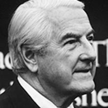
designer and editor, Westvaco Inspirations for Printers (1938/39–1962, 61 issues); art director, Mademoiselle (1945–c. 1960); design director, Art News and Art News Annual; professor, Yale School of Art (1956–1995); design coordinator, Citizens' Stamp Advisory Committee (1969–1978) Topeka, Kansas → New York → Connecticut
Palette of the œuvre
"The designer should be a good typographer first."
Biography
Born 1911 in Topeka, Kansas. Graduated from Washburn College in 1934 in economics with
a minor in art; he was editor and designer of the yearbook. He learned the trade at the
Capper Publications printing house in Topeka, where, per RIT, he "thoroughly learned every
aspect of print production." That production experience is his real school — no
source names a design teacher.
He came to New York in 1938. Kansapedia records that he turned down offers from Vogue and
Vanity Fair and took a job at an advertising agency; RIT cites a post as art director at the
Rogers-Kellogg-Stillson printing house. That same year, 1938 (Wikipedia, AGI) or 1939 (RIT, Heller),
he starts Westvaco Inspirations for Printers — a paper manufacturer's promotional magazine with
no requirement other than that the paper and print should look good. By 1962 he had produced 61 issues
with a print run of around 35,000. During the war he designs magazines for the Office of War Information (USA,
Victory). From 1945 he is art director of Mademoiselle (for about fifteen years) and design
director of Art News and Art News Annual; in total he designed or redesigned around 35
magazines, among them Smithsonian. From 1956 until his death he teaches at Yale School of Art
in Alvin Eisenman's program, alongside Rand, Hofmann, and later Weingart.
His late career is marked by stamps and the Bible. He does his first stamp in 1958; from 1969
to 1978 he is design coordinator of the Citizens' Stamp Advisory Committee. The number of his stamps
is given differently by different sources (RIT "more than 90", Mystic "more than 100", Wikipedia "more than
120"). The Washburn College Bible (Oxford University Press, 1979) is a
ten-year project: three volumes, around 1800 pages, 398 copies, set in Sabon
14 pt to the cadence of speech. The autobiographical monograph The Art of Graphic Design
(Yale University Press, 1988) — he designed it himself. He died in 1995 in Greenwich,
Connecticut.
Influences
Studied with
Capper Publications, Topeka (after graduating in 1934) — according to RIT this is where he "thoroughly learned every aspect of print production"; no source names a mentor
Washburn College, Topeka — degree in 1934 in economics with a minor in art; editor and designer of the yearbook (Wikipedia, Mystic Stamp) — no named design professor
early draftsman experience — he himself says it taught him discipline and that on large sheets of tracing cloth he "handles space neatly" (quote via Modernism101 / CA 1999)
Borrows from
the printing apparatus as material — process separations, overprinting of transparent colours, enlarged screen (AGI: "colour separations and enlarged screens"; Eye 43, Kindel)
historical woodcuts and engravings, clichés and separations borrowed from museums, magazines and agencies (Wikipedia; AGI: "ingeniously appropriated paintings and engravings")
the modernist vocabulary of mechanical reproduction from the 1920s — Kindel groups him with these designers, and in parallel cites Kepes (Language of Vision, 1944) and Moholy-Nagy (Vision in Motion, 1947); direct influence is not documented
Baskerville as the basis for Alphabet 26 — reworking of an existing transitional serif form
Influenced
Janet Odgis (Odgis + Co) — student in the Yale graduate programme; names Thompson, alongside Rand and Eisenman, as one of three mentors ("Bradbury Thompson's love of typography"; own text, 2026)
Alexander W. White — designer and textbook author; his father had him studying the set of Westvaco Inspirations from childhood (own text, 2017) — influence through the publication, not through teaching
generations of students at the Yale School of Art 1956–1995 (Yale University Press: "trained a generation of design students") — by name only those listed above
readers of Westvaco Inspirations — circulation around 35,000, printers, designers and teachers (Wikipedia, RIT); Kindel warns that general influence is hard to establish
Contemporaries
Alexey Brodovitch — same city, same decade, both art directors of women's magazines
Cipe Pineles — Condé Nast / Seventeen, a parallel career in the same New York circle
Paul Rand — colleague at Yale in Eisenman's programme; opposite temperament (identity mark versus process experiment)
Lester Beall — published works in Westvaco Inspirations (Modernism101, issues 203–216)
Who he studied under
There is no named teacher or mentor. His school was the printing house (Capper Publications)
and drafting experience which he himself says taught him discipline and to "handle space cleanly"
on large sheets of tracing cloth. In this sense he is self-taught like
Lester Beall and Paul Rand — but his learning material was not the European poster but
the printing press itself.
What he plunders
The printing apparatus as material. AGI: "colour separations and enlarged screens". Eric
Kindel (Eye 43) writes that after the war Thompson turned Inspirations toward the mechanics
of the four-colour process and from it took a "vocabulary of form and colour": screens, process
separations, colour mixing through overprinting. In Rain, Rain, Rain (06) this is literal.
Appropriated images. Plates, engravings and separations borrowed from museums, magazines
and agencies (Wikipedia); AGI: "ingeniously appropriated paintings and engravings".
The work lies in montage, not in drawing.
Modernist vocabulary of reproduction. Kindel places him among modernist
designers who from the 1920s on use the form of mechanical reproduction, and in parallel cites
Kepes's Language of Vision (1944) and Moholy-Nagy's Vision in Motion (1947).
A direct influence is not documented — this is kinship, not lineage.
Baskerville as the basis for Alphabet 26. The reform does not draw a new alphabet but
reworks an existing transitional serif form.
Thompson himself formulated the program in Westvaco Inspirations 206 (1956, via RIT):
a typographic designer must display the art of past centuries, but create "in the spirit of
his time" — through understanding, not "painstaking copying" of the old masters. This is an
exact description of the procedure in 01–04: an 18th/19th-century engraving + transparent process colour of the 1950s.
Who he influenced
Janet Odgis (Odgis + Co) — at Yale she names him as one of three mentors (alongside
Rand and Eisenman): typography as a "living language" of rhythm and emotion, design begins
with attention to words and images.
Alexander W. White — designer and textbook author; grew up with the set of
Westvaco Inspirations his father gave him to study. Influence through the publication,
not through teaching — and precisely for that reason White preserved the scans that are today the main
image source for this note.
Generations of Yale students 1956–1995 and readers of Inspirations (around 35,000
copies). Kindel warns that it is "hard to determine" how much Inspirations
influenced the general use of overprinting among designers. The claim from v1 that he "preceded
punk" has no source and has been removed.
Contemporaries
Alexey Brodovitch — both art directors of women's magazines in New York in the same decade,
by opposite means (photographic sequence versus print process). Cipe Pineles —
the same New York circle, Condé Nast / Seventeen. Paul Rand, Armin Hofmann, Wolfgang Weingart —
colleagues at Yale in Eisenman's program. Lester Beall published work in
Inspirations (issues 203–216).
Update 23.09.2026 (session 29): all eight works reviewed again on A. W. White's
scans (19 spreads, contact sheets) and sources. The v2 reading from 06.09 was
wrong on four of six Westvaco spreads (Nature, Victory, Worship, Rain) and in
the image description for 07 and 08 — see "Notes on sources".
West Virginia Pulp and Paper Co. (Westvaco), Inspirations for Printers No. 194
Technique
lithograph (offset) on Westvaco Sterling Enamel paper — stated in the colophon on the spread itself
Size
11¾ × 17¾ in (spread; White, scanned at actual size)
Type
the title N-a-t-u-r-e — high-contrast serif letters, mixed sizes and three colours (black, red, blue); the setting of the quote and introduction — serif italic and a round typeface; specific typeface not confirmed
What it is — a spread from Westvaco Inspirations for Printers no. 194 (1953),
11¾ × 17¾ in. Colophon on both pages: lithograph on Westvaco Sterling
Enamel paper. Intro text top right explains the point in advertising language: good design
catches the reader's curiosity like a net.
Composition — ONE fish across the whole spread: blue tail left, red
head with a white eye right, the page break cuts through its body. Over the blue part
lies an engraving of a fishing net held by two boats (yellow top left, grey bottom).
The letters N-a-t-u-r-e climb up the net like caught objects. On the right: an engraving of fishermen in
boats (top third) and an encyclopedic plate of tackle — hooks, lines, lead,
marked with letters A–D — over the red head. Emerson's quote below, in blue.
Colour — two process plates (blue, red) + black engraving + paper. Where the black
net falls over the blue, a third dark-blue value is created (#465b74, 25%
of the area) — the net is visible only because it is overprinted, not cut out.
Typography — the title is not a line but six objects: high-contrast serif letters in three
colours and several sizes. Quote and intro — calm serif setting in short
lines, tucked into free pockets of the shape.
Message — "print catches attention like a net catches fish": the metaphor from the intro
text is drawn literally. Emerson lends a lofty tone, the labelled tackle lends humour.
Why exactly this way — a fish across the fold is a test for the printer: two flat
colours have to align across two sides of the sheet. For a magazine selling paper and
printing, an error would show immediately — so the composition doubles as a demonstration of precision.
What would kill it — the fish entirely on one side. The fold would become a wall,
not a joint; and the check on register across the spine would disappear too.
lithograph (offset) on Westvaco Sterling Enamel paper — colophon on the spread
Size
11¾ × 17¾ in (spread)
Type
the title Victory — bold serif roman in a single line, the only large letter on the spread; the introduction and quote — serif italic in a narrow column; specific typeface not confirmed
What it is — a spread from no. 194 (1953), same format; colophon: lithograph on
Sterling Enamel. Left, text about "the nation's goals"; right, a Polybius quote: it is good to
win a battle, but it takes more wisdom to make use of the victory.
Composition — left: a red ring around a halftone photograph of an eye; through it
engraved arrows fly horizontally, below left an engraving of a knight on horseback. Right:
three rings — yellow, red, blue — overlapping one another, in the centre
a dark photograph of an eye; the arrows continue their flight from the left side. The arrows are
horizontal and all point right. The title Victory sits on the left edge, level with the eye.
Colour — here overprinting is the theme: yellow over red gives orange, yellow over
blue gives green — colours no single plate contains. Kindel (Eye 43) cites Thompson as the
designer who from 1945 turned overprinting into a visible image tool.
Typography — one word large, everything else small italics in a narrow column —
a two-level hierarchy, with no intermediate step.
Message — target = eye: "hitting the centre" and "seeing" are the same image. The left
side is a single target (victory), the right is a target that multiplies and mixes (what
comes after victory) — the Polybius quote says this in words.
Why exactly this way — concentric rings are the ideal motif for demonstrating
process colours: each plate is one ring, and the printer and paper buyer can see exactly where
the third colours appear.
What would kill it — opaque colours (knock-out). The rings would only touch,
orange and green would not exist, and the right side would lose its reason to exist.
Principles:preklop-daje-trecu-bojuplosna-cetiri-bojeistorijski-citat-kao-gradivni-materijalprisvojena-slikav2 correction: v2 described "identical targets symmetrically on both sides, cut
by diagonal arrows". The targets are NOT the same (one ring versus three overlapping),
the arrows are horizontal, and the centre of the target is an eye.
H-O-M-E — high-contrast serif capitals (H as two columns with capitals); the right-hand title Home — same family in lowercase; specific typeface not confirmed
What it is — spread from No. 202 (1955), 11¾ × 17¾ in.
Composition — on the left the letters build a house: a black H gives two pillars/walls,
a red triangular roof carries the O, M stands in the white field of a window, E. is on
the yellow door. Set into the walls are two small reproductions of genre paintings
(family scenes). The right side is a full grey-green plane with the outline of a house
rendered in a dashed line, tiny engravings of furniture and the title Home.
Colour — every colour belongs to one building element: red roof, yellow door,
black structure; the grey-green ground (45% of the surface) turns the right side into
a "wall" — the only one of six spreads with a full coloured ground.
Typography — letter as architecture: H is not a caption but a construction. The
word still reads — H-O-M-E from top to bottom, in order.
Message — a home is assembled the way a word is set; the right side is the
blueprint of the same house, the left is the inhabited house.
Why exactly this way — two states of the same subject on two sides (full house /
blueprint) show both crafts Westvaco is selling: colour reproduction and pure line.
What would kill it — if the letters couldn't be read in order. The house would
remain, the word would disappear — and it would no longer be typography.
Principles:prisvojena-slikaplosna-cetiri-bojedvostrana-je-jedinicav2 correction: M is not yellow — yellow is the field of the door with E.; M is black
in the white window. The drawing on the right is the outline of a house in a dashed
line, not a "dotted sketch on greenish".
lithograph (offset) on Westvaco Sterling Enamel paper — colophon on the spread; four-colour reproduction of the image
Size
11¾ × 17¾ in (spread)
Type
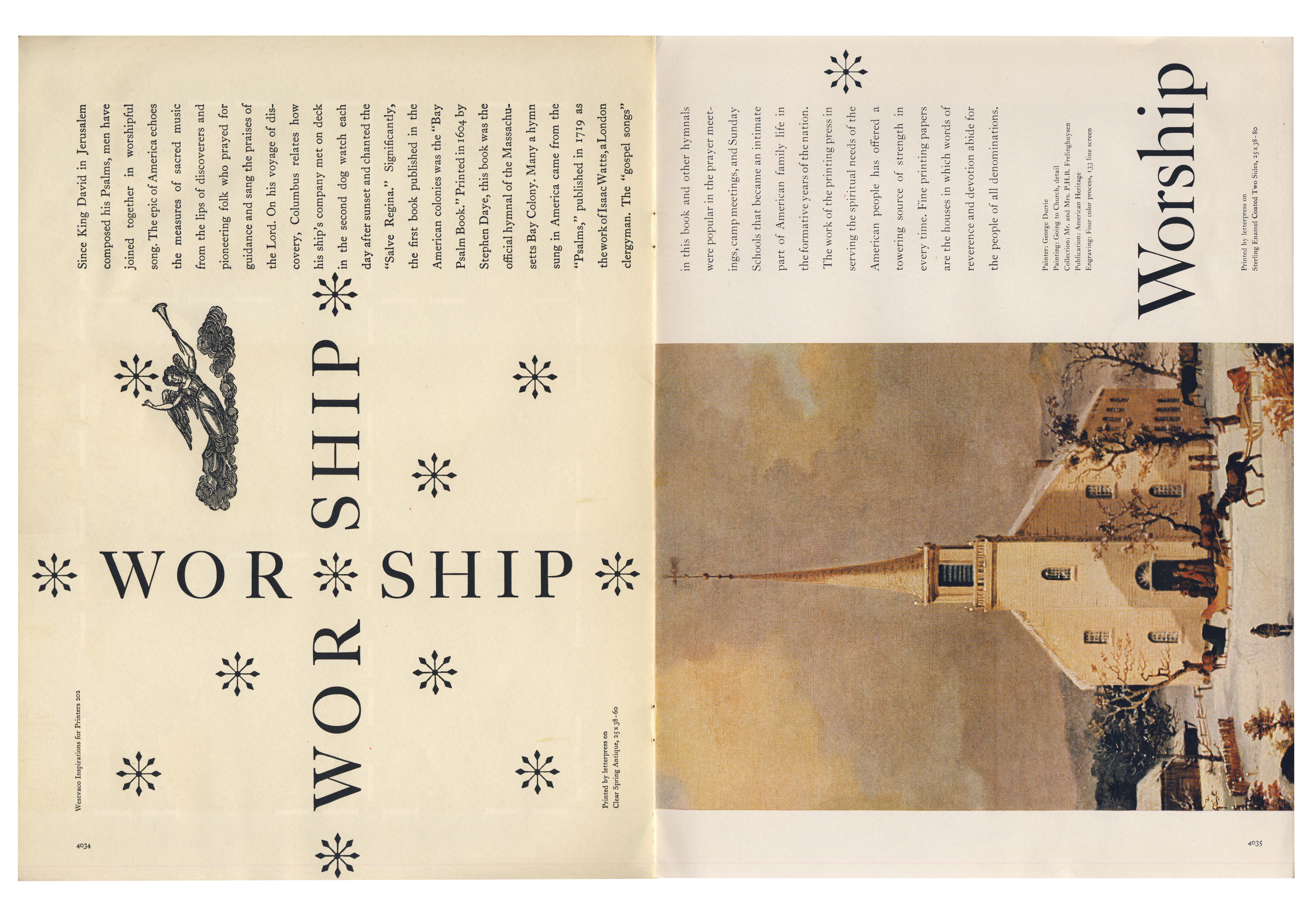
WOR·SHIP — wide-spaced serif capitals, the same word both horizontally and vertically (rotated 90°); asterisks as ornament; the title Worship on the right — same family, rotated; specific typeface not confirmed
What it is — spread from No. 202 (1955); colophon: lithograph on Sterling Enamel.
Text about psalms and printed hymn books in America.
Composition — on the left the word WOR·SHIP is set twice: once horizontally, once
vertically (rotated), and the two cross — the word builds a cross. Asterisks
around it work as stars; above, an engraving of an angel with a trumpet; the columns
of text above are rotated 90°. On the right: a colour reproduction of a painting — a
winter scene of a village church with a steeple — across the full width of the lower
two thirds; above it the text columns and the upright title Worship.
Colour — on the left only black and paper; colour exists only in the reproduced
painting on the right (warm ochre, brown, white snow). There is no process plane —
here Westvaco is selling faithful reproduction of an artwork, not an overlap.
Typography — widely spaced capitals allow the crossing: the horizontal and
vertical lines share letters without collision. The asterisk here is both punctuation
and image.
Message — the word "worship" becomes a sign of worship; on the right the same
place (church) as an image.
Why exactly this way — the cross made of words keeps the left side empty and
quiet, so the image on the right carries all the colour — a contrast of silence and
fullness within a single spread.
What would kill it — dense letterspacing. The crossing would clog up, the cross
wouldn't be seen before the word.
Principles:tipografija-po-fraziistorijski-citat-kao-gradivni-materijalprisvojena-slikav2 correction: v2 described "a word mirrored top/bottom", "a sepia photograph" and
"a diagonally rotated building". The word is crossed into a cross, the image is a
colour reproduction and stands horizontally. Who painted the church — the source does
not say (the credit on the spread is illegible at 720 px; to verify against the full
scan).
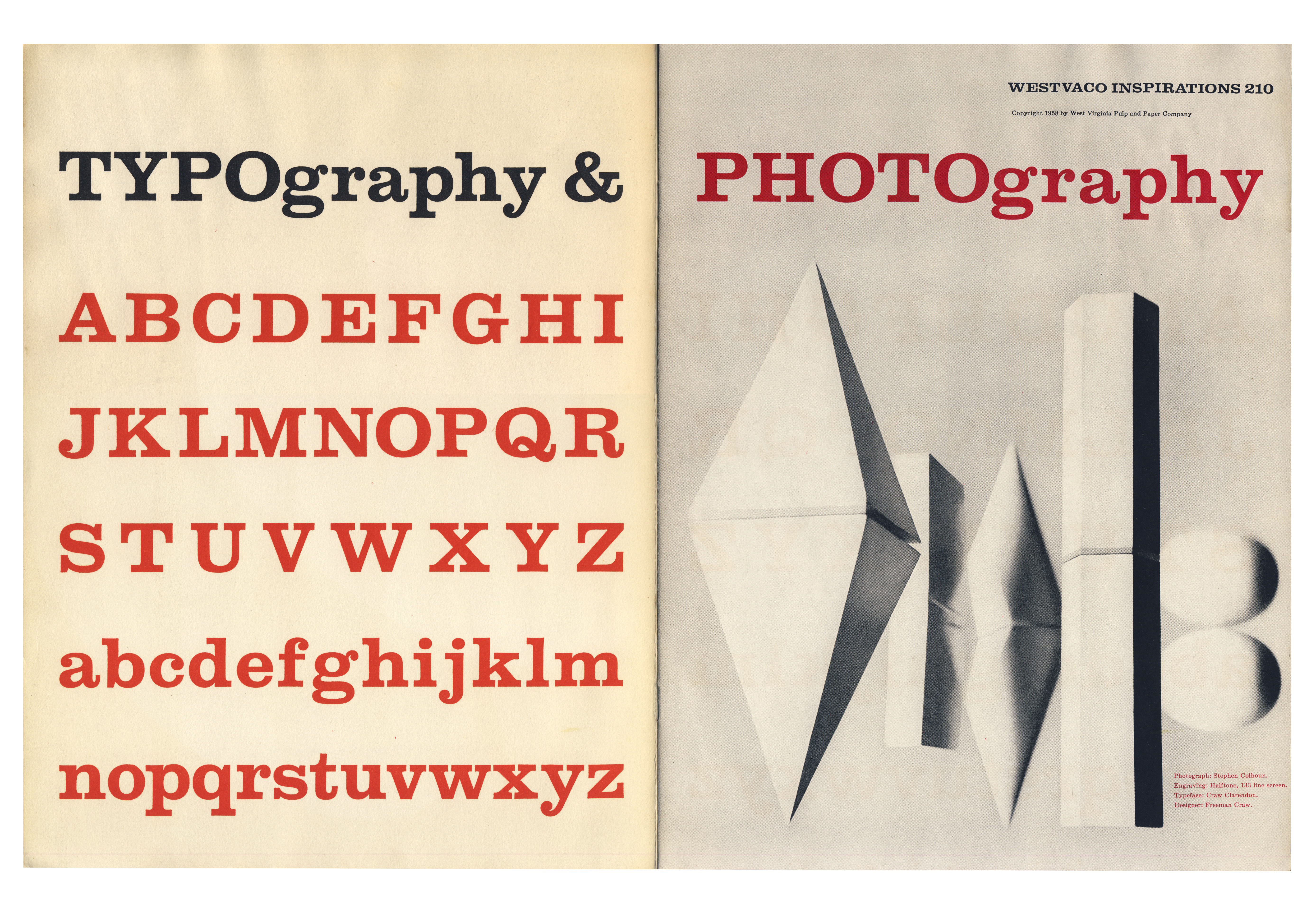
05 · Typography & Photography — title spread of No. 210 (1958)
11¾ × 17¾ in (spread; White); booklet 11 7/8 × 9 in (NMAH 1982.0187.00826)
Type
an Egyptian (slab serif) throughout the spread; the eye chart in the same issue (spread 210-8) itself names the typeface CLARENDON — probably the same typeface, not confirmed for this spread
What it is — title spread of No. 210 (1958); White calls it "probably the best
single issue". NMAH copy: volume 11 7/8 × 9 in. Modernism101: issue title
"Typography & Photography".
Composition — on the left: the title TYPOgraphy & (black) then the alphabet in
five rows — three rows of capitals, two rows of lowercase — all red, left-aligned.
On the right: the title PHOTOgraphy (red) and a black-and-white photograph of white
paper shapes (a folded and twisted sheet) on grey.
Colour — typography carries the colour (red), photography carries the tone
(greys). Red is only 3% of the surface because the strokes are thin — the colour is
in the letters, not in the planes.
Typography — a slab serif throughout the spread. Words are built through a play
of capitals/lowercase (TYPO + graphy) — the same device as in the monoalphabet, only
reversed: size and case carry the emphasis. Spread 8 of the same issue is an eye
chart set in the typeface named on it: CLARENDON.
Message — the issue's two crafts as a mirror: letter on the left, lens on the
right.
Why exactly this way — as the opening of the issue, it announces the theme
without a sentence.
What would kill it — an illustration or a paragraph on the left side. The
alphabet as the only motif is the point.
Principles:proces-kao-materijaldvostrana-je-jedinicav2 correction: v2 saw "capital letters red, lowercase black" and "origami" — all
the letters of the alphabet are red, only the title TYPOgraphy & is black; the
photograph is a folded and twisted sheet of paper, not an origami figure.
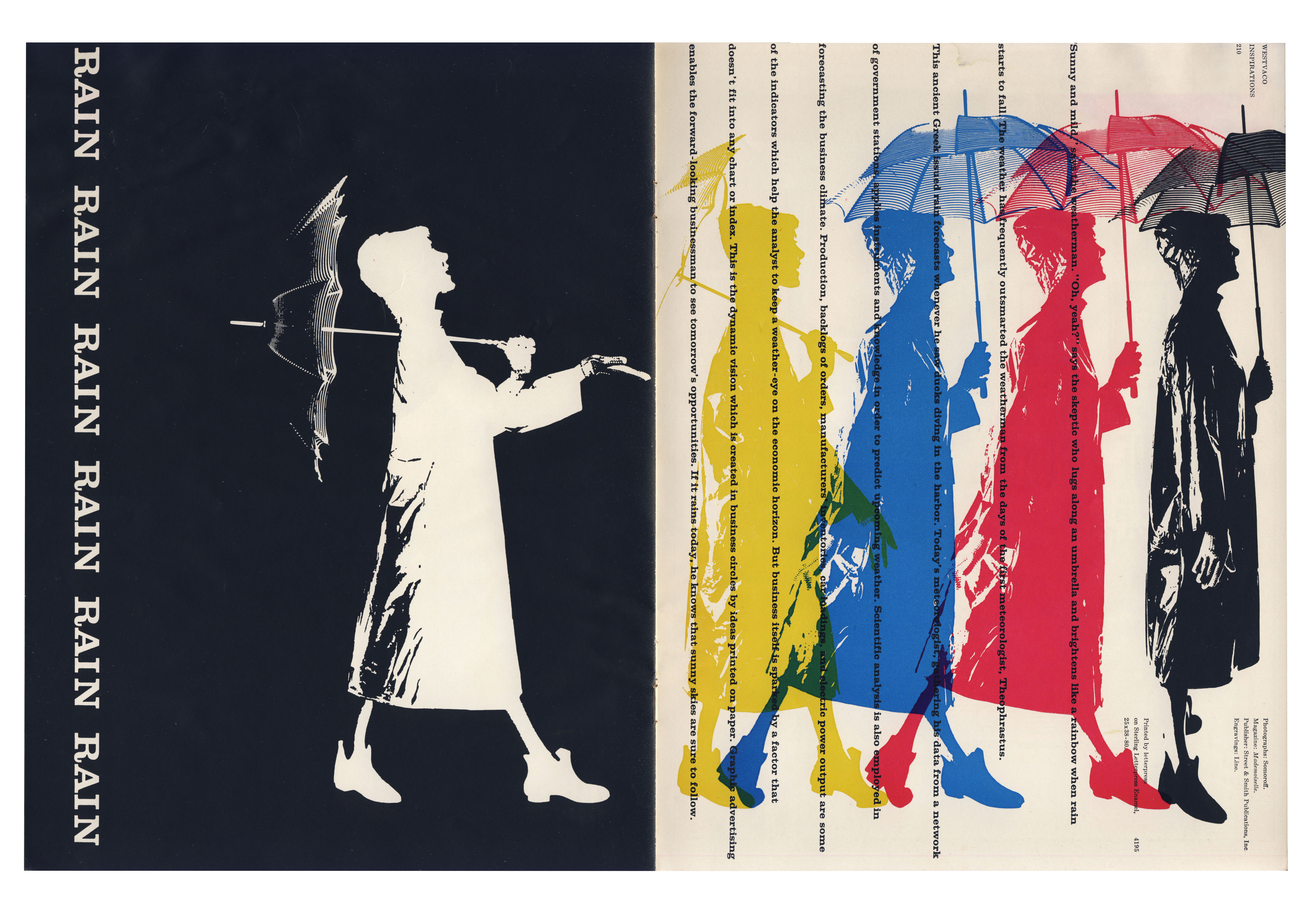
lithograph (offset), four process separations of a single photograph printed spaced apart
Size
11¾ × 17¾ in (spread)
Type
RAIN ×6 — Egyptian (slab serif) in capitals, white on black, rotated 90°; the setting on the right-hand page arranged vertically like streams of rain; specific typeface not confirmed
What it is — spread from No. 210 (1958), 11¾ × 17¾ in.
Composition — the left side entirely black: RAIN set six times vertically along
the left edge, a white silhouette of a figure in a raincoat with an umbrella (the
umbrella is an engraving). The right side: the same photograph of the figure with the
umbrella broken down into four process separations — yellow, cyan, magenta,
black — placed side by side with the same horizontal offset, so that adjacent ones
partly overlap. Across them the type runs vertically, like streams of rain.
Colour — each separation is its own figure; where two overlap, green, purple,
red appear. An image that in print resolves into a single point is here broken apart
in time — as if you were watching four passes through the press.
Typography — RAIN ×6 as sound (onomatopoeia), vertical type as rain: the letters
imitate both the sound and the direction of the theme.
Message — walking through rain as a sequence of steps; colour printing as a
sequence of passes.
Why exactly this way — for the reader who is a printer this is a textbook: it
shows separations that they otherwise only see on proofs. Kindel: Thompson turned
Inspirations toward the mechanics of the four-colour process.
What would kill it — an uneven offset. If each separation jumps differently,
it's a mess; the same step reads as a walk.
Principles:registar-kao-slikapreklop-daje-trecu-bojuproces-kao-materijalplosna-cetiri-bojev2 correction: v2 saw "RAIN three times", "lightning" and "a row of coloured
silhouettes like a film strip". RAIN appears six times, there is no lightning, and
the figures on the right are separations of ONE photograph.
What it is — a proposed typeface with 26 characters instead of 52: one shape
per letter, with the upper/lower case distinction carried only by size. A transitional
serif form modelled on Baskerville (Wikipedia). First published in Westvaco
Inspirations (CA 1999; issue number not given).
Composition (available images) — the Commons image is a modern diagram in five
rows (A–E, F–K, L–P, Q–U, V–Z), not a reproduction of the 1950 plate. The colours on
it are a legend: magenta = lowercase shape retained, blue = shape the same in both
cases, black = capital shape retained.
Colour — original: provjeriti. The diagram's colours are not Thompson's.
Typography — what was done: the lowercase shape is kept for a, e, m, n; the
capital shape for B, D, F, G, H, I, J, K, L, P, Q, R, T, U, Y; C, O, S, V, W, X, Z are
the same in both cases.
Message — an argument, not an image: a typeface easier to learn (per Clifford,
via a secondary source, the occasion was said to be a son learning to read —
unconfirmed).
Why exactly this way — the same problem as Bayer's universal alphabet, the
reverse solution: Bayer erases the capital letter, Thompson keeps both and separates
them by size. The choice is pragmatic: whichever shape is more recognisable for that
letter stays.
What would kill it — a random choice of shape per letter. The system only works
because it is consistent through the whole alphabet.
Principles:tipografija-po-fraziDiscrepancy: CA dates the "monoalphabet" to 1945, Wikipedia dates "Alphabet 26 or
monoalphabet" to 1950. The contents of The Art of Graphic Design have separate
chapters "The monalphabet" and "Alphabet 26" — these are probably TWO projects, and
Wikipedia merges them.
08 · The Washburn College Bible — opening of the Book of Daniel (1979)
Washburn College (University), Topeka; publisher Oxford University Press
Technique
book, set in Sabon 14 pt, left-aligned, ragged right, broken according to the cadence of speech; three volumes, about 1800 pages; limited edition of 398 copies; chapter openings with image reproductions
Size
8 × 11 in (Besnowed — display measurements, unconfirmed for the book)
Type
Sabon (Jan Tschichold, 1967), 14 pt — confirmed; the title Daniel in the image is Garamond Premier Pro Display from the digital reconstruction (2005), not the original
What it is — The Washburn College Bible (Oxford University Press, 1979), King
James translation; three volumes, about 1800 pages, 398 copies; a ten-year effort
(1969–1979). Sabon 14 pt, left-aligned, ragged right; chapter openings with
reproductions of images of biblical themes (RIT).
Composition (available images) — Besnowed shows a digital reconstruction
of the setting, not a photograph of the book: title Daniel at top, two columns of text with verse
numbers in the margin, lines broken by phrase. The image at the chapter opening in
the reconstruction does not exist.
Colour — black on paper in the reconstruction; the colour of the original (paper, image
reproductions) has not been seen.
Typography — set to the cadence of speech: each line is one unit of thought, so the
right edge looks like verse. Sabon was new in 1979 (1967) — the Bible is one of the
first books in that typeface (Wikipedia).
Message — the text is read in the rhythm in which it is spoken, not the one
imposed by a fully justified column.
Why exactly this way — a revision of the standard set by Gutenberg (a full,
justified column) — RIT: "the most monumental reevaluation of Bible typography since
Gutenberg".
What would kill it — justify. What the work proves disappears immediately.
Principles:tipografija-po-fraziDiscrepancy: AGI gives the year 1969 (start of work), the rest 1979 (publication).
Other works — evidence, no analysis
All Westvaco spreads below: scans by A. W. White, 11¾ × 17¾ in, citanje rada (v2),
viewed 23.09.2026 on contact sheets (720 px).
Cover no. 194 (1953) — a grid of blue and black circles (a halftone dot
enlarged into a motif), a red line figure over it, geometric bodies; caption
Westvaco 194. Enlarged halftone as the cover image. image
Tools (194, 1953) — engravings of tools (chisels, pliers, hammer) in grey; a black
hammer silhouette over the layout carries the word Tools.
Luck (194, 1953) — L-u-c-k in red and black card-suit shapes (spade, heart);
a reproduction of an image of a boy with cards and a woodcut with a multitude of figures. The image's author is not
given in the source.
go / stop (194, 1953) — a red ornament over a red band with an engraving of a city,
a black arrow; go and stop in circles (green, pink).
Liberty (194, 1953) — L-i-b-e-r-t-y around bell silhouettes; the right bell in an overlap of
yellow, red and blue. The third example of overlap in the same issue.
Spread with an engraving of a horseman (194, 1953) — letters in coloured squares down
the horse; the word illegible at 720 px.
Recreation (202, 1955) — drawings of croquet mallets and balls in yellow, red, blue,
green; letter outlines in a dashed line on the left.
Masks (210, 1958) — M-C-T-S-A around the letter O, WESTVACO at the bottom; on the right a photograph of
African masks. Britannica cites this spread as an example: Thompson "responds to
the geometric shapes of African masks".
Baseball (210, 1958) — a batter's silhouette, a row of O's traces the ball's trajectory across
the spread; scoreboard VISITORS / LOCALS.
Basketball (210, 1958) — a photograph of the court from above rotated 90°, jersey numbers
(29, 21, 23, 10…) and dotted lines as an action diagram; scoreboard CELTICS /
ROYALS.
ROCK ROLL (210, 1958) — on the left a musician in a black circle (a record), on the right scattered
transparent coloured shapes in a circle; ROCK in black, ROLL in colours. RIT has it in its collection
(Rock Roll).
DANCE (210, 1958) — dancers in black and letters D-A-N-C-E in red and blue,
part upside down — the spread is read by turning it around.
Eye chart (210, 1958) — on the left a portrait of a woman with red circles over
her eyes (OO), on the right an eye chart set in CLARENDON (the typeface name is the bottom of the chart).
The clearest evidence that the typographic specimen is itself an image.
U.S. postage stamps (from 1958; >90–120 per source) — e.g. Learning Never Ends
(1980, Albers' Glow), Love (1984). dokumentovano (RIT, CA), without analysis.
Principles — summary
Thompson's local tags (only in this note): proces-kao-materijalgresk-u-registru-kao-sredstvouvecan-rastartipografija-po-fraziprisvojena-slikaplosna-cetiri-boje
Bridge to practice: poster · graphic design · motion
Poster
Take one printing-process error (deliberately shifted registration, enlarged
halftone, moiré) and treat it as the poster's sole visual motif — not as a
texture over a finished image but as the reason the image looks that way at all.
Graphic design
The "scrounging" principle: instead of drawing an illustration from scratch, find an existing
cliché, engraving or photograph (archive, open-access museum, old
catalogue) and assemble it with your own typography. The work is in the montage, not in the
drawing.
Motion
Letter-as-architecture (Home, 01/03 above) transfers directly into a frame: letters
that assemble into a building or object, instead of simply entering the frame as
text.
Bad imitation
What it looks like when someone imitates Thompson and misses:
Halftone as a filter, not as a decision. Someone adds a "halftone"
effect in Photoshop over a finished photograph to look "retro" — for Thompson
the halftone was an actual production parameter (how much it was enlarged, where the registration
was shifted), not a cosmetic filter added at the end.
Letter as ornament, not as structure. Copying "a big letter over an image" without
the letter literally carrying a construction role (wall, roof, frame) — for
Thompson the letter H in "Home" is a wall; a copy that just places a big H behind
a photograph of a house has none of that logic, only the look.
Appropriation without montage. Pasting someone else's engraving onto a page and calling
it "in the style of Bradbury Thompson" — in his work an appropriated image
is always in dialogue with the colour and letter that changed something in its
reading (rotation, overlap, contrast), not just placed next to the text.
The brief through their eyes
(enter the current job here before using the exercise)
The first question he would ask: "What is this printing/production process already doing
that I can use, instead of hiding it?" Second move: look for one
existing piece of someone else's visual material (archive, stock, old scan) that can be
appropriated and assembled, instead of drawing something new. Third: if the job has
text meant to be spoken aloud (slogan, quote, opening sentence) — break
it by phrase, not by line measure.
Exercises
Enlarged halftone. Take any photograph, in Photoshop convert it into a
black-and-white halftone (Bitmap → Halftone Screen) with a deliberately oversized
dot diameter (30+ px), then print/export it as if it were a finished poster, not an effect. Constraint: no additional images or textures whatsoever.
Letter as architecture. Choose a word of 3–4 letters that describes a
physical object (house, bridge, tower) and assemble the letters so they literally build
that object — no guide lines, just letterforms. 45 minutes.
Motion study
One frame, 5 seconds, in AE or MOHO: a big letter H (or a letter of your choice)
is assembled from two separate strokes (two "walls") that slide and meet,
while a triangle (roof) descends from above and settles on them — the "letter as
architecture" principle from work 03 (Home), not its motif (a house), but its method
(letter=construction).
Rebuilding the benchmark
The skeleton of spread 05 (title Typography & Photography, no. 210, 1958) as
.svg: left half = title line TYPOgraphy & + five lines of the alphabet (three lines
of capitals, two lines of lowercase, left-aligned), right half = title
PHOTOgraphy + one large field (place for the photograph). Task: reconstruct the relationship of margins and line height in
Illustrator in 45 min without looking at the original, then compare the line spacing with the
scan.
Notes on sources
Addendum 23.09.2026 (session 29, phase 2b) — status gotovo.
All 8 works have a documented part (before 0): number, year and format from White's
scans; technique and paper from the colophon on the spreads themselves (01, 02, 04); booklet
measurements 210 from NMAH; Alphabet 26 and the Bible from Wikipedia, RIT and CA.
v2 from 06.09. was wrong in reading the image for 01, 02, 04, 05, 06 (details in
"v2 correction" below each work) — the same pattern as with Paul Rand: on its first day v2
gets the description wrong, not just the fields. Worst error: Rain (06) — separations of a
single photograph read as a "film strip of coloured silhouettes".
Images 07 and 08 are not originals. Alphabet 26 on Commons is a modern colour scheme;
the Bible on Besnowed is a digital reconstruction (Sabon + Garamond Premier Pro
Display, 2005) — hence the "Garamond Premier Pro" that v2 flagged as suspect. For
the actual image: RIT Digital Collection (LUNA) or Yale MS 1794 — not verified.
The palettes for 07 and 08 are measured, but do not describe the original.
Monoalphabet (1945) and Alphabet 26 (1950) — probably two projects (separate
chapters in The Art of Graphic Design); Wikipedia merges them. provjeriti in the book.
Start of the Westvaco series: 1938 (Wikipedia, AGI) versus 1939 (RIT, Heller).
Number of stamps: >90 (RIT) / >100 (Mystic) / >120 (Wikipedia). Mademoiselle: AGI
"1945–72" merges Mademoiselle and Art News; CA and Wikipedia — Mademoiselle ~15 years.
Portrait found — RIT Cary Collection (and White's page). v1's "portrait" (PGDA
#17722) was a book cover.
Influences:ucio_kod without a named teacher — the institution and production
experience are recorded, not an invented mentor. uticao_na: Janet Odgis (student, own text),
Alexander W. White (through the publication). The v1 claim "preceded punk" removed.
Open questions: the painted church in Worship (credit illegible at 720 px — check the full
scan version, 9–21 MB); the word on the spread with the horseman (194); the author of the
image in Luck; the issue of Inspirations in which Alphabet 26 was first published; whether
the title typeface in 05 is actually Clarendon.
Contact sheets: 3 for 19 spreads + 2 enlargements (Nature/Victory, Rain/Worship) +
1 for 07/08 = 6 screenshots, 0 discarded.
Difference from the pair:Alexey Brodovitch assembles photography into a sequence across the
spread (the layout is a cut between frames); Thompson assembles borrowed material within a
single spread using the printing process itself — overprint, separation, register — as glue.
For both the spread is the unit, but for Brodovitch the unit is temporal (film), while for
Thompson it is productional (a pass through the machine). Rain, Rain, Rain (06) is where the
two meet: there Thompson turns the production process into a sequence.