professor at the Academy of Fine Arts in Warsaw (1952–85), ran the poster studio; theatre and film posters Warsaw
"We all agreed that [the head of the State Film Agency] should not expect us to design anything that resembled Japanese, American, Russian, or Swiss posters. I was trying to find the essence of the film... I wanted to illustrate this essence with my own language, in my own way."
Biography
Born 10 June 1914 in Warsaw. He graduated in 1934 from the School of Graphic Artists (drawing and lithography), and simultaneously enrolled at the Academy of Fine Arts in Warsaw (1934–1939), where he studied under Professor Mieczysław Kotarbiński. He first worked on a poster in 1936, the same year he began his collaboration with the satirical weekly Szpilka. During the occupation his paintings, drawings and woodcuts were destroyed in the Warsaw Uprising of 1944; that year he published drawings in the underground satirical paper Stańczyk.
After the war he moved to Łódź and continued his collaboration with Szpilka, and in 1947 began designing film posters for Centrala Wynajmu Filmów (the state film distribution agency), alongside colleagues Tadeusz Trepkowski and Tadeusz Gronowski — in the absence of a commercial client and marketing research, the poster itself became the only form of visual communication about the film. In 1948 he won five awards (sources differ in the wording — "five gold medals" according to some, "five first prizes" according to others) at the International Poster Exhibition in Vienna — not 1953 as previously recorded in this project (see Notes on sources). He returned to Warsaw in 1950 and worked on set design for the Syrena Theatre.
From 1952 to 1985 — 33 years — he ran the poster studio at the Academy of Fine Arts in Warsaw, where by his own account he did not teach a formula but set philosophical tasks: students would draw a visual translation of sayings such as "Always the other thing" or "Life is short," with no set technique. The only student confirmed by name in the available sources is Wiktor Sadowski (graduated 1981 from his studio); the popular claim that he also taught Franciszek Starowieyski and Andrzej Pągowski is not confirmed (see Notes on sources). He was elected to the Alliance Graphique Internationale in 1957. His poster for the Henry Moore exhibition (1959) became a turning point and, in the words of colleagues, an absolute hit — proof that the system of reduction he had developed for the film poster carried over to institutional, cultural commissions as well. He held the title of "Honorary Royal Designer for Industry" from London's Royal Society of Arts (1975, one source gives 1976 — see Notes on sources), and throughout his career won gold medals in Vienna (1948), Leipzig (1965), Warsaw (1970) and Katowice (1967), as well as first prizes in São Paulo (1963), Lahti (1979) and Fort Collins (1981). He died on 11 September 2005 in Warsaw, of progressive nerve degeneration (according to Wikipedia), at the age of 91.
Unlike post-war Polish posters, which "as a rule were baroque, dark in appearance and melodramatic in content" (under the influence of surrealist monstrosity), Tomaszewski was distinguished by "a non-Polish, almost Czechoslovak capacity for self-irony and wit" (Eye/Icon), which saved him from the stylistic stagnation that overtook many of his peers. He worked directly — with brush and paint on cardboard, with cut-out or painted shapes — deliberately avoiding "complicated photographic techniques"; his originals reveal "how much of it was improvisation," with deliberately unfinished strokes left in and a visible brushstroke worthy of surrealist painters. He described his method as a sequence: "First I think about the question, then about the right answer, then about the best form." To avoid repeating his own style, he practised what he called "professional hygiene" — imagining a mental "double" from another profession so as to look at his own work from an objective distance — and used a musical analogy: "in the simplest musical forms... we hear a variety of sounds; some are distant, some close," warning that a designer who "doesn't change chords is condemned to one kind of sound." Seymour Chwast described him as "he is a great child. Play is what it's all about with him," and Ivan Chermayeff compared him to Picasso for the "childlike sense of creativity" he retained throughout his career.
Influences
Studied with
Mieczysław Kotarbiński — Academy of Fine Arts in Warsaw, 1934–1939
Borrows from
simplification of Socialist Realism's visual codes — turned against its pathos, not in its service
Surrealism and Dada as a vocabulary of gesture (unfinished stroke, visible brush trace, accidental error kept)
jazz as a principle of variation — every work a different 'chord', avoiding a repeated style
folk and circus iconography of postwar Poland — cheap print, greyish paper, free colour register
Influenced
the entire Polish poster school after him — the only named, confirmed student in the available sources is Wiktor Sadowski (graduated 1981 from his studio)
James Victore, Seymour Chwast, Ivan Chermayeff — American designers who publicly cited him as a model (Chermayeff compares him to Picasso for a 'childlike sense of creativity')
Contemporaries
Tadeusz Trepkowski, Tadeusz Gronowski — colleagues at Centrala Wynajmu Filmów in the late 1940s, same state client for film posters
Who he studied under
Mieczysław Kotarbiński — Academy of Fine Arts in Warsaw, 1934–1939. No second named teacher is confirmed in the available sources.
What he steals
Simplification of the visual codes of socialist realism — but turned against its pathos, not in its service. Surrealism and Dada as a vocabulary of gesture: the unfinished stroke, the visible brush mark, the mistake kept rather than corrected. Jazz as a principle of variation: each work is a different "chord," style deliberately not repeated. The folk and circus iconography of post-war Poland, together with the loose, free register of the Polish press of the time (poor colour registration, greyish paper), which he used as a device, not as a limitation to be hidden.
Who he influenced
The whole Polish poster school after him — Wiktor Sadowski is the only student confirmed by name (graduated 1981 from his studio at the Academy in Warsaw). Outside Poland, James Victore, Seymour Chwast and Ivan Chermayeff have publicly named him as an influence.
Contemporary: Tadeusz Trepkowski and Tadeusz Gronowski — colleagues at Centrala Wynajmu Filmów in the late 1940s, the same state client and the same poor printing conditions.
Difference from the pair already covered:Paul Rand ↔ Tomaszewski — both build their entire method around wit as a tool, but Rand's wit is precise, geometric and calculated down to the pixel (Eye-Bee-M), while Tomaszewski's wit is deliberately unfinished and clumsy by hand — with Rand the joke lands immediately, with Tomaszewski it arrives with a "delayed fuse" (see quote below).
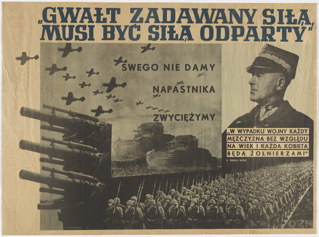
What it is — Lithographic poster for OZN (Obóz Zjednoczenia Narodowego, the semi-official state political bloc of pre-war Poland), 1939, 53.3 × 72.4 cm; the earliest work in this note, five years before Tomaszewski developed his recognisable hand-drawn language.
Composition — Photomontage: a row of cannon barrels in the bottom left corner, above them a column of marching soldiers running the full width, the silhouette of warplanes in flight top left, the portrait of an officer (probably a marshal) fitted in on the right — all layers of photographs montaged one over another, with not a single drawn element. The eye enters through the title at the top, then drops down through the planes towards the cannons and the troops.
Colour — Monochrome, sepia-beige tones of photographic paper; the contrast is carried by black printed text, not colour.
Typography — Printed capitals arranged in three blocks of different sizes ("GWAŁT ZADAWANY SIŁĄ, MUSI BYĆ SIŁĄ ODPARTY" largest at the top; "SWEGO NIE DAMY / NAPASTNIKA ZWYCIĘŻYMY" medium; a small block of text about general mobilisation next to the portrait) — it has nothing to do with his later hand-drawn lettering, it is entirely conventional propaganda typography of its time.
Message — Three-second test: military force (cannons, planes, the column) plus a call to defence — readable as a mobilisation call even without reading the text. From five metres the motif of the march and the weaponry remains recognisable.
Why exactly this way — In 1939, on the eve of the war, photomontage was the standard language of state propaganda across Europe (a legacy of Soviet and German constructivist posters); the young Tomaszewski (25 years old) works in a given idiom, not his own.
What would kill it — Nothing in this work carries his later signature; its value is purely documentary — it shows where he started from, so one can see how complete his later break with this language was.
Principles: —
To verify against the image: the typeface has not been identified; the name of the officer in the portrait is not confirmed in the record.
02 · Urok Szatana — poster for the film by René Clair (1954)
What it is — Lithographic poster for the Polish distribution of the French film La Beauté du Diable (directed by René Clair, 1950, with Gérard Philipe), 1954, 58 × 85 cm (Stedelijk Fi_P-7); the MoMA record has no image but preserves a direct quote from the designer about the intention.
Composition — Three male figures in a row, same silhouette of hat and coat, arranged left-to-right like a filmic sequence of frames: the first fully black, a solid silhouette; the second with the coat's contour thinned into cream, as if losing density; the third fully green, in a distorted, "melted" run — one figure in three states of transformation. The film's title in a small block at bottom centre, below the third figure.
Colour — Three values: black (solid, material), cream/paper white (disappearance), green (devilish, unstable) — colour here literally measures the degree of transformation, it doesn't decorate.
Typography — Hand-drawn lettering for the film title, small relative to the figures — the text is a signature, the figures carry the story.
Message — Three-second test: the same man, three states, the third state is monstrous-green = the "selling of the soul" Faust story readable as a sequence before a single letter of the title is read.
Why exactly this way — According to Tomaszewski's own testimony (MoMA), the Polish state client asked that it not resemble a Japanese, American, Russian, or Swiss poster — the brief was to "find the essence of the film" in one's own language; here the essence is literally a transformation sequence, a film reduced to three static images.
What would kill it — If all three figures were the same colour — the whole effect rests on the gradual loss of solidity and materiality across the sequence, not on the difference between individual figures.
Principles:transformacija-kroz-niz-figuraTo verify against the image: the exact name of the institution/gallery whose copy was photographed at the Stedelijk differs from the MoMA copy by accession number; it is considered the same edition of the poster.
03 · Moore — poster for Henry Moore's sculpture exhibition (1959)
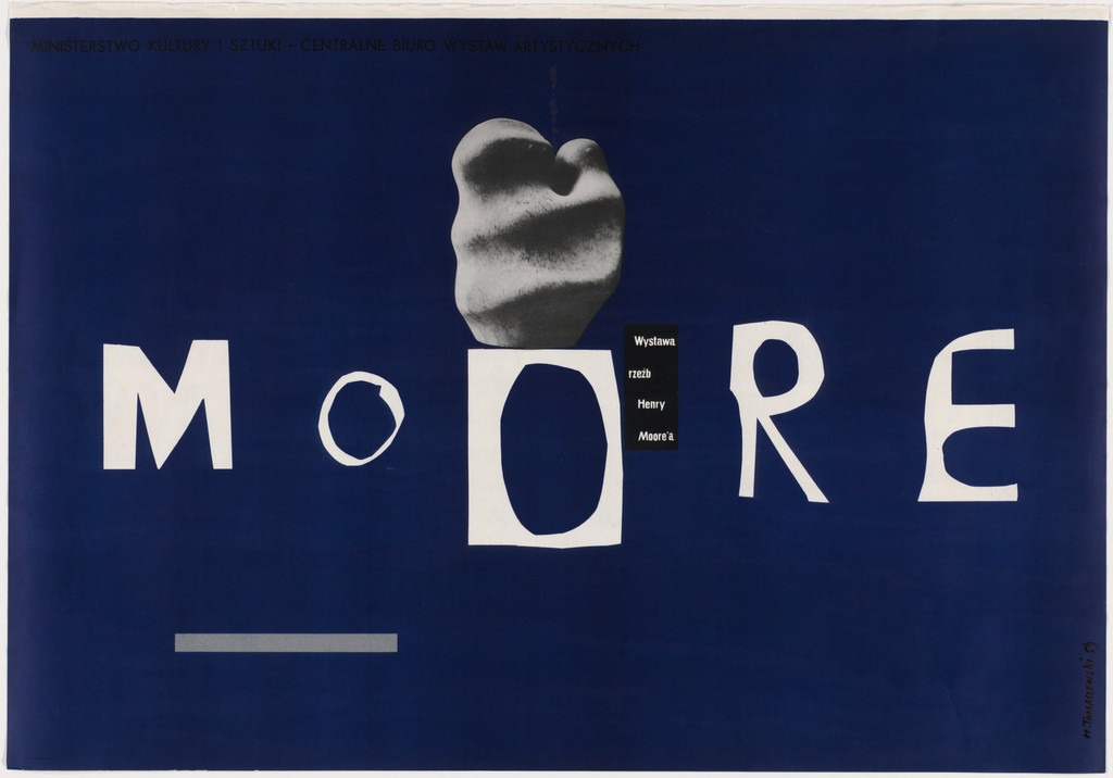
What it is — Lithographic poster for Henry Moore's sculpture exhibition in Warsaw, 1959, 69.3 × 99.1 cm; gift of the designer himself to MoMA. According to a secondary source (Seek & Speak / James Victore), this poster is a turning point in which Tomaszewski "builds a sculptural garden out of the letterforms themselves".
Composition — A saturated indigo-blue field; the word "MOORE" broken into large white letters across the full width, with the spacing enlarged between "M" and "OORE" so as to leave a gap into which a small grey photographic fragment is fitted, resembling a sample of sculptural form (an organic, rounded shape, like a Moore hole-through-form). The eye reads the letter as form before it reads it as word.
Colour — Two values: deep indigo field and white letter, with one grey photographic accent — the same logic of reduction as in the film posters, applied to an exhibition brief rather than a sales brief.
Typography — Large, hand-built capitals — the letter is not a font but a drawn shape whose weight and spacing are part of the composition, not an adjustment made afterward.
Message — Three-second test: the artist's name alone, broken as if it were itself a sculpture — an abstract form (Moore's hole through stone) translated into the space between letters, before a single word about the exhibition itself is read.
Why exactly this way — Moore's sculptures build form around a void (a hole through a mass of stone); Tomaszewski translates that principle into typography — the void BETWEEN letters becomes the place where the form happens, the same trick as in the sculpture.
What would kill it — Even spacing between all letters — the whole point is in the irregular, "broken" spacing that turns the letter into a sculptural object, not into a legible inscription.
Principles:jedna-slika-jedna-rijecTo verify against the image: which exact Warsaw institution organised the 1959 exhibition is not stated in any available record.
What it is — Lithographic circus poster, 1961, 67 × 97.5 cm (Stedelijk 1992.2.0115); one of hundreds of "Cyrk" posters Polish designers made for the state circus administration, here without a single figurative image of a clown or animal.
Composition — The word "CYRK" written in large, irregularly cut letters, each a different colour and texture (C green, Y black, R red, K black), surrounded by six hand-drawn spirals of varying size (black, green) and one black dot and a small red rhombus, scattered across a cream ground without a grid or axis.
Colour — Three colours on a neutral cream ground (green, black, red), each used both for a letter and for an accompanying graphic mark — colour links the letter to the spirals as part of the same visual system, not as separate decoration.
Typography — The letter is a drawing, not a font — each letter a different shape and colour, as if drawn by a different performer in the show; the imperfection of the cut is deliberate.
Message — Three-second test: spirals = the dizziness and movement of the circus, scattered colourful letters = playfulness — the message "circus" arrives from the sheer energy of the composition, without a single image of a tent, clown, or animal.
Why exactly this way — Unlike most "Cyrk" posters (which depict a specific act on the programme), the brief here is generic — a poster for the genre itself, not for a specific show — so the analogy (spiral = circus movement) is the only route possible without illustrating a scene that doesn't exist.
What would kill it — If all letters were the same colour and the same cut — the sense of playful discord that the spirals and letters build together would be lost; a uniform font would turn the poster into an ordinary name, not a visual circus act.
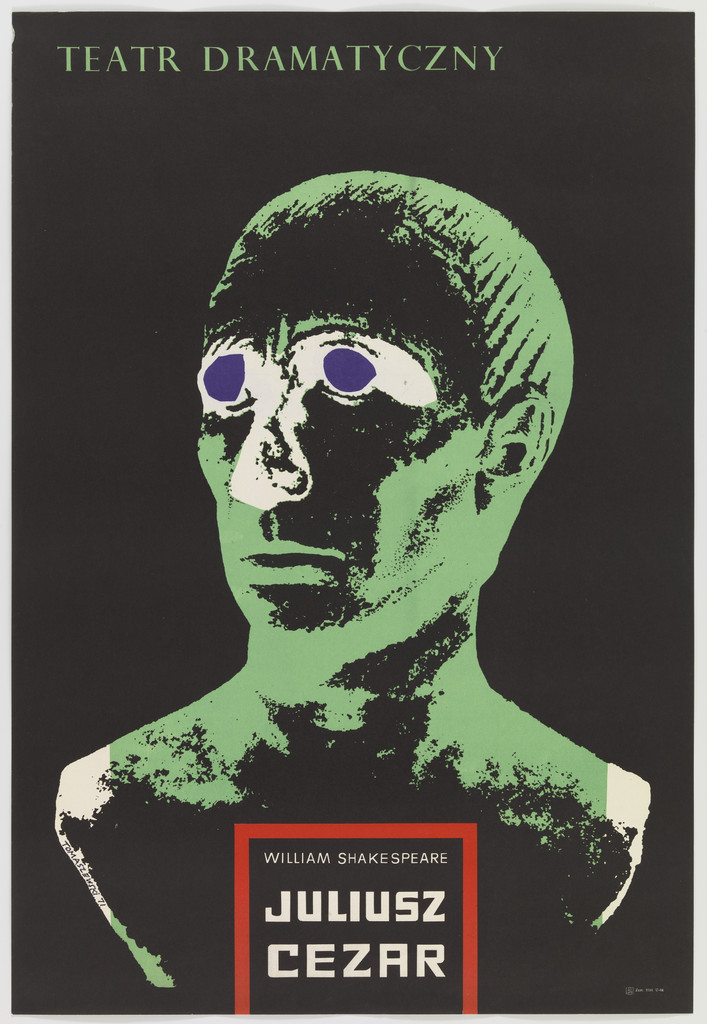
What it is — Lithographic theatre poster for the production "Juliusz Cezar" (Shakespeare) at the Teatr Dramatyczny in Warsaw, 1971, 86.6 × 59 cm.
Composition — A large portrait of a head on a black ground, shaven skull, with two hollow, purple-rimmed eye-whites without pupils — like an ancient marble or bronze bust, not a living face. The theatre's name in a white block at the top, the title of the play in a white block at the bottom — the head occupies the whole centre, framed by two texts like an inscription on a monument's pedestal.
Colour — A green head on a black ground — the colour of patina on bronze or mould on old marble, not the colour of living skin; purple only in the rim of the eyes, as the sole "bloody" accent on an otherwise deathly palette.
Typography — Printed capitals in white rectangular fields, strictly separated from the image — the only piece in this note where the text is NOT fitted into the drawing but stands as a plaque-like inscription.
Message — Three-second test: a face like a statue = a ruler/historical figure already dead before the play begins — the green colour announces in advance the decay/murder that is the drama's central event, before a single name is read.
Why exactly this way — By the time of the play Caesar is already a symbol, not a person — the statue is the right choice because the play begins with historical distance (everyone knows how the story ends); the green/purple palette fuses "monument" with "corpse".
What would kill it — Realistic skin instead of patinated stone/metal — the moment the face becomes the portrait of a living person, the idea that we are looking at an already-monument, not a man, is lost.
Principles: —
To verify against the image: whether the green colour is a deliberate reference to bronze patina or to marble overgrown with moss is not clarified in the available sources — both readings are visually possible.
06 · Varsovie 1975, Théâtre des Nations, Entrée (1975)
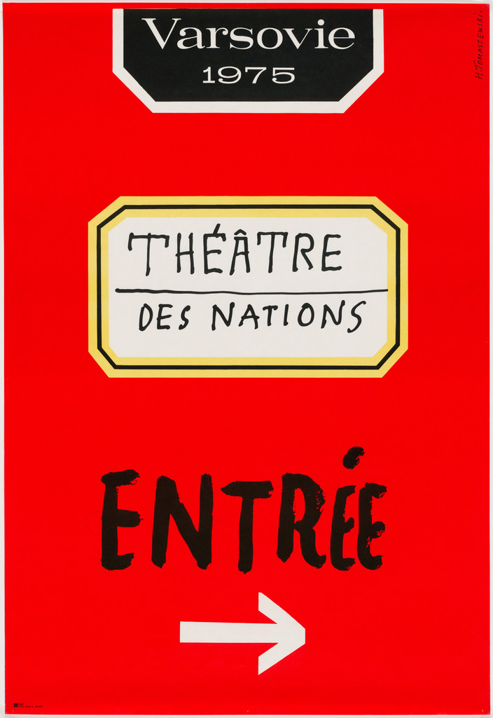
What it is — Lithographic signage poster for the Warsaw edition of the international theatre festival Théâtre des Nations, 1975, 98.4 × 67.3 cm — a functional entrance marker, not a show announcement.
Composition — The whole surface is saturated red; near the top, a black plaque with "Varsovie 1975" (white lettering), below it a cream/gold plaque with a gold border and "THÉÂTRE DES NATIONS" — both plaques imitate museum or monument plaques. Below, hand-written "ENTRÉE" in large black lettering and a white arrow pointing right.
Colour — One saturated red ground carries everything; two plaques (black, cream-gold) give hierarchy of information (city/year vs. festival name), black/white for the functional, urgent message (enter here).
Typography — Two registers: neat, "official" lettering on the plaques (city, festival) and hand-written, quickly drawn lettering for "ENTRÉE" — the difference in lettering signals the difference in function (ceremonial announcement vs. practical instruction).
Message — Three-second test: red + arrow + "ENTRÉE" readable as "enter here" even to someone who knows neither French nor Polish — functional signage that works as a poster and as a sign at the same time.
Why exactly this way — The task is not to sell the show but to direct a physical audience on the ground at a festival in a foreign city (Warsaw, international guests) — hence two layers of text: "ceremonial" (name/year/festival) and operational (arrow, entrance).
What would kill it — If "ENTRÉE" and the arrow were written in the same neat lettering as the plaques above — the functional message would be lost in decoration; the difference in register IS the message.
Principles: —
To verify against the image: the exact location (which building/entrance in Warsaw) the poster was placed at is not stated in the record.
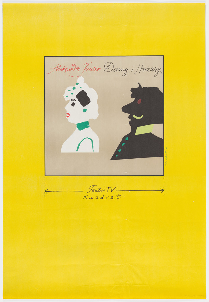
07 · Aleksander Fredro — Damy i huzary, Teatr TV Kwadrat (1977)
What it is — Offset lithograph poster for the television theatre adaptation of Aleksander Fredro's comedy "Damy i huzary" (Teatr TV "Kwadrat"), 1977, 96.8 × 66.5 cm.
Composition — Saturated yellow field; in the centre, a smaller framed rectangle (grey ground) with two figures in profile facing each other: a lady with an ornamented white-green hairstyle/hat and a black silhouette of a moustached hussar officer. Below the framed field, a thin line with arrows at both ends (like a technical dimension line on a drawing) and the text "Teatr TV Kwadrat" — as if the scene were literally "measured" with an instrument.
Colour — A full yellow field (the most saturated colour in this whole body of work covered here), grey background inside the frame, white-green lady, black hussar silhouette — the contrast of warm yellow against cold grey/black sets the central scene apart as a "specimen under glass".
Typography — Hand-written cursive lettering for the title (author's name and title of the piece) above the framed scene — the cursive suggests the written/manuscript tone of a comedy of manners, unlike the printed lettering used for Cezar.
Message — Three-second test: a lady and a soldier in profile, "measured" by a dimension line = a witty, "scientific" distance toward a drawing-room comedy about courtship and soldiers — Fredro's humour translated into the humour of the depiction itself (drawing as diagram).
Why exactly this way — Fredro is a writer of light, witty comedies of manners; the dimension line is a visual joke that treats the romantic scene as a technical object of measurement — the same degree of irony as in the text of the comedy itself.
What would kill it — Removing the dimension line — without it, only an illustration of two figures remains; with it, the scene becomes a comment on the very act of depicting/measuring human relations.
Principles:gest-rukom-nasuprot-rezuTo verify against the image: the exact year the TV adaptation aired (as opposed to the poster's year) is not stated in the record.
What it is — Advertising poster for the French cigarette brand Gitanes (Seita), 1991 — one of the rare Western commercial clients in this body of work, made in the last decade of his career.
Composition — A square sign in the form of a standard traffic prohibition sign (red border, blue diagonal line across the symbol) — but instead of a cigarette, inside is the silhouette of the well-known Gitanes logotype (a flamenco dancer in motion, with legs leaving a trail of smoke/movement behind her). Below the sign, the pink cursive logotype "gitanes".
Colour — The red-blue-white of the traffic sign (a universally recognisable convention) plus the black silhouette of the dancer and the pink brand logotype — the colours of the sign are deliberately "borrowed" from a system that sells nothing but prohibits.
Typography — The existing cursive Gitanes logotype (not lettering designed by Tomaszewski) — the only work in this note where the typography is not his own hand but someone else's trademark.
Message — Three-second test: a recognisable "prohibited" sign, but with marketing content instead of a prohibition = a witty inversion of a universal visual language — the message works precisely because the viewer first reads "prohibited", and only then realises it's an advertisement.
Why exactly this way — By 1991, cigarette advertising in Europe is already under pressure from regulation and no-smoking signs in public space; Tomaszewski turns that very visual sign of prohibition into a vehicle for advertising — the same logic of analogy (a borrowed form carries new meaning) as in the Cyrk spiral, here applied to ready-made, borrowed iconography.
What would kill it — If the sign had been drawn as an original symbol (not as a recognisable traffic sign) — the whole joke depends on instant recognition of an existing visual convention that is then subverted.
Principles:znak-konvencije-izvrnutanalogija-umjesto-ilustracijeTo verify against the image: the exact distribution medium (street poster, magazine) is not stated in the AGI record.
Other works — evidence, no analysis
50-ème Anniversaire de l'Union Internationale de la Marionnette (1978) — poster for the fiftieth anniversary of the International Puppeteers' Union. record
Jan August Kisielewski, Karykatury (1978) — poster/catalogue for a caricature exhibition. record
"Pralnia" (Laundry Tym S.) (1981) — late work, evidence of the method's continuity into the eighth decade of his career. record
Principles — summary
gest-rukom-nasuprot-rezu — a hand-guided, deliberately imperfect gesture (letter, line) as the opposite register to a precise, machine-neat cut; shared with Saul Bass.
analogija-umjesto-ilustracije — a borrowed form (spiral, traffic sign) carries meaning instead of a literal picture of the object.
jedna-slika-jedna-rijec — the whole message reduced to a single graphic gesture (a broken letter, one transformation).
vic-sa-odgodom — the message is built as a joke with a delayed "fuse": first shock/surprise of recognition, only then the smile of understanding (Gitanes, Cyrk).
transformacija-kroz-niz-figura — the same motif repeated in a series with progressive change (Urok Szatana) translates a filmic sequence into a single still image.
serija-bez-fiksnog-recepta — the body of work deliberately avoids a fixed layout or regime (unlike Lester Beall and Alvin Lustig); each work changes technique, not just the motif — the "chord" is never repeated.
znak-konvencije-izvrnut — an existing universal visual sign (traffic sign, museum plaque) taken over and subverted for a new purpose.
Bridge to practice: poster · graphic design · motion
Poster
Before opening Illustrator, decide what "chord" of this poster is different from the last one — Tomaszewski never repeats the same layout/technique two times in a row. If the last poster was clean vector, draw the next one by hand and scan it; if the last one was dense, reduce the next one to a single gesture.
Graphic design
Take a ready-made, universally known visual sign (traffic, warning, ISO) and swap out its content — like the Gitanes prohibition-that-advertises. Test: does the viewer first read the OLD meaning of the sign, and only then the new one? If they read only the new meaning right away, the witty inversion is lost.
Motion
Treat the sequence (Urok Szatana) as proof that three static images can carry a montage — in AE make three keyframes of the same figure in three degrees of "decay" of form (colour, density, contour) and play them as a cut, not a morph; a cut between states is stronger than a smooth transition.
Bad imitation
Someone copies "hand-drawn" lettering with Illustrator's brush tool at perfectly consistent pressure — the result is a decorative font that LOOKS clumsy but is actually perfectly repeatable, so it loses exactly what clumsiness carries: proof that someone actually made a mistake. Someone makes a "witty" poster with a double meaning that is immediately clear to the reader the moment they see the image — without delay, without a moment where the brain first reads one thing and then another — so the joke doesn't "land", it merely illustrates a pun. Someone attempts a series of posters with deliberately different technique in each, but without a single shared reason (same client, same theme) to justify the differences — the result is unsystematic, not a "jazz variation" but a lack of decision.
The brief through their eyes
First I'd ask: what question does this job actually pose, before asking what form it should take. Then I'd look for a ready-made, universally known visual sign or convention tied to the theme, and ask whether that convention could be subverted instead of illustrating the content all over again. Finally I'd check whether the result sounds like the "same chord" as the last job — if so, I'd look for another technique, not another motif.
Exercises
Take any ready-made, universally recognisable sign (traffic, ISO, safety pictogram) and swap its content for a theme from your own work — check whether the viewer first reads the OLD meaning. Draw the same small motif three times with the same tools but each time deliberately in a different technique (brush, scissors, marker) and compare how much each version changes the "tone" of the same idea.
Motion study
A 5-second exercise in AE or MOHO: one character/shape shown in three static states (full density → transparent → completely transformed, like Urok Szatana), cut together as three edits with not a single smooth transition. Constraint: three frames, zero interpolation between them — the audience "completes" the motion themselves.
Rebuilding the benchmark
The benchmark is Moore (work 03) — measure from the image the position and proportion of each letter block and the gap between "M" and "OORE" in % of the format (letter width, gap width, position of the grey photographic fragment), then rebuild it in Illustrator in 45 minutes without looking at the original, making your own "gap that carries the form" with a different word.
Notes on sources
Awards in Vienna: v1 stated "1953, all five gold medals"; all sources found (MoMA gallery label, Design Reviewed, Culture.pl) give 1948, with two different formulations of the number/kind of award ("five gold medals" vs. "five first prizes") — corrected to 1948, the exact nature of the award remains provjeriti uz sliku (no access to the original exhibition catalogue).
Students: v1 (implicitly, per this project's format) treated Starowieyski, Sadowski and Pągowski as Tomaszewski's students. Only Wiktor Sadowski is confirmed (Wikipedia: graduated 1981 from his studio). Franciszek Starowieyski studied in Kraków and Warsaw 1949–1955 (overlaps with the start of Tomaszewski's professorship in 1952, but a direct teacher-student link is not confirmed). Andrzej Pągowski graduated in Poznań in 1978, not under Tomaszewski — he is not carried forward as his student.
English Wikipedia claims that Tomaszewski is the "father" of designer Filip Pągowski. This is likely an error: Filip Pągowski, in public interviews, speaks of "my father's posters" from the 60s, 70s and 80s, and bears the surname Pągowski — which matches Andrzej Pągowski (born 1953, well-known Polish poster designer), not Tomaszewski. The claim has not been carried into this note as fact.
Royal Designer for Industry: the year differs between sources — 1975 (Design Reviewed, AGI indirectly) versus 1976 (one Culture.pl mention) — not resolved within this session.
Urok Szatana: the MoMA record (which also carries the only direct designer quote used in this note) has no image available; the image was found at the Stedelijk museum (a different copy/accession number, same edition of the poster) and used for the visual analysis.
The institution for the Moore exhibition (1959) is not named in the available sources — only the city (Warsaw) and the year.
Cause of death ("progressive nerve degeneration") is taken from Wikipedia without an additional medical source to confirm the diagnosis.
A secondary source (Seek & Speak / James Victore) describes Moore as a "sculptor's garden of letterforms" — in the image seen, there is one photographic fragment present, not multiple figurative elements; the phrasing has been carried over as the source's interpretation, not verified by additional viewing of other versions of the poster.