title designer and corporate identity designer; own studio in Los Angeles (Saul Bass & Associates, from 1978 Saul Bass/Herb Yager & Associates) Bronx, New York → Los Angeles
Symbolize and summarize.
Biography
Born 1920 in the Bronx, into a family of Eastern European Jewish immigrants. Finished
James Monroe High School, then attended the Art Students League in
Manhattan part-time; decisive were the evening classes with György Kepes at Brooklyn
College — through Kepes, who had earlier worked alongside Moholy-Nagy, Bass gets the Bauhaus
second-hand, as a method of reduction, not as direct contact with the movement. In the early
forties he works on film advertisements (Champion, 1949; Death of a Salesman, 1951),
moves to Los Angeles and in 1954-55 gets from Otto Preminger the assignment that will
define his career: not just a poster but also a title sequence for Carmen Jones,
followed immediately by The Man with the Golden Arm (1955).
The established story in design literature says this created the first complete
visual identity ever made for a film. Film scholarship disputes this: Deborah Allison (Film International) shows that
ambitious, animated, and narratively integrated title sequences already existed
in the silent and early sound era (twenties and thirties), and that the "auteurist"
focus on Bass covered over an entire layer of anonymous authors before him. What Bass
actually introduces is not moving image in titles as such, but the fusion: one
reductive graphic symbol that simultaneously works as a poster, as a
title sequence, and as a preview of the story — all from the same drawing.
He worked for over four decades with Preminger, Hitchcock, Wilder,
Kubrick, and, in the final phase of his career, Scorsese. With Hitchcock, on
Psycho (1960), he was credited as "pictorial consultant" and claimed he
directed the shower murder scene; Janet Leigh originally disputed this, and
film scholar Bill Krohn, based on 48 surviving storyboard panels, concluded
that Bass designed the scene and worked it out down to the smallest detail
(the attacker's silhouette, the close-up of the knife, the torn curtain, the
drain-to-eye transition), but that Hitchcock
was present and that he was the one actually shooting — Bass did not "direct" in
the literal sense of the word. To convince Hitchcock that the concept worked at all, Bass
himself shot a test version eight days before filming with Marli Renfro, Janet Leigh's
body double.
Parallel to the film titles he builds one of the strongest corporate
identity practices in America: Continental Airlines (1968), United Airlines' "tulip"
(1974), Minolta, Quaker Oats, Geffen Records (1980), the Hanna-Barbera star
(1979), and two marks for the same client 14 years apart —
the bell in a circle for Bell System (1969) and the striped globe for AT&T (1983), created after
the antitrust breakup of the company in 1982-84, when AT&T could no longer
use the name or mark "Bell". Both marks share the same method: a silhouette reduced to a
line of variable thickness, so it holds up at any size and in single-colour
reproduction.
From the mid-sixties to the late eighties he and his second wife
Elaine Bass (married in 1961, collaborated on title sequences for over
thirty years) shift their attention to directing films — the short
Why Man Creates (1968) wins an Oscar for best documentary short, Phase IV
(1974) is his only feature-length directing work. James L. Brooks and Martin
Scorsese bring them back into title design in the early nineties: Goodfellas
(1990), Cape Fear (1991), The Age of Innocence (1993, using slow-motion
photography), and Casino (1995) — the last sequence the couple made.
The last commissioned poster, for Schindler's List (1993), was not distributed.
He died in 1996 of non-Hodgkin's lymphoma. His daughter Jennifer Bass later
co-edits a monograph on his complete body of work.
Influences
Studied with
Art Students League, Manhattan — evening classes, specific teacher not named in sources
György Kepes — evening classes at Brooklyn College; through Kepes comes an indirect Bauhaus influence (Kepes had earlier worked alongside Moholy-Nagy in London and Chicago), not direct contact with the Bauhaus
Borrows from
the reductive poster logic of the European interwar school (Cassandre, Constructivism) — indirectly, through Kepes's teaching, no personal contact confirmed
montage as a way of building an image — the title sequence is built as a film cut, not as illustration
jazz as a structural principle: design made to a count given in advance by the composer, not fitted afterward to finished music
Influenced
the entire branch of title design after him — Kyle Cooper (Se7en, 1995) explicitly names Bass as his starting point
corporate identity as an American post-war discipline — measuring 'whether the mark works in one colour and at every size' becomes the standard test
the "Saul Bass look" as a widely copied, often trivialised style (see Bad imitation)
Contemporaries
Paul Rand — the same American post-war corporate identity, opposite medium: Rand's mark is a fixed image that gets reproduced, Bass's mark is motion that can, incidentally, be fixed as an image
Who he studied under
György Kepes — evening classes at Brooklyn College; indirect transfer
of the Bauhaus method of reduction (Kepes had earlier worked alongside Moholy-Nagy). No formal
teacher at the Art Students League is named in the available sources.
What he steals
The reductive logic of the European interwar poster (Cassandre, constructivist
montage) — indirectly, through Kepes's teaching, without confirmed personal contact.
Montage as a principle of image-building: the sequence is built like a film cut, not as an
illustration following the action. Music as a structural framework — designed
to a given number/beat in advance (Elmer Bernstein gave him the
"count" for Golden Arm before the design was finished: "He gave me the beat... I
designed to that beat").
Who he influenced
The entire field of film title design after him — Kyle Cooper (Se7en,
1995) explicitly cites Golden Arm and Psycho as the starting point of his own
practice. In corporate identity, his test "does the mark work in one colour
and at every size" becomes the standard check of the trade. The "Saul Bass look"
itself becomes so copied that it causes banalization, not respect for the original
(see Bad imitation).
Contemporary: Paul Rand — the same American postwar moment of
corporate identity, opposite medium: Rand's mark is a fixed image
made to be reproduced (IBM, ABC, UPS); Bass's mark is movement that can,
incidentally, be fixed as a still image — even his static logotypes
(the Bell bell, the AT&T globe) are drawn as a line of variable thickness, built
to "withstand" animation before any of them was actually animated.
Difference from the already covered pair:Paul Rand ↔ Bass — both
reduce identity to a single mark without text around it, but Rand makes a mark
that stands still and carries meaning through the wit of the form (Eye-Bee-M), while
Bass makes a mark that is already, in its very drawing, a rehearsal of motion — the
difference between a designer who thinks in a fixed image and a designer who thinks
in a frame.
What it is — A single-sheet poster for Preminger's film about heroin
addiction, lithograph, 1955; the first time a poster and a title sequence
share the same graphic system. Signed Bass (signature visible next to the blue band).
Composition — Cream surface divided into irregular "collage" blocks:
a petroleum-blue and black rectangle at top, a jagged black band across the
middle out of which an arm is "cut," reaching diagonally downward, two narrow
photographs (Sinatra on the right, Novak/Parker on the left) wedged into the black
block, a blue and purple horizontal strip at the bottom with a third photograph. The eye
doesn't follow the centre but the diagonal of the arm, from the upper black block to the
tiny black hand at the bottom of the title text.
Colour — Four flat colours (petroleum, black, indigo-blue, purple) on
a cream base, without gradient and without photographic colour
reproduction — the photographs are black and white, inserted as material, not as tone.
Typography — Hand-lettered condensed capitals (Harold Adler), gold
on black, with jagged edges that follow the jaggedness of the arm itself — the letter and the symbol
share the same cut, they are not two separate crafts joined afterward.
Message — The three-second test: a jagged black arm on a light ground
reads as "a broken body" before a single letter of the title is read. From five metres
the silhouette of the arm and the film's name remain recognisable.
Why exactly this way — The studio wanted to sell the stars (Sinatra, Novak,
Parker); Preminger agreed that the symbol of addiction should be more dominant than
the actors' faces — a rare concession for a Hollywood poster in 1955.
What would kill it — Replacing the jagged, broken line of the arm with a smooth,
"tidy" silhouette — precisely the tremor of the cut is the visual equivalent of
the "broken" life of the addict that Bass speaks of in his own statement of intent.
Principles:redukcija-na-jedan-pokretni-gestfragmentacija-tijela-kao-simboldizajn-po-otkucaju-muzikeTo verify against the image: the exact dimensions of the poster are not given in any
available record.
What it is — Single-sheet poster for the Hitchcock film, 1958; shares
the spiral motif with the title sequence Bass made with John Whitney
(Lissajous curves generated on a mechanical analogue computer — one
of the first uses of computer graphics in film).
Composition — The whole surface is one saturated orange plane; in
the centre a concentric spiral of white/cream lines that pulls the eye
in toward the middle, where a black silhouette of a man falls together
with an outline (not black, just a contour line) silhouette of a
woman — two different drawing techniques for two bodies in the same
fall. The film title in a narrow hand-lettered face at the bottom, the
actors' names in the same lettering at the top — the text frames the
spiral, doesn't cut into it.
Colour — Essentially two values: the orange field and the whiteness
of the spiral, with a small red oval at the very centre of the
vortex — a minimal palette that heightens the optical vertigo effect
without a single extra colour.
Typography — Narrow, hand-lettered capitals, the same texture as
Golden Arm but less jagged — here the subject is dizziness, not
breakage.
Message — Three-second test: spiral + falling body = a physical
sense of vertigo before a single word is read; the title "VERTIGO"
arrives only as confirmation of what the eye has already felt.
Why exactly this way — The film is about obsession and loss of
balance; the spiral is the only geometric shape that literally
simulates that state on a static poster surface, without a single
figurative scene from the film.
What would kill it — A static, concentric target without falling
figures — the spiral alone would be decorative; only the fall of two
bodies through it turns it into a psychological symbol, not an optical
toy.
Principles:redukcija-na-jedan-pokretni-gestsekvenca-je-dio-filmaTo verify against the image: the exact split between Bass's and
Whitney's contribution to the technical execution of the spiral is not
separated out in the available sources — Whitney built the curves on the
machine, Bass ran the graphic concept.
What it is — Single-sheet poster for Preminger's courtroom drama,
The PGDA record gives the wrong year (1955, the year of Golden
Arm) — corrected here to the film's release date.
Composition — A human figure taken apart like a broken toy: torso,
two legs, two forearms placed separately on the orange surface, each
part slightly shifted from its neighbour as if the body has literally
been dissected — the film title lettered inside the torso itself.
Colour — Orange gradient (lighter at top, darker at bottom) with a
black silhouette of the figure; the lower half of the poster shifts
into a more saturated orange field with the cast list in outline
lettering.
Typography — Hand-lettered type placed inside the figure's body —
the title isn't separate from the image but literally sits "in" the
cut torso.
Message — Three-second test: the dismembered body = "anatomy"
literally shown before the word "murder" is read — the poster stages
the film's own title as a visual cipher.
Why exactly this way — The film is a courtroom drama about murder,
not an action film with on-screen violence; the fragmentation is
abstract and graphic, not literal blood — it allows the subject
without censorship risk in 1959.
What would kill it — Reassembling the figure into a whole body —
the moment the parts join, the exact image is lost that turns the
title "anatomy of a murder" into a picture, not a metaphor.
Principles:fragmentacija-tijela-kao-simbolrez-britvom-kao-fakturaTo verify against the image: exact poster dimensions are not given in
the record.
What it is — Single-sheet poster for Preminger's political drama
about confirming a cabinet appointment in the Senate, 1962.
Composition — Red surface; above, an arm (just forearm and hand)
holds a handle as if from a bag or briefcase, from which hangs a price
tag with a silhouette of the Capitol dome and the film title — the
cast list is lettered directly on the "bag" between the arm and the
tag.
Colour — Saturated red surface, black arm and text, white tag —
only three values, maximum contrast between the "goods" (red field)
and the "price" (white tag).
Typography — Hand-lettered type for the cast list, fitted into the
outline of the bag; more compact, outline lettering for the film title
on the tag.
Message — Three-second test: politics (the Capitol) has a price
(the tag) and someone holding it in hand (the bag) — the whole
political intrigue of the film reduced to a transaction before a
single actor's name is read.
Why exactly this way — The film is about voting, blackmail and
trading influence in the Senate; the buying metaphor is a direct
translation of the theme into an object, not an illustration of a
scene from the film.
What would kill it — If the tag didn't hang from the arm but stood
separately — the link between "someone holds/controls" (the arm) and
"what's being sold" (the tag) must be physical, not just
compositional.
Principles:predmet-kao-metaforaredukcija-na-jedan-pokretni-gestTo verify against the image: exact poster dimensions are not given in
the record.
What it is — Corporate mark for American Telephone & Telegraph and
its 23 regional companies ("Bell System"), 1969 — the sixth version of
the bell since 1889. Accompanied by a logotype in Helvetica with
customised spacing; rolled out through the largest rebranding
programme in American history (roughly 135,000 vehicles, 22,000
buildings, 1.25 million payphones, over twelve manuals).
Composition — A solid bell silhouette (not a line drawing of a bell
but a solid shape) set inside a circle, both elements built with the
same, uniform line weight — the circle and the bell share the same
"wall" thickness, so at small size (the mark on a payphone) no detail
disappears.
Colour — Essentially one colour, "Bell Blue" on white for the mark;
black text on white for the logotype — the system is built to work in
a single colour too (stamped into metal, engraved, etc.).
Typography — Logotype in Helvetica, with hand-adjusted letter
spacing (not the font's standard kerning) — documented in the source
as part of the identity manual.
Message — One object (the bell) recognisable at any distance and in
any application — "every impression contributes to the whole, every
signal is part of the mosaic" (Bass's own formulation in the pitch
film for AT&T management).
Why exactly this way — In 1969 the company had 23 different
regional versions of the bell with no unified typography; the task
wasn't "a new symbol" but one symbol that could withstand thousands of
different materials and sizes without losing legibility.
What would kill it — Detailing the bell (shading, an outline
instead of a solid silhouette, a circle line thinner than the bell
line) — any inconsistent line weight breaks the impression that the
mark is one continuous cut, not an assembled illustration.
Principles:znak-od-linije-promjenljive-debljineTo verify against the image: the exact number/appearance of the
earlier five versions of the bell (1889-1969) is not separated out in the
available sources.
What it is — Corporate mark for AT&T Corporation, 1983, a direct
consequence of the antitrust breakup of the Bell System (1982-84),
when AT&T could no longer keep the "Bell" name or mark. AGI (the
professional association Bass was a member of) lists the mark as
Bass's own, "successor to his 1969 Bell System mark".
Composition — Horizontal bands of varying width arranged so that
the density and spacing of the bands alone create the illusion of a
sphere (globe) without a single curved line literally drawn — the
principle is the same as with the bell (line builds form), applied to
a completely different object.
Colour — In a blue version (the best known) and a black-and-white
version for single-colour reproduction — the same test as 1969: the
mark has to work in one colour.
Typography — The "AT&T" logotype in Helvetica, a heavier weight,
placed directly next to the globe in a horizontal arrangement.
Message — "Global communication" expressed without a single
literal element (no telephone, no cable, no continents) — the sphere
form built from lines alone carries the meaning.
Why exactly this way — The company was transforming from a
regional telephone monopoly into a global player; the bell was tied to
American telephony, the globe isn't tied to any technology or
territory.
What would kill it — A solid, closed sphere silhouette instead of
bands — that would lose exactly the quality (transparency, the
"network" of lines) that makes the mark more modern than a solid,
"corporate" ball.
Principles:znak-od-linije-promjenljive-debljineTo verify against the image: the number of bands and the years of
revision are given inconsistently across sources (twelve bands 1983-1999
according to one source, a change to eight bands in 1999 according to
another; the Wikimedia record for the file itself mixes them up further)
— treated here as a construction principle, not as an exact band count.
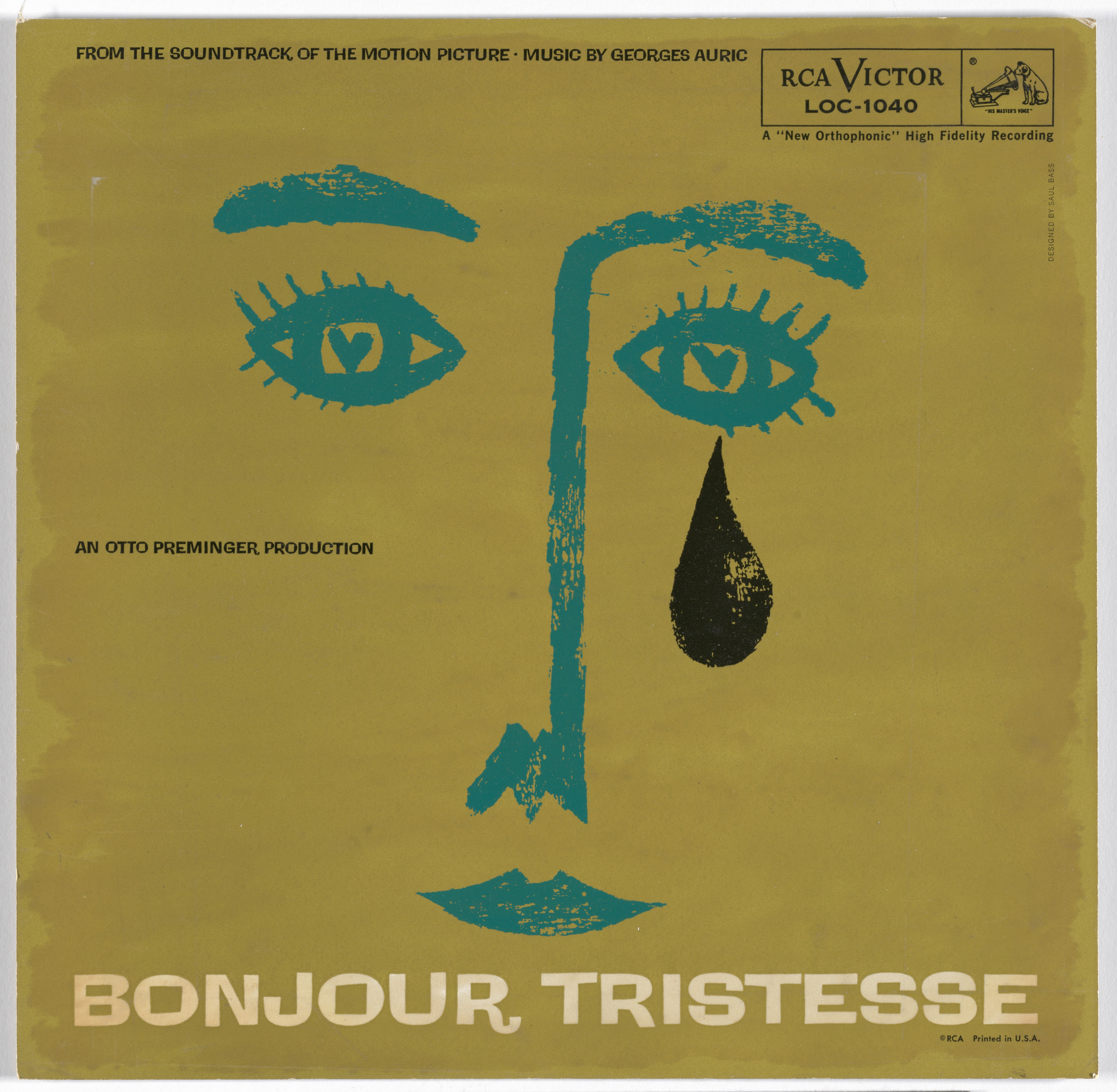
What it is — Record sleeve for the music from Preminger's film (composer
Georges Auric), lithograph, gift from the designer himself to MoMA; 29.2 × 30.8 cm.
Note: the copy circulating on PGDA and collector sites is a
later reissue (label "Milan") with the same drawing — MoMA's copy
is the authentic 1957 one.
Composition — Simplified face in three strokes: eyebrow, eye with a
tear, nose/mouth — all crammed into the upper half of a square area,
the lower half empty yellow.
Colour — Mustard-yellow ground, turquoise-blue face line, a single
teardrop in black as the only accent outside those two colours.
Typography — Hand-lettered condensed type for the film title, composer,
and "original motion picture soundtrack" — bolder than poster titles,
legible on the small surface of a record sleeve.
Message — "Tristesse" (sadness) read literally as a tear on the face before
the title is even read — the sleeve translates the novel's/film's title
into a single pictogram.
Why exactly this way — The format is a record sleeve, not a poster — a smaller
surface and a square format demand an even greater degree of reduction than a poster
by the same designer in the same year.
What would kill it — A more realistic face (nose, lips, eyebrows drawn in full) —
the moment the face becomes a portrait rather than a pictogram, the direct
link between form and the single word of the title is lost.
Principles:gest-rukom-nasuprot-rezupredmet-kao-metaforaTo verify against the image: whether the RCA Victor pressing from 1957 is
identical in every detail to the drawing on the later "Milan" reissue
(the ground colour on the reissue is more saturated) not measured with an
instrument, only visually.
What it is — Single-sheet poster for Wilder's Cold War comedy,
1961, filmed in West Berlin.
Composition — A crudely felt-tip-drawn woman's face at the top; three
white balloons with the words "ONE TWO THREE" hand-lettered; a black silhouette
of a hand at the bottom holding the balloon strings.
Colour — Saturated orange ground (the same colour family as Anatomy
of a Murder from the same decade), black-and-white figures with no shading or gradient.
Typography — Hand-lettered, deliberately unpolished letters (felt-tip pen,
imperfect spacing) — the opposite of the precisely cut posters for dramas.
Message — The three-second test: a childish drawing (balloon, crude face) =
comedy, before a single actor's name is read — the register of the drawing
itself announces the genre.
Why exactly this way — The film is a farce, not a drama; the same reductive method
(one gesture, few colours) is translated here into an unskilled, quick drawing rather
than a precise paper cut — proof that the method adapts to tone, it isn't a fixed style.
What would kill it — A more precise, "tidier" drawn face — the humour that comes
precisely from the drawing's clumsiness would be lost; this poster works because
it looks unfinished.
Principles:gest-rukom-nasuprot-rezuTo verify against the image: nothing crucial; the composition and technique are clearly
visible on the available scan.
Other works — evidence, no analysis
The Shining — poster (1980, accepted version) — Kubrick rejected several of
Bass's concepts in writing ("hard to read, even at this size",
"hotel looks too sprawling") before the final version was accepted; the rejected
concepts are better known today than the accepted one. record · rejected concepts
2nd New York Film Festival — poster (1964) — a standalone work for a
film festival, not for an individual film; evidence that the same reductive
language transfers to an institutional, not only a studio, client. record
Saul Bass and Associates — self-promotion (Graphis/Communication Arts
contributions, early 1950s-60s) — evidence that the studio conducted its own
promotion in the same language as client work. record
Principles — summary
redukcija-na-jedan-pokretni-gest — the whole problem (film, company,
political subject) is reduced to a single graphic gesture conceived to
MOVE, even when the final product is a still image.
sekvenca-je-dio-filma — the title sequence isn't an announcement but the first shot of
the film, a formal statement of theme before the plot.
fragmentacija-tijela-kao-simbol — a disassembled or fractured body as a
graphic metaphor for illness, addiction, or crime — abstract, not literally
violent.
rez-britvom-kao-faktura — the trace of a knife/scissors in the edge of a shape carries
meaning; a smooth vector edge kills it.
znak-od-linije-promjenljive-debljine — a corporate mark built as a
continuous line of even thickness, so it holds up at any size and in
single-colour reproduction.
predmet-kao-metafora — an abstract theme (politics, sadness) translated into a
concrete, tangible object (price tag, tear) instead of an illustration of a
scene.
gest-rukom-nasuprot-rezu — a deliberately unskilled, hand-drawn line as the opposite
register to a precise paper cut, used when the tone is comic or emotional
rather than dramatic.
dizajn-po-otkucaju-muzike — visual rhythm determined by a pre-set
musical count/beat, not synchronised afterwards.
Bridge to practice: poster · graphic design · motion
Poster
Before you open Illustrator, write one sentence: "this poster must
say X before a single word is read." If that sentence doesn't exist,
the composition will end up as a list of elements, not a message.
Graphic design
A test for every mark you make: turn it into a single-colour silhouette, at
favicon size (16×16 pixels). If you can still read what it's about, the mark
is good; if not, the problem is in the shape, not the colour or typography you'd
add.
Motion
Don't sync the animation to music afterwards — write down the beats (BPM, count)
BEFORE you start animating, the way Bass did with Bernstein. Key frames land on
the beat, not on "whatever looks good".
Bad imitation
Someone copies the "cutout" look with a vector tool instead of cutting paper or
hand-drawing — the curve comes out smooth, without the tremor of a cut, and the entire
"brittleness" effect disappears even though the silhouette is identical. Someone makes a
minimalist film poster with a single silhouette on a single colour, but with no idea tying
the silhouette to a SPECIFIC film — the result is a generic "Bass homage" poster that would
fit any title equally well (badly). Someone syncs motion graphics to the music's beat
literally (an element pulses on every beat) but forgets that the beat also has to carry
an idea, not just rhythm — the result is a technically accurate, content-empty exercise.
The brief through their eyes
First he'd ask: what ONE sentence describes this job, and can that sentence
become a shape that moves? Then he'd test that shape in a single colour and at
the smallest possible size — if it doesn't work there, it doesn't work anywhere. Finally he'd
insist that the rhythm (musical or visual) be set in advance, not added at the
end as decoration.
Exercises
Pick any earlier poster of your own and reduce it to ONE graphic gesture without
text — if the gesture alone doesn't carry the message, the poster is already
relying on text more than it should. Draw the same symbol in two techniques — cut
paper (sharp edge) and felt-tip pen (unskilled line) — and compare which tone
each technique carries automatically, independent of the shape itself.
Motion study
5-second exercise in AE or MOHO: your own initial or mark is composed
of scattered fragments (paper pieces, lines) that, in one continuous
motion, on a pre-set number of beats, assemble into the final silhouette.
One shot, one event — the assembly.
Rebuilding the benchmark
The benchmark is the poster The Man with the Golden Arm (work 01) — measure from the image
the position and proportion of each colour block and the hand in % of the format
(height/width of each rectangle, angle of the hand), then rebuild it in Illustrator
for 45 minutes without looking at the original. Compare the accuracy of angles and proportions.
Notes on sources
The widespread claim that Bass "invented" the title sequence as part of film has been contested in film scholarship literature (Deborah Allison, Film International) — treated in this note as popular belief, not documented as literally the first.
The PGDA record for Anatomy of a Murder gives the wrong year (1955 instead of 1959, an obvious mix-up with Golden Arm) — corrected according to the film's premiere date.
Bonjour Tristesse cover: the copy circulating on PGDA and collector sites carries the mark of the reissue label "Milan" (a later reissue of the soundtrack); MoMA holds and dates an authentic copy from 1957 with the same artwork, a gift from the designer himself — used here as the image source.
AT&T globe (1983): the number of horizontal bands and the years of revision (12→8) are reported inconsistently across different sources; there is no single primary document (like the MoMA press archive for other designers) that would resolve this within this session.
The exact ratio of Bass's and Whitney's contribution to the technical execution of the Vertigo spiral (work 02) is not separated out in the available secondary sources.
The portrait (1979, RIT) is 24 years after Golden Arm — a portrait from the period of the earliest key works was not found with clear usage rights.
The psychoanalysis of the Psycho shower scene (Bill Krohn) is not entered as a separate "work" because Bass is not the author of the poster/titles there but "pictorial consultant" — described in the Biography as important, but a case separate from the eight works analysed.
.jpg?width=440)