editorial typography — a typeface drawn for a single job, identity as behaviour instead of a mark
art director of The Face (1981–86) and Arena (1987–90); founder of FUSE (1991, with Wozencroft), Research Studios / Brody Associates; RCA Southgate, London → London
„Our golden rule was to question everything. If a page element existed just as taste or style, it could be abandoned.“ — Brody to Wozencroft, 1987 (in The Graphic Language of Neville Brody, 1988; quoted per Smashing Magazine 2020). v1 quote „Type is not neutral. It never was.“ was not found in any source — replaced.
Biography
Born 23 April 1957 in Southgate, north London. After secondary school a year of
art foundation at Hornsey (1975), then London College of Printing 1976–79 — graduation project on
dada and pop art (Wikipedia). At the time London is punk: his first job is a record sleeve,
not a magazine. For Fetish Records (1980–82) he does the whole catalogue of a small label — 23 Skidoo,
Clock DVA, Throbbing Gristle, Bush Tetras, The Bongos, Z'ev — and says himself that the
musicians let him work „under my own steam“ (Coulthart 2006). That is the condition
he will seek his whole life: a client who does not edit.
1981 (Wikipedia; Smashing says 1982) he takes over the art direction of Nick
Logan's The Face and holds it until 1986. Two weeks of art direction, a week of
layout, everything drawn over by hand — no computer (Brody 1987). This is where everything he is
remembered for is made: the masthead that turns, a typeface drawn for a single headline, a symbol instead of a letter, a symbol
as page furniture. In parallel he does posters for the Royal Court (1983–84, V&A) and sleeves
for Cabaret Voltaire on Virgin (1983–84).
1987–90 art director of Arena — a deliberately opposite move: headlines in Helvetica,
„discarding style and decoration“ as an ironic answer to The Face having become
a „perfect graphic phrase-book“ for advertising (Eye 6/1992). He leaves Arena when it becomes a
„shopping catalogue“. 1988 retrospective at the V&A (40,000 visitors, Wikipedia) and
Wozencroft's monograph — afterwards he deliberately withdraws from public life (Eye).
1990, with Erik Spiekermann, he founds the FontFont library (Wikipedia; Design
Reviewed states FontShop International 1994 — a discrepancy, see Notes on sources).
1991, with Jon Wozencroft, he launches FUSE: a box with four posters and a disk with
four experimental typefaces, twenty issues into the 2000s. 1994 Research Studios
(with Fwa Richards), from 2014/15 Brody Associates. Clients: Nike, Parco, Guardian,
Times (Times Modern 2006), BBC, Channel 4, Die Woche (1993). Dean of the School
of Communication at the RCA until September 2018. D&AD President's Award 2011.
The criticism that stands and that he himself accepts: The Face style immediately became a
commodity („a thousand yuppie mood boards“, Leslie, Eye 105/2023), and he spent the nineties
working for corporations against which his early work had stood. For learning, this is the most useful
part of the whole story — what happens when a way of behaving gets rewritten as a look.
Influences
Studied with
Hornsey College of Art — foundation year in art, 1975 (Wikipedia)
London College of Printing — BA Graphics 1976–79 (Wikipedia); no teacher named in any source
Borrows from
London punk and post-punk 1976–80 — sleeves for Fetish and Stiff (Wikipedia, Coulthart)
dada and pop art — subject of his graduation thesis (Wikipedia)
constructivism — the diagonal, the band, the sign as building material (Smashing, Print — named as an influence, no specific work cited)
Cabaret Voltaire / Sheffield industrial scene — as a client who let the designer work alone (Brody in Coulthart 2006)
Influenced
Peter Saville — a contemporary, not a successor; same British music industry
Fuse circle 1991–2000 — Phil Baines, Malcolm Garrett, Ian Swift (Fuse 1), David Carson and Tobias Frere-Jones (Fuse 7, Letterform Archive)
Jeffrey Keedy, Barry Deck — Brody publicly defends them in Eye 6/1992 as "subjective type"
RCA students (dean of the School of Communication until 2018)
No teacher is named (Hornsey, LCP). A practical school: Fetish Records
1980–82 — sleeves with no editorial control.
What he steals
Punk — not as a look (no torn paper) but as permission to
throw out the rule: Jamie Reid was doing the same thing with scissors in the same city in 1977.
Constructivism — a diagonal square in the corner of the cover (red/black,
red/blue — on all five covers seen), vertical setting, a bar. Named
in Smashing and Print, without a specific Rodchenko work — it stays at the level of vocabulary.
Dada and pop art — his graduation project; visible in symbols that replace letters.
Industrial music (Cabaret Voltaire, Throbbing Gristle) — cold photography,
posterisation, letters as a code, not as a headline.
Who he influenced
Peter Saville is a contemporary, not a successor — but both were working in the same British
music industry in 1983: Saville quotes (historical image untouched), Brody draws (a typeface for
one sleeve). The FUSE circle (Baines, Garrett, Swift, later Carson, Frere-Jones) and
the American „subjective“ typographers he defends in Eye 6/1992 (Keedy, Deck). RCA students.
Through FontFont — the whole of nineties digital typography: FF Blur is in MoMA as an
example of the era, not of the author.
Images viewed in this session's built-in browser (Design Reviewed, V&A framemark,
MoMA, feuilleton). There is NO analytical text online about individual covers
(Eye only has the 1992 interview, Design Reviewed only metadata) — fields 2–4 are
a v2 reading of the work; what is documented is what stands next to the source.
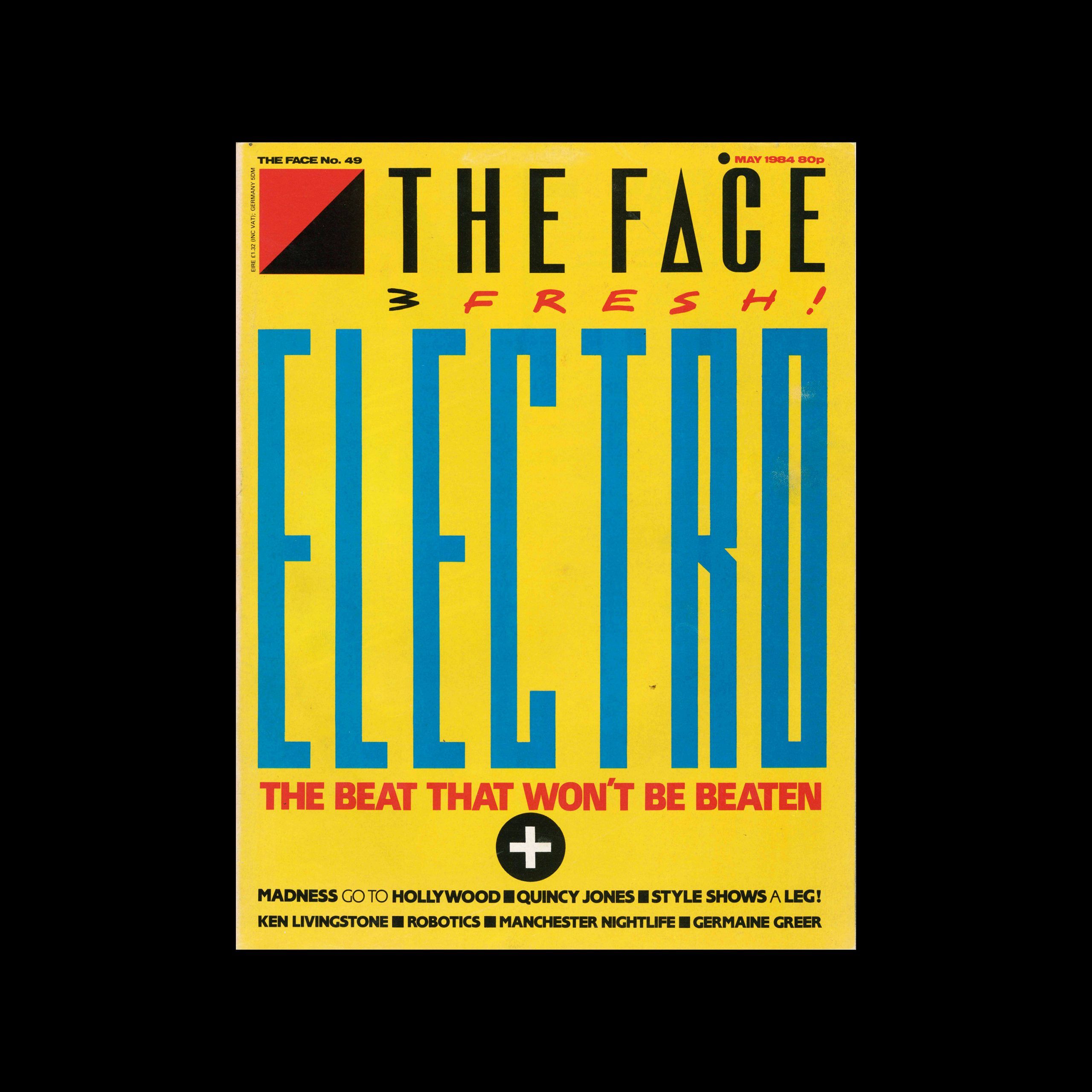
What it is — the cover of The Face No. 49, 230 × 303 mm, offset, May
Issue theme: electro and beat box (text David Toop, Paul Rambali; photographs
Steve Pyke, Patricia Bates — per Design Reviewed). No photograph on the
cover — the only one of the five seen.
Composition — the format is split into three horizontal bands: masthead
(y 5–14%), the word (y 22–61%), text (y 63–83%). ELECTRO is set across the full
width (x 4–96%) and occupies ~40% of the height — the letters are almost square blocks in
two levels of density: solid stem + wedge. The eye enters through the red diagonal square in
the corner (x 3–15%), runs down the masthead into the word, then the red bar „THE BEAT THAT
WON'T BE BEATEN“ pulls it back to centre — onto the black plus in a circle at (50, 71)%, which is
the pivot point between the big word and the small lines. Everything is centred except
the corner; symmetry holds back the chaos of six different typefaces.
Colour — four flat colours: yellow ground, blue word, red bar and
corner, black masthead and lines. Blue on yellow is the strongest light-dark
contrast on the format, so the word stands in front of everything; red is reserved for
what should be read second (the corner, the tagline, „3 FRESH!“). There isn't a single tone —
colour works as hierarchy, not as decoration.
Typography — ELECTRO is a typeface drawn for this headline: letters made
of upright stems and diagonal wedges, E and C opened up with a diagonal cut,
O as a rectangle — legible from five metres, but not a single letter is from a catalogue.
The masthead is Brody's THE FACE with A as an inverted V with no crossbar. „3 FRESH!“ is a
hand-written script in red — a third register. The content lines: a narrow
semi-bold grotesque, items separated by small black squares instead of commas.
A class, not a specific typeface (Fonts In Use has no record).
Message — the word IS the image: no performer, no face, a magazine about style has
only lettering on its cover. Three-second test: ELECTRO + yellow-blue. Five metres:
the same. The message is that The Face is recognisable by how it writes, not who it depicts.
Why exactly this way — the theme (electronic music) demands that the MACHINE be shown;
a drawn geometric typeface is, in 1984, the only way to make a headline look „digital“
without a computer — everything is drawn over by hand (Brody 1987).
What would kill it — a photograph of anyone underneath the word. Or the word set in
Futura: the reason for the cover to exist disappears.
What it is — cover No. 37, 230 × 303 mm, offset. Photograph of Bowie
(the credit at bottom left reads „Photo by Tony McGee“ — to verify). Lines:
„Cool, calm & collectable — three years at the top“, „The Face interview“.
Composition — the masthead is rotated 90° and set along the left edge
(x 3–15%, y 8–63%, read from bottom to top); the red-blue diagonal square
in the top left corner is the stopper for that bar. The face occupies the right two-thirds, the eyes at
y 38%; the name DAVID BOWIE is laid across the lower third (x 5–92%, y 67–75%) in
yellow italic that runs rightward, same as the gaze. Two asterisks —
at „three years“ and at the name — are navigation: the same mark up top and below
ties the line and the name together like a footnote.
Colour — the photograph is grey and beige (suit, wall), so three flat colours do all the
work: yellow for the name, red for the corner and lines, blue for the masthead and subhead.
The hair is the only warm colour in the image and echoes the yellow of the name — the join
between image and type runs through colour, not through overlap.
Typography — the name is in a heavy italic grotesque (a class), the lines in a narrow
grotesque, the masthead drawn. Three typefaces, three ranks: name, masthead, rest.
Message — a pop star on the cover of a style magazine, but the magazine
stays the main actor: the masthead is the size of the whole face. Three seconds: Bowie + yellow.
Five metres: the vertical THE FACE bar before the name.
Why exactly this way — the portrait is upright and central, so a horizontal masthead
would have no room without cutting into the hair; rotation frees up the whole width for the face.
What would kill it — putting the masthead back horizontal at the top: you get
every other music cover from 1983.
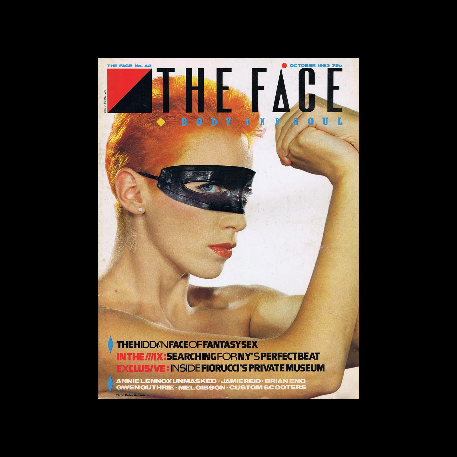
What it is — cover No. 42, 230 × 303 mm, offset. Annie Lennox with a black
mask over her eyes, raised hand. Lines: „The hidden face of fantasy sex“,
„In the mix: searching for N.Y.'s perfect beat“, „Exclusive: inside Fiorucci's
private museum“.
Composition — here the masthead is horizontal (x 22–95 %, y 5–14 %), with
a red-black corner on the left; below it the subtitle BODY AND SOUL spaced out across
the full width. The mask sits at y 37–46 % — exactly where the eyes would be, i.e.
in the zone of first glance; the hand closes off the right edge. The lines sit in the bottom 12 % (y 78–90 %)
left-aligned against a blue rhombus. Eye path: masthead → mask → hand → lines.
Colour — the photograph is warm (skin, orange hair); the type is black, white, red
and blue. Red for the masthead corner and one line („In the mix“), blue for the rhombus and
the subtitle — each colour has exactly one job.
Typography — in three words the letter I is replaced with a slash:
HIDD/N, M/X, EXCLUS/VE. The word still reads, but the viewer pauses for half a second —
this is the typographic equivalent of the mask on the face. BODY AND SOUL: letterspacing
wider than the letter width, reads as a band. Class: narrow semi-bold grotesque (sans serif).
Message — „hidden face“: the mask in the image and the slash in the word say the same thing.
Three seconds: mask + THE FACE. Five metres: masthead and red.
Why exactly this way — when the portrait has a strong horizontal (arm, shoulders), the masthead
stays at the top; it only rotates when the portrait is upright (No. 37, 50, 57). The rule
isn't written down anywhere — it's derived from five covers.
What would kill it — I restored in all three words: the lines become ordinary, and the mask
is left alone, like a photographic trick.
Principles:znak-umjesto-slova (slash = I) citljivost-na-granici
(replacing a single letter with a sign — the limit is pushed to the LETTER, not to spacing or
copy) razmak-usporava-citanje (BODY AND SOUL)
To verify against the image: photographer; whether the slash is the same in all three cases.
What it is — cover of the jubilee No. 50, 230 × 303 mm, offset. Black-and-white
studio photograph of two young people mid-jump (t-shirts with slogans, scarves). Lines:
„Bodylicious“, „Teenage kicks: 20 years on — the mods ride again and gang wars
rage in LA“, „Stevie Wonder · Jerry Dammers · Richard Branson · Marvin Gaye“.
Composition — the masthead is vertical again, but now red (x 4–17 %,
y 12–68 %). The number „50!“ is a second masthead: a red condensed digit in the lower
right corner (x 63–95 %, y 55–80 %), below it ISSUE spaced out into a band (y 82–85 %).
Two red masses — upright on the left, upright on the right — frame the grey photograph
like a bracket; the figures leap into the void between them. The lines are pushed into the middle of the right
half, below the jump, right-aligned toward „50!“.
Colour — one colour on the black-and-white photograph: red. Everything that's red is
identity (masthead, number, corner); everything that's black is content. Pink for „Bodylicious“
and small labels — the only other colour, deliberately weaker.
Typography — „50!“ in a condensed grotesque with almost no spacing, the exclamation mark
is part of the digit; ISSUE spaced ~1 em; lines in narrow grotesque. On the t-shirts in the photograph
there are slogans (WORLDWIDE…, STOP…) — the type in the photograph and the type over
the photograph compete, and Brody lets them compete.
Message — the magazine celebrates itself: two mastheads, one permanent (rotated) and one
one-off (the number). Three seconds: 50! + jump. Five metres: two red verticals.
Why exactly this way — the anniversary demands that the number be bigger than the name;
the solution isn't a bigger name but a second sign of the same rank, the same colour, the same orientation.
What would kill it — „50!“ in a colour different from the masthead: it falls apart into
identity + sticker.
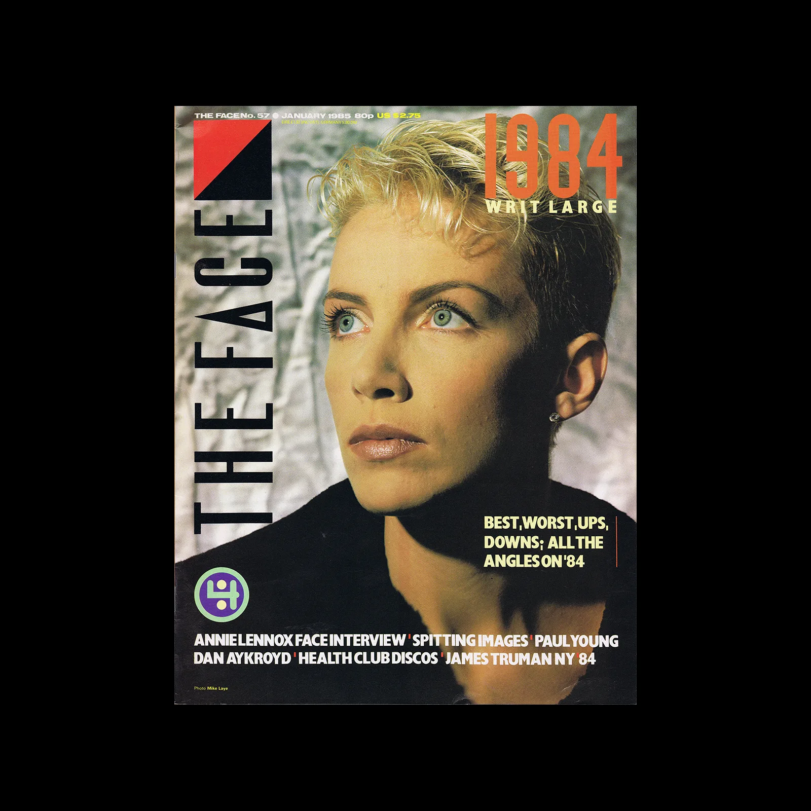
What it is — cover of No. 57, 230 × 303 mm, offset. Annie Lennox for the second time
(see 03), now without the mask, cold blue-grey photograph. Lines: „Best, worst,
ups, downs; all the angles on '84“, „Annie Lennox Face interview · Spitting
Images · Paul Young · Dan Aykroyd · Health club discos · James Truman NY 84“.
Composition — masthead vertical, black (x 4–17 %, y 12–70 %); diagonally
from it, top right, an orange digit „1984“ (x 63–95 %, y 5–14 %) with WRIT LARGE
spaced out below it. The face sits between these two masses, eyes at y 33 %, gaze to the left —
toward the masthead. Bottom left there's a drawn sign in a circle (green-purple,
(10, 78) %, Ø 9 % w) — it doesn't mean anything, but it closes off the bottom left
corner as a counterweight to the digit top right. Lines white in the bottom 8 %.
Colour — the photograph is cold (blue, grey, blue hair), so the orange
digit is complementary and the only warm colour; the black masthead is the darkest mass; green and
purple only in the sign. Three colours, three roles.
Typography — „1984“ condensed grotesque with flat cuts; WRIT
LARGE letterspaced; lines narrow grotesque with a white background for „Best, worst…“ —
the only block of text with a frame. Same masthead as 02 and 04, different colours.
Message — year in review: the year's digit is bigger than the star's name, which
doesn't appear on the cover at all (Lennox is only in a line). Three seconds: face +
Five metres: black vertical and orange digit — a diagonal.
Why exactly this way — a cold photograph allows only one warm colour,
and it goes to whatever is the theme of the issue, not to the name.
What would kill it — the name „Annie Lennox“ over the image: the digit and the name would
fight for the same warm colour.
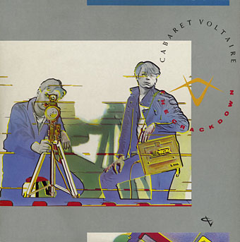
What it is — LP sleeve, Some Bizzare/Virgin, 1983; letters applied by Letraset
rub-down transfer, not typeset (Coulthart). The same photograph (Kirk and Mallinder with
a camera on a tripod) enlarged and cropped for the backgrounds of the sleeve's other sides; the 12"
single has faces „enlarged almost to abstraction — typical brodyism“; the green
square on the 12" is the same size as the 7" sleeve (Coulthart).
Composition — a square photograph shifted up-left (x 2–80 %,
y 18–82 %) on a grey background; the right band (x 82–90 %) carries the band name and title
vertically, letterspaced; a blue stripe top right, a red broken
stripe at the bottom, a small sign (yellow-orange wedge/compass) in the upper right corner
of the photograph. The titles are set „to fit into the shape dictated by the geometry“
(Coulthart on the reverse) — type as a field, not as a line.
Colour — cold grey background + posterised photograph (blue, ochre,
green) + three flat marks (blue, red, yellow). Coulthart: the inner sleeve is
„a hot interior for a cool exterior“ — temperature as sleeve structure.
Typography — Letraset; typeface not named — class: spaced grotesque,
vertical. Band name and title the same size: hierarchy from position, not from scale.
Message — surveillance (camera, tripod, men staring into the lens):
the sleeve doesn't sell the band, it sells the record's theme. Three seconds: grey + camera. Five metres:
square shifted off-centre.
Why exactly this way — Letraset requires the layout to be known in advance (each letter
is rubbed on once); vertical type along the edge is the lowest-risk and most
„Brody-like“ move — the same move as the rotated masthead the same year (02).
What would kill it — photograph centred and the name set horizontally above: an ordinary
Virgin sleeve, 1983.
Principles:smjer-citanja-kao-hijerarhijarazmak-usporava-citanjeznak-umjesto-slova (wedge in the corner) — plus series: the same photograph cropped across
LP, 12", 7" (Coulthart) = serija-kao-identitet at the level of a single release.
To verify against the image: image 340 px — colours and small sign to be verified on a larger
scan (Discogs); print technique not documented.
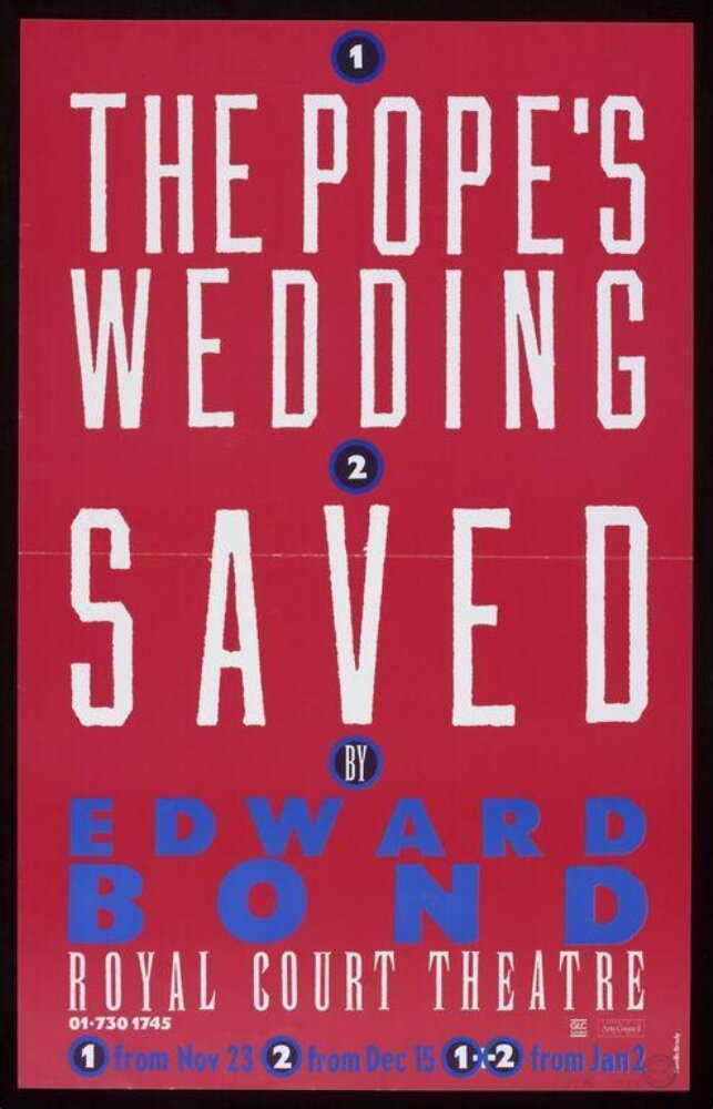
07 · The Pope's Wedding / Saved — Royal Court (1984)
What it is — a poster for two Edward Bond plays at the Royal Court Theatre,
50.9 × 32 cm, "printing ink on paper" (V&A S.3727-1994); V&A: "white and blue
lettering on a red background". There is also a reversed variant (S.3728-1994):
white and red lettering on blue — the same poster, colours swapped.
Composition — purely typographic, central axis, everything set as a stack:
circle "1" (y 8%), THE POPE'S WEDDING in two lines (y 12–38%), circle "2" (y 41%),
SAVED (y 46–58%), BY (y 62%), EDWARD BOND (y 67–77%), ROYAL COURT THEATRE
(y 80–84%), a line with dates (y 89%). No image — the numbered circles are
a system: 1 from 23 November, 2 from 15 December, 1+2 from 2 January. The poster is
a schedule, not an announcement.
Colour — two flat colours plus paper: red ground, white lettering, blue for
the author's name and the numbers. White on red reads from the street; blue on red
(same lightness) deliberately vibrates — the writer's name is not the first thing read,
but the second.
Typography — the titles in a drawn condensed capital of rough
edge (brush/stencil stroke, letters of uneven width — v2 reading), spaced
so each line fills the width; EDWARD BOND in an extended geometric
grotesque (sans serif), spaced even further; ROYAL COURT THEATRE a narrow serif capital.
Three classes of type, three voices: the play, the writer, the house.
Message — two plays, one writer, one schedule. Three seconds:
red plus a white word. Five metres: a column of text like a totem.
Why exactly this way — two colours are the small theatre's budget; no image because
there are two plays — one image would have picked one. The numbered circles solve
the dates without a table.
What would kill it — flat set type from a catalogue instead of the drawn one: the
schedule remains, the poster disappears.
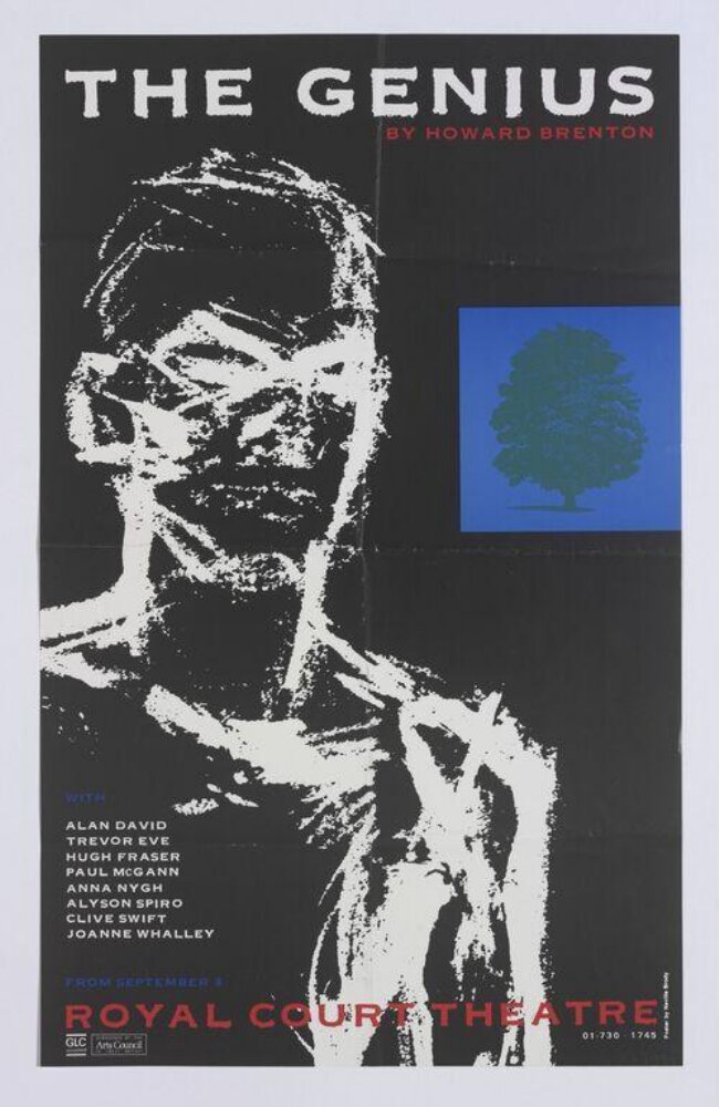
What it is — a poster for Brenton's play, Royal Court, from 8 September 1983; 50.7 × 31.6 cm
(V&A S.3633-1994, "pictorial and typographic"). Cast: Alan David, Trevor Eve,
Hugh Fraser, Paul McGann, Anna Nygh, Alyson Spiro, Clive Swift, Joanne Whalley.
Composition — black ground; a white painted figure (head and torso, brush
strokes like an X-ray) takes up the left three-quarters (x 5–75%, y 15–92%); in
the upper right a blue square with a green tree (x 62–86%, y 27–48%)
— the only "picture within a picture", like a window. The title THE GENIUS spaced
across the top (y 8–13%), the cast lower left (y 60–72%), ROYAL COURT THEATRE red
near the bottom. The eye: title → face (empty eyes) → blue window → down.
Colour — black plus white plus three flat colours (blue, green, red). The blue
square is the only saturated plane and sits exactly where the figure would be looking —
like a thought. Red only for the writer and the house.
Typography — the title in a wide geometric grotesque, spacing ~1 em;
the cast in a narrow grotesque; class. The letters do not touch the image — everything
is in the margins, the image is in the centre.
Message — genius = a head that shines (white strokes like light), and the tree in
blue is what it thinks (the play is about a physicist and the nuclear bomb — not from the
source, not to be claimed). Three seconds: white head on black. Five metres: the title.
Why exactly this way — a year before 07, same house, but with an image: Brody hasn't
yet reduced the Royal Court to pure typesetting. The painted gesture is there so the poster
doesn't look like a photograph from the production.
What would kill it — a photograph of the actor instead of the brush strokes: it becomes
an advertisement for Trevor Eve.
Principles:razmak-usporava-citanjejedna-slika-jedna-rijec (one figure,
a title of two words; the blue window is part of the figure)
To verify against the image: who painted the figure (Brody or an illustrator) — V&A doesn't say.
What it is — a digital typeface, FontFont 1992, MoMA 1064.2010 (gift of FSI FontShop
International), "digital typeface, variable". On the MoMA page: a specimen
"FF Blur" plus four text samples plus three weights (A A A — Light, Medium, Bold per
the thumbnails).
Composition — not a poster: the unit is the letter. The form is a humanist
grotesque whose edges are blurred so that the corners round off and the joints thicken
— the word gains a body like a rubber stamp. Three weights = three STEPS of the same
operation.
Colour — black on white; but "colour" here is the tone of the edge: the blur gives
a grey halftone halo that disappears in print, so the letter looks heavier than it
actually is.
Typography — MoMA: the letters are "fuzzy around the edges like an out-of-focus
photograph" and evoke "type that has been reproduced cheaply on a Xerox
machine — degenerated through copying and recopying"; MoMA links it to punk and
record sleeves. A typeface that CARRIES the technique it was made with as a message.
Message — a perfect digital tool (Mac, 1992) used to
simulate an imperfect cheap copy. Three seconds: "soft". Five metres: a fat
grotesque. Only up close does the sick edge show.
Why exactly this way — Wolfgang Weingart did the same in 1976 with a process camera through
generations of copying and published it as a SERIES of steps; Brody freezes the same step
in three weights and SELLS it as a font — the variable becomes a product.
What would kill it — a fourth weight, blurred enough for the letters to merge:
it stops being a typeface. Three weights is exactly "the step before failure".
Principles:varijabla-do-otkaza (a second author after weingart) citljivost-na-granici
(the limit moved to the letter's EDGE) jeftina-tehnika-kao-jezik (Xerox degeneration
as vocabulary, MoMA)
To verify against the image: the original typeface it was blurred from (literature: not
in the MoMA text — not to be claimed).
A kraft-coloured cardboard box 175 × 230 mm with a black label glued on: FUSE in
cream fat grotesque across the full width, a grey "1" below, small print: four A2
posters with experimental PostScript typefaces, authors Phil Baines, Neville Brody,
Malcolm Garrett, Ian Swift. Eye 6/1992: the goal is to "demystify digital technology",
four new typefaces per issue, typeface as CONTENT rather than a service; Brody: "keyboard as a
musical instrument". The box is deliberately poor (cardboard, sticker) — what's expensive is
what's inside (the disk). Principles: jeftina-tehnika-kao-jezik, artefakt-nosi-distribuciju
(the typeface is distributed in a box with posters — the poster is the specimen, the disk the product;
related to Peter Saville Blue Monday: the sleeve = the disk). The posters have not been seen.
Other works — evidence, no analysis
Mountain Language, Lyttelton/National Theatre 1988 — 76.7 × 50.9 cm, "typographic"
(V&A S.1458-1995, framemark 2011ER9625). Not seen.
The Face No 52, August 1984 — Design Reviewed; not seen.
Fetish Records 1980–82 (Coulthart): 23 Skidoo Seven Songs (FM 2008, 1982) and
The Gospel Comes to New Guinea (FE 11, 1981); Clock DVA Thirst (FR 2002, 1981);
Throbbing GristleFive Albums (FUX 001, 1981); Bush Tetras (FET 007, 1981); The
Bongos Zebra Club / Mambo Sun (1982); Z'ev Wipe Out (1982); Stephen Mallinder
Pow-wow (1982); 8 Eyed Spy (1980–81). Method: handmade objects (woodcut,
plaster hand) photographed for the sleeve — nadjeni-predmet-kao-rijec candidate, not seen.
Cabaret Voltaire — Micro-Phonies 1984 (Virgin; Discogs), 2x45 1982, Red
Mecca 1981 (Rough Trade) — attributed in the literature, not seen.
Insignia (PGDA 12035), Industria, Arcadia — Brody's typefaces from The Face
period, issued by Linotype (Wikipedia lists Industria; dates not confirmed).
Typeface One–Six 1979–86 (Test Pressing per the 1988 monograph).
Arena 1987–90 — headlines in Helvetica as irony (Eye 6/1992); not seen.
Die Woche 10/1993 (Commons) — a German weekly, launched 1993.
The Graphic Language of Neville Brody (Wozencroft, 1988; PGDA 17676), /2 (1994),
/3 (Thames & Hudson 2023; Eye 105).
V&A 150th anniversary album, 2007 (O1160672) — one page.
Bridge to practice: poster · graphic design · motion
Poster
Draw the title, don't pick it. For one poster, 6–12 letters are enough (ELECTRO
= 7). In Illustrator: Rectangle + Pen only at 0°/90°/45°, one stroke weight,
one wedge — half an hour. The rest of the text from one catalogue condensed typeface.
Square in the corner. One fixed geometric plug (diagonally split square)
in the same corner of every poster in the series — cheaper than a logotype, works even when
everything else changes.
Two flats + paper (07): red background, white title, blue for the name — and
an obligatory reversed variant (blue background) as the second sheet of the same series.
Numbered circle instead of a table for dates/times.
Graphic design
Identity as behaviour — the test for LØADERRØR: can the mark be rotated 90°,
change colour and position, and still be recognised? If not — the identity is in the mark, not in the
behaviour. A list of permitted behaviours (rotation, colour, angle) is the rulebook.
Mark instead of a letter, but only one (HIDD/N): replace one letter in the title
with a slash, a mark, a number — not two.
Spacing as tempo: a subtitle spaced ≥ 1 em reads slower and feels
"more serious" — use for one line per format, never for two.
When to rotate the masthead: only with an upright portrait (02, 04, 05); with horizontal
format it stays up top (03). A derived rule, not Brody's — to verify against more covers.
Motion
Rotated masthead = frame. The title enters vertically along the edge, stays as
a frame, and content happens in the field to the right. For YT gaming animations: the channel mark
vertical, left, through the whole episode.
FF Blur logic in AE: Gaussian Blur → Levels (crush) → one step before the
letters merge; three values = three "cuts" for three states (idle / hover / hit).
Mark instead of a letter as an event: one letter in the title is replaced in frame
by a mark (plus, dash, circle) — one frame, hold, no morph.
Bad imitation
Copied 1984 look without a reason — geometric condensed typeface + yellow/blue
on a poster for a jazz club. In Brody's case the typeface is drawn because the theme (electro) demands
a machine; without the theme it stays "retro 80s". Cause: copied typeface, not the process (draw
for THIS job).
Mark instead of a letter in every other letter — H/DD/N, M/X, EXCLUS/VE throughout the
paragraph. Brody does this in the title, once per word. Beyond that = illegible for no
reason; that's the difference between a mask and a face without a face.
Rotated masthead on everything — vertical logotype on every page of the site because
"it looks like Brody". Rotation is a DECISION per format (upright portrait → rotate);
automatic rotation is just an odd position.
Blur as a filter — FF Blur effect on flat text because "it gives character". Without
the three steps (and without stopping one step before cancellation) that's defocus, not a typeface.
The brief through their eyes
The job: LØADERRØR site/identity + YT gaming animations. Brody would first ask what
BEHAVES on the site (rotates, changes colour, changes position) while still being recognised —
and would scrap the fixed logotype in the header in favour of a masthead that every page
sets differently, with one fixed plug (glitch square in the corner). For YT he would
draw the episode title from 6–10 letters in a typeface made for that episode, with
one letter replaced by a mark from the game, and would forbid any other typeface on the thumbnail.
First move: a list of behaviours, not a sketch.
Exercises
Seven letters, one job (45 min). Pick a word of 6–8 letters for a specific
poster. Draw it in Illustrator using only rectangles and triangles (0/45/90°),
one stroke weight. Lay it out on a format with one flat background and one line of small
text in a catalogue condensed typeface. Test: does it read from five metres? Is there not a single
letter from a catalogue?
One masthead, five behaviours (30 min). Take LØADERRØR and make five
covers: horizontal, vertical left, vertical right, in another colour, half
hidden by a photograph — with the same plug in the corner. All five must be recognised as
the same brand. Whatever doesn't survive, drop from the rulebook.
HIDD/N (15 min). Ten titles; in each, replace exactly one letter with a mark
(slash, plus, circle, number). Cover the mark — it must still read; reveal it —
it must mean something (mask, speed, counting).
Motion study
"The masthead turns" (5 s, AE). Frame 1080 × 1350 (upright portrait). The word THE
FACE (or LØADERRØR) enters horizontally at the top (0–1 s), at 1.5 s in one cut
(hold keyframe, not rotation over time) it ends up vertical along the left edge, and
into the empty space on the right a single photograph drops (2–4 s); at 4.5 s a red diagonal square
settles into the corner as a plug. One event: change of orientation. Principle:
identitet-je-ponasanje-ne-znak + smjer-citanja-kao-hijerarhija. Constraint:
no easing on the rotation — only a cut.
Rebuilding the benchmark
Electro 1984 (230 × 303 mm). Skeleton for .svg: yellow background; diagonal
square x 3–15% / y 5–14% (red top-left, black bottom-right); masthead
x 22–95% / y 5–14%; "3 FRESH!" y 15–19%, right-aligned; ELECTRO x 4–96% /
y 22–61% blue, 7 letters ≈ 13% width each; red stripe y 63–67% centred;
plus in a circle (50, 71)% Ø 6% width; two lines of content y 76–83%. Task: build it in
Illustrator in 45 min without the original — draw letters from stroke + wedge; then
compare where the letters are too wide.
Second skeleton — The Pope's Wedding (50.9 × 32 cm): axis 50%; circle 1 (50, 8)%;
title y 12–38% two lines; circle 2 (50, 41)%; SAVED y 46–58%; BY y 62%; EDWARD
BOND y 67–77% blue; ROYAL COURT y 80–84%; dates y 89%; margins 6% width.
Notes on sources
An analytical text on individual covers doesn't exist online. Eye only has an
interview (6/1992, after The Face); Design Reviewed gives images + measurements without
analysis; Smashing retells Wozencroft (1988) at the level of method, not the work; Design
Museum profile 500; Fonts In Use designer/865 timeout (twice) — not a single work
has a confirmed typeface except FF Blur. Fields 2–4 on 01–08 = v2 reading of the image.
Start year at The Face: Wikipedia and v1 say 1981, Smashing says 1982 — not
resolved (could have been a shift across two issues).
FontShop/FontFont: Wikipedia — FontFont with Spiekermann 1990; Design Reviewed —
FSI 1994. Probably two different things (library / company). Not resolved.
v1 quote "Type is not neutral. It never was." — not found; replaced with Wozencroft
1988 (per Smashing). v1 clients (Coca-Cola, Times, BBC) — only Times and BBC confirmed
(Wikipedia, Design Reviewed).
v1 list of works unusable: 9 items, of which 4 typefaces/specimens, 1 portrait,
1 book, 1 screenshot; not a single Face cover. Roster is from Design Reviewed
(7 covers + 6 FUSE), V&A API (4 posters), MoMA (1), Coulthart (12 sleeves).
V&A has only 6 records with an image — for Brody the V&A API isn't as rich as for Reid/
Saville; The Face isn't in V&A online.
The Crackdown: image 340 px — fine mark and colours to verify against a larger scan; print
technique and measurements undocumented; publisher Some Bizzare/Virgin per Coulthart.
The Genius: author of the pictured figure unknown (V&A doesn't say); the piece's theme from general
knowledge, not from a source.
Cover photographers (02 "Tony McGee" per credit, 04 illegible) — to verify.
Fuse 1 posters not seen; Brody's typeface in Fuse 1 isn't named in the sources.
Not seen: inside pages of The Face (grid, section symbols — v1 claim
about "section markers" remains unproven on image), Arena, Cabaret Voltaire other
sleeves, Fetish sleeves, Insignia/Industria specimens, Mountain Language, Die Woche.
Portrait: Commons TYPO SF 2012 — ima: true, not opened (within screenshot quota).
Difference from its pair
Wolfgang Weingart ↔ Neville Brody — both break down typesetting, but Weingart FROM WITHIN
(lead, film, spacing up to +200, generation of a copy published as a series of steps),
Brody with A NEW VOCABULARY (typeface drawn for one title, a letter replaced by a mark;
FF Blur freezes Weingart's copy into three cuts and sells it as a font).
Peter Saville ↔ Neville Brody — the same British music industry 1983: Saville takes
someone else's historical image untouched and removes letters; Brody takes nothing — he draws
a typeface and sets it vertically along a cropped photograph of the band. Quotation / drawing.
Herb Lubalin ↔ Neville Brody — the letter as image with both: Lubalin by TOUCH
(letters pushed until they touch, & as a fetus — the letter still from the catalogue), Brody
by CONSTRUCTION (letter drawn from a stroke and a wedge, or replaced by a mark).
Wim Crouwel ↔ Neville Brody — geometric typeface with both: Crouwel 1967 out of
screen constraints, a system for all letters; Brody 1984 out of the issue's theme, 7 letters for
one title — system / one-off.
Jamie Reid ↔ Neville Brody — the same London, the same music, seven years apart:
Reid the found letter (each of a different origin, scissors), Brody the drawn letter
(each of the same origin, pencil); both against Letraset from a catalogue — one
because there's no money, the other because he won't.
Josef Müller-Brockmann ↔ Neville Brody — neutrality as ethic / neutrality as
impossible ("question everything", Arena-Helvetica as IRONY): the same tool
(grotesque, grid), opposite stance toward what the tool says.