typography as image — wood type, extreme scale, identity as behaviour
AD CBS Records and Atlantic (1972–82); Koppel & Scher (1984–91); partner at Pentagram New York since 1991; professor at SVA since 1992 Washington DC → New York
Palette of the œuvre
Colours (described, not measured): Public Theater 1994–96 — black + one hot background colour (yellow-orange, green, yellow) + red/magenta accent; never more than three (reading of the image v2, three MoMA posters + season); Best of Jazz 1979 — kraft brown background, black, red, cream (reading of the image v2; Poster Museum also lists yellow); Citibank 1998 — Citicorp blue inherited, red arc from Travelers umbrella (Pentagram, Fonts In Use)
„Words have meaning and typography has feeling.“ — Eye no. 77, 2010 (Walters). v1 quote „It's through mistakes that you actually can grow“ exists only as the title of an article on Creative Bloq — not confirmed as her own sentence, do not use.
Biography
Born 1948 in Washington; father a photogrammetric engineer at the USGS, inventor of stereo templates — she herself says that's why she thinks in maps. Tyler School of Art (BA 1970), where Stanislaw Zagorski asks her the question that will determine everything: why not illustrate with letters. In 1972 she enters CBS Records through the promotion department, then Atlantic, then back to CBS as art director for album covers — around 150 covers a year, with almost no budget. From 1974 to 1980 she commissions lush illustration and "puts typography on it"; when there's no money for illustration, typography becomes the image — and the source of the typography is a tobacco tin and old sheet-music books, not a textbook. Best of Jazz 1979 is the poster of that year.
In 1982 she leaves; in 1984 she and Terry Koppel found Koppel & Scher — book covers, Swatch, Manhattan Records (Mondrian), promotional booklets for Champion paper. The studio collapses in the recession of 1991 and that same year she becomes a partner at Pentagram New York — the only woman partner at the time. In 1994 she gets the Public Theater and director George C. Wolfe ("favourite client of all time", "when he became director he had immense power"): an institution with no money, with a political need to be loud and public. The answer is wood-type auction posters — populist typography for a populist house — and this is what, by 1996, changes the look of all theatre advertising in the city. In 1998, Citibank (merger of Citicorp/Travelers): an umbrella arc over the letter t, sketched on a napkin, set in Interstate. Since 1992 she teaches at SVA. Alongside this she paints huge typographic maps with no client — "practice without a client" is, per v1, the place where ideas come from that later get sold. AIGA medal 2001, National Design Award 2013.
Her stance toward Swiss modernism is the stance from which the whole body of work can be read: Helvetica "neutralises feeling" — while all other styles "imbue the words with a shade of meaning… which is where I think all the fun is". She doesn't work by refining: "my best work has been big bold strokes that came very quickly" (TypeRoom). She doesn't care about gear — "I don't even take pictures" — she works with a real collaborator.
Influences
Studied with
Stanislaw Zagorski — Tyler School of Art, Philadelphia, BA 1970; his line "Why don't you illustrate with type?" (Eye 77)
Borrows from
American 19th-century wood type — auction and vaudeville posters (Pentagram, Public Theater)
Russian Constructivism — Best of Jazz 1979 (Poster Museum, v1); V&A summary: Art Deco and Constructivism
A Buckingham Pipe Tobacco tin and old sheet-music books — source of typography for the CBS covers (Eye 77, her own words)
Herbert Matter — Pontresina/Engadin 1935 taken literally for Swatch 1984/85, signed "Koppel & Scher with Herbert Matter" (Brower, AIGA Eye on Design)
Beatles album covers — Revolver, Sgt Pepper, White Album as three types of covers (Eye 77)
Her father, a USGS photogrammetric engineer — "He's the reason I paint maps" (Eye 77)
Influenced
All New York theatre advertising after 1995 — "everything began to be displayed in blocky wood type in all caps" (Pentagram case study)
Michael Bierut, Lisa Mazur and the younger Pentagram NY (joint projects — Citibank, Noise/Funk)
Contemporaries
Barbara Kruger — same era 1985/1995, same New York, someone else's image + word; Kruger's label from outside, Scher's band through the image
April Greiman — both in the Eye 77 generation; Greiman pushes the image on screen, Scher pushes the letter on paper
Neville Brody — both treat identity as behaviour, he did it for a magazine in 1983, she for theatre in 1994
Massimo Vignelli — same city, opposite stance: grid and Helvetica versus "Helvetica neutralises feeling" (Eye 77)
Terry Koppel (partner 1984–91), Michael Bierut (Pentagram), George C. Wolfe (Public Theater, "favourite client of all time")
Who she studied under
zagorski Stanislaw Zagorski, Tyler — the only named teacher; the sentence "illustrate with type" (Eye 77).
What she steals
19th-century wood type (auction and vaudeville posters) — the entire Public Theater system; not as homage but as vocabulary. Pentagram: "street typography… almost graffiti-like".
Constructivism — Best of Jazz 1979 (diagonal wood type "in the manner of 1920s Russian Constructivist design", Poster Museum). v1 says "straight lift, and she has always been open about it" — confirmed indirectly (V&A summary: art deco + constructivism), a direct quote of hers on this has not been found.
Herbert Matter — Pontresina/Engadin 1935 as Swatch 1984/85: a literal parody with a signature.
Vernacular typography (tobacco tin, sheet-music books) — Eye 77, her own words.
Push Pin / chwast Seymour Chwast — "illustration landscape… a golden age".
Who she influenced
New York theatre advertising after 1995 (Pentagram).
Younger Pentagram NY: Michael Bierut (Citibank), Lisa Mazur (Noise/Funk).
Every "loud wood type" campaign for a cultural institution after 2000 — this is a local conclusion from the sources, not a documented influence.
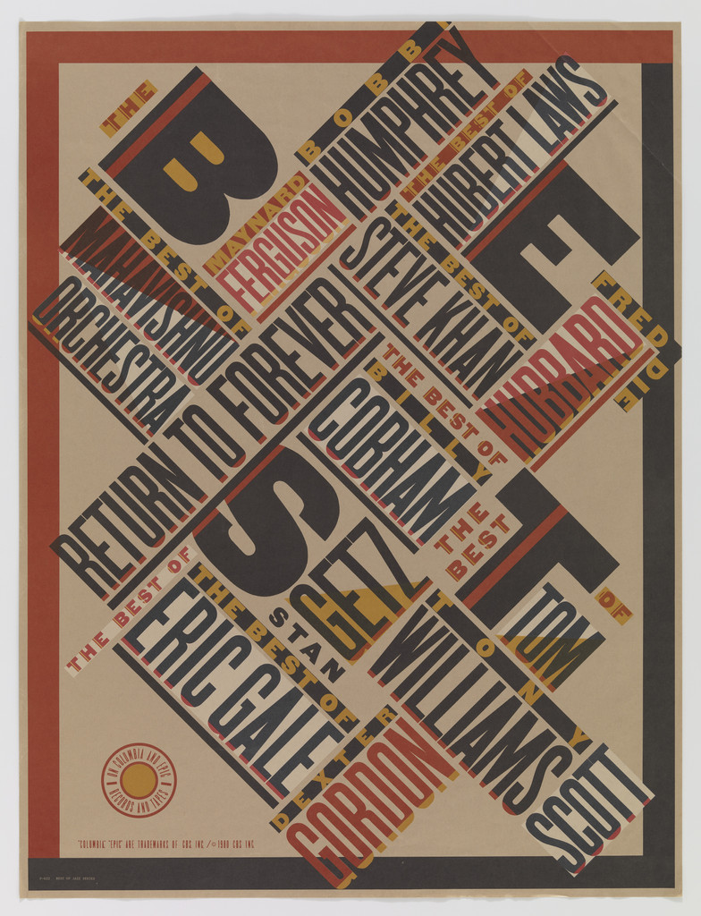
What it is — a promotional poster for a Columbia/Epic jazz catalogue ("The Best of… on Columbia and Epic Records and Tapes"), 1979, lithograph, 91.1 × 68.9 cm (MoMA). Cooper Hewitt lists the same work as 1980 and "for New York Public Theater" — a record error (the Public Theater comes 15 years later). Poster Museum sells a reprint from 1994 (97 × 74) and lists the printer as Toppan — with reservations.
Composition — the whole format is a grid of two diagonals at ±45°. All the text sits on one of them: names (Ferguson, Humphrey, Hubert Laws, Return to Forever, Eric Gale, Stan Getz, Tom Scott, Gordon…) in bands that cross like planks. Four enormous letters B-E-S-T, black, with a cream shadow, sit on the diagonal running from top-left to bottom-right and hold the whole thing together — without them it would be an empty crosshatch of type. The eye enters at the B (top left, largest), jumps across the letters B-E-S-T diagonally down to the T at bottom right, and only then reads the names. A thin red-black frame closes the format; a small round Columbia mark at bottom left.
Colour — kraft brown ground (paper tone, not print), black, red, cream. Red is reserved for the names and the frame, black for the four main letters and part of the names, cream for the shadows and reversed bands. Three colours on brown = four tones; the hierarchy runs by colour (black = headline) before it runs by size.
Typography — American wood grotesque in several widths, condensed for the names, extra-extended and shadowed for BEST. The typeface isn't named anywhere (Fonts In Use has no entry for 1979). The contrast comes from WIDTH and from the shadow, not from mixing families — v1: "extreme width contrast is the most under-used typographic tool".
Message — "the best of all of these": a pile of names as a pile of supply, four letters as verdict. Three seconds: BEST. Five metres: a diagonal kraft poster with red — it reads like an old circus bill, i.e. "jazz as American tradition", not as modernism.
Why exactly this way — no budget for illustration; the typography has to be the image. She chose a historical quotation (the constructivist diagonal) as a ready-made system that allows twenty names with no hierarchy among them — because a hierarchy among musicians would have been a political problem for the label.
What would kill it — aligning the names horizontally. The diagonal is the only reason twenty names don't look like a price list.
What it is — a poster, ad and window display for Swatch, Koppel & Scher, credited "Koppel & Scher with Herbert Matter". Brower gives 1984, v1 and most sources 1985; no museum record, dimensions and technique unknown. The PGDA record carries the date 5.12.2014 and credit "Steven Brower" — that is the date and author of the ARTICLE, not the work (a trap).
Composition — Matter's photomontage taken whole: a smiling woman in a white cap occupies the upper half, two hands enter from bottom-left toward the face, behind them a snow slope with tiny skiers. The change is in two things: on the hands are three Swatch watches (instead of a glove) and across the lower half runs an enormous red word SWATCH diagonally upward. Brower: the composition is Matter's, "recontextualised"; Retinart: the skier reshot, the text enlarged, the watch inserted.
Colour — Matter's regime (black-and-white photograph, one hot colour) kept; red is both Swatch's and Matter's; blue only in the logotype.
Typography — SWATCH in a red wood-type egyptienne, letters stepping upward to the right just as in Matter's original lettering; the typeface isn't named.
Message — "Swiss watch = Swiss poster": the parody only works if the viewer knows Matter. Brower: the poster hung in Swatch's meeting room — the audience was in on it. Three seconds: SWATCH. Five metres: it's "that Matter piece".
Why exactly this way — Scher (Make It Bigger, per Retinart): "All through the eighties clients seemed to believe they were buying style, not thinking" — the work is at once a product of that state and a joke at its expense. She sought permission from the AIGA and the estate (Retinart).
What would kill it — changing the composition "to make it her own". The joke is that NOTHING was changed except the watch.
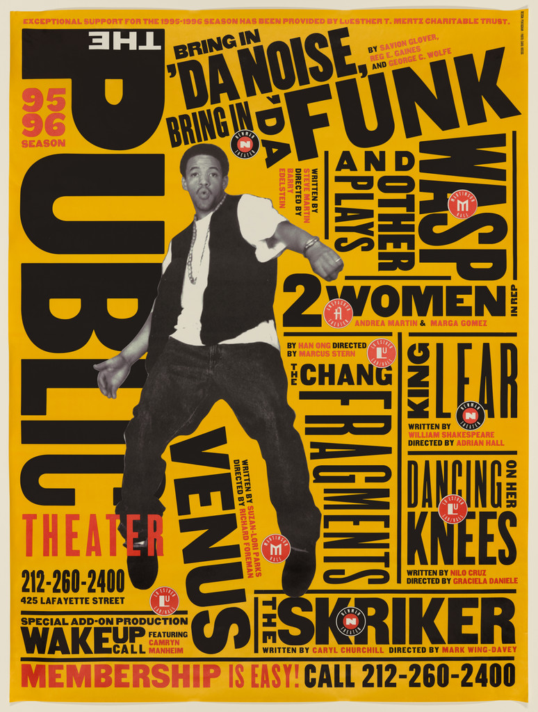
What it is — Public Theater season poster, 1995, lithograph, 152,4 × 114,3 cm (MoMA) — twice the size of individual show posters. MoMA: „set a new bar for typography of the 1990s". This is the poster on which Noise/Funk first hit the street (Pentagram: 1995).
Composition — yellow-orange format with no margins. The left third is held by PUBLIC, vertical, ultra-condensed, top to bottom (letter height ≈ 85 % of the format), with THE rotated above it and THEATER in red at the bottom. A photograph of Savion Glover (black-and-white, cut out, mid-jump) sits over the lower part of PUBLIC, x ≈ 15–50 %, y ≈ 25–70 %. The right two-thirds are a wall of show titles in every width, partly horizontal (NOISE, FUNK, 2 WOMEN, KING LEAR), partly rotated 90° (WASP, FRAGMENTS, DANCING ON HER KNEES, THE SKRIKER) so the letters fit together like planks in an auction notice — not one rectangle of empty space bigger than the height of a lowercase letter. The eye enters on PUBLIC (biggest, vertical), jumps to Glover, then down through the titles from the largest (FUNK) on. Bottom: a red band „MEMBERSHIP IS EASY! CALL 212‑260‑2400" runs across the whole format.
Colour — three: ground, black, red. Red ONLY for institutional matter (95–96 SEASON, THEATER, phone number, membership) and for the small „P" stamps — so colour is hierarchy (institution ≠ shows), not decoration. All titles are black: the shows are equal.
Typography — wood type grotesque in five-six widths, all capitals. The PUBLIC logotype is Gothic (Nesbitt) per Fonts In Use (entry 2197). The other typefaces are not identified. Contrast comes from WIDTH and ROTATION, not from family.
Message — „a lot is happening here and it's all public": noise as programme. Three seconds: PUBLIC + a man mid-jump. Five metres: recognisable even without reading — which is the definition of identity as behaviour.
Why exactly this way — Pentagram: identity for an institution with an „accessible" mission; wood type is „street typography". In practice: a theatre with no money to photograph every show; the typography has to carry the poster on its own, and the system has to work when other designers run it — her line (Fonts In Use): „designed to be flexible, because we knew it would need to be handled by individual designers over the years".
What would kill it — add margins and line the titles up in a column. Then it's just layout, and Public is „loud and visible and urban".
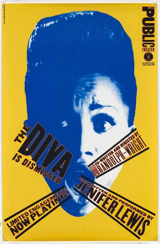
What it is — poster for the solo show by Jenifer Lewis (written and performed by her; directed by Charles Randolph‑Wright), Public Theater 1994, screenprint, 116,8 × 76,5 cm, printer Ambassador Arts, New York (MoMA). One of the first three screenprint posters in the system (Him, Some People, Diva — all 1994, same printer, same format).
Composition — yellow format; a blue duotone photograph of Lewis from forehead to chin, the face taking up ≈ 80 % of the width, eyes at y ≈ 48 %. Over the lower half of the face two bands of black text in the colour of the ground run diagonally from edge to edge and cross in an X over the mouth: „THE DIVA IS DISMISSED" rises up to the left, „written and performed by JENIFER LEWIS" falls down to the right; a third, shorter one, „LIMITED ENGAGEMENT NOW PLAYING", sits at bottom left. The PUBLIC logotype stands vertical in the top right corner. The eyes are left free — the face looks out, the text covers its mouth: a show about a diva who's been „dismissed", and she's still watching.
Colour — three: yellow ground, blue duotone, black. The yellow of the bands is NOT a new colour — it's the ground showing through a cut in the image. So the band doesn't look pasted on but CUT OUT: the image is discarded where the text is.
Typography — black wood type grotesque, condensed for the title, narrower for the credits, all capitals; not identified. Bands at ≈ 25–30°, not 45°.
Message — „diva" + a covered voice = dismissal. Three seconds: blue face, X over the mouth. Five metres: a yellow-blue poster with a black X — and that's enough.
Why exactly this way — screenprint in three colours = cheap and fast; a duotone photograph on one colour solves „no budget for colour". Same logic as Barbara Kruger (borrowed/cheap image + word), but here the word isn't a label stuck on top — it's a cut through the image.
What would kill it — put the bands over the eyes. Then the diva would be cancelled (Reid), not dismissed.
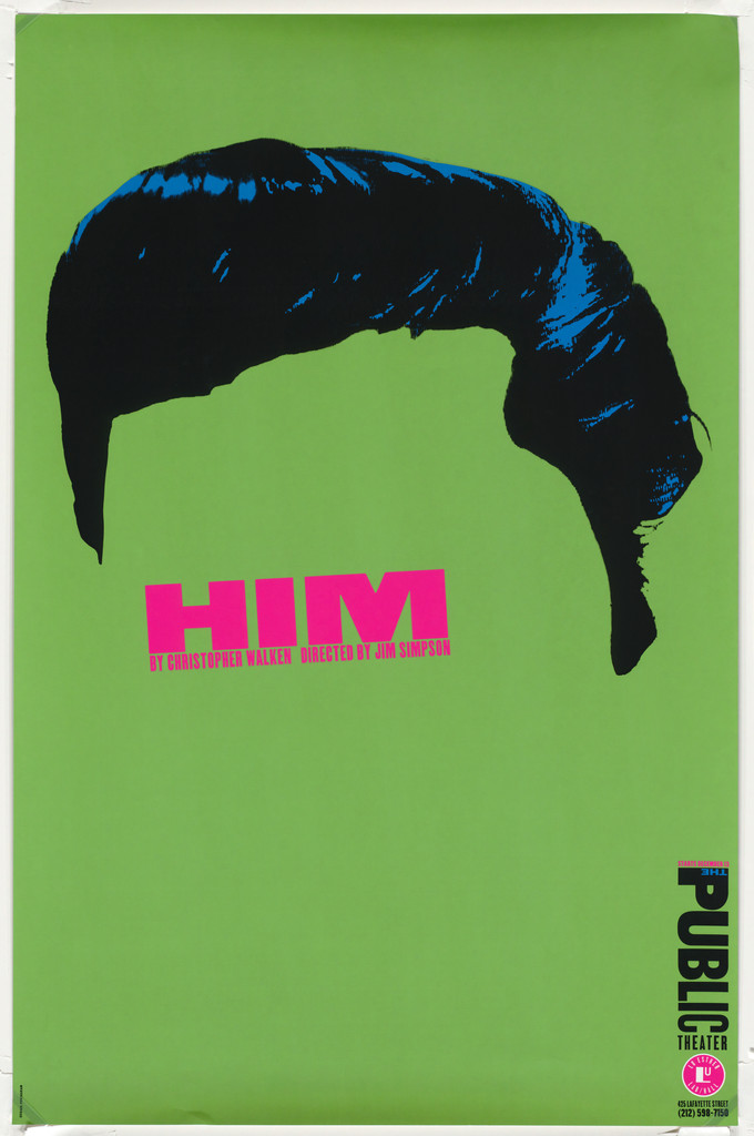
What it is — poster for Christopher Walken's play „Him" (about Elvis; directed by Jim Simpson), Public Theater 1994, screenprint, 116,8 × 76,5 cm, Ambassador Arts (MoMA).
Composition — green format. The top ≈ 45 % is taken up by a black pompadour hairstyle with a blue highlight, cut out as a silhouette — below it there is NO face: green ground. „HIM" in magenta sits exactly where the forehead would be (y ≈ 52 %), with two small lines of credits below. The bottom 40 % is empty; the PUBLIC logotype stands vertical bottom right. The eye moves: hairstyle → HIM → emptiness.
Colour — four: green, black, blue (highlight), magenta. Magenta only on one word — smallest area, strongest colour = the title. Green/magenta are a complementary pair, so the word vibrates.
Typography — HIM in magenta, extra-extended wood type grotesque, word width ≈ 45 % of the format; not identified.
Message — Elvis without Elvis: the hairstyle is enough, the face is anyone's (Walken, and the audience). Three seconds: hairstyle + HIM. Five metres: black hair on green.
Why exactly this way — there was neither permission nor budget for an Elvis likeness; and besides, the play is about „him" as a myth, not a person. The absence of a face is the content.
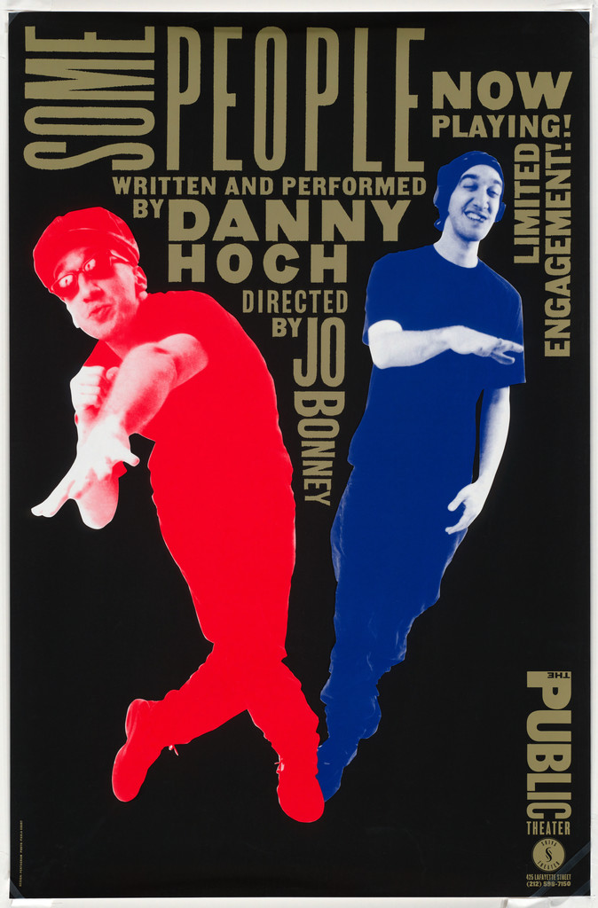
What it is — poster for Danny Hoch's solo show (directed by Jo Bonney), Public Theater 1994, lithograph, 117,1 × 76,9 cm, Ambassador Arts (MoMA).
Composition — black format. Two full-height figures of the same actor: the left one, red, leans left, the right one, blue, leans right — together they form a V, i.e. two characters out of one man. The text doesn't sit ON the figures but in the space they leave: SOME vertical in the top left corner, PEOPLE horizontal across the top, the credit in the wedge between the bodies, „NOW PLAYING! LIMITED ENGAGEMENT!" rotated along the right edge. The letters change width and direction to fill the gap — the same move as 03, except here the gap is made by the bodies.
Colour — four: black, red, blue, ochre. Red and blue are the FIGURES (duotone = costume), ochre is the text; nothing overlaps.
Typography — ochre wood type grotesque, condensed (SOME, NOW PLAYING) and extended (PEOPLE); not identified.
Message — „some people" = several people in one; one actor, two colours. Three seconds: red and blue figure on black. Five metres: a V made of two men.
Why exactly this way — a solo show with multiple characters; one actor, one photograph, two separations — cheaper than two photographs, more accurate than one.
What would kill it — text in a rectangular block above the figures. Then the figures become an illustration alongside the title, whereas here they ARE the layout.
What it is — poster for the Broadway transfer of the show (Ambassador Theatre, 219 W 49th St, Tele‑charge), 1996; AD Paula Scher, design Scher + Lisa Mazur, typeface "American Wood Type" (AIGA record); PGDA lists it as a lithograph, "circa 1995". No dimensions given. This is the SECOND version: the first (1995, Public, Pentagram) is on seasonal poster 03. AIGA: over time the campaign became "more anonymous" so other dancers could take over Glover's role. PGDA record 17113 ("1995") has no image — student contribution.
Composition — white format (the only white one in the series). NOISE blue, FUNK red — the two largest words, one top left, the other top right, each ≈ 40% of width. Glover (black-and-white photograph, cut out, tap dancing) in the middle, y ≈ 15–70%. All the rest is a WALL OF QUOTES from reviews, in black wood grotesque in five to six widths, partly horizontal, partly rotated 90° — "A JOYOUS MEDITATION ON TAP", "STUNNING!", "HEROIC!" — so that the quotes fill every empty corner around the figure. Bottom: black strip with address and phone number across the whole format, red Tele‑charge circle. Path: FUNK (red) → Glover → NOISE → quotes.
Colour — four: white, black, blue, red. Blue and red ONLY on the two title words — everything else black. Colour again signals rank.
Typography — American wood grotesque (AIGA), capitals, widths from ultra-condensed to extended; no specific typeface named.
Message — "everyone says it's great": quotes as noise, noise as theme (noise/funk). Three seconds: NOISE / FUNK / a man in motion. Five metres: blue-red title on white.
Why exactly this way — Broadway requires review quotes (a rule of the genre); instead of hiding them at the bottom, she turns them into a wall — i.e. into exactly what wood-type auction advertising already does. White background: a Broadway poster also has to work as a newspaper ad.
What would kill it — quotes in small serif at the bottom. Then it's an ordinary theatre advert, and the Public system disappears.
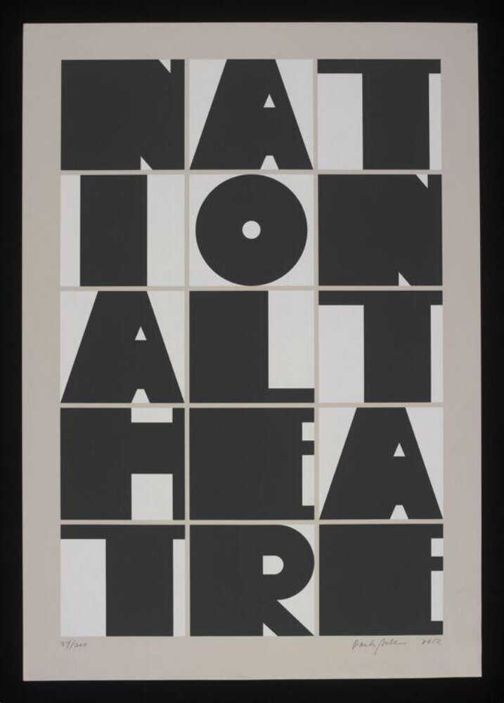
What it is — one of a series of art posters commissioned by the National Theatre for 50 years (since the Old Vic), 2013, screenprint, 88 × 62 cm, numbered and signed, gift of the National Theatre (V&A API). V&A description: "the letters National Theatre printed in a large, black format".
Composition — format divided into a 3 × 5 grid (white fields on a light grey background, thin grey gaps). One letter per field, black, stretched or compressed until it fills the field: NAT / ION / ALT / HEA / TRE. The word breaks along the grid, not by syllable — "ALT", "HEA". A has no crossbar (two stems and a triangle), O is a disc with a dot, T occupies the whole field. The grid holds 15 letters that would otherwise be incomparable; signature and numbering in pencil below.
Colour — two: black and white (plus grey background). No accent — here the system itself is the colour.
Typography — extra-bold grotesque, probably drawn per field (letter width is not from a single cut — each letter has a different width-to-height ratio); not named. This is the Public rule ("fill the field, vary the widths violently", v1) taken to its conclusion: one letter = one field.
Message — the house's name as a wall; it only reads once the grid is accepted. Three seconds: a black block of 15 letters. Five metres: a raster of black shapes — typography as architecture (the National Theatre is a Brutalist building — a reading, not documented).
Why exactly this way — the series constraint (same format for multiple artists) and a single-colour screenprint; she answers with what only she has — a typeface that behaves, not an image.
What would kill it — breaking the word by syllable (NA‑TIO‑NAL). Then it's a typographic poster; as it stands, it's an object.
Citibank identity (1998, Pentagram, with Michael Bierut; consultant Michael Wolff) — arc (Travelers umbrella) over the t in "citi", Interstate typeface with custom c and t, inherited Citicorp blue; sketch on a napkin 1998. Pentagram · Fonts In Use 5238. jedna-operacija-po-radu (candidate — one arc solving two cultures).
Public Theater logotype 1994 → 2005 → 2008 — Gothic (Nesbitt) → the word "theater" dropped, Akzidenz‑Grotesk Condensed → Knockout (H&FJ), vertical → horizontal "more architectural". Fonts In Use 2197 · Pentagram. identitet-je-ponasanje-ne-znak.
Shakespeare in the Park series (1995–2008) — Free Will 1995 (Tempest / Troilus, a political message about funding), Taming of the Shrew / Tartuffe 1999 (Garage Gothic, "lust / shrew / tart" in degraded fluorescent red), Measure for Measure / Seagull 2001 (Nobel; poster = map of Central Park), Henry V 2003 (quote about war), Much Ado 2004 (the only photograph), Free Love 2007, De Stijl grid 2008 (Knockout). Pentagram + Fonts In Use 73472, 73468, 21814.
Dancing on Her Knees (1995) — screenprint; upper half of legs in a yellow stocking on red, lower half purple letters with a yellow outline on black, text aligned with the top of the shoe. Cooper Hewitt 1998‑2‑3 (via si.edu). The record DOES give a description of the composition — a rare case.
Nude Nude Totally Nude (1996, Andrea Martin) — offset; cropped face, red eyes, yellow lips/hair/glasses, text on the CHEEK, logotype blue top right. Cooper Hewitt 1997‑99‑3. Candidate for a second author of etiketa-preko-slike — not seen (si.edu verification in browser).
Best of Jazz / CBS covers (1972–82) — Sonny & Cher 1975 (Push Pin Art Deco + Futura), Fifty Years of Jazz Guitar 1976 (MoMA 189255, with Nick Fasciano), Bernstein/Poulenc/Stravinsky 1977 (MoMA 189247), Graffman/Bartók 1978 (Fatima, Gershwin, Slenderella), Bob James "H" 1980 (MoMA 189253, with John Paul Endress). Fonts In Use 64999, 64142.
Koppel & Scher (1984–91) — Manhattan Records (Mondrian; Cooper Hewitt 1996‑88‑3), Champion "Beautiful Faces" (PGDA 9216), Tania Maria 1986 (Dolmen, Gill Sans).
Maps (2000–) — painted, typographic, "wrong on purpose" (v1); book MAPS 2011; PGDA 18099. Practice without a client.
The Big A (1991) — MoMA 5538, record 404 in this session.
Make It Bigger (2002) — book, Akzidenz‑Grotesk (Fonts In Use 1709).
Series: the constant
Public Theater 1994–2004 is a fixed regime, not a fixed layout: always capital wood grotesque in multiple widths, always a background without margins, always two or three colours, always words filling the field through rotation and width, logotype upright in the corner. Everything else changes — background colour, whether there's a photograph, text direction, angle. That's why Pentagram and she herself speak of a "system" that other designers run: the rule is a list of behaviours. Same type as Alvin Lustig New Classics, opposite of Lester Beall REA.
Bridge to practice: poster · graphic design · motion
Poster
Three colours, one hot background, zero margins. Illustrator: artboard = background (Spot 1), all text Spot 2 (black), only institutional copy in Spot 3 (red). Before working, write down which words are ALLOWED to be in the third colour.
Fill the field with width, not size. For a five-word headline: each word in a different width cut (Condensed → Extended), same capital height; rotate the ones that don't fit by 90°. Test: no gap larger than the height of a lowercase letter.
Strip in the background colour across a face (04): duotone photograph on one colour, text in a cutout that shows the background — not a white label. Eyes free.
Graphic design
Identity as a list of behaviours (03, 07, logotype): for LØADERRØR write five permitted behaviours (upright/horizontal, three backgrounds, widths, angle, where the cap sits) and zero fixed lockups. Check: three different posters that someone else could make.
Quote with a signature (02): when taking a historical work, take it WHOLE and sign it — a half-quote is theft, a whole quote is a joke.
Word across a grid (08): brand name in a 3 × N grid, one letter per cell, width to the limit — like a stamp / icon.
Motion
Rotation to fill space in AE: title of N words, each on its own layer; animate only Scale X (width) and Rotation (0 / 90) until the frame is full — not Position. Letters "enter" by expanding, not sliding.
Duotone as a character (06): one figure, two Tint layers (red/blue), mirrored — two roles from one shot in 2 seconds.
Cutout instead of a label (04): text as a Track Matte that CUTS INTO the image and reveals the background; enters as a Hold, never a fade.
Bad imitation
Wood type as style, not as behaviour — a theatre poster with three wood typefaces, nicely aligned, with margins. What's copied is the look of the letters, not the fill rule; the result is "retro", not "loud and urban". Test: if you can swap the typeface and the layout stays the same — that's not Scher.
Rotation as decoration — words rotated wherever there was room, and horizontally. In her work rotation only comes in when a word doesn't fit; if it fits, it stays horizontal (03: NOISE, FUNK, KING LEAR).
A fourth colour "to liven it up" — adding orange to Diva. The whole hierarchy of her posters rests on the third colour being rare and institutional; a fourth colour cancels the rank.
Parody without a signature (02) — taking Matter, changing "enough" that it's not recognisable. That's theft; her version works because she hides NOTHING and because she signed the source.
The brief through their eyes
Current job: gaming animations for YT (short comedy episodes) — title cards and thumbnails. She would first write the episode title like an auction poster: three words in three widths, capitals, on one hot background, no margins, and rotate the third one because it doesn't fit. Second: one cutout figure (character mid-jump) over the title, black and white, so colour stays reserved for the word that's the joke. Third: same system for every episode, different background — so the channel is recognisable from five metres away, without reading.
Exercises
Auction poster of 12 names (01/03) — 12 names, one format, wood grotesque in 5 widths (any Gothic/Grotesk with Condensed–Extended), three colours. Rule: no gap bigger than the height of a lowercase letter; rotation allowed only when a word doesn't fit. 60 min.
Band in the background colour (04) — one portrait, duotone in one colour on a background of another colour; title in two bands at the same angle crossing over the mouth, eyes free. Three colours total. 45 min.
Word across a grid (08) — your own name in a 3 × N grid; draw / stretch each letter to fill its cell, break by cell not by syllable. One colour. 45 min.
Motion study
AE, 5 s, 1 frame: a four-word title on a hot background. Each word enters by EXPANDING (Scale X 0 → 100, expo easing) in its own cell; the fourth doesn't fit, so in 0.3 s it rotates 90° and only then expands. One event (filling the space), colour only on the word that rotated. No Position keyframes.
Rebuilding the benchmark
The Diva is Dismissed 1994 — .svg skeleton: format 3:4 (116.8 × 76.5); face from y 10% to 100%, width ≈ 80%; eyes y ≈ 48%; band 1 (title) from (0, 78%) to (100%, 55%); band 2 (credit) from (0, 60%) to (100%, 85%); crossing over the mouth y ≈ 68%; band 3 bottom left; logotype upright x 92%, y 5–20%. Tonal zones: background 100%, duotone face 60%, bands 0% (background). Task: 45 min in Illustrator without looking, then overlay.
Notes on sources
Uncertain / conflicting:
Best of Jazz: MoMA 1979 Columbia; Cooper Hewitt 1980 "for New York Public Theater" — Cooper Hewitt record is wrong (client), MoMA taken instead. Poster Museum: printer Toppan, yellow colour — with reservation (reprint 1994).
Swatch: Brower/AIGA 1984, others 1985; Koppel & Scher founded 1984. Matter original: per reading of the image, Pontresina/Engadin 1935 (MoMA 5323) — not Engelberg/Trübsee (glove). To verify in parallel.
PGDA 17307 (Swatch) carries the date and author of the ARTICLE (5.12.2014, Steven Brower) — not of the work.
Noise/Funk: Pentagram — posters 1995 (Public); AIGA/Google Arts — 1996 Broadway, Scher + Lisa Mazur; PGDA "circa 1995". The Broadway version was analysed (the only one with an available image); the 1995 version is only visible within poster 03.
Fonts In Use 2197: a commentator doubts that the 2005 logotype is really Akzidenz-Grotesk.
v1 quote unconfirmed; replaced with Eye 77.
v1 "150 covers a year" and "joined Pentagram 1991" — confirmed by Wikipedia; "only woman partner" — a commonplace, not verified in a primary source.
Dead ends: si.edu requires browser verification (Cooper Hewitt images Nude Nude and Dancing not seen); MoMA 5538 (Big A) 404; aiga.org medalist essay unavailable; Letterform Archive has no Scher record; Art21 not checked (not found in the gallery search — not searched).
Analytical text per work: only 01 (Cooper Hewitt description + Poster Museum), 02 (Brower, Retinart), 03 (MoMA label + Pentagram), 07 (AIGA record). 04, 05, 06, 08 — fields 2–4 are v2 reading of the image alongside the record.
Typeface: none of the eight works has a confirmed typeface; only the logotype (Gothic Nesbitt) and later works (Knockout, Interstate, Garage Gothic, Nobel) per Fonts In Use.
Difference sentences:Herbert Matter ↔ scher — Matter montages a face and a hand to sell a mountain / Scher takes Matter's whole montage to sell a watch and signs it; quote as dictionary / quote as joke. Barbara Kruger ↔ scher — both use someone else's image + a band across the face, eyes free; Kruger pastes a label FROM OUTSIDE (white/red, word-width) to show who's speaking / Scher cuts a SLIT into the image (background colour, edge to edge) to show what's been cancelled. Neville Brody ↔ scher — both treat identity as behaviour; Brody rotates a magazine masthead so the face comes first / Scher rotates TITLES to fill the space, logotype always upright in the corner. Herb Lubalin ↔ scher — both build a wall of text; Lubalin sets his own copy in a justified block / Scher sets other people's quotes and titles into a wall through rotation and width, without alignment. Massimo Vignelli ↔ scher — same city, same type of client (public institution); Vignelli's grid + Helvetica because neutral is fair / Scher's wood type because neutral "neutralises feeling"; a system that freezes / a system that allows. April Greiman ↔ scher — both in the Eye 77 generation; Greiman stretches the IMAGE on screen to the pixel / Scher stretches the LETTER on paper to the cell (08). Max Huber ↔ scher — both mreza-drzi-haos; Huber's grid under photography and overlay (Monza) / Scher's diagonal grid under twenty names (01) and 3 × 5 under fifteen letters (08).