hybrid image — video, bitmap, photography and typeface in one space; first serious Macintosh
April Greiman Inc. (1976), Made in Space, Los Angeles; director of Visual Communications, CalArts 1982–84; DQ 133 (1986) New York (Wantagh, Long Island) → Kansas City → Basel → Philadelphia → Los Angeles (from 1976)
„Why people didn't put typography on the diagonal, I could never figure out."
— AIGA Eye on Design, 2019 (Meg Miller). v1 quote „The computer is not a tool.
It is a medium, and it has a nature." not found in any source — do not use.
Also confirmed (Laurence King, 1984): „It's not just graphic design anymore. We just
don't have a new name for it yet."
Biography
Born 22.3.1948. in New York (Wantagh, Long Island; later Woodcliff Lake, NJ).
Kansas City Art Institute 1966–70: graphic design, photography, ceramics; the
programme was run by Rob Roy Kelly (Yale) — modernist grid and corporate design, but the
school had no typographic equipment (Kutztown per AIGA). Postgraduate study in Basel 1970–71 under
Hofmann and Weingart — Weingart, in her own words, „freed them to
experiment" and taught her to „look at the letter as an image". This is a direct lineage: the same
classroom as Wolfgang Weingart's TM 12/1976, the same reprographic camera, the same spacing pushed to the point of collapse —
only she will be doing it on screen ten years later.
After Basel she taught at Philadelphia College of Art, took a Fortran course at Yale
to make a calendar (failed, but „absorbed by osmosis how the machine thinks" — AIGA).
In 1976 she moved to Los Angeles, founded April Greiman Inc. There she found light, space and
photographer Jayme Odgers (1939–2022; Art Center 1962, assistant to Paul Rand) — with
him she made Wet („magazine of gourmet bathing") 1978–82, the CalArts folder 1978, Space
Mats 1979, the Olympic poster 1982. Their formula was already hybrid: his
photography and airbrush, her diagonal and floating fragments; East Coast criticism
called it „fine art, not design" and „fluff" (AIGA 2019).
In 1982 she took over the design programme at CalArts, renamed it Visual Communications
and acquired video equipment and a Quantel Paintbox — there, before the Mac, she learned the logic
of the digital image (she says: „toilet training"). In 1984, after Kay's talk at
TED, she bought her first Macintosh at Macy's in Carmel. The male part of the AIGA board said „this
is the end of everything"; Glaser kept his Mac unopened in the basement, Scher said computers
„don't smell right" (AIGA 2019). Mickey Friedman of the Walker was the only one to call her
a „serious threat" to the establishment — and commissioned her issue of Design Quarterly.
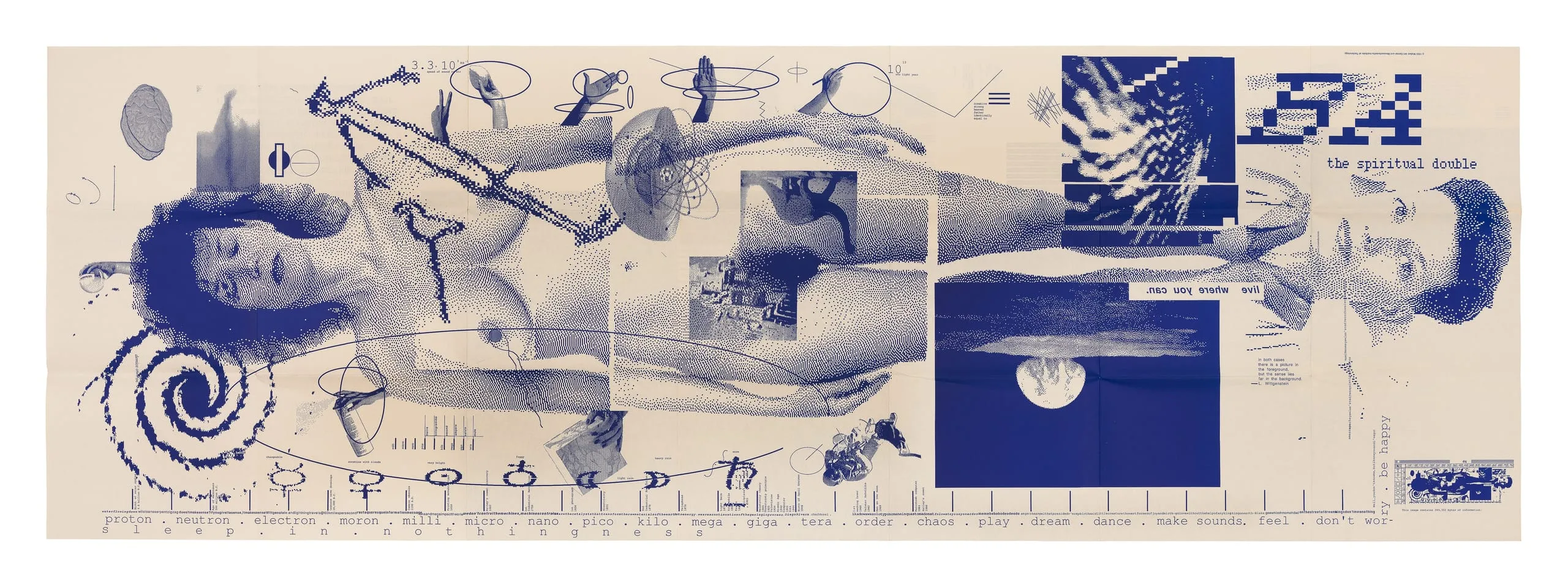
DQ 133 (1986) is the turning point: instead of 32 pages, a double-sided poster 25.5 × 76.5
inches (author's own figure; MoMA 68.9 × 193.4 cm), the whole thing assembled in MacDraw/MacPaint/MacVision
on a 512K Mac, printed on a LaserWriter as eight sheets of 8.5 × 11 in and
assembled by hand; six months of gathering material, three months of digitising, three months of
laying out (aprilgreiman.com). The files printed out all night (NCSU GD203). On
the front, her nude self-portrait life-size, doubled —
„The Spiritual Double" (Walker). The profession was in shock; after this
resistance to the Mac stopped (NCSU). She herself has, since 1984, rejected the label „graphic designer" and
„Queen of New Wave" — since then she has been a „trans-media artist".
Afterwards: Snow White + the Seven Pixels 1986, Sci-Arc 1986, Pacific Wave and Workspace
1987; MacWorld first prize 1988 (won the first colour Mac); the book Hybrid Imagery
1990; AIGA gold medal 1998; a stamp for women's suffrage 1995; the public mural
Hand Holding a Bowl of Rice 2007 (Koreatown, Wilshire/Vermont metro); Made in
Space from 2005; taught at SCI-Arc 1992–2009, Woodbury 2009–18, USC Roski from 2020.
Photographic books Drive-by Shooting 2006 and WhiteSpace 2021 (Eye 103 —
the underscore as a sign of the invisible). Retrospective at Arc en Rêve, Bordeaux 1994 (Eye);
LACMA Digital Witness 2024–25.
Influences
Studied with
„Rob Roy Kelly (Kansas City Art Institute 1966–70) — modernist grid, corporate design; school without typographic equipment (Kutztown/AIGA)“
„Armin Hofmann and Wolfgang Weingart (Allgemeine Kunstgewerbeschule Basel 1970–71) — Weingart — „start to see type as image“ (Kutztown; Wikipedia; Cooper Hewitt)“
Borrows from
„Jayme Odgers (1939–2022) — collaborator 1978–82, photography and collage; Wet, CalArts, Space Mats, Olympics (V&A; LACMA; Wikipedia Odgers)“
„Wittgenstein — „If you give it a sense, it makes sense“ (title DQ 133; Walker reader)“
„video and Quantel Paintbox before the Mac (1982–84, CalArts equipment); Alan Kay TED — first Mac 1984 (AIGA Eye on Design 2019)“
„Leonardo (Vitruvian Man, Sci-Arc 1986), NASA space photographs, spiral galaxies (DQ 133)“
Influenced
„the whole line of digital design after 1986 — Émigré/Zuzana Licko, Rudy VanderLans (not verified in the source — trace only)“
„Made in Space as studio; teaching SCI-Arc 1992–2009, Woodbury 2009–18, USC Roski from 2020 (Wikipedia)“
Rob Roy Kelly, Kansas City 1966–70 — grid, corporate, but no hands-on typesetting;
hence her comfort with the system she later takes apart.
Armin Hofmann and Wolfgang Weingart, Basel 1970–71. From Hofmann: one mark,
fragment, perception (see Olympics 1982 — legs as Hofmann's body fragment, but
in colour and with depth). From Weingart: the letter as image, spacing, the layer of film on
the light table — which she, in 1984, translates into a layer on the screen. She is the only
covered author who is a direct student of two already covered.
What she steals
Jayme Odgers's photography and collage 1978–82 — Wet, CalArts, the Olympics. Who
did what in the pair, the sources don't separate (V&A and LACMA credit both) — do not claim otherwise.
Video (still frame, MacVision digitising) — DQ 133, Workspace (eye, city),
Snow White (wire sphere). Video is her source of „grain" the way generation-copy
was Weingart's.
Science and the cosmos — spiral galaxy, Earth from the Moon, the brain, dinosaurs,
a timeline from the Big Bang (DQ 133, Cooper Hewitt description); Vitruvian
Man as bitmap (Sci-Arc). An image of the world, not an image of a product.
Wittgenstein — „If you give it a sense, it makes sense" — the title of DQ 133;
and „the observer is the observed" (modernism101 quote).
The tool itself — MacDraw „stretch it from a few inches to a few feet in seconds"
(aprilgreiman.com): stretching the bitmap is a compositional device, not an error.
Who she influenced
The entire pixel/dither/glitch line after 1986 — the v1 claim („anyone working in a
raster, dither or pixel idiom today is standing on this poster") holds as
chronology, but no source in this session names a specific successor. Émigré
(Licko/VanderLans 1984–) works in parallel, not after her — do not claim a lineage.
CalArts students 1982–84, SCI-Arc 1992–2009 — names not in the sources.
Muriel Cooper — a parallel, not an influence: Cooper 1986–94 builds depth on the screen
as a space for reading; Greiman 1986 builds depth on paper out of the screen. No
source connects them.
What it is — issue 133 of Design Quarterly (Walker Art Center / MIT Press,
editor Mildred Friedman) delivered as a two-sided folded poster in a paper
sleeve 8.5 × 11 in. Measurements: the author 25.5 × 76.5 in (intended 33 × 76.5, cropped
due to printing); MoMA 68.9 × 193.4 cm; LACMA 64.77 × 193.04 cm. Offset (MoMA
"lithograph", LACMA "photolithograph"); George Rice & Sons — separations, assembly,
printing; Ivy Hill — printing; Area Trade — folding. Front side one colour,
cobalt blue on cream paper (LACMA description, confirmed against image); back side in colour
("atmospheric spatial video images" — modernism101, not seen). Typesetting: Mac +
LaserWriter, eight sheets 8.5 × 11 joined by hand.
Composition — landscape format 1 : 2.8. A nude figure lies along the entire
length (head left, feet right — when the poster is hung upright, the figure STANDS at
life size). The body is not one scan but blocks: visible seams at the waist and thighs (Cooper Hewitt: "segmented at the waist and thighs") — these are the
eight LaserWriter sheets, left as a cut. Lower left a spiral galaxy;
along the bottom edge a dotted timeline with tiny captions (from the Big
Bang to invention); on the right large bitmap letters and the caption "the spiritual double" beside a second, inverted head with open eyes
(Cooper Hewitt: "upside-down head of
another woman with open eyes"); on the right a blue rectangle with the Earth/Moon.
The eye enters on the face (closed eyes), slides down the body, stops on the second head
— two gazes, one asleep, the other looking. Everything else (arms holding objects, brain,
diagrams) are fragments of varying size SCATTERED, with no grid — "floating".
Colour — one: cobalt blue. All tone comes from the density of the halftone (MacVision
dither of a video capture: skin is fine grain, background empty). One colour is a printing
decision (huge format) and an argument: the pixel doesn't need colour. The back side is in
colour — two sides, two registers.
Typography — Mac bitmap typeface in two sizes: tiny text at 72 dpi (reads
as texture) and enlarged letters (stretched in MacDraw — visible "jaggies"). The typeface name is not confirmed (class Chicago/Geneva). The title is not
large on the front side — the message is the body, not the word.
Message — "Does it make sense?" — a question about the meaning of the new medium posed
through the author's nude body: I am in the machine, the machine is in me. From five metres: a
blue figure, one grain. From three seconds: the pixels are deliberate, not error.
Why exactly this way — the constraint is the Mac 512 K and the LaserWriter 8.5 × 11: the format
CANNOT be made in a single file, so it was split; the resolution CANNOT be increased,
so it was enlarged. Both constraints left visible (body blocks, jaggies).
Friedman gives her an issue about her work; she refuses the survey and changes the format — because
the format is what a new tool changes first.
What would kill it — a single move in Photoshop: a smoothed edge. As soon as the pixel becomes
"clean", the poster is just a big photograph of a nude woman.
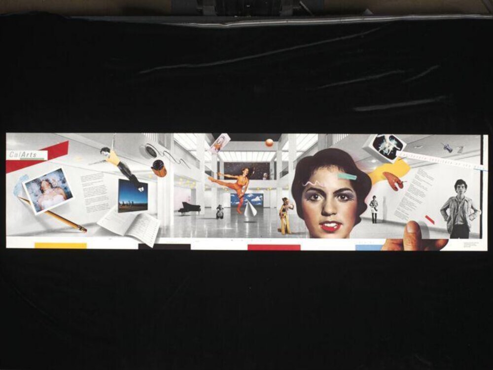
What it is — a "poster or folder", multicolour offset, 28 × 117 cm (V&A) —
an extremely landscape band 1 : 4.2 that folds into a brochure. Client CalArts.
Date V&A 1978 (Kutztown "1977" — no source). Both sign it.
Composition — a white hall in perspective (photo of the CalArts atrium) as a stage
that runs the entire length; "inserted" into it are objects at the wrong scale: an enormous
woman's face right of centre (photo, colour), a dancer in orange mid-leap,
a piano at the bottom, polaroids, a pencil, an open book on the left, a young man on the right. Everything sits
on diagonals and casts soft shadows on the hall floor — a collage acting as space.
"CalArts" small, upper left, beside a red diagonal; along the bottom edge a row of small
coloured squares (yellow, red, black — like registration marks). The eye enters on the face,
then left into the hall, then scatters over the objects — deliberately without one focus.
Colour — the white hall as background, three solid colours (orange dancer,
red diagonals, yellow accents) and colour photographs; there is no palette, there is photography.
Typography — small, in blocks along the edge, subordinate to the image; class cannot
be confirmed from the small image.
Message — the school is a space that fits everything, at every scale. From five metres: a
white tunnel with a face. From three seconds: a collage.
Why exactly this way — two authors, a photographer and a designer: the format is a band so that
the photo of the hall would be LONG, and folding into a folder gives a sequence of panels.
What would kill it — aligning the objects to a grid. The disproportion and the shadow are the whole job.
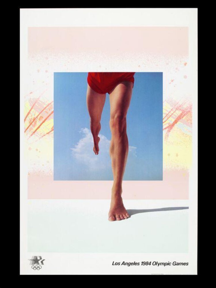
What it is — a poster from the official LA 1984 series (commissioned 1981, printed 1982 —
Wikipedia; V&A "printed 1982"), multicolour offset, 91.5 × 61 cm. Both sign it.
Composition — measured from the image, upright format: white border; pink
field x 6–92 / y 12–68 %; within it a blue square of sky x 22–74 / y 22–62 %; from the
square emerge bare legs in red shorts, the foot LANDING on a white "floor"
below the field (foot y ≈ 71 %), with a cast shadow. Along the left and right edges of the field
yellow-orange pastel strokes (airbrush/pastel). Lower left the Olympic
"star in motion" logo, lower right the line "Los Angeles 1984 Olympic Games" (y ≈ 86 %).
The eye enters on the red shorts (the only saturated colour), slides down the leg, stops on the
foot and its shadow — that shadow is the whole trick: the figure has STEPPED OUT of the image onto the paper.
Colour — sky blue (a single photograph), pink and pastel yellow as
atmosphere, red only on the shorts, mint below the horizon. Three floating planes of
varying saturation — depth without perspective.
Typography — one line of grotesque at the bottom, small, in the role of a signature; class
Helvetica — name not confirmed. The image is 95% of the poster.
Message — an athlete stepping out of the image into your space; LA light
(pastel, sky). From five metres: a red dot and two legs. From three seconds: the shadow.
Why exactly this way — the official poster series calls for a legible sport without a face;
Hofmann's body fragment (Stadttheater) carried into colour and into space. Airbrush
and pastel are Odgers' register; "floating square + shadow" is hers.
What would kill it — removing the shadow under the foot: the legs would be back inside
the photograph, not in front of it.
Principles:lebdeca-ploha-baca-sjenuekstremna-nesrazmjera-mjerila (legs at
human scale, sky square at window scale) providni-sloj-kao-dubina (pastel
strokes OVER the pink, under the blue)
To verify against the image: whether the pastel is printed as a separate colour or in process; who is
the model; the exact year (1981 design / 1982 print).
04 · Your Turn, My Turn, 3-D — Pacific Design Center (1983)
What it is — poster for the Westweek symposium at the Pacific Design Center (PDC 2), Los
Angeles, on collaboration between artists, designers and architects (Gildor). Five-colour offset
(LACMA), 91.44 × 60.96 cm, delivered with 3-D glasses she made herself (Gildor). LACMA record has no image; PGDA image shows the upper half.
Composition — upper part: black band with a turquoise triangle and the logotype
„P D C 2" (red small squares + a white one with a number); a yellow lightning-triangle enters
diagonally; „Your Turn" and „My Turn" in two rows of large bold grotesque, on a slight diagonal (≈ 10°), each row DOUBLED — cyan and magenta offset — and on the right the same text mirrored and upside down („Your Turn" backwards). On the right a red halftone gradient with
large numbers 3 8 3, bottom left Earth from space, scattered small numbers and
stardust. The eye enters on „Your", is led by the diagonal and the colour shift.
Colour — cyan + magenta as a stereo pair (Gildor: „two superimposed images
of the text, one in cyan and the other in magenta"); where they overlap, a third,
dark violet; plus yellow, red, black. Colour here isn't hierarchy but
OPTICS: without glasses it's vibration, with glasses depth („unstable layers, which
spring from the surface").
Typography — „a conventional sans serif typeface" (Gildor) — bold grotesque,
name not confirmed; all the unconventionality is in the doubling, the diagonal and the mirroring,
not in the cut. Stretched/condensed letters and numbers work as space, not as text.
Message — „your turn, my turn": the two layers (cyan/magenta) are two
interlocutors; the title becomes a demonstration of its theme. From five metres: red-blue
flicker. From three seconds with the glasses on: the text pops out.
Why exactly this way — CalArts video equipment 1982–84 and stereo experiments; the symposium's
theme is exchange, so the poster is built as an exchange between two channels.
What would kill it — aligning cyan and magenta into register: what's left
is an ordinary bold diagonal title.
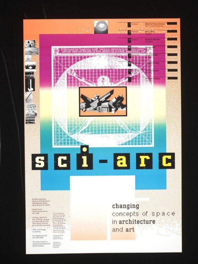
What it is — poster for the SCI-Arc lecture series (Southern California Institute of
Architecture), multicolour offset, 91.5 × 61 cm; V&A: „Sci-Arc Changing Concepts
poster". Same year as DQ 133 — first Mac works.
Composition — measured from the image: peach-orange dither
gradient background at top, fading into white with scattered dots; central square x 18–78 /
y 8–58 % — the Vitruvian Man as a WHITE BITMAP (coarse pixels) over a
magenta → cyan gradient, framed by an orange grid of tiny characters; in the middle of the figure
a small orange square with a PHOTOGRAPH (a winged classical fragment — sharp).
Left, a column of small square photographs (x 5–14 / y 8–45 %) like a filmstrip;
right, a list of speakers with black date bands (y 4–30 %). A blue plane x 18–78 /
y 40–70 % below the square; on it „sci-arc" in yellow bitmap letters with a black
outline, letterspaced, with a hyphen (y 52–60 %). Below, a white/peach rectangle
x 30–60 / y 60–85 % with „changing / concepts of s p a c e / in architecture /
and art" bold, „space" letterspaced. Small text bottom left in columns.
The eye enters on the yellow „sci-arc", rises into the figure, falls to „space".
Colour — orange, magenta, cyan, yellow, black: process colours as LAYERS
(gradients), not as flat fields. Each layer has its own resolution: fine dither of the background,
coarse bitmap of the figure, continuous-tone photograph. Colour doesn't order the hierarchy —
DEPTH does (what is in front).
Typography — the title is Mac bitmap enlarged to the visible pixel, yellow with a black
outline to separate it from the cyan; subtitle bold grotesque/bitmap-bold; „space"
letterspaced as an illustration of the word. Typeface names not confirmed.
Message — Leonardo's man as the measure of space, but made of pixels: „the changing
concept of space" shown within the image itself. From five metres: a square with a gradient and
a yellow name. From three seconds: the figure is made of squares.
Why exactly this way — the subject (space) demands depth; the Mac in 1986 gives only bitmap and
gradient; the solution: stack five layers of different origin so each becomes another
„plane" — depth without perspective (Cooper Hewitt: „the page as a
three-dimensional space").
What would kill it — a single resolution for everything (vectorise Leonardo): the layers would
merge into one flat plane and the space would disappear.
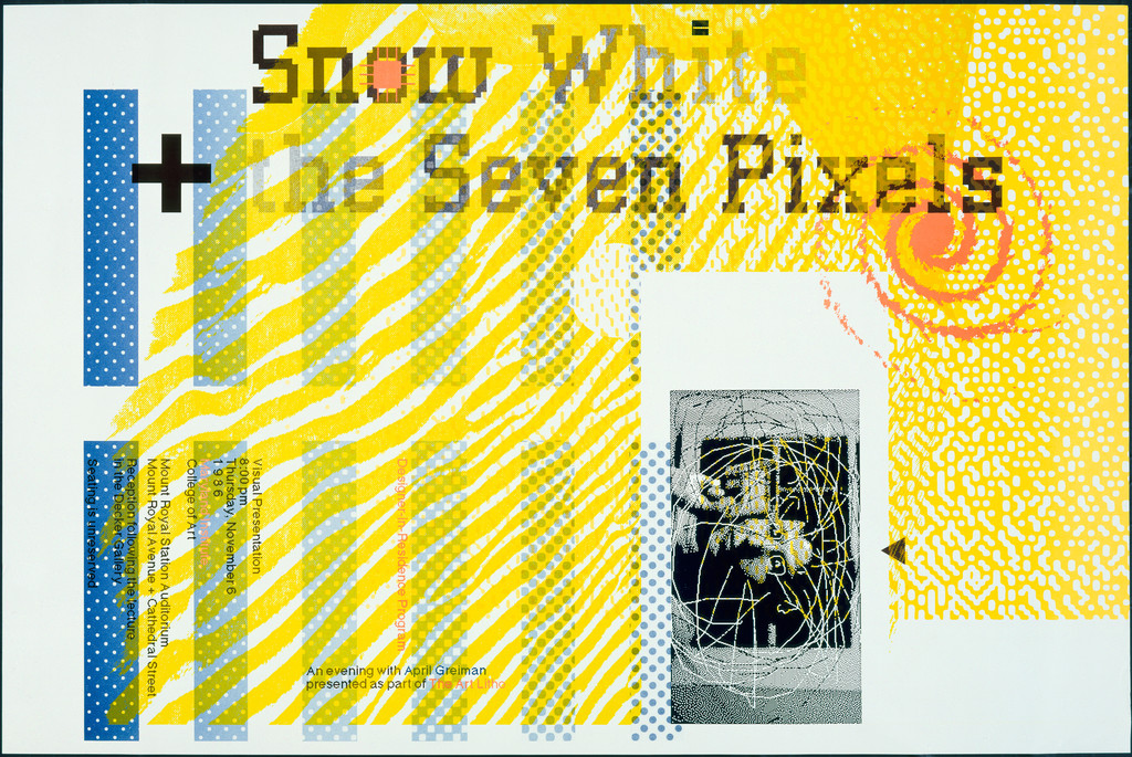
What it is — poster for her lecture; offset, printer Art Litho. Co.,
Baltimore; MoMA 36 × 24 in (91.5 × 61 cm) — the image is landscape (842 × 563 px,
whole with border), so it's likely 61 × 91.5 (h × w); client not in the record.
Gift of the designer.
Composition — landscape format. Yellow field with white diagonal stripes
(waves) across the whole surface; the title „Snow White + the Seven Pixels" in two rows of
large bitmap serif (black), across the top third, with a large black „+" on the left;
left edge: a vertical column of blue halftone dots (x 8–14 %) and next to it vertical
rows of lecture text (red/blue); top right a red spiral mark (target); bottom right a white
rectangle with a photograph of a wireframe sphere/globe (video still, x 58–75 / y 45–90 %) and a small
black triangle (cursor/„play"). The eye enters on „Snow White",
slides along the stripes to the globe.
Colour — yellow as the base (whole field), blue and red as halftone/line, black for
the letterforms. The white stripes are „subtracted" yellow — a negative. Pop palette, but everything
in halftones.
Typography — bitmap SERIF (a pixel Times class — not confirmed) in the title:
Snow White (classic, serif) + pixels (bitmap) in one typeface — the title is a joke
carried out typographically. Small text vertical, letterspaced.
Message — a fairy tale in seven pixels: the Mac in 1986 as Snow White in the dwarfs' house.
From five metres: yellow with a black headline. From three seconds: the serif is made of squares.
Why exactly this way — a poster for a lecture about the Mac has to show the Mac: halftone,
bitmap, video still, all on one sheet; yellow is LA sun and a Weingart trademark.
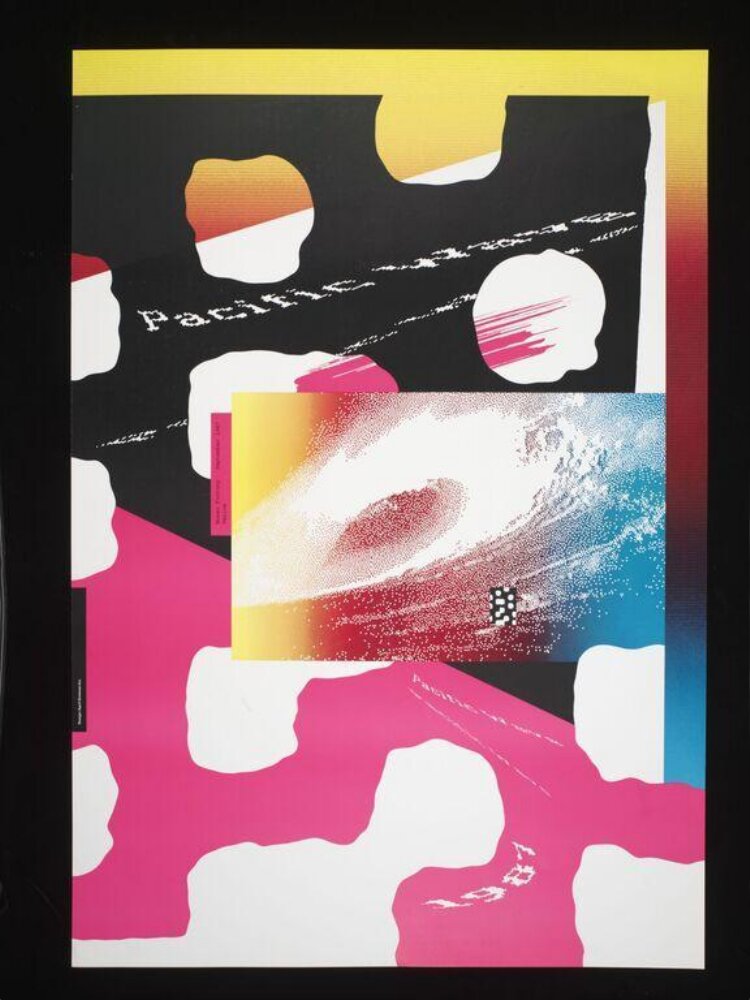
What it is — poster for the exhibition of Californian graphic design at the Museo Fortuny,
Venice; V&A 98.5 × 68 cm, LACMA 98.74 × 68.1 cm; four-colour offset with
fluorescent process colours (PGDA — the only source that says fluorescent); V&A and
LACMA give "offset lithograph" (LACMA's image caption says "screenprint" — a
description error, the record says offset). PGDA: "Location made: Italy".
Composition — portrait format. Yellow band across the top (y 0–8%) with a
transition yellow → red along the right edge; the upper half a BLACK field, the lower a
MAGENTA field, both punctured by the same white organic "clouds" (or holes) running
diagonally down the format; right of centre a rectangular PHOTOGRAPH of a wave x 30–80 /
y 40–62% — halftone/dither, in a transition from yellow-orange (left) → blue (right), so
the wave's foam breaks down into dots; "Pacific" set stepped-diagonal across the black
(y ≈ 30%) in white, torn bitmap serif; "1987" below in the same typeface;
pink brushstrokes top right; small vertical text left of the photograph.
The eye enters on the wave (the only photograph), then to "Pacific", then down the clouds
to "1987".
Colour — black / magenta / yellow / white + blue only in the photograph. Fluorescent
magenta (V&A description: "hot pink") gives LA light; black on top and magenta below is
an inverted landscape (sky dark, ground light). The white clouds are the SAME shape
across both fields — one layer punches through two fields: providni-sloj-kao-dubina
without transparency, just by cutout.
Typography — "Pacific" and "1987": the lettering is deliberately damaged — bitmap
enlarged and stretched (MacDraw stretch), edges torn like a raster; typeface name not
confirmed (serif class). The title isn't legible from five metres — and that's
intentional: the word behaves like a wave, not like a sign.
Message — California in Venice: wave, sun, fluorescent. From five metres:
black/pink with white holes and a wave. From three seconds: the foam is made of pixels.
Why exactly this way — a design exhibition in a textile museum: the poster as fabric
(repeated clouds, fluorescent) more than as advertisement; the Mac in 1987 gives a dither
transition in the photograph — she puts it right into the wave itself, where the foam is
already grain.
What would kill it — a clean title in Helvetica across the top: the piece would
become a tourist poster.
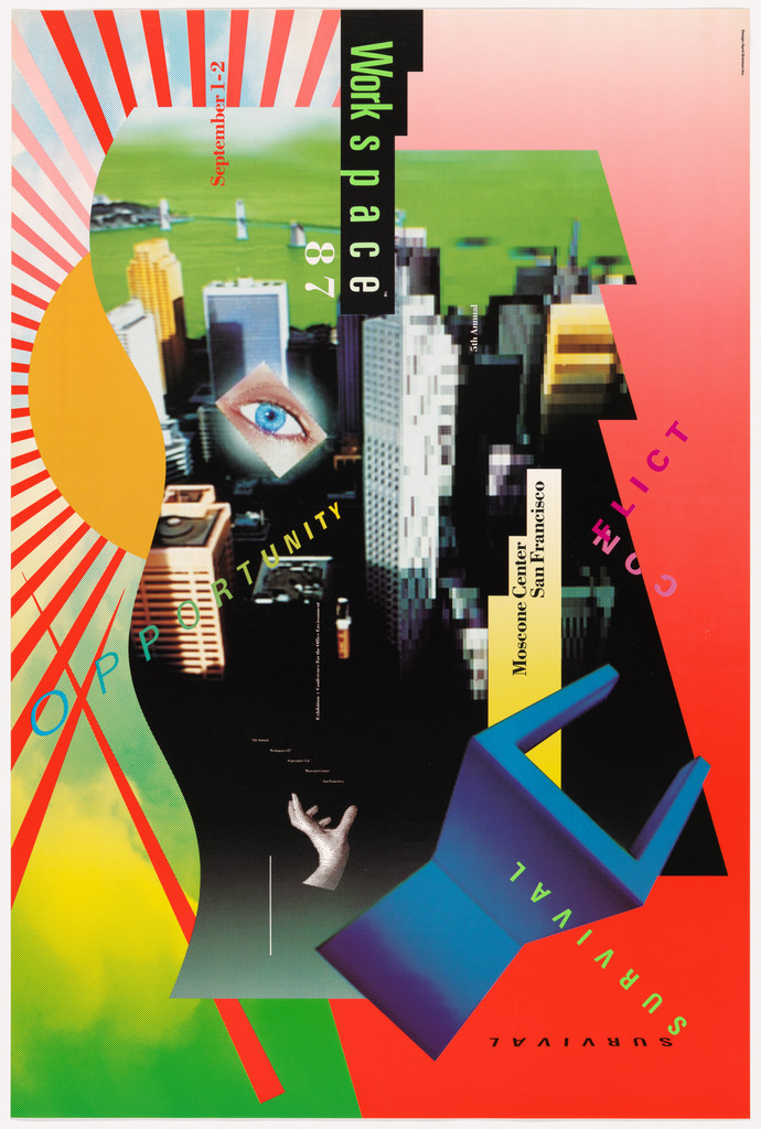
What it is — poster for the Workspace 87 conference/trade show, Moscone Center, San
Francisco, September 27 (from the image); client Charles Yourd, Workspace (PGDA);
offset (MoMA "lithograph"), 91.4 × 61 cm; gift of the designer, 2024. PGDA: in
"Design Excellence: 50 Posters of the 80s".
Composition — portrait. Red-and-white rays from a point on the left edge
(x 0 / y 35%) spread across the whole format; red vertical stripes along the left and
right edges; a green field (aerial photograph/lawn) trapezoid upper-right x 30–80 /
y 10–30%; in the centre a tilted video-still of a city from above (black-and-white
buildings) x 30–75 / y 22–80%; an eye (video-still) at x 40 / y 35%; a hand at bottom
centre (y 78%); a 3-D blue chair/block (computer render, isometric) bottom right
x 45–80 / y 60–90%; a yellow-green dither transition bottom left. Text: "Workspace
87" vertical in a black band top right (bitmap grotesque); "September 27" vertical
in red; "Moscone Center San Francisco" vertical in a yellow band; three words
OPPORTUNITY (yellow, diagonal ↗), CONFLICT (pink, vertical), SURVIVAL (along the
chair leg, and mirrored). The eye enters on the eye, falls to the chair, reads the words
along the way.
Colour — red rays + white as background (energy), green and yellow as fields, blue
only on the 3-D object, the photograph black-and-white. Colour = origin of the layer:
render blue, video grey, field green.
Typography — every word is an object: vertical, diagonal, mirrored, spaced; none of
them is a "title at the top". Bitmap grotesque in the title, spaced grotesque in the
words — names not confirmed.
Message — the workplace of the future: city from above, an eye that watches, a hand
that works, a chair from a computer; the three words are the conference theme. From five
metres: red rays and a blue chair. From three seconds: everything is flying.
Why exactly this way — 1987 already has 3-D render and video; she doesn't hide them,
but gives each its own layer and its own angle — the poster is a catalogue of the media
Workspace promises.
What would kill it — align the words horizontally and remove the rays: what's left is
a collage.
Principles:hijerarhija-po-dubini (the chair in front of everything = the newest
technique closest) hibridna-slika-po-rezoluciji (render + video + photo + dither)
tekst-je-predmet-u-prostorulebdeca-ploha-baca-sjenu (the chair and green field have a
shadow/offset)
To verify against the image: whether the green field is an aerial photo or flat; the full
content of the words (SURVIVAL mirrored?); who Charles Yourd is.
Other works — evidence, no analysis
Space Mats (1979, with Odgers) — brochure, offset, closed 10.2 × 21.6 cm,
open 50.8 × 21.6 cm; LACMA M.2014.238.9 (no image). Not seen.
Wet magazine (1976–81, with Odgers) — art direction; Walker, AIGA. No issue has been
seen; Kutztown "cover 1979" with no image.
California Design 2 (1985, AIGA) — six-colour offset, 92.7 × 61 cm, LACMA
M.2014.126.30 (image exists, not opened): "diagonal white stripe dividing a
stylized blue-and-yellow California map graphic from a halftone photographic
image" (LACMA description).
Iris Light (1984) — Kutztown describes it (a lamp from video, blue trapezoid, yellow
foot with shadow, Roman bust) — no museum record, not to be claimed as fact.
Poster for SCI-Arc (1990) — folded, open 50.6 × 80.3 cm, LACMA
M.2014.238.11 (no image).
AIGA Communication Graphics (1993) — Cooper Hewitt (Madlener 2016): seven coloured
brains = seven chakras on a human figure. Not seen.
SCI-Arc summer program (1994) — Eye: double-sided, cuts horizontally into three
posters OR stands whole; "digitised ancient symbols at various scales".
format-je-prva-odluka — third piece of evidence.
Women's Suffrage stamp (1995, USPS) — Kutztown: the words Progress/Equality/
Freedom over Congress; not verified.
Hand Holding a Bowl of Rice (2007) — public mural, Wilshire/Vermont, from a
video-still; aprilgreiman.com.
WhiteSpace (2021) — photography book; Eye 103: underscore as a sign.
Principles — summary
Global (confirmed IN the work):
- providni-sloj-kao-dubina — Olympics 1982 (pastel under blue, over pink), Your Turn 1983
(two channels), Sci-Arc 1986, Pacific Wave 1987, Snow White 1986.
Third author after Muriel Cooper and Wolfgang Weingart: Cooper resolves, Weingart
blurs, Greiman stretches — the layer is made of pixels and stays visible as a layer.
- hijerarhija-po-dubini — Sci-Arc (yellow name IN FRONT OF blue, the figure behind),
Workspace (render in front of video in front of field). Promotion — second author after
Muriel Cooper: for Cooper closer = more important for READING; for Greiman closer =
NEWER by technique (render > video > photo > field).
- jeftina-tehnika-kao-jezik — DQ 133, Snow White: the technique isn't cheap in money
(Mac + LaserWriter in 1986 were expensive) but in RESOLUTION; jaggies left in as
handwriting. Eleventh author; the only one for whom "poverty" is 72 dpi.
- zrno-i-zamucenje-kao-oblik — DQ 133 (dither of the video footage is skin), Pacific
Wave (the wave's foam = dither), Sci-Arc (dither transition = sky).
- ekstremna-nesrazmjera-mjerila — CalArts 1978 (face ↔ piano), Olympics
(legs ↔ window of sky), DQ 133 (body at life size ↔ galaxy). Basel
lineage of Herbert Matter — through Armin Hofmann.
- preklop-daje-trecu-boju — Your Turn 1983: cyan × magenta = purple, and the overlap
is stereo-depth, not just colour.
Not confirmed / rejected:smjer-citanja-kao-hijerarhija — vertical and
diagonal lines in her work do NOT signal rank (Workspace: three words three directions,
same rank) → hence the new tag tekst-je-predmet-u-prostoru, not this one.
strelica-i-dijagonala-kao-kretanje — the diagonal in her work is space, not movement;
do not tag. v1 "hybrid imagery" and "leave the artefacts" confirmed on the work; v1 quote
about the medium rejected.
Bridge to practice: poster · graphic design · motion
Poster
Layer by resolution, not by colour. Three layers: photograph (continuous), bitmap
(enlarged 8×, Image Trace off — Rasterize then Object Mosaic or by hand), dither
transition (Illustrator: Effect > Pixelate > Color Halftone or Photoshop Diffusion
dither, imported as 1-bit). Colour only after that.
One object casts a shadow on the paper (Olympics) — Drop Shadow only on ONE
element, offset 3–4% of the format, the rest without shadow. The image steps out of the image.
A word on the diagonal as an object, not as a headline: rotation 8–12°, one word,
preferably doubled (two layers, Multiply, cyan/magenta offset 2 mm).
Format before the sketch: folded A2 that also reads as a brochure; or two posters
cut from one.
Graphic design
LØADERRØR: her 1986 is my dither/glitch idiom — but with her every artefact
has an ORIGIN (video, MacPaint, LaserWriter). Rule for the site: every glitch must
be able to say where it's from (which tool, which resolution), otherwise it's a filter.
Headline in bitmap serif (Snow White): classic + pixel in one typeface — for
the site's section headlines; not bitmap grotesque (everyone does that), but bitmap Times.
Single colour + dither (DQ 133) for large formats/print: cobalt on cream — the whole
hierarchy from dot density.
Underscore as a mark (Eye 103) — for web typography: _ as an emptiness that's visible.
Motion
AE: layers of different resolution in one frame — video 1080p + bitmap 64 px
enlarged Nearest Neighbor (Preserve Resolution when Scaling / Draft) + vector.
The camera moves (parallax) and the layer reveals its resolution — that's Greiman in
time.
Stereo pair: two text layers, cyan and magenta, Screen/Multiply, offset animated
0 → 12 px; the overlap turns purple until it separates.
MOHO: shape plane + bitmap layer + photo layer, each on its own Z; layer shadow
on only one layer.
Bad imitation
Glitch as a filter. The look is copied (jaggies, dither, chromatic aberration)
with a Photoshop plugin over a FINISHED image. With Greiman the artefact comes FROM the tool
(LaserWriter tiling, MacVision) — it has an origin and a measure. Cause: copied look,
not process. Test: can you say WHICH tool made that artefact?
Everything floats, nothing stands. Ten elements at ten angles without a single one that
casts a shadow or touches the edge — „New Wave" as a style. With her, one element always
TOUCHES the paper (a foot, a shadow, a blue plane) and holds the rest. Cause: the diagonal
copied as ornament, not as space.
Same resolution for all layers. Vectorise the bitmap, sharpen the video, and the depth
disappears — what's left is a collage on one plane. Cause: „purity" as reflex; with her
the difference in resolution is WHAT makes the plane.
The brief through their eyes
My current job: the LØADERRØR site (glitch/raster). First move: she wouldn't design
a page but would change the FORMAT — the site as one long folded poster that
scrolls, not as a grid of cards. Second: every element would have its own resolution
(logo 16 px enlarged, photo full, text vector) and its own Z-depth with parallax. Third:
single colour + dither for the whole site, colour only on one element that „casts a shadow".
Exercises
One colour, three resolutions (60 min): A3, one colour (cobalt). A portrait from
a webcam → 1-bit dither 72 dpi, enlarged 4×; one object as a photograph in
greyscale of the same colour; one word in bitmap serif. Arrange so each layer
is a different plane. Constraint: no gradients, no second colour.
A foot out of the image (45 min): a square with a photograph, a figure/object
stepping out of the square onto white and casting a shadow. Only ONE shadow on the format.
Stereo headline (30 min): a word in bold grotesque, two layers cyan/magenta,
offset 2–3 mm, diagonal 10°; verify through red-blue glasses if you have them.
Motion study
5 s, AE, one frame: three layers — video (1080p), bitmap 48 px enlarged Nearest
Neighbor, vector word. The camera moves 10% along X (parallax, three depths).
The only event: the bitmap layer stretches along X from 100% to 400% (MacDraw stretch),
the pixels grow, the word stays sharp. Principle: resolution is depth.
Rebuilding the benchmark
Benchmark: Los Angeles 1984 Olympic Games (runner). .svg skeleton: upright
format 2 : 3; pink field x 6–92 / y 12–68%; blue square x 22–74 / y 22–62%;
legs from the top edge of the square to the foot at y 71%, x ≈ 48–58%; shadow of the foot
bottom-right; logo x 20 / y 86%; line of text x 52–80 / y 86%; pastel patches at
x 6–20 and x 78–92%. Task: 45 min in Illustrator without looking — then compare where
the shadow is.
Notes on sources
Class by field: field 1 documented (V&A, MoMA, LACMA, Cooper Hewitt,
aprilgreiman.com); fields 2–4 on all 8 works = reading of the image v2 (the only
analytical text per work: Gildor for Your Turn; Walker/Cooper Hewitt description for DQ 133);
fields 5–7 my reading. No typeface is confirmed by name — Fonts In Use
wasn't even attempted (14.09. timeout on Brody), all typefaces by class.
Source discrepancies:
- DQ 133 measurements: MoMA 68.9 × 193.4; LACMA 64.77 × 193.04; artist 25.5 × 76.5 in
(= 64.8 × 194.3); Kutztown „five-foot-four-inch"; PGDA „177 × 25 in" (?). Take
artist/LACMA.
- DQ 133 technique: „lithograph" (MoMA) / „photolithograph" (LACMA) / „offset
lithograph" (Cooper Hewitt) — all the same: offset; MoMA's description says „produced entirely
with MacDraw", the artist says MacDraw + MacPaint + MacVision.
- CalArts: V&A 1978, Kutztown 1977. Take V&A.
- Olympics: design 1981 / printed 1982 (Wikipedia); V&A „printed 1982".
- Snow White: MoMA 36 × 24 in, image landscape — orientation unresolved.
- Pacific Wave: PGDA 4-colour + fluo; LACMA image description „screenprint" (record: offset).
- v1 quote about the medium — not found, dropped. v1 „512K RAM" — the artist doesn't say; NCSU
„125 KB" (!). Don't assert the number.
- Kutztown essay (student) — only traces (Iris Light, stamp 1995), nothing from it
entered as a claim without further confirmation.
- Influence on Émigré / later designers — not in the sources, don't assert.
Not seen: back side of DQ 133; lower half of Your Turn; California
Design 2; Wet; Space Mats; AIGA 1993; SCI-Arc 1990/1994.
Difference sentences against the processed pairs: see _PRINCIPI.md (weingart, hofmann,
murielcooper, brody, matter).