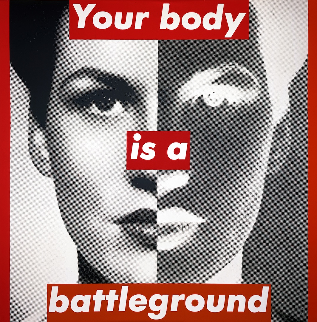
found photograph + one sentence in a label — an advertisement that speaks against advertising
a magazine designer (Condé Nast) who turned craft into art; the only one in the project whose "body of work" is a single series Newark, NJ → New York → Los Angeles
Palette of the œuvre
Notes: #D0181F red of the label and frame — measured from screenshot, not Pantone
„I'm someone who works with pictures and words, and people can take that to mean
anything they like.“ — Eye no. 5, 1991 (Karrie Jacobs). The v1 quote „I work with pictures
and words because they have the ability to determine who we are and who we aren't“ is
a paraphrase circulating online — no primary source was found, replaced.
Biography
Born 26 January 1945 in Newark, New Jersey (JWA). Syracuse, then Parsons 1965–66 —
one semester (Wikipedia) or nine months (Eye 5): Diane Arbus and Marvin Israel.
She did not graduate. Israel finds her a job at Condé Nast; at Mademoiselle she works
under AD Roger Schoening, who leaves after six months — "and I found myself,
so young, running a magazine" (Eye 5); JWA: head designer at age 22. Then
House and Garden under Liberman — twelve layout variants per double-page spread,
then a move into picture editing (House and Garden, Aperture), where she spends whole
days looking at slides: "until cropping, cutting and pasting became second nature"
(Eye 5). 1970–71 art director of Rags (San Francisco, Baron Wolman — PGDA). Not
verified in a second source.
The seventies: wall hangings of yarn and beads (1969), Whitney Biennial 1973 (Marcia
Tucker), Berkeley 1976, a break; 1977 architectural photographs; 1979 first photograph
+ text works (P.S. 1) and the book Picture/Readings (Wikipedia). From 1981 a series
that does not change for forty years: a found black-and-white photograph, cropped, enlarged
until the halftonegrid is visible, and one sentence in a label. ICA London 1983; Artangel/Public Art
Fund billboards; 1988 first woman at Mary Boone Gallery; 1989 poster for the Women's March, which
she pastes up herself with students because the organisation couldn't manage it (Eye 5); 1999–2000
retrospective MOCA LA → Whitney; 2005 Golden Lion Venice; 2012 Belief+Doubt
Hirshhorn (620 m²); 2021–22 Thinking of You. I Mean Me. I Mean You. AIC → LACMA →
MoMA. Teaches at CalArts, UC Berkeley, UCSD, UCLA (emerita). Lives between New York and
Los Angeles.
What matters here for a designer is this: she is not an artist who uses design, but
a designer who spent ten years making pages for women's magazines and knows exactly where
an advertisement holds the viewer — she turned the same grip into her own work. Eye 5: "85% of my work as an
artist comes from my job as a graphic designer"; Walters (Eye 109): "everything she does is
editorial design". Her language is tabloid (Broad: "tabloid, sensational,
authoritative, direct"). The cost of that craft is well known: the system is so fixed that it
became a brand, Supreme took it literally in 1994, and when Supreme and Married to the
Mob sued each other over her format in 2013, she replied: "What a ridiculous clusterfuck of
totally uncool jokers. I make my work about this kind of sadly foolish farce."
(artnet).
Influences
Studied with
Parsons School of Design 1965–66, one semester / nine months (JWA / Eye 5) — Diane Arbus (photography) and Marvin Israel (graphic design, AD Harper's Bazaar) — Israel: "the first one who gave me the feeling that I was special" (Eye 5, 1991)
Roger Schoening, AD Mademoiselle — left after six months, she runs the magazine at age 22 (Eye 5; JWA: chief designer)
Alexander Liberman (Condé Nast, House and Garden) — a negative teacher: twelve layout variants per spread (Eye 5)
Borrows from
American advertising and tabloids — Daily News, Post, all sans-serif (Dinner Party Download); Eye 5: "85% of my work as an artist comes from my work as a graphic designer"
found photographs from magazines and books of the 1940s–50s, halftone enlarged — Eye 5: "I have no proprietary relationship to those images"
feminist film theory (Mulvey 1975) and structuralism — Artists Meeting for Social Change (JWA); Smarthistory on Your gaze
Jamie Reid and situationism — not confirmed as a direct influence, only an affinity (someone else's image + text strip)
Influenced
Supreme (box logo 1994 — Jebbia gave his designers her book, artnet); Guerrilla Girls (Tate offers them as related); MoMA/Roberts 2004: "countless graphic designers have adopted her visual style"
Fonts In Use tag "Barbara Kruger style" (342) — style as genre; Pro-Choice PEP campaign 77% (FIU 46739)
Contemporaries
Jamie Reid (1977 — someone else's official image + strip), Emory Douglas (slogan + face), Corita Kent (Sister Mary Corita) (someone else's slogan turned around), Jenny Holzer (text without image — not in the project), Cindy Sherman, Guerrilla Girls
Who she studied under
Marvin Israel (Parsons; AD of Harper's Bazaar after Alexey Brodovitch) — Eye 5:
"the first one who gave me the feeling that I was special"; through him she enters Condé Nast. The lineage
runs Brodovitch → Israel → Kruger: layout as a sequence of images and text.
Diane Arbus (Parsons) — photographer; influence on the choice of IMAGE (frontal, without
beauty) is likely. Not documented work by work.
Condé Nast as school — Schoening (Mademoiselle), Liberman (twelve variants —
a negative school), the darkroom and slides (picture editing). Craft: cropping.
What she steals
Advertising and tabloid, literally: the sans-serif headlines of the Daily News and Post from her childhood
(Dinner Party Download); the red-and-white label is the label with the PRICE from a shop window.
Found photographs from magazines and books of the 1940s–50s (Walters: „crude,
newsprint images“) — without ownership rights (Eye 5); Michelangelo (02), advertising
illustration (05), 19th-century anatomical photograph (06), studio portrait (07).
Theory: Mulvey 1975 (the male gaze) → 01; Descartes → 04; the title of a Tina
Turner song from 1985 → 05; the proverb „children should be seen and not heard“ → 03.
Kinship, not influence: Jamie Reid (official image + tape, 1977), Corita Kent (Sister Mary Corita)
(someone else's slogan, 1964–69), Emory Douglas (slogan + face). She herself cites
none of them — she takes directly from advertising, not from counterculture.
Who she influenced
Supreme (box logo 1994 — Jebbia gave his designers her book, probably
Remote Control 1994; artnet) — the biggest and worst student.
The profession as a whole — MoMA/Roberts 2004: "countless graphic designers have adopted
her visual style"; Fonts In Use has a tag Barbara Kruger style (342) and the
Pro-Choice PEP "77%" campaign (46739) in her format.
Candidates in the project: Paula Scher (Public Theater — word over image; not verified
against the image), Stefan Sagmeister (sentence on body — reverse direction, text IN the image, not ON the image).
Sources for these works are museum records (Art21, MoMA, Whitney, SFMOMA, PGDA). Unlike with Tanaka and Fukuda, analytical text exists here — fields 2–4 are documented wherever the source gave a sentence, and the reading of the image supplements the measurements and positions within the format.
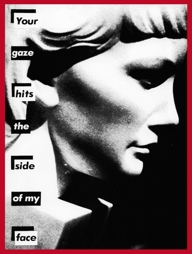
01 · Untitled (Your gaze hits the side of my face) (1981)
What it is — photograph, 55 × 41 in (Art21), portrait orientation; authored work, Mary Boone.
A found photograph of a classical bust of a woman's head in profile, "whose neck disappears into a block
of stone" (Smarthistory), plus seven words. First phase of the series: text black on white
labels, red only as the frame.
Composition — the bust occupies x 20–95%, looking RIGHT, nose at x ≈ 78%; text in a
narrow left-hand column x 10–24%, seven labels of one word each, evenly spaced y 10–90%
— Smarthistory: "in a vertical column, like a ransom note, to the left of the bust".
Four labels (Your / hits / side / face) have a black L-bracket in the upper left
corner, three (gaze / the / of my) do not — a rhythm of 1-0-1-0-1-0-1 that pulls the eye down
the column. The eye enters on "Your" top left, reads down the column, then is deflected
rightward by the profile — the viewer is physically on the side the bust is NOT looking at: the sentence is
descriptively accurate ("your gaze hits the side of my face").
Colour — black-and-white, halftone grain visible; red only in the frame (2% of the format).
No red label — evidence that the label was originally typesetting (black on white, as if
cut from a newspaper), and the red came later as a brand.
Typography — class: geometric grotesque, bold italic, lowercase with a tall
Y; each word on its own white label, the label the width of the word (not the column) —
which is why the right edge of the column "jumps". Specific typeface not confirmed for this work (Fonts In Use has no
record); Futura Bold Oblique documented for the oeuvre (Kemper, Eye 109), not for this sheet.
Message — Smarthistory: a direct response to Mulvey 1975; "you" is the presumed
male viewer. Three seconds: face + "Your gaze". Five metres: bust, column; not the words
— the labels are small. This work demands half a metre, unlike 05 and 07.
Why exactly this way — profile right + text left: so that the viewer who reads from the
left stands exactly "to the side". Had the bust looked left, into the text, the sentence would have
been a lie.
What would kill it — one label with the whole sentence at the bottom. The word-by-word column
is what creates the tempo (seven beats) and the "ransom note" effect.
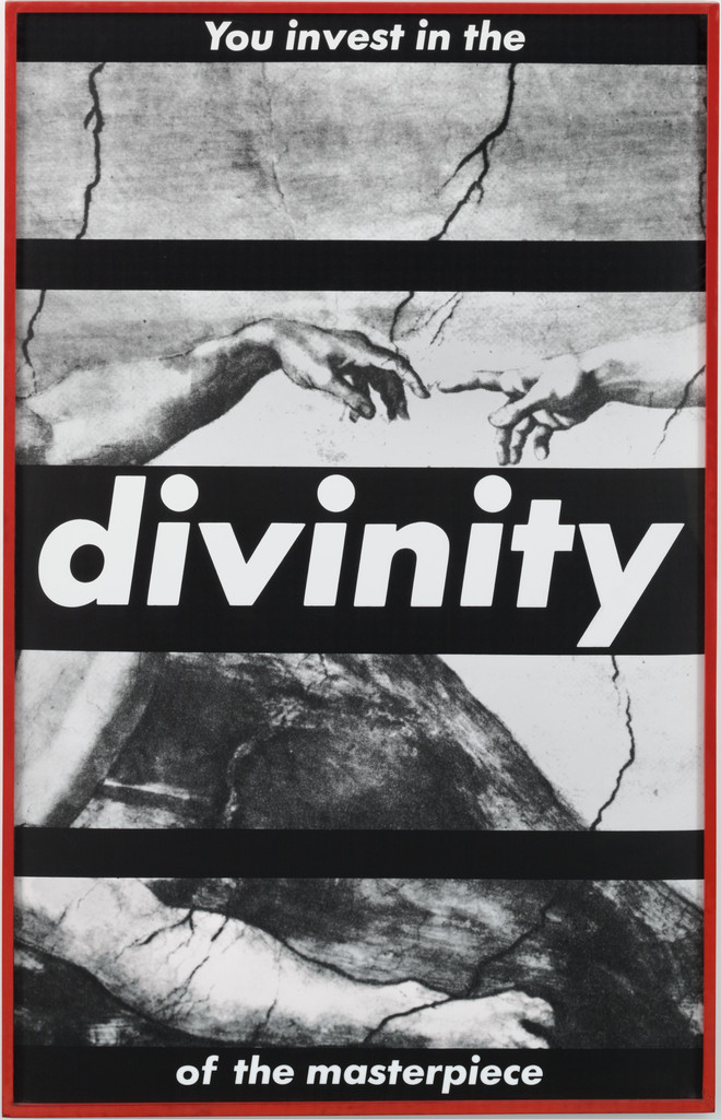
What it is — gelatin silver print, mounted and framed, 182.2 × 115.8 cm (MoMA, anonymous
fund). A found reproduction of a detail from Michelangelo's The Creation of Adam (two fingers,
cracks in the vault) + a sentence in five black bands.
Composition — five black bands across the full width: y 2–8% ("You invest in
the"), y 24–28% (empty), y 42–58% ("divinity" — huge, one word across
the whole format), y 76–80% (empty), y 92–98% ("of the masterpiece"). The image is
sliced as if through a blind: the fingers touch at y ≈ 33%, x 45–60%, exactly in the band
of image between the first empty band and "divinity". The eye travels: top left → fingers → "divinity"
(which stops everything) → down. MoMA describes this as the creation of man set
against audacious text.
Colour — black-and-white; red only the frame. The contrast is between the "sharp" text and
the soft light of Michelangelo's fresco — the fresco's soft tone against the hard black bands.
Typography — white geometric grotesque, bold italic, on black; three
sizes: "divinity" ≈ 14% of the format's height, the upper and lower phrases ≈ 3%. One word
carries the image, the rest of the sentence is small — Two reading distances.
Message — the pronoun "You" draws the viewer into perpetuating the patriarchal
narratives of religion and art history; art is secularised religion that is
bought and sold. Five metres: fingers + DIVINITY. Half a metre: "you invest" — you
invest both money and faith.
Why exactly this way — the most famous image in Western art, which must not be
altered; so the operation is from OUTSIDE: bands laid over, nothing within the image. The authority of the source
stays legible and works against the source — Détournement of the official image.
What would kill it — removing the two empty bands. Without them the image is "an illustration
with a caption"; with them the image is TRAPPED, the fingers touch through a grille.
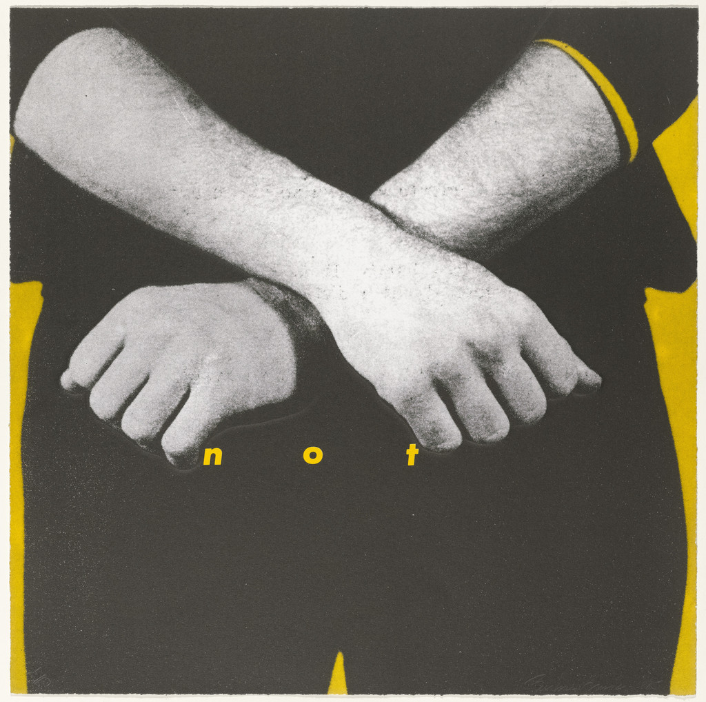
What it is — one of nine sheets in a portfolio; offset lithograph and screenprint with
lithograph and blind embossing, 52.1 × 52.1 cm; Peter Blum Edition, printer
Derriere L'Etoile Studios, NY; edition 50 + 10 AP; this impression 37/50 (MoMA). The portfolio's
title flips the proverb "children should be seen and not heard".
Composition — square. Two crossed forearms with clenched fists occupy
x 5–95%, y 10–65% — an X across the format; the eye enters on the fists (y ≈ 55%) and only then
finds the word "n o t" BELOW them, y ≈ 60%, x 30–60%, tiny, yellow, letterspaced.
Above and below the elbows a flat yellow field (not a background — it outlines the arms as
a silhouette). The gesture (refusal) is the message, the word only confirms it.
Colour — the only work in this selection without red: black-and-white halftone + YELLOW field
(~#F2C21B) which is also the colour of the letters. Colour works as hierarchy: yellow = what isn't
the photograph (the field and the word are the same layer). The portfolio carries other colours
per sheet; the whole portfolio has not been reviewed.
Typography — geometric grotesque, italic, LOWERCASE letters, ~2% of the format height,
spacing ≈ 4 em — three letters scattered under the fists. No label: the letters sit directly on
the image. Spacing slows reading — the only word in the format is the quietest.
Message — MoMA on the portfolio: first person plural, "we", an invitation to question
media messages. Five metres: the X made by the arms = "no". Half a metre: "not" — the word repeats
the gesture, adds nothing to it; the cover test passes (Fukuda's criterion).
Why exactly this way — a portfolio of nine sheets asks to be recognised as a
series without a red label; that's why the operation is reversed here: the word is SHRUNK, the colour
changed, the gesture enlarged. Proof that the system is not a "red-and-white label" but
a RELATIONSHIP between the large image and the small word.
What would kill it — "NOT" in capitals on a red label. It would become a poster; as it is it's
a whisper beneath the blow.
Principles:Spacing slows readingOne image, one wordColour as hierarchy, not decorationTo verify against the image: which of the three techniques (litho / screen / blind embossing) carries the yellow.
The other eight sheets (MoMA 59845–59854) have not been reviewed; the portfolio's title is probably
on one of them.
What it is — photographic screenprint on vinyl, 111 × 113 in (Art21, Mary Boone) — almost
a square; 1987. The Broad holds the 1987–2019 version: single-channel video on an LED panel with
sound, 350.2 × 350.2 cm. It also exists as a bag, a t-shirt, a keyring — the full merch — the work is
its own distribution. The year of the work is 1987; the PGDA record cites a different date, which
belongs to the version/release, not to the work's creation.
Composition — a found photograph of an open hand, thumb up to the left, holding a white
card; card x 25–80%, y 22–65%, tilted ≈ −3° (held, not resting); fingers
emerge above and below the card. The eye: card (brightest field) → text → hand.
The card is a physical object within the image (the hand holds it), not a label OVER the image — the only
one of eight where the label sits inside the photograph's space.
Colour — black-and-white halftone; card white; text RED on white (the reverse of the
standard white-on-red); frame red. Red = text + frame, nothing else.
Typography — geometric grotesque, bold italic; three lines: "I shop" ≈ 12%
of the format height, "therefore" ≈ 4%, "I am" ≈ 12% — the conjunction shrunk, subject and
predicate large; the sentence reads as two slogans with a footnote in between.
Message — Descartes inverted: "cogito ergo sum" → I shop, therefore I am;
Slogan in a new context — the source recognisable, the surroundings (a card in hand =
credit card) change the meaning. Five metres: hand + I SHOP. Half a metre:
"therefore" — a philosophical conjunction in an advert. "I" without an antecedent: who is speaking, the hand or
the viewer?
Why exactly this way — the card in the hand is Kruger's only label that has a REASON
to be in the image: a credit card. Hence red on white — the card is plastic, not
a sign.
What would kill it — white text on a red label over the hand. It would return to
the standard and lose the object; the hand would be holding nothing.
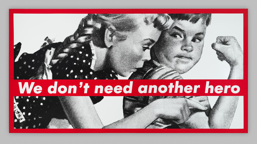
What it is — screenprint on vinyl, 276.5 × 531.3 × 6.4 cm (Whitney, Emily Fisher Landau).
The same work on billboards across New York, Public Art Fund, 1.11.1988–31.1.1989 (eight
photographs in the archive); installation Las Vegas 1987 (Art21). It's based on a found
reproduction of an advertising illustration: a girl in profile feeling the biceps of a boy flexing
it.
Composition — landscape format ≈ 1:1.92. A red band across the full width at y 55–72%
(17% of the height), in the lower third; girl x 5–50%, boy x 45–95%; the boy's
fist upper right (x ≈ 85%, y ≈ 15%), the girl's finger on the bicep at y ≈ 80% —
the band runs between fist and finger, cutting the scene exactly between the gesture (flexing)
and the reaction (touch). The boy looks at the viewer; the girl looks at him. The eye travels: the boy's
face → band (sentence) → finger. According to the Whitney audio guide, the enlargement makes the halftone
dots visible.
Colour — black-and-white + one red (band, frame). The illustration was probably
in colour — the reduction to black-and-white is an operation (Walters: "crude, newsprint images").
Typography — geometric grotesque, bold italic, white, one line, ≈ 9%
of the format height, across the whole band with small margins — readable from the street off the billboard.
Message — title of a 1985 Tina Turner song (Mad Max Beyond Thunderdome) used as a slogan;
the Whitney reads it as a question about stereotypes of who is allowed to be a hero. "We" without an
antecedent pulls the viewer into a plural that refuses. At five metres what remains are two children and the sentence;
the test passes as a billboard — the work IS a billboard.
Why exactly this way — an illustration from a 1950s advert already speaks in advertising's language
(muscle = masculinity, admiration = femininity); the band doesn't illustrate but refutes the image in the same
tone of voice. The image must not be cropped closer: both the finger and the fist must be visible.
What would kill it — the band moved to the top. Then it would be a headline (the image illustrating
the text); as it is, the band is a verdict that comes after the image.
What it is — photograph and screenprint in a painted wooden artist's frame, 130.3 × 173.5 ×
4.6 cm (SFMOMA, Fisher Collection). A found 19th-century photograph: a bearded man in a
coat, arm raised, standing over a naked body laid on a table covered with cloth;
on the wall a shelf of bottles — an anatomical/medical scene.
Composition — landscape format 3:4 (reversed: 1.33 width). The man x 5–30%,
body diagonal x 15–90%, y 55–80%; the words "N o R a d i o" at y 42–48%, x 30–75%,
in the space between the raised arm and the body — in the place where a headline would sit
in an advert. The eye goes: the man's face → arm → word → body. The frame is red and
thick (≈ 3%).
Colour — black-and-white + red: letters and frame. The letters are red directly on
the photograph, without a label — the only such example in this selection; the frame is painted wood (part
of the work, according to the record).
Typography — geometric grotesque, bold italic, spacing ≈ 3 em, ≈ 5% of the height —
two words stretched across 45% of the width. Spacing slows reading: the sign
reads letter by letter, like a sign in a shop window.
Message — "No Radio" is the sign New York drivers in the 1980s left on their
windows so a thief wouldn't smash the glass (Washington Post 1989, "No radio, nothing in
trunk"). That context doesn't come from the SFMOMA record but from a newspaper source about
the phrase itself, not about the work. The link to the body on the table (nothing to steal) is a reading, not
a documented fact. At five metres the scene and the red dots are visible; at half a metre
the words are read.
Why exactly this way — the spacing carries the effect. If "No Radio" had been set normally in a label,
it would be a slogan; letterspaced and small it becomes a sign on an object — as on a car.
What would kill it — a white label on red across the middle. The body would disappear beneath
the band, and the work lives on the fact that the whole body is visible.
What it is — photographic silkscreen on vinyl, 284.48 × 284.48 cm (Broad; Art21 112 × 112
in). Made as a POSTER for the Women's March on Washington, April 1989, against the wave of
laws that were tearing down Roe v. Wade (Broad); Eye 5: "I got frustrated and did it
myself. I went out with my students… putting up the posters". Found studio
portrait of a woman (1950s), frontal.
Composition — square. Face split exactly at x = 50%: left positive, right
negative (Broad: "split in positive and negative exposures"). Three labels: "Your body"
y 12–22%, x 22–78%; "is a" y 44–52%, x 40–60% — sits on the bridge of the nose, right on
the dividing line, between the eyes; "battleground" y 78–88%, x 15–85%, across the mouth and chin.
The eye travels: eyes (y ≈ 32%, one dark, one white) → "is a" → down to "battleground" →
back up to "Your body". Broad: the face "without a body, divided and obscured by
text, signals a sharp division".
Colour — black and white + red label. The negative on the right is half the image
"in colour" without colour: halftone dots on the right half light, skin black — one
operation (One operation per piece: invert half) makes all the contrast; red only
carries the words. Black and white before colour literally: the composition stands in positive and
negative, colour is added as type.
Typography — geometric grotesque, bold italic, white, three lines, label widths =
width of the word (hence three different widths, centred) — "is a" is narrow so it doesn't
cover the eyes. Letter height ≈ 7% of the format — legible from 20 m.
Message — Broad: "simultaneously art and protest"; "you" here is a
woman (unlike in 01, where it's a man) — same pronoun, different audience, same indeterminacy.
Five metres: face + battleground. Half a metre: "is a" between the eyes. Walters (Eye 109):
today it works as a "statement of fact" for all sides.
Why exactly this way — a poster for the street: square (sticks anywhere), one face
(recognisable from across the street), split in half (argument without words — the body
is already divided). The words only name what the image is already doing.
What would kill it — shifting the dividing line from x = 50% or a soft
transition instead of a sharp cut. The division must be a cut, not a gradient — this is a war
line.
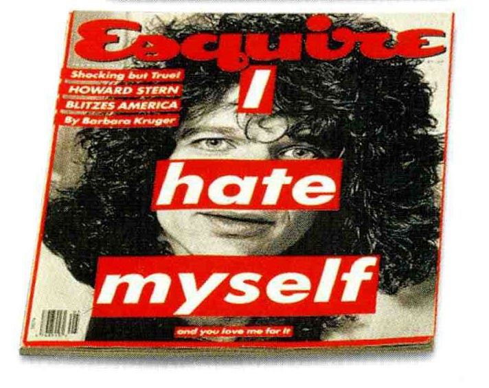
What it is — offset lithograph, 27.3 × 22.9 cm, Hearst Corporation (publisher and
printer), mass print run (MoMA SC731.1995). Esquire cover, Howard Stern.
Roberts (MoMA 2004): visual strategies "which she appropriated from mass media
are returned to their sources on covers she made for Newsweek and Esquire".
Composition — Stern's portrait centred, hair fills the top two thirds;
three labels in a downward-widening step: "I" y 15–22% / x 47–58%; "hate"
y 36–47% / x 33–67% (across the nose and mouth — the eyes remain open above); "myself"
y 55–68% / x 20–80%; below, small "and you love me for it" y 72–75%, x 40–65%.
Top left, house cover lines in red labels ("Shocking but True! HOWARD
STERN BLITZES AMERICA By Barbara Kruger") — and these too are in her format: the cover has
entirely become her work. The Esquiremasthead (the house script) remains.
Colour — black and white portrait and red labels; the same red for the
masthead — the magazine and the artist share the colour, so you can't see where one ends.
Typography — geometric grotesque, bold italic; "myself" ≈ 13% of height,
"I" ≈ 7%, the small line ≈ 2% — three sizes: Two reading distances (from the kiosk: I
HATE MYSELF; from the hand: "and you love me for it" — the second message mocks the first, as with
Jamie Reid).
Message — "I" is Stern? her? the reader? The label across the mouth speaks instead of him.
At five metres: face and hate. At half a metre: a sentence that blames the buyer ("you love me
for it") — the buyer of the magazine is the addressee.
Why exactly this way — the magazine is her home institution; here is proof that the system works even when
returned to its source — and that then it's indistinguishable from advertising. The small line is the only
difference between her cover and an ordinary one.
What would kill it — removing the small line. What would remain is "I hate myself" as a shock headline —
a tabloid without the twist.
Untitled (Don't tread on me / Don't tempt me), 1989–90 — photographic silkscreen on
vinyl, 140 1/4 × 92 1/4 × 2 5/8 in, Kemper Art Museum. The ONLY record naming the
typeface: Futura Bold Oblique ("a simple, strongly geometric sans-serif, common
in advertising"); the snake (bull snake) cropped, red border, red text boxes top and
bottom; Kruger: "I work circularly… around certain ideational bases, motifs and
representations". Image not viewed (Cloudflare in browser). — Bar across the whole format
Untitled (You are not yourself), 1982 — photograph 72 × 48 in (Art21); shattered
mirror — not viewed.
Untitled (Your comfort is my silence), 1981 — gelatin silver 60 × 40 in (Art21).
Untitled (When I hear the word culture, I take out my checkbook), 1985 — 138 × 60
in (Art21); Göring's line turned around — Slogan in a new context, not viewed.
Untitled (Can I Help You?), 1987 — lenticular photograph 58,4 × 127 cm, SFMOMA
97.770 — the image changes with viewing angle (motion principle in print).
Untitled (If you're so successful, why do you feel like a fake?), 1987; Untitled
(You are a very special person), 1995; Untitled (Hate like us), 1994; Roy Toy,
1986; Have Me Feed Me Hug Me Love Me Need Me, 1988; Twelve, 2004 — all Broad.
We Will Not Become What We Mean to You, 1983; Untitled (Perfect), 1980 — v1 via
artic.edu — not verified.
Rags magazine, 1970–71 — art director (PGDA 8349: Kruger AD, R. Crumb, Baron
Wolman; single source).
Willi Smith t-shirt, 1984 — "I can't look at you and breathe at the same time" (Wikipedia).
Consolidated — Business of Punishment, 1994, CD sleeve (PGDA 16470); bandana,
WOW towel, matchbox (PGDA 14720, 14719, 18585) — MoMA: "matchbooks, coffee
mugs, shopping bags" — The artefact carries distribution.
Barbara Kruger & Kim Kardashian on W, 2010 — Fonts In Use 12: Futura + Benton
Modern (only FIU record).
Belief+Doubt, Hirshhorn 2012 (620 m², vinyl on floor and walls); MetroCards
2017 (50,000); Untitled (Questions) MOCA façade.
Bridge to practice: poster · graphic design · motion
Poster
Label the width of the word, not the column. Her labels are always exactly as wide
as the word + margin ≈ 0.4 em — that's why three lines read as three STRIKES, not as a block.
Illustrator: not Area Type; Point Type + Appearance → Fill beneath the text with Offset
Path (Effect > Convert to Shape > Rectangle, relative 0.4 em) — the label grows with the
word.
Eyes always free. The label goes on the mouth, forehead, nose — never across the
eyes (07, 08). The face has to look for "you" to work. Test: cover the eyes — if the sentence
still works, the label isn't on the face but on the image.
Band to the edge or label within the image — two different decisions (05 vs 04). A band to the
edge is a VERDICT (belongs to the frame); a label within the image is an OBJECT (a hand holds
it). The decision has to be made before layout.
Halftone as proof of origin. A scan from a printed source, enlarged without
smoothing, no Image Trace — the raster must remain visible from half a metre (Whitney).
Red only where there is text. One red (~#D0181F), two places: label and frame.
A third place = decoration.
Graphic design
Sentence before the image, or simultaneously (Eye 5: "almost simultaneous") —
never layout first, then "insert headline". For a video series episode title: title as a
pronoun without antecedent ("You paid for this") — only then the frame.
Cropping is authorship. Her darkroom craft: from the same photograph
make five crops and choose the one where the gesture remains and the context disappears. Exercise on
every found image before any text at all.
System = three decisions that DON'T change (typeface, colour, label) + one that
changes every time (image + sentence). Example: a series of posters for a film festival —
which are the three constants? If there are none, there's no series either.
Motion
Label as a Hold, not a fade. Her words don't "appear" — they stand. In AE:
Opacity Hold keyframe 0 → 100 in a single frame, no easing; three labels = three
frames spaced 8–12 frames apart (rhythm 01: 1-0-1-0).
Positive/negative as a cut (07): Invert effect on a duplicate with a Linear Wipe mask at
50%, Hold — never animate the wipe, only cut it.
Spacing as a whisper (03, 06): Tracking on the text layer from 0 to +300 over 2
frames, then Hold — the word "spreads out" and quietens; the reverse direction from Brody
(with him spacing is a breath in before the title, with her it's a breath out after the image).
Lenticular (Can I Help You?): two frames, Time Remap Hold that switches with the
camera angle — a motion principle she was already doing in print.
Bad imitation
Label as style, not as sentence (Supreme and "Barbara Kruger style" on Fonts In
Use): red-and-white Futura without a pronoun and without a found image — it remains a logotype.
What's copied is the LOOK (colour + typeface), while the rule is the RELATIONSHIP (found image + sentence that
contradicts it). Test: remove the text — if the image without text says nothing contradictory, it's decoration.
A sentence that explains the image. The sentences CONTRADICT the image or
ACCUSE it (05: muscle + "we don't need a hero"). Imitation puts "Strength" under
the muscle — it comes out as a gym poster.
Label across the eyes or more than one red. The face stops looking → "you"
has no one to hit. Two reds (label + accent) wreck the hierarchy, because
red was ONLY a voice.
A polished image. High-resolution stock photography instead of newsprint halftone erases the
origin ("this is from an ad") — all that remains is the ad.
The brief through their eyes
First move: choose one official photograph from the festival or from a film in the programme, not a drawing or an illustration, then crop it to a single gesture — a look, a hand, a silhouette in the dark of the cinema hall. The image goes as a newsprint halftone, enlarged enough that the raster is visible from half a metre — that's proof of origin, not decoration. Over the image, a label the width of the word (not the column) carries the festival title as a sentence in the second person, a pronoun without antecedent — never across the eyes. The typography is grotesque, capitals, black on white; red is reserved only for the label and the frame, nowhere else. From that pair image+sentence grows a system: three constant decisions — typeface, red, label — repeat unchanged on the booklet, the ticket and the cover, while the image and the sentence change from film to film. The motion titles don't animate the label with a fade but hold it as a Hold frame, with a single positive/negative cut at the end — nine seconds of silence, the last second a hit.
Exercises
Five crops, one sentence (45 min): one found photograph from a printed
magazine, scanned 1-bit or halftone; five crops of different gestures; on each
the same sentence in the second person on a label the width of the word. Choose the crop where the image and
the sentence contradict each other the most.
Eyes free (30 min): a portrait, three labels (top, middle, bottom) — all
positions except the eyes; then one version ACROSS the eyes for comparison. Note what
happened to "you".
System in three decisions (one evening): for an identity system or a video series
write three unchanging decisions and one changeable one; make three cards following
that rule. If the third isn't recognised as a sister of the first — the system wasn't in the
decisions but in taste.
Motion study
5 s, AE, one frame: black-and-white portrait (halftone), static. Frame 0–1.5 s nothing;
1.5 s: label 1 Hold; 2.0 s: label 2 Hold; 2.5 s: label 3 Hold; 3.5 s: right
half of the frame Invert cut (Linear Wipe 50%, Hold). No easing, no fade.
Principle: the verdict comes after the image, in hits.
Rebuilding the benchmark
Benchmark: 07 Your body is a battleground — 1000 × 1000 square. .svg skeleton:
split axis x = 500 (left positive, right negative); eyes y ≈ 320; label 1 x 220–780,
y 120–220; label 2 x 400–600, y 440–520 (on axis, below the eyes); label 3 x 150–850,
y 780–880; border 20 px. Task: 45 min in Illustrator with no original — any
frontal portrait; check: does "is a" land BETWEEN the eyes, not on them.
Difference from its pair
Jamie Reid ↔ kruger: both use someone else's image and a strip of text — Reid uses the strip to ABOLISH the gaze (censorship, torn paper edge, scissors) / Kruger keeps the strip AWAY from the eyes, so the face still looks and accuses; Reid is against the state, Kruger against advertising, in advertising's own language.
Corita Kent (Sister Mary Corita) ↔ kruger: both take someone else's text — Corita takes a READY-MADE slogan and turns it into a prayer, the seam stays visible / Kruger WRITES a sentence in the form of a slogan and pastes it on like a label, the seam is the label itself; Corita is for the one who comes close, Kruger for the one who passes by.
Emory Douglas ↔ kruger: slogan and face in both — Douglas draws HIS OWN face and a slogan in the first-person plural "we" / Kruger takes SOMEONE ELSE'S face from advertising and writes "you"; Douglas builds a community, Kruger splits it into speaker and addressee.
Roman Cieślewicz ↔ kruger: both carry out a single operation on a found photograph — Cieślewicz operates WITHIN the image (halftone, mirror, wound) to show that it lies / Kruger operates ON the image (label, strip, inverting half of it) to show who is speaking.
Neville Brody ↔ kruger: both space out a single line — Brody uses the space as an inhale BEFORE the headline (the magazine's tempo) / Kruger uses the space as an exhale AFTER the image ("not", "No Radio" — the quietest word in the frame); Brody draws a typeface for one job, Kruger one typeface for everything.
Herb Lubalin ↔ kruger: both write the headline — Lubalin works with a copywriter, to SELL, and the letter becomes image / Kruger works alone, to ACCUSE, and the letter stays a letter on a label.
Peter Saville ↔ kruger: both follow One operation per piece — invert — Saville inverts the whole cover, white on black, to PRESERVE the image / Kruger inverts HALF the face, to DIVIDE it.
April Greiman ↔ kruger: same era, 1985, same LA — Greiman stretches a single layer down to the pixel, bringing in depth and shadow / Kruger stays flat, two planes (image, label), zero depth; both take reproduction as material — one to show the tool, the other to show the owner.