systemic typography brought to a polemic against itself
Co-founder of Total Design (1963); designer for the Stedelijk Museum (1964–1985); director of Boijmans Van Beuningen (1985–1993) Groningen → Amsterdam
I am a functionalist, but I am not a fundamentalist.
Biography
Born 1928 in Groningen. He trained as a painter — fine art at the Academie Minerva
(1947–49) — and studied typography in the evenings, at the Gerrit Rietveld Academie, not as a main subject.
After military service he works on exhibition displays and trade-fair stands; from 1955 he collaborates
with Kho Liang Ie, the Indonesian-Dutch designer whose poetic sensibility, in Ben Bos's words,
balanced Crouwel's rationalism into what Bos called "fusion design". From
1956 he is a designer for the Van Abbemuseum in Eindhoven.
In 1963 he co-founds Total Design — the first Dutch multidisciplinary design studio — with
a group of colleagues (Friso Kramer, Benno Wissing, Dick Schwarz, Paul Schwarz, Ben Bos and others).
TD "almost single-handedly defines the style and tone of Dutch post-war design", industrializing
the craft: budgets, teams, project management, corporate clients. The same year he begins a long
collaboration with the Stedelijk Museum in Amsterdam, which lasts until 1985 — twenty-two years
of posters and catalogues without a fixed logo, just a consistent grid and typographic rule.
He receives rationalized Swiss typography second-hand, through colleagues — Karl Gerstner,
Gérard Ifert, Ernst Scheidegger — and from there comes his lasting affinity for
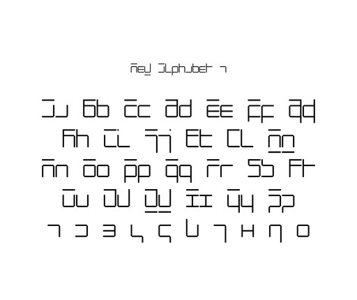
Akzidenz-Grotesk. In 1967 he publishes New Alphabet, a deliberately impractical alphabet-argument about
early phototypesetting (see work 06). In 1970 he designs the Dutch pavilion for Expo Osaka; in 1972
(roughly) he works on the visual identity of Rotterdam (work 09) and, the same year, on 9 November, at the
Amsterdam Museum Fodor, publicly clashes with Jan van Toorn over whether a designer can, or should, be
a neutral transmitter of a message — a debate that later came out as a
book, The Debate, and which still divides the profession into two camps today.
In the mid-seventies Total Design expands and changes: in 1976 Anthon Beeke joins the studio,
a provocateur opposite in temperament to Crouwel — posters about sex, violence and theatre, collaged
rather than gridded. In 1977 the two of them share a signature on a poster for the first time (work 10).
Crouwel gradually withdraws from TD's day-to-day work towards academia: professor in Delft
(industrial design, connection since 1965, full professor only from 1972 according to Wikidata — sources
disagree here, see "Open questions"), then 1985–1993 director of the Museum Boijmans Van Beuningen
in Rotterdam, where he deliberately does NOT impose his grid on other designers but seeks only
to "make the institution visible" through a single typeface (Futura) and standard formats — a different,
milder form of systemic thinking than the one with which he himself designed. He died on 19 September
2019 in Amsterdam, ninety years old. His sons Mels and Remco Crouwel continue in
architecture and design respectively.
Crouwel's own assessment of his own work is surprisingly un-Crouwel-like: in an interview for
Creative Review he says that "design is, of course, problem-solving, but I cannot resist
adding something personal. The page must have tension." Jan Middendorp goes further and claims that
Crouwel's entire strictness is actually channelled temperament: the young Crouwel drew
abstract compositions inspired by Calder and worked on costumes for Peer Gynt — an "almost
dandy" sensibility which, by Crouwel's own admission, he suppressed for the sake of discipline:
"It has to do with my Calvinist background, with that kind of morality that forbids you from leaving
the path once you've set out on it." This is important for reading the whole body of work: the grid for
Crouwel is not just a method but also a moral obligation to himself.
Influences
Studied with
Academie Minerva, Groningen — fine art, 1947–49
Gerrit Rietveld Academie — evening course in typography
Kho Liang Ie — collaborator from 1955, brought a poetic counterweight to Crouwel's rationalism
Borrows from
Swiss rationalised typography — transmitted through colleagues Karl Gerstner, Gérard Ifert, and Ernst Scheidegger, hence the affinity for Akzidenz-Grotesk
Calvinist ethic of consistency — he admitted this himself (see Middendorp below)
Experimental Jetset (invitation for the exhibition of Crouwel's architectures, MoMA 2007)
Freda Sack and David Quay, The Foundry (digitisation of New Alphabet in 1997 and Gridnik)
Contemporaries
Karl Gerstner (parallel program-before-drawing approach, opposite goal)
Jan van Toorn (publicly opposed position on neutrality, 1972 debate)
Anthon Beeke (colleague at Total Design, co-author on Holland Festival 1977)
Who he studied under
Kho Liang Ie — collaborator from 1955, not a formal teacher but a colleague whose poetic
sensibility softened Crouwel's rationalism (Bos: "fusion design"). His formal education is
in painting (Academie Minerva), not design — he picked up typography in evening classes,
as a secondary pursuit.
What he steals
Rationalized Swiss typography — but not directly from Switzerland, rather through colleagues
Karl Gerstner, Gérard Ifert and Ernst Scheidegger, who "cast the spell"
of Akzidenz-Grotesk on him. He never worked in Switzerland nor studied under any of the
teachers there (a difference from Josef Müller-Brockmann, Armin Hofmann, Max Huber, Emil Ruder, who
received the system first-hand, in the classroom).
Who he influenced
Peter Saville revived New Alphabet in 1988 for the sleeve of Joy Division's Substance —
the most famous posthumous use of one of Crouwel's drawings. Experimental Jetset made an
invitation for a MoMA exhibition about his body of work in 2007 using the same typeface. The Foundry
(Freda Sack, David Quay) digitized both New Alphabet (1997) and Gridnik, so his
drawings from the sixties are still in active use as commercial fonts.
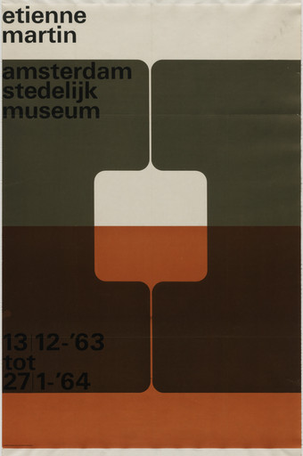
What it is — a poster for the exhibition of sculptures by Étienne Martin at the Stedelijk Museum, 13.12.1963–
27.1.1964. Photolithograph, 95.2 × 62.2 cm, gift of the Stedelijk Museum to MoMA (acc. 437.1964).
Composition — a band of text at the top (exhibition title, institution smaller), then a large
abstract form — two rounded, joined bodies resembling a mould or cocoon — placed
over four horizontal colour bands; the form interrupts the bands and "emerges" from them; a date
band at the bottom.
Colour — four horizontal zones: cream, olive-green, dark brown, burnt
orange — all earthy, without a single pure primary. The form is cream/white, thus
"cut out" from the lightest value in the sequence.
Typography — grotesque, specific typeface not confirmed; small and subordinate to the image, contrary
to the later body of work where typography becomes the image itself.
Message — this is NOT an abstract geometric sign but a borrowed shape: Étienne Martin is
a sculptor known for organic, cave-like bodily forms ("Demeures" — dwellings, cocoons,
wombs). The poster does not illustrate one sculpture but quotes the WAY
Martin thinks form — rounded, joined, as if growing from the material.
Why exactly this way — in 1963 Crouwel does not yet have his own grid alphabet (that comes in 1967);
he solves the exhibition poster in the language of the artist he is announcing, not with his own system.
What would kill it — geometrizing the form (sharp angles instead of rounded) would reduce it to
a generic abstract sign and lose the connection to Martin's own vocabulary.
Principles:posudjeni-vokabular-autoraTo verify against the image: the exact title/number of the sculpture that the form most closely quotes (if it quotes
a specific one at all, and not a general type) — not found in the available sources.
02 · Edgar Fernhout, Van Abbemuseum Eindhoven (1963)
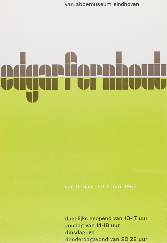
What it is — a poster for the exhibition of painter Edgar Fernhout at the Van Abbemuseum,
Eindhoven. Technique and dimensions are not given in the SFMOMA record (general artist page,
individual record not found — same pattern as with Otl Aicher, see procedure).
Composition — the artist's name in two lines, large, almost filling the format; a small
band of information (dates, institution) below. No image, no form — just the name.
Colour — a saturated lemon/acid-green background, black lettering. One colour, complete contrast.
Typography — a condensed/narrow grotesque, heavily bolded — the letter is so large that
the name alone becomes a visual event.
Message — the opposite of work 01: here Fernhout's painterly vocabulary (gentle,
atmospheric landscapes and still lifes) is not borrowed but the name is treated as a pure typographic
object. The three-second test: read the name, nothing more — and that is enough
for an announcement.
Why exactly this way — Fernhout's painting is quiet, tonal, hard to translate into poster
contrast; Crouwel chooses NOT to compete the poster with the painting but to be a pure signal:
"here, now, this name".
What would kill it — adding a reproduction of the painting would turn the poster into an exhibition
announcement like everyone makes; the bare name on an incisive colour is the reason this poster is remembered.
Principles: (none confirmed for this work)
To verify against the image: the exact print technique and dimensions — SFMOMA has no individual record.
03 · Alfred Jensen, Stedelijk Museum Amsterdam (1964)
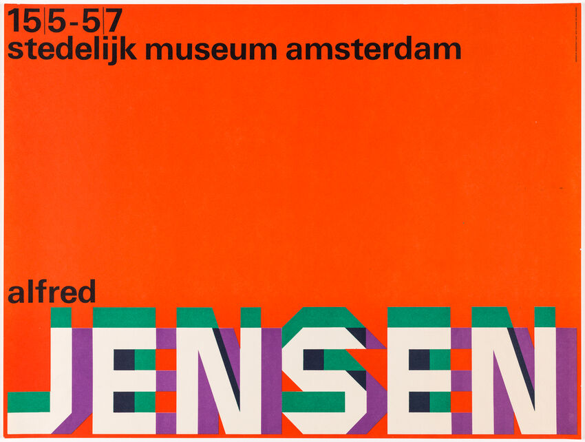
What it is — poster for the exhibition of painter Alfred Jensen at the Stedelijk, 1964. Landscape format
(rare for Crouwel — most of the posters are portrait). Technique/dimensions are not given in the
available record.
Composition — small name "alfred" top left; enormous "JENSEN" fills almost the entire
format, letter against letter, no spacing.
Colour — coral/salmon background; every letter of "JENSEN" is filled with a different colour in
segments (green, lavender, cream) — like stained glass or like Jensen's own paintings.
Typography — geometric grotesque (sans serif), very bold, specific typeface not confirmed.
Message — the most explicit example in the whole body of work: Alfred Jensen painted saturated,
chessboard/diamond-structured abstractions in exactly these tones. Here Crouwel doesn't
quote a single piece but BORROWS Jensen's palette and his way of colouring fields and applies it
directly to the letters of his name — the name becomes a miniature Jensen painting.
Why exactly this way — same mechanism as work 01 (Étienne Martin), but much more
aggressive and literal here, because Jensen's visual language (dividing the surface into coloured fields)
transfers directly onto typographic construction without the mediation of form.
What would kill it — a single-colour letter; the whole point is that the colour BELONGS to Jensen, not
to Crouwel's usual black-and-white system.
Principles:posudjeni-vokabular-autoraTo verify against the image: the exact number and order of colours per letter — seen on a small thumbnail,
the exact arrangement of segments within each letter requires a higher-resolution image.
04 · Henri Michaux, Stedelijk Museum Amsterdam (1964)
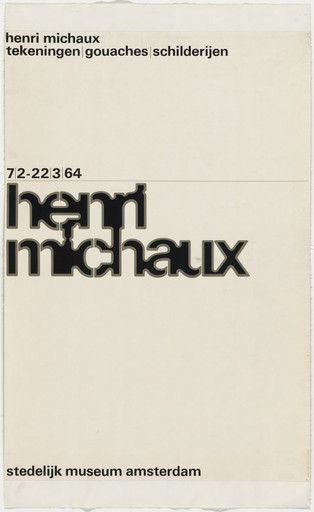
What it is — poster for the exhibition of drawings, gouaches, and paintings by Henri Michaux, 7.2–22.3.1964.
Lithograph, 94.9 × 63.5 cm, gift of the Stedelijk Museum (MoMA obj. 436.1964).
Composition — a thin band at the top (the exhibition title in two lines), a date line, then an enormous
"henri michaux" in two lines with almost zero line spacing (the lines nearly touch), an institutional
band at the bottom. Everything left-aligned, everything on a cream background with no image.
Colour — black on cream. No other colour.
Typography — bold grotesque, densely set, specific typeface not confirmed; what carries the
piece is the tightness of the line spacing, not the choice of typeface.
Message — the opposite of works 01 and 03: Michaux is a painter/poet whose own hand is
calligraphic, gestural, an "automatic" drawing. Crouwel here does NOT attempt to quote that hand
— he chooses a cold, mechanical grotesque and a clean typographic composition. The name is treated as
information, not as gesture.
Why exactly this way — a possible explanation (not confirmed in the sources, just an observation): gesture
cannot be systematised without becoming parody; when an artist's vocabulary is a personal
hand rather than a transferable form/palette, Crouwel leaves it alone and returns to the neutral letter.
What would kill it — any attempt to "draw" the letter calligraphically would be exactly the kind
of illustrative copying that the whole body of work avoids.
Principles: (none confirmed — this is deliberately a COUNTER-EXAMPLE to posudjeni-vokabular-autora)
To verify against the image: the exact typeface/cut of the grotesque used.
What it is — cover of the exhibition catalogue for painter Corneille (Cornelis van Beverloo, CoBrA) at
the Stedelijk Museum, catalogue number 402, 1966.
Composition — the name "Corneille" in two lines, heavily bold, top left; a large circle
emerges from the bottom edge of the page, cutting across the lower part of the letters.
Colour — a pale, muted grey-green background; the name in dark grey; the circle in a saturated
red-orange — the only warm, loud colour on the page.
Typography — grotesque, semi-bold, specific typeface not confirmed.
Message — a third example of borrowed vocabulary: CoBrA painters, Corneille included, often
use sun/planetary motifs and a hot, joyful colour range. The circle-sun that "rises" from the edge
of the page is a direct, simple metaphor for Corneille's painterly warmth — but reduced to a single geometric
shape and a single colour, without imitating Corneille's own drawing.
Why exactly this way — unlike work 03 (Jensen, where the ENTIRE palette and colouring
technique is borrowed), here only the MOTIF (sun/circle) is borrowed, in Crouwel's own
flat, single-colour treatment — a milder degree of the same principle.
What would kill it — adding texture or gradient to the circle; flat colour is what separates
this "quotation" from an attempt to imitate Corneille's own brushstroke.
Principles:posudjeni-vokabular-autoraTo verify against the image: the exact print technique of the catalogue.
What it is — an experimental digital typeface, Crouwel's self-initiated work, not a commission.
MoMA lists it as a "Digital typeface", gift of Foundry Types Ltd (obj. 1072.2010).
Composition — specimen sheets show an alphabet built exclusively from horizontal and
vertical strokes of equal weight on a square grid — no diagonals, no curves. Letters are
reduced to a minimal set of lines that still distinguish them; lowercase letters are especially hard
to read (e.g. the b/d/p/q distinction reduced to the position of a single stroke).
Colour — black on white, without exception; colour is not the subject of this piece.
Typography — the typeface itself is the subject: monolinear, rasterised, "machine-like" by design.
Documented (MoMA, Wikipedia) as born out of a real technical constraint: early CRT
monitors for phototypesetting rendered coarse pixels, so the curved forms of classical
letters were hard to reconstruct.
Message — Crouwel is explicit: New Alphabet is, in his own words, "exaggerated and
never intended to actually be used" — a statement about the impact of new technology on a centuries-old
typographic tradition, not a proposed solution. Designer Piet Schreuders immediately declared it
"illegible" and mocked it as a "Martian style that needs subtitles" — and that was exactly
Crouwel's point: to show what happens when technology is accepted without question.
Why exactly this way — the constraint of the CRT screen is ACCEPTED COMPLETELY, not partially: no
letter makes an exception, no curve is smuggled back in. Half-hearted acceptance
would have produced a mediocre typeface; complete acceptance produces an argument.
What would kill it — any subsequent smoothing (curves, antialiasing) would remove the
thesis itself; which is why in 1988 Peter Saville deliberately kept its roughness for the cover of Substance
by Joy Division, instead of "improving" it.
Principles:jeftina-tehnika-kao-jezikTo verify against the image: nothing — the piece is fully documented (MoMA + Wikipedia + Fonts In
Use, seven confirmed uses of the typeface listed on fontsinuse.com).
07 · Stedelijk Museum Amsterdam — Vorm Gevers (1968)
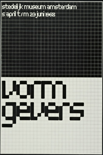
What it is — poster for the exhibition "Vorm Gevers" (form givers), Stedelijk Museum, 5.4–23.6.1968.
Offset lithograph, 95.1 × 63.4 cm, printed by Stadsdrukkerij van Amsterdam, gift of the designer
(MoMA obj. 1285.1968).
Composition — the top ~55% of the format is a dense black micro-grid (a fine raster of small squares,
reading as a screen texture) with small white text in the top left corner; the bottom
~45% is a cream background with an enormous "vorm gevers" set in large blocks derived
directly from the same grid.
Colour — black on cream, no third colour.
Typography — the letters are NOT chosen from an existing font but constructed directly from
a grid of 57 vertical × 41 horizontal lines (documented, Fonts In Use) — the same grid
that builds the texture above also builds the letter below. This drawing was digitised in 1997/2011
as the font Architype Stedelijk (The Foundry, David Quay and Freda Sack).
Message — the poster LITERALLY shows its own method: the dense grid above is the "raw material", the large
letter below is what the grid CAN build when given enough modules. The five-metre test:
it's recognised immediately as a Stedelijk poster, without a single fixed logo.
Why exactly this way — a year after New Alphabet (work 06), Crouwel applies the same
principle — a letter derived from a technical grid — but now IN SERVICE of legibility, not against it:
New Alphabet was an argument, Vorm Gevers is the solution that makes that argument usable.
What would kill it — if the micro-grid above and the letter below used different modules,
the link between "material" and "product" would disappear and the poster would fall apart into
two unrelated halves.
Principles:mreza-izvedena-iz-tipografijeTo verify against the image: nothing critical — the 57×41 grid is documented on Fonts In Use.
08 · Visuele Communicatie Nederland — Stedelijk Museum Amsterdam (1969)
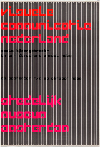
What it is — poster for the annual exhibition of the Art Directors Club at the Stedelijk, 1969. Offset
lithograph on paper, 94.8 × 64.8 cm (MoMA) / 94.6 × 64.7 cm (Cooper Hewitt — the difference
is in the measuring method, not two versions of the work), printed by Steendrukkerij de Jong, Hilversum,
gift of the designer (MoMA obj. 1128.1969); Cooper Hewitt copy acquired 2009 (2009-13-1).
Composition — the Cooper Hewitt record gives RARELY exact measurements: the work was drawn on
pre-printed millimetre paper where 1 line = 1 cm; the large headline
"visuele communicatio nederland" is set from letters 4.5 × 4.5 cm, the smaller subheading from
letters 1.3 × 1.3 cm; the background is built from vertical grey bands in a 3-1-3 rhythm (three narrow
bands, gap, three narrow bands, repeated).
Colour — fluorescent pink/magenta for both texts (headline above, "stedelijk museum
amsterdam" below) on a black-grey striped ground — the only colour in the work, but so saturated
that it vibrates against the fine background stripe (an optical effect similar to moiré).
Typography — grid-lettering of the same type as work 07 (not confirmed that it is an identical
drawing to Architype Stedelijk, but the construction principle is the same — a letter from the grid).
Message — this is Crouwel's most explicit "here's how this is made" work in the whole
body of work: the module is measured in centimetres on paper, not judged by eye. Two letter
sizes (4.5 and 1.3 cm) and their ratio (almost 1:3.5) build hierarchy without a single change
of typeface.
Why exactly this way — the very title of the exhibition ("Visual Communication of the Netherlands") is
self-referential — a poster about an ADC exhibition of graphic design itself demonstrates the method of graphic
design, literally through the paper's visible grid.
What would kill it — any letter size outside the measured series (4.5 / 1.3 cm) would
break the provable, repeatable system and turn it into "looks similar".
Principles:mreza-izvedena-iz-tipografijeTo verify against the image: nothing critical for seven fields — Cooper Hewitt gives exact measurements.
09 · Visual identity of the city of Rotterdam (c. 1972)
What it is — a visual identity system for the city of Rotterdam. The credit is not just
Crouwel's: PGDA (quoting Ben Bos, TD 63–73, Unit Editions 2015) lists Crouwel
as art director, Eli Gross as the designer who "played a prominent role in the design
of the symbol itself", Jolijn van de Wouw as team lead, and John Stegmeyer as an additional designer.
Composition — the mark is a geometric abstraction of a map of Rotterdam: a hexagonal grid
reduces the city's urban structure and the river dividing it into a chain of hexagonal forms; the river is
treated as a DETACHABLE element of the system — it can be shown with the river (full version) or
without it (compact version) depending on the application format.
Colour — documented applications are black and white (envelopes, documents); there is no confirmed
colour palette for the mark.
Typography — not applicable, the mark is purely geometric.
Message — this is NOT a fixed logotype but a RULE for constructing a geographically accurate, yet
abstract, mark that adapts to context while retaining recognisability — an early (for
1972, innovative) example of identity as a system, not as an image.
Why exactly this way — a city as client requires applications from envelopes to
signage; a fixed drawing of the river would not fit everywhere, so the system was designed from the start with a
variable part.
What would kill it — if the "compact" version (without the river) looked like a completely different
mark instead of a subset of the same system, the whole point of modularity would collapse.
Principles: (none confirmed — see the note on authorship below)
To verify against the image: the exact year (PGDA states "c. 1972"); the exact division of work between
Gross, van de Wouw and Stegmeyer relative to what Bos states.
Note on authorship: this work is included as an example of Crouwel's later,
corporate phase, but it is "his" in the sense of art direction and the Total Design brand, not
an individual drawing. Eye Magazine specifically emphasises that the assistants Daphne
Duijveslshoff and this same Jolijn van de Wouw made up "a considerable part of the body of work usually
attributed to Crouwel alone" — two independent sources agree here on the same name,
which makes the claim of collective authorship stronger, not weaker.
What it is — poster for the Holland Festival 1977, theme "the human voice". PGDA states this is
the FIRST TIME a festival poster was done by two designers together: Wim Crouwel and Anthon
Beeke, both from Total Design.
Composition — a large, coarsely halftone-screened photograph of an open mouth (a scream or
singing) occupies most of the format; over the right edge is placed a band resembling a flag
or textile pattern with zigzag/wave lines in several colours.
Colour — the photograph is monochromatic, coarse halftone dot; the band over it is
multicoloured (blue, red, yellow) in a folk/textile, not geometric, arrangement.
Typography — not emphasised in the visible crop; if present, it is subordinate to the image.
Message — the open mouth literally illustrates the theme "the human voice" — photographically, directly,
contrary to Crouwel's usual method (analogy or an abstract mark, never literal illustration). The decorative
band reads as the other author's signature introduced into the same composition.
Why exactly this way — Beeke has been a partner at TD since 1976 and is known for photographic,
provocative, "collage" posters contrary to grid discipline; the shared credit in 1977 is a
documented moment where two opposing languages ACTUALLY meet on one surface, not
only in theory (as in the debate with Van Toorn).
What would kill it — had the band been drawn in Crouwel's usual cold geometry, the
contrast of two hands that makes this poster interesting precisely as a document of
collaboration, not as a pure example of either individual style, would be lost.
Principles: (none confirmed)
To verify against the image: the exact division of authorship (which part is whose) — PGDA states only
a joint credit, without separation.
Other works — evidence, no analysis
Gridnik (1974) — typeface commissioned by Olivetti for electric typewriters
(successor to Crouwel's earlier Olivetti Politene typeface), monolinear, constructed on
a square grid at a 45° angle. Olivetti abandoned the project before completion; copyright
returned to Crouwel. Adapted for numeral postage stamps of the Dutch post office (PTT),
in circulation 1976–2002. Digitised in 1997 (The Foundry), later expanded into light/medium/
bold as Foundry Gridnik. dokumentovano — Wikipedia.
GridnikSpec.svg — a specimen sheet made in 2009 by a Wikimedia user (Typehigh),
not by Crouwel himself; useful as EVIDENCE of the letterform (single-storey geometric "a",
uniform stroke weight), but not an original Crouwel artefact. citanje rada (v2).
New Alphabet — introductory spread — PGDA,
accompanying text alongside specimen sheets of the typeface from work 06.
NAGO (Netherlands Archive of Graphic Designers) — PGDA,
an archival record, not an individual design work.
Kieler Woche 1994 — official programme — PGDA,
a late work (Crouwel was 65–66 years old), evidence that he remained active in the nineties.
Bridge to practice: poster · graphic design · motion
Poster
When you're doing an announcement for someone else's work (a guest artist, someone else's film, someone else's
music in gaming animations) — ask yourself first whether that person/work has a RECOGNISABLE visual vocabulary
(palette, shape, gesture) you can borrow (like Jensen, work 03) before reaching for your
usual grid. Crouwel's Michaux (work 04) also shows when NOT to borrow: if the hand
is too personal to systematise without parody, go back to a neutral letter.
Graphic design
Before you draw a grid "by eye", measure the actual paper/canvas format in whole
units (cm, px) and derive element sizes from that number — like 4.5 cm / 1.3 cm in work 08. The goal
is not an aesthetic grid but a grid you can DESCRIBE with a number, not by eye.
Motion
New Alphabet (work 06) is a lesson in fully accepting constraints: once you choose a technical
limit for a project (e.g. a palette of 4 colours, only rectangular movement, only cuts instead
of easing), apply it to EVERY frame without exception — half-hearted adherence to the rule produces
mush, full adherence produces a language.
Bad imitation
Three typical failures among Crouwel imitators:
"Pixel-art" as decoration without an argument. Copying the look of New Alphabet (blocks, absence of curves) as a "retro" or "cyber" style trick, without a single real technical constraint behind it. In Crouwel's case, illegibility was PROOF of the thesis about CRT screens; without that thesis, the same shapes are just costume.
Grid as decorative lattice. Placing a visible grid over a layout that is NOT derived from the actual measurements of the content (as in work 08) but is a decorative layer added at the end — the result looks "systematic" but not a single decision in it is actually verifiable by number.
"Neutrality" as an excuse for lack of stance. Invoking objectivity/functionality as justification for a layout without a single deliberate decision — while for Crouwel every "neutral" decision (choice of Akzidenz-Grotesk, module size, band spacing) was conscious and numerically verifiable, not default.
The brief through their eyes
For the LØADERRØR site: he would first measure the actual unit (a grid from the typography you already use, not an arbitrary number of columns), then define a RULE for adding a new section (poster, motion, video art, games) instead of designing each one separately — the principle from work 09 (identity as a system that accepts new applications, not a fixed image). First move: build a module table before any page drawing.
Exercises
Borrowed vocabulary. Pick one artist/musician for a gaming-animation episode and make a cover using ONLY their palette and shapes, without a single one of your usual elements — then compare it to a version using your default style.
Grid from measurement, not from the eye. Measure the format in cm/px, derive two text sizes from one ratio (like 4.5:1.3 in work 08), and make a poster using only those two sizes.
Motion study
Five seconds, one frame: a letter (or logotype) that "builds" using only horizontal and vertical strokes appearing one by one on a visible grid, and a cut exactly at the moment it becomes legible — not a frame earlier or later. Constraint: no curves, the whole study.
Rebuilding the benchmark
Benchmark: Visuele Communicatie Nederland (work 08), for its measured proportions. Format 94.8 × 64.8 cm → height = 100%. Module 1 cm ≈ 1.06% of height. Large headline: letters 4.5 cm (≈4.75% of height) in three lines at the top ~8–22% of height. Small subtitle: letters 1.3 cm (≈1.37% of height) directly below. Background: vertical bands in a 3-1-3 module rhythm across the whole format. Bottom text block ("stedelijk museum amsterdam") in the same 4.5 cm letters, positioned in the bottom ~15% of height. Task: rebuild as an .svg skeleton in Illustrator in 45 minutes from these numbers, without looking at the original, then compare the layout.
Notes on sources
The year of the Delft professorship is not consistent: one source states an association from 1965 to 1985, Wikidata gives "full professor" only for 1972–1985. Both claims are kept, the discrepancy noted.
The exact division of credit on the Holland Festival '77 poster (work 10) is not broken down in the source — only a joint Crouwel/Beeke credit.
The exact year of the Rotterdam visual identity (work 09) is given as "circa 1972" — no more precise date was found.
The portrait is not a studio photograph but a press photo from an award ceremony (1976, CC0, Nationaal Archief) — the only freely available image in good resolution.
Work 02 (Edgar Fernhout) and work 03 (Alfred Jensen) have no individual SFMOMA record — the source is the general artist page, the same pattern as with Otl Aicher.
The exact colour arrangement per letter in work 03 (Alfred Jensen) has only been seen on a small thumbnail; it needs confirmation against a higher-resolution image.
The typeface used in works 01, 02, 04, and 05 is not confirmed (only class: grotesque) — no source names the specific typeface.
neutralnost-je-stil remains a local tag until another designer in the project is found whose neutrality has been explicitly and publicly disputed as a stylistic choice, not as the absence of choice.
Difference from its pair
Karl Gerstner ↔ Crouwel — both build an explicit program/system BEFORE drawing, but Gerstner's program (Designing Programmes, 1968) remains in the service of legibility and the client's identity; Crouwel's most radical program (New Alphabet, 1967) explicitly SACRIFICES legibility to prove a thesis about technology — same tool, opposite goal.
Josef Müller-Brockmann ↔ Crouwel — both claim the system is an ethically neutral carrier of the message, but with Crouwel this claim is explicitly and publicly disputed (Van Toorn, Museum Fodor, 9.11.1972, later the book The Debate), while with Müller-Brockmann it remains an unrefuted assumption within the project.
Emil Ruder ↔ Crouwel — both are the second/third confirmed author of the principle posudjeni-vokabular-autora (Ruder with Miró once, as an exception in typographic practice; Crouwel with Martin/Corneille/Jensen three times, as a repeated method for exhibition posters) — but Crouwel also explicitly REJECTS the same principle once (Michaux, work 04), which Ruder's body of work does not show in any work seen.
Otl Aicher ↔ Crouwel — both run large team programs where personal authorship dissolves into the institution (Aicher's football poster, team credit; Crouwel's identity for Rotterdam, the work of Eli Gross under Crouwel's art direction) — for both, "their" name is on work actually drawn by others, documented in both cases by the archive itself (PGDA), not as speculation.