visual paradox — figure/ground, impossible object, object turned against its own function; one image, one word, flat black
independent poster designer and sculptor of optical illusions in Tokyo; ambassador of the Japanese poster at biennials (Warsaw, Brno, Lahti); first Japanese in the ADC Hall of Fame (1987) Tokyo → Tokyo (Ajinomoto 1956–58, independent from 1958; Yale 1982–84 as guest) → Mitaka
Palette of the œuvre
Notes: #E8B234 ochre-yellow (Victory 1945 background) — measured from screenshot; #D6322B red (No More 1968 background; #E8431E red-orange (Happy Earthday, axe; #2E9E3A green (HAPPY EARTHDAY lettering; #1B1F4B indigo (Kyogen background; Hiroshima globe; #8A9A48 olive (On Children's Day; #B7AE9B grey-beige (Montreux background; #C9A46A sand (Hiroshima Appeals background; #E86BA8 pink (APPEALS; #111111 black; #F4F2EC white
„I believe that in design, 30% dignity, 20% beauty and 50% absurdity are necessary.“
— IDEA special issue, November 1991 (quoted per modernism101 and Sessions). v1 quote
„In communication, the shortest distance between two points is a joke“ not found in
any source — see Notes on sources.
Biography
Born February 4, 1932 in Tokyo, into a family that made toys (Sessions,
NCSU per Heller — not primarily confirmed, but it explains the mechanics of his tricks
better than any teacher). Graduated 1956 from Tokyo Geidai (Tokyo National
University of Fine Arts and Music); first job as designer at the Ajinomoto house 1956–58, then from
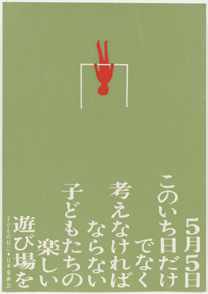
1958 independent (AGI). The earliest work in MoMA's collection is a student work: On Children's Day 1955
(work 07) — already here it has everything he will do for thirty years: one flat colour of ground, one
small red figure, one line of text.
The turning point is 1967: Paul Rand organises his first American exhibition at the IBM Gallery in New York
(Wikipedia). From then on he works doubly — in Japan as designer of official posters (Expo '70
Osaka, Toyama Expo 1991, logotype of the National Culture Festival 1986 — AGI), abroad as a
"biennial champion": gold in Warsaw 1972 (AGI), Warsaw Competition grand prix 1975 for
Victory 1945 (Wikipedia), first prize Brno 1993, UNESCO Grand Prix
1995, Lahti 1995 (AGI). AGI member from 1979. Taught at Tokyo Geidai 1972–2002 and at Yale
1982–84 (AGI). In 1987 the first Japanese admitted to the ADC Hall of Fame (AGI, Wikipedia).
IDEA devotes an entire issue to him in 1991 (119 pages, 517 reproductions: 330 two-dimensional,
187 three-dimensional) with texts by Chwast, Fletcher and Ikko Tanaka and a Rand portrait
on the frontispiece (modernism101).
The second half of the body of work are not posters but sculpture-tricks: Lunch With a Helmet On 1987
(cutlery whose shadow is a motorcycle), Underground Piano 1984, a 3D model of Escher's
Waterfall 1985, Disappearing Pillar 1985 (Wikipedia). For this note they matter because
they show that the paradox in the poster is the SAME operation as in space: the object is precisely
made, and it lies only from one point of view. Died January 11, 2009 in Mitaka
(Wikipedia).
Who paid: museum records almost never state the client — most works enter
museums as gift of the designer (MoMA 1986, 1987) or as gift of DNP Foundation (UMMA 2017,
M+ 2016/2018). This means a large part of the posters were made for himself, for exhibitions and competitions
(Victory, Keio, Look 1, Earthday, No More), while earning from official programs
(Expo) and advertisements (UCC coffee, Spoon & Tamago). The poster as a portfolio for the biennial is
his model, not the poster as commission — and that explains why almost none has
text other than the title.
Influences
Studied with
Tokyo National University of Fine Arts and Music (Tokyo Geidai), graduated 1956 (AGI, Wikipedia) — no teacher named in any source
Ajinomoto Co., 1956–58 — first job, in-house designer (AGI); independent from 1958
family toy workshop in Tokyo — Sessions and NCSU (per Heller, NYT 2009) cite it as the source of the mechanical, toy-like logic of the tricks; not confirmed primarily
Borrows from
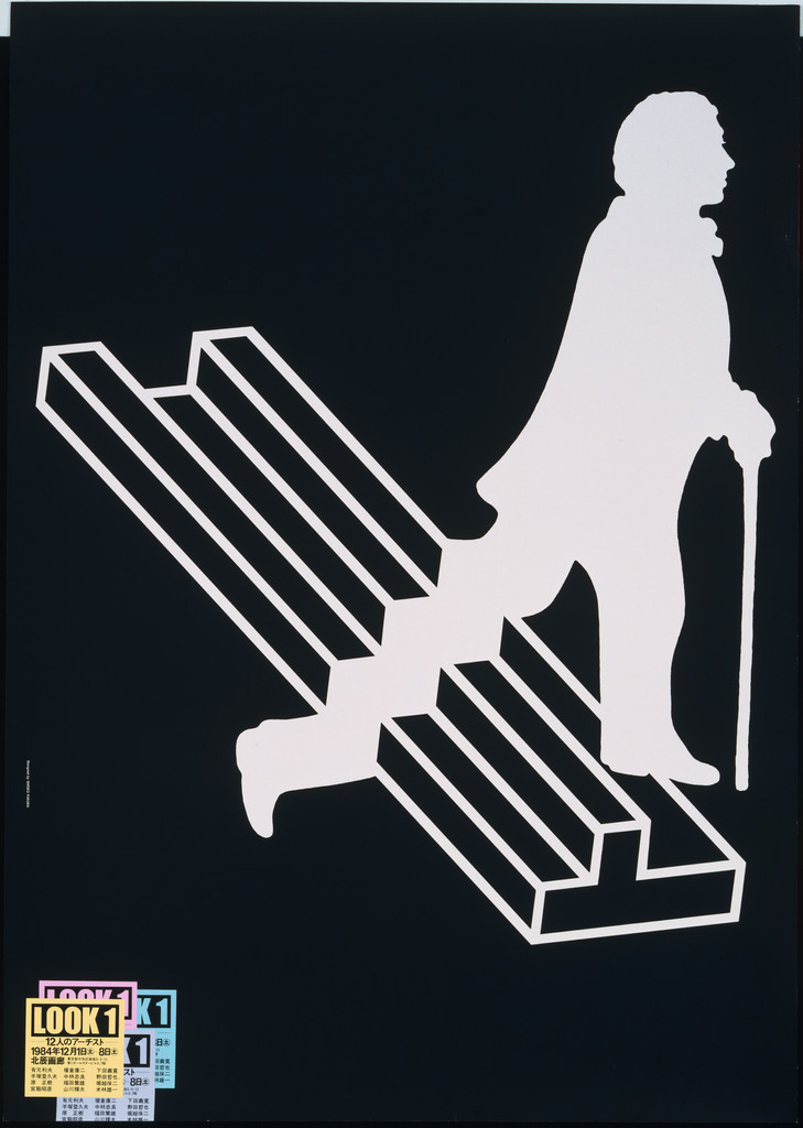
M. C. Escher and impossible objects — 3D model of Escher's Waterfall 1985 (Wikipedia); the staircase in Look 1 (1984) is Penrose/Escher type — see work 05
gestalt figure/ground — Keio 1975 (work 02); no source names a theoretical origin, this is a reading of the work
Swiss reduction — Wikipedia and NCSU cite "Swiss minimalism"; in the works it shows as flat black + one colour, not as a grid
Japanese tradition of emblems (mon) and hanafuda cards — Mt. Fuji 1976 (UMMA 2017/2.83: moon over mountain as hanafuda motif)
Paul Rand — organized his first American exhibition (IBM Gallery, New York 1967) and shot the frontispiece for IDEA 1991; the kinship is in wit through economy, not in form (Wikipedia; modernism101)
Influenced
the generation of Japanese poster artists after 1980 (Kazumasa Nagai, Koichi Sato) — colleagues, not students; not confirmed as an influence
Yale Graphic Design 1982–84 — visiting teacher (AGI); names of students not confirmed
Seymour Chwast, Alan Fletcher, Ikko Tanaka (田中一光) — wrote assessments in IDEA 1991 (modernism101); Chwast: „his purpose is to mystify“ (NCSU)
Contemporaries
Ikko Tanaka (田中一光) — same Tokyo, two years older; both in the Hiroshima Appeals series (Fukuda 1985, Tanaka 1988) and in the DNP donation UMMA/M+
Yusaku Kamekura — first Hiroshima Appeals 1983; Expo 70 (Fukuda official poster, AGI)
Kazumasa Nagai — same movement in Japanese poster design; the PGDA file for the Keio poster carries the name nagai_n2.jpg (source Gurafiku), see Notes on sources
Milton Glaser — both made a poster for Montreux Jazz (Glaser 1976, Fukuda 1985)
Herb Lubalin — No More War 1967 (Lubalin) / No More 1968 (Fukuda): same title, a year apart, opposite method
Who he studied under
No source names a teacher. Tokyo Geidai 1956 (AGI, Wikipedia) and two
years at Ajinomoto (AGI). The toy workshop at home is the only "teacher" that
recurs in secondary literature.
What he plunders
Escher and impossible objects — not just a quotation: in 1985 he builds a physical model
of the Waterfall that works from one angle (Wikipedia). The staircase in Look 1 (work 05) is
the same type of impossible object transferred to the poster.
Gestalt figure/ground — Keio 1975 (work 02). No one states where from; the works
prove it better than the biography.
Japanese emblem (mon) and hanafuda — UMMA reads Mt. Fuji 1976 as a hanafuda motif
(moon over mountain) with an added stick that turns it into a lollipop or magnifying glass — thus
the same operation as Victory: found sign + one foreign element.
Paul Rand — not in form but in attitude: one sign, one joke, zero ornament. Rand
brought him to America in 1967 and recorded him in 1991.
Swiss reduction (Wikipedia, NCSU) — visible in the works only as a
flat colour and absence of texture, not as a grid or as Akzidenz.
Who he influenced
No confirmed students by name. Yale 1982–84 (AGI). What is certain: after him
"visual paradox" becomes a standard category of poster at biennials (Lahti, Brno,
Warsaw), and Chwast, Fletcher and Ikko Tanaka (田中一光) write about him in 1991 as an already finished
phenomenon. For the lineage what matters more is what is inherited in the method: jedna-operacija-po-radu
(Roman Cieślewicz, Jamie Reid, Peter Saville, Ikko Tanaka (田中一光)) reaches its
purest form with Fukuda — operation on a DRAWN object, not on a photograph.
What it is — a poster for the Warsaw competition marking the 30th anniversary of the war's end, 1975, grand
prix (Wikipedia). UMMA holds a 1976 reproduction: screenprint, 102.9 × 73 cm, gift of DNP.
A client in the sense of a commissioner doesn't exist — a competition work.
Composition — the entire format is one flat ochre-yellow plane. Two black objects on
the same diagonal (≈ 35° from vertical, tilted left): a cannon barrel enters from the lower
left corner (muzzle of the barrel at ≈ 46% w, 49% h), a shell hovers upper right (centre of mass
≈ 72% w, 20% h) and RETURNS into the barrel — its tip is turned toward the muzzle. The title VICTORY
1945 upper left (≈ 5–47% w, 4–8% h), white. The eye enters on the title, slides along the
diagonal onto the shell, then down it into the barrel — and stops there because the direction doesn't add up.
The gap lower right (≈ 40% of the format) is deliberate: the shell has nowhere else to go.
Colour — three colours: ochre-yellow ground, black silhouette, white word. On the black
objects one thin YELLOW glint (edge of the barrel, ring of the shell) — not a fourth colour,
it's the ground showing through a break in the black. Zero midtone, zero shadow; the shine is a line.
Yellow was chosen so the black would be as hard as possible (maximum brightness contrast without
a white ground) and so the poster from five metres would be one yellow rectangle with two black
stains.
Typography — condensed grotesque (sans serif), capitals, white, one line; a class, not a specific typeface
(not in Fonts In Use). It sits like an inscription on the object, not like a title above the
image: same 0° angle, same whiteness as the glint. Nothing else on the format.
Message — victory is a bullet that returns to whoever fired it. Three seconds: you recognise
the cannon and the shell; the fifth second: you grasp the direction. Five metres: yellow, two black
marks — cannon and shell; the message reads only from three metres, but even from five it works as "war".
Text-covering test: it passes — the image says it all; the title only dates it.
Why exactly this way — a competition, a single sheet, an international audience without a shared
language: the word must be redundant. The limitation of screenprint (flat colours) and the limitation of the
jury (hundreds of sheets, three seconds per sheet) yield the same solution: one operation on one
familiar image — reverse the direction. Fukuda doesn't draw war, he draws a ballistic error.
What would kill it — turning the shell "correctly" (away from the barrel): it becomes
an artillery poster. Or adding a second shell: "impossible" becomes "a lot" and the argument disappears.
Or a shadow under the barrel — the object gains a floor, and loses the diagram.
Principles:jedna-slika-jedna-rijecjedna-operacija-po-radu (reverse the direction)
predmet-protiv-svoje-funkcijenemoguci-predmet-kao-argumentravna-boja-na-daljinuTo verify against the image: exact angle of the diagonal and whether the glint is the yellow ground or a
separate colour (screenprint 1976 — probably a break in the black); the 1975 original versus the 1976
reproduction (UMMA itself says "Reproduction").
Measurement (from screenshots): muzzle of the barrel (46, 49) %; centre of mass of the shell (72, 20) %;
title (5–47, 4–8) %; angle ≈ 35°.
02 · Shigeo Fukuda Exhibition — Keio Department Store (1975)
What it is — poster for the author's own exhibition in the gallery on the 5th floor of the Keio department store, Tokyo,
23–28 May 1975 (inscription; UMMA). Screenprint, 102.9 × 73 cm (UMMA; PGDA says offset, 103 ×
72 — see Notes on sources). Same year as Victory.
Composition — format divided into six vertical "columns": six black women's legs with high heels hang FROM ABOVE (heel at ≈ 12% v), and the white gaps between them are men's legs in trousers with shoes standing FROM BELOW (shoe at ≈ 88% v). There is nothing else but one line of small text along the bottom edge (≈ 95% v): name, date,
venue. The eye reads the black legs first (figure), then the white "snaps" into male legs — and from then on
it can no longer see just one. The rhythm is strict: six modules, equal step, full
height.
Colour — black on white, nothing else; and this isn't economy but a condition: as soon as
one side got colour, it would become the figure, and the other the background, and the illusion would
die. Equal "weight" of black and white (≈ 50/50 of the area) is what keeps both
readings alive.
Typography — one line of small capitals, grotesque (PGDA states Helvetica with no
source — class Helvetica). Deliberately illegible from a distance: the poster must first be
an image, and only at half a metre a notice. The text sits below the shoes like ground.
Message — a poster for the exhibition of a man who makes illusions IS an illusion. There is no slogan;
the message is the experience "I see one thing / I see another". From five metres: black-and-white stripes,
op-art; from two metres: women's legs; from one: men's too. Three distances, three contents.
Why exactly this way — department store, passers-by, zero budget for text: the poster must
stop the step. The constraint he set for himself is stronger than the client's: both
readings must be COMPLETE (heel AND shoe, with no "leftover" in either). This is
what distinguishes this poster from Rubin's vase: there is no neutral zone.
What would kill it — one module shifted (unequal step) or one leg in
a different pose: the white stops being a leg and reverts to a gap. Or a grey background:
the figure gains priority and the background dies.
Principles:oba-citanja-dovrsenabijeli-prostor-kao-oblikjedan-primitiv-za-sve
(one leg shape, six times) dva-rastojanja-citanjacrno-bijelo-prije-bojejedna-operacija-po-radu (repeat and invert)
To verify against the image: exact number of modules (six black / five or six white — edge);
technique screenprint/offset; whether the PGDA image (file nagai_n2.jpg, source Gurafiku) is really this
sheet or a reprint.
Measurement: module step ≈ 16.7% w; heel ≈ 12% v; shoe ≈ 88% v; text ≈ 95% v.
What it is — anti-war poster 1968, screenprint, 103 × 72.5 cm (MoMA 475.1987, gift of the
designer; M+ 2018.618, 102.7 × 72.7). The client is not stated in either record. One year after
Herb Lubalin's No More War (1967, Avant Garde competition) — see Pairs.
Composition — the whole format covered with one primitive: a short black line
(bomb), slightly tilted, in tens of thousands of repetitions. The skull emerges SOLELY from
density difference — dense along the edges, sparse in the face, nothing drawn with an outline. The skull
occupies ≈ 70% of the width, from ≈ 12% to 95% of the height; eye sockets ≈ (37, 40) and (62, 40)%;
teeth ≈ 65–72% v. The eye doesn't zoom in anywhere — the skull is instantly there from a distance, and at half
a metre it disappears into a rain of bombs. Two readings, like Keio, but by DISTANCE, not by
figure/ground.
Colour — red background, black line. The red is chosen as a mid-tone value:
dark enough for the black density to build shadow, light enough for the sparse fields to work as
light. On white, the skull would be a diagram; on red, it's flesh.
Typography — none; one small line along the bottom edge (illegible in the screenshot).
The title only exists in the catalogue. This is a borderline case of jedna-slika-jedna-rijec:
one image, zero words.
Message — the bombs falling ARE the skull; there is no metaphor to explain, because
the image is itself both cause and effect. Five metres: skull. Half a metre: bombs. In between —
the moment you realise one is the other.
Why exactly this way — screenprint in two colours, without tone: to get a shadow without a halftone screen,
Fukuda makes a screen out of CONTENT. The same procedure as Gerstner's or Cieślewicz's
enlarged halftone dot, but the dot isn't a dot but an object — and that is what's new in 1968.
What would kill it — a skull outline (one line): the bombs become texture
inside a drawing. Or bombs in two sizes: density stops being the sole parameter and
the image falls apart into "big and small".
Principles:lik-samo-iz-gustinejedan-primitiv-za-svedva-rastojanja-citanjarebus-tjera-na-izvodjenjejedna-slika-jedna-rijecTo verify against the image: whether the line is a bomb (with a tail) or a plain line — in the screenshot it
looks like a short rounded line without a tail; whether there's text along the bottom edge; the exact red.
Measurement: skull (15–85, 12–95)%; eyes (37, 40) and (62, 40)%; teeth 65–72% v.
What it is — sheet #5 from the series Happy Earth Day 1982, offset, 100 × 70.7 cm (M+
2016.739). The series has several sheets; UMMA 2017/2.89 is a DIFFERENT poster of the same year and
title (green-black globe in a white "holder" on blue — Earth as a seed germinating, per UMMA's description). Here the sheet with the axe is analysed; see Notes on sources.
Composition — red-orange plane; a black axe placed UPSIDE DOWN:
head bottom left (≈ 15–60% w, 82–95% v), handle upright through the centre (≈ 50–55%
w), and at the top of the handle (≈ 5% v) two sprouts with little leaves. The inscription HAPPY / EARTHDAY in
two lines bottom right (≈ 68–95% w, 84–92% v), green, with Japanese text left and
right of it. The eye enters on the axe (the largest black mass), climbs the handle to the sprout, and
only then falls on the green inscription — a path from blade to leaf.
Colour — three: red-orange, black, green. Green appears only on the word, not on
the sprout — the sprout is black like the axe, because it IS the axe. The green word is the only "living"
tone and sits where the eye ends up. On the axe, thin white highlights (edge
of the blade, wood grain) — a break in the black, not a fourth colour.
Typography — condensed serif capitals (class Clarendon-condensed), green;
unconfirmed. A typeface tone was chosen that "speaks" the poster about nature in the 1980s, rather than
a grotesque — the only work among the eight where the typeface carries the mood.
Message — an axe that sprouts: a tool cuts wood, and yet wood grows through the tool. Three seconds: axe; five: sprout; from five metres: black vertical on red — an exclamation mark.
The text-covering test passes.
Why exactly this way — a series of at least five sheets on the same theme: each must have
ONE different idea, same format, same economy. Here the operation is substitute: top of the
handle → sprout. The upside-down axe is not a style but a necessity — the sprout grows
upward, so the head must be down.
What would kill it — a green sprout: the message becomes an illustration of "even an axe can
be good", instead of the paradox that wood is stronger. Or the axe in perspective: the
diagrammatic legibility of the silhouette is lost.
Principles:predmet-protiv-svoje-funkcijejedna-operacija-po-radu (substitute)
jedna-slika-jedna-rijecravna-boja-na-daljinuTo verify against the image: the Japanese text beside the inscription (name of the organisation Earth Day
Japan?); whether #5 is M+'s numbering or Fukuda's; the background colour (M+ says "red", the screenshot
shows red-orange).
Measurement: handle (50–55)% w, 5–82% v; head (15–60, 82–95)%; inscription (68–95,
84–92)%.
What it is — poster for his own exhibition Look 1, 1984; screenprint, 103 × 72.5 cm (MoMA
266.1986, gift of the designer). Wright 2018 sells a copy as offset lithograph on glossy paper
from Rand's estate — two processes for the same sheet or two editions; see Notes on sources.
There is also a variant Look 1 (Mona Lisa) from the same year (Wright lot 248, Artsy).
Composition — black plane. White SILHOUETTE of a man in an 18th-century coat, with a
wig and cane, striding down and to the right (head ≈ (78, 12) %, front foot ≈ (30, 68)
%). Below him a WHITE OUTLINE of a staircase in isometric view: three steps from the upper
left toward the lower right corner (≈ 5–85 % w, 30–78 % h). The trick: the figure is drawn
so that its front leg passes THROUGH the step — the staircase is an impossible object
(Penrose type), and the figure doesn't notice. Lower left (≈ 4–22 % w, 88–96 % h)
a multicoloured "sticker" LOOK 1 with Japanese text. The eye enters on the lightest thing —
the silhouette — then down the stairs, then snags at the point where the leg and the step don't line up.
Colour — black + white, and one tiny colour zone (magenta, cyan, yellow, red)
in the sticker. All the colour is squeezed into 2 % of the surface, and at the spot the eye visits
LAST. The silhouette is a solid plane, the staircase is only a line: two weights of white on
black make depth without a single tone.
Typography — LOOK 1 as a stuck-on label, bold grotesque (sans serif) in colour; the rest
is small Japanese type. Typeface not confirmed. The label is deliberately a "foreign body" —
the only element that isn't black-and-white and the only one not drawn by hand.
Message — "Look" literally: keep looking until you see the mistake. Three seconds: a gentleman
descends the stairs; five: the stairs aren't possible; ten: he doesn't know it, you do.
From five metres: a white figure on black, reads as a figure, not as a trick.
Why exactly this way — a poster for an exhibition of illusions is itself an illusion (same as Keio 1975,
nine years earlier) — but here the device is an IMPOSSIBLE OBJECT, not figure/ground.
The 18th-century silhouette was chosen because it's recognisable (Hogarth/costume iconography
of the "gentleman") — it must be identifiable from a single outline so that all attention goes to
the stairs.
What would kill it — the staircase as a solid white plane (like the figure): two masses
collide and the depth disappears. Or a coloured figure: the eye stays on it and never reaches
the mistake.
Principles:nemoguci-predmet-kao-argumentrebus-tjera-na-izvodjenjejedna-slika-jedna-rijeccrno-bijelo-prije-bojeTo verify against the image: exact type of impossible staircase (Penrose / Escher Ascending
and Descending); who the figure is (Hogarth? a generic "gentleman"); content of the sticker
(date, exhibition venue).
Measurements: head (78, 12) %; front foot (30, 68) %; staircase (5–85, 30–78)
%; sticker (4–22, 88–96) %.
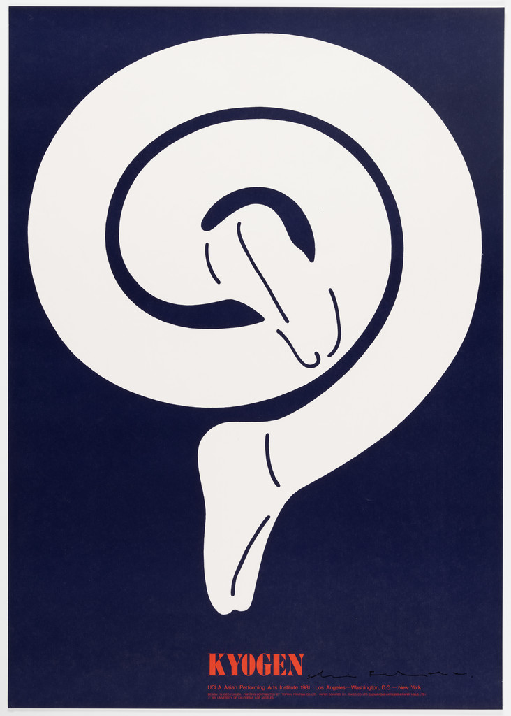
What it is — poster for an American tour of kyogen theatre, UCLA Asian Performing Arts
Institute 1981 (Los Angeles, Washington D.C., New York — as inscribed), offset lithograph, printer
Toppan, 103 × 72.8 cm (MoMA 599.1981, gift of UCLA). Same programme and same printer as
Ikko Tanaka (田中一光)'s Nihon Buyo 1981 (MoMA 649.1981) — two posters for the same tour.
Composition — indigo plane. A SINGLE white band, like a wide brushstroke or a kimono
sleeve, coiled into a spiral from the upper left corner (≈ 8 % w, 8 % h) toward the centre; at
the centre of the spiral, in the indigo left showing through, a PROFILE FACE reads facing downward
(nose, closed eye — a smiling kyogen mask), and the tail of the band exits below (≈ 45 % w, 82 % h)
and ends as a tabi-clad foot with a toe. The whole figure — sleeve, face, foot — is one
unbroken white stroke. The title KYOGEN in red, below (≈ 40–58 % w, 88 % h), a line of small
text underneath, designer's signature to the right. The eye enters at the outer end of the spiral and spirals
inward to the face; the face is the reward at the end of the path.
Colour — three: indigo, white, red (title only). The face isn't drawn in white but LEFT
as indigo — the background becomes the figure in one spot. Fine
indigo lines within the white (folds of the sleeve, the toe) — the only drawing in the piece.
Typography — KYOGEN serif capitals (Clarendon class), red; a line of small
text underneath. Not confirmed. The red word is the only warm point and sits below the foot
— the ground the figure stands on.
Message — kyogen is a comedy played out in a single gesture of the sleeve; the poster is
one gesture. Five metres: white spiral on blue (a mark, almost a mon crest). Two metres:
the face. Half a metre: the foot, the toe, the folds.
Why exactly this way — the American audience doesn't know what kyogen is: the poster can't
explain, it has to give ONE image that is both Japanese (brushstroke, sleeve, mon) and
universal (spiral, smile). The condition he set himself: the whole body from a single
stroke — and the face from what the stroke doesn't cover.
What would kill it — a white face drawn inside the spiral: two white shapes, the spiral
stops being a single stroke. Or a different colour for the sleeve: the mon becomes an
illustration of a costume.
Principles:jedan-primitiv-za-sve (one stroke) jedna-slika-jedna-rijecrebus-tjera-na-izvodjenjeravna-boja-na-daljinuTo verify against the image: whether the tail of the band is a foot or a sleeve (in the screenshot the toe of the
tabi); content of the small text line (cities, dates); comparison with Tanaka's sheet for the same
tour — same size, same printer, opposite method (grid / stroke).
Measurements: start of spiral (8, 8) %; centre of face ≈ (50, 42) %; tail (45, 82) %;
title (40–58, 88) %.
What it is — poster for Children's Day (5 May), 1955, screenprint, 72.6 × 51.2 cm (MoMA
80.1990, Lauder Foundation). Student work (1956 diploma). Small inscription: 子どもの
日に・日本童画会 — for the Japan Society of Children's Illustration (Nihon Dōgakai); MoMA does not
list a client.
Composition — olive plane. At the top centre (≈ 50 % w, 18 % h) a small red
figure of a child hangs UPSIDE DOWN from a white horizontal bar (a shaft, ≈ 40–60 % w);
the bar has two white supports going down. The lower half of the format (≈ 55–100 % h) is a wall
of white vertical Japanese text in five columns reading right to left, largest
on the right (5月5日 — 5 May), progressively smaller to the left, with the smallest line
at the far left (author and society). The eye enters on the red dot, falls onto the large date, then reads
leftward and downward.
Colour — three: olive, red, white. Red only on the child (≈ 1 % of the surface)
— the only warm point, as with the KYOGEN title 26 years later. The white text is a tone
of light, not information, from a distance.
Typography — Japanese gothic (sans serif), vertical setting, stepped-down
column sizes; a class, not a specific typeface. The text is half the image: zid-teksta-kao-oblik in
the Japanese vertical mode — the block has a geometry (a staircase right to left) before
it is read.
Message — "Not just on 5 May — one should think about children's playgrounds (every
day)". The child hangs upside down from a single bar: the playground reduced to one object. Three
seconds: red dot + date; five metres: olive with a white staircase of text.
Why exactly this way — 1955, a student, screenprint in three colours, B2: the limitation of the medium
is the same as twenty years later, and the solution is the same — one figure, one plane,
text as shape. This piece is proof that the method didn't come from Switzerland in the 1960s but
from screenprinting and poverty in 1955.
What would kill it — the child upright on the bar: the only oddity disappears and it's left
as a pictogram. Or the text in one size: the wall loses its geometry and becomes a paragraph.
Principles:jedna-slika-jedna-rijecravna-boja-na-daljinuzid-teksta-kao-oblikTo verify against the image: exact translation of the columns (read from the screenshot: このいち日だけ
でなく / 考えなければならない / 子どもたちの / 楽しい遊び場を); whether it's a shaft or a
frame; author's signature in the small line.
Measurements: child (50, 18) %; bar (40–60, 22) %; text 55–100 % h, largest
column ≈ 80–95 % w.
What it is — official poster for the 19th Montreux Jazz Festival, 5–20 July 1985 (per the inscription).
No museum record has surfaced; technique and dimensions unknown — by appearance offset
in six colours. Nine years after Milton Glaser's poster for the same festival (1976).
Composition — grey-beige field. Large black treble clef running the full height
(≈ 30–75% w, 2–92% h). Around the clef and over it, eight-nine comic-strip speech
bubbles (cloud, star-shaped "burst", rounded) in flat colours, with tails coming OUT
of the clef — the clef "speaks" in several voices at once. Below, one line of black
capitals (≈ 92–96% h): 19 JAZZ FESTIVAL · MONTREUX · 5-20 juillet 1985. The eye enters
on the black mass, then jumps across the bubbles like a rhythm — there's no single
path, there's a pulse.
Colour — six: grey-beige ground, black, ultramarine, magenta, orange, green.
The bubbles OVERLAP with the clef so black passes over some of them, and some pass
over black — depth comes from sequence, not from tone. The grey-beige was chosen so
the four colours stay equally loud (on white the yellow would disappear, on black the
blue would).
Typography — condensed bold grotesque (sans serif), capitals, black, one line
along the bottom; unconfirmed. The text is the quietest element: everything loud is
already in the image.
Message — jazz is one sign (the clef) speaking with many voices at once;
wordless bubbles = sound that can't be written down. At five metres: black clef +
colourful "confetti"; at three seconds: festival, music, joy. The text-cover test
passes (place and date remain unknown, but the theme doesn't).
Why exactly this way — the festival needs joy and recognisability from thirty
metres away (street poster, Switzerland); Fukuda doesn't build a trick but an
ANALOGY: improvisation = many voices from one source, shown through a comic-strip
code anyone can read. The only one of the eight works where he drops the paradox —
and the only one with more than three colours.
What would kill it — text inside the bubbles (musicians' names): the bubbles
stop being sound and become a programme. Or a coloured clef: it loses the one black
mass holding the colours together.
Principles:analogija-umjesto-ilustracijejedna-slika-jedna-rijecravna-boja-na-daljinuTo verify against the image: exact number of bubbles and colours; format (Montreux
series — to verify in the festival archive); whether this is Fukuda's only Montreux
(Glaser did several).
Measurement: clef (30–75, 2–92)%; text 92–96% h.
The third sheet in the Hiroshima Appeals series (JAGDA, from 1983; PGDA copies the
MAAS/Powerhouse description: a globe outlined by meridians, "broken at one corner, a
hand with a cuff emerges trying to put the broken world back together"). Sand-beige
field; large indigo globe (≈ 12–88% w, 3–70% h) with a network of meridians and
parallels CUT OUT in white (holes where the lines cross); top left (≈ 22, 12%) a white
fist with a cuff inside the globe — holding it like a ball, or emerging from it.
Below, APPEALS in pink, wide light capitals across the full width (≈ 84–97% h), over
it a red diagonal band HIROSHIMA in white, and "1985" small in the middle. Same
series as Ikko Tanaka (田中一光) 1988 (Cooper Hewitt) and Kamekura 1983: Fukuda alone doesn't
use the fire/ash metaphor but an OBJECT (the globe as a ball in a hand) —
predmet-protiv-svoje-funkcije in reverse: the hand doesn't throw, it holds.
To verify: MAAS record (robots locked) — technique, dimensions, client; whether
the fist is "inside" or "outside" (MAAS: emerges); exact number of sheets in the
series. The PGDA date 1958 is an error — the poster reads 1985.
Happy Earthday (globe-seed) 1982 — offset, 102.9 × 73; UMMA 2017/2.89: green-black
globe in a white "holder" on blue, text below. Second sheet in the series.
record
Amnesty International 1980 — a fist entwined with barbed wire; the S in the
lettering as a shackle (Sessions, Spoon & Tamago) — not seen.
Expo '70 Osaka — official poster (AGI, Wikipedia) — not seen.
Look 1 (Mona Lisa) 1984 — variant (Wright lot 248, Artsy) — not seen.
Hiroshima–Nagasaki 50 1995 (Spoon & Tamago) — not seen.
The World of Shigeo Fukuda in U.S.A. — PGDA 19089; Shigeo Fukuda Exhibition
PGDA 19184; International Design Exhibition PGDA 17100; International
Observation of Prisons PGDA 19822; SOS AIDS PGDA 9533; IDEA 235 cover
PGDA 9450; Fukuda Exhibition Mitsukoshi (dinosaur) PGDA 22906 — roster for
expansion.
M+ — 238 objects online (gift of DNP 2016/2018), records with description: best
roster for the second round.
Sculptures (Wikipedia): Lunch With a Helmet On 1987, Underground Piano 1984,
Escher Waterfall 1985, Disappearing Pillar 1985, Aquarium for Swimming Characters
1988 — the same method in space.
Bridge to practice: poster · graphic design · motion
Poster
A verb before the sketch, and only one — Fukuda has three verbs across his
whole body of work: reverse (direction, function, orientation), repeat (to
density, to background), substitute (one part of an object for another object).
Before I open Illustrator: which of the three? If two are needed — it's not Fukuda,
and it's not a good poster either.
Silhouette on one field, highlight as a break — black object, flat ground
colour, and the "shine" is the line where the black stops (Victory, Earthday). In
Illustrator: Pathfinder Minus Front to cut a narrow shape out of the silhouette,
NOT a white line laid over it. Three colours maximum, the ground colour chosen by
lightness (the black must be the hardest value).
Figure/ground test — when I make a cutout figure, invert the colours and look
at what's white: is the background "finished"? In Keio, the white is also a leg.
For a poster: before handing it in, make an Invert version and see if anything
still reads.
Text as ground — all mandatory text in one line along the bottom edge, small,
below the "feet" of the image (Keio, Montreux). Not in a corner, not in a block.
Graphic design
Density instead of a screen — when a two-colour tone is needed (screenprint,
riso, cheap offset), build the screen out of the OBJECT of the content itself
(No More). In Illustrator: a Scatter Brush with one symbol, density set via an
Opacity Mask from a greyscale image, then Expand. One symbol, one size — two sizes
kill the principle.
A series = same economy, a different idea (Earthday #1–#5): for a poster or
cover series, fix the same format, the same three colours, the same position for
the lettering — and for each sheet a different verb. The constant of the series is
the REGIME (as with Alvin Lustig), not the layout.
Impossible object as a logo — a mark that "doesn't add up" from one viewpoint
is remembered longer than a correct one. For LØADERRØR: is there a variant of the
mark where one line passes "through" another (Penrose)?
Motion
A flip as the only event in the frame — Keio and No More are animated with
only one parameter: scale (No More — the camera moves from 0.5 m to 5 m, the skull
emerges from the bombs) or colour (Keio — one Fill Color keyframe black↔white, and
the legs swap polarity). In AE: NOTHING moves, only one layer parameter changes.
Impossible object in MOHO — Look 1 as a 2D rig: the staircase is one vector
layer, the figure walks with a walk-cycle, and the "error" is only the character's
Z-order in ONE frame (a leg goes below a step that should be behind it). The
audience only sees the error on a second look — that's the whole point.
Object against its function as a gag — Victory is a ready-made storyboard for
a gaming animation: the bullet goes back into the barrel. The same gag works for
any object from a game (a bomb pulling back its fuse, a sword cutting its own
handle) — one object, one reversed direction, no text.
Bad imitation
Trick without a second reading — the figure/ground is copied (black and white
stripes with "something" in the gap), but the white isn't finished: it's op-art
wallpaper, not Keio. Cause: the look is copied (rhythm, black-and-white), not the
rule (BOTH readings must be a complete object). Test: cover the black — is the
white a picture on its own?
Paradox + explanation — a shell is drawn returning into the barrel, then the
slogan "War kills the winner too" is added. Cause: distrust of the viewer;
Fukuda's work "forces the solving" (rebus-tjera-na-izvodjenje), but the caption
solves it for him and the idea isn't remembered. Text-covering test: if the image
doesn't work without the slogan — the problem is the image, not the missing slogan.
Two tricks in one work — figure/ground AND impossible object AND hidden word
in the shadow. Cause: Fukuda is perceived as a "magician", so tricks pile up; he
did ONE per sheet, and different tricks across SHEETS. The result of piling up is
Tadanori Yokoo without Yokoo's ear for noise — a mess.
Tone, shadow, gradient on the silhouette — "to look better" a shadow is added
under the barrel or a gradient on the globe. Cause: it isn't understood that
flatness is the CONDITION of the trick (as soon as there's a shadow, the object
has a floor, and the impossible becomes merely clumsy).
The brief through their eyes
Current job: YT gaming animations (short comedic episodes about games and
players; thumbnail + 5-second gag). Fukuda would first take ONE object from the game
that everyone recognises (health potion, controller, loot box) and ask: which single
verb makes it funny — invert, repeat, replace? The thumbnail would be that silhouette
on one flat colour, no face and no text; text goes in the video title, not in the
image. The gag in the animation would be the same object in one frame where only a
flip happens — and an end before the viewer manages to look for an explanation.
Exercises
Three verbs, one object (45 min) — take one everyday object (key, scissors,
controller). Draw it as a silhouette in Illustrator, one background colour. Make
three sheets, each with one verb: invert (direction/function), repeat (to a
density that builds a second figure), replace (one part with another object).
Zero text. Test: show someone for three seconds — which sheet did they "get"
without asking?
Finish the background (30 min) — one module (leg, arm, bottle) six times in
rhythm across the format; black on white. Then Invert: what is the white? Keep
adjusting the module until the white becomes a second complete object.
Constraint: no shape may be added, only the silhouette of the module may change.
Figure from density (30 min) — grey photograph of a face → Image Trace into
one symbol (Scatter Brush, one symbol, one size), density following the grey.
Then Expand and delete every contour. Test at five metres: a face? At half a
metre: an object?
Motion study
"Flip" — AE, 5 s, one frame. Composition: Keio type — six black modules on
white (draw them so the white is a second object). The only keyframe: the Fill Color
of the background solid and the modules swap values over 1 s (sec. 2→3), no
Position, no Scale. The viewer at second 2.5 sees that they were looking at the wrong
figure. Variant B: No More — camera Scale 500 %→100 % linearly, nothing else; the
skull "emerges" from the bombs. Condition: one parameter, one event.
Rebuilding the benchmark
Benchmark: Victory 1945 (format 103 × 72,5, portrait). Skeleton .svg: field
ochre-yellow; diagonal axis 35° from vertical, passing through (46, 49) % and
(72, 20) %; barrel cylinder width ≈ 22 % w, from the bottom left edge to the muzzle
at (46, 49) %; shell length ≈ 22 % h, centre of mass (72, 20) %, tip toward the
muzzle; title rectangle (5–47, 4–8) %. Tonal zones: one (background) + two black
masses (≈ 18 % of the area). Task: build it in Illustrator in 45 min without looking
at the original (skeleton only), then compare: where is the highlight, how wide is
the muzzle, how much empty space remains bottom right.
Difference from its pair
Ikko Tanaka (田中一光) ↔ Shigeo Fukuda (福田繁雄) — same Tokyo, same 1981 tour (Nihon Buyo / Kyogen,
same printer Toppan, same scale): Tanaka builds the face from a GRID of modules
and tradition is the material; Fukuda builds the body from ONE stroke and
tradition is only a costume — geometry that's recognised / a trick that's
performed.
Paul Rand ↔ Shigeo Fukuda (福田繁雄) — Rand brought him to America (1967) and both work "wit
through economy": Rand reduces the WORD to a sign (IBM, eye-bee-M) and the joke is
in the letterform; Fukuda reduces the OBJECT to a silhouette and the joke is in the
physics (direction, function, possible/impossible).
Henryk Tomaszewski ↔ Shigeo Fukuda (福田繁雄) — Warsaw awarded him (1972, 1975): Tomaszewski draws
by hand, clumsily, to be warm, and the idea is in the gesture; Fukuda draws
perfectly to be cold, and the idea is in the error that the perfect drawing
contains.
Roman Cieślewicz ↔ Shigeo Fukuda (福田繁雄) — both jedna-operacija-po-radu: Cieślewicz operates
on the PHOTOGRAPH to show that the image lies; Fukuda on the DRAWN object to show
that the object lies — so he needs neither halftone nor a wound, only direction.
Milton Glaser ↔ Shigeo Fukuda (福田繁雄) — two Montreux posters (1976 / 1985): Glaser quotes Art
Nouveau and fills the format with ornament; Fukuda takes one sign (a key) and a
comic-strip speech bubble — a quote from history / a code from mass culture, both
for the same audience.
Herb Lubalin ↔ Shigeo Fukuda (福田繁雄) — No More War 1967 / No More 1968: Lubalin stacks the
WORD into a wall with an exclamation mark and the face is in the letter; Fukuda
drops the word and stacks BOMBS into a face — the same title, text as image /
object as tone.
Peter Saville ↔ Shigeo Fukuda (福田繁雄) — both leave zero words (Unknown Pleasures / No More):
Saville because the informed audience fills it in themselves; Fukuda because the
UNINFORMED audience (biennial jury, passer-by) must not have to read — the same
emptiness, opposite reason.
Notes on sources
Analytical text on individual works doesn't exist online (Eye: nothing;
Cooper Hewitt: nothing; artforum 402; NYT/Heller not accessed). Fields 2–4 are a
v2 reading of the image for all nine works; museum descriptions (UMMA, M+) give
only the content of the image.
Victory 1945: award — Wikipedia: grand prix of the Warsaw poster competition
1975; AGI: gold medal of the Warsaw Biennale 1972 (a different work or the same
award with the wrong year). UMMA holds a 1976 reproduction (2017/2.86), not the
original. The PGDA date 1945 is a data-entry error.
Keio 1975: technique — UMMA screenprint, PGDA offset; PGDA lists Helvetica
without a source; the PGDA file is named nagai_n2.jpg (Gurafiku) — to verify it
isn't a Nagai sheet.
Look 1: technique — MoMA screenprint (266.1986), Wright offset on glossy paper
(2018, Rand's copy): two editions or an error in one record.
Happy Earthday 1982 — at least two sheets of the same title and year: axe
(M+ #5) and globe-seed (UMMA 2017/2.89). v1 tracked one "Happy Earthday 1982" —
didn't say which. The sheet with the axe is analysed here.
Hiroshima Appeals 1985 — MAAS record inaccessible (robots); PGDA transcript;
the PGDA date 1958 is wrong (the poster is 1985). The sheet number in the series
(third) is from PGDA/MAAS.
Montreux 1985 — PGDA only; technique and measurements unknown.
v1 quote "In communication, the shortest distance between two points is a
joke" — not found; replaced by the IDEA 1991 30/20/50 quote (modernism101,
Sessions). Chwast's "his purpose is to mystify" — only the NCSU student page, no
source.
Teachers — none named; "toy family" only secondary (Sessions, NCSU per
Heller).
v1 "Legs that are also legs of the opposite gender", "forks → piano",
"cutlery → motorcycle" — legs confirmed (work 02); cutlery/motorcycle confirmed
by Wikipedia (Lunch With a Helmet On); piano made of forks not confirmed.
v1 "flat black and one colour, no texture" — true for 01, 02, 03, 05; NOT
TRUE for 08 (six colours) and 09 (five). The palette is not assumed from
reputation (same as Hofmann, Tanaka).
Portrait — no free one found; remains false.
Not accessed: V&A O1419420 (poster 1960), M+ roster (238 records), NYT
obituary, plakatarchiv (404 on the standard path — maybe a different folder
name).