Japanese tradition (Rinpa, ukiyo-e, Noh, Kabuki) translated into flat geometry and grid; face as sign; Muji — identity without identity
independent designer in Tokyo; art director of the Seibu/Saison group; first art director of Muji (1980) Nara → Kyoto (school) → Osaka (Kanebo, Sankei) → Tokyo (Light Publicity, Nippon Design Center, own studio from 1963)
Palette of the œuvre
Notes: #D0281E vermilion (Kanze Noh 1981 background; mouth Nihon Buyo) — measured from screenshot, not from print; #F08A1E orange (Japan 1986; #7B8A2E olive (Sharaku fan, Japan deer; #8B5FB0 purple (Nihon Buyo comb; #1F4FA8 ultramarine; #3FB9D8 light blue (Nihon Buyo ornament; Sharaku top of head; #1A1A1A black; #E9E7E0 broken white / light grey
„Everything in life is design.“ — quoted in the materials for the exhibition Ikko Tanaka and
Future/Past/East/West of Design, 21_21 DESIGN SIGHT 2012 (director Kazuko Koike).
Ivan Chermayeff on him: „distiller of visual truth“ (Die Neue Sammlung, 2018).
v1 quote „Design begins where the space between things is decided“ not found in
any source — dropped.
Biography
Born 13.1.1930 in Nara, raised between Nara and Kyoto — two cities where
tradition (Kasuga deer, temples, Rinpa) is everyday landscape, not a museum. Graduated
1950 from the Kyoto City College of Fine Arts; Wikipedia lists the field as „old Japanese
art“, which would explain how much of his Rinpa and ukiyo-e material is source, not reference.
His first job is textile design at Kanebo (Osaka) — flat colour, repetition, pattern;
then 1952–57 Sankei Shimbun, where he moves from clerical work up to the graphic department.
At Sankei he also begins the longest series of his career, posters for Sankei Kanze Noh (5. 1958,
8. 1961, 16. 1969, 28. 1981 — each with a different logic, same client). In 1957 he moves to
Tokyo, to the agency Light Publicity; in 1960 he is among the founders of the Nippon Design Center with
Kamekura; in 1963 he opens his own studio in Aoyama. He does medals and signage for
Tokyo 1964 and Sapporo 1972, the pavilion for Expo '70. From the mid-1970s he is art director
of the Seibu/Saison group (Seiji Tsutsumi) — from there the Seibu bags, Parco, and in 1980 Muji, where
with Kazuko Koike (copy) and Takashi Sugimoto (interior) he sets up an
identity without identity: kraft paper, red lettering, product without a logotype, 40
items, the slogan „わけあって、安い“ (Lower priced for a reason). In parallel he runs
graphic work as „graphic art“ (woodblock prints with Adachi 1979, screenprint series), books (Japan
Style 1980 alongside the V&A exhibition), posters for Issey Miyake from the 1970s (Miyake's first
collection catalogue, 1978, he proposes and edits). Died 10.1.2002 in Tokyo, three days before
his 72nd birthday. The archive (around 2,700 posters, 3,600 books) has been at CCGA
Fukushima since 2008; the DNP Foundation holds another major collection and has published two catalogues
(1953–1979, 2010; 1980–2002, 2012).
Key to reading the body of work: he never „joined East and West“ as decoration. He
worked at the intersection of two systems that share a structure — asymmetric balance, flat
plane, measured emptiness, diagonal exist in both Rinpa and constructivism — and
that is why his posters don't look dated to a period.
Influences
Studied with
Kyoto City College of Fine Arts (Kyoto City University of Arts), graduated 1950 — the major which Wikipedia lists as "ancient Japanese art" (confirmed by NPO PLAT and NMAO as Kyoto City University of Arts)
Katsujiro Kinoshita — head of textile design at Kanegafuchi Boseki (Kanebo), Osaka, first job (Wikipedia, ref 2; sole source)
Jiro Yoshihara — painter (later founder of Gutai), mentor during the Sankei Shimbun years 1952–57 (Wikipedia, ref 2; sole source — to verify in the DNP catalogue)
Kyoto City College of Fine Arts, 1950 (documented — NMAO, NPO PLAT).
Katsujiro Kinoshita (textiles, Kanebo) and Jiro Yoshihara (Sankei) — only Wikipedia,
no confirmation in another source. Don't build on this until it is verified in the DNP catalogue.
No Swiss school: he learns geometry from Bauhaus reproductions and American graphics
of the 1950s (Neue Sammlung), and the grid from kimono and tatami before Müller-Brockmann.
What he loots
Sharaku — his whole life: 1962 (fragment of a face for the Print Biennale) and 1995 (nine
circles). He doesn't copy the print, he takes its SYSTEM: white face, eyebrow, sideways gaze,
hair as a black mass, fan.
Noh/Kabuki/maiko make-up — white face, red mouth, red dot in the corner of the eye,
purple comb: these are ready-made signs, he only translates them into rectangle and circle.
Rinpa — flat colour without outline, emptiness that carries weight, animal as silhouette
(deer, 1986).
Bauhaus — circle, triangle, square as the only vocabulary (Hanae Mori, 1977, Nihon Buyo).
Hiroshige — grey haze as ground (Hiroshima Appeals, 1988, Cooper Hewitt).
Who he influenced
hara-kenya (Kenya Hara) — successor at Muji; Muji's „empty“ programme is
Tanaka's, Hara only articulated it.
Issey Miyake — from collaborator to heir of the image: in 2016 Tanaka's posters become
haori (NGV).
The JAGDA generation; the Neue Sammlung places him alongside Kamekura and Yokoo as „official
history“ of Japanese design (Eye, Japanese traces).
Class for all eight: documented + reading of the work (v2) — image viewed in this session
(V&A framemark ×1, MoMA ×5, PGDA ×3), metadata from museum records. Measurements from
the image are rough (screenshot 0.7, ± 2%).
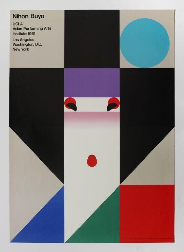
What it is — poster for a guest performance by the Nihon Buyo troupe (classical Japanese dance with
shamisen) at UCLA and on a Los Angeles – Washington – New York tour, 1981; one of
twelve posters commissioned for five traditional stage forms by Masaru
Katsumi from leading Japanese designers (V&A). Offset lithograph, Toppan, 103 × 72.8
cm (MoMA); LACMA adds DX Diapaque paper. From UCLA's donation to MoMA the same
year — the poster entered the museum before the tour had even ended.
Composition — the format is divided into three equal vertical bands (0–33 /
33–68 / 68–100% of width) and the face lives only in the middle one. Top to bottom in the middle
band: black (hair) 0–26%, purple comb 26–34%, pink gradient (forehead, eyebrows, eyes)
36–54%, white face with red mouth (mouth at 48% w / 62% h, Ø 5%
w), green plane 84–100% (kimono). Left band: a large black triangle (hair falling
over the shoulder) from the top to ~85%, below it a blue rectangle; right band:
light grey with a turquoise circle (hair ornament, centre at 82% w / 14% h, Ø 22% w)
and a red rectangle at bottom right (74–100% h). The eye enters at the eyes (41–45% h),
drops to the red mouth, then the triangle's diagonals lead it to the corners — and bring it back. The text is
the only element off the grid: a small block top left (2–30% w, 3–20% h).
Colour — nine colours, none a primary triad by the Swiss recipe: black,
light grey, white, purple, magenta gradient, vermilion, green, ultramarine,
turquoise. The hierarchy is carried by the only gradient on the poster: the pink airbrush of the cheeks
and eyelids. Everything else is flat; that's why the eye goes straight to where the skin is. Red is
tripled (mouth, corner of the eye, lower-right rectangle) and thereby ties the face to the format.
The v1 claim about a „traditional dyeing palette“ (vermilion, indigo, moss) remains an
unverified claim — the poster also has turquoise and ultramarine, which no source
links to textiles.
Typography — grotesque (sans serif) (Helvetica class), four short lines, left-aligned, small.
Latin script because the audience is American; there is not a single Japanese character. The text is deliberately
below the image's threshold: at five metres it doesn't exist, at half a metre it says everything. The typeface is not
confirmed in any source.
Message — at three seconds: face, woman, Japan. At five metres: three colour bands and
a red circle. Cooper Hewitt (Nomiyama): „limited colors and forms on a grid
structure“ that capture „the typical geisha look“ — pink cheeks, red
make-up. NGV (Crothers): „angular, fragmented forms that construct an abstracted
face of a maiko“. The message carries through because maiko make-up ALREADY IS
geometry (white plane, red dot, flat black hair) — Tanaka didn't abstract the face,
he showed that tradition had done it before him.
Why exactly this way — the constraint was an audience that doesn't know what nihon buyo is, and
twelve posters for the same programme: it needed a sign that stands alone in the series and needs no
translation. The three-band grid gives it Swiss legibility from the street; the maiko make-up gives
content. Offset (not screenprint) allowed for the gradient — without it the face would be a mask, not skin.
What would kill it — remove the gradient, leave a flat pink rectangle: the poster
becomes a diagram and all the colours become equally important. Or: centre the face across all
three bands — the asymmetry (black triangle left, circle right) that keeps it
Japanese rather than Bauhaus-like disappears.
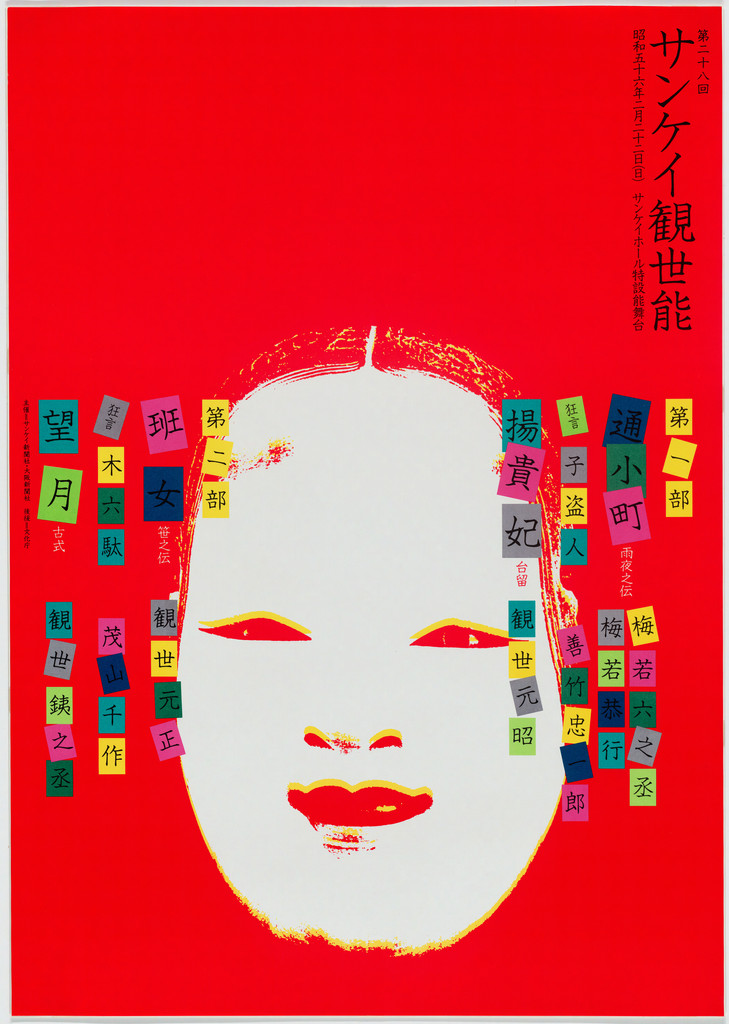
What it is — poster for the 28th annual Noh performance by the Kanze school
at Sankei Theatre, Osaka; offset lithograph 102.8 × 72.5 cm, gift of the designer
to MoMA. Part of a series Tanaka has made since 1958 (5. — NMAO; 8. 1961 —
Cooper Hewitt; 16. 1969 — UMMA: „black-and-white signs in multicoloured circles
on a black ground“).
Composition — cinnabar to the edge. White Noh mask (ko-omote, young woman)
frontal, in the lower half (18–79% w, 34–91% h), cut out from a photograph and
reduced to white with barely visible grey-pink modelling. Around the mask, like
confetti, two columns of small coloured rectangles with kanji (left 3–28% w,
right 65–97% w) — these are titles of the pieces and performers, the programme
of the performance. Title „サンケイ観世能“ vertical, top right, white, bold
(76–92% w, 3–31% h). The eye enters on the black eye-slits of the mask, then
the coloured squares lead it up toward the title.
Colour — one flat cinnabar plane carries 70% of the surface; the white mask
is the negative; all other colours (turquoise, yellow, magenta, green, purple)
live only in tiny squares and so read as kimono fabric, not as a poster
palette. The red of the mask (lips) is the same as the ground — the mask
"burns" from within.
Typography — Japanese gothic for the title, small grotesque for the Latin
script below; the programme in the squares is set so small it only reads from
half a metre away. Specific typeface not confirmed.
Message — at five metres: red and a white face — Noh. At half a metre: the
coloured squares become the performance schedule. The same two-distance game
as in Corita Kent (Sister Mary Corita)/Herb Lubalin (dva-rastojanja-citanja), but here the second
message isn't hidden, it's DISGUISED as ornament.
Why exactly this way — the twenty-eighth poster for the same client for the
same performance: the constraint is that it must be different every year while
remaining Kanze. The solution — never the same system (circles in 1969, grid in
1958, photograph of the mask in 1981), always the Noh subject. The series holds
identity through the SUBJECT, not the form.
What would kill it — align the squares into a neat table: the programme
becomes information, the ornament disappears, and the mask is left alone on
red like a souvenir.
What it is — poster for the two-hundredth anniversary of Sharaku's brief
period of activity (1794–95); full title on the poster: „Sharaku Ōkubi-e Prints
composed from Nine Circles“. Offset 102.9 × 73 cm (UMMA, gift of the DNP
Foundation); TLmag writes screenprint. Image source: Sharaku's portrait of the
actor Sawamura Sōjūrō III in Hana-ayame Bunroku Soga (NGV, Crothers) — so a
KABUKI ACTOR, not a geisha as a PGDA student writes.
Composition — dark grey ground (Sharaku's mica-grey background). Nine
circles: white circle of the face (centre 45% w / 31% h, Ø 72% w), light-blue
segment of the crown, black circle of side hair (81 / 26%, Ø 32%), a small
black arc of a topknot, olive circle of the fan covering the lower half of the
face (29 / 71%, Ø 66%), brick-orange (84 / 60%) and blue (80 / 77%) circle of
the collar. The only non-circles: two eyebrows and two eyes by brush, gaze to
the left (y 40%). The eye enters on the gaze, slides across the fan into the
lower-left corner, then the collar circles bring it back right. Title vertical
along the right edge (92–98% w, 3–21% h).
Colour — seven flat colours, no gradients, no outline; the contrast is
carried by the white face on grey. Olive and brick (secondaries) instead of
red and green — the palette is Sharaku's, not the Bauhaus's.
Typography — bold kanji gothic, vertical; Latin script in one small line
below. The typography is deliberately invisible from a distance; the poster
signs itself with the circle.
Message — Neue Sammlung: „compositional principles based on nine circles“.
The message isn't "Sharaku", but "Sharaku was already geometry": ōkubi-e is a
close-up, the fan cuts the face, the hair is a black mass — Tanaka simply
replaces every element with a circle and shows that the portrait still holds.
Why exactly this way — a self-imposed constraint (in the title!): circles
only. When the primitive is singular, the only free parameters are size,
position and overlap — and these three parameters become the entire
expression. The hand-drawn eyebrows are the exception that proves the rule:
the face doesn't look without them.
What would kill it — add a nose or a facial outline: the circles become
illustration. Or: move the fan so it doesn't cut the face — Sharaku's framing
disappears and a snowman is left.
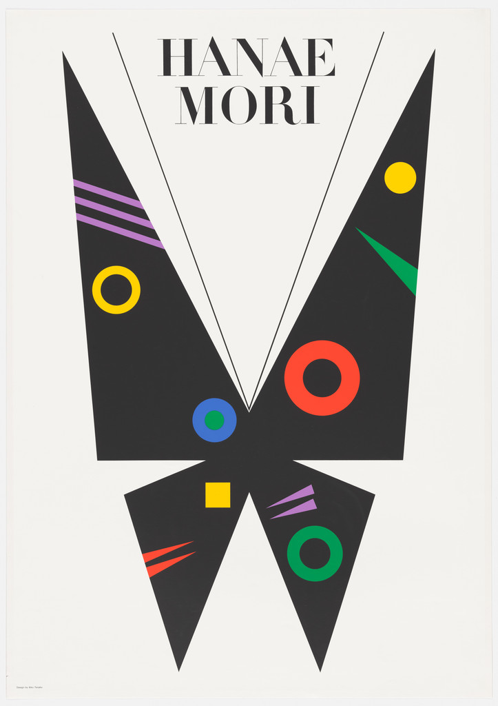
What it is — poster for the fashion house Hanae Mori; screenprint
103.2 × 72.8 cm, gift of the designer. Tanaka is the author of Mori's
butterfly logo (Wikipedia, ref 2 — the only source).
Composition — broken white ground; a black butterfly made of four
triangles (two large wings above, two narrower below, tips meeting in the
middle as the body) occupies 10–85% w and 9–91% h — almost the whole format,
but with space around it. Two thin lines as antennae going up. On the black
wings, "patterns": solid circles (blue, red, yellow, green), rings, three thin
diagonal lines (purple, red, green), a small yellow square. Title HANAE MORI
centred at top, between the wing tips (9–18% h). The eye enters on the red
ring in the middle of the right wing, then circles through the patterns.
Colour — the black-and-white construction carries everything; five pure
colours only as tiny accents (< 5% of surface). Remove the colours — the
butterfly remains. This is the crno-bijelo-prije-boje test passed.
Typography — a Didone (Bodoni class), capitals, letterspaced, thin: a
fashion register, Parisian, deliberately opposite to the Bauhaus circles
below. Not confirmed.
Message — butterfly = Mori (logo); patterns = collection: geometry as
fabric print. At five metres: black butterfly. In three seconds: fashion +
Japan + Bauhaus.
Why exactly this way — screenprint demands flat colours without overlap;
the butterfly is a sign that already exists, the poster just changes its
"fabric". Constraint: it must not look like a butterfly illustration — hence
triangles, not wings.
What would kill it — round off the wings. Or add a photograph of a dress:
the butterfly becomes a logo in the corner.
What it is — poster for the "Japan" exhibition, 1986; screenprint
103 × 72 cm per PGDA (the only technical source — there is no museum record;
NMAO exhibited it in 2016 as Japan 1986). Client unverified; print shops
write "Tokyo National Cultural Festival" — not to be taken as fact.
Composition — orange to the edge. A deer seen from above and behind, head
lowered to graze: the body is almost a circle (centre 48% w / 35% h, Ø 62% w),
the legs go down to 90% h, the head is at the bottom centre. White and pink
spots of a fawn along the back; red half-circle of the ear, blue rhombus of
the eye. JAPAN across the top (3–12% h), five letters spaced across the whole
width, each a different colour (purple, red-orange, blue, brown, olive). The
eye enters on the word, falls down the circle of the back, stops on the red
ear.
Colour — the whole palette is secondary: orange ground, olive-khaki deer,
brown and purple letter. Not a single pure primary except the tiny blue eye.
The edges of the deer are soft, airbrushed — Tanaka's second gradient in
this series, here across the whole silhouette, like Sōtatsu's tarashikomi
when ink bleeds.
Typography — wide grotesque capitals, tracking so wide the word becomes
five separate signs; each letter in a different colour is the same device as
the spots on the deer — the letter is a pattern. Not confirmed.
Message — the deer from Nara (Tanaka's home town; the Kasuga deer are
sacred) as a sign for Japan instead of the flag, Fuji, or cherry blossom.
Writing for the Public Realm (2013) claims the poster quotes ancient scrolls
and that the "elegant curve of the back" is emphasised by colour; my
hypothesis — Sōtatsu/Kōetsu Deer Scroll — is not confirmed, not to be
entered as fact.
Why exactly this way — the word JAPAN at every other exhibition goes with
a red circle; the constraint was to avoid the cliché while remaining legible
to a foreigner. Solution: an animal every tourist meets in Nara, in a colour
that is neither red nor white.
What would kill it — a hard outline around the deer (it becomes a
pictogram); or JAPAN in a single colour (the word would take the poster over
from the animal).
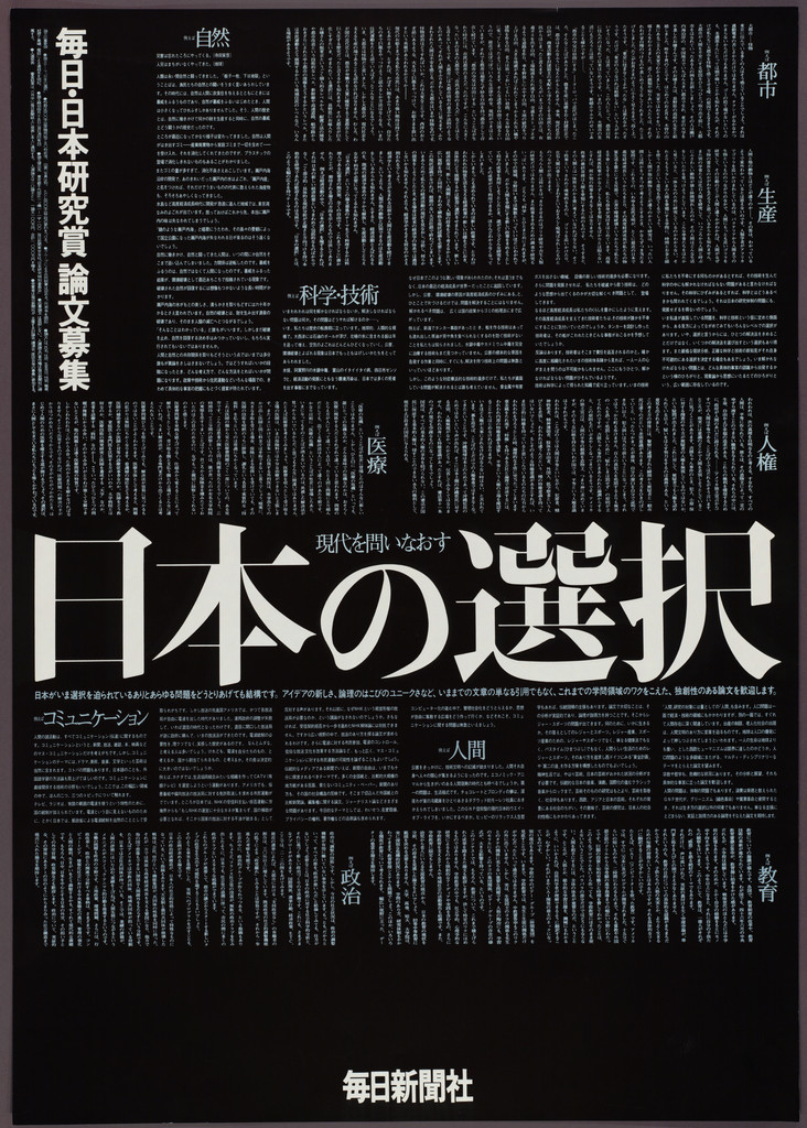
What it is — poster for the Mainichi Prize essay contest on Japan studies;
offset lithograph 102.8 × 72.5 cm, gift of the designer.
Composition — the whole format is A SINGLE NEWSPAPER PAGE IN NEGATIVE: dense
vertical columns of small type, white on black, to the edge. Across the middle (2–98%
w, 47–61% h) a bold horizontal headline "日本の選択" (Japan's Choice) in mincho.
Top left, in a framed column, the name of the prize and the call; bottom centre
the Mainichi Shimbun logotype. The eye enters on the headline because it's the only horizontal
element in the vertical type, then tries to read the columns and realises it's a wall.
Colour — only black and white. Newspapers are black on white; he inverts them, turning
the page into night — the "choice" becomes serious.
Typography — mincho, two sizes at a ratio of about 1:40; no other typeface.
Not confirmed, but the class is obvious (Mainichi's newspaper typesetting).
Message — the client is the newspaper: the poster IS a newspaper. The content of the contest
(Japan chooses) is in the headline; the rest is texture that says "this is where writing happens."
From five metres: a black rectangle with white lettering. From half a metre: a page.
Why exactly this way — one operation (invert) on a found object
(the page) solves both the client's identity and the theme; nothing is drawn. The constraint
may have been budget/deadline — offset in one colour.
What would kill it — any other colour; or a photograph of Japan. Or typesetting
that could actually be read — then the page would become information, not
form.
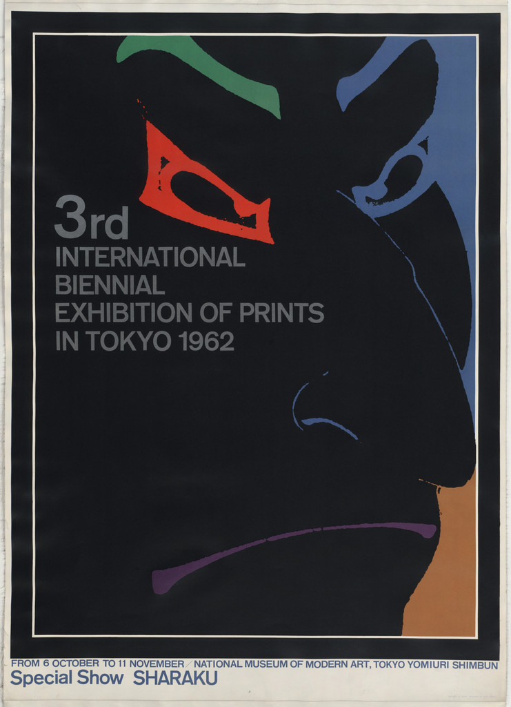
What it is — poster for the 3rd International Biennial Exhibition of Prints,
National Museum of Modern Art Tokyo (on the poster: 8 October – 11 November; "Special Show
SHARAKU"); photolithograph; MoMA lists 72.4 × 101.5 cm (w × h) — the image shows
a vertical format, so it's probably 101.5 in height. Gift of the artist, 1963 — Tanaka is 32.
Composition — black to the edge. Out of the blackness emerges a fragment of Sharaku's face
(a large actor's face, tilted): only what is coloured is visible — cyan sclera
with a black pupil (63% w / 39% h), red-orange lines of the eyebrow and eye rim,
purple lips (70 / 73%), ochre plane of the kimono at the right edge (75–100% w, 47–83%
h). The rest of the face is black like the background — the contour exists only where the colour
stops. Text top left (6–57% w, 24–44% h), "3rd" in bold red-orange,
the rest white; date bar at the bottom.
Colour — black + four colours, all as FRAGMENTS: colour does not describe the face,
it produces it. Same procedure as Sharaku's mica print: the face glows out of a dark background.
Typography — grotesque capitals, left-aligned, four lines; "3rd" at a larger size
as the only emphasis. Not confirmed.
Message — from five metres: an eye watching you from the dark. From half a metre:
a print biennial + Sharaku. The fragment works because Sharaku's gaze (mie) is the most
famous shot in Japanese printmaking; an eye is enough.
Why exactly this way — photolithography allows taking a reproduction of a print
and isolating a few tones; the black background hides everything unnecessary and saves colours.
Thirty-three years later the same actor gets nine circles (03) — two
solutions from the same source, two techniques.
What would kill it — show the whole face. Or a white background: the fragment would become
a badly cropped photograph.
What it is — poster for the reopening (新しくなってオープン, 1 September)
of the Muji Aoyama 3-chōme store; PGDA dates it "c. 2001" per the ggg library —
if correct, it's among Tanaka's last works (he died January 2002). Technique and
dimensions unknown; the image is a photograph of a reproduction from a book, so the colour is not
reliable.
Composition — white background. A thick black brush stroke, almost a single line:
a mother holding a child — two faces (profile and en face) embracing, 11–95% w, 11–70% h,
without a single detail except eyes and mouth. Slogan vertical at top centre (48–56% w, 3–23% h).
Bottom left, small credits and the MUJI logotype in a burgundy block (2–22% w, 83–94% h). The eye
enters on the child's two eyes, slides along the stroke.
Colour — black on white; the only colour is the house burgundy of the logotype. Muji's identity
is the absence of colour — this poster honours that completely.
Typography — slogan in mincho, with a full stop (。) as part of the sentence — Koike's
copywriting register; logotype in gothic. Not confirmed.
Message — "Love does not decorate itself": the drawing is proof of the sentence. One stroke,
without ornament — the message and the form are the same thing. This is the Muji programme in one image:
in 1980 they stripped the logo off the product, kraft paper, red lettering, "わけあって、
安い" (Lower priced for a reason) — an identity made by SUBTRACTION (Wikipedia
Muji; Koike).
Why exactly this way — Muji cannot advertise the product as a brand; all that's left is a stance.
The brush gesture is Tanaka's personal register (Neue Sammlung: "calligraphic
expressivity") set against his own geometric system — and against
Muji's machined tidiness.
What would kill it — a photograph of the product. Or a clean vector line
instead of a brush: the sentence would become a lie.
Principles:gest-rukom-nasuprot-rezujedna-slika-jedna-rijecoduzimanje-kao-autorstvo (the proof is the Muji programme of 1980, not the poster itself)
To verify against the image: date (2001 or earlier — Aoyama was the first Muji store
in 1983; "愛は飾らない" is a known Muji campaign — when?); technique, dimensions; whether the stroke
is brush or marker.
Other works — evidence, no analysis
Muji identity, 1980 — with Koike and Sugimoto for Seiyu; 40 products, kraft +
red lettering, cellophane, no logo on the product; oduzimanje-kao-autorstvopaleta-po-iskljucenju · Wikipedia Muji, Koike (muji.com).
Rope, 1979 — 6 woodcuts with the Adachi Institute, 36 × 23.5, washi by Iwano Ichibei,
200 sets; "graphic art" as a lifework (Adachi).
Japan Style, 1980 — book accompanying the V&A exhibition (Wikipedia; UMMA 2017/2.24 poster).
C. R. Mackintosh Design, 1979; Green & Water / Mind / Human Being, 1982;
House Foods, 1982 — Walker Art Center (28 records, not viewed).
Tradition and New Techniques, 1984; Music Today '85; Close Up of Japan London,
1985 — NMAO / UMMA.
Morisawa & Co., 1986 — offset 102.5 × 72.7; MoMA 625.1990 (typographic —
candidate for a follow-up).
Hiroshima Appeals, 1988 — screenprint; white dove against grey haze after Hiroshige
(Cooper Hewitt, Soos); JAGDA sent it to Obama in 2009.
Ikko Tanaka Graphic Art "Botanical Garden", 1990 (NMAO); Communication &
Print, 1991 — a face without a grid, three dots = eyes and mouth (Cooper Hewitt 18645863,
Nomiyama).
Bridge to practice: poster · graphic design · motion
Poster
Three bands, face in the middle (01): split the format into three equal verticals;
the motif may live in one, the other two carry colour and diagonal. Check:
blur it — can you see three bands? If what you see is a "centred image with margins", you haven't
done it.
One gradient in a flat piece (01, 05): everything flat, one spot of airbrush
(Illustrator: Gradient Mesh or Feather on one shape). That spot is where the eye
lands. Two gradients = none.
One primitive (03): a poster made only of circles (or only of triangles, 04). The freedom
is in size, position, overlap. Title in a vertical band at the edge, outside the image.
Found document in negative (06): for a client who HAS a document (newspaper,
form, score, code) — a page in negative across the whole format, one
large line across the middle.
Graphic design
Series without a house style (02): when the same client asks for the same event every
year, keep the OBJECT (mask, sign, actor), change the system. The identity is in the subject, not the
template. The opposite of Lester Beall REA and Massimo Vignelli Unigrid.
Data as ornament (02): schedule, prices, names — if there are 30+, arrange them
as a pattern (squares, small circles) in a colour that appears nowhere else on the format; they read from
half a metre, from five metres they're fabric.
Muji lesson (08): identity by subtraction only works if the rule is absolute
(never a logotype on the product, never colour). One exception and you're back to an ordinary brand.
Secondary palette (05): orange + olive + purple + brown; zero
primaries. It immediately looks like "someone's", not default.
Motion
Face from modules (01): in AE a face made of 8–10 rectangles and circles on a 3-column
grid; animation = only Position/Scale of a module along the grid (snap), never rotation.
The expression changes by moving one module by one step.
Overlapping circles (03): nine Shape layers, Z-order is the only
animation — the face appears when the fan "comes to the front". No morph needed.
Emerging from black (07): the frame is black; colour appears only on the eye and mouth
(Track Matte with a soft edge); the face is never whole. Kabuki mie as the cut.
Invert (06): one effect (Invert) on the whole frame as the only event in
5s — before it the content is legible, after it the content is a wall.
Bad imitation
"Japanese style" as a palette — red, black, white, circle: that's a flag, not
Tanaka. Tanaka uses turquoise, olive, purple, orange; he gives red
only to the mouth. Cause: the look was copied (the Sun), not the rule (the palette comes from the object —
make-up, kimono, mica).
Geometric face without a source — rectangles and circles arranged into a face, but
from no specific tradition (not maiko, not Sharaku, not a mask). It comes out
a Memphis avatar. Cause: the method of reduction was copied, but there was nothing TO reduce —
Tanaka always reduces an existing system of signs.
Grid + tradition = collage — a ukiyo-e photograph placed into a Swiss
grid with Helvetica. Two things side by side. Tanaka doesn't put tradition INTO the
grid; he shows that tradition ALREADY HAS a grid (maiko make-up, ōkubi-e framing). Test:
remove the grid — does the image stay the same? With Tanaka, yes, because the grid is in the motif.
Gradient everywhere — the airbrush cheek from Nihon Buyo applied to all shapes →
1980s advertising. Tanaka has one gradient per piece, the rest flat.
The brief through their eyes
For YT gaming animations (title card / episode thumbnail): Tanaka would first ask
which object from gaming culture already IS a system of signs (controller, health bar,
an 8-colour pixel character, ESRB rating) — then reduce that object to three or four modules on a
grid of three bands and give it one gradient where an eye is needed (a screen, a character's eye).
He'd put the title in a small vertical band at the edge, not over the image. The palette
wouldn't be RGB neon but secondary: orange, olive, purple — so the card in a
feed of neon would stand out as the only adult thing there.
Exercises
Face from modules (45 min, Illustrator). Format 2:3, grid 3 × 6. Make a face
of a maiko / mask / Sharaku using only rectangles and circles aligned to the grid.
One triangle and one gradient allowed. Constraint: no shape may
cross from one band to another except the triangle.
Nine circles (30 min). A portrait of anyone (a well-known photograph) made only of 9
circles + 4 brush strokes (eyebrows, eyes). Title vertically at the right edge.
Compare: wherever you needed a tenth circle — that's where there was excess information.
Series without a template (one evening). Same client, same event, three years:
three cards with the same OBJECT (e.g. a controller) and three different systems (grid,
photograph in negative, circles). Alvin Lustig test: the edition from 5m, the number from half a metre.
Motion study
"One module moves" — 5s, AE, one frame. Face from 01 as 9 shape layers
on a 3-column grid. 0–2s static; 2,0–2,4s: the red mouth (circle) jumps one
module to the right, snap, no easing in space (Hold keyframe + 4-frame ease); 2,4–5s
static. The expression has changed, nothing else. Rule: no other layer may
move by even one pixel. Colours: black, grey, purple, vermilion, green, ultramarine,
turquoise + one Ramp on the cheeks.
Rebuilding the benchmark
The skeleton of Nihon Buyo 1981 (raster/svg/ikkotanaka-01.svg, not yet made), measurements
from a V&A framemark screenshot, format 72,8 × 10³ (≈ 0,707):
- three vertical bands 0–33 / 33–68 / 68–100 % w;
- middle band from the top: black 0–26 %, purple 26–34 %, grey slit in the black
(parting) around 48–52 % w / 0–26 % h, gradient 36–54 %, white 54–84 %, green 84–100 %;
- eyes: two black quarter-circles with a red corner, y 41–45 %, x ≈ 38 % and 62 %;
- mouth: red circle, centre (48, 62) %, Ø 5 % w;
- right: turquoise circle centre (82, 14) %, Ø 22 % w; red rectangle 68–100 % w,
74–100 % h;
- left: black triangle from the top-left corner of the middle band diagonally to the left
edge at ~85 % h; blue rectangle 0–16 % w, 83–100 % h; white collar triangle
at the bottom centre (40–48 % w, 84–100 % h);
- text: block 2–30 % w, 3–20 % h, four lines, left-aligned.
Task: build it in 45 minutes without the original, then overlay.
Notes on sources
Nihon Buyo technique: MoMA and LACMA "offset lithograph"; V&A "screen print and
rotogravure". The gradient on the cheeks argues for offset/gravure. MoMA used.
Nihon Buyo measurements: MoMA 103 × 72,8; LACMA 101,6 × 71,1; V&A 75,5 × 49,2 — the V&A
is either a smaller touring format or an error. MoMA used.
Number of circles in 03: the title says nine; on the screenshot I count eight full ones + the arc
of the topknot. To verify against a larger image.
JAPAN 1986: no museum record; screenprint and 103 × 72 from PGDA only; client
unknown; the Sōtatsu/Kōetsu deer scroll is MY assumption, not a source.
Muji poster 08: the date "circa 2001" from PGDA/ggg only; "愛は飾らない" possibly an older
campaign; the image is a photograph of a book. Technique and measurements unknown.
Teachers: Kinoshita and Yoshihara from Wikipedia only (ref 2) — unconfirmed.
v1 quote dropped (not found). v1 claim "palette of traditional dyeing"
(vermilion, indigo, gold, moss) is not confirmed in any of the 8 works —
the works show turquoise, ultramarine, orange, olive, purple.
v1 claim "flat, unmodulated fields" — incorrect for 01 and 05: both have airbrush.
v1 list of works: 20 PGDA entries; 12 usable; "Gift of Ikko Tanaka" (13488)
is untitled; Hanae Mori PGDA 22895 is a screenshot; MoMA was a better roster.
Portrait: not sourced — Neue Sammlung / 21_21 have none free to use; remains false.
Orientation of 07: MoMA measurements 72,4 × 101,5 read as w × h contradict the image.
There is almost no analytical text on individual works: Eye 44 (2002) only a caption
("elegant, but spoke to the person in the street"), Cooper Hewitt two sentences,
NGV description of the Sharaku, Neue Sammlung one sentence about the nine circles. Fields 2–4 are
mostly a v2 reading of the image.
Difference from its pair
Tadanori Yokoo ↔ ikkotanaka: same Tokyo, same Persona 1965, same decades — Yokoo
piles up registers in a single piece until they burst; Tanaka reduces one traditional
sign system to modules until only the gaze remains. Maximalism / reduction —
both from the same tradition (ukiyo-e), one quotes it as noise, the other as geometry.
Josef Müller-Brockmann ↔ ikkotanaka: both grid and flat colour — MB derives the grid
from music/mathematics and fills it with abstraction; Tanaka finds the grid in the kimono and make-up
and fills it with the face. For MB the grid is ethics; for Tanaka the grid was already there.
Armin Hofmann ↔ ikkotanaka: fragment of a face as sign (Stadttheater / Print Biennale
1962) — Hofmann's fragment from observing a photograph, tonal; Tanaka's fragment from
a Sharaku print, colour only, no tone.
Peter Saville ↔ ikkotanaka: both oduzimanje-kao-autorstvo — Saville strips the name off
the sleeve so the object becomes an artefact for the initiated; Tanaka (Muji 1980) strips the logo off the
product so the object becomes a commodity for everyone. Same operation, opposite audience.
Alvin Lustig ↔ ikkotanaka: serija-sa-individualnim-licem — Lustig holds the regime
(sign + 2–3 colours) and varies the layout; Tanaka holds the SUBJECT (Noh) and varies the whole
system. Lustig's series is recognised by form, Tanaka's by theme.
Max Huber ↔ ikkotanaka: sekundarne-boje-umjesto-primarnih — Huber takes them to
look more modern than the Swiss; Tanaka takes them from the subject (mica, kimono,
Nara) and ends up more modern along the way.
Herb Lubalin ↔ ikkotanaka: zid-teksta-kao-oblik — Lubalin sets his own text into a
wall; Tanaka takes someone else's ready-made wall (a newspaper page) and inverts it.