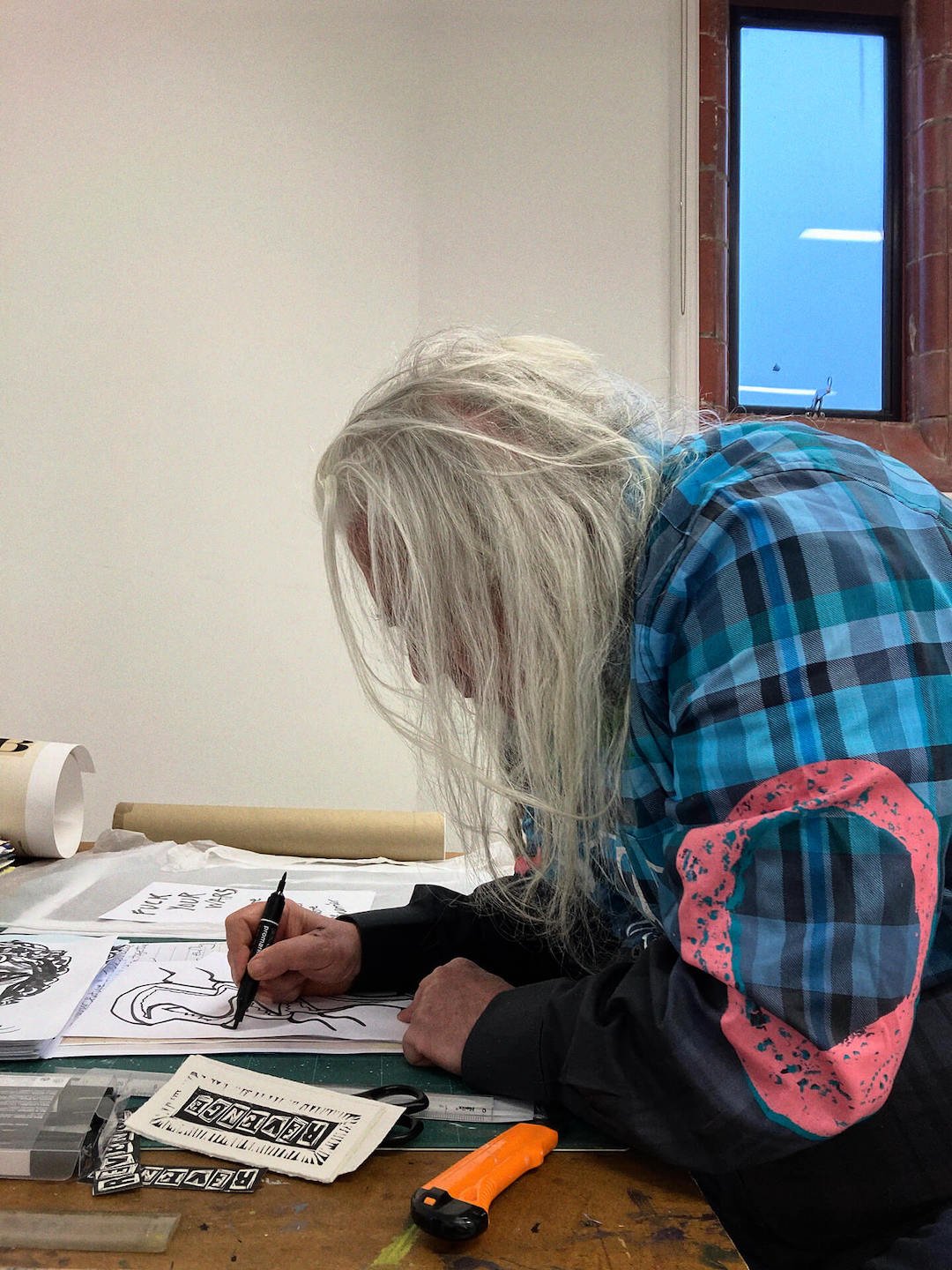
art director for the Sex Pistols 1976–79; Suburban Press 1970–75; political artist Croydon (London) → Croydon / London → Paris → Brixton → Liverpool
Palette of the œuvre
Notes: #F5E642 fluo yellow, NMTB — hex estimated from image, not confirmed; #FF2D8B fluo pink, NMTB — estimated; #C8102E and #012169 (Union Jack, GSTQ and Anarchy — standard flag values, not measured
„We couldn't really afford things like Letraset, so it seemed natural to cut things out and do collage, to save money." — Reid, according to AnOther Magazine 2023. (We couldn't afford Letraset, so it was natural to cut and paste — to save money.)
v1 quote „Anyone can do it. That was the whole point." was not found in any source — removed.
Biography
Born 16.1.1947. in Croydon, south London, into a socialist family with a druid
lineage (great-uncle George Watson MacGregor Reid was a „Chief Druid" — this will return
in the late work). Wimbledon School of Art 1962–64, then Croydon College of Art 1964–68,
where he organises a student occupation with Malcolm McLaren in 1968 — the same year
both of them absorb the Situationist International in Paris. That's the only „teacher"
that can be verified: not a professor but a movement, and not in a classroom but on the street.
After school, 1970–75, he runs Suburban Press in Croydon: six issues of „technologically
primitive graphics and Situationist texts" (Eye), plus stickers — This Store
Welcomes Shoplifters, Save Petrol Burn Cars, Keep Warm This Winter — Make Trouble,
and counter-propaganda for striking miners in 1973–74. Tools: „scalpel, glue and Xerox machine"
(Marchant). This is where the ransom-note typeface is born — not as a style, but as an economy: no money
for typesetting or Letraset, letters are cut from newspapers.
In late 1975 / 1976 McLaren telegrams him to do graphics for a band he runs with
Vivienne Westwood out of the SEX boutique on King's Road. Over the next three years (1976–79) Reid
produces the entire visual identity of the Sex Pistols: logotype, posters, single sleeves,
album, film. All on the same technology as Suburban Press, only now with the process camera at
the Better Badges workshop (Joly McFie), which turns a small collage into an offset plate.
After the Pistols: Paris, then Brixton (the group Assorted iMaGes), the retrospective Peace Is
Tough 1987–97, a ten-year commission for Strongroom Studios („colour magic and
sacred geometry"), campaigns against the Poll Tax and Clause 28, Afro Celt Sound System,
Comme des Garçons 2009, and finally a 100-metre OVA symbol made of wildflowers in the Lost
Gardens of Heligan 2021–23. Died in Liverpool 8.8.2023. (Marchant, Wikipedia; Clash
gives 9.8.). What matters for design history fits into three years — but the method
stayed the same for fifty.
Influences
Studied with
Wimbledon School of Art 1962–64 (Eye, Safety pins and Letraset); Wikipedia states enrolment in 1962
Croydon College of Art 1964–68 — no confirmed named teacher; only the 1968 sit-in with Malcolm McLaren is confirmed (Eye, Designboom, V&A)
Borrows from
Situationist International — Paris 1968 (Marchant); texts in Suburban Press (Eye); the beach photograph for Holidays in the Sun from a situationist publication (V&A S.775-1990); Nowhere/Boredom buses from a pamphlet by the group Point-Blank! 1973 (Flashbak, Jacobs)
all DIY/punk graphics 1977–; Eye: the method was universalised and absorbed into the establishment, which he himself parodied in Letraset Multi-Punk 1988
Peter Saville (same roster, era 1975 — an inverse response: coldness instead of the cut) — to verify when working on saville
Barbara Kruger (text over a found photograph; era 1985) — to verify when working on kruger
Contemporaries
Malcolm McLaren (partner, client, co-author of the concept)
John Varnom (co-author of the Never Mind the Bollocks artwork per V&A S.863-1990)
Point-Blank! (David Jacobs, Francis Rubinstein) — authors of the bus image
Wolfgang Weingart — same era, breaking down the system from within, not from outside
Who he learned from
Wimbledon School of Art (1962–64), Croydon College of Art (1964–68) — no named
teacher in any source. Not to be attributed.
Malcolm McLaren — not a teacher but a partner: same school, same sit-in, same Paris
1968, then client. Louder Sound attributes to him the quote about the „ugliest cover" (see work 07).
What he loots
The Situationists — détournement: take material from culture and turn it against
it. For Reid this isn't theory but a production process: the beach photograph for Holidays in
the Sun was lifted from a Situationist publication (V&A); the Nowhere/Boredom
buses are a ready-made image from the group Point-Blank! from 1973 (Jacobs — see „Notes on sources").
Dada photomontage (Heartfield, Höch, Grosz) — the cut as a political argument.
The state as image supplier — Grugeon's official jubilee portrait, the Union Jack,
the anthem title. Reid draws nothing; the state has already drawn it all for him.
Tabloids — letters cut from newspapers carry ransom-note meaning before anyone uses them that way.
Who he influenced
The entire DIY graphics scene after 1977 — fanzines, sleeves, posters. Eye: the method is
„universalised" and swallowed by the establishment; Reid himself parodied this
with the Letraset Multi-Punk set in 1988 — selling his own subversion as a sheet of transfer letters.
Peter Saville (era 1975) — a directly opposite response to the same industry (cold,
quotation-based, clean). To verify when working on it.
Barbara Kruger (era 1985) — text over found photography as attack; to verify whether
there is a documented connection or just an affinity.
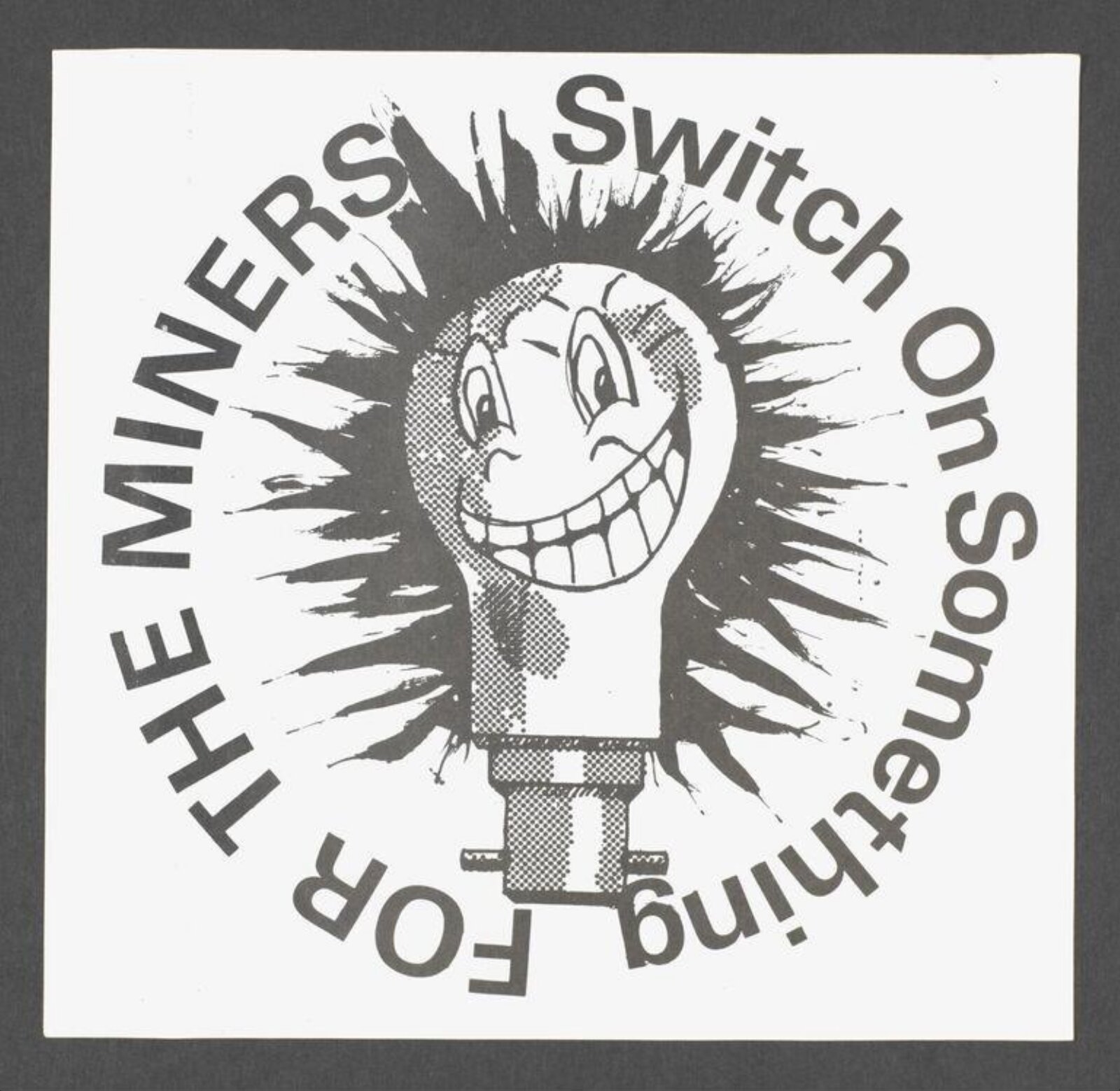
What it is — a Suburban Press sticker, screenprint on paper with an adhesive
backing, winter 1973–74 (the miners' strike, the government's energy-saving campaign). V&A:
counter-propaganda — instead of saving energy as the government asks, it calls
to „switch on something" for the miners. The dimension in the record (58 × 76 cm) doesn't match a sticker —
not to be trusted.
Composition — a square; in the centre a smiling lightbulb-face (halftone), around it a
black starburst mark (an „explosion" of light); text in a ring around the whole figure,
reading in a circle: SWITCH ON SOMETHING top right, FOR THE MINERS bottom left. The eye
enters at the grin, then goes round in a circle — no beginning or end, like a badge.
Colour — black and white, one screenprint colour. The halftone face against a solid
black mark: two tones from a single colour.
Typography — bold grotesque bent along the circle (Letraset-type; not
confirmed). This is the ONLY work in the series with „proper" typesetting without a ransom-note
typeface — in 1973 Reid was still using bought letters when the slogan needed
to look like an official campaign it was subverting.
Message — an inverted government appeal: the sentence structure stays official, the verb
is reversed. Three seconds: lightbulb + grin = something cheerful about electricity. Five metres: the sticker
is small — it doesn't work at five metres, it works at half a metre on a lamp post, in a toilet, in a shop window.
Why exactly this way — the sticker is the only medium that carries its own distribution: you print
a hundred copies, the public sticks them up. The circle is the form of a badge/stamp — it looks official, so
it passes as part of the campaign it's attacking.
What would kill it — an angry expression on the lightbulb. The grin is why it works: the government pleads,
the sticker laughs.
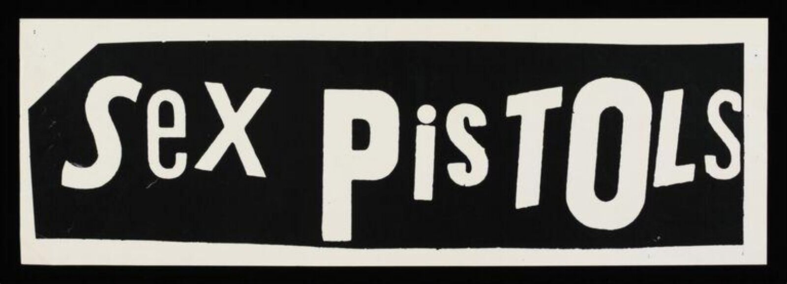
What it is — a small banner 16 × 48 cm, screenprint, black and white; V&A: Reid's
second logotype design, first used on a flyer for a concert at the 100 Club on 31.8.1976.
Composition — a black rectangle, inside white cut-out letters; the letters aren't on
a baseline but each is slightly shifted and rotated, S-e-X: capital-lowercase-capital,
P-i-S-T-O-L-S: lowercase and shifted in the middle. The rectangle isn't quite rectangular —
the edges are cut by hand, top and bottom aren't parallel.
Colour — inversion: white letter on black. On a wall or a sleeve it reads as a hole
in the paper, not as a sign.
Typography — every letter is a different object: different typefaces, sizes, angles.
That's the whole identity decision: the logotype isn't a typeface but a PROCEDURE, so it can be
re-cut every time and stays recognisable.
Message — ransom note: someone has taken a name and is holding it hostage. Three seconds: yes. Five
metres: yes — a black block with white marks of letterform rhythm is recognisable even unread.
Why exactly this way — no money for typesetting; but even if there had been, typesetting would give a band that
looks like every other one. Cut letters carry a threat before they're even read.
What would kill it — aligning the letters to a baseline. The moment the letters sit on a line
it's a font, and a font can be bought.
Principles:nadjeno-slovo-nosi-porijekloserija-kao-identitetTo verify against the image: whether the letters are from newspapers or hand-cut from white paper — on
this reproduction they look cut from solid white, not from newspaper headlines.
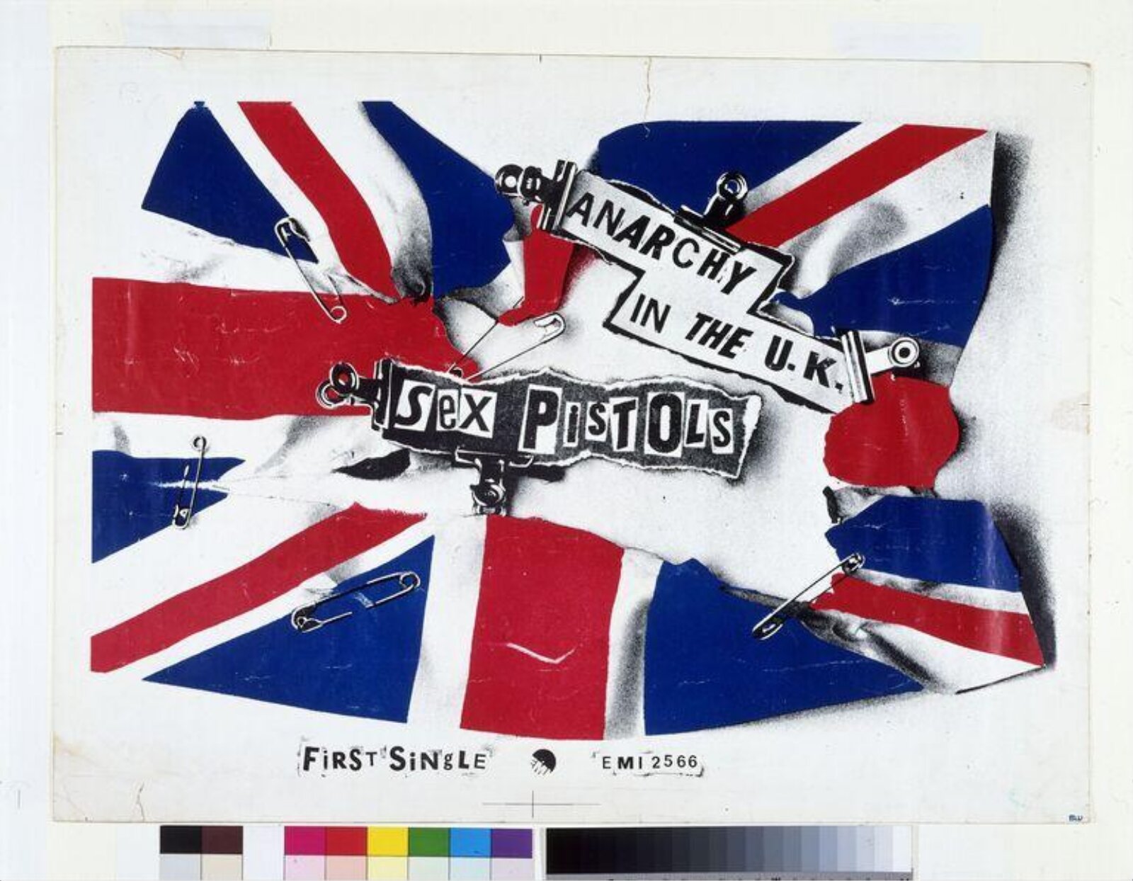
03 · Anarchy in the U.K. — poster for the first single (1976)
What it is — promotional poster for EMI, November 1976; V&A screenprint 71 × 98 cm, MoMA
same motif as lithograph 43.2 × 61.6 cm (two editions, two techniques — not to be mixed up).
Composition — photograph of a TORN flag, ripped into five or six pieces,
rejoined with safety pins; in the centre two white labels with the title, held by
metal office paper clips; the band's name on a black label below. The flag
occupies ~75% of the white sheet, slightly rotated. At the bottom, tiny: FIRST SINGLE · EMI 2566.
The eye: the flag's diagonals lead to the centre, where the labels are — Reid uses the
Union Jack's composition (all lines going to the middle) as a ready-made focus system.
Colour — red and blue of the flag, plus GREY tones of the photograph (folds, shadows of the pins).
The flag isn't drawn but photographed — that's why it has material, dirt, and shadow.
The white sheet around it is the fourth "colour" and holds the dirty object like an exhibit.
Typography — the title in ransom-note lettering on white labels; the labels are
physically glued and fastened with paper clips — the typography IS an OBJECT that's
held, not a layer. Catalogue data in typewriter (class).
Message — the state torn and patched with safety pins (which at that exact
moment are also a punk fashion sign). Three seconds: flag + torn = yes. Five metres:
the flag is recognisable, the labels aren't — but they don't need to be.
Why exactly this way — one operation: tear it, then document the repair. It's not a drawing
of a torn flag but a photograph of a real act — evidence, not illustration.
What would kill it — a vector flag with a "tear effect". The whole point of the work is
that someone actually did this by hand.
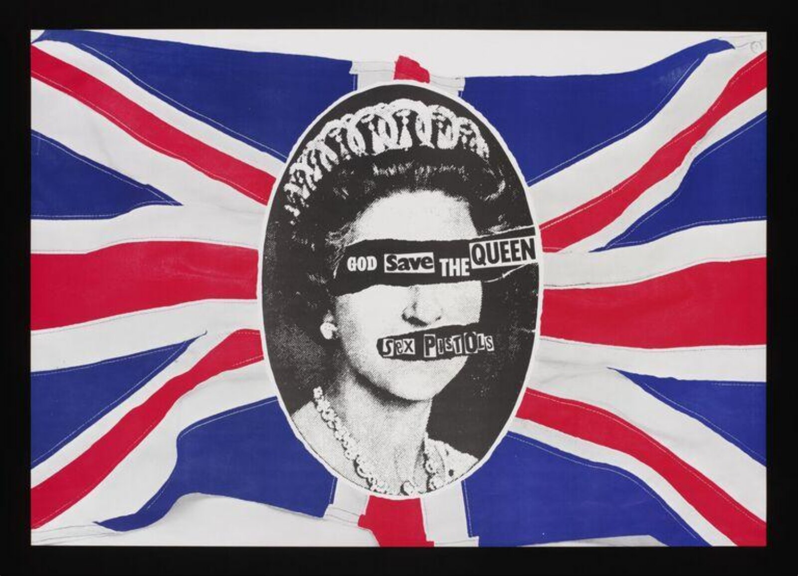
What it is — poster and single sleeve, Virgin, 27.5.1977 — one week before the Silver
Jubilee. Offset (V&A), MoMA lithograph 69.9 × 100.3 cm, sleeve 17.5 × 17.5 cm (NPG).
Original photograph: Peter Grugeon, official jubilee portrait (NPG and RCT,
RCIN 2148924). v1, AnOther, Eye and Clash all say "Cecil Beaton" — wrong. RCT: Reid
mirrored the photograph ("flipped"). Printworkers refused to run the print; the BBC banned
the song; Woolworths and W.H. Smith refused to sell it; #2 on the chart (NPG).
Composition — the whole format is a Union Jack with painted/brushed edges to the stripes
(the flag as if hand-painted, not geometric); in the centre an OVAL — the form of a cameo,
a postage stamp, a coin — with a high-contrast portrait; across the eyes a black
strip reading GOD save THE QUEEN, across the mouth a strip reading SeX PiSTOLS. The flag's
diagonals again lead to the middle; the oval is the only rounded shape so the eye finds it at once.
Colour — red, blue, black, white paper. The portrait is pure black-and-white (no
halftones in the midtones — lith contrast), so it stands in front of the flag as if cut out.
All the colour is on the state; the queen has no colour — a document, not a picture.
Typography — ransom-note lettering on two strips. The anthem title over the eyes, the band's
name over the mouth: the anthem shuts her eyes, the band shuts her mouth. The letterform cut differs, the strip is a
physical piece of paper with an edge.
Message — text exactly where the gaze and speech are. Three seconds: you recognise
the queen and see she's been "censored". Five metres: oval + flag — it reads without
a single word. That's why it was banned: it works even for the illiterate.
Why exactly this way — two found sources (official portrait + newspaper lettering), one
operation (cover). Nothing is drawn. The state supplied the image, the tabloid supplied the
lettering, the scissors supplied the politics. The oval isn't decoration but a form the state
uses for itself (stamp, coin) — Reid takes even the packaging.
What would kill it — a strip across the forehead instead of the eyes. Or move it 1 cm up:
then it's "a title above the portrait", not a bind across the eyes.
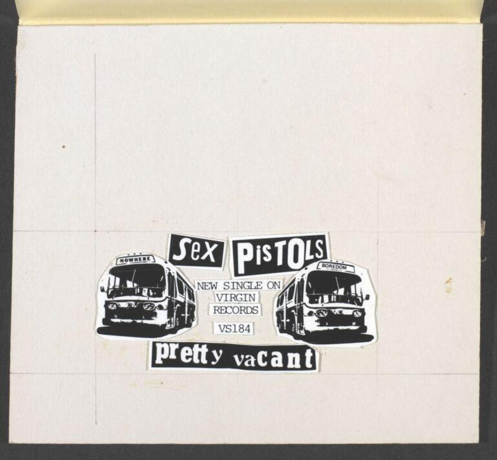
What it is — original paste-up for the promotional poster Virgin VS184, July 1977:
artboard with a yellow cover, tracing paper, underneath a collage — photocopy, pencil, glue;
13 cm wide. The bus image is not Reid's: David Jacobs (Point-Blank!, San
Francisco) 1973 — a news photograph of a GMC bus, negative mirrored, Letraset
lettering NOWHERE / BOREDOM / ALIENATION; one bus has its GMC logo upside down because of
the mirroring (Flashbak). Reid's gallery claims Reid made it in 1972 and gave it to
Point-Blank; Jacobs denies this. Here it is listed as a found image.
Composition — the design is small in the middle of a large empty artboard, with pencil
lines drawn in for the cut. Two buses facing each other (mirrored), between them
a column of text: SeX PiSTOLS above, NEW SINGLE ON VIRGIN RECORDS VS184
in the middle, pretty vacant below as white on a black strip. Symmetry around the vertical
axis — two identical buses going to two "nowheres".
Colour — black-and-white on greyish card. Colour comes only in the application (badge:
green background, blue text — V&A).
Typography — the band's name and the title in ransom-note lettering; catalogue line in typewriter.
Three registers: cut / typed / Letraset on the bus destination boards (someone else's).
Message — two buses, two destinations, both nowhere. Three seconds: buses + word.
Five metres: yes, once enlarged by process camera onto the poster; not in the original — the original is
palm-sized.
Why exactly this way — this sheet shows Reid's WHOLE production system: a postcard-sized
collage, a process camera enlarging it 5–8×, every cut edge and every grain of the copy grows
with it. That's why the posters have "rough" lettering — it's not rough, just enlarged.
What would kill it — working at full size. The enlargement is the style.
Principles:postupak-citljiv-kao-pozivserija-kao-identitetTo verify against the image: Point-Blank! pamphlet Space Travel 1973 — verify the copy
(not found online); the rejected Virgin poster with buses in Up They Rise 1987.
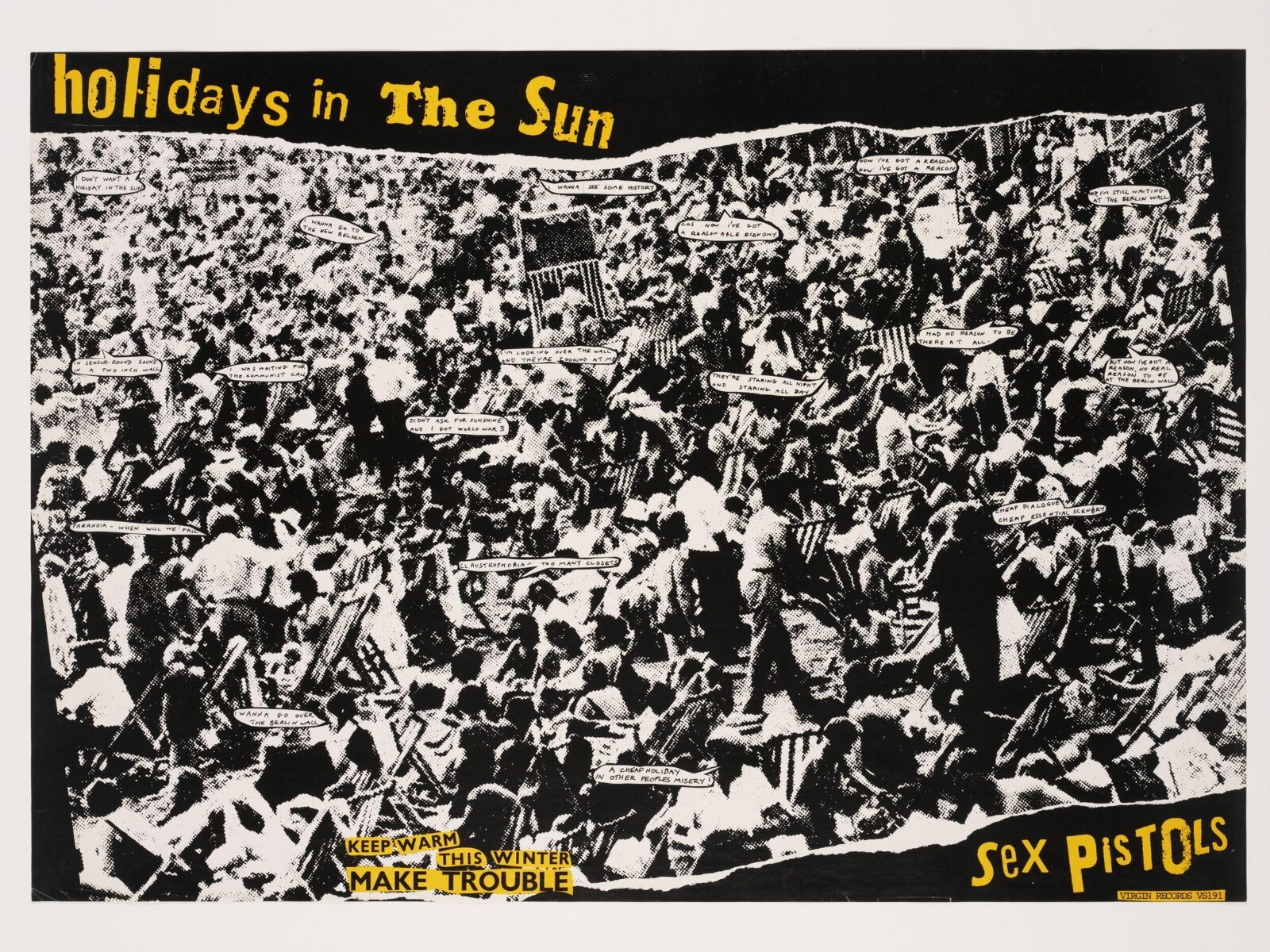
What it is — promotional poster, Virgin VS191, October 1977; lithograph 82 × 108 cm.
V&A: photograph of an overcrowded beach taken from a situationist publication. MoMA
dates its lithograph 1976 — the single is from 1977; trust V&A.
Composition — black frame; inside a photograph of a beach with a TORN upper edge
(white showing through the tear); the crowd fills everything, no horizon, no sky — just
the pattern of people, deckchairs and umbrellas. The title top left in yellow, the band's name
bottom right in yellow — a reading diagonal across the whole crowd. In the crowd tiny white
speech bubbles with lyrics. Bottom left a small slogan KEEP WARM THIS WINTER — MAKE
TROUBLE (an old Suburban Press sticker, recycled).
Colour — two colours: black (the photograph in lith contrast + the frame) and yellow (the text).
Yellow appears in only four places; the photograph has none — so yellow works as a
marker over the black-and-white document.
Typography — ransom-note lettering in yellow for the two large headings; lyrics in the
speech bubbles in small grotesque (class); the slogan in two registers. The speech bubbles turn a
documentary photograph into a comic strip — the crowd "speaks" the song's lyrics.
Message — the holiday as a mass prison; the song title as a tourist ad.
From five metres: black block, yellow title, the crowd's texture — reads like a beach ad.
From half a metre: the bubbles and the slogan say the opposite. Two audiences, two messages.
Why exactly this way — a situationist image (the spectacle of the holiday) taken literally
and merely SIGNED; Reid adds text, doesn't change the image. The torn edge at the top is the
only physical gesture — it shows that the image is a piece of paper, not a window.
What would kill it — a clean cut instead of the torn edge, or a third colour. Or if the
lyrics were bigger: then the difference between the two reading distances disappears.
Principles:dva-rastojanja-citanjaslogan-u-novom-kontekstufotografija-je-layoutTo verify against the image: which situationist publication (V&A doesn't name it); the single
sleeve is a different work (a Belgian tourist brochure turned into a comic strip — AnOther doesn't
describe it, v1 doesn't have it) — not to be confused with this poster.
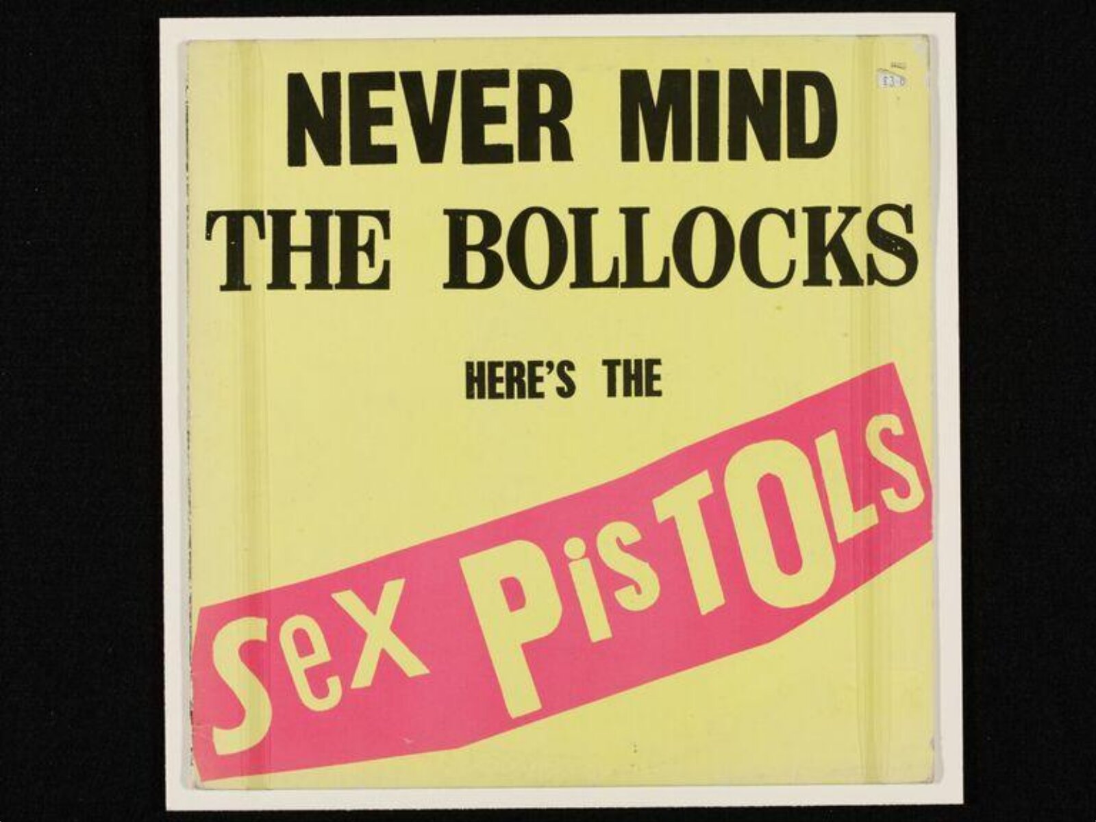
07 · Never Mind the Bollocks Here's the Sex Pistols — sleeve (1977)
artwork: paper collage on card, black type on white; print: offset in fluorescent yellow and pink (UK), green and purple for North America (PGDA/Louder)
Size
artwork 58 × 76 cm; LP sleeve 31 × 31 cm (standard, not from the record)
Type
title: bold condensed serif (typesetting, not a specific typeface); HERE'S THE: condensed grotesque; SeX PiSTOLS: cut-out letters — no typeface confirmed (Fonts In Use has no record)
What it is — LP sleeve, Virgin, 28.10.1977. Original artwork (V&A, with John
Varnom): paper collage on card, 58 × 76 cm, black type on white — colour was
added only at print stage. V&A: "fluorescent colours and title were chosen to be
noticed and to offend." UK: yellow + pink; North America: green + purple
(PGDA/Louder). Obscenity trial in Nottingham — acquitted, "bollocks"
as an Old English church term (V&A).
Composition — square, yellow plane; at top two lines NEVER MIND / THE BOLLOCKS
centred, below in small type HERE'S THE, then a pink BANNER at an angle (~10°) running off
both edges carrying the cut-out SeX PiSTOLS. Thirds: top third type, middle empty,
bottom banner. No image. The angled banner is the only "event" — everything else is
horizontal, so the banner looks like a sticker stuck over a finished sleeve.
Colour — two fluorescent colours that clash + black. Yellow and pink are the same
lightness so they vibrate at the edge — the edge of the banner can't be looked at calmly. The colours were
the CHEAPEST loud colours (fluo two-colour offset), but here chosen to hurt.
Typography — title: bold NARROW SERIF, typeset (the first purchased typeface
for a large word); HERE'S THE: narrow grotesque (sans serif); SeX PiSTOLS: cut-out letters. Three
registers deliberately combined with no hierarchy of typefaces/cuts — the type looks like a cheap
newspaper ad, the banner like vandalism over it. Specific typeface not confirmed (Fonts In
Use has no record) — do not name it.
Message — a curse word in the title, layout like a clearance-sale ad. Three seconds: yes.
Five metres: yellow square with pink diagonal — recognisable as a sign even without the words.
Why exactly this way — McLaren (Louder Sound): "The only real thing about Never Mind
The Bollocks was that it had to look ugly. We came up with the ugliest cover we
could think of; that in a sense would attack the idea of super-graphics. I wanted
to make ugliness beautiful." PGDA attributes that quote to Reid — incorrectly. Reid
(Louder): the sleeve was meant to "articulate ideas… anti-establishment and quite
theoretical" — while at the same time dismissing it as "cheap hype".
What would kill it — a single photo of the band. Or a straight banner. Or a "nice" typeface.
The ugliness is deliberate and must be total — half-ugly looks like a mistake.
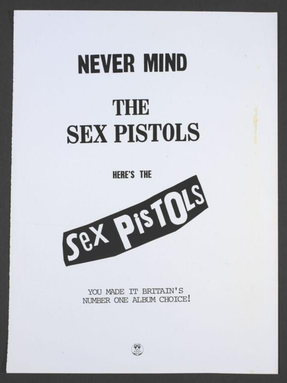
What it is — process-camera print (Better Badges) for an offset plate, 40.5 × 50.8 cm;
V&A lists it both as artwork for the inner sleeve of The Great Rock 'n' Roll Swindle (1979)
and as an advert "Never Mind the Sex Pistols Here's the Sex Pistols — You made it
Britain's number one album choice!" Date 1977 in the record; album 1979.
Composition — the same TEMPLATE as 07: title in two lines at top, HERE'S THE, then
the angled banner with cut-out SeX PiSTOLS; below, in typewriter type, the ad line; at the
bottom a small mark. Vertical format, text in the upper two-thirds, bottom empty.
Colour — black and white (plate print); colour would come at print stage.
Typography — same narrow serif + grotesque (sans serif) + cut-out letters. Difference from 07: the text
has been swapped — "the bollocks" → "the Sex Pistols". The system is so solid it can
parody itself a year or two later.
Message — the band, in its own advert, mocking its own album and audience ("YOU made it
No. 1"). Three seconds: the sleeve is recognised. Five metres: the same.
Why exactly this way — when the identity is a TEMPLATE (layout + three typeface registers),
a new message costs one hour of work. This is proof that 07 was a system, not a single sleeve.
What would kill it — changing the layout. The whole joke is that everything is the same.
The Cat Book (1972) — colour xerography of a drawing, 35.7 × 21.6 cm, pre-Suburban Press;
V&A S.875-1990 — proof that he drew before he stopped drawing. record
Sex Pistols Flyer (1975) — MoMA 156128; first logotype (before the cut-out one). record
Anarchy in the UK no. 1 — fanzine, cover with Soo Catwoman (1977), MoMA 156127; V&A
also cites the Nowhere/Boredom buses in that fanzine, 1976. record
Never Mind the Bollocks promotional poster "song by song" (1977) — V&A S.xxx,
a collage of all the single sleeves on a black ground; image 2009BY0217 — shows the whole
system on a single sheet. record
The Great Rock 'n' Roll Swindle (1979) — MoMA 156132, lithograph. record
Flogging a Dead Horse (1980) — MoMA 309.2012, lithograph 99.1 × 69.9 cm; not viewed
in this session. record
Letraset Multi-Punk (1988) — sheet of transfer letters with his own "style" (Eye);
no record, no image — literature only.
What is the series' constant: a fixed regime, not a layout — (a) logotype made of cut-out
letters, (b) one found source (official image, someone else's photograph, someone else's picture), (c) one
operation on it, (d) two cheap colours. The source, the operation, and the colour change. The exception
is the 07/08 pair — there the constant is the layout (template).
Bridge to practice: poster · graphic design · motion
Poster
Find the official image of the subject, not your own. For gaming satire: box art, ESRB mark, Steam
"Overwhelmingly Positive", press screenshot — that's Grugeon's portrait. One operation
(cover / tear / mirror), then stop.
Banner over the eyes or mouth, not over the forehead. If a word goes on the face, it goes on an organ.
Cut-out letters are made physically: print headlines from three different sources (newspaper,
catalogue, instruction manual), cut with scissors, scan at 300 dpi in 1-bit, enlarge 3×. Vector
"grunge" doesn't work — every letter has to be a different object with a different edge.
Two fluo colours of the same lightness when it needs to hurt; one colour + black when it needs
to read from five metres.
Graphic design
Identity as a procedure, not a file. LØADERRØR logotype: is there a rule
by which I can rebuild it from scratch every time and have it stay the same? If not — it's a
logo, not an identity.
A template that parodies itself (07 → 08): once you make a sleeve/poster, immediately
make a second version with different text in the same layout. If it works — you have a system.
A sticker and badge before a poster: a format the audience distributes itself.
Motion
The cut as an event, not a transition: in AE — a Shape mask with a hand-drawn torn
edge (Roughen Edges NO), the banner flies in on a single frame and STOPS. No easing, no fade.
What is paper has to behave like paper: it's either there or it isn't.
Photocopy grain as a layer: one scanned photocopier noise as a Multiply layer over
everything, static — do not animate it (animated noise = TV, static noise = paper).
Letters as objects in MOHO: every letter a separate layer with its own pivot and
±3° rotation; don't animate text as text.
Bad imitation
"Ransom font" — a purchased typeface that imitates cut-out letters: all letters with the same edge, same texture, same noise. A copied look, not a rule (each letter from a different source). Instantly visible because the same letters repeat identically.
Torn for no reason — torn edge, safety pins and Union Jack on a poster for anything that needs to look "rebellious". With Reid every gesture is an operation ON something official; without an official source the tear is just texture.
Pink + yellow as "punk palette" — the NMTB colours taken as style. With Reid they were chosen to offend in the context of 1977 (super-graphics, hi-fi sleeves); today they're just retro. The rule is "colours that don't fit with the rest of the shop window", not these two specific ones.
Too many operations — tear + cover + mirror + add slogan. One. Reid's GSTQ is one strip.
The brief through their eyes
Current job: YouTube gaming satire (thumbnail + 10-second intro). Reid wouldn't draw anything — he'd take the official key art of the game the episode mocks, paste one black strip over the character's eyes with the episode title in cut-out letters, and that would be the thumbnail. Intro: same image, the strip flies in in one frame, holds, end. Colours: the ones that clash worst with that game's palette.
Exercises
One strip (45 min): take an official photograph (press portrait, official game image). Cut out 12 letters from three different printed sources, arrange one word on a black strip, place it OVER THE EYES. Scan 1-bit. Test: cover the word — can you still tell it's "censored"?
Tear and document (1 hour): print a flag/logo/sign on paper, tear it by hand, join with safety pins, PHOTOGRAPH it (don't scan — the shadow matters). Put the title on two labels. Test: can you tell someone actually did this?
A template that parodies itself (30 min): take any finished poster of yours, replace only the text so it mocks the original, don't touch anything else. If it works — the poster was a system.
Motion study
"The strip" — 5 s, AE, one shot: static photograph (black and white, lith contrast). At 1 s a black strip with cut-out letters enters in ONE frame over the eyes, no transition; the camera doesn't move; at 4 s the strip disappears in one frame. Static photocopier noise as a Multiply layer. Principle: the cut is an event, not a movement. Constraint: no keyframe with interpolation.
Rebuilding the benchmark
Benchmark: God Save the Queen poster (V&A 2015HW3035, landscape ~1000 × 721 px). Measured from a screenshot (estimate ±3 %): oval — centre at ~50 % width / ~50 % height, oval width ~38 % of format width, height ~72 % of height; strip over the eyes at ~43 % height, strip over the mouth at ~57 %; both strips ~28 % of format width wide, ~5 % of height tall. Flag: diagonals from the corners, cross width ~14 % of height. Tonal zones: flag in colour (red/blue/white), oval black and white with no greys. Task: Illustrator, 45 min, without looking — flag as vector but with uneven edges via brush, oval as a clipping mask, two strips as PATHFINDER-processed irregular rectangles; then compare.
Notes on sources
Original GSTQ photograph: NPG and RCT → Peter Grugeon (official jubilee portrait, RCIN 2148924). v1, AnOther, Eye ("Beaton"), Clash (Milburn) → Cecil Beaton. Museum records win — Beaton dropped.
Nowhere/Boredom buses: David Jacobs / Point-Blank! 1973 (Flashbak) versus the claim by Reid's gallery that Reid made them in 1972. Unresolved; treated as a found image with disputed authorship. v1 doesn't mention this at all.
The "ugliest cover" quote: Louder Sound → McLaren; PGDA → Reid. Taken as McLaren.
v1 quote "Anyone can do it…" — not found, dropped; replaced with a confirmed one (AnOther).
V&A dimensions: sticker 01 (58 × 76 cm) and GSTQ poster (60 × 38 portrait, image landscape) — suspect records, flagged in the frontmatter.
MoMA date for Holidays in the Sun 1976 — single is 1977; V&A taken.
Date of death: 8.8.2023 (Marchant, Wikipedia, Designboom) / 9.8. (Clash). 8.8. taken.
1968 Croydon sit-in — confirmed (Designboom, Eye); Wikipedia the same.
Wimbledon 1962–64 — Eye; Wikipedia only "enrolled 1962". No third source.
Holidays in the Sun single sleeve (Belgian brochure as comic strip) — not seen or documented in this session; the POSTER was analysed.
Typefaces: none confirmed — all classified. Fonts In Use has no entry for Reid (verified via WebSearch, not a site search).
Portrait: Marchant Gallery bio page — ima: true, but the photographer is unknown.
Guardian, BBC, Vogue — blocked for WebFetch in this session; the biography was compiled from Marchant, Eye, AnOther, Designboom, Clash, Wikipedia.
Difference from its pair
Corita Kent (Sister Mary Corita) ↔ Jamie Reid: both take someone else's text and show the seam — Corita turns a supermarket slogan into a prayer and gives a different audience a quiet message; Reid turns the anthem into a blindfold and gives a different audience lyrics that offend.
Emory Douglas ↔ Jamie Reid: both use cheap print + slogan + distribution built into the artefact itself — Douglas draws his own character and his own slogan (the people against the state, the image is OURS); Reid draws nothing, he takes the STATE'S image and just covers it.
Roman Cieślewicz ↔ Jamie Reid: both place text over the eyes of a found portrait — Cieślewicz (Che si 1967) replaces the gaze with a name, the face still looks; Reid (GSTQ 1977) ABOLISHES the gaze, the strip is censorship. Same position, opposite outcome.
Herb Lubalin ↔ Jamie Reid: with Lubalin the letter becomes an image (drawn, touching); with Reid the letter is an OBJECT (cut, not touching, each from a different origin).