Paul Rand
source

Era 1945 · 1914–1996

Paul Rand

Corporate modernism, wit

art director (Esquire/Apparel Arts, Weintraub); identity designer; professor at Yale
Brooklyn → New York → Weston, Connecticut

Palette of the œuvre

"Don't try to be original; just try to be good."

Biography

Born Peretz Rosenbaum on 15 August 1914 in Brooklyn, into an orthodox Jewish family, son of Isidore Rosenbaum and Lena Hecht. Already as a child he paints ads for his father's grocery store and school events (P.S. 109). His father, doubting one can make a living from art, insists he attend Haaren High School alongside evening drawing classes. In the mid-1930s he shortens his name to "Paul Rand" — he later wrote of this himself as his first corporate identity project, and it turned out to be the most lasting one.

He is formally schooled at the Pratt Institute (evening courses, 1929–1932), Parsons School of Design (1932–1933) and the Art Students League of New York (1933–1934) — no source names a professor from any of these three schools; he is largely self-taught, learning from European magazines featuring the work of Cassandre and László Moholy-Nagy. The closest thing to a mentorship is his meeting with Moholy-Nagy, who, after Rand admitted he didn't read art theory, pointed him toward Roger Fry, Alfred North Whitehead and John Dewey — an invitation to read, not formal teaching.

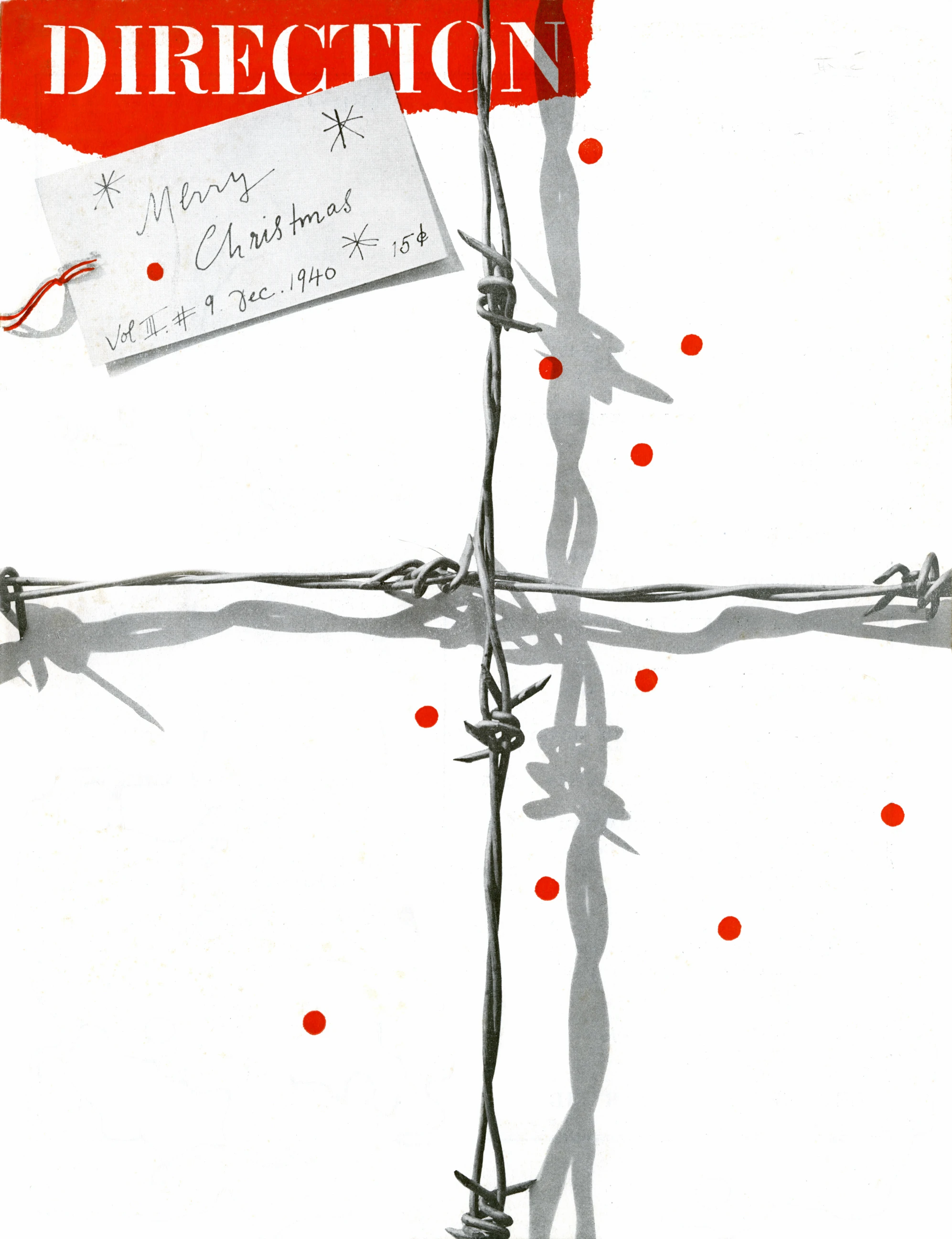
He begins his career as an author of stock illustrations for newspaper syndicates; in 1936 he is given the task of designing the anniversary issue of Apparel Arts magazine, which in 1937, at only 23 years old, earns him the post of art director at Esquire-Coronet magazine. In parallel, from the early 1930s to 1940, he designs covers for Direction Magazine for free, in exchange for complete artistic freedom — the December 1940 cover (barbed wire as a cross and gift ribbon, work 01) is from this period. At the Weintraub advertising agency he runs the advertising art department together with Bill Bernbach.

From 1955 he builds identities that define American corporate design: IBM (1956, refined 1960, striped version 1972), Westinghouse (1960), UPS (1961), ABC, Cummins Engine, later Enron, Morningstar and NeXT (1986, for Steve Jobs, who called him "the greatest living graphic designer"). Ford hires him in 1966 to redesign the logo, but the company rejects the proposed modernised solution. From the 1980s he charges around $100,000 per project and, according to testimony, offers the client only one solution, with no alternatives — a practice confirmed for the NeXT project.

At Yale he teaches graphic design 1956–1969 and again 1974–1985; in 1992 he resigns in protest at the appointment of postmodernist designer Sheila Levrant de Bretteville, persuading his colleague Armin Hofmann to do the same. He is the author of the books Thoughts on Design (1947, based on John Dewey's philosophy of functional-aesthetic perfection), A Designer's Art (1985), Design, Form, and Chaos (1994) and From Lascaux to Brooklyn (1996). In his later writings he sharply and dogmatically attacks postmodernism in design ("Confusion and Chaos").

He was married three times (Harriet Wallace 1937–1946, Anne Binkley from 1949, Marion Swannie) and had a daughter, Catherine. He dies of cancer on 26 November 1996, aged 82, in Norwalk, Connecticut. Before his death he asked his colleague Fred Troller to design his headstone.

Influences

Studied with

  • Pratt Institute, evening courses 1929–1932; no professor confirmed by name
  • Parsons School of Design, 1932–1933; no professor confirmed by name
  • Art Students League of New York, 1933–1934; no professor confirmed by name
  • László Moholy-Nagy — wasn't a formal professor to him, but after their first meeting steered him to read art theory (Roger Fry, Alfred North Whitehead, John Dewey); the closest thing to a mentoring relationship that the sources record

Borrows from

  • European avant-garde poster — Cassandre, Moholy-Nagy — which he learned from European magazines, on his own, not in a classroom
  • German Sachplakat style and the work of Gustav Jensen
  • children's drawing and naive form (Klee, Miró) set against strict, precisely drawn geometry
  • collage technique — torn paper, cut shapes

Influenced

  • Henry Steiner — student of Rand's at Yale 1955–1957; credits Rand with contrast as a central tool and rigorous analysis of the problem (Steiner, Thoughts on Paul Rand)
  • Ivan Chermayeff (Chermayeff & Geismar (Ivan Chermayeff, Tom Geismar)) — himself says Rand was his mentor (designculture.it; see note chermayeffgeismar)
  • generations of Yale students 1956–1969 and 1974–1985, plus the Brissago summer school (from 1985) — Steiner: "remarkable number of outstanding designers"

Contemporaries

  • Bill Bernbach — ran the advertising art department at the Weintraub agency together with Rand
  • László Moholy-Nagy — a mentor figure, without a formal teaching relationship
  • Armin Hofmann — colleague at Yale; resigned in solidarity with Rand in 1992
  • Armin Hofmann — see above; both taught design in the US in the same decade

Who he studied under

None of the three schools (Pratt, Parsons, Art Students League) left a named, confirmed professor — Rand is largely self-taught. The closest thing to a mentorship is with László Moholy-Nagy, who did not formally teach him but directed him toward reading art theory after their first meeting.

What he steals from

Who he influenced

No name of an individual Yale student has been found that sources directly link to his legacy as a designer (as opposed to Yale's generations of students generally) — remains provjeriti.

Contemporaries

Bill Bernbach — ran the advertising art department at Weintraub together with Rand, before Bernbach founded DDB. László Moholy-Nagy — a mentoring figure without a formal teaching relationship. Armin Hofmann — Armin Hofmann, a colleague at Yale; resigned in solidarity with Rand in 1992. The two represent two parallel currents of postwar American design education from the same decade.

Linked from other profiles

Saul BassChermayeff & Geismar (Ivan Chermayeff, Tom Geismar)Shigeo Fukuda (福田繁雄)Milton GlaserHerb LubalinMuriel CooperBradbury ThompsonHenryk TomaszewskiTadanori Yokoo

Key works — full analysis

01 · Direction Magazine — "Merry Christmas" (1940)

Direction Magazine — „Merry Christmas“, Vol. 3 No. 9
documented + reading
Year
1940
Client
Direction (publisher Marguerite Tjader Harris) — done without a fee
Technique
photograph of real barbed wire on white, torn red paper, punched red circles, hand-lettered label; cover print (print technique not documented)
Size
not documented — magazine cover; scan ratio 0.77
Type
masthead DIRECTION — white high-contrast serif capitals (thin serifs) cut from a torn red field; label — handwriting; specific typeface not confirmed

nadjeni-predmet-kao-rijec naivna-forma-uz-strogu-tipografiju

record ↗ · original image ↗

  1. What it is — cover of Direction magazine, Vol. 3 No. 9, December 1940. Rand worked for Direction without a fee, in exchange for complete freedom (publisher Marguerite Tjader Harris; Heller, Design Literacy, 1997).
  2. Composition — white ground; two arms of real barbed wire cross like a gift ribbon (the vertical slightly left of centre, the horizontal in the upper half) and run across everything, including the masthead. Top left, a torn red strip with the title DIRECTION cut out of it in white; across it, at an angle, a paper gift tag with a handwritten "Merry Christmas", a number and a price. About a dozen small red circles scattered across the white. (v2 read the title as a red sans-serif line — corrected against the image: white serif capitals on red paper.)
  3. Colour — measured: white 81%, two shades of grey wire 14%, red (#e32508) 5%. The whole "greeting card" rests on five percent red.
  4. Typography — masthead: white high-contrast serif capitals, part of the torn red plane; tag: handwriting. There is no typesetting in the classical sense — Heller notes that, due to budget, Rand worked with collage and handwritten letters.
  5. Message — per Heller: barbed wire in place of a decorative ribbon, real wire photographed on a white ground, and red circles punched with a hole punch suggest bloodshed — wartime oppression without propaganda iconography. Christmas 1940 as a gift wrapped in wire.
  6. Why exactly this way — the object is not illustrated but used: the wire is at once a gift ribbon (form) and war (meaning), and the blood drops are half a centimetre of paper from an office hole punch. Maximum meaning from minimal, cheap material.
  7. What would kill it — a direct illustration of war (soldier, bomb) or Christmas (fir tree, nativity scene); or red covering the whole cover — the dots would stop being blood and become decoration.

Principles: nadjeni-predmet-kao-rijec, naivna-forma-uz-strogu-tipografiju

02 · Second Interfaith Day (1953)

Second Interfaith Day — Sunday, September 27, Central Park Mall
documented + reading
Year
1953
Client
Interfaith Movement, Inc. (president Harry Hershfield; mayor Vincent R. Impellitteri)
Technique
lithograph (MCB); PGDA states screenprint — discrepancy
Size
45 1/8 × 29 1/4 in (≈ 114.6 × 74.3 cm; MCB — MCB's conversion to cm, 104.3 × 74.8, is wrong)
Type
Interfaith Day — typewriter-style slab serif, red next to blue; the numerals 27 and 2 — bold high-contrast serif digit (black over blue); small type at the bottom — typewriter; specific typeface not confirmed

naivna-forma-uz-strogu-tipografiju igra-kao-pamcenje

record ↗ · original image ↗

  1. What it is — poster for Interfaith Day, Sunday 27 September, Central Park Mall, "All Star Show" at 2 PM; lithograph, 45 1/8 × 29 1/4 in (Merrill C. Berman: Second Interfaith Day, 1953). v1 and PGDA (per paulrand.design, "Interfaith Day Poster 1943 02") date it to 1943 — corrected: the small print at the bottom names Mayor Vincent R. Impellitteri (in office 1950–1953), and 27 September falls on a Sunday in 1953.
  2. Composition — a rooster: a round blue head with an eye, a red jagged comb on top and a red flaming tail/body (posterposter.co.uk reads it as a rooster; v2 wrote "dove" — the shape of the comb gives it away as a rooster). The information is built into the body: "Sunday, September" on the head, a huge "27" across the neck, "2 PM" below — the number is both the date and part of the animal. "Interfaith Day" at the bottom, full width, then a line of small print.
  3. Colour — measured: cream paper 66%, red 12–16%, violet-blue 10–11%; black only in the numerals. Two colours plus black — flag colours without a flag.
  4. Typography — "Interfaith Day" in a typewriter-style slab serif, letters red against blue; numerals in bold high-contrast serif (black over blue); the date and place in typewriter type. (v2 read "hand-drawn rounded grotesque" — corrected against the image.)
  5. Message — the rooster is morning and waking up, a call to gather; the interfaith gathering gets a cheerful, non-sacred sign that belongs to no single faith.
  6. Why exactly this way — text and image are one body: a passer-by sees a bird, and in the same glance reads the day and hour. The series (paulrand.design: 1941–1951, sun 1951, rooster with a trumpet "1944") shows the same pattern — one naive figure, the date built into it.
  7. What would kill it — religious symbols (cross, star, crescent) side by side: an exact illustration of "interfaith" that would put each community into its own box.

Principles: naivna-forma-uz-strogu-tipografiju, igra-kao-pamcenje

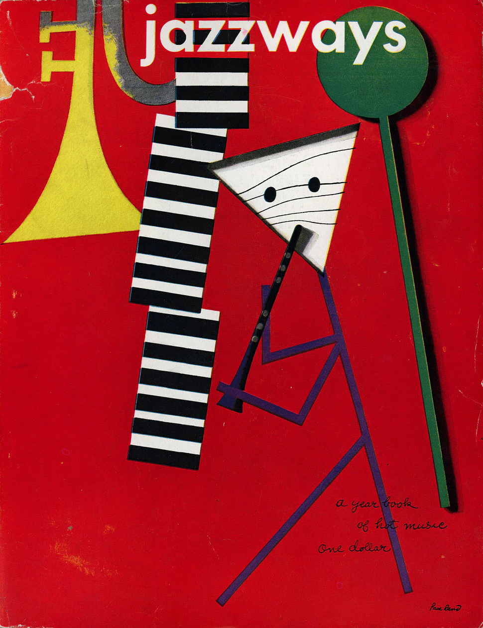
03 · Jazzways (1946)

Jazzways — A Yearbook of Hot Music, Vol. 1 No. 1 (korica)
documented + reading
Year
1946
Client
Jazzways, Cincinnati (ed. George S. Rosenthal and Frank Zachary)
Technique
collage (cut paper), cover print
Size
215 × 278 mm (PGDA per designreviewed.com)
Type
jazzways — white sans-serif lowercase; subtitle and editors — handwriting; specific typeface not confirmed

naivna-forma-uz-strogu-tipografiju

record ↗ · original image ↗

  1. What it is — cover of the first issue of the annual Jazzways — A Yearbook of Hot Music, Cincinnati, 1946 (ed. George S. Rosenthal and Frank Zachary); 215 × 278 mm. The second issue (1947) came out without Rand's cover (RIPM Jazz).
  2. Composition — on a red ground a musician figure built from cut-out pieces: the head is a white triangle with two eyes, the body and legs are purple lines, a black clarinet in the mouth; behind him a black-and-white "keyboard" like a column, on the left a yellow trumpet bell, on the right a green cymbal on a long stick. Title above, white, over everything.
  3. Colour — measured (paulrand.design): red 70%, cream 12%, grey and black 18%, yellow trumpet ~5%. One hot ground carries the whole tone.
  4. Typography — "jazzways" white sans-serif lowercase (v2 "italic capitals" — corrected: lowercase, upright); subtitle and editors in handwriting bottom right.
  5. Message — jazz as improvisation of form: the instrument becomes part of the body, the body is a few strokes.
  6. Why exactly this way — cut paper holds a hard edge and flat colour under cheap printing, and the arrangement of pieces "plays" like a solo over the rhythm section.
  7. What would kill it — a photograph of the band on stage, the standard genre solution.

The edition from PGDA (and the v2 description of "three bands with press quotes") carries a sticker with quotes from the British press (Melody Maker, Musical Express) — the cover from the estate has none; this is not part of Rand's design but a trace of distribution.

Principles: naivna-forma-uz-strogu-tipografiju

04 · The American Democrat — comp and final cover (1956)

The American Democrat (J. F. Cooper) — komp i finalna korica, Vintage Books
documented + reading
Year
1956
Client
Vintage Books (Knopf)
Technique
comp: collage on paper, printed paper (Wright/Artsy); final: printed softcover
Size
comp 18.4 × 10.8 cm (Wright 2018, lot 343); cover — not documented
Type
title and author's name — handwriting (white on blue and black); Vintage Book — handwriting/type in red; specific typeface not confirmed

naivna-forma-uz-strogu-tipografiju

record ↗ · original image ↗

  1. What it is — cover of J. F. Cooper's book, Vintage Books, c. 1956; a surviving comp (collage on paper, 18.4 × 10.8 cm; Wright 2018, lot 343) and the final cover — a pair published by Letterform Archive (Stephen Coles, 2019) as evidence of a hand comp in Rand's process.
  2. Composition — comp: two large initials "A" and "D" on a red and a blue square, a blue field with white dots (stars), red stripes, a yellowish block. Final: a hand-lettered title white on a blue field, a row of red vertical rectangles, a black band with the author's name, a row of blue squares, "A Vintage Book" in red at the bottom. The flag broken into elements and assembled into a column. (v2 "red stripes of different lengths" — on the final one the vertical blocks are roughly equal.)
  3. Colour — measured (comp + final): cream 55%, red 20%, blue 16%, black 8%. The yellow block from the comp does not exist in the final.
  4. Typography — handwriting for the title and the author; initials in the comp are bold, in the final they disappear in favour of the whole title.
  5. Message — American democracy as a flag the reader assembles himself.
  6. Why exactly this way — the comparison shows editing: half as many colours, initials replaced by a written title, stars become squares. "Simple" is the result of cutting, not of the first stroke.
  7. What would kill it — literal illustration (portrait of the author, historical scene) or the whole flag in a corner — the heraldry assembled from pieces is lost.

Principles: naivna-forma-uz-strogu-tipografiju

05 · El Producto — Cigar Album (1952)

El Producto — Cigar Album (kutija za cigare, verzija 1)
documented + reading
Year
1952
Client
G.H.P. Cigar Co., Inc. (El Producto)
Technique
printed paper glued to cedar wood (MFAH); on the lid a reproduction of a photogram (rayograph) by Man Ray (MFAH, ICP)
Size
29.2 × 21.6 × 3.2 cm (MFAH 2020.137.127)
Type
EL PRODUCTO — high-contrast serif capitals, every LETTER a different colour; Cigar Album — white handwriting; specific typeface not confirmed

avangarda-kao-kvalitet-proizvoda naivna-forma-uz-strogu-tipografiju

record ↗ · original image ↗

  1. What it is — a cigar box "Cigar Album" for G.H.P. Cigar Co. (El Producto), c. 1952; printed paper glued to cedarwood, 29.2 × 21.6 × 3.2 cm (MFAH 2020.137.127). MFAH credits Rand and Man Ray: the image on the lid is a reproduction of a Man Ray photogram (rayograph; ICP 2010.45.1, dated 1954). Swann describes two versions of the box; this one (paulrand.design "v1") has the title above the image and Rand's signature below.
  2. Composition — a black plane; over it pale, translucent silhouettes of cigars in crossed diagonals and a round ashtray into which one cigar falls — traces of objects laid on photo paper, without a camera. Title band across the full width above, "Cigar Album" in handwriting below right; side panels of the box in multicoloured stripes. (v2 read the silhouettes as "abstract translucent bands resembling smoke" — corrected: photogram of cigars and an ashtray.)
  3. Colour — measured: black 64%, olive-grey tones of the photogram 31%; the title letters red, green, blue (4–11% in the band). Colour is only in the typography and on the edge of the box.
  4. Typography — EL PRODUCTO: high-contrast serif capitals, every letter a different colour (v2 "every syllable" — corrected against the image); handwriting as a second voice.
  5. Message — the cigar as an object of taste, not habit: MFAH states that Man Ray's art gave the product an "avant-garde sophistication".
  6. Why exactly this way — the photogram gives the cigar the glow of an X-ray and a gallery instead of the cliché illustration from the category (tobacco leaves, coats of arms, gold medals); the multicoloured letters bring back the cheerfulness that a plain black photograph would extinguish.
  7. What would kill it — a realistic photograph of a cigar with smoke or the manufacturer's coat of arms — the box would return to the shelf where all boxes look alike.

Principles: avangarda-kao-kvalitet-proizvoda, naivna-forma-uz-strogu-tipografiju

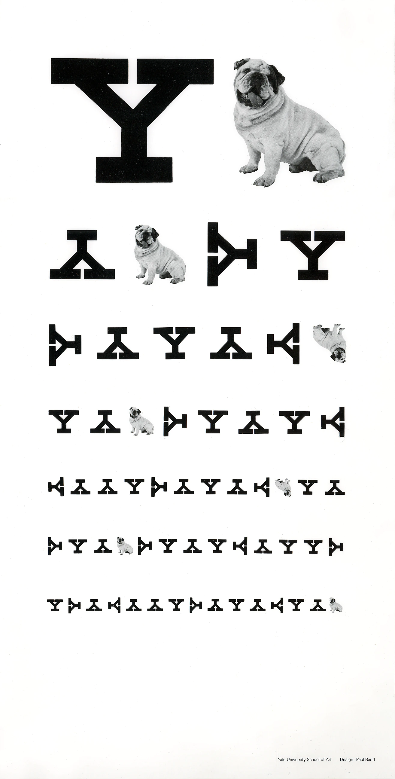
06 · Yale University School of Art — poster (1988)

Yale University School of Art — plakat (tablica za vid od slova Y)
documented + reading
Year
1988
Client
Yale University School of Art
Technique
black-and-white offset lithograph (Cooper Hewitt; PGDA)
Size
not documented in the Cooper Hewitt record; internationalposter.com offers "Yale Eye Chart" ca. 1985, 22 × 44 cm — whether it is the same sheet, to verify
Type
Y — bold slab serif (plate serifs); signature at the bottom — small grotesque (sans serif); specific typeface not confirmed

igra-kao-pamcenje

record ↗ · original image ↗

  1. What it is — a poster for Yale University School of Art, 1988; black-and-white offset lithograph, gift of Marion S. Rand to Cooper Hewitt (chndm 2002-11-4). The date is confirmed by both paulrand.design and PGDA (which cites Cooper Hewitt, Making Design, as its source).
  2. Composition — a Snellen eye chart: the first row is one large letter Y and a photograph of a bulldog (Yale's mascot), then seven rows of increasingly small Ys, turned in all four directions, with inserted bulldogs; bottom right in small type "Yale University School of Art — Design: Paul Rand". The bottom third of the sheet is empty. The Cooper Hewitt blog derives the motif from the Snellen "Tumbling E" chart (for illiterate patients) and notes that the dog's body corresponds to the shape of the letter Y.
  3. Colour — measured: white 86%, black 6%, grey tones of the photograph 8%; not a single chromatic colour — medical, clinical.
  4. Typography — the Y is a bold slab serif; the rotation is a typographic play from "Tumbling E", not decoration.
  5. Message — an art school teaches you to see; the poster is an eye test.
  6. Why exactly this way — the chart format is recognisable in half a second, so the joke works without explanation; the shrinking rows force the eye to "read" to the bottom.
  7. What would kill it — a tagline below ("Sharpen your vision") or colour — the joke has to stay alone and clinically cold to be funny.

Principles: igra-kao-pamcenje

07 · IBM logotype (1956 / striped versions)

IBM logotip — 1956 i prugaste verzije (13 i 8 pruga)
documented + reading
Year
1956
Client
IBM
Technique
corporate mark; striped versions for print, signage and packaging
Size
not applicable (mark)
Type
base City Medium (Georg Trump) instead of Beton Bold — IBM.com; letters reworked (square counters in the B, asymmetric serifs on the M)

ogranicenje-postaje-koncept logotip-ne-opisuje-nego-identifikuje

record ↗ · original image ↗

  1. What it is — the IBM mark: in 1956 Rand replaces Beton Bold with the typeface City Medium (IBM.com); striped versions — IBM.com: 1972 ("eight, sometimes 13 stripes"), paulrand.design: 13 stripes in 1965, 8 stripes in 1970. The discrepancy remains, see Notes on sources.
  2. Composition — 1956: solid, geometric letters with square counters in the B and asymmetric serifs on the M (IBM.com); striped versions: the same outlines cut through by horizontal white stripes that bind all three letters into one block.
  3. Colour — black, grey, white, or IBM blue PMS 2718C (IBM.com); the estate's SVG #4181c2 (screen value).
  4. Typography — the mark itself is typography; City (Georg Trump) as raw material, reworked.
  5. Message — precision and speed without an image of a computer.
  6. Why exactly this way — the stripes unite three different letters into a single texture and give the mark a rhythm that survives even in one colour. The interpretation "stripes solve poor reproduction" from v2 was not found in a first-order source — it remains a reading; IBM.com does not give a reason for the stripes.
  7. What would kill it — an illustration of the product in the mark (a punch card, a computer) — the mark would age along with the product.

Principles: ogranicenje-postaje-koncept, logotip-ne-opisuje-nego-identifikuje

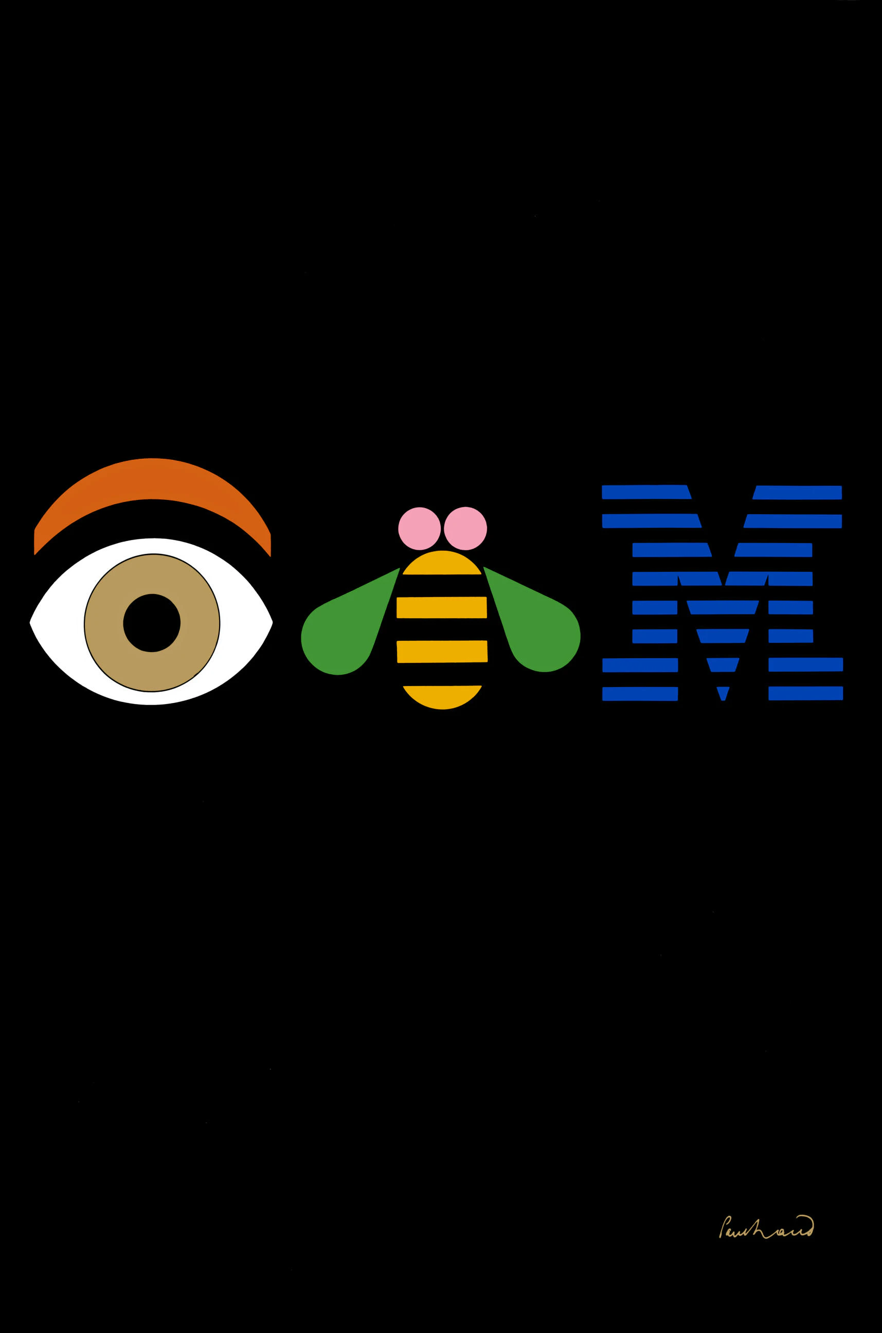
08 · Eye-Bee-M (1981)

Eye-Bee-M (rebus plakat za IBM)
documented + reading
Year
1981
Client
IBM
Technique
poster; the technique of the 1981 original is not documented; mechanical artwork ink on paper 26 × 20 cm (UMMA); 1982 edition — offset lithograph (MoMA 520.1983, MCB)
Size
1982 edition: 91.5 × 61 cm (MoMA, MCB); 1981 edition — not documented
Type
the third element is the IBM logo with 8 stripes (dark cobalt); the 1981 edition has no text except the signature at bottom right; the 1982 edition adds a block of small type at bottom left

igra-kao-pamcenje rebus-tjera-na-izvodjenje logotip-ne-opisuje-nego-identifikuje

record ↗ · original image ↗

  1. What it is — a rebus poster for IBM, 1981; a mechanical template in ink on paper (26 × 20 cm, with Rand's handwriting) at UMMA; the 1982 edition — offset lithograph 91.5 × 61 cm (MoMA 520.1983; MCB). IBM.com: the rebus "humanises" the company, still in use today, in MoMA's permanent collection.
  2. Composition — a black plane, in the middle of the height a row of three equally tall signs: an eye (white, beige iris, black pupil, orange eyebrow), a bee (yellow-black stripes, green wings, two pink circles on the head) and IBM with 8 stripes. The 1981 edition has no text except the signature bottom right; the 1982 edition (which PGDA shows) adds a block of small type bottom left. (v2 described the 1982 edition as the original — corrected.)
  3. Colour — measured (1981): black 93% of the sheet; in the band of signs beige/gold eye and bee, green wings, cobalt IBM. Warm (eye, bee) against cold (logotype).
  4. Typography — the only "letters" are the stripes of the logotype; the third member of the rebus is a true sign.
  5. Message — eye-bee-M has to be spoken aloud to be read; a technology giant presented through a children's wordplay.
  6. Why exactly this way — two images and one letter: the viewer assembles the name himself, while the corporate mark remains untouched as the solution to the puzzle.
  7. What would kill it — writing "IBM" underneath — the rebus would become an illustration of its own solution.

Principles: igra-kao-pamcenje, rebus-tjera-na-izvodjenje, logotip-ne-opisuje-nego-identifikuje

Other works — evidence, no analysis

Principles — summary

logotip-ne-opisuje-nego-identifikuje igra-kao-pamcenje dizajn-za-najlosiju-reprodukciju naivna-forma-uz-strogu-tipografiju ogranicenje-postaje-koncept nadjeni-predmet-kao-rijec rebus-tjera-na-izvodjenje avangarda-kao-kvalitet-proizvoda

Bridge to practice: poster · graphic design · motion

Poster

A logotype or mark doesn't need to describe what a company does — it needs to identify it; meaning accumulates through use, not through a literal illustration of the business in the mark itself.

Graphic design

Give the viewer a small puzzle to solve (a rebus, a visual pun) — the act of completing the puzzle itself makes the mark more memorable than a directly stated message.

Motion

Test every mark against the "worst possible reproduction" — blurred, single colour, tiny, embroidered — a principle directly transferable to design for autoplay without sound or a small mobile screen: if the mark doesn't work under those conditions, it doesn't work.

Bad imitation

The brief through their eyes

(fill in the current job here before using the exercise)

The first question he'd ask: "Does this mark identify or does it try to explain? Explanation ages together with the product; identity doesn't have to." Second move: find a small visual puzzle (a rebus, an ambiguous form) that the viewer can "solve" on their own in two seconds. Third: imagine the mark in the worst possible reproduction (fax, embroidery, single colour, 8mm wide) and check whether it still works.

Exercises

  1. Identity rebus. For any name (your own, a client's, a product's), make a visual rebus from three pictograms that, spoken aloud, spell out that name — without a single letter written as text. 45 minutes.
  2. Worst reproduction test. Take an existing mark (yours or someone else's), simulate its worst possible reproduction (greyscale photocopy, small size, blur) and check whether it stays recognisable. If not, simplify until it passes the test.

Motion study

Three seconds: two pictograms (e.g. an eye and a bee) appear one after another, pausing before the third element (the actual logotype/text) so the viewer has time to guess the solution themselves before it's revealed — the principle of work 08 carried over into time instead of space.

Rebuilding the benchmark

The skeleton of the Eye-Bee-M poster (work 08, 1981) as .svg: three elements arranged horizontally at equal spacing (% of format), with an estimated ratio of the sizes of the eye, the bee, and the logotype. Task: rebuild it in Illustrator in 20 min without looking at the original, then compare the proportions with the PGDA reproduction.
Notes on sources

  • Update 23.09.2026 (28th session, phase 2b): all 8 works got a first-order source and the class dokumentovano + citanje rada (v2); palettes measured; three wrong attributions and five wrong v2 readings corrected against the image (below). Log: 2026-09-23_LOG_rand-dopuna.md.
  • Interfaith Day (02) — year 1953, not 1943. paulrand.design lists the image as "1943 02"; PGDA (and posterposter.co.uk) take over 1943; MCB calls it Second Interfaith Day, 1953. The poster itself settles it: mayor Impellitteri (1950–1953) and a Sunday on September 27 → 1953. On the same estate page the poster "1944 01a" carries "Sunday September 26" — that Sunday falls in 1943, so the year labels in that series are probably shifted; not checked further (not a work covered in this note). PGDA technique (screenprint) versus MCB (lithograph) — MCB used. MCB's conversion to cm (104,3) is wrong; the inches are consistent.
  • El Producto (05) — the image is a Man Ray photogram. MFAH credits both Rand and Man Ray; ICP dates it 1954, MFAH and Swann 1952 — 1952 used. The v2 reading ("smoke-like streaks") was wrong.
  • Eye-Bee-M (08) — two editions. 1981 (paulrand.design, no slogan) and 1982 (MoMA 520.1983 "IBM, 1982, offset lithograph", MCB — with the slogan bottom left; PGDA shows this one). The MoMA record has no image — that 520.1983 is indeed the rebus was concluded from the match of year, technique, and measurements with MCB; to verify against the image. The technique of the 1981 original is not documented (v2 "screenprint" removed).
  • Jazzways (03) — the PGDA edition has a sticker with British press quotes; the estate's copy doesn't have it. v2 described the sticker as part of the composition.
  • Direction (01) — the PGDA description (student) talks about a "Swiss style" and a "slab-serif" headline — both wrong; Heller (1997) is the source for the process and meaning.
  • The year of the striped IBM version (07) remains unresolved: IBM.com 1972 (8- and 13-stripe), paulrand.design 13-stripe 1965 / 8-stripe 1970; the PGDA compilation matches the estate. The reason for the stripes — no first-order source; the v2 thesis about poor reproduction remains a reading.
  • Yale (06) — measurements not documented; internationalposter.com offers a "Yale Eye Chart" ca. 1985, 22 × 44 cm — not established whether it's the same sheet or a smaller version.
  • Fonts: Fonts In Use (designers/1242) has none of the eight works; only City Medium is confirmed as the basis of the IBM mark (IBM.com). The rest is class only.
  • Influenced: Henry Steiner (student 1955–57, his own essay) and Ivan Chermayeff (self-proclaimed mentee) — documented; the rest generic.
  • DADA Poster (1951) still has no image seen (artic.edu locked); MCB lists it as a lithograph 38 1/8 × 26 1/8 in — measurements differ from AIC (91,6 × 61,3 cm).
  • Log v2 (06.09.2026): full analysis of 8 works (PGDA, paulrand.design, Art Institute of Chicago API for metadata), 9 additional items in "Other works".

Difference from the pair: Armin Hofmann builds a system that stays consistent regardless of content (a grid, few rules, strict discipline) — Rand builds a mark that changes from project to project, but always according to the same principle: identification through play, not through description. Both taught at Yale in the same decade and both left the institution on principle (Hofmann in solidarity with Rand, 1992) — the difference is that Hofmann's tool is order, and Rand's tool is wit.