„New Wave" typography — the Swiss system dismantled from within, with Swiss discipline
typography teacher, Schule für Gestaltung Basel (1968–2004); member of the editorial board of Typografische Monatsblätter Salemertal (near Lake Constance, Germany) → Stuttgart → Basel
„My work is like a quarry. People see a stone they like, appropriate it and work it until there's nothing left." — Eye 4, 1991
Biography
Born 6 February 1941 in Salemertal near Lake Constance (Wikipedia; TGDS writes
Konstanz — unconfirmed). In April 1958 he enrolled at Merz Akademie in Stuttgart, a two-year
programme in applied graphics: typesetting, linocut, woodcut. After that, three years
of the typesetting trade in hand lead composition at the Ruwe print shop, where his mentor
was the design consultant Karl-August Hanke. This is the key to everything that follows: he is not a designer who
learned printing but a printer who learned design — „the only way to break typographic
rules was to know them" (My Way to Typography). Already in Stuttgart he distorts lead
settings to get new forms and modular motifs (Letterform Archive).
In 1963 he meets Ruder and Hofmann, in 1964 moves to Basel — by his own admission
disappointed at the start (Eye 4/1991). He is never a regular student: with Ruder he has a special
arrangement to use the workshop on his own. The relationship is conflicted; he solves Ruder's
assignments by „the most unorthodox means possible" and is threatened with expulsion, which Hofmann
prevents (Letterform Archive). That same Hofmann, in 1968, at twenty-seven years old, appoints him
as typography teacher in the newly founded Weiterbildungsklasse für Grafik. He stays there until
2004 — thirty-six years of dismantling the system of the school that invented him.
From 1970 (Wikipedia) or 1972 (Letterform Archive: „newly appointed member") on the editorial board of
Typografische Monatsblätter. In 1972 he proposes a series of „covers for learning": he makes
about ten trial pieces in the school's composing room, the committee accepts, the only one against is Walter Zerbe
(TM Research Archive). Fifteen covers from 1972–73 provoke Tschichold's letters to editor
Hostettler: he hopes this is the last one with Weingart, doubts whether the „man is in his right mind";
later „anti-typographer Weingart" (Letterform Archive, footnotes 1 and 6). Alongside this he
launches the supplements TM/communication and Typographic Process (from 1972) and issue 12/1976
devoted to his own work, where he chose the paper, colour, layout and plates (TM Research Archive).
In the early seventies a decisive shift: instead of lead composition, film. He teaches himself the repro camera
and darkroom in order to control the process from start to finish; film allows continuous
repetition of layers through multiple exposures, which lead cannot do (Letterform Archive).
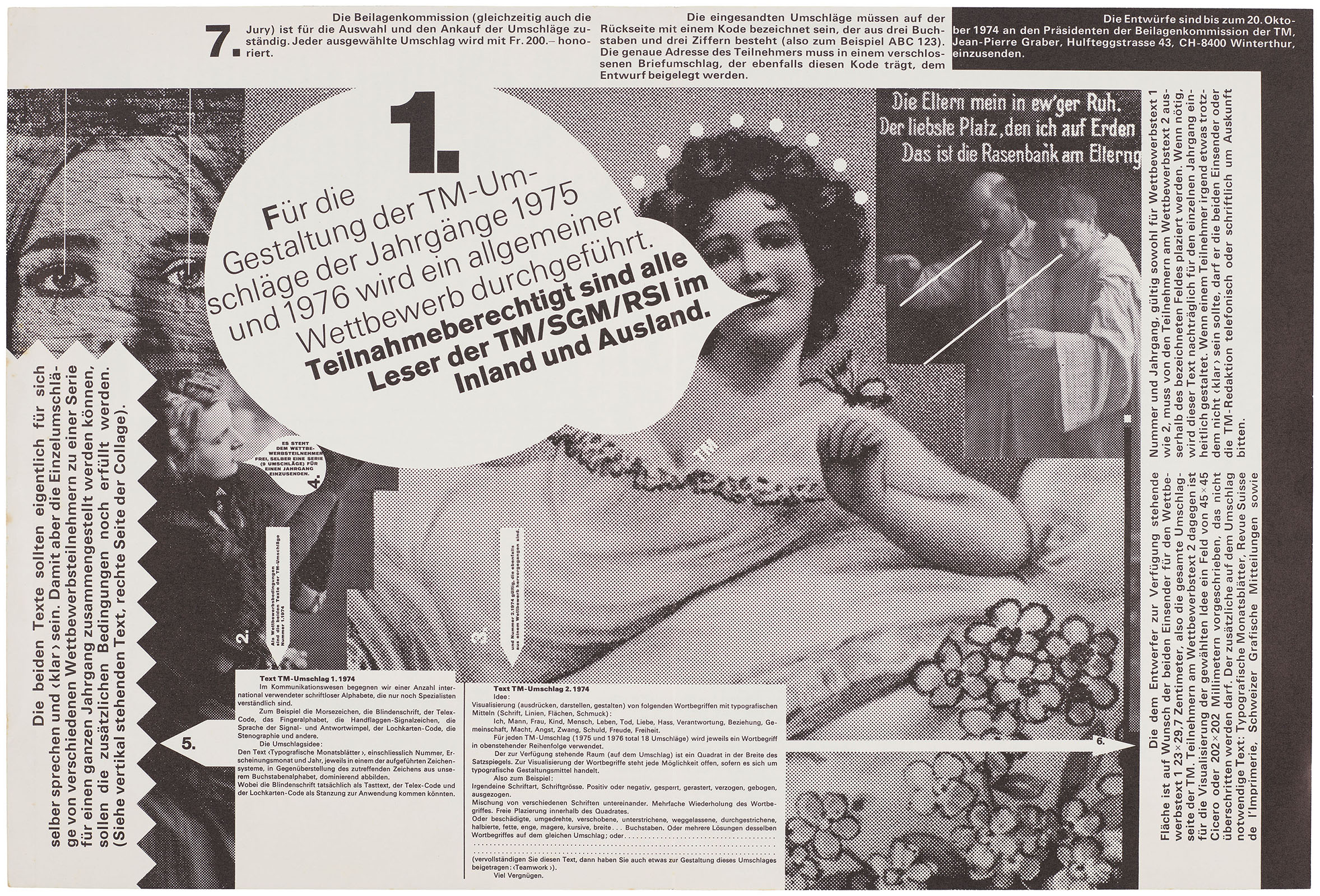
Out of this come Nine Collages (1974–75), the Kunstkredit posters (1977–83), Schreibkunst
(1981), Das Schweizer Plakat (1984) — all in B4 format, 128 × 90 cm, which Eye calls
a technical peak. From 1972 he teaches across the USA, 1974–96 runs the Yale Summer Program in
Brissago; through Greiman, Friedman and others the results go to America as „New Wave".
In January 1985 he introduces the Macintosh into teaching (Eye; Eye on Design writes 1984). AGI 1978–99,
AIGA medal 2013, Swiss Grand Prix for Design 2014. The archive (two thirds his own work, one
third student work) has been at the Museum für Gestaltung Zürich since 2010. Died 12 July 2021 in Basel.
Influences
Studied with
„Merz Akademie Stuttgart (from April 1958) — two-year programme in applied graphics; typesetting, linocut, woodcut (Wikipedia)“
„three-year typesetting apprenticeship in hand lead type, Ruwe printworks, Stuttgart (Wikipedia); TGDS claims Hollenstein Cliché — UNCONFIRMED“
„Karl-August Hanke — design consultant to the Ruwe printworks, mentor (Wikipedia)“
„Emil Ruder — Basel from 1964, as a free student with a special arrangement for workshop access; relationship conflicted (Eye 4/1991; Letterform Archive)“
„Armin Hofmann — prevented Weingart's expulsion during Ruder's time, in 1968 placed him in the Weiterbildungsklasse für Grafik (Letterform Archive; Lars Müller)“
Borrows from
„Akzidenz-Grotesk — brought back from the drawer where it had been gathering dust, against Univers (My Way to Typography, cit. neugraphic)“
„photo-mechanical process — repro camera, film, light table; taught himself so as not to depend on technicians (Letterform Archive)“
„desert and half-buried ruins — photographs of the desert as compositional inspiration (Letterform Archive, TM 12/1976)“
„H. N. Werkman — experiment with type as material (Letterform Archive lists him as a kindred spirit, not a confirmed influence)“
„Jan Tschichold — wrote to Weingart that the best design is invisible; Weingart does the opposite (Letterform Archive)“
Influenced
„April Greiman — April Greiman, Basel around 1970–71 (TGDS; dates unverified)“
„Dan Friedman — Basel around 1968–70 (TGDS; dates unverified)“
„Jim Farris — student, collaborator on TM 4/1979; donor to Letterform Archive (Letterform Archive)“
„Willi Kunz — TGDS lists as a student 1967–70; UNCONFIRMED by another source“
„a generation of American designers through the Yale Summer Program Brissago (1974–96) and lectures from 1972 (Wikipedia, Eye)“
Contemporaries
„Jamie Reid — same era, dismantling from outside (scissors, found letters) versus Weingart's from inside (lead type, film)“
„Muriel Cooper — layers and depth; her on screen, him on film“
„Karl Gerstner — programme instead of artefact; Weingart's Typographic Process posters are programmes of exercises“
„Robert Büchler, Emil Ruder — predecessors on the TM covers, the quiet precision that Weingart breaks in 1972 (Letterform Archive)“
Who he studied under
Craft before school: Merz Akademie and Ruwe/Hanke in Stuttgart. In Basel Emil Ruder (discipline
of word and space, which Weingart takes as a tool and turns against it — Ruder's
repetition he calls „wallpaper typography", TM Research Archive) and Armin Hofmann (eye, gestalt,
protection). Tschichold recommends invisible design to him by letter — Weingart takes this as a
list of what's forbidden: „Everything that made me curious was forbidden" (Letterform Archive).
What he plunders
Akzidenz-Grotesk from the drawer, against the Univers that TM had adopted. Photo-mechanics from
the print shop (repro camera, film, screen, moiré) — not as a tool but as material.
The desert and buried ruins as a compositional model (TM 12/1976). Letterform Archive
places him alongside Werkman — kinship, not proven influence.
Who he influenced
April Greiman, Dan Friedman (both around 1968–71; dates per TGDS, unverified), Jim Farris,
Susan Vogt; the entire American „New Wave" and after it everything called glitch, screen,
dither. He himself says students copied the surface and missed the method — hence the quarry
metaphor (Eye 4/1991). For Jamie Reid it's a parallel, not an influence: same year, same
dismantling, different tool.
Šta je — the cover of a trade journal, first from a series of fifteen (1972–73). Hand
lead composition in the school's composing room, letterpress (TM Research Archive: „hand-composition
and film materials"). Quarto, about 23 × 30 cm. Weingart conceived the covers as
„covers for learning": each one poses a question — what is typography, what is
communication, what is text.
Kompozicija — a grey field, a small „1" in the top left corner, below it the words
„Typographie / realisiert / Sprache" in three lines, large, so that the left edge of the words
sits on the left margin and the right edge extends to the right. To the right of the block a narrow column of small
type (the journal's name, numbers), below it another paragraph of small setting. The eye enters
the large word, falls on the small column to the right, returns down to the paragraph. There is no grid holding
these three elements together — Letterform Archive: „operate outside the bounds of the
conventional grid system", „imbalanced asymmetries". The cover of 5/1972 goes further:
a centred definition of the word SPRACHE in five to six lines, each line in a different cut, with
underlines under individual words (screenshot).
Boja — one: black on grey paper (1/1972), black on white (5/1972). Colour is not
the subject; the subject is the weight of the setting.
Tipografija — Akzidenz-Grotesk, CONFIRMED (Letterform Archive) — a 19th-century
typeface that TM had abandoned in favour of Univers; Weingart brings it back as a gesture. „Conspicuous
variety of line weights": within one sentence several cuts, a word changes weight
mid-line (5/1972: „SPRACHE:" bold, „Ein sozial-" light, „institutionalisiertes"
bold). An underline beneath a word as in handwriting.
Poruka — at three seconds: a large German word, scientific tone, grey. From five metres:
a journal for printers. The real message is for the trade: a cover that itself does not
behave by the rules it preaches inside. Tschichold read it exactly right.
Zašto baš ovako — the constraint is lead: the setting can be spaced out, underlined, mix
cuts, but not overlapped. That's why the covers of 1972–73 are still „typographic" in the narrower
sense — everything he does is done in the composing room, without film. Later, on film, the same
stance gains layers.
Šta bi ga ubilo — one cut instead of five. With a single cut this is a plain Swiss
cover, only somewhat clumsily laid out — Büchler without Büchler.
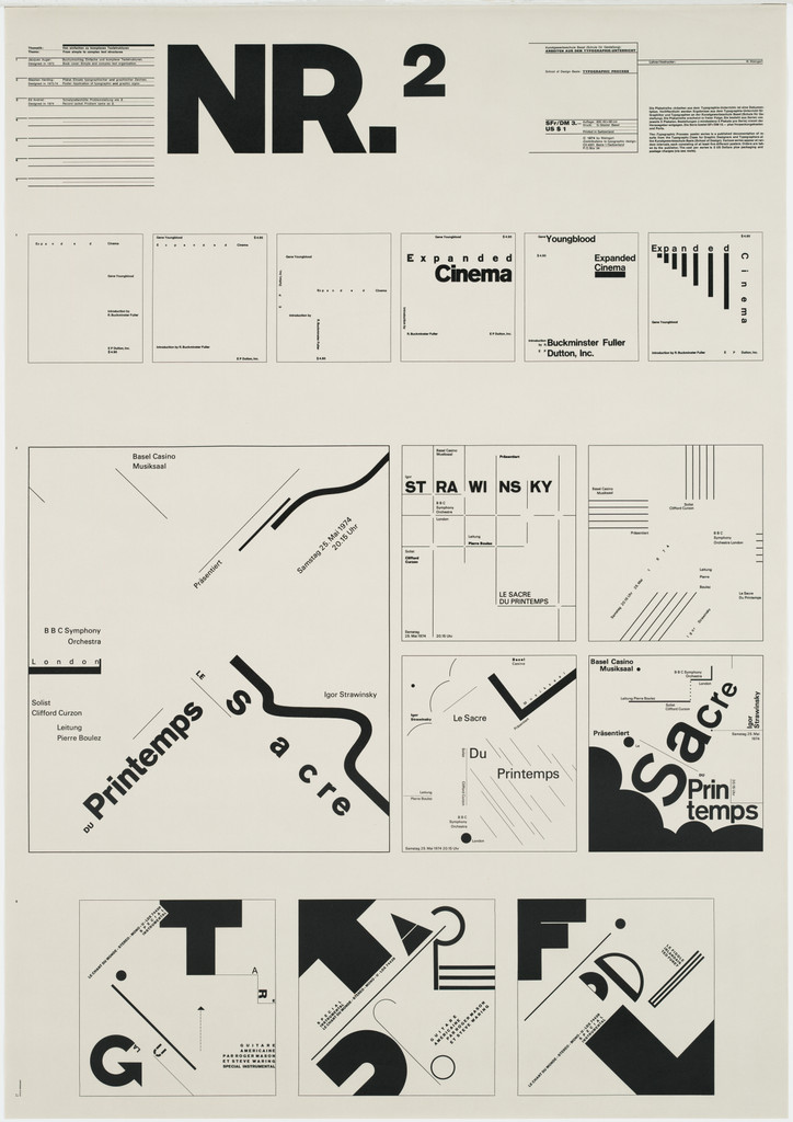
What it is — educational poster from a series of five (Nr 1–5, 1971–74), lithograph, 87.6 ×
61.6 cm, printer G. Gissler, Basel (MoMA, for Nr 1, 3, 5; for Nr 2 MoMA does not
list a printer but it is the same format and same acquisition fund 264.2002). The series was made alongside
the Typographic Process column in TM (from 1972). This is not a poster advertising something —
it's a teaching panel that explains a method.
Composition — cream sheet divided into a regular grid of smaller fields: top left a block
of small text, top right a large "NR.2" with a superscript, below 4 × 3 fields, each
one exercise: "Cinema" with letterspaced type, "STRAWINSKY", then four variants of
"Printemps / Sacre" — words set at an angle, like rotated type, one on
a black diagonal field; the last row four large letters G, T, F, D with black
diagonal bands and lines cutting through them. The eye reads it like a textbook page: row by row,
left → right, from simple (letterspaced word) to complex (letter cut by a diagonal). The grid is there
— but as a frame for demonstration, not as a poster composition.
Colour — black on cream paper. Monochrome, because the subject of the demonstration is the form of the type;
colour would blur the variable.
Typography — Akzidenz-type grotesque (class; not confirmed for this sheet). All
exercises use the same typeface in several weights — the typeface is the constant, what changes is spacing, angle,
ground, cut. This is exactly what he says about the method: "basic design relationships with
type placement, size, and weight" (My Way to Typography).
Message — at three seconds: a board of letters. From five metres: only "NR.2". The message isn't
for the passerby but for the student who stops in front and reads — the poster as a lesson on a classroom
wall.
Why exactly this way — the constraint is pedagogical: he has to show the PROCEDURE, so he must
break it down into steps someone else can repeat. Hence the grid of fields: each field is one
step, one changed variable. The series Nr 1–5 is the same principle across five topics
(organised textual structures, from simple to complex, calendar
structures, typographic symbols, typography as painting).
What would kill it — merging the fields into a single composition. Then it's a poster that
looks like Weingart, and the lesson disappears — and the lesson is the only content.
Principles:program-umjesto-artefaktavarijabla-do-otkazaTo verify against the image: which typefaces/cuts exactly are in the "Cinema" field; whether the diagonal
bands in the last row are printed or the letter is physically cut (film).
03 · Typographic Process, Nr 5 — Typographie als (Malerei) (1971–74)
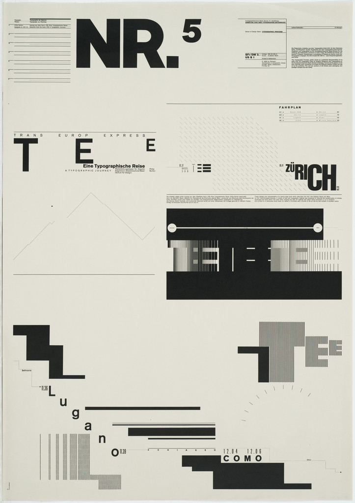
What it is — fifth sheet of the series, lithograph, 87.6 × 61.6 cm, printer G. Gissler Basel,
MoMA 264.2002.5. Title in brackets: typography as (painting) — the brackets are
Weingart's hedge.
Composition — same top block as on Nr 2 (small text left, "NR.5" right). Below
there's no grid of fields but one large free composition: the word "T E E" large,
spaced across half the width; "ZüRICH" with letters of different sizes, ü dropped
down; black horizontal bands across the middle of the sheet, on one of them circles as the end of a line; two
"staircases" — blocks climbing in steps from left and right toward the centre,
like stylised pyramids; below "Lugano" and "COMO" with letters set off diagonally,
below them bands repeating the staircases. The eye enters through "T E E", slides along the black
band to "ZüRICH", falls down the staircase to "Lugano/COMO". The composition is a journey
— Zürich, Lugano, Como are stations, the staircases are the Alps. Not confirmed by literature
— a reading of the image.
Colour — black on cream paper; "painting" without colour, only tonal masses of black type.
The black bands are the darkest tone, the spaced letters the lightest: a range from a full plane to the
greyness of letters on paper.
Typography — Akzidenz-type grotesque (class; unconfirmed). Three treatments of the same
typeface: spacing up to +200 (T E E), mixed sizes in one word (ZüRICH), letter as
a black mass (the staircases are actually type: lines and squares from the composing case). This is
directly from his discovery: when spacing increases, the word becomes graphic and
"understanding the message was less dependent upon reading than we had supposed"
(My Way to Typography).
Message — at three seconds: a black-and-white abstraction, maybe a landscape. From five metres:
staircases and bands, the words disappear. The message: typographic material — lead, lines,
squares — can PAINT, and do so without an image. That's the thesis of the whole sheet.
Why exactly this way — the constraint: only what fits in the composing case. No photography,
no drawing. The staircases are probably set from rule material (Letterform: already in
Stuttgart "distorting existing metal type blocks to create new letterforms and
modular motifs"). Hence there are no curves except the circles.
What would kill it — adding a photograph of the Alps. Then the staircases become an illustration
of a mountain and the whole thesis (typography AS painting, not alongside painting) collapses.
Principles:stepenasti-tekst-kao-oblikcitljivost-na-granicivarijabla-do-otkazaTo verify against the image: whether "T E E" is part of a word (TEE = tea? or the start of something);
what's written in the small text top left — probably an explanation of the exercise; whether the
staircases are type or film.
04 · TM 12/1976 — cover and feature on Weingart (1976)
What it is — the December 1976 issue of TM dedicated to Weingart, with a feature on seven
years of his work, in the series "Pioneers of Graphic Design". He chooses the paper, colour,
layout, and plates (TM Research Archive: "I made all the decisions"). Technique: offset from a
montage of photographic film — Letterform Archive explicitly: "produced entirely through
the complex layering of photographic films".
Composition — cover (screenshot, small): left a white block of dense text
with the title "Ist diese Typografie noch zu retten?" (can this typography still be
saved?), right a photomontage: a woman's face, a mechanical wheel/lens, halftone planes
overlapping, diagonal lines. The text and image don't split into two zones but
overlap along the edge. Inner spreads (Letterform): letterspaced type, shifted
images, thick black text frames and a broken grid OVER a photograph of a desert;
fragments of text break apart on one side and reassemble on the next.
Colour — black-and-white with grey halftones; colour comes from
the density of the screen, not from pigment. Syncopation on the 1976 cover: "irregular fields of reversed type on a dark
background" — negative as colour.
Typography — grotesque (unconfirmed). Syncopation: horizontal lines that
"cross through the lines of text" — the line is no longer a frame but a participant in the type. Letterform:
"passages of heavily degraded type" — type photographed by a repro camera across several generations
until the edges break down.
Message — at three seconds: chaos, a question in the title. From five metres: illegible, grey.
The message is performative: the title asks whether this typography can be saved, and
the cover answers that it doesn't want to be saved. Letterform: the feature "resists
systematic interpretation", "less concerned with clarity than with cultivating an
atmosphere".
Why exactly this way — the constraint is lifted: film allows overlap, negative, multiple
exposures, degradation — everything lead (item 01) didn't allow. This issue is the first time
the whole of TM passes through his darkroom, and that's why it looks like what
the computer will do ten years later (Letterform: "resembles the visual conventions
later associated with digital design").
What would kill it — clean, sharp type on the same montage. The degradation of the letters is
the argument; without it, it's a collage with a title.
Principles:providni-sloj-kao-dubinazrno-i-zamucenje-kao-oblikTo verify against the image: the whole cover in a larger reproduction (Letterform gallery
"hi-fi captures" — click for fullscreen, not opened); who the woman in the photograph is; whether
the desert spread is in the same issue or in the feature.
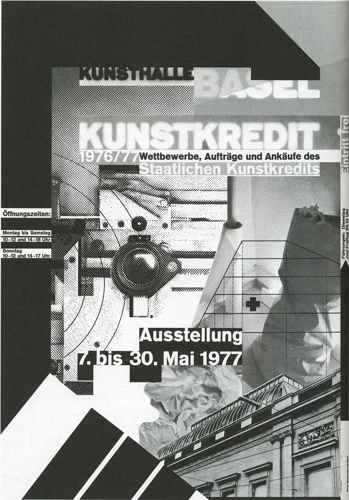
What it is — exhibition poster for the annual exhibition of the state art purchase
(Staatlicher Kunstkredit Basel-Stadt) at Kunsthalle Basel, 7–30 May 1977. First from the
Kunstkredit poster series 1977–83 (plakatarchiv: seven sheets). 128 × 90.2 cm (B4); MoMA:
lithograph; LACMA: offset lithograph; plakatarchiv: offset, ONE COLOUR. Gift of Clarisse
Alcock Bronfman (MoMA 208.2006).
Composition — upright sheet, black-and-white, built from overlapping layers: at top
"KUNSTHALLE BASEL" in two lines, the second line larger and indented; "KUNSTKREDIT 1976/77"
in negative (white on black) over a grey screen; subtitle in a black band; left, a column
of small print (Öffnungszeiten); centre — a photograph of a lens or mechanical wheel,
behind it crumpled paper, top right a cross (Basel's coat of arms in the form of a
cross? — to verify); bottom "Ausstellung 7. bis 30. Mai 1977" and a photograph of the
Kunsthalle façade cut diagonally; bottom left diagonal screen stripes. Running through it
all are thin black lines (grid, axes), which LACMA describes as "architectural fragments".
The eye enters through the negative "KUNSTKREDIT", falls into the lens at centre, exits on
the date below. LACMA: "complicated the picture plane by overlapping the pattern and text,
creating a sense of depth throughout the composition."
Colour — one colour (black), but with at least four tones: solid black, negative,
fine screen, coarse screen. Tone is made by the screen, not by pigment — hence LACMA:
"the building blocks of offset imagery — lithographic half-tone dot and overlapping
moiré patterns — as graphic elements". Colour would be surplus here; the whole tonal
system is already in the screen.
Typography — Akzidenz-type grotesque (class, unconfirmed), in two registers: large
titles as flat shapes (some in negative) and small text as texture in the column. The
title "KUNSTKREDIT" is the largest element and the only one legible from a distance.
Message — at three seconds: a black-and-white layered image, the word KUNSTKREDIT.
From five metres: only the negative title and the black band. Message: the exhibition is
not shown (no artwork appears on the poster) — the poster itself is the artwork competing
with the exhibition. Eye 4/1991: the halftone dot as an "independent graphic element".
Why exactly this way — the constraint: one colour and B4 format. With one colour it
has to achieve depth, so he stacks screens at different angles on a light table — Eye on
Design: "stacked film layers inches high; over-exposed type via repro camera". The moiré
is not a mistake but a third tone that emerges between two screens.
What would kill it — aligning the screens (same angle, same line count). The moiré
disappears, the depth disappears, leaving a tidy black-and-white reproduction — and then
it looks like an unfinished sketch for a Hofmann poster.
Principles:moare-je-namjeran-slojzrno-i-zamucenje-kao-oblikprovidni-sloj-kao-dubinaTo verify against the image: the identity of the object at centre (camera lens? valve?);
the mark top right; whether the poster is really one colour (the MoMA reproduction is
grey, but plakatarchiv says "Offset, einfarbig").
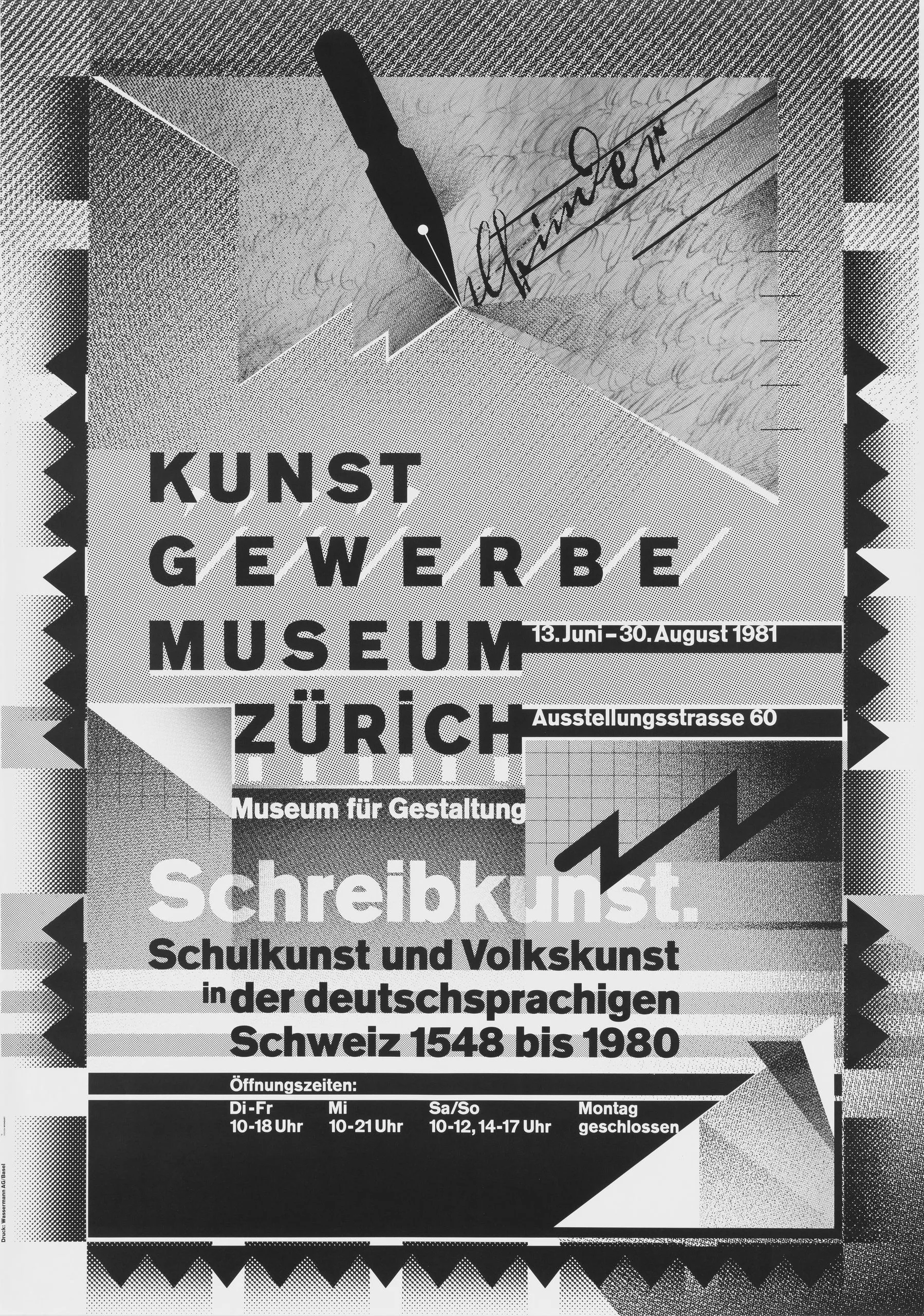
What it is — exhibition poster for the Kunstgewerbemuseum Zürich (Museum für
Gestaltung), the exhibition "Schreibkunst — Schulkunst und Volkskunst in der
deutschsprachigen Schweiz 1548 bis 1980", 13 June – 30 August 1981, Ausstellungsstrasse 60
(read from the poster). LACMA: offset lithograph, 127.6 × 90.2 cm; plakatarchiv: offset,
TWO COLOURS. Pinterest/auction listings cite the Swiss Poster Award 1981 (unconfirmed by a
primary source).
Composition — upright sheet; the top third is held by a photograph of a steel pen
writing a signature (handwriting at an angle), the pen is the largest single shape and
enters diagonally from the upper right; below it "KUNST / GEWERBE / MUSEUM / ZÜRICH" in
four lines, letterspaced, left-aligned, with black date bands to the right ("13. Juni –
August 1981", "Ausstellungsstrasse 60"); "Museum für Gestaltung" in a black band;
then "Schreibkunst." large in a grey field, subtitle in three lines; bottom, opening hours
in a black band. All of this sits on a ground of geometric planes: triangles, zigzag
bands along the left and bottom edge as a jagged frame, screens and stripes breaking
diagonally. A lightning-shape (zigzag) to the right of "Schreibkunst" echoes the stroke of
the pen. The eye: pen → museum name (steps, left) → Schreibkunst → dates. TGDS: a
calligraphic pattern over grid-set type "at extreme scale contrasts" — an argument that
the grid and historical calligraphy are not opposed but cumulative.
Colour — cannot be established from the LACMA reproduction (black-and-white
photograph); plakatarchiv: two colours. To verify against the image — which is the
second colour and where.
Typography — grotesque (unconfirmed). The museum name letterspaced to the point where
the four words become four equal bands — typography as structure, not as sentence. Against
this, the pen's handwriting: the only "real" mark of writing on a poster about the art of
writing is photographed, not set.
Message — at three seconds: the pen and the word Schreibkunst. From five metres: the
pen, the zigzag, black bands. The message is witty: a poster about Swiss school
handwriting made with means that are the opposite of handwriting (screen, film, grotesque)
— and handwriting is allowed in only as an image. The trade (typographers) reads it as a
stance; the public sees a pen.
Why exactly this way — the subject is historical (1548–1980), so the temptation was to
make an "old" poster. He refuses illustration of the era and leaves only one object (the
pen) as a sign, with everything else in his own contemporary language. The zigzag frame is
probably cut film (Letterform on Nine Collages: "hand-cut films").
What would kill it — setting "Schreibkunst" in a calligraphic font. Then the poster
illustrates the theme instead of taking a stance on it, and the pen becomes redundant.
Principles:moare-je-namjeran-slojjedno-pismo-siroka-skalaTo verify against the image: the second colour; whether the zigzag frame is a screen or
a solid plane; whether the signature in the photograph is an actual historical example
from the exhibition.
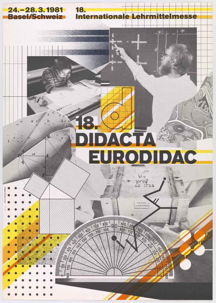
What it is — poster for the 18th international teaching-aids fair (Internationale
Lehrmittelmesse), Basel, 24–28 March 1981. MoMA: lithograph, 128.9 × 90.2 cm,
Christopher H. Browne Purchase Fund (207.2006); plakatarchiv: offset, multicolour.
Composition — upright sheet, at top a band with date and place on the left, the
fair's name on the right; the main field is a photomontage: at top two photographs (a
child at a desk, a teacher with a raised hand in front of a blackboard), over them a
millimetre grid and a large "18." in a yellow circle-letter "d"; centre — "DIDACTA /
EURODIDAC" large, black, tilted slightly diagonal; below — geometric solids (cube, prism)
in isometric view, upper right a photograph of a hand on a keyboard; bottom a protractor
(half-circle with graduation) as the largest single shape, over it a branch/diagram, all
on a coarse-dot screen and diagonal orange stripes. The eye: "18./DIDACTA" (the largest) →
protractor below → photographs above. The material is all from school: grid, protractor,
geometric solids, blackboard — the poster is a collage of teaching aids, literally.
Colour — yellow, orange, black, white, grey screens. Yellow carries the title ("18."
in a circle, yellow plane behind the teacher's photograph), orange works as diagonal
energy in stripes and dots at bottom right, black carries the text. The colours are flat,
printed — there is no tonal colour photography, the photographs are black-and-white over
colour.
Typography — grotesque (unconfirmed). The title in two large lines, the second line
shifted to the right; small text in the top band. Little text — the poster speaks through
objects, not sentences.
Message — at three seconds: school, geometry, yellow-orange, "18." From five metres:
"DIDACTA EURODIDAC", the protractor. The message gets through: a teaching-aids fair, and
it is cheerful. This is his most communicative poster in this set of notes — because the
client is not an art institution but a trade fair, and the message has to reach the
visitor.
Why exactly this way — the constraint is the client: a fair demands a clear message,
he delivers it through teaching objects, while keeping his own language (screen, diagonal,
overlap) as the ground. A compromise that works.
What would kill it — removing the protractor. It is the only large simple shape
holding the lower half; without it the bottom is just a screen and the poster tips over.
Principles:moare-je-namjeran-slojprovidni-sloj-kao-dubinaTo verify against the image: whether the "18." is inside the letter "d" or in a circle;
what exactly the object at the upper right is; the number of print colours (4 or spot?).
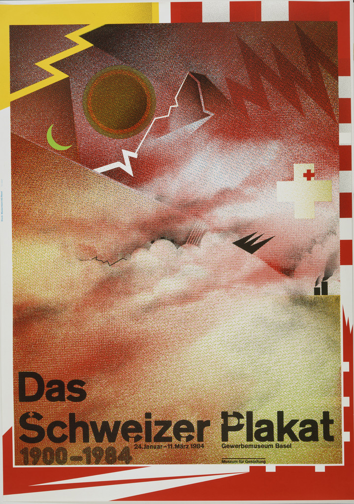
What it is — poster for the exhibition of Swiss posters 1900–1984 at the Gewerbemuseum Basel
(24 January – 11 March 1984, reading of the poster). MoMA: offset lithograph, 120 × 84.1
cm, gift of the designer (457.1985); LACMA: offset lithograph, 127.6 × 90.2 cm, dated
Plakatarchiv lists TWO sheets from 1984: for Gewerbemuseum Basel and for Birkhäuser
Verlag (publisher of the catalogue "L'affiche Suisse / Das Schweizer Plakat"). The difference in dimensions
between MoMA/LACMA is probably a difference between two variants — see Notes on sources. Eye on Design: exemplary
"halftone film collage with fragmented dot screens revealing photo-mechanical
processes."
Composition — upright sheet; the top two thirds are sky: clouds in coarse
halftone, over them diagonal stripes of screen (like rain or sun rays),
red-and-white bands at the left and top edge (like a tent or flag), top left
a red disc of the sun, next to it a green crescent, top right a white lightning bolt or
a jagged mountain, right a white cross on red (the Swiss coat of arms) and a black silhouette of a bird; the bottom
third — "Das / Schweizer Plakat / 1900–1984" in three lines, black, left-aligned, behind the text
the title repeats in grey, shifted (double impression, register). The eye enters through the red
sun top left, slides across the clouds to the lightning bolt, falls onto the title below. The title is
the only stable element; everything above it moves.
Colour — red, yellow, grey, white, green. Red is Switzerland (coat of arms, bands),
but broken into stripes and a disc — the coat of arms is quoted in fragments, not shown. Grey is the screen
of the clouds; yellow the stripes. The colours overlap in the screens and produce third tones (orange
between red and yellow). LACMA (for the series): "overlapping the pattern and text, creating a
sense of depth."
Typography — bold grotesque (sans serif) (not confirmed), three lines of different sizes
("Schweizer Plakat" the largest). The grey duplicate of the title behind the black one = two impressions offset,
which gives the title volume and ties it to the screen above. Small exhibition details in one
line under the title.
Message — at three seconds: Swiss sky in halftone, red-and-white, title. From five
metres: red bands, sun, title. Message conveyed: Switzerland + poster. But with
irony — a poster for 84 years of Swiss posters quotes not a single poster, but
the Alps, the sky, the coat of arms — kitsch motifs of the tourist poster — and translates them into a halftone language which
has nothing to do with the tradition it represents. This is a "reluctant inheritor" (Letterform) in
a single image.
Why exactly this way — the end of the film phase: 1984 (Eye on Design) brings in the Mac. This is the
last major film collage before the bitmap — and it looks like a bitmap (coarse halftone
of the clouds). Constraint: represent an entire national poster tradition without privileging
any one author — so the only solution was to show none.
What would kill it — putting a small collage of historical posters in the corner. Then it's a
catalogue, not a stance; and stance is the only reason this poster stands in MoMA.
M. Thematische Veränderungen, 1974, relief print 58.9 × 49 cm, gift of Aaron Marcus — SFMOMA 2014.760; series of the letter M since 1962 (Eye on Design)
Nine Collages — The New Graphics by Weingart, 1974–75 — SFMOMA 2014.754; cut film, barely legible setting, deliberate moiré (Letterform Archive)
Astronautentypographie, Kreisförmige Schriftstrukturen, 1972 — SFMOMA 2014.742; circular compositions of foundry type
Kunstkredit 1977/78 (screenprint, one colour), 1978/79, 1979/80, 1980/81, 1981/82, 1982/83 — all 128 × 90, Kunsthalle/Mustermesse Basel (plakatarchiv)
Herbert Bayer — Das künstlerische Werk, 1982, Gewerbemuseum Basel, offset two-colour 128 × 90 (plakatarchiv)
The 20th-Century Poster — Design of the Avant-Garde, 1984, Walker Art Center, offset multi-colour 128 × 90 (plakatarchiv)
Das Kotzenbuch, 1970–72, relief print, hand-set (Eye on Design)
Typography — My Way to Typography, Lars Müller 2000, 520 pp., bilingual (Syncopation)
Principles — summary
Global, proven in the work: citljivost-na-granici (01, 03, 08 — eighth author: the boundary
shifted to SPACING and to DEGRADATION by the process camera), zrno-i-zamucenje-kao-oblik (04, 05,
08 — fourth author, the first for whom the screen IS the material of the image, not of the photograph),
jedno-pismo-siroka-skala (01, 06 — one typeface, five cuts in a sentence),
program-umjesto-artefakta (02 — third author: the Typographic Process posters are lessons,
not posters).
Promoted to global: providni-sloj-kao-dubina (04, 05, 07 — second author after
Muriel Cooper; with her it's glassine and alpha, with him it's layers of film on a light table;
LACMA: "creating a sense of depth").
New local tags (awaiting a second author):
- varijabla-do-otkaza — a single parameter (spacing, angle, generation of copy) pushed to
the point where the work stops working; held one step before that. Candidates: carson, greiman.
- moare-je-namjeran-sloj — two screens at different angles as a third tone and depth;
a print error as a planned layer. Candidates: greiman, brody.
- stepenasti-tekst-kao-oblik — a block of text or type stepped line by line
until it becomes a geometric shape (Letterform: "stepped text blocks"). Candidates:
greiman, scher.
Bridge to practice: poster · graphic design · motion
Poster
One colour, four tones. Kunstkredit 1977: before adding a second colour, build a
tonal scale from one — solid, negative, fine screen, coarse screen. In Illustrator:
one spot colour, four Pattern swatches (halftone 20/40/60 lpi + solid), and only then ask
whether a second colour is needed.
Moiré as a layer, not an effect. Two halftone patterns of the same motif, one rotated
15°, Multiply. The angle shift is the only parameter — don't confuse it with a Photoshop filter.
Title in two impressions. Das Schweizer Plakat: title black + the same title grey,
shifted 1–2% of the format diagonally. Gives volume without a shadow.
Spacing as a variable. "T E E": tracking +200 and beyond. Rule from Nr 5 — when
a word stops reading as a word, it starts working as a shape. Find that point, step back one.
Graphic design
Cover as a question. TM 1972–73: a series of covers where each one poses one
question about the medium. For a series of thumbnails or covers: one typeface, one colour, a
different single parameter each time.
Five cuts in a sentence. TM 5/1972: the weight changes mid-line according to the meaning of the word,
not according to headline hierarchy. Try it on one paragraph — bold on the words that carry weight,
light on the connective tissue.
Material from the subject, language your own. Didacta: teaching subjects as collage, but the screen and
the diagonal are his own. Rule: put the client's content in the foreground, your language in the base.
Motion
Generation of copy as time. AE: text → precomp → Posterize Time + Noise +
Blur → render again → re-import → repeat 4–5 times. Each generation is
one frame — degradation as animation, the same thing he did with the process camera.
Stairs from text. A paragraph in AE, each line's Position X offset = line × step
(Expression: [value[0] + index*20, value[1]] on text layers). Animate the
step from 0 to 40 — the text turns into a pyramid (Nr 5).
Layers of film = 3D layers without a camera. Three halftone planes at different Z, Multiply,
rotate only one — the moiré changes over time.
Bad imitation
Copied look, not experiment. A 1985 Greiman-imitation: diagonal text, screen
over photograph, stripes — without a stated question. Weingart: every piece is the outcome of
one declared exercise ("From Simple to Complex"). Without a declaration — decoration. He says this himself
about his students (quarry).
Screen as filter. A halftone effect in Photoshop applied over a finished composition. With him
the screen arises BEFORE the composition — tone is chosen through the screen because there's no other colour
(Kunstkredit). When the screen is added afterward, there's no hierarchy of tones, just
texture.
Illegible without reason. Title half-covered, because "that's New Wave." With him
the boundary of legibility is the subject (Nr 5, TM 1976), and he holds it one step before collapse; when
the client wants a message (Didacta), the title is clean. Covering without a decision about the boundary is
just poor typesetting.
The brief through their eyes
Current job: YT gaming animations / thumbnail series. Weingart would first take one typeface and one colour and make ten thumbnails where only ONE variable changes
(spacing, angle, screen density) — then look at which one the title stops being readable. The series
would be that sequence, not ten different images. The process would be visible: the screen coarse like
the clouds in Schweizer Plakat, so that at 200 px you can still see the dot.
Exercises
One colour, four tones (45 min). Take one title and one photograph. Only
black. Make a poster where full black, negative, fine and coarse screen are four
DIFFERENT functions (title, background, image, texture). Constraint: no element may
use two tones.
To failure (30 min). One word of 5–7 letters, grotesque (sans serif). Tracking 0, +50, +100,
+150, +200, +300. Print six, stick them on the wall, step back 3 m. Mark where
the word stops and the shape begins. Keep the step before.
Cover as a question (60 min). Three covers for the same publication, same typeface,
same colour. Each answers one question: what is text / what is spacing / what is
weight. None may use an image.
Motion study
5 s, AE. One word, Akzidenz-type bold, white on black. 0–2 s: tracking from 0 to +300
(the word breaks apart into letters). 2–4 s: each character gets a Y offset = index × 15 px
(letters become steps). 4–5 s: cut to the same word in coarse halftone screen, 30 lpi,
static. One shot, one event: word → shape → screen.
Rebuilding the benchmark
Benchmark: Kunstkredit 1976/77 (MoMA 101455), portrait B4 (90 × 128, ratio 1:1,42).
From the screenshot (MoMA, scale 0.7 — rough): „KUNSTHALLE BASEL" top edge at ~7 % of height,
negative „KUNSTKREDIT" band at ~17–22 %, subtitle black band ~22–25 %; central
circular object centre at ~(45 %, 45 %), diameter ~30 % of width; „Ausstellung 7. bis 30. Mai
1977" at ~57–62 %; photograph of the facade bottom right quadrant from ~68 % to the bottom; diagonal
stripes bottom left corner. Tonal zones: top light (fine screen), middle dark (object
+ negative), bottom mid-tone (photograph). Task: .svg skeleton with these five rectangles
and a circle, then 45 min in Illustrator with one colour and three screens without looking
at the original. Measurements from the image need to be verified once the image is local (measurement script).
Notes on sources
Date and place of birth: Wikipedia 6.2.1941, Salemertal; TGDS „Konstanz" — following
Wikipedia, TGDS has already been caught in errors before (Hofmann 1987).
Trade: Wikipedia — Ruwe printworks, mentor Hanke; TGDS — „Hollenstein Cliché
1958–63". Following Wikipedia; to verify in My Way to Typography.
Joining the TM editorial board: Wikipedia 1970–88; Letterform Archive „newly appointed
board member" 1972. The cover series is confirmed 1972–73 (Letterform, TM Research Archive).
Number of covers: Letterform Archive „fifteen covers for the 1972 and '73 print
runs"; TGDS „1971–72". Following Letterform.
Students:Greiman and Friedman widely documented as students (Eye, v1), exact
years only per TGDS. Willi Kunz „1967–70" only TGDS — UNCONFIRMED (Kunz is from Zürich,
later taught in Basel — to verify).
„18 Didone poster series (1988)" per TGDS — not in any other source; likely
confused with „18. Didacta" (1981). DO NOT use.
Mac in teaching: Eye 4/1991 — January 1985; Eye on Design — 1984.
Das Schweizer Plakat: MoMA 120 × 84,1 cm dated 1984; LACMA 127,6 × 90,2 cm
dated 1983; plakatarchiv two variants 1984 (Gewerbemuseum Basel / Birkhäuser).
Likely two prints of different format; which is which — unresolved.
Kunstkredit 1977 technique: MoMA „lithograph", LACMA „offset lithograph", plakatarchiv
„Offset, einfarbig". Treated as offset, single colour.
Schreibkunst colour: LACMA reproduction black-and-white; plakatarchiv two-colour. Second
colour UNKNOWN — provjeriti uz sliku.
Typefaces: only the TM covers 1972–73 confirmed as Akzidenz-Grotesk (Letterform).
For the posters no confirmation anywhere; Fonts In Use has only one third-party entry tagged Weingart.
Class „grotesque of the Akzidenz type" throughout.
v1 quote „I wanted to find out what typography could be if you took away all the
rules" — not found in any source; replaced with a quote from Eye 4/1991 (the quarry).
v1 claim „Herman Miller (via students)" as client — unconfirmed, removed.
Work 04 (TM 12/1976) analysed from a small reproduction in the Letterform article; the
„hi-fi captures" gallery was not opened (data saving). Classed v2 with a caveat.
Portrait: Wikipedia infobox (Tüllingen 2011); Commons URL not found via
WebSearch; a-g-i.org/members/wolfgang-weingart — 404.
eguide.ch — both the /designer/ and /objekt/ paths now redirect to
museum-gestaltung.ch/de/digitaler-guide (09.09.2026). Museum für Gestaltung records
were NOT used this time.
Difference from its pair
Armin Hofmann ↔ Wolfgang Weingart — teacher and successor at the same school: Hofmann builds the image
from observation (eye, gestalt, one mark), Weingart from process (repro camera, layer, moiré)
— system / dismantling the system from within, with the same discipline.
Emil Ruder ↔ Wolfgang Weingart — both derive everything from spacing and the rhythm of setting; Ruder
uses spacing to let the word breathe (a grid from the letterform), Weingart pushes it to +200 until the word stops being a
word — same parameter, opposite goal; for him, Ruder's repetition is „wallpaper".
Jamie Reid ↔ Wolfgang Weingart — same 1977, same dismantling of the ruling taste: Reid
from outside, with scissors and found letters, cheap and visible; Weingart from inside, with lead type
and film, expensive and invisible (the process cannot be reconstructed from the work).
Karl Gerstner ↔ Wolfgang Weingart — both program-umjesto-artefakta: Gerstner's programme is
parametric and forward-looking (the morphological box), Weingart's is experimental and backward-looking
(the variable pushed to failure, the result kept).
Muriel Cooper ↔ Wolfgang Weingart — both providni-sloj-kao-dubina in the same 1976–77:
her on screen and glassine (layer = hierarchy of reading), him on film (layer = tone and
moiré); she uses depth to organise, he uses it to blur.