Typography teacher and director, Allgemeine Gewerbeschule Basel (1942–1970); author of Typographie (1967) Zürich → Basel
Typography has one plain duty before it and that is to convey information in writing.
Biography
Born 20 March 1914 in Zürich; died 13 March 1970 in Basel, at fifty-six, at the height of his influence. He entered typesetting apprenticeship very young (fifteen) and learned the trade for seven years (1929–1933) — hands in lead type before any theory. A year and a half in Paris followed (1938–39, language diploma), then a return and a job as head of the letterpress composing workshop at a Zürich trade publishing house.
The turning point is 1941–42: studies at the Kunstgewerbeschule Zürich under Walter Käch and Alfred Willimann — the same class that Max Huber and Josef Müller-Brockmann passed through (see Influences). There he systematically encounters the Bauhaus and Tschichold's Die neue Typographie for the first time. Already in 1942 he gets a permanent post as typography teacher at the Allgemeine Gewerbeschule in Basel; in 1947 he becomes head of the department for applied art scholars, the same year founds the Tagesfachklasse for letterpress (a specialised full-day class for typesetting and printing), and the same year Armin Hofmann joins him at the school — together they build a programme that by the mid-fifties will have waiting lists. From 1946 he writes for Typografische Monatsblätter (TM); between 1957 and 1959 he publishes a four-part series "Wesentliches" (Essentials) which, expanded, becomes the book Typographie (1967, Verlag Arthur Niggli) — a manual still in print today and still accurate today. In 1962 he co-founds the International Center for the Typographic Arts (ICTA) in New York (the names of the other founders are not confirmed in available sources). From 1965 until his death in 1970 he simultaneously runs the entire Allgemeine Gewerbeschule and the Gewerbemuseum Basel; in 1968, together with Hofmann, he founds an international advanced (postgraduate) programme in graphic design. He married Ingeborg Susanne Schwarz in 1950 (sons Martin, b. 1951, and Daniel, b. 1954).
Unlike Tschichold, who in the late thirties himself abandoned strict asymmetric doctrine, Ruder spent the rest of his life refining it as a system that could be taught — not as a style but as a set of verifiable rules about the relation of black and white, word and space, eye and reading time.
Influences
Studied with
Walter Käch — Kunstgewerbeschule Zürich (1941–42), typesetting and typography
Armin Hofmann — colleague at the same school from 1947, joint advanced programme from 1968
Karl Gerstner — collaborator at TM, coined the term integral typography for Ruder's TM issue in 1959
Who he studied under
Walter Käch and Alfred Willimann, both at the Kunstgewerbeschule Zürich (1941–42) — confirmed independently through the German Wikipedia and through Kiriazis's text (Medium). The Willimann connection is especially valuable: it's the same class that Max Huber and Josef Müller-Brockmann passed through (see _STANJE_I_NASTAVAK.md) — a group of three, not two, tied to the same teacher, with three entirely different outcomes (Huber's colour overlap, Müller-Brockmann's grid system, Ruder's system of text rhythm).
What he steals
The Bauhaus and Tschichold's Die neue Typographie — passed on through the school, not through direct contact. From Eastern philosophy (Zen, the Japanese garden) he takes the idea that "empty space gives life to the printed" — for him this isn't a metaphor but a compositional instruction: white is drawn, not left over. The deepest "stolen" source is nonetheless his own craft: seven years of working with lead type taught him that the square/module is a physical fact of typesetting (letter width, spacer thickness), not a drawing decision made by eye.
Who he influenced
Direct students: Wolfgang Weingart (who would later dismantle from within the system he learned from Ruder and Hofmann — the Basel New Wave of the seventies), Hans-Rudolf Lutz, Helmut Schmid (who becomes the main author of analytical texts on Ruder's work), and Steff Geissbühler. The claim that April Greiman and Dan Friedman were also his students (via the Basel–Yale exchange) doesn't hold up chronologically — both arrived in Basel in 1970/71, after Ruder's death in March 1970 — they likely studied under Weingart and Hofmann, not Ruder (see Notes on sources). More broadly, the entire later debate about ragged setting on the web — caused by the inability of early browsers to justify text algorithmically — arrived, forty years later, at the same conclusion Ruder reached by hand in 1967.
What it is — the cover of the Swiss monthly Werk (architecture, art, applied art), A4 format, 1948.
Composition — five lines of text centre-aligned to the right margin along the left edge of the white page; huge spacing between lines and toward the edges — the text occupies maybe a fifth of the surface, the rest is pure white field.
Colour — black for all text except the word "werk", which is in red — the only colour on the whole page, and it falls on the one word that is also the publication's name.
Typography — a humanist serif (class; specific typeface not confirmed at the available resolution) — surprising, since this is 1948, before Ruder's later, almost exclusive reliance on grotesque (sans serif). It shows that his "Swiss" language wasn't finished from the start but was being built.
Message — a calm, almost contemplative announcement of the contents ("werk, a Swiss monthly for architecture, art and applied art") without a single graphic trick — the message is the word itself and its weight in space.
Why exactly this way — in 1948 Ruder is in his sixth year of teaching, but hasn't yet published a single theoretical text; this is the work of a craftsman who already knows that white carries meaning, before he formulated it in words.
What would kill it — centring the text on the page instead of along the left margin — the current asymmetry is the reason the white space feels drawn, not accidental.
Principles:bijeli-prostor-kao-oblikTo verify against the image: the exact serif typeface; whether "werk" is in the same typeface as the rest or a separate cut.
02 · Kunsthalle Basel — Walter Bodmer / Hans Hartung (1952)
What it is — a poster for the joint exhibition of Walter Bodmer and Hans Hartung at the Kunsthalle Basel, February–March 1952; no photography, pure typography.
Composition — three text blocks scattered asymmetrically across the white surface: "Kunsthalle / Basel" top right, "Walter / Bodmer / Basel" middle left, "Hans / Hartung / Paris" bottom right — no two blocks align on the same vertical, and yet the whole page feels balanced.
Colour — exclusively black on white; no other colour.
Typography — a bold grotesque (sans serif) of the Akzidenz-Grotesk type (class; specific typeface not confirmed), all capitals of the same cut — hierarchy comes purely from size and position, not from mixing typefaces.
Message — the three-second test works: institution, two names, two cities — nothing more, nothing less. The five-metre test works equally well because there's no small text to get lost.
Why exactly this way — two artists, two cities of origin, one institution — Ruder treats this factual structure as a compositional diagram, not as a problem to hide through uniformity.
What would kill it — aligning all three blocks to the same left margin — the current scattered layout is the reason the eye has to actively travel across the whole surface to read the poster, instead of sliding down one edge.
Principles:tekst-kao-siva-povrsina (local tag)
To verify against the image: exact proportions/positions of the blocks in % of format (awaiting measuring tool).
What it is — a TM cover, an issue devoted to proofreading in the printing industry, April 1953.
Composition — a huge rectangle of solid colour occupies about two-thirds of the right side of the page; a small block of text is squeezed against the very left edge, arranged vertically.
Colour — a full, flat red (vermilion) surface against white — extreme surface contrast without a single transitional value.
Typography — a small grotesque (sans serif) (class), deliberately at the edge of legibility in this reproduction — the text here doesn't carry the main message, the colour does.
Message — the five-metre test: what you see is "a red rectangle against a white edge", not the text content — the cover communicates the mood/genre of the issue before a single word is read.
Why exactly this way — a cheap trick (one flat colour, no photography, no halftone screen) that works at the newsstand just as well as a more expensive solution.
What would kill it — making the text bigger and more legible — the whole strength of the piece is that colour dominates and text remains secondary, almost a decorative trace.
Principles:ravna-boja-na-daljinuTo verify against the image: the exact content and typeface of the small text (illegible at the available resolution).
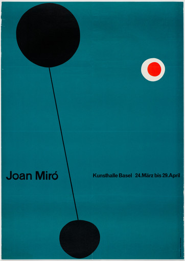
04 · Joan Miró — exhibition poster, Kunsthalle Basel (1956)
What it is — poster for Joan Miró's exhibition at Kunsthalle Basel (24 March – 29
April); lithograph, 128 × 90.5 cm, printed by Buchdruckerei VSK Basel; MoMA
copy is a gift from the designer himself.
Composition — on a deep petrol-blue ground: a large black circle top
left connected by a thin diagonal line to a smaller black circle below —
like a pendulum or a "coup de dés" figure; separate, top right, a small red circle
with a white halo. The name and exhibition details sit at the bottom, outside that figure.
Colour — only four: petrol-blue (ground), black (figure), red and
white (small accent circle) — the red-white circle is the only place where
all the poster's "warmth" concentrates.
Typography — small grotesque (sans serif) (class; specific typeface not confirmed),
reduced to two lines of information — typography here is not the carrier of
the message, only a caption to the image.
Message — three-second test: "Miró" is recognised even before reading
the name, because the figure itself is composed of Miró's own visual
vocabulary (circle, dot, thin line, red eye) — this is not an illustration
of one of his works but a diagram assembled from his trademark signs.
Why exactly this way — for an exhibition of an artist whose vocabulary is already iconic,
borrowing that vocabulary is more effective than quoting a specific image — the poster
works both as an announcement and as a small exercise in Miró's language.
What would kill it — if the red circle were the same blue as the background —
that single warm accent is exactly the reason the eye returns to it after
crossing the diagonal.
Principles:posudjeni-vokabular-autora (local tag — related but different
from analogija-umjesto-ilustracije: no analogy is built for the exhibition's content,
rather the exhibitor's own visual vocabulary is borrowed)
To verify against the image: exact position of elements in % of format (awaiting measuring tool).
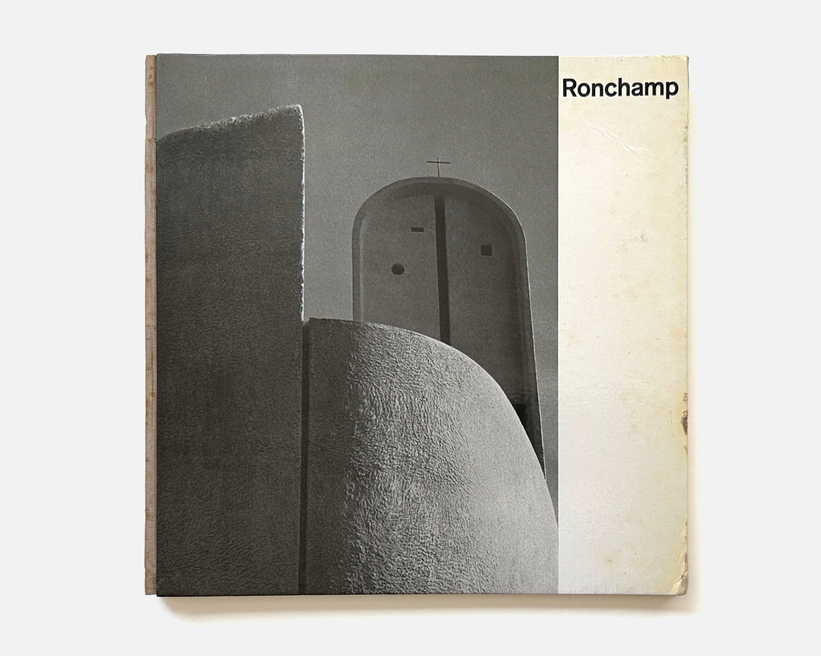
What it is — a monograph on Le Corbusier's chapel Notre-Dame du Haut in
Ronchamp; 106 pages, 25.4 × 25.4 cm, French text, 48 black-and-white
photographs by Paul and Esther Merkle, foreword by Hans Urs von Balthasar;
published by Editions Desclée De Brouwer, printed in Basel.
Composition — according to Helmut Schmid's description (2017): vertical
and horizontal photographs on the right-hand page, text in one or two columns
on the left, with pagination aligned to each column — the spread is the
unit of layout, not the individual page.
Colour — high-contrast black-and-white photographs on a white/cream
page; no added colour.
Typography — to verify against the image (specific typeface not confirmed in available
sources for this edition).
Message — "freed from the weight of the Bauhaus... fresh and new compared to
typography of its time" (Schmid) — a book on radical sacred
architecture gets an equally radically fresh, yet disciplined, layout.
Why exactly this way — an architectural monograph demands that photography carry
the proof (form, light, material), while text remains strictly secondary, but
legible — hence the two-column text against full-bleed photographs.
What would kill it — photographs embedded within the text instead of on
a separate page — the separation lets each photograph gain full format
and full attention, as in the architecture it depicts itself.
Principles:fotografija-je-layoutdvostrana-je-jedinicaTo verify against the image: the interior spreads have not been seen in full resolution
(only the front cover); the exact typeface and exact column scheme remain
unverified from the secondary description.
What it is — cover of TM, an issue dedicated to the term "integral typography"
coined by Karl Gerstner, June–July 1959.
Composition — an enormous empty, cream space occupies almost the whole
page; all content — one line of small names/terms and two larger words
"sondernummer integrale typographie" — is compressed into the bottom third, against
the left margin.
Colour — red for all text on a neutral cream ground; no other
colour.
Typography — Akzidenz-Grotesk (documented — but only for a more recent
digital reconstruction of the same cover made in 2018 by a Wikimedia
contributor; for the original (scan), the typeface is not independently confirmed, although it is
consistent with the rest of the body of work).
Message — the format itself is the argument: an issue announcing the fusion of text and
image into a single system opens with maximum emptiness — the message is
restraint before a single word is read.
Why exactly this way — Ruder here practices what the issue preaches: if
"integral typography" is the equality of text and image, then the absence of image
(a pure white/cream field) becomes an equal compositional element.
What would kill it — centring the text in the middle of the page — the current
position against the bottom-left corner is exactly why the huge empty space above
reads as a drawn figure, not as leftover space.
Principles:bijeli-prostor-kao-oblikTo verify against the image: two versions of this cover circulate online — one is
a scanned reproduction (used here), the other is a modern digital
reconstruction of the same design; do not mix them as a source for the exact letterform.
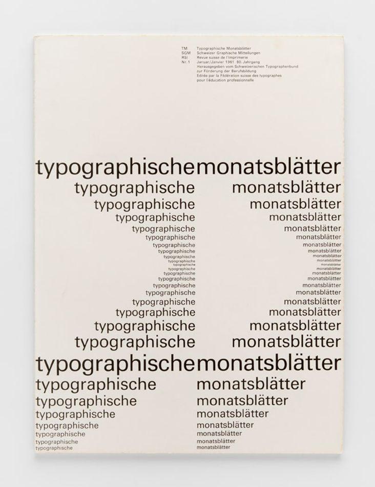
What it is — cover of TM, an issue dedicated to Adrian Frutiger's typeface
Univers, January 1961.
Composition — the entire surface is a grid of lines; each line repeats
the words "typographische monatsblätter" in a different weight/width
cut of Univers — from the smallest, lightest cut at the top to the largest,
heaviest at the bottom.
Colour — black on off-white/cream ground; no other colour.
Typography — Univers (documented) — this is NOT an illustration about a typeface
but the issue itself, speaking about Univers, printed as a specimen
of Univers — content and form are the same text.
Message — three-second test: even without reading the text, the eye immediately reads
"this is a specimen table of a typeface" — a publication that looks like its own
thesis is the strongest possible advertisement for that thesis.
Why exactly this way — Univers was the first typeface designed as a coordinated
family of cuts/widths/weights under a single number system (Frutiger's
system 39–83) — Ruder's cover makes that abstract system literally
visible, line by line.
What would kill it — if the lines were in a random rather than progressive
order of weight — the current arrangement from lighter to heavier builds a visual
crescendo that reads as "system", while a random arrangement would read only
as "noise".
What it is — cover of TM for the twentieth anniversary of the Buchdruckfachklasse
(special letterpress class founded by Ruder in 1947), October 1967.
Composition — a huge number "20" is cropped so aggressively that only
fragments of the digits fit within the frame — the arc of the digit "2" is visible at
the top and part of the digit "0" at the bottom, both cut off by the page edge.
Colour — black on off-white ground; no other colour.
Typography — bold grotesque (sans serif) (class; specific typeface not
confirmed) — but here the letter/number is not text to be read but the very
form of the composition.
Message — legibility test at the limit: the number is recognised as "20" only
after the eye assembles the two fragments — one step before total loss
of the form's identity, exactly as Ruder taught testing where
recognisability breaks.
Why exactly this way — the anniversary of a class dedicated to the craft of letters
is celebrated by breaking down the letter/number itself to the edge of
recognisability — the content of the number is a demonstration of the very risk
Ruder taught about.
What would kill it — if the whole number "20" fit within the frame — without
cropping, exactly the tension of "is this still a number" is lost, which is
the reason the work still feels contemporary today.
Principles:citljivost-na-graniciTo verify against the image: exact typeface and exact percentage of cropping (awaiting measuring
tool).
What it is — cover of the book Typographie: Ein Gestaltungslehrbuch / A Manual
of Design, Verlag Arthur Niggli, 1967; hardcover, cloth.
Composition — square cover divided into unequal fields: on the right
a large black field with an enormous white "T"; on the left a series of smaller fields which,
read top to bottom, spell out the remaining letters of the word "TYPOGRAPHIE" — where
the lower part of that left column is rotated 180° (letters upside down), alternating
black-on-white and white-on-black.
Colour — black and white only; no third value.
Typography — Univers (documented, PGDA) — the same family that is also
the subject of TM issue 1/1961 (work 07), here broken into modules of unequal
size instead of into lines of equal length.
Message — the three-second test: the word "TYPOGRAPHIE" reads
even when half the letters are upside down and scattered across unequal cells — the message
of the book (the letter stays recognisable even under extreme pressure from the system) is spelled out
on its own cover before a single page is opened.
Why exactly this way — a book that teaches that legibility, module, figure/ground
contrast, and the limit of readability are real tools, not abstract theory,
proves it on its own cover first, in its content afterward.
What would kill it — if all fields were the same size — the unequal module
(one enormous "T" against a row of tiny fields) is why the composition has
hierarchy instead of being merely a decorative checkerboard.
There are no additional works without full analysis. The remaining three entries from the v1 roster have
been removed as incorrect attributions — see Notes on sources.
Two local candidates (not yet in _PRINCIPI.md — need a second author to enter
the shared index):
- tekst-kao-siva-povrsina — the text block has an optical grey value
that must be balanced against all other elements of the page as an
abstract composition, regardless of what it says (Kunsthalle Basel poster;
the central thesis of the whole book Typographie).
- posudjeni-vokabular-autora — a poster for an artist's exhibition builds its composition
from that artist's OWN visual vocabulary (the shape, colour, gesture by which they are
recognisable), not from a general geometric language nor from a literal quotation of
one specific work (Miró, 1956).
Bridge to practice: poster · graphic design · motion
Poster
The Kunsthalle Basel poster (02) shows that the hierarchy of three equal-weight
facts (institution, two names) can be resolved purely by position and size,
without a single image and without a single additional colour. When you're doing
an announcement for something with several equal-weight names/terms (collaboration, guest
artist), try it first without an image — scatter the text blocks deliberately asymmetrically and check
whether the typography alone carries enough.
Graphic design
A word from Ruder's craft that transfers directly into Illustrator/InDesign: set the space
between words as a function of letter size and keep it fixed —
never let automatic justification change it line by line.
When you're laying out a larger block of text, squint at the whole page (or shrink it
to a tiny thumbnail) and check whether the text's grey value is balanced against the other
elements as an abstract composition — exactly as on the Kunsthalle poster.
Motion
This is a designer whose central argument translates literally into your medium:
Ruder claims that typography is a temporal art — the reader moves
through it, and the designer's real material is the rhythm of black and white, not the
individual letter. In AE or Moho that means: treat the timing of on-screen text (how long
it stays, how fast it enters, what the gap/pause is between alternating lines)
as the same craft as word spacing on paper — spacing in time is word
spacing, just measured in frames instead of millimetres.
Bad imitation
The most common mistake in modern "Swiss" pastiches: take a grotesque and a grid,
but justify the text because it "looks tidy" — Ruder explicitly rejected exactly
this, because justification stretches and compresses word spacing randomly
and destroys the rhythm that his whole system was meant to preserve.
Second mistake: treating the grid as a decorative skeleton drawn over
the page, instead of deriving the grid from the actual size and leading of the type —
the test is simple (see _PRINCIPI.md, mreza-izvedena-iz-tipografije): if
changing the leading by one point doesn't change the grid, the grid wasn't derived but
drawn. Third: copying the "emptiness" of Ruder's covers (TM 1959) as
empty space with no content, instead of as a deliberately drawn element
that carries exactly as much weight as the text.
The brief through their eyes
For the title card of your YouTube gaming-animation series, Ruder
would first ask: how long does the title stay on screen, and is that timing
consistent from episode to episode, like word spacing that doesn't change from
line to line. Then he would treat every graphic element (logo, episode number, title)
as a block with its own grey value and demand that these blocks be
balanced as an abstract composition even when the content is switched off. Finally he would
suggest you try a version with no image at all — just typography,
size and position — and check whether the word alone carries enough.
Exercises
Take one paragraph of text (any) and set it in three versions: justified,
unjustified with fixed word spacing, and unjustified where you manually
"draw" the shape of the unaligned edge (rag) line by line. Compare the grey
value of all three versions with a squinted eye.
Take three equal-weight pieces of information (three names, three dates, three terms) and
lay them out on a page with no image, deliberately asymmetrical, as in the
Kunsthalle Basel poster — check whether the result is balanced before
you add a single other element.
Motion study
A five-second exercise in AE or Moho: one line of text enters, stays exactly as many
frames as it "weighs" (number of letters × fixed time per letter), then exits;
the next line enters under the same rule. Constraint: one frame, one timing system
for all lines — timing is your "word spacing".
Rebuilding the benchmark
Benchmark: cover of Typographie (09). Skeleton: a square divided into one large
field (~55% of the width, full height) and a series of smaller fields in the remaining ~45% of the width,
alternating black/white. Task: reconstruct the layout in Illustrator in 45
minutes without looking at the original, fill in every letter of the word TYPOGRAPHIE in its own
field (including rotating the lower fields by 180°), then compare with the original.
Notes on sources
The location of the apprenticeship is not agreed upon: the English Wikipedia states a typesetting apprenticeship (1929–1933) "in Basel", while Design Reviewed and the context of later work in Zürich before 1942 suggest a Zürich context. Not resolved in the available sources.
Co-founders of ICTA (1962) are not named in any verified source.
April Greiman and Dan Friedman as "Ruder's students" (claim from TGDS) does not hold up chronologically — both arrived in Basel in 1970/71, after Ruder's death in March 1970; they probably studied under Weingart and/or Hofmann. Excluded from the confirmed list of students in this note.
v1 error — incorrect attribution (TM 3/1971): the v1 harvest classified the cover of TM 3/1971 as one of Ruder's works. The Wikimedia record clearly states: "Special issue dedicated to Emil Ruder. Cover design by Robert Büchler" — this is a posthumous issue DEDICATED to Ruder (who died a month earlier), not his design. Removed from this note entirely.
v1 error — incorrect attribution (TM 4/2014): the v1 harvest also classified the cover of TM 4/2014 as one of Ruder's works — the centenary of his birth, an issue from 2014 dedicated to him, not his work. Removed.
v1 error — incorrect attribution ("Making and Breaking the Grid"): the v1 harvest classified the book Making and Breaking the Grid as one of Ruder's works — this is a book by Timothy Samara (Rockport Publishers, first edition 2003), a contemporary textbook on grids that only mentions/cites Ruder as a historical source. Removed from this note entirely.
Portrait: on Wikimedia Commons there is only a drawing of Emil Ruder made in 2018 by a Wikimedia contributor (Manuel Schmalstieg, "Drawing of Emil Ruder", own work) — not a photograph of the actual person. Per the project rule (nothing is invented), this was NOT taken as a portrait; portret.ima remains false.
Ronchamp (05) was analysed from a secondary description (Schmid, 2017) and only a photograph of the cover — the inside spreads of the book were not seen in full resolution (the gallery at bookstore.thisisdisplay.org did not open in the browser panel); the exact typeface of the text remains "to verify against the image".
TM 1959/6 (06) has two versions in circulation: the actual scanned reproduction (used here as the source) and a newer digital reconstruction of the same layout made in 2018 by a Wikimedia contributor in modern Akzidenz-Grotesk — do not mix them up as evidence of the exact historical typeface.
The exact typeface is not confirmed for most works without an explicit documented record (01, 02, 03, 04, 08) — left as a class, not as a typeface name.
Measurement in % of format for all works is pending the script (see _STANJE_I_NASTAVAK.md, "Waiting on computer / script").
Difference from its pair
Armin Hofmann ↔ Emil Ruder: colleagues at the same school from 1947, but with material that doesn't match. Hofmann's material is the eye — the image is taken in all at once, as a gestalt, before it is read. Ruder's material is time — the word is read letter by letter, line by line, and his "system" is literally the rhythm by which that temporal sequence moves. Both build discipline, but Hofmann is the discipline of the moment, Ruder is the discipline of duration.
Josef Müller-Brockmann ↔ Emil Ruder: both "system" designers, but with different types of grid. Müller-Brockmann's grid is spatial — it divides the page into columns and modules for arranging image and text. Ruder's grid is derived from the typeface itself — the module comes from the width of the letters and the thickness of the spacing, not from dividing the format; for him, the grid doesn't exist until the typeface is chosen.