appropriation, record sleeves, subtraction as authorship
art director and co-founder of Factory Records; Peter Saville Associates; partner at Pentagram London; creative director of the city of Manchester Manchester → London (Los Angeles 1993–94) → London
„The whole point with appropriation is knowing what to do, and when.“ — Eye 4/1995, Reputations (Rick Poynor). v1 quote „Everything is a quotation now. The skill is in the choice.“ not found in any source — removed.
Biography
Born 9 October 1955 in Manchester, into a well-off family („I grew up with a lot of
objets d'art around me“). Senior school St Ambrose College in Hale Barns from 1967,
a year ahead of Malcolm Garrett and Keith Breeden; art teacher P. D. Hancock, trained
at Newport College of Art, ran the department as a design department — with typography
and lettering, not painting. In his foundation year at Manchester Polytechnic he saw
Warhol's Marilyns at the Whitworth („I would have been less shocked if a UFO had landed“);
Garrett brings him Kraftwerk's Autobahn in 1974. Graphic design at Manchester
Polytechnic 1975–78 (teachers George Hardie, Dan Fern); dissertation on pop painter
Peter Phillips. Key book: Spencer's Pioneers of Modern Typography, from which he
takes Tschichold — at the moment when punk graphics (Reid) sits across the street.
He himself says that he and Garrett had a „masterplan“: the mid-seventies is the
moment that needs to be changed.
1978, he makes the poster for the Factory night at the Russell Club (FAC 1, the
industrial sign Use Hearing Protection) — Dazed calls it the first use of the
industrial aesthetic that would define the label — and becomes co-founder of Factory
Records with Tony Wilson and Alan Erasmus (1978 per Wikipedia, 1979 per Eye and the
Design Museum). Of the first ten FAC numbers he designed eight. 1979, moves to
London, art director of Dindisc (Virgin) until 1983; 1983, opens Peter Saville
Associates with Brett Wickens — this is where the colour code, Blue Monday and
Power, Corruption and Lies come from. Partner at Pentagram London 1990–93; 1993,
Los Angeles, Frankfurt Balkind, „broke after the recession“; from 1994 back in
London, freelance at the Tomato studio, then The Apartment in Mayfair (1993–96, with
Howard Wakefield). 2000, founds SHOWstudio with Nick Knight. Fashion campaigns: Yohji
Yamamoto (early nineties, „Game Over“, no clothing in the image), Jil Sander, Stella
McCartney, Dior; Suede (Coming Up 1996, he himself poses for Knight), Pulp (This Is
Hardcore 1998, We Love Life 2001). Design Museum retrospective 2003 (The Peter
Saville Show), creative director of the city of Manchester from 2004, Burberry
logotype 2018, CBE 2020.
Key fact for reading the body of work: Factory had no brief and no budget („Factory
never talked budgets. Nobody ever said to me: This is a costly sleeve“). The sleeves
were „a form of self-expression to articulate whatever happened to obsess him“
(Design Museum) — and at the same time guided by „what I felt the visual aspirations
of the group's audience to be“ (Eye). Hence also his conclusion that sleeves
„communicate nothing“ and that nobody past thirty should be making them.
Influences
Studied with
P. D. Hancock — art teacher, St Ambrose College, Hale Barnes (senior school from 1967; Newport College of Art, introduced typography and lettering into the curriculum) — Eye, Malcolm Peter and Keith
George Hardie and Dan Fern — Manchester Polytechnic, graphic design 1975–78 — Eye 4/1995 Reputations
Malcolm Garrett — peer, not teacher; he himself says „Malcolm fed me“ — Eye
Herbert Spencer — indirectly, through the book Pioneers of Modern Typography (this is where he discovered Tschichold) — Eye 4/1995
Borrows from
Jan Tschichold, Die neue Typographie and Herbert Bayer — „elegantly ordered aesthetic“ as opposed to punk graphics (Design Museum)
Fortunato Depero, poster Futurismo Trentino 1932 → Movement 1981 (Fonts In Use, Vinyl Factory)
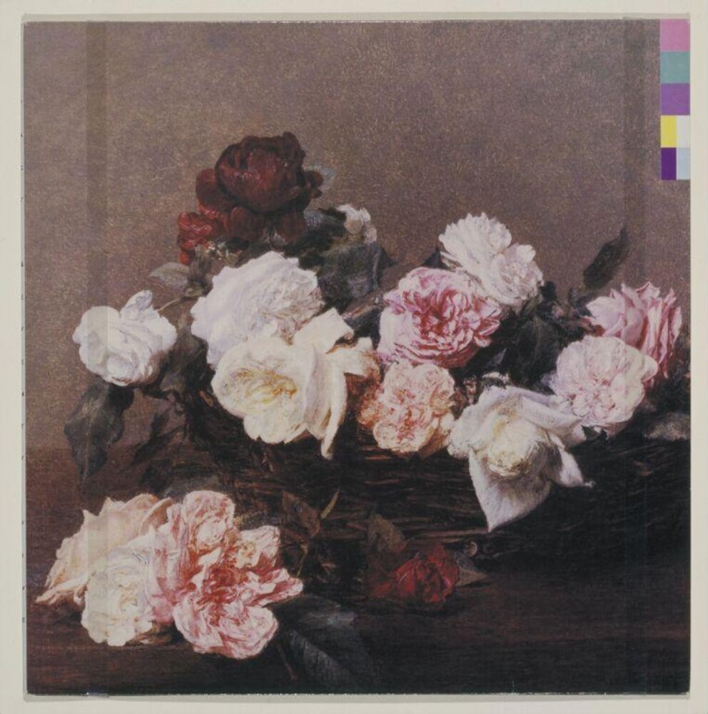
Henri Fantin-Latour, A Basket of Roses 1890, postcard from the National Gallery → Power, Corruption and Lies 1983 (V&A, Design Museum)
Giorgio de Chirico, The Evil Genius of a King 1914 → Thieves Like Us / Murder 1984 (Vinyl Factory)
Peter Phillips (British pop; his degree thesis was on him), Warhol Marilyn at the Whitworth — Eye
Roxy Music („the single biggest influence in my life“), Kraftwerk Autobahn 1974 via Garrett, Velvet Underground & Nico sleeve 1967 — Eye
Wim Crouwel, New Alphabet → Substance 1988 (Fonts In Use) — link Wim Crouwel
later: Yves Klein The Void 1958, Barbara Kruger, Richard Prince (Marlboro Man → Regret 1993) — Design Museum, Vinyl Factory
Influenced
Brett Wickens (PSA partner 1983, co-author of the colour code), Howard Wakefield (The Apartment 1993–96) — Wikipedia, greg.org
Ben Kelly — collaborator (OMD 1980, Section 25), later architect of the Haçienda — Eye
younger musicians in the nineties (Suede, Pulp) asked him to REALISE their own visual ideas — Design Museum; the names of successor designers are not documented in the sources used
Contemporaries
Jamie Reid — same scene and years, opposite taste (deliberate beauty / deliberate ugliness)
Malcolm Garrett (Buzzcocks, Magazine) — same class, same new Manchester graphics
Wolfgang Weingart — same years, both dismantle the Swiss system: Saville quotes it, Weingart breaks it
Who he learned from
P. D. Hancock (St Ambrose) — the school department set up as design, with
typography.
George Hardie, Dan Fern (Manchester Polytechnic 1975–78) — Eye lists them as
teachers; no specific transfer of method is documented.
Malcolm Garrett — peer, „my cultish muse and connection“; Garrett brings
Kraftwerk and the sense that „the time is right for something“.
Herbert Spencer indirectly — Pioneers of Modern Typography → Tschichold.
What he steals
Tschichold and Bayer — order instead of chaos; with him order isn't a system
(no grid like with Josef Müller-Brockmann) but a TONE: sparse, classical, quiet.
Futurism, verbatim — Depero 1932 for Movement; his own line: better to quote
Futurism verbatim than to clumsily parody it — „more honest, more intellectual“.
19th-century painting — Fantin-Latour (postcard from the National Gallery), then
de Chirico (1914) for Thieves Like Us; Staglieno tombstone sculpture via Wolff's
photographs (Closer, Love Will Tear Us Apart).
Industrial found objects — the hearing-protection sign (FAC 1), the floppy disk
(Blue Monday), the industrial colour chart and colour wheel (the code), Kelly's
perforated panel (OMD).
Pop and Warhol (Phillips, Marilyn) — not as a style but as permission for the
image to be TAKEN. Roxy Music as a model: art disguised as pop.
Wim Crouwel — New Alphabet on Substance 1988: Swiss-Dutch system quoted as a
historical artefact, not as a living tool.
Later Klein, Kruger, Richard Prince (Marlboro Man → Regret 1993) — appropriation
that comments on itself.
Who he influenced
Brett Wickens (co-author of the colour code and Blue Monday), Howard
Wakefield; Ben Kelly moves with him from sleeves into the Haçienda.
The whole of British „sleeve art“ 1979–90 (4AD/Vaughan Oliver, Factory house) —
but the names of successors are not documented in the sources used, remains
unconfirmed.
Design Museum: in the nineties younger musicians (Suede, Pulp) came with their OWN
visual concepts and asked him to realise them — an influence that came back as a
brief.
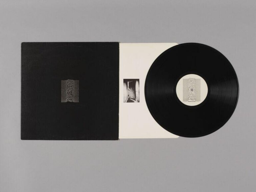
What it is — LP sleeve, Factory FACT 10, 1979; offset on textured card
(Saville: printed on „textured card“ for the first pressing); printer Garrod and
Lofthouse; 30.5 × 30.5 cm. The image is a plot of successive radio pulses from
pulsar CP 1919 — Harold D. Craft Jr., Cornell dissertation 1970, Arecibo, 318 MHz;
published in Scientific American 1/1971 (white on cyan) and in the Cambridge
Encyclopaedia of Astronomy (1977), where Sumner (or Morris — Wikipedia leaves
both) found it. Saville INVERTED the image from black-on-white to white-on-black,
against the band's wishes: „I was afraid it might look a little cheap. I was
convinced that it was just sexier in black.“ Inner sleeve: photograph of a hand on
a door — Ralph Gibson, Hand Through a Doorway, used without knowing whose it was.
Composition — (v2, V&A image of the whole set) The plot is SMALL: in the
screenshot it takes up ~18% of the sleeve's width, centred (~50%, ~50%). It's not
a poster but a stamp — the eye doesn't „enter“ the image, it approaches the object.
The rest is a black surface with card texture; that emptiness is 80% of the work.
On the inner sleeve the same move in white: a small photograph in the middle.
Colour — two: black ground and white line. Saville himself says black was
chosen for the CONTENT of the image (a signal from space) — colour as argument,
not taste. The card texture works as a third tone under light.
Typography — front: NOT ONE letter. No band name, no title, no catalogue
number (Eye blog: he himself asked for and got permission to leave them out —
„a cover I just wanted for myself“). Back: title and details small, white,
centred (V&A inscriptions). Typeface on the back not confirmed.
Message — At three seconds: a black object with white „mountains“. At five
metres: nothing — and that's the intent; the sleeve doesn't sell, it asks you to
come closer. The test passes in reverse of advertising: the less it says, the more
it's remembered. Today the most reproduced British sleeve of all.
Why exactly this way — Factory without a brief or a budget; a debut album that,
commercially, „must“ have a name — and doesn't. The constraint that shaped it was
the absence of constraint: with no client demanding a logotype, all that's left is
what Saville WANTED to see. And a found image: he didn't make it, he only set its
colour, size, ground, and silence.
What would kill it — the band's name in the top left corner, in any typeface.
Or the plot enlarged to 60% of the sleeve: it would become illustration, it would
stop being an object.
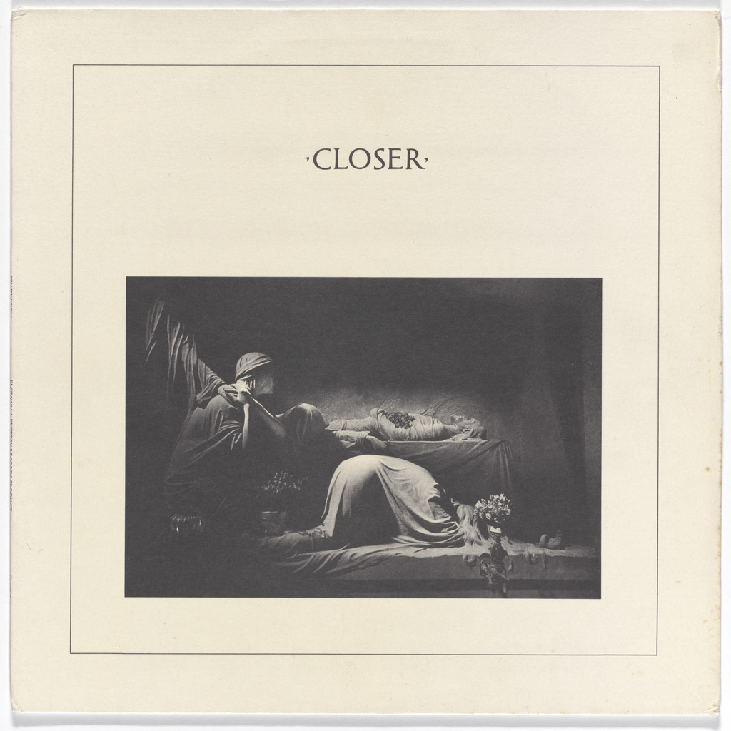
What it is — LP cover, Factory FACT 25, 1980; offset (MoMA: lithograph), 31.4 × 31.4 cm.
Design Saville and Martyn Atkins; photograph Bernard Pierre Wolff — tomb of the Appiani
family (sculptor Demetrio Paernio) at the Staglieno cemetery in Genoa (Louder Than War,
Post-Punk). MoMA text: when the band was asked what was in the studio, „out came Pierre
Wolff, and images of tombs … because I think they look trendy“; Curtis killed himself before
release — Saville: „we've got a tomb on the cover of the album!“.
Composition — (v2, MoMA) Cream ground; thin double rule frame inset ~8% from
the edge; title ·CLOSER· centred at ~22% of height; photograph — a rectangle
~76% of width, from ~33% to ~88% of height — in the lower two-thirds. Three zones: empty,
word, image. The eye enters on the word, drops to the image, stops on the figure kneeling
right. A classic book title page, not a record cover.
Colour — two: cream card and black (photograph in warm monochrome). Not a single
"colour". Cream instead of white is a decision about age: the object looks as if printed
in 1880.
Typography — Spaced roman capitals with interpuncts (·CLOSER·) — typeface
NOT CONFIRMED, not in Fonts In Use; MoMA says only "neoclassical style of
typography". The interpunct (dot between words) is a quote from Roman inscriptions — the tomb and
the letterform from the same tradition.
Message — Saville, literally: the graphic is "purely historical, but the totality is a
modern mix" — neoclassicism wrapped "around a twentieth-century piece of vinyl, on which
is the sound and language of 1980". At three seconds: an old book. At five metres: a cream
square with a dark rectangle. The message is not in the image but in the GAP between the image and the
content.
Why exactly this way — a found photograph that already has its composition (Wolff), so the design
only chooses the frame, the typeface, and the paper. Constraint: two authors (Atkins) and an image that must not
be "processed" — hence the frame as the only gesture.
What would kill it — the photograph full-bleed without a frame: it would become a
"gothic" cover, losing the distance of a book. Or a white ground instead of cream.
Principles:raskorak-slike-i-sadrzajaistorijski-citat-kao-gradivni-materijal
(WEAK case: both quotations — the tomb sculpture and the roman capitals — from the same
tradition; the "two unrelated sources" test fails, the tag stands only as evidence of the method, not as confirmation)
To verify against the image: whether the frame is double or a single thicker rule; the exact position
of the title; whether Atkins had a share in the typography (undocumented).
03 · Joy Division — Love Will Tear Us Apart (1980)
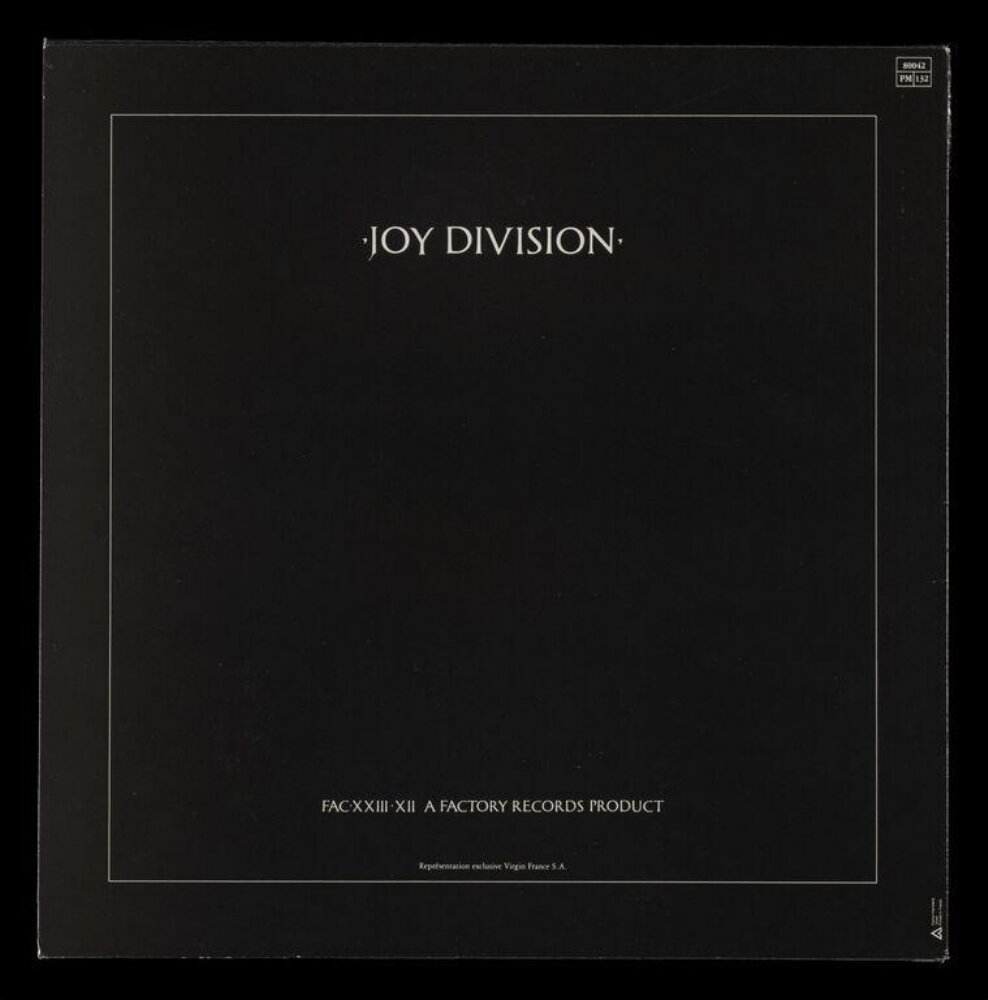
What it is — 12-inch single, Factory FAC 23, 1980; offset, printed in France
(France Imprimerie; inscription "Virgin France"). Front cover: Wolff's photograph
of an angel from the Ribaudo tomb (Onorato Toso, c. 1910), same cemetery Staglieno (Louder
Than War). The V&A IIIF image 2026PT3183 shows the BACK.
Composition — (v2, back) Black surface, thin light frame inset ~6%,
·JOY DIVISION· centred at ~22% of height, the catalogue line "FAC XXIII XII A FACTORY
RECORDS PRODUCT" at ~85%, a small print line below. Same scheme as Closer in
negative: empty — word — empty — data. Front cover (per literature):
the angel photograph in the same frame.
Colour — (back) black and cream-grey line; a pair with Closer: cream/black inverted.
Typography — the same class of spaced capitals with an interpunct; the catalogue number in
ROMAN numerals — Factory number 23 becomes an inscription on a monument. Typeface not confirmed.
Message — the song title does NOT appear in large type on the front cover
(V&A inscriptions list the band name, title and number small). An angel instead of the title:
a gap between the image (monument) and the content (pop single, no. 13 on the chart).
Why exactly this way — a series: Closer and this single work as a PAIR from the same Wolff
session and the same typographic shelf; once the mode is set (cream/black, frame,
capitals) it is repeated in a reversed tonal key — Armin Hofmann Stadttheater logic.
What would kill it — the song title large over the angel. Or arabic numerals.
Principles:raskorak-slike-i-sadrzajaoduzimanje-kao-autorstvoTo verify against the image: the front cover has not been seen in this session — the framing of the angel,
whether there is a frame; V&A 58 × 76 is the measurement of the set, not the cover.
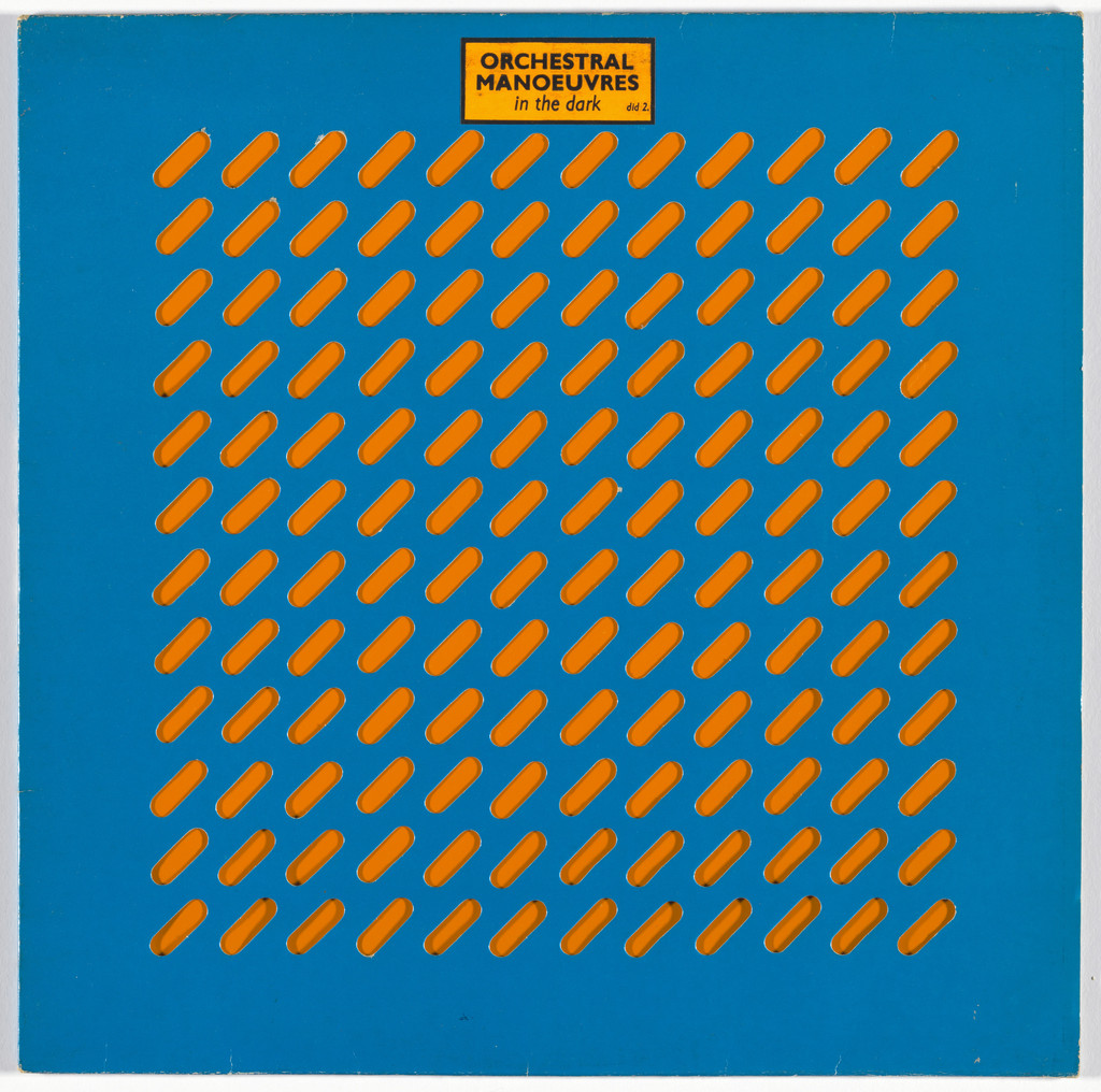
What it is — LP cover, OMD's debut, 1980; die-cut cover, Saville + Ben Kelly. V&A:
publisher Dindisc (correct — OMD was Dindisc DID 2), MoMA says "Factory Records" —
an error or a mix-up with the FAC 6 single Electricity; 30.5 × 30.5 cm.
Composition — (v2, MoMA) Blue surface; a grid of 12 × 11 diagonal CUTS
(slanted slits at ~45°) through which the orange inner sleeve shows; in the upper
right corner a small orange sticker with the band name. The whole cover is one
repeated module — Kelly's perforated industrial panel transposed into card.
The eye doesn't enter anywhere: no figure, no centre; the sticker is the only "error" in the
grid and therefore the only place the eye lands on.
Colour — two, but NOT on the same sheet: blue is the cover, orange is the inner
sleeve seen through the holes. The colour comes from the cut, not from print. The V&A physical description says "orange and
black" — there are several variants of the inner sleeve (see Notes on sources).
Typography — only the sticker: the band name in a grotesque (sans serif), white on orange;
typeface not confirmed. The name is a STICKER, hence temporary — the cover would work even without it.
Message — an industrial object (grating, ventilation) instead of a band image;
at three seconds: a blue board with holes; at five metres: a texture. The message is haptic —
the cover is HELD, fingers pass through the holes.
Why exactly this way — Kelly (architect) brings the material, Saville the rules: module,
layout, sticker. Constraint: die-cutting is expensive — so the whole budget went into the cut, not the
printing. The same pattern as Blue Monday three years later.
What would kill it — printed diagonals instead of cut ones. Or a band photograph
in the centre.
What it is — LP cover, Factory FACT 50, November 1981; offset; UK edition light blue
with dark blue drawing, US edition white with maroon (Fonts In Use). Source: a poster
by Fortunato Depero for the exhibition Futurismo Trentino, Rovereto 1932 — the Depero museum today
displays the original next to Saville's cover (Haslam).
Composition — (v2, PGDA) Square; central block ~44% of width (x ≈ 28–72%),
from ~20% to ~80% of height. Top: three horizontal bands with a vertical stem left
= letter F; bottom: stem left + band right = letter L; between them, three lines
of the text "NEW ORDER / FACT. 50 1981 / MOVEMENT" in dark blue bands; two dots
right (top and bottom) close the composition like punctuation. The eye reads from the top:
F → text → L. Everything is centred, but internal asymmetry (stems left, dots
right) keeps the tension.
Colour — two: light blue ground and dark blue — one hue in two tones,
with no warm/cool contrast. The band chose the blue for the UK (Vinyl Factory).
Typography — Elegant-Grotesk, confirmed (Fonts In Use); cassettes Kabel Black
/ Univers. Letters are inscribed into bands of the same weight as the geometry — text and drawing are
one material, as in Depero.
Message — Futurism quoted verbatim, with a shift in the MEANING of the letters: F = Factory,
L = roman 50 = FACT 50. Saville: better to quote Futurism literally than to
awkwardly parody it. At three seconds: a poster from 1932. At five metres: two blue
stripes with text. The audience read irony into it (a band accused of a neo-fascist name taking up
Futurist graphics — a comment on Fonts In Use).
Why exactly this way — the first album after Curtis's death, no face, no photograph;
it needed a language that was "neutral" yet charged — history instead of feeling. The catalogue
number as the CONTENT of the cover (L = 50) is pure Factory: the number has the status of a work.
What would kill it — adding a third colour or a photograph; or the letter F in
a different typeface from the band.
Principles:istorijski-citat-kao-gradivni-materijal (one source quoted +
the Factory number as second material — a borderline case, closer to homage) raskorak-slike-i-sadrzajaTo verify against the image: whether the blue tone of the cover matches the PGDA reproduction (Vinyl
Factory sketch); the exact proportions of the block.
06 · New Order — Power, Corruption and Lies (1983)
What it is — LP sleeve, Factory FACT 75, 1983; colour offset lithograph (V&A); MoMA
"lithograph", 30.5 × 30.5 cm; Saville / PSA, after the painting by Henri Fantin-LatourA Basket of Roses (1890, National Gallery) — found as a POSTCARD in a museum
shop (Design Museum, Vinyl Factory). The colour handled with Brett Wickens:
a 26-segment wheel and concentric colour rings on the back is the key to letters and
numbers 1–9 (greg.org).
Composition — (v2, V&A) The image runs to the edge, no frame — the whole front
is the reproduction. The only addition: a vertical strip of six small colour squares in
the top right corner, ~4% width, from ~5% to ~32% height — encoding FACT 75.
The basket of roses in the centre (~50%, 45%), the dark rose upper left (~35%, 22%) gives
a diagonal toward the code strip. The eye enters on the roses, sees the code only second.
Colour — the palette is Fantin-Latour's (grey background, pink, cream, maroon) + PURE
process colours in the code (cyan, green, yellow, purple). Two colour registers on the same
sheet: 1890 painting pigment / 1983 CMYK chart — each code colour has a defined
CMYK value (greg.org). That's the whole argument of the sleeve, carried out through colour.
Typography — NOT A SINGLE letter on the front. V&A curator: "Saville has wilfully
omitted type from the sleeve to intensify the presence of the fine art quotation".
Text exists, but as colour — a cipher instead of typesetting.
Message — V&A: "a sedate image which conflicts with the unsettling title and the
austere modernity of the music"; Saville: the decoder alongside the classical image speaks of
how "power, corruption and lies infiltrate our lives". At three seconds: a bouquet of roses. From five
metres: a painting reproduction. The message is 100% in mismatch — a sleeve for synthetic pop
1983 that looks like an auction catalogue.
Why exactly this way — a found image nothing should be added to; the only
"permitted" intervention is the information the law and the catalogue require — so it's
encoded. Constraint: Factory with no brief, Saville alone decides what is seen. And:
"I had the opportunity to make the kind of objects I wanted to see in my life."
What would kill it — the band's name in any typeface over the roses. Or the
code enlarged into a band across the whole edge (as in Blue Monday) — here it must stay
small to remain a secret.
What it is — 12-inch single, Factory FAC 73, March 1983; die-cut and printed card with an
inner silver sleeve (SMG record); Saville + Brett Wickens; replica of a 5.25-inch
floppy disk — Design Museum: he made it "as a replica" since he'd seen a floppy disk for the first
time. The text "FAC 73 BLUE MONDAY AND / THE BEACH NEW ORDER" exists only as a colour code
along the edge (SMG, greg.org). The best-selling 12-inch single ever; the story that the
sleeve cost more than the revenue: Wilson "5p per sleeve" — Saville: "I am so bored with this story",
PSA invoiced £538.20 (Wikipedia with sources); later pressings PRINT the silver
instead of die-cutting it; the 1988 7-inch (V&A E.2262-1990) a plain sleeve, photograph by Trevor Key.
Composition — (v2, PGDA) A black surface; a large circle (the floppy disk's spindle hole)
centred at ~(45%, 40%), diameter ~27% of width, through which the silver
inner sleeve shows; below it, a vertical slot for the read head ~(50%, 68–85%) and
a small notch to the right ~(60%, 62%). Along the right edge: a colour code band the full height,
~4% width. The composition is NOT composed — it's the geometry of an industrial object
1:1, enlarged from 13.3 cm to 30.5 cm.
Colour — black + silver (through the holes, material not pigment) + the code spectrum on the edge.
The same trick as OMD: colour is achieved through DIE-CUTTING. The code is the only pigment.
Typography — none. All text is code; the key is on another product (the PCL back cover) —
the buyer has to have both. Wickens' share in the code is confirmed (greg.org, Wikipedia).
Message — a pop song as SOFTWARE: the sleeve says "this is data, not a record". At three
seconds: a floppy disk. From five metres: a black square with a silver circle. The message is in
the object, not the image — Vinyl Factory: functional computer design elevated to the status
of art.
Why exactly this way — a found object + a single operation (enlarge to record format);
Saville, because of the deadline, sent it straight to the printer, without the band or the label (Vinyl
Factory). The constraint that shaped it: none — and that's why the cost myth persists:
when no one says "expensive", the die-cutting and silver get through.
What would kill it — a printed silver circle instead of the hole (which is exactly what later pressings
did — and the sleeve became a picture of a floppy disk, not a floppy disk). Or the title spelled out in letters.
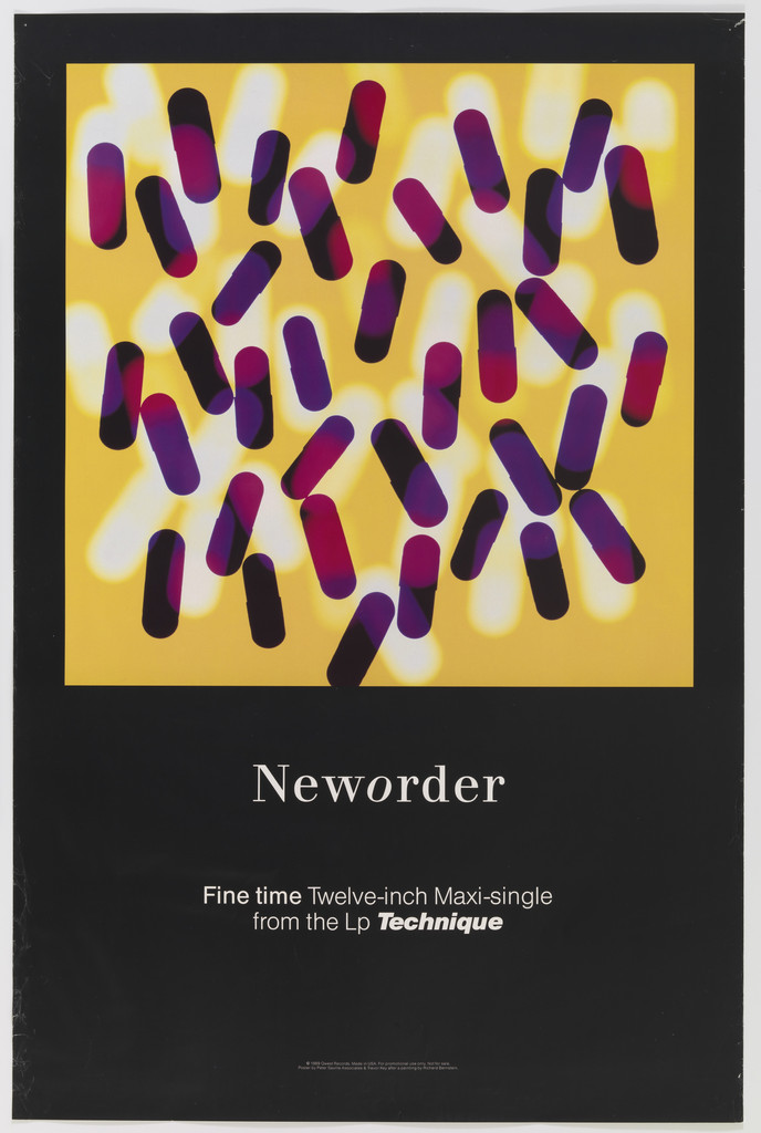
What it is — Poster for the 12-inch single Fine Time from the album Technique, Factory 1989;
offset (MoMA: lithograph), 85.7 × 58.4 cm; Saville + Trevor Key (photographer). The only
VERTICAL format among the analysed works.
Composition — (v2, MoMA) Black surface of the poster; square image (single cover)
in the upper part, ~90% of width, from ~5% to ~52% height: yellow background across which
capsules are scattered (purple-magenta, with white "halo" shadows) with no order; below, at
~63%, the "Neworder" logotype in a serif roman with an italic o; at ~70% two lines
of text (title, format, "from the Lp Technique"); right at the bottom a small line. Structure:
image-square + text plate = record cover extended downward. The eye enters on the yellow,
falls on the logotype, goes no further.
Colour — four: black (poster), yellow (image background), purple-magenta (capsules),
white (halo, text). Warm inside the image, cold-black around it: the image "glows" like
a screen in the dark.
Typography — logotype: serif roman, one italic letter mid-word — typeface
not confirmed (not in Fonts In Use); accompanying text in a grotesque (sans serif), small point size. Classical
roman for an acid-house single = the same mismatch as Fantin-Latour.
Message — capsules on yellow (reading: pills; the 1989 context reads itself, but
no source used confirms this as intent — remains provjeriti). At three
seconds: colourful pills. From five metres: a yellow square on black — the poster works
like a lit-up advert.
Why exactly this way — the poster is derived from the cover: the square isn't cropped, a
black plate is simply placed underneath and text added; the identity of the Technique era (logotype with italic o)
carries everything. Constraint: single campaign, the text has to exist — so it's pushed below
the image, not over it.
What would kill it — text over the yellow; or a white poster background instead of black.
Principles:raskorak-slike-i-sadrzajapodloga-nosi-polovinu (a black plane as
a ground that carries the image)
To verify against the image: what exactly the objects in the image are (Key's photograph of capsules
or a graphic?); the logotype's typeface; whether the square is identical to the single's sleeve.
Other works — evidence, no analysis
FAC 1 — poster for Factory night, Russell Club, 1978 — industrial sign Use Hearing
Protection; Dazed: first use of Factory's industrial aesthetic; Eye: „a tightly
focused industrial aesthetic“. nadjeni-predmet-kao-rijec. Not seen in session.
Dazed
FAC 2 — A Factory Sample, 1978 — double 7-inch; rice paper, silver, sealed in a
plastic bag (Dazed). podloga-nosi-polovinu.
Section 25 — Always Now, 1981 — Bembo, Baskerville (Fonts In Use 6479); with Kelly.
New Order — Ceremony, 1981 — Albertus (Fonts In Use 1584); two sleeves for two recordings.
OMD — Architecture & Morality, 1981 — Gill Sans (Fonts In Use 6476).
Roxy Music — Avalon, 1982 — Koch-Antiqua, Weiss (Fonts In Use 14694).
China Crisis — Difficult Shapes & Passive Rhythms, 1982 — Steile Futura, ITC
Fenice, Futura (Fonts In Use 79296).
New Order — Thieves Like Us / Murder, 1984 — de Chirico's The Evil Genius of a
King 1914, day and night version (Vinyl Factory); MoMA 185454, with Trevor Key.
istorijski-citat-kao-gradivni-materijal.
New Order — Low-Life, 1985 — Polaroids of the band members, the only sleeve with the band (Vinyl Factory).
New Order — Brotherhood, 1986 — titanium-zinc limited edition / photograph of metal
(Vinyl Factory). podloga-nosi-polovinu.
New Order — European Tour, 1987 — poster, MoMA 156100.
Joy Division — Substance, 1988 — New Alphabet (Wim Crouwel), Stempel Garamond
(Fonts In Use 16200).
Stereo/Porno (Vermorel), 1988 — V&A E.2264-1990: fold-out „envelope“, blue-yellow,
photograph of skin on the back that continues onto the front; 42 × 31,5 cm.
New Order — Technique, 1989 — antique garden cherub; Republic 1993 — retouched
stock photograph, Regret with cowboys (Prince/Marlboro) (Vinyl Factory).
Pulp — We Love Life, 2001 — Pouchée wood type, Univers (Fonts In Use 4885).
Invitation to Tony Wilson's funeral, 2007 — PGDA 364; not seen.
Factory International, Manchester, 2023 — Gräbenbach Mono (Fonts In Use 67815).
Bridge to practice: poster · graphic design · motion
Poster
Subtraction test before delivery: remove the title. If the poster gets stronger — leave it
without a title and put the title on another carrier (QR, back, another poster in the series). If it
becomes empty — the image wasn't strong enough, go back to the choice of image, not to typography.
Found image + one gesture: reproduction to the edge, one small addition in the corner
(colour code column, small mark) — Illustrator: image as Place, one rectangle 4% of width,
nothing third. Everything your hand wants to add — no.
Substrate as design: when specifying for the printer, ask for textured or
uncoated board, spot varnish or die-cut — half of Saville's work is in the technical spec sheet, not
in the AI file. Link to the cutout figure for the printer: the CutContour line IS the design.
Graphic design
Colour code as identity system: make your own colour ↔ letter table (26 + 9) with
CMYK values and use it throughout a series (thumbnails, covers, sleeves) — every
piece carries its name in the code, the key lives in one place (the website). That's program-umjesto-artefakta
which can be made in one evening.
Catalogue number as content: LØADERRØR works numbered as FAC — the number on the work
is a graphic element, not metadata; roman numerals shift the register immediately.
Deliberate mismatch: for content X, take an image from a register it doesn't belong to
(Renaissance for gaming, industrial diagram for theatre) — and DON'T soften the seam
with typography; one line of classical type, small.
Motion
Subtraction as event: AE — the frame starts with title, logotype, colours; one by
one they disappear until only the image and black remain. Reveal backwards.
Decoding as animation: a strip of coloured squares → letters appear beneath each
square (Text Animator, Opacity per character, offset by index). A code that reads
through time = sifra-umjesto-teksta in motion.
Object as frame: floppy disk/cassette/CD as a MASK through which the content is seen (Track
Matte); the content doesn't animate, the object rotates.
Bad imitation
Classical image + small text = "Saville": the look is copied (Renaissance canvas,
small capitals) without a mismatch — the image MATCHES the content (church concert with a fresco).
No seam, no message; it's a museum catalogue. Cause: copied combination, not the
principle of "image from the wrong register".
Minimalism as emptiness: title and logotype are removed, but the image wasn't found but
generic (stock). Subtraction only works when what remains has its own weight
(pulsar, Fantin-Latour). Cause: subtraction happened before selection.
Code without a key: encoded information that has no decoder anywhere — the audience can't
unlock it, so they don't try. In Saville's case the key exists on another product of the
same house; without a key it's decoration. Cause: copied colour spectrum, not the system.
Expensive substrate as excuse: die-cut and spot varnish on a sleeve whose image doesn't work even
on screen. The substrate carries HALF — the other half must be carried by one decision about the image.
The brief through their eyes
For a YT gaming animation (thumbnail + intro): Saville wouldn't draw anything — he'd take
the official key-art of the game, reproduce it to the edge without a single letter, and add in the corner a
column of six colour squares encoding the episode title; the code's key would be on the channel, once.
Intro: black, textured "board", one small white diagram (episode waveform) in the
centre, without the channel name — the name comes only at the end, like the back of a sleeve.
Exercises
Subtract to the object (45 min): take a finished poster/sleeve from your own archive; remove
in order the title, logotype, date, subtitle — record each step. Find the step after which
the work WEAKENS; the step before that is your poster. Constraint: you may not ADD anything.
Six-square code (1 evening): make a table of 26 colours + 9 digits with CMYK
values (Illustrator swatches, .ase); encode the title of three of your own works; place a
column 4% of width in the corner of each. Constraint: squares with no border, no gaps.
Object 1:1 (1 evening): pick an industrial object from your room (SD card,
cassette, switch) and enlarge it to A3 format as a SILHOUETTE WITH HOLES (die-cut logic) —
colour only through the holes (a second substrate). No letters.
Motion study
AE, 5 s, one frame: composition full — image, title, logotype, colour code, date. Every
0.7 s one element disappears (cut, not fade), in order from loudest. In the 4th second
only the image and black remain; in the 5th second the image shrinks to 18% of the format and centres (Unknown
Pleasures proportion). Constraint: no element moves except in the last step.
Rebuilding the benchmark
Benchmark: Closer (1980). .svg skeleton (from a MoMA screenshot, roughly): format 1:1;
double line frame inset 8%; title ·CLOSER· centred, baseline at 22% of
height, word width ~30% of format, letterspaced capitals; photograph 76% of width,
top edge 33%, bottom 88%, centred; tonal zones: cream substrate, black-brown image with the
brightest point (kneeling figure) bottom right. Task: build it in Illustrator in 45 min without the original, using any
black-and-white photograph of your own — then compare where the eye stopped.
Second skeleton (Blue Monday): circle centre (45, 40)%, Ø 27%; slot (50, 68–85)%; code
strip on the right 4% of width.
Notes on sources
Founding date of Factory: 1978 (Wikipedia, Dazed — FAC 1 and FAC 2 are 1978) /
1979 (Eye 4/1995, Design Museum). Taken 1978 as the start of operations, 1979 as the formal
label — unresolved.
OMD 1980 publisher: V&A and the discography — Dindisc; MoMA — „Factory Records,
Manchester“. MoMA is probably wrong. Variant colours: V&A „orange and black“ /
MoMA image blue-orange — several inner sleeve variants, which is which is not
documented.
Unknown Pleasures — who found the image: Sumner (Big Think, v1) / Sumner or Morris
(Wikipedia). Who chose the direction of the inversion: Saville, against the band (Wikipedia with a quote).
V&A measurements 76 × 58 / 58 × 76 for Unknown Pleasures, Love Will Tear Us Apart and OMD are
measurements of the WHOLE SET (sleeve + inner sleeve + record laid out in the photograph) — confirmed
by a screenshot of set 2011EW6763. Same pattern as Reid's 1990 donation.
Typefaces: only Movement (Elegant-Grotesk) and „Others“ from Fonts In Use confirmed.
Closer / LWTUA capitals, the Neworder 1989 logotype, the OMD sticker — all unconfirmed,
tracked as a class.
Blue Monday cost: the myth (Wilson 5p) disputed by Saville himself and Hook's account;
PSA invoice £538.20. Do not write „cost more than it earned“ as fact.
PGDA reproduction of Blue Monday probably a later edition with printed silver —
specific typeface not verified against the image.
Fine Time capsule — reading of the image; intent is not documented.
Portrait: not searched beyond Wikipedia (the record text did not return a file name) —
ima: false.
v1 quote „Everything is a quotation now…“ — not found, dropped. v1 claim „found
industrial colour chart“ for the code — greg.org confirms the colour wheel, not a „found“
chart; tracked as PSA's own system.
Influenced — no source names successor designers; remains open until
brody/sagmeister are covered.
Difference from its pair
Jamie Reid ↔ saville: same 1977–79, same Britain, both don't draw but take —
Reid takes the OFFICIAL image and disfigures it (ugliness as attack, process visible), Saville
takes the MUSEUM image and doesn't touch it (beauty as distance, process invisible); Reid
adds tape and letters, Saville removes both letters and name.
Wolfgang Weingart ↔ saville: both 1977–83 dismantle Swiss order — Weingart from within,
pushing Akzidenz until it fails; Saville from without, quoting Tschichold as HISTORY, quietly
and small. Weingart makes an image out of process, Saville out of choice.
Milton Glaser / Roman Cieślewicz ↔ saville: all three istorijski-citat-kao-gradivni-materijal
— Glaser's quote beautifies and hides the seam, Cieślewicz wounds and shows the seam, Saville
does NOT TOUCH the quote (reproduction to the edge) and makes the seam with one foreign body (the code stub).
Corita Kent (Sister Mary Corita) / Herb Lubalin ↔ saville: dva-rastojanja-citanja in a related form —
there a second message for whoever comes closer, here a second message for whoever has the KEY (another
product); not promoted because the condition is ownership, not proximity.