system as a service to the reader — one typeface, grid, manual, word instead of mark
co-founder of Unimark International (NYC 1965/66) and Vignelli Associates (1971, with Lella Vignelli) Milan → Chicago (1958–60) → Milan → New York (from 1964/65)
Palette of the œuvre
Colours (described, not measured): black + white (foundation of everything); red as identifier (Piccolo, AA, Austrian Architecture) — hex not confirmed; blue (AA) — hex not confirmed; process CMYK pure and in overlap (Knoll 1967, Vignelli's text); Unigrid 24 standard colours — beige PMS 451–454, greys PMS 414–417, Super Warm Red (NPS specification)
„We proceeded by logic, not emotion. Not trends and fashions." — on the American Airlines logotype (Archivio Grafica Italiana)
„I love systems and despise happenstance." — The Vignelli Canon
„If you see the layout, it is probably a bad layout!" — The Vignelli Canon
Biography
Born in Milan on 10 January 1931. At sixteen he leaves school and works as an
architectural draughtsman (Wikipedia: at the Castiglioni brothers' — Eye does not
confirm this). He studies architecture at the Politecnico in Milan and at IUAV in
Venice 1950–53, does not graduate; from 1953 he draws glass for Venini on Murano —
his first job where material and production dictate the form, which Lella later
turns into a method (Cooper Hewitt: „decoration by subtraction"). Two Milanese
draw him from architecture into graphic design: Max Huber and Antonio Boggeri
(Eye).
In 1957 he marries Lella Valle, an architect; that same year a Towle Silversmiths
fellowship takes them to America — Chicago 1958–60, where he teaches at the
Institute of Design (IIT) and works for Container Corporation of America. They
return to Milan in 1960 and open a joint studio. From that Milan period come the
Biennale 1962, Pirelli 1963, and the whole Piccolo Teatro programme 1964–68 —
already his entire vocabulary is complete: one typeface, black line, two sizes,
red as address.
In the mid-sixties (Cooper Hewitt: 1964; Wikipedia: New York office 1966; v1:
1965) he moves to New York and with Bob Noorda and five others founds Unimark
International — a firm that brought Helvetica to the US, along with white lab
coats and the idea that identity is a manual, not a drawing. From Unimark come
American Airlines 1967, Knoll from 1966, Dot Zero 1966–67, and the subway: the
Transit Authority engages them in 1966/67 on the recommendation of MoMA curator
Mildred Constantine, the manual comes out in 1970, the map in 1972. Unimark goes
bankrupt in 1977; the Vignellis had already left in 1971 and founded Vignelli
Associates (from 1978 also Vignelli Designs), where they do everything — from the
Bloomingdale's bag in 1973 to St. Peter's church in 1977 and Heller tableware.
In 1977 he designs the publications programme for the National Park Service —
Unigrid — for which in 1985 he receives the first Presidential Design Award.
Compasso d'Oro 1964 and 1998, AIGA medal 1983. In 2008/2010 he donates the
archive to RIT (Vignelli Center for Design Studies). He dies in New York on 27
May 2014; Lella in 2016. His own formula for the work: „I was always seeking to
affect the lives of millions of people — not through politics or entertainment
but through design" (Eye).
What he actually did: he wrote rules for other people's hands. He ran the
Piccolo Teatro for four seasons, and then an assistant continued it; the subway
was continued by clerks; the Unigrid was used by hundreds of NPS designers for
forty years. His success is measured by how much the system survived without him
— which is also why the map, the one work where he asked the user to adopt it
rather than merely use it, was rejected by the city.
Influences
Studied with
Castiglioni (brothers), Milan — apprentice draughtsman at age 16 (Wikipedia; Eye says only "architectural draughtsman")
Politecnico di Milano and IUAV Venice — architecture, 1950–53 (Eye), unfinished
Venini, Murano — glass designer from 1953 (Eye)
Borrows from
Max Huber and Antonio Boggeri — Eye: Swiss modernists who led him from architecture into graphics
Harry Beck — London diagrammatic map 1933 as the logic of the NYC map (Bierut, MoMA)
Music — per him, the primary inspiration (Eye)
Mildred Constantine (MoMA) — recommended Unimark to the Transit Authority in 1967 (MoMA record 89300)
Influenced
bierut — Michael Bierut, worked at Vignelli Associates (Wikipedia); not in the roster
Joan Charysyn — lead designer of the NYC map under his direction (MoMA)
Emilio Fioravanti — assistant, took over Piccolo Teatro in 1969 (AGI)
Unimark as a school — white coats, Helvetica in the US (Cooper Hewitt, AGI)
Otl Aicher — state programme Munich 1972 versus NPS 1977
Herb Lubalin — the same tight Helvetica setting, opposite purpose
Bob Noorda — co-founder of Unimark, NYC subway signage (MoMA, Shaw)
Lella Vignelli (1934–2016) — partner in all works from 1960; MoMA credits her as co-author
Who he learned from
The Castiglioni brothers, Milan — draughtsman at sixteen (Wikipedia; unconfirmed
elsewhere).
Politecnico di Milano / IUAV Venice — architecture 1950–53 (Eye). No named
professor in any source; what he carries as method is being an "architect":
structure before typeface (TDC: „structure should always come first").
Venini, Murano — glass design 1953–57: production as the source of form.
What he steals
Max Huber and Boggeri (Studio Boggeri) — Eye: „inspired by Swiss Modernists Max
Huber and Antonio Boggeri". From Huber he takes the overlap of process colours
(Knoll 1967 is a literally Huber-esque move), but not the noise.
Harry Beck, London 1933 — diagram instead of map; Bierut and MoMA explicitly cite
this for the NYC map.
Music — Eye: „primary inspiration". Not illustration, but rhythm and interval —
see Canon, „a publication is at once a static range and a cinematic
sequence".
Print economics as aesthetics — the Unigrid is derived from a 25 × 38 inch sheet
and from cost: „incredible cost reduction due to the standardization" (RIT).
Who he influenced
bierut Michael Bierut — an employee of Vignelli Associates, today the chief
interpreter (Design Observer). Not in the v1 roster.
Joan Charysyn — lead designer of the 1972 map (MoMA credits her).
Emilio Fioravanti — assistant, took over the Piccolo Teatro in 1969 (AGI).
The whole American corporate modernism after 1967: the AA logotype is, according
to AGI, one of the projects that contributed most to „the fortune of Helvetica
in the US".
Hundreds of anonymous NPS and MTA designers working from his manuals — an
influence that no one else in the project has, except Otl Aicher (DOT pictograms
1974).
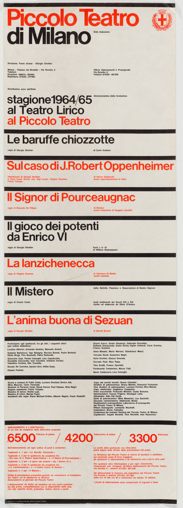
What it is — a programme poster (playbill) for the 1964/65 season of the
Piccolo Teatro and Teatro Lirica; lithograph, 99.1 × 34 cm (MoMA). The first in a
series Vignelli made for four seasons, 1964/65–1967/68 (AGI). Not a street poster
but a season timetable: eight productions, all names, prices.
Composition — a narrow vertical format (almost 3:1) divided by thick black
horizontal lines into bands: an upper title block (~18% of height), a
"stagione 1964/65" strip, then seven to eight equal rows of one production title
each, a two-column block of names, a price zone. The eye enters top left
("Piccolo Teatro") and falls row by row as down steps — no diagonal, no centre,
just the left edge as spine. All setting is left-aligned on one vertical (v2).
Eye calls this his "master language": black lines, two adjacent size steps,
strong horizontal lines.
Colour — white ground, black, red. Red is not an accent but an address:
red titles = productions at the Piccolo Teatro, black = at the Teatro Lirica
(AGI). Colour does the job of a category label; remove it and you must add a
word.
Typography — one typeface, Helvetica (Eye, TDC), tightly set (Eye:
"closely set Helvetica"). Three sizes: theatre title, production titles, and
everything else — and that "everything else" is in ONE size: AGI notes that for
the first time on a playbill, actors and stagehands are set at the same size.
Hierarchy comes from position in the row, not from the typeface/cut.
Message — from five metres: two colours and the rhythm of black lines —
"programme, two halls". From half a metre: a timetable. The three-second test
passes because the first row reads the theatre's name, not a production title.
Why exactly this way — the format is a narrow ad column / theatre wall; the
content is a list, not an image. Vignelli refuses illustration and makes a
table that looks like a poster; the democratic equal sizing of names is an
ideological choice, not merely a formal one (the Piccolo was Strehler's public
theatre). The same grid repeats for four seasons — a system, not a one-off
piece.
What would kill it — a second typeface family for the titles. The whole
piece rests on the fact that contrast comes only from size and colour; a single
serif and the playbill becomes an ordinary ad.
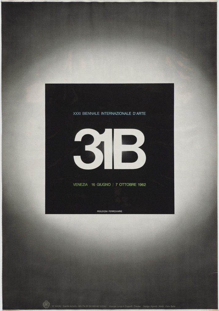
What it is — exhibition poster, offset lithograph, 68.6 × 97.8 cm (MoMA).
MoMA credits Lella, Massimo, and Guido Ballo (Ballo's role unclear — see Notes
on sources).
Composition — the whole field is a photographic grey vignette: light in
the middle, dark corners, like a lit wall. In the centre, slightly above the
middle (v2: ~40% of height), a black square about 40% of the format's width,
with a large white "31B" inside it, above it a small "XXXI Biennale
Internazionale d'Arte", below it the dates. A small line of text along the
bottom edge. The eye goes straight to the centre and stays there — there is no
other element.
Colour — no colour. A grey gradation and one black block. The contrast is
tonal: the darkest spot is also the only piece of information.
Typography — grotesque (sans serif) (Helvetica or Akzidenz, specific
typeface not confirmed), white cut out of black. The number and letter "31B"
are the only large sign — the exhibition's name reduced to a code.
Message — "Biennale, 31st, Venice" in a second; everything else requires
approach. Serious, museum-like, not festive. The distance test passes because
of a single block.
Why exactly this way — the Biennale has no single work that could represent
it; Vignelli does not choose an image but builds a pedestal: the emptiness
around the black square is what gives it weight. The vignette is a cheap way to
keep a blank sheet from reading as unprinted.
What would kill it — any image in the grey field. Or shifting the square off
the central axis — the whole piece is one symmetry.
Principles:bijeli-prostor-kao-oblikjedna-slika-jedna-rijecTo verify against the image: whether the vignette is photographic or
airbrushed; the exact text of the bottom line; the exact position of the square
in %.
03 · Dot Zero — Unimark's magazine, issues 1–4 (1966–67)
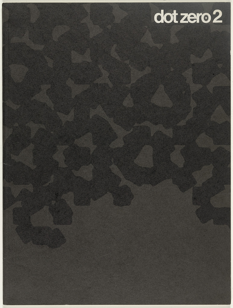
What it is — Unimark's house magazine, four issues, lithograph, 30.5 × 22.9 cm
each (MoMA; Wikipedia gives 1966–68). Publisher Unimark International. MoMA
credits Massimo and Lella.
Composition — cover of issue no. 2 (v2): the entire sheet covered in dark blotchy
texture — black amorphous blots on dark grey, like an extremely enlarged halftone or
camouflage; no edge, no margin. The title "dot zero 2" small, white, in the upper
right corner — the only place where the image "breathes". The other issues (thumbnails in the record)
work the opposite way: dense text and red.
Colour — black and dark grey; white only in the title. In the other issues, red
as a second tone.
Typography — grotesque (sans serif), tight setting, lowercase, small size — the title
behaves like a signature, not a headline. Typical of Unimark: the name is not loud because
the texture is already loud.
Message — "we are about print and the dot" literally: the name of the magazine is the zero point, and
the cover is the dot enlarged until it becomes a landscape. Three-second test: you see
the texture, not the name — deliberate, because the audience is the trade.
Why exactly this way — the house magazine of a firm that sells a system must itself be
proof of the system: format, one typeface, title in the same place, only the cover changes
with the topic. Texture instead of image because Unimark doesn't illustrate — it analyses.
What would kill it — an enlarged title in the centre. The whole idea is that the cover is
material, and the title is a label placed on it.
Principles:sistem-kao-medijzrno-i-zamucenje-kao-oblikTo verify against the image: origin of the texture (enlarged halftone? blot? photograph?);
exact typeface of the title; contents and editors of the issues (MoMA does not list them).
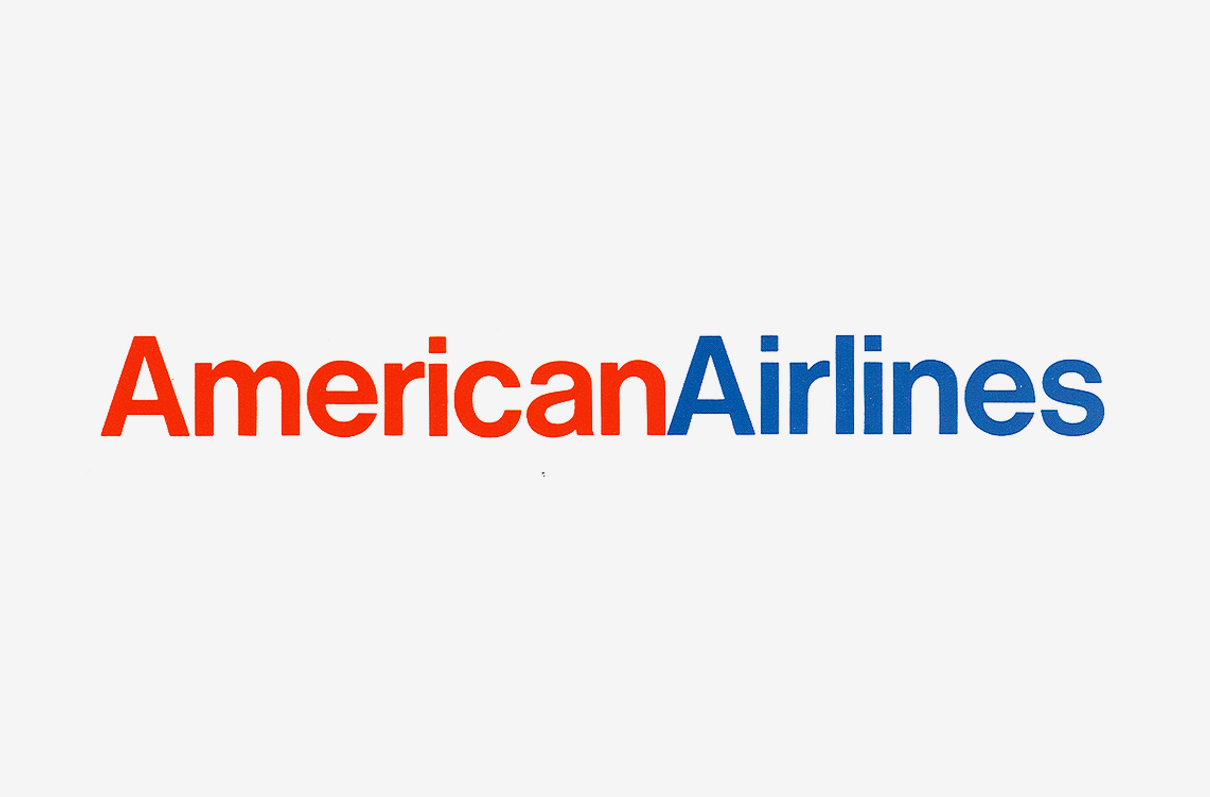
What it is — corporate identity for American Airlines, Unimark, 1967; designers
Massimo Vignelli and Heinz Waibl; the job came through Henry Dreyfuss, who
worked on the aircraft interior (AGI, PGDA). Lasted until 2013 (Futurebrand).
Composition — the logotype is one word without a space: "AmericanAirlines", lowercase,
tight setting; on tickets and folders (v2) it stands alone, left-aligned, on white,
without any frame. The "AA" monogram with an eagle between — two slanted capital A's and
an eagle — goes only on the tail of the aircraft.
Colour — "American" red, "Airlines" blue, on white; the colours of the flag (AGI).
Colour is the only space: "So we took the space away and split it by colour"
(Vignelli, AGI). On the aircraft, polished aluminium instead of body paint (v1).
Typography — Haas Helvetica (AGI). Vignelli loved Helvetica precisely
because "it has no shoulders" so it can be set tight (Shaw, idsgn) — the logotype is proof: two
words as one shape.
Message — the name, nothing else. "A word is so much better" (Vignelli, AGI). At five
metres, two colours and one stroke; at half a metre, the company name. Nothing to
misread.
Why exactly this way — Vignelli wanted only the word; he refused to draw the eagle ("Don't
stylise the eagle and make a cartoon out of it") — pilots threatened to strike,
so Dreyfuss's office drew the eagle (AGI). The work is therefore a compromise: the word is
his, the mark is the client's. Same logic as Chermayeff & Geismar (Ivan Chermayeff, Tom Geismar) with Chase —
but the opposite conclusion: instead of an empty mark that fills the budget, a word that doesn't
need a budget.
What would kill it — a space between the words. Or a third colour. Or — as
indeed happened in 2013 — replacing the word with a "more modern" mark: "It's been around for 45 years,
the whole world knows it" (Vignelli, AGI).
What it is — poster for Knoll International, offset lithograph, 81.3 × 120.7 cm
(Met 1989.1019.1; Cooper Hewitt also holds one). Back: drawings of the entire furniture
collection, visible when the poster becomes a mailer (Vignelli).
Composition — horizontal format; the word "Knoll" in enormous letters that
overlap and run off the format — parts of the K, n, o, l, l read as
geometric planes, not as a word (v2). Above, in the upper left corner, two columns of
small text and "Knoll International" set at 45° — the only element that
is not on the axis of the letters. The eye runs into a collision of blue and yellow in the centre, then
into magenta on the right.
Colour — Vignelli: "The colors are the four-process ones: yellow, blue, magenta,
and black, used pure and in overlapping combinations." The overlaps produce green,
red, purple — a third colour without a fifth plate. Literally Max Huber's
method, only without photography.
Typography — Helvetica (Cooper Hewitt). Letters enlarged until they stop being
text; the company name as image. Small text at a contrast of 1:50 or more.
Message — Vignelli himself: the name is so well known that "even if you play with the name,
distort it, or overlap its letters, the message still comes across". Three-second
test: colour and K — "Knoll". Reading test: fails, deliberately.
Why exactly this way — Vignelli's view that the poster is an "obsolete form of communication"
and that it works only "within an overall program". This is not a poster but one instance of
a program (Knoll since 1966): same process, same typeface, same colour as the brochures (MoMA
89306, 20 brochures 1966–80). The drawings on the back turn it into a catalogue — the same object in
two media.
What would kill it — opaque (spot) colours. The overlap is the whole image; with
opaque colours all that's left is a pile of letters.
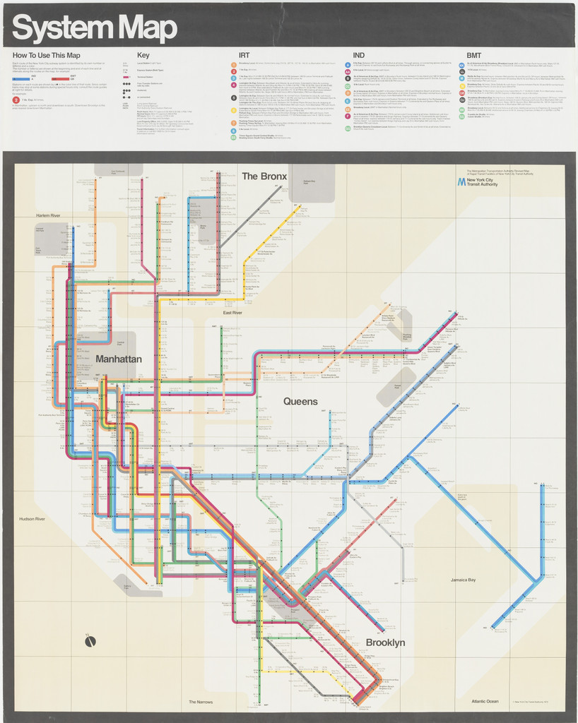
What it is — subway system map, lithograph, 149.9 × 118.7 cm (MoMA; two
copies). Publisher NYC Transit Authority. MoMA credits Vignelli, Joan
Charysyn (lead designer), Bob Noorda, and Unimark. In use 1972–79 (Bierut),
replaced by the topographic one.
Composition — at the top a black band with "System Map" in white, below it a row of legend,
then the map (v2). Lines only at 45° and 90°, stations as dots, even spacing
— a diagram, not a map (MoMA). Land beige, water white, park a grey square: Central
Park is a square even though it's three times longer than it is wide (Bierut). Manhattan is a
bundle of parallel coloured lines that breaks at 45° toward Brooklyn — the only "gesture"
on the sheet.
Colour — MoMA: "brightly colored lines… pale, neutral colors and white showing
waterways and landmasses". Each line its own colour; colour = route, not decoration. The background
is deliberately bland so that the lines remain the only information.
Typography — grotesque (sans serif), lowercase, station names horizontal next to the dots (v2;
specific typeface not confirmed — the 1970 manual specifies Standard Medium, not Helvetica,
according to Shaw).
Message — "the train runs this way, this is where you transfer". The three-second test passes better
than any map before it. The "where am I in the city" test — fails, and that's the reason for its
rejection.
Why exactly this way — Beck's logic: topology instead of topography. New Yorkers
rejected it because they hold the city in their heads as a street grid (Bierut: everyone knows that 28th Street is
"six blocks south and four blocks east of Penn Station"). The v1 summary stands:
the level of abstraction is a decision about how the user holds the system in their head, not about
elegance. Bierut nonetheless defends it as "gorgeous, iconic and cerebral".
What would kill it — a compromise: half diagram, half geography. Or a green park.
The work only functions as complete abstraction; the moment it gives way, it loses both elegance and accuracy
(which is roughly what the MTA did in 1979).
What it is — the system for all US National Park brochures; designed in 1977 with
Vincent Gleason (chief of publications, NPS) and a team; first brochure Clara Barton NHS
1978; ~20 million copies a year; Presidential Design Award 1985 (Wikipedia,
RIT). The brochure seen matches the same specification: lithograph, 59,7 × 41,9 cm, 1985
(RIT).
Composition — (v2) beige sheet, black bar at the top with "Unigrid" in white, three
columns of text on the left, on the right a large red grid of modules, at the bottom another black
bar with format diagrams. The document itself is an example of the system. System: module
6½ × 80 pt (A) / 7 pica × 80 pt (B), gutter 1 pica / 10 pt; ten formats
(A1–A6, B1–B6) from table B6 420 × 594 mm; sheet folded to 99 × 210 mm; title
bar 100 pt, section bars 25 pt (NPS). Accordion fold, opens from both sides.
Colour — 24 standard colours: process, four beiges, four greys, four blues, three
greens, two yellows, two oranges, Super Warm Red (NPS). The black bar is a
constant of the identity; colour is allowed only from the list.
Typography — Helvetica, all cuts (NPS). Park name 60 pt Medium (up to 12
letters) or 42 pt; text 8/10 or 9/10; captions 7/7–8/9; at most two-three
sizes per sheet. The 80 pt module is exactly eight lines of 8/10 — the grid is derived from
the leading, not from the paper.
Message — from a kiosk: black bar + park name = "this is official, take it". In
hand: the map in full, no text over it (NPS: maps "fit squarely within formats").
The system says one thing: the state is the same in every park.
Why exactly this way — Vignelli himself (RIT/GA&C): first standardize sizes "into a
system of folded posters", then a flexible grid with a black bar, then a limited set
of typefaces and sizes — result "a very consistent level of quality… and, above all,
an incredible cost reduction". The grid is derived from the 25 × 38 inch table and from
the fact that the brochures are made by hundreds of people he will never meet.
What would kill it — letting the parks choose their own typeface or bar colour. The system
has survived 47 years exactly because in 1999 only the crest was added, and in the 2000s the typeface
changed — never the structure.
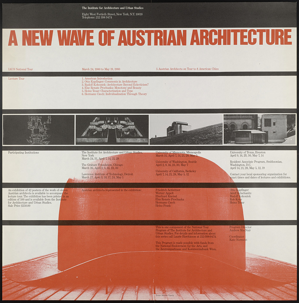
What it is — exhibition poster for the Institute for Architecture and Urban Studies, New
York; lithograph, square 57,2 × 57,2 cm (MoMA). Signed Massimo and Lella.
Cooper Hewitt also holds one (1991-69-83).
Composition — (v2) square divided by black horizontal lines into five-six
bands: small headers at the top, title in the second band, a row of small black-and-white
photographs of buildings, two wide bands of text in columns. Over the lower half a
large red dome — silhouette of an arched roof — enters below the lines and "carries" the text
sitting over it. Same skeleton as Piccolo 1964 (lines = rows), but with one image breaking through the rows.
Colour — cream background, black, red. Red twice: title and dome — word and
image in the same colour, so they read as one.
Typography — the title in condensed grotesque, capitals, tight setting (typeface not
confirmed); all other text small, in columns, left-aligned. Extreme contrast of size.
Message — "new Austrian architecture" in red + one red form that
looks like a Hollein/Domenig-style dome: from five metres, colour and arch; from half a metre,
the lecture schedule. It works at both distances.
Why exactly this way — IAUS is an institute, not a gallery: the poster is also a programme (text in
columns). Vignelli keeps his playbill-skeleton and inserts ONE pictorial gesture;
square because the poster probably also went out as mail (cf. Knoll 1967). This is the closest
he comes to illustration — and it's a silhouette, not a drawing.
What would kill it — a second photograph in colour. The whole hierarchy is: one
red form, everything else grey and black.
Principles:mreza-drzi-haosjedna-osa-kontrastacrna-traka-kao-adresaTo verify against the image: what the dome is (which building); the title typeface (Helvetica
Compressed? — do not guess); the exact number of bands and their heights in %.
Other works — evidence, no analysis
NYCTA Graphics Standards Manual, 1970 (Unimark, Vignelli + Noorda) — manual
for subway signage; typeface Standard Medium (Akzidenz), not Helvetica —
Shaw: the TA's sign-shop didn't have Helvetica, Standard was the "best match" (Urban
Omnibus, idsgn). Colour of the lines, black bar, sign grid. identitet-je-prirucnik.
MoMA text on 89300
Bloomingdale's Big Brown Bag, 1973 (Vignelli Associates; Print: Massimo and
Lella) — kraft paper, only the wording "big brown bag" in small grotesque letters; three
sizes (little/medium/big) differ only by the word (Cooper Hewitt blog). The V&A holds a
copy c. 1990 (E.2122-1991, "designer unknown", no image). rijec-umjesto-znaka
in its purest form — the bag is called what it looks like. No image in this session.
Knoll International Graphic Program, 20 brochures 1966–80 — MoMA 89306,
lithograph, 29,8 × 21 cm; no. 20 with fabric samples. The programme from which poster 05 comes.
serija-kao-identitet.
Heller — Stacking Dinnerware, 1964 (Massimo and Lella) — MoMA 4551; melamine,
Compasso d'Oro 1964. A system in three dimensions: stacking as a rule.
isti-sistem-kroz-medije.
Handkerchief Chair, 1985 (with David Law) — MoMA 1601. Evidence that "Design is
One" is a programme, not a slogan.
Designer's Saturday, 1973 — Cooper Hewitt 2009-42-2, offset on white paper
(CH blog). Not seen.
Open Plan 80 (IAUS), 1980 — MoMA 89297; sister poster to work 08.
Bridge to practice: poster · graphic design · motion
Poster
Playbill-skeleton (01): when the content is a list (festival programme, schedule, episode
list), it doesn't need an image — build a table that looks like a poster. Illustrator: one
font, three sizes (e.g. 120 / 36 / 9 pt), 4 pt black lines between rows, everything on
the left vertical. Colour = category (red = one hall / one category), never
emphasis.
Overlap of process colours (05): letters as flat shapes, Multiply, CMYK pure 100 %. Works
on risograph and screenprint without an extra colour — the third colour is free. A title that doesn't need
to be read if everyone already knows it (channel name, brand name).
Black bar (06/07): name of the series/park/channel in a black bar 8–10 % of the height at the top,
white, same place on every copy. Cheaper identity than any mark.
Graphic design
Build your own Unigrid for all LØADERRØR materials: module = a whole number of lines
of body text (8/10 → 80 pt), gutter 1 pica, formats derived from the table the
print shop actually uses (B2/B3 or SRA3), title bar of fixed height, 24 colours
from the list. Write it as a one-page document — like Vignelli 1985 — because the
document itself is the first specimen of the system.
Word instead of mark (04): for small brands (YT channel, studio) the logotype is the name in
one typeface; the difference between two words is colour, not spacing. Saving: zero
budget for "filling" an abstract mark (cf. Chermayeff & Geismar (Ivan Chermayeff, Tom Geismar)prazan-znak-puni-klijent — the opposite case).
Canonical setting rules (Canon): 8/9, 9/10, 10/11 pt up to a 70 mm column; 12/13,
14/16 wider; at most two sizes per page; title twice the size of the text;
left-aligned, no indent, no word breaks. Apply as default in
Illustrator (paragraph styles).
Motion
45°/90° constraint (06): animate a path (route, cable, data flow) that may only
turn at 45 and 90 — AE: Motion Path with whole-number values, or Shape Layer
"Trim Paths" along a pre-drawn rectangular path. The viewer instantly knows it's
a diagram, not a scene.
The bar stays, the content changes (07): the black bar with the name is a constant
layer throughout the video; underneath it the "panels" change — a lower-third as
Unigrid, not as decoration.
Overlap as animation (05): two planes in Multiply that overlap — the event is
the moment a third colour is born. One frame, one overlap.
Level of abstraction (06): before animating any map/diagram ask: how does the
viewer hold that thing in their head — geographically or topologically? Animate
that model, not the prettier one.
Bad imitation
"Helvetica = Vignelli." The typeface gets copied, not the grid. Result: Helvetica in
six sizes with no rules, no module — it looks "Swiss" and doesn't read. For him
the typeface is the last decision (TDC: "structure should always come first"); the
first is the module.
A diagram for something the audience holds geographically. A flow chart, a "site
map", an infographic — all at 45° because it's pretty, while the user is looking
for where "up/down" is. The same mistake as NYC 1972, only without Bierut's defence.
Test: ask the user how they describe it in words; if they say "north of", don't make
a diagram.
A black bar without a system. The bar at the top gets placed once, and then
every new piece has a different height, a different typeface, different spacing.
The bar isn't a style but a law of height (100 pt / 25 pt); without a number it's
decoration.
Six typefaces as law. His list (Canon: Garamond, Bodoni, Century,
Helvetica, Optima, Futura, Univers, Caslon, Baskerville — that's not six) is
pedagogy. Whoever copies it as a rule has missed the point: "it is not the type but
what you do with it that counts".
A name with no space for no reason. "AmericanAirlines" works because colour
creates the space. Words joined in a single colour are just a typo.
The brief through their eyes
Current job: identity and thumbnail system for a YT gaming animation channel (v.
gaming-animacije). Vignelli would first reject the mark: the channel name as
logotype, one typeface, two colours splitting the word. Then he'd write a one-page
manual — thumbnail format, black bar of fixed height with the series name, two
allowed layout sizes, a list of six colours — and only then let each episode be the
"twentieth application". The episode image goes below the bar and is allowed to be
loud, because the bar is quiet.
Exercises
Playbill (45 min): format 100 × 35 cm, one typeface, three sizes, black rules,
red/black by category. Content: your project schedule for the season. Constraint:
no images, all names the same size.
Your own Unigrid (one evening): measure the leading of your body text, derive
the module (n rows), draw grid A and B, define the bar and five formats from a
single table. Write it up as a one-page document — in the system.
Diagram vs. map (30 min): draw your workflow (MOHO → AE → export) twice —
once as a 45/90 diagram, once "geographically" (by screen, by folders). Show both
to someone and ask where it's easier for them to find a step. Write down why.
Motion study
"Route at 45." 5 s, AE. A black bar at the top with a single word stays on screen
the whole time. Below it, one coloured line draws itself from point A to point B only
at 90° and 45°, with stations as dots that light up as the line passes. One event: the
line arrives. No easing except linear — the rhythm comes from the equal spacing of
the stations, not from a curve.
Rebuilding the benchmark
Piccolo Teatro 1964 (work 01). Skeleton in .svg from a screenshot (rough, ±3%):
format 34 × 99 (1:2.91). From the top: title block 0–18% (title in red at ~3–12%,
mark upper right); "stagione" bar 18–26%; eight rows of performances 26–68% (each
~5%, separated by a full-width black rule); name block in two columns 68–83%; prices
and terms 83–100%. Left margin ~4% of width, everything left-aligned. Task: lay it
out in Illustrator in 45 min without looking at the original — one typeface, three
sizes, red only on every other title — then compare where your lines "ran off".
Notes on sources
Year of arriving in the US / founding Unimark: Cooper Hewitt 1964; Wikipedia
New York office 1966 (Unimark founded 1965 in Chicago); Eye "mid-1960s"; v1 1965.
Left as "1965/66".
The Castiglioni brothers as first employer: Wikipedia only. Unconfirmed.
v1 quote "The life of a designer is a life of fight against the ugliness" — not
found in any source of this session; replaced with three confirmed ones (AGI, Canon).
Piccolo Teatro — typeface: Helvetica per Eye and TDC; AGI doesn't name it. Eye
says "two size steps", the image shows three.
Guido Ballo on the Biennale poster (MoMA): role unknown (critic? text?).
Dot Zero: MoMA 1966–67 (4 issues), Wikipedia 1966–68. Editors unknown.
The subway: the 1970 manual = Standard Medium, not Helvetica (Shaw); Helvetica
came in later (year unverified). Map: Eye "1970", MoMA 1970–72, commonly 1972.
Noorda credited on the map (MoMA) even though Charysyn was the lead designer.
Knoll poster — text by Vignelli on design-is-fine.org with no source; probably
Design: Vignelli (Rizzoli 1981/1990). To verify.
Bloomingdale's: V&A lists "designer unknown", c. 1990; Cooper Hewitt and Print:
Vignelli 1973. No image in the museums — left in "Other".
List of typefaces: v1 "six"; Canon lists nine (+ News Gothic, Trajan per TDC).
Austrian Architecture: title typeface and the dome identity unconfirmed.
AA: AGI "Haas Helvetica"; PGDA images won't load (SOURCE captions) — go to
archiviograficaitaliana.com directly.
Difference from its pair
Josef Müller-Brockmann ↔ Vignelli: for both, the grid is ethics — Müller-Brockmann
defends it against the subjectivity of the author (the poster speaks for the concert),
Vignelli against the subjectivity of the successor (the manual speaks for the
system even when the author is gone). Europe: a grid for one sheet; America: a grid
for twenty million sheets.
Chermayeff & Geismar (Ivan Chermayeff, Tom Geismar) ↔ Vignelli: same city, same clients, same 1967 — C&G make an
empty mark that the client's budget fills; Vignelli makes a word that doesn't
need the budget ("A word is so much better"). Hole / name.
Otl Aicher ↔ Vignelli: two state programmes — Munich 1972 chooses its palette by
exclusion (no red/black), NPS 1977 chooses its palette by listing (24 colours).
Aicher builds marks that others can continue; Vignelli builds formats that others
can't change.
Herb Lubalin ↔ Vignelli: both set Helvetica tight ("no shoulders") — Lubalin all the
way to touching so the word gets a body (an image), Vignelli all the way to touching
so the word stays one shape (a mark). Same move, one toward expression, the other
toward identity.