Psychedelic collage, Japanese pop, clash of registers without hierarchy
Graphic designer 1960–81 (posters for Tenjō Sajiki theatre, music,
fashion); after 1981 mostly a painter, with occasional posters continuing Nishiwaki (Hyōgo) → Kobe → Tokyo
I don't make posters. I make my own reality and print it.
Biography
Born June 27, 1936, in Nishiwaki (Hyōgo Prefecture, Japan). At around twenty he works as an illustrator and layout artist for the newspaper Kobe Shimbun; in 1956 he becomes a nominated member of Nissenbi (Japan Advertising Artists Club). Around 1960 he moves to Tokyo and joins Nippon Design Center — the same house that produced Yusaku Kamekura and Ikko Tanaka — where he works until 1964. He has no formally named teacher either at the newspaper or at NDC; he builds his craft in practice, drawing covers, posters for the local chamber of commerce, and copying pictures.
The turning point is 1965: at the Persona exhibition at the Matsuya department store in Tokyo he exhibits the self-portrait poster Made in Japan, Tadanori Yokoo, Having Reached a Climax at the Age of 29, I Was Dead (work 01) — himself as a hanged figure amid a red-blue radiating sun field, with a childhood photograph and a raised fist. MoMA acquires the work as early as 1966; by 1967 fifteen of his posters are in their collection. In that same year, 1965, he begins making posters for Shūji Terayama's experimental theatre Tenjō Sajiki and for Tatsumi Hijikata's butoh performances — a collaboration that defines his decade.
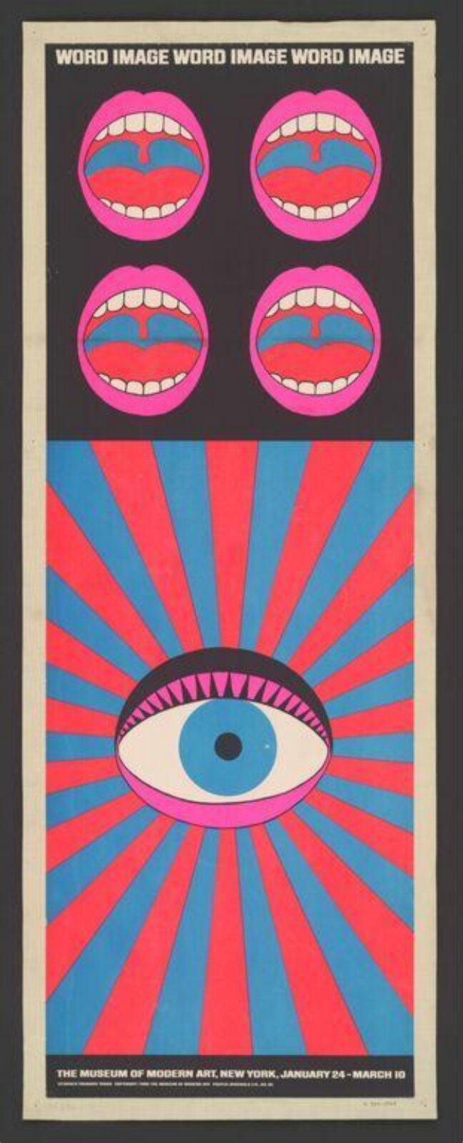
In 1968 MoMA devotes an exhibition to him, Word and Image (January 24 – March 10) — the poster announcing it (work 04) he designed himself. In 1972 he is given the full MoMA exhibition space for a solo retrospective — the first Japanese graphic designer to be given this. In the 1970s, after a trip to India, he brings Buddhist iconography into his work (covers for Beatles, Santana, Cat Stevens); from 1974 he draws the cover for Graphis (work 06) and that same year makes the cover for Santana's Abraxas. From the mid-1970s he collaborates with fashion designer Issey Miyake — invitations for the Paris shows, twice a year from 1977, a collaboration that lasts decades (work 08).
After the death of Yukio Mishima in 1970 — a writer whose thesis that "the sacred and the profane are one" he adopted as a personal influence — he spends the next fifteen years in occultism and mysticism, until he himself later describes it as "a deep illusion". In 1981, after visiting a Pablo Picasso retrospective, he publicly announces that he is leaving graphic design to devote himself exclusively to painting — though he continues to occasionally make posters (see work 08, from 1988/89). In 2011 he receives Japan's Order of the Rising Sun; in 2012 the Tadanori Yokoo Museum of Contemporary Art, dedicated to his body of work, opens in Kobe.
Influences
Studied with
No formally named teacher — self-taught. Illustrator/layout artist at
the Kobe Shimbun newspaper from around age twenty (documented, TGDS);
Nippon Design Center, Tokyo, 1960–64 (documented, shashasha.co) — with
senior colleagues Yusaku Kamekura and Ikko Tanaka as context from the
same house, not as a confirmed teacher-student relationship
Borrows from
ukiyo-e woodblock print — particularly Hokusai's wave and the motif
of sun rays (documented, multiple sources)
Japanese imperial iconography — the rising sun flag, Fuji, the
Shinkansen as signs of postwar modernisation (documented, SFMOMA)
American pop-art and halftone portrait — the Warhol register (see
work 06, Tarzan/Graphis 1974)
art nouveau silhouette, the Beardsley/Klimt register (see work 07,
Marie in Furs 1968)
kabuki and butō theatre convention — collaboration with Tatsumi
Hijikata and Shūji Terayama (documented)
Russian constructivist and Dada-Surrealist montage (reading of the
work — SSENSE, Design Observer)
Yukio Mishima — personal meeting and influence of the thesis 'the
sacred and the profane as one'; after Mishima's death in 1970 he turns
to occultism and mysticism for fifteen years before abandoning it as a
'deep illusion' (documented, hanga-museum.jp via PGDA)
Push Pin Studio / American illustration scene of the 1960s (one
source — English Wikipedia; to verify against another source)
Influenced
Keiichi Tanaami, Harumi Yamaguchi, Masuteru Aoba — the next
generation of Japanese designers (one source, TGDS; to verify against
another source)
the American psychedelic poster scene of San Francisco in the late
1960s — SFMOMA and PRINT Magazine state that his 1965 self-portrait
'anticipates' that style; the direction of influence Japan → USA is
unusual in this project and worth highlighting
Contemporaries
Yusaku Kamekura and Ikko Tanaka — senior colleagues at the Nippon
Design Center, 1960–64
Shigeo Fukuda — Japanese contemporary in the v1 roster under the
same period (1985), not yet covered
Milton Glaser / Push Pin Studio — parallel American reaction to the
Swiss system in the late 1960s (see difference in _PRINCIPI.md, pair
Tadanori Yokoo ↔ Milton Glaser)
Who he learned from
There is no confirmed named teacher — Yokoo is, in this project, the second self-taught designer after Paul Rand. Kobe Shimbun (newspaper illustration) and Nippon Design Center (1960–64, with older colleagues Kamekura and Tanaka as house context, not as a confirmed teacher–student relationship) are the only two workplaces before he becomes independent.
What he plunders
Ukiyo-e woodblock prints (Hokusai's wave, the sunburst motif); the imperial iconography of postwar Japan (the rising sun flag, Fuji, the Shinkansen); American pop art and the halftone portrait in Warhol's register (work 06); the art nouveau silhouette, the Beardsley/Klimt register (work 07); kabuki and butoh theatrical convention through his collaboration with Hijikata and Terayama; Russian constructivist and Dada-surrealist montage. He personally knew Yukio Mishima and adopted his thesis that "the sacred and the profane are one" as his own — after Mishima's death he spends fifteen years searching through occultism and mysticism before abandoning that path. One source (English Wikipedia) also lists Push Pin Studio as an influence — not confirmed by another source.
Who he influenced
According to TGDS (one source, to verify against another): he directly influenced the next generation of Japanese designers — Keiichi Tanaami, Harumi Yamaguchi, Masuteru Aoba. A more interesting and better-confirmed direction runs opposite to the usual pattern in this project: SFMOMA and PRINT Magazine state that his 1965 self-portrait "anticipates" the psychedelic poster style of San Francisco in the late 1960s — Japan influencing America, not the other way round.
What it is — a standalone self-portrait poster, screenprint, 109.2 × 79.1 cm, exhibited at Persona (Matsuya, Tokyo, 1965); MoMA acquires it in 1966 ("gift of the artist", object 696.1966).
Composition — the entire field below the title is filled with a radial burst of rays from a single point in the lower third — the compositional axis is symmetrical, vertical. On that axis, in the centre, a black silhouette figure hangs with its head down (the author himself). Above: a silver-metallic arc with the name "TADANORI YOKOO", a pink band reading "MADE IN JAPAN", a small green figure resembling the Statue of Liberty on the left, a pink flower on the right. Below: on the left a framed photograph of a baby with the number "1½", on the right a pink caricatured fist with green nails next to a grainy black-and-white group photograph (a class photo). The title text ("...A CLIMAX AT THE AGE OF 29, I WAS DEAD") runs in a narrow band beneath the hanging body. The four corner fields work as quadrants of symbols around one central, literally "hanged" figure.
Colour — alternating rays in red and blue (not monochrome, despite one secondary source's claim that they are "exclusively cool blue" — direct viewing confirms alternating red/blue); silver-metallic for the title arc; pink for two corner elements. There is no neutral grey field anywhere — every surface carries a full, saturated colour.
Typography — the author's name in large, hand-drawn, almost poster-like lettering on the metallic arc; the rest of the lettering in smaller, more densely composed blocks that follow the curved edges of the elements, not a straight baseline.
Message — three-second test: the recognisable "Japanese" colour (radiating sun) reads immediately as a national sign, only afterwards does the hanged figure register. Five-metre test: it remains a symmetrical target/mandala — it pulls the eye before a single detail is read. The point is autobiographical and political at once: the designer as the subject of his own work, not as its invisible executor.
Why exactly this way — in 1965 Japan graphic design is an institutional, corporate discipline (Kamekura, NDC). Yokoo deliberately breaks that norm by using a national symbol (the rising sun) as a backdrop for personal, autobiographical, darkly comic content — design as confession, not as service to a client.
What would kill it — removing any one of the four corner elements (the baby, the fist, the class photograph, the "Statue of Liberty") would collapse the balance of the quadrants around the central axis and turn the poster into an illustration of one idea instead of a collision of several.
Principles:simetricna-os-drzi-haos (local), sudar-registara-bez-hijerarhije (local)
To verify against the image: whether the central figure holds a black rose (stated in one secondary source — not confirmed by direct viewing at the available resolution).
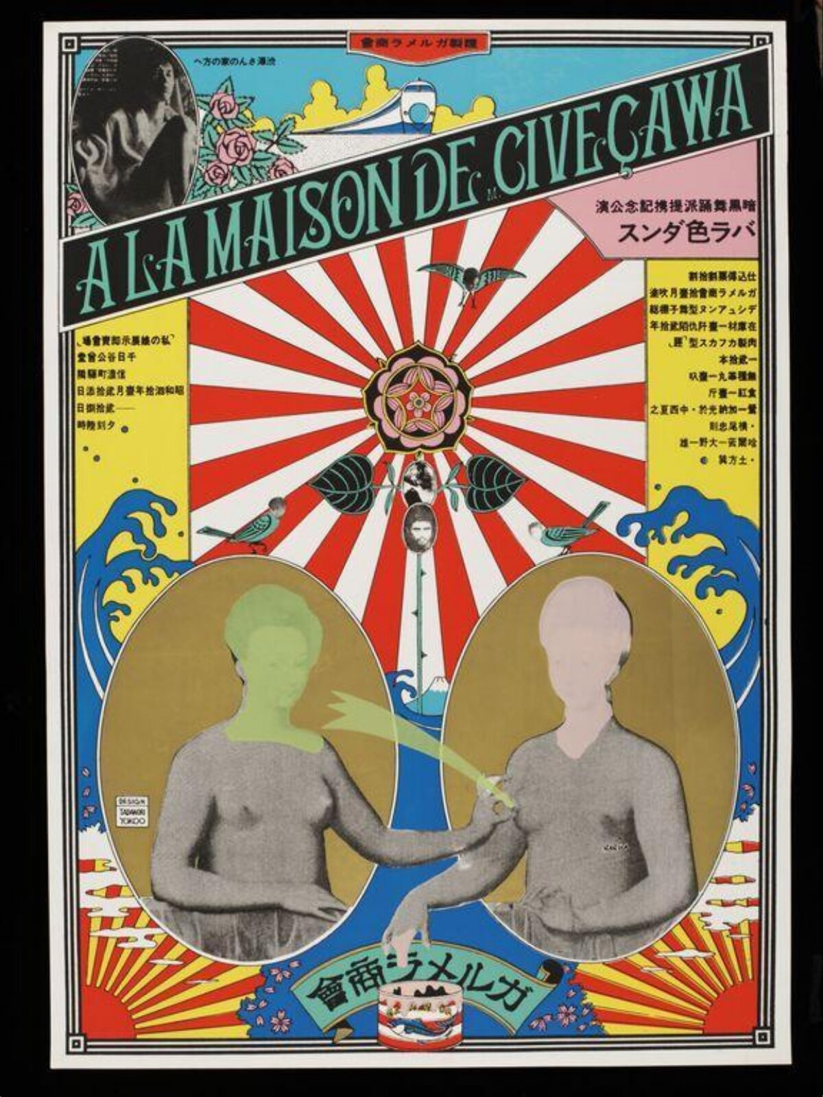
What it is — poster, colour screenprint, 104 × 73.7 cm, V&A (E.43-2011, classified under "Psychedelia" and "Post-Modern").
Composition — the same radial principle as work 01, but without a figure on the axis: red-white rays radiate from a central rose; two oval medallions with busts (one green-toned, one skin-toned) lie symmetrically left-right across the lower half of the radiating field and "touch" fingers on the central axis. In the corners: a black-and-white photographic fragment (an animal head) top left, a wave motif resembling Hokusai top right, birds scattered in small numbers. A diagonal band with the title cuts across the top third over the rays.
Colour — red-white rays as the base; a blue-green wave in the corner; pink floral accents; the two medallions in contrasting skin tones (green versus natural) — a deliberate difference in skin colour between two otherwise symmetrical busts.
Typography — the title in a diagonal band, large capital letters over the sun's rays; side panels of yellow tone carry vertical Japanese text in a small cut.
Message — three-second test: the hypnotic radial pattern first pulls the eye as a pure optical signal, only afterwards do the two figures in the medallions read. Five-metre test: the red-white rays carry the poster even without reading the text — they work as colour/signal, the same as in work 01.
Why exactly this way — the title ("At the house of Mister Civeçawa") suggests an intimate, named space; the composition places that intimate content in the middle of a public, almost religious optical field — a small private scene blown up to the scale of a ritual.
What would kill it — turning the two medallions into an identical skin tone would lose the only subtle asymmetry in an otherwise perfectly symmetrical composition, and with it the reason for the eye to settle on the figures at all.
Principles:simetricna-os-drzi-haos (local)
To verify against the image: the client/occasion for the work is not named in the record.
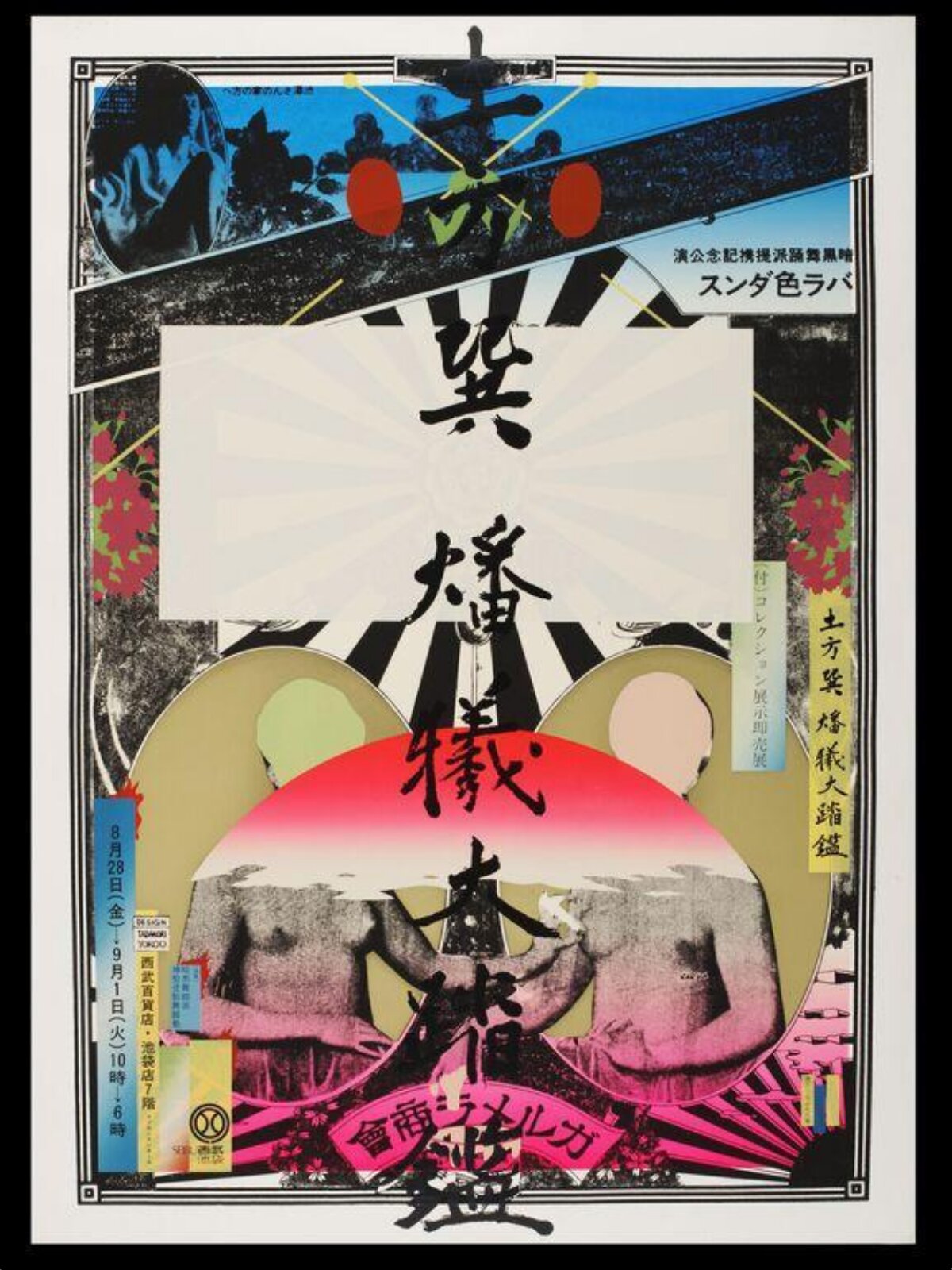
03 · The Great Mirror of the Dance as an Immolative Sacrifice (1968)
What it is — poster, screenprint in colour, 109 × 79.5 cm, V&A (E.44-2011,
Tokyo, 1968).
Composition — black-and-white radiating burst in the background (a variant of the same
radial axis as works 01–02), but here almost completely covered by a large white rectangular
panel in the middle, on which large vertical Japanese calligraphy runs from top to bottom as an
independent figure, not as a caption over the image. Below the panel: a pink-red circular
gradient behind two grey, nude figures (back to back or as a pair). Above: two red circles (like
pairs of eyes) and blue-turquoise triangular fragments in the corners with a small drawn motif.
Colour — black-and-white radiating base; the large white field without colour functions as
a pause; the pink-red gradient is the only warm, saturated zone of the composition; blue accents
limited to the upper corners.
Typography — the calligraphic inscription is not a caption but occupies the central figure
of the composition — the same logic of "text that is image" as in Gerstner (see Karl Gerstner),
but executed by hand, not by photographing an object.
Message — three-second test: the large white field with large letters acts as a pause in
the middle of visual noise — the eye stops there first, only then explores the edges. Five-metre
test: the grey human presence at the bottom remains legible even when all the ornament is lost
at distance.
Why exactly this way — the title announces sacrifice/burning ("immolative sacrifice") —
the composition literally performs this: a calm, empty field (calligraphy) is surrounded on all
sides by a fiery register (rays, red-pink gradient) as if burning around the text that remains
still.
What would kill it — filling the white panel with ornament or image — the only pause in the
composition would disappear and the whole piece would become uniformly dense, with no place for
the eye to rest.
Principles:sudar-registara-bez-hijerarhije (local)
To verify against the image: client (probably Tenjō Sajiki, not named in the record); the
exact content of the calligraphy.
What it is — poster for the MoMA exhibition Word and Image (24.1.–10.3.1968),
screenprint in colour, extremely elongated format 124.8 × 43.7 cm (ratio almost 1:3), V&A
(E.399-1968, gift of MoMA).
Composition — a strictly symmetrical vertical strip divided into two zones. Upper third:
title in small letters at the top, below it four identical pink oval medallions in a 2×2 row,
each with a large drawn open mouth (lips, teeth, tongue). Lower two-thirds: one large eye (blue
iris, black pupil, drawn eyelashes) in the centre of a radial red-blue radiating field — the same
type of burst as works 01–03, here reduced to a purely geometric, flat drawing without
photographic collage.
Colour — flat, hard colours without overlap: pink fields of the mouths, alternating
red-blue rays, blue iris — no gradation, no overlap of two transparent colours.
Typography — the title in geometric grotesque capitals, reduced to the smallest possible
role — the whole composition carries the message without relying on text.
Message — three-second test: the repeated mouths (speech, voice, word) and one eye (image,
looking) literally illustrate the title "Word Image" — but as a pure graphic sign, not as
illustration. Five-metre test: the one eye remains legible even from the greatest distance — the
most reduced, least collage-like work in this selection.
Why exactly this way — for an exhibition dealing with the relationship between word and
image, Yokoo makes a diagram of that relationship: four mouths = word (utterance), one eye =
image (gaze), placed one above the other in the same strip.
What would kill it — adding a photographic collage or a third element — the piece works
precisely because it reduces "word" and "image" each to one pure graphic sign; any third element
would break that equation.
What it is — advertising poster for Asahi beer, 1966; exact printing technique and
dimensions not confirmed (PGDA record without museum data, source Pinterest).
Composition — a completely different register from works 01–04: a densely illustrated
park/picnic scene in a naive, almost childlike drawing style (trees, tiny human figures) fills
the whole background. Over it, a photographic hand holds a red Asahi can and a bottle with a
beer case; a diagonal red-white band with Japanese lettering cuts the composition from the lower
right toward the upper left corner.
Colour — a warm, colourful illustrated background (green, yellow, red in many small fields)
against the photographic hand and product in natural, saturated red-white brand tones.
Typography — Japanese lettering in large letters on the diagonal band, following the angle
of the band, not a horizontal line.
Message — three-second test: the red Asahi can in the photographic hand reads immediately
as "beer", regardless of the dense illustration behind it. Five-metre test: the diagonal
red-white band remains legible and carries the brand on its own.
Why exactly this way — the commercial brief (sell beer) is solved with the same
collage-collision method as the author's own work (01) — photographic product against an
illustrated, almost folk scene — but here without the personal, autobiographical layer; the
collision remains a purely formal selling tool.
What would kill it — replacing the illustrated background with a photograph of a landscape
— the difference in register (drawing versus photograph) that carries all the visual energy of
the composition would disappear.
Principles:sudar-registara-bez-hijerarhije (local)
To verify against the image: printing technique, exact dimensions — the source of the record
is a weak aggregator (Pinterest via PGDA), no museum/archival record.
06 · ターザンがやってくる — cover of Graphis, "Tarzan is Coming" (1974)
What it is — cover of the Swiss design magazine Graphis, client Amstutz & Herdeg
Graphis Press (Zürich), 1974, screenprint (documented, source hanga-museum.jp).
Composition — a large, tightly cropped portrait of Johnny Weissmüller (the actor who
played Tarzan, whom Yokoo first watched in childhood) — mouth open in a scream, two hands by the
face. The title "TARZAN" runs diagonally across the upper part of the frame in large red
letters.
Colour — pure halftone pop-art register: magenta/pink tones for skin and shading,
cyan-blue for the background and part of the shadows, red for the title — the same palette used
by American pop-art portraiture (Warhol), not traditional Japanese colouring.
Typography — a large, hand-drawn display lettering, placed diagonally across the face —
the lettering as an additional graphic element, not as a separate block of text.
Message — three-second test: the scream frame + the title "TARZAN" immediately reads as
excitement/sensation, before the specific actor is recognised. Five-metre test: the halftone
colour patches remain legible as a face even from a distance.
Why exactly this way — for a design magazine, Yokoo chooses a personal memory (a childhood
film) and treats it in a borrowed American pop-art vocabulary — a double collision (personal
memory + borrowed foreign style) on a cover aimed precisely at a Western design audience.
What would kill it — returning the portrait to natural photographic colours — the whole
point (halftone as a citation of pop art, not as photographic reproduction) would disappear.
What it is — theatre poster for Shūji Terayama's play 毛皮のマリー
(literally "Marie of the fur"), Tenjō Sajiki, performed at the Art Theatre
Shinjuku Bunka from 1 to 7 September (year readable from the poster
itself as 1968); screenprint.
Composition — a completely third register in this selection: flat
illustration in art nouveau silhouette style (Beardsley/Klimt register) —
a large black silhouette of a figure in feathers/fur with elongated,
stylised lines, yellow face with no shading, a second smaller figure
bottom right. Large Japanese calligraphy for the word "fur" (毛皮) runs
diagonally across the whole composition. A block of small text on the
left carries the production information (theatre, dates, ticket price,
names of collaborators).
Colour — flat pink ground with no gradient; black silhouette with no
modelling; yellow used only for faces — only three colours total, the
most reduced palette in this selection.
Typography — the large calligraphic word as the main graphic element
(same logic as work 03 — lettering as figure, not as caption); the small
information block completely separate, almost administrative.
Message — three-second test: a black silhouette in fur/feathers with
an instantly recognisable art nouveau manner signals "decadence,
costume drama" before the title is even read. Five-metre test: pink +
black contrast stays legible as a silhouette shape from a distance.
Why exactly this way — for Terayama's play about a transvestite
mother figure, borrowing the vocabulary of European fin-de-siècle
decadence (Beardsley/Klimt) is a more precise choice than any
"Japanese" or "psychedelic" register Yokoo uses for his own self-portrait
work — proof he picks the style according to the content of the play,
not according to his personal signature.
What would kill it — adding shading or modelling to the black
silhouette — the flat, plane silhouette is the reason the work cites art
nouveau at all, rather than the photo-collage approach of works 01, 03
and 05.
Principles:visestruki-registar-kao-potpis (local)
To verify against the image: exact technique and dimensions; the record source (artnet.com)
is moderately reliable, the date is confirmed from the poster itself.
08 · Invitation for the Issey Miyake fashion show (1988/1989)
What it is — invitation for an Issey Miyake fashion show in Paris
(client: Miyake Design Studio); according to the New York Times the show
was held on 22 October 1988 (spring/summer 1989 collection), while the
PGDA record dates it 1989 — inconsistent, see Notes on sources.
Composition — a completely fourth register: an expressive,
painterly-treated face on a dark, blotchy anthracite ground — a white
face half-emerging from the texture, a gestural mark scattered across the
eyes and mouth in several colours (yellow, blue, red, turquoise) like a
painted, not printed, trace. In the bottom left corner a small red
hand-drawn shape (hand/leaf).
Colour — predominantly grey/anthracite and white; the coloured
gesture reduced to small, asymmetric blots across the centre of the
face — the complete opposite of the full, flat fields of the earlier
works (01–07).
Typography — no visible text in the available frame (to verify
against the image — the text may be on the reverse or outside the frame
of the reproduction).
Message — three-second test: the textured, almost horror-poster-like
face reads as a painting before it reads as design — a total absence of
any "graphic" signal (no logotype, no flat colour).
Why exactly this way — twenty years after works 01–07, and seven
years after publicly announcing he was leaving graphic design for
painting (1981), even his fashion commercial work already looks like a
painting, not a poster — proof that the boundary between "designer" and
"painter" was blurred in his work even before the official announcement.
What would kill it — adding a logotype or a typographic block with
the name of the show — it would pull the work back into the category of
"graphic design" that it deliberately flees.
Principles:visestruki-registar-kao-potpis (local)
To verify against the image: exact date (1988 show versus 1989 PGDA
record); whether there is text outside the frame of the reproduction.
09 · 続これがアメリカだ! (Zoku — Kore ga Amerika da, nastavak) (provjeriti uz sliku)
Bridge to practice: poster · graphic design · motion
Poster
When a poster has to carry dense, conflicting content (multiple messages,
multiple registers), first draw ONE symmetrical axis (radial, mirrored or
grid-based) and only then pile elements around it — the axis is what keeps
the composition legible no matter how much "noise" surrounds it (works
01–04). Leave at least one empty, calm field (work 03) as a place for the
eye to rest.
Graphic design
Don't apply the same visual system to every brief. Yokoo changes the whole
register according to content — collage for personal work, halftone pop art
for a portrait of a celebrity, art nouveau silhouette for a decadent
theatrical theme, flat illustration for a commercial beer. Before sketching,
ask: which EXISTING visual language (not your usual one) best carries this
particular content?
Motion
The radial axis from works 01, 02 and 04 translates directly into AE: build
a rig where elements appear/disappear along rays from a single point
(radial burst), rather than along the x/y axis — movement that "breathes"
toward the centre instead of sliding in from the side.
Bad imitation
"Maximalism" without an axis — piling up elements with no
symmetrical or radial structure holding them; the result is visual noise
with no spine, not Yokoo's controlled collision (see
simetricna-os-drzi-haos).
"Japanese style" reduced to a red circle — copying only the surface
sign (sun disc, red-and-white palette) without the collision of
registers that makes that sign meaningful — you get a tourist souvenir,
not a work that says something about the nation and the body of its
author within it.
One "Yokoo style" applied everywhere — imitators take ONLY the
psychedelic collage register (works 01–05) and apply it to everything,
ignoring that Yokoo himself, for the theatre poster (07) and the fashion
invitation (08), deliberately used completely different systems.
The brief through their eyes
For a current job I would first ask: which EXISTING visual language (not my
usual raster/glitch) best carries this particular subject — then I'd
borrow it openly, without apology. Then I'd set one symmetrical or radial
axis as the spine of the composition. Only then would I start piling
conflicting elements (personal, historical, commercial) around that axis,
without worrying whether they "match".
Exercises
Make one poster in two completely different visual registers for the
same content (e.g. one in your raster/glitch language, one borrowing
someone else's recognisable style) — compare what each register "says"
about the content.
Take dense, personal content (self-portrait, autobiographical detail)
and set it on one strict symmetrical/radial axis — constraint: everything
you add must fit into one of four corner "quadrants" around the axis,
as in work 01.
Motion study
Five-second loop in AE or MOHO: one element emerges from the centre
of a radial ray field and travels toward the edge along one of the rays
(not in a straight x/y line) — constraint: one frame, one event, movement
follows the geometry of the rays, not a free path.
Rebuilding the benchmark
Benchmark: work 01 (Made in Japan / Having Reached a Climax). Skeleton:
measure from the image the position of the central figure, four corner
elements and the title arc in % of format; build a radial grid of rays
(number, angle) as .svg.
Task: rebuild the composition in Illustrator in 45 minutes without
looking at the original, using your own content in all four quadrants,
then compare.
Notes on sources
Teacher not confirmed — Yokoo is self-taught; Nippon Design Center
(1960–64) gives context (Kamekura, Tanaka as senior colleagues), not
a documented teacher–student relationship.
Studio "Ilfil" (1964) — only one source (shashasha.co) names the
studio under that name after leaving NDC; other sources speak only of
"independent practice". Not entered into the biography as a confirmed
fact.
Work 01 — black rose — one secondary source (Tumblr, yokoozuan)
states that the central figure holds a black rose; not confirmed by
direct viewing of the image at the available resolution from MoMA.
Work 01 — colour of rays — one secondary source claims the rays
are "exclusively cold blue"; direct viewing (MoMA) confirms alternating
red/blue. Secondary source treated as inaccurate on this point.
Work 03 — client — likely Tenjō Sajiki/Terayama by context (year,
style, Tokyo), but the V&A record does not explicitly name a client.
Work 05 (Asahi Beer) — source reliability — the only source is a
PGDA record whose image source is Pinterest, with no museum or archival
record; technique and dimensions remain unconfirmed.
Work 07 (Marie in Furs) — date — the year 1968 is readable from
the poster itself (performance dates), but the PGDA "date" field and
the artnet source have not been cross-checked against an independent
third source.
Work 08 (Issey Miyake invitation) — date discrepancy — the New York
Times states the show was held on 22.10.1988 (spring/summer 1989
collection); the PGDA "date" field states 1989. Both recorded, not
resolved.
Two SFMOMA works from the v1 list removed — the v1 harvest included
two works from sfmoma.org without a readable title (only cropped
images). The SFMOMA artist page lists only two works in the collection
— "À la Maison de M. Civeçawa" (already work 02 in this note, confirmed
that SFMOMA and V&A hold separate copies) and "Balancing Act" (circa
1960) — neither matches the v1 crops with certainty. Rather than guess,
both v1 entries were removed from the work list (same principle as the
Broxi/Kunsthalle errors with Karl Gerstner).
Influenced Tanaami/Yamaguchi/Aoba — only one source (TGDS); not
cross-checked against another source.
Push Pin Studio as an influence — only one source (English
Wikipedia); not cross-checked.
Portrait — no photograph with clear usage rights found in the
reviewed sources (Wikimedia Commons category has only photographs of
buildings/trains, not a portrait); portret.ima remains false.
Difference from its pair
Paul Rand ↔ Tadanori Yokoo: both are self-taught, without a confirmed
named teacher (the only two such cases in the project), but they build
opposite methods from the same fact of learning on their own — Rand
reduces to one witty, economical sign (reduction as discipline), Yokoo
piles up opposing registers to the point of vertigo (maximalism as
discipline, resting on a symmetrical axis instead of reduction).
Henryk Tomaszewski ↔ Tadanori Yokoo: both build a language outside the
Swiss systemic mainstream, from the periphery (Polish postwar Cold War
context versus Japanese postwar context), and both consciously use an
"unfinished" or "borrowed" register as an argument, not as a flaw —
but Tomaszewski reduces to one uncertain, hand-led gesture, while Yokoo
goes the opposite way: piling up several finished, mutually foreign
registers (photographic collage, pop-art halftone, art nouveau silhouette)
within the same body of work, sometimes even in the same year (1968:
works 03, 04 and 07).