intuitive layout, type against the tonal masses of photography, degradation as shared surface
AD Transworld Skateboarding 1984–87, Beach Culture 1989–91, Surfer, Ray Gun 1992–95; David Carson Design Corpus Christi, Texas → San Diego / Del Mar, California → New York (1995–2003) → San Diego / Zürich
„Don't mistake legibility for communication.“ — attributed to Carson in v1 and in countless
secondary sources; no primary source in this session confirms it (see
Notes on sources). Two sentences from interviews are confirmed: „there are MANY
ways to communicate – I like the emotional ones“ (designboom 2013) and „If you
haven't got the eye, no program will give it to you“ (Blackwell 1995, per Design
Open Data).
Biography
Born in Corpus Christi, Texas — AIGA says 1954, Wikipedia September 8, 1955 —
grew up in southern California. Professional surfer (v1: eighth in the world; not
verified) and sociology graduate (San Diego State), at twenty-six teaching
sociology at a high school in Oregon and only then taking a summer graphic design course
with Jackson Boelts in Tucson. The decisive contact with the craft is a workshop in
Rapperswil under Hans-Rudolf Lutz — a Swiss who used the Swiss school against
itself. That is the whole of his formal education. Everything else is magazine work:
Transworld Skateboarding 1984–87 (becomes AD), Transworld Snowboarding, Musician and
Self (New York, briefly), then Beach Culture 1989–91 for Surfer's publisher — six issues,
over 150 awards (Birch/magCulture, Letterform Archive), and Owen's verdict in Eye
1991 that his legacy would be negative because he'd be copied where he doesn't belong.
Marvin Scott Jarrett takes him on in 1992 for Ray Gun, „the bible of music + style“,
Santa Monica; first issue November 1992 (Henry Rollins, Sonic Youth photographed by Spike
Jonze), Carson for three years, through issue 30 (v1: 1992–95). Ray Gun's audience doesn't
read but consumes atmosphere — Shaughnessy in Eye 99 says it without dressing it up: „did
anyone buy Ray Gun for the writing?“ — and Carson designs exactly that audience. The interview
with Bryan Ferry set in Zapf Dingbats (1994) is a well-known anecdote; Blackwell
describes it as a reaction to a boring text, and creativepro notes that it's still debated to this day whether that was
intentional or a production error. Emigre 27 (1993) is an entire issue about him,
Fuse 7 (1993) lists him as contributing editor — so the middle of the decade had already
claimed him as its own. The End of Print (Laurence King 1995, Blackwell, introduction by Byrne) sold
35,000 copies in its first edition and became the book everyone owned who in 1996
enrolled in design.
From 1995 to 2003, a studio in New York — Nike, Pepsi, Levi's, Quiksilver, MTV, Toyota,
Microsoft, Armani; later creative director at Bose; books 2nd Sight 1997,
Fotografiks 1999, Trek 2003, The Book of Probes 2003 (McLuhan); AIGA medal 2014.
Late works (National Theatre 2013) show the method hasn't aged — it just lost the
magazine that would test it every month.
Influences
Studied with
Jackson Boelts — summer course in graphic design, University of Arizona, Tucson (AIGA); Carson is 26 at the time and teaches sociology at a high school in Oregon
Hans-Rudolf Lutz — workshop in Rapperswil, Switzerland (AIGA, designboom); two-week course (v1); Heller 2012 also mentions Jean Robert — unresolved
Oregon College of Commercial Art (Wikipedia) — not confirmed by a second source
Borrows from
Cranbrook — Owen (Eye 4) says that Beach Culture's typographic methods were derived from Cranbrook student work and applied to a magazine with international distribution
Emigre / VanderLans — Carson's circle in 1993 (Emigre 27 dedicated to him); later rejects them (Heller 2012 — Emigre typefaces became „like clipart, recognisable, dated“)
Photography — Geof Kern (Beach Culture), Spike Jonze (Ray Gun 1); composition comes from the image, not from the grid
Photocopier, fax, scanner, photo software — degradation as material (PGDA 22718, v1)
Influenced
Chris Ashworth and Amanda Sissons (Substance) — Ray Gun 1997–2000, „Swiss Grit“ (Eye 99)
Robert Hales — Ray Gun after Carson (Wikipedia)
generation of imitators 1993–2000 — Owen (Eye 4) and v1 on the same consequence, mannerisms copied where they don't belong
Contemporaries
Neville Brody — same type of magazine, Fuse 7 (1993) Carson as contributing editor
April Greiman — Mac as tool, her in 1986, him in 1992
Paula Scher — same generation, rotation for filling / rotation as stance
Hans-Rudolf Lutz (Rapperswil, workshop) is the only teacher he himself names as decisive —
and that matters: Carson's „freedom“ has a Swiss pedigree, just from the dissident branch.
Boelts (Tucson) gave him his first course. Everything else is from magazine practice.
What he steals
Cranbrook and the Emigre circle — Owen 1991 sees in Beach Culture the typographic methods
of Cranbrook student work; Mills 1993 (Eye 8) asks whether Ray Gun's „lacerated,
stretched, butting columns“ will become synonymous with postmodernism, i.e. whether
it's theory or just look. Carson himself in 2012 (Heller) says Emigre's typefaces
had become clipart, so he dropped them — theft with an expiry date.
The photographer — Kern, Jonze, Albert Watson: composition comes from the photograph, the type is
placed on its tonal masses (v1 craft note; confirmed across all eight works).
Degradation machines: photocopier, fax, scanner, photo software (PGDA 22718). Grain and
decay give the type and image a shared surface — that's Alexey Brodovitch's method
(Ballet) carried over to the desktop.
Found objects and signs (RG 10 — traffic signs, torn paint; EOP cover — a
map, technical drawing): Jamie Reid's and Paula Scher's register, but without mockery and without
parody — as texture.
Who he influenced
Chris Ashworth / Substance (Ray Gun 1997–2000, „Swiss Grit“ — Eye 99): the only
heir who took from Carson the METHOD (Swiss layout + destroyed
Letraset), not the look.
An entire generation of web and advertising design 1995–2002 (Blackwell, Poole) — and this is
exactly the part Owen 1991 predicted as harm: v1 says he „gave the field
permission“, not a procedure; Josef Müller-Brockmann, Karl Gerstner and Emil Ruder gave
procedures.
Images viewed in the embedded browser 14.09.2026 (Design Reviewed ×4, V&A framemark,
PGDA thumbs, MoMA, magCulture/Shopify). Analytical text on individual works practically
doesn't exist online — neither Eye, nor AIGA, nor Blackwell's reviews describe the
composition of a specific issue. Fields 2–7 are therefore reading of the image (v2), with
documented quotes where they exist (01, 02, 07, 08).
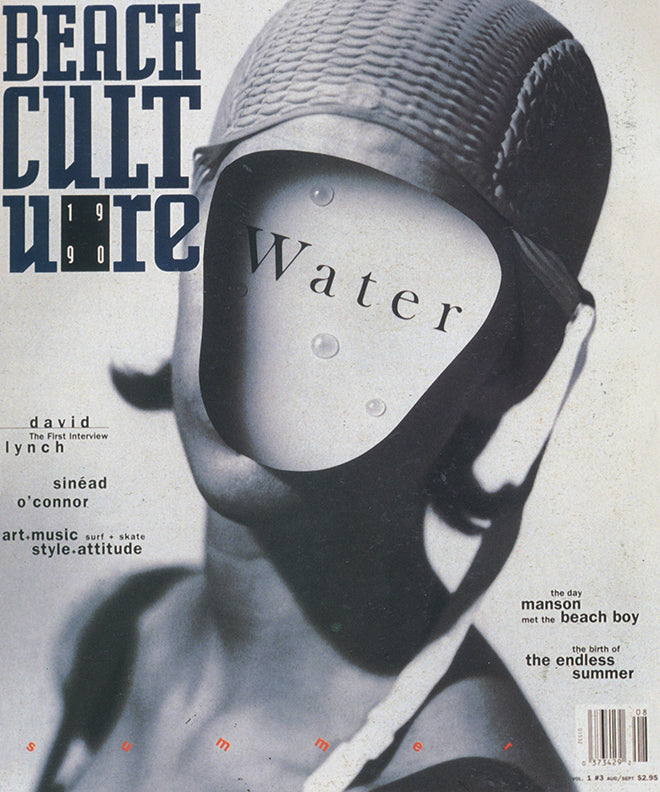
What it is — cover of the third of six issues; photograph by Geof Kern (submitted for
the interior, „the surprise quality and compositional strength made it the cover“
— Birch); format 10 × 12 in (per no. 5); editor Feineman, AD Carson. The same Kern
photograph appears the same year on the cover of the Japanese Picabia.
Composition — black-and-white photograph filling the whole format: a figure in a rubber
swim cap, the face replaced by a smooth oval plate (x 40–75%, y 25–55%).
Masthead BEACH / CULT / URE in three lines top left (x 15–45%, y 12–35%), entering the
photograph and partly covered by the cap — the type is PLACED ON THE TONAL MASS
(dark cap behind light letters), not in a free corner. Eye path: plate with the word Water →
masthead → small headlines at left (y 50–65%) → red „s u m m e r“ at bottom (y 80%).
Colour — a monochrome silver-grey photograph + black letters + one red line.
Colour is reserved for the quietest element (letter-spaced summer), not for the headline —
boja-kao-hijerarhija-ne-ukras reversed: colour marks the season, not rank.
Typography — masthead in a narrow black grotesque, capitals, letters broken into three
lines (CULT / URE) with the year 19/90 set into a field; „Water“ in a serif face with letter-spacing on the
face-plate — the only word that stands still, like an engraving on an object. Cover lines in
two-three cuts of the same family, aligned in small rags. Typeface not confirmed.
Message — from five metres: a faceless face and one word; from half a metre: headlines
(David Lynch, Sinéad O'Connor, Manson and a Beach Boy). Two audiences — Owen: for readers
„impenetrability … a source of satisfaction“, keeping outsiders out. Passes the three-second
test because the image is one.
Why exactly this way — Kern's photograph already had an empty oval where the face should be;
Carson didn't add an image but a word ON the image, and placed the masthead where the cap
could eat it. Constraint: the 1990 surf-magazine newsstand — this has to be different from
every Surfer next to it.
What would kill it — pulling the masthead out of the photograph into a clean white band at the top:
it becomes an ordinary cover with a good picture. Or: Water in the same grotesque as the
masthead — the object/headline distinction disappears.
What it is — premiere issue, November 1992, Santa Monica; 10 × 12 in, 100 pp.;
publisher and editor Jarrett, Carson credited as design consultant; in this issue Rollins,
Sonic Youth (Spike Jonze), Lemonheads, Prodigy, Luna. Editorial: „a magazine
conceived in white heat. Raw by choice.“
Composition — ochre-yellow and dirty-white painterly ground with scratches;
Rollins's face (high contrast, scratched) bottom right (x 55–95 %, y 45–85 %),
eyes at y ≈ 55 %; masthead rAY / GUn red in two lines top right (x 60–92 %,
y 20–40 %) — sits on the lightest field; list of names left (x 15–45 %,
y 22–60 %) in a rag that follows the edge of the yellow patch; a black scribbled
bundle over the lower part of the face (y ≈ 70 %). Eye path: red masthead → face → list.
Colour — three: ochre, black, red; white is the paper. Red only on the masthead —
the only saturated colour carries the name, everything else is dirty.
Typography — masthead in a mixed capitals/lowercase setting of a single grotesque (sans serif) (r-A-Y /
G-U-n): the same word, three different „registers“ of letters — the first sign that the
masthead will be a variable, not a constant. „music+style / the bible of“ in a condensed black
grotesque (sans serif); PREMIERE ISSUE by hand; list in a typewriter face (class). Four kinds of
lettering on one cover, none subordinate to another.
Message — from five metres: a red name and one face; from half a metre: who's inside.
Everything is „raw by choice“ — the scratch, the stain, the scribble are the message, not a mistake.
Why exactly this way — Beach Culture folded after six issues; Ray Gun must
immediately look like something that cannot be mistaken for Rolling Stone. Photo
software (PGDA) makes it possible to do the scratch and stain on screen, not on the negative.
What would kill it — a clean portrait without scratches or scribbling: still a good
Rollins photo, but Ray Gun disappears. Or a masthead in a single typeface/cut — the
announcement that the name will change disappears.
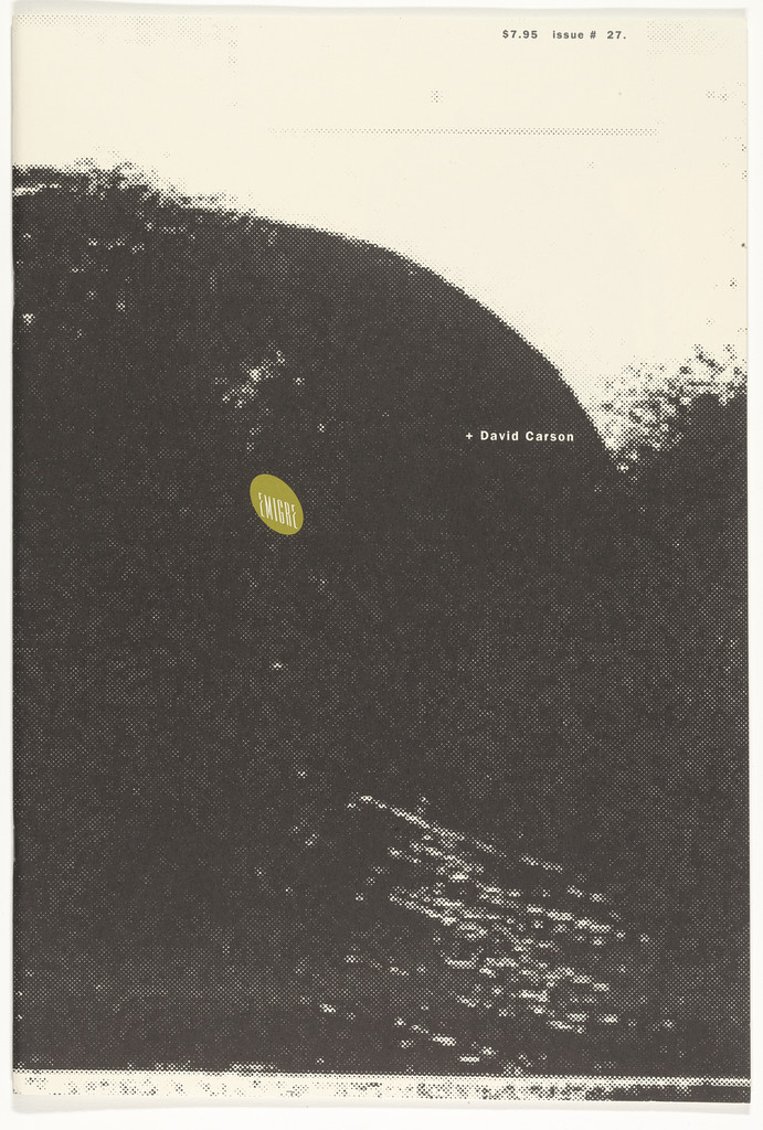
What it is — issue 27 of Emigre, 1993, 40 pp., 11.25 × 16.75 in, 6,500 copies,
printed by Cal Central, Sacramento; MoMA 205.2006.27, „lithograph“, 16 3/4 × 11 1/4 in.
VanderLans edits and designs the issue, Carson designs the front and inside front
cover; contents — a phone conversation between VanderLans/Carson, an interview with Honey Barbara.
Composition — cream paper; one enormous black mass, soft, grainy edges (like
a photocopy of a shadow or a wave), occupying x 10–95 %, y 15–95 % with a diagonal „exit“
top right; „+ David Carson“ tiny on the right edge of the mass (y ≈ 32 %); a yellow-green
oval Emigre logo left (x ≈ 25 %, y ≈ 38 %) like a sticker; „$7.95 issue # 27“
tiny top right. Eye path: mass → oval → name. No title.
Colour — two: photocopy black on cream, plus one oval accent. All tonal
variation comes from grain density, not from grey ink.
Typography — one line of small grotesque (sans serif); the cover of an issue about a typographer has no
typography. That's the stance: the name is a footnote next to a stain.
Message — a design magazine represents the designer with one unfinished shadow;
from five metres it's an abstract image, from half a metre a sticker and a name. Three-second test:
ONE shape is visible — it passes.
Why exactly this way — VanderLans's format (tall, newsprint-like) and Emigre's
self-confidence allow a cover without a sale pitch; Carson, as a guest, shows what
Ray Gun's newsstand doesn't allow — pure subtraction.
What would kill it — any title over the mass. Or a sharp edge instead of a grainy one
— it becomes geometry, the copy machine disappears.
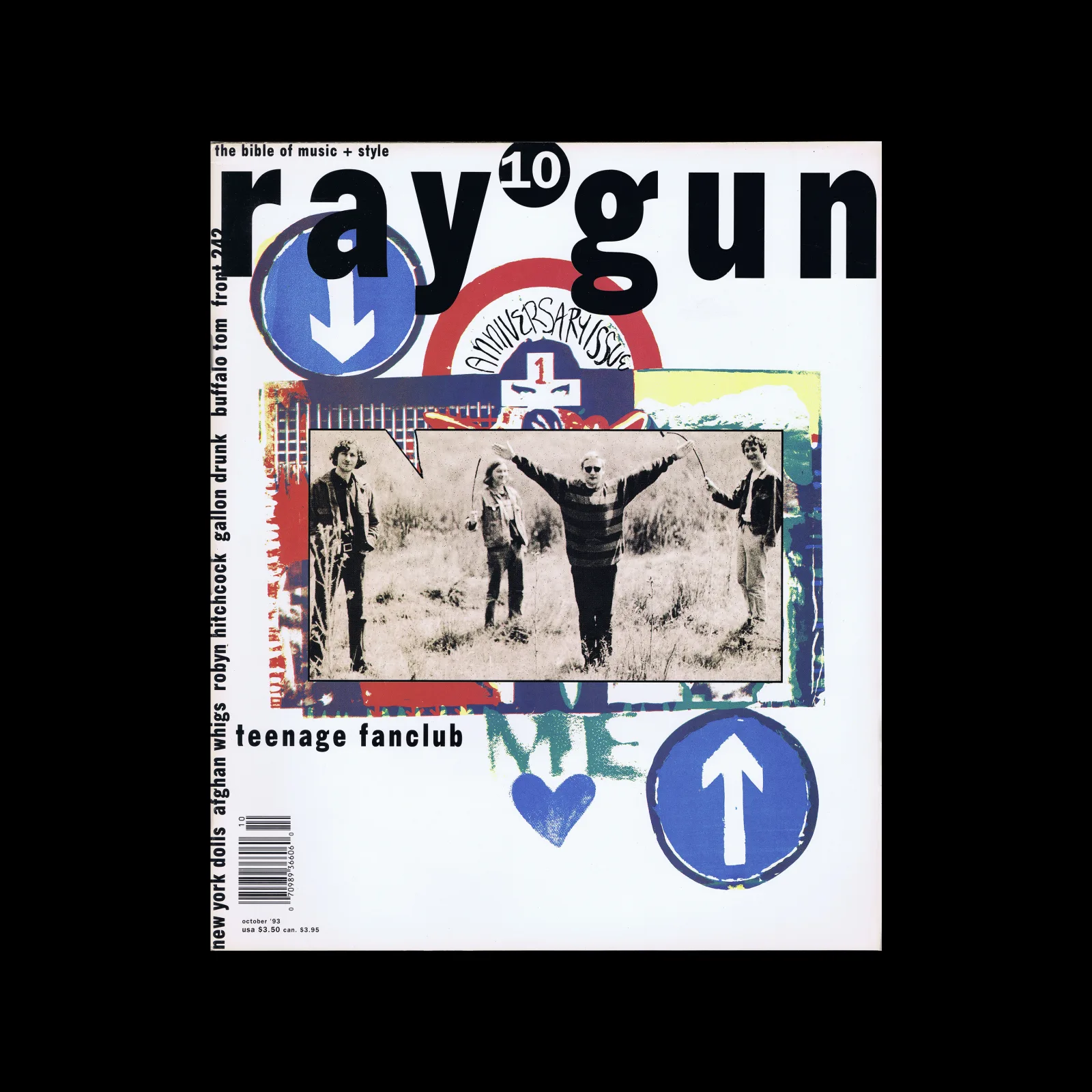
What it is — issue 10, October 1993, 257 × 305 mm; „1 anniversary issue“; Teenage
Fanclub on the cover; in this issue New York Dolls, Afghan Whigs, Robyn Hitchcock,
Gallon Drunk, Buffalo Tom, Front 242.
Composition — white ground; masthead „ray gun“ black across the top fifth
(y 12–22 %), the number 10 in a circle standing in for the word space; below it a collage
(x 20–85 %, y 22–72 %): blue circular traffic signs with arrows (down-left,
up-right), a star badge „anniversary 1“, torn coloured planes, a blue heart;
a photograph of the band (three figures in the frame, the middle one arms spread) in a white frame,
slightly tilted, x 28–78 %, y 38–60 % — lying OVER the collage like a postcard; the band's name
small black below (y ≈ 66 %); the contents spine vertical along the left edge (x ≈ 8 %,
y 25–85 %). Eye path: masthead → arrows → photograph → name → spine.
Colour — white carries everything; blue (signs, heart) is the only repeated colour and
ties the top and bottom together; red, yellow, green in the collage as leftovers; the photograph
is in colour, but faded. Black only in the lettering.
Typography — masthead in a heavy lowercase with letterspacing, wide, low — a COMPLETELY different
typeface than in No. 1 (red mixed capitals/lowercase) and No. 24 (condensed grotesque): the masthead is
a variable per issue. Contents spine in a bold grotesque, lowercase, one size, names joined without rank.
Specific typeface not confirmed.
Message — an anniversary as traffic confusion: arrows in two directions, a badge,
a heart, a band postcard. From five metres: black name + blue circles; from half a metre: names on
the spine. The white ground makes the collage look festive rather than dirty.
Why exactly this way — the tenth issue calls for an „event“ without a star's face; Carson uses
found signs (like Jamie Reid, without mockery) and a framed photograph — the only
time in the series where the image does NOT run across the whole format.
What would kill it — the photograph without a frame, running across the whole format: the collage becomes
noise on the image. Or the masthead in a standard cut: the confirmation that every issue
is renamed anew disappears.
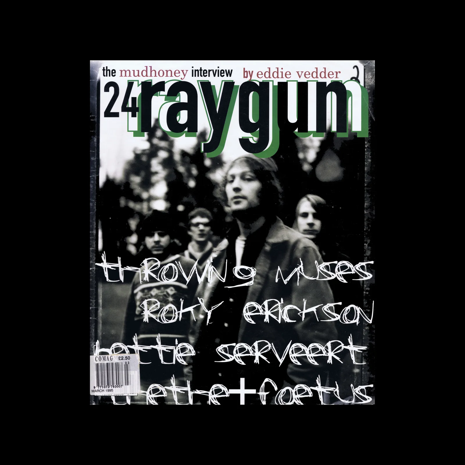
What it is — issue 24, March 1995, 255 × 310 mm; „the mudhoney interview by eddie
vedder“; Throwing Muses, Roky Erickson, Bettie Serveert, The The + Foetus;
COMAG sticker £2.50 (British distribution).
Composition — a photograph of four men in a forest, dark green-black duotone across
the whole format; faces at y 30–45 %; masthead „raygun“ black, condensed, lowercase, across the
top fifth (y 12–24 %) with a green rectangle behind the upper half of the letters — the letters are
HALF on green, HALF on the photograph; „24“ white within the lettering; a small line above in white;
four titles by hand, white marker, across the lower half
(y 55–85 %), over faces, bodies, trees, one line = one name. Eye path: white
handwriting → faces → masthead.
Colour — green-black duotone + white + one green plane. White is the handwriting;
black is the masthead: darker colour for the name, lighter for the content — the reverse of habit.
Typography — masthead a condensed bold grotesque (a different typeface from No. 10);
the titles are NOT typography but a hand gesture — fast, uneven, letters of varying height,
„the the+foetus“ with a plus like in No. 1. The marker over the photograph works like graffiti on a
band poster.
Message — from five metres: four faces in the dark and white graffiti; from half a metre
the names and „by eddie vedder“ can be read. The three-second test passes because the handwriting is
light on dark.
Why exactly this way — when the photograph is dark and has no free field, the titles cannot
be SET without looking like a sticker; the handwriting crosses everything and doesn't need a field.
Constraint makes the solution.
What would kill it — titles in grotesque in a white band at the bottom. Or handwriting in
black — it disappears.
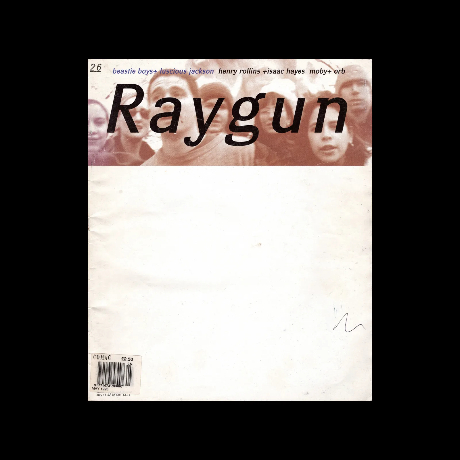
What it is — issue 26, May 1995, 257 × 305 mm; Beastie Boys, Luscious Jackson,
Henry Rollins, Isaac Hayes, Moby, Orb; COMAG £2.50. Among Carson's last
issues.
Composition — top third (y 0–33 %): sepia photograph of a crowd of faces
looking up, masthead „Raygun“ over it (y 12–30 %, x 20–85 %), small headlines
above; bottom two-thirds (y 33–100 %): EMPTY cream paper — just a barcode bottom
left and one pencil-drawn scribble bottom right (x ≈ 80 %, y ≈ 82 %). Eye path:
masthead → faces → emptiness → scribble.
Colour — sepia + cream + black type. The emptiness isn't white but cream,
like uncoated paper: it reads as "unfinished", not "clean".
Typography — masthead in a wide bold italic (third typeface across three
reviewed issues); cover-lines in two colours (blue/black) small at the top, joined
by plus signs. Nothing in two-thirds of the format.
Message — on a newsstand in 1995, next to covers full of faces:
two-thirds of nothing. The crowd looks up — into the masthead — and the reader
looks into emptiness. From five metres it's the loudest cover in the row because
it's the only one keeping quiet.
Why exactly this way — after 25 issues of maximum density, the only thing left
that can still surprise is subtraction. Same move as Peter Saville (a sleeve without
the band's name), but Saville subtracts the NAME, Carson subtracts the IMAGE and
leaves the name.
What would kill it — any headline in the emptiness. Even one band's name.
What it is — monograph, Laurence King 1995, text by Lewis Blackwell, foreword
by David Byrne, design by Carson; 245 × 285 mm, 156 pp.; 35,000 copies of the first
edition (Design Open Data); revised edition 2000. PGDA: "messy, overlapping text with
different fonts and sizes".
Composition — the format split vertically: left ochre-yellow field (x 0–55 %) with
a pale technical drawing and stripes, right dark blue photographic texture of a
machine (x 55–100 %); title THE / END OF / PRINT: in three short lines top left
(x 25–55 %, y 18–35 %) — small, degraded; "THE GRAPHIC DESIGN / OF DAVID" in
the middle (y 50–60 %), CARSON large in a blue band across the full width (y 60–70 %);
author and foreword small white at the bottom; "DATUM" vertical along the seam; a
piece of map (Mercury) on the right. Eye path: CARSON → ochre/blue seam → title
(last!).
Colour — two large fields, complementary (ochre / ultramarine), + black type +
small white. The book's title has no colour of its own; the author's name has a band.
Typography — title in hybrid, damaged glyphs (letters from several typefaces,
parts missing — "end of print" literally in the letters); CARSON in a transitional
serif, capitals, light on blue; BLACKWELL/BYRNE in a narrow sans capitals. Three
registers, three ranks: title smallest.
Message — a book about the end of print looks like an old printed thing
falling apart: map, technical drawing, machine. From five metres: CARSON and two
colours; from half a metre only THE END OF PRINT. The title is a reward for
proximity.
Why exactly this way — a monograph sells on the name, not the title; Carson
knows this and gives the name a band, and the title a ruin. Ochre/blue is one of
the oldest complementary splits (Matter, Beall) — a quote without quotation marks.
What would kill it — the title large and legible at the top. Or one field
instead of two — the seam the letters cross over disappears.
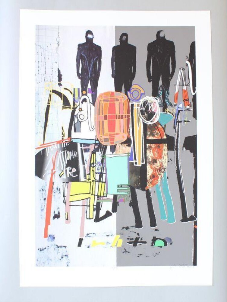
What it is — screenprint on paper, 88 × 62 cm; one of five authors invited for
the National Theatre's fiftieth anniversary (2013); V&A: "multicoloured shapes which form the letters
of the word 'National'" with "silhouetted figures in the background"; a gift from
the National Theatre. Same client and same year as Paula Scher (National Theatre
2013, V&A S.622-2016) — a direct pair.
Composition — vertical format, ground split vertically into light grey
(left) and mid-grey (right) halves; three black silhouettes of men in suits,
faceless, in the top fifth (y 5–20 %), spread across the width; below them a dense
collage of coloured shapes (y 22–75 %) — an orange barrel, yellow stripes, cyan and
magenta lines, black fragments — which, per V&A, spell out the word NATIONAL
letter by letter; "the national theatre" scrawled white on the left (y ≈ 50 %); a
row of small marks at the bottom (y ≈ 82 %). Eye path: silhouettes → orange mass →
only then an attempt to read.
Colour — two grey fields + black + four saturated ones (orange, yellow, cyan,
magenta) only in the letter-shapes. Colour = word; grey = stage.
Typography — no typeface: the letters are coloured shapes (V&A). In a 1000 px
image the word NATIONAL does NOT assemble without a key — the key is the work's
title. Unlike Paula Scher (same word, 3 × 5 grid, letters stretched to the breaking
point but legible), Carson pushes past the boundary.
Message — theatre: three figures on stage above, below a colourful jumble that
is actually the house's name. From five metres: three black silhouettes; from half
a metre: collage. The word doesn't read at either distance — and that's a
decision, not an error (V&A: "fused together in a chaotic form").
Why exactly this way — the client has a name everyone knows; five authors,
each different. Carson doesn't need to say NATIONAL — he needs to say CARSON.
Screenprint carries flat fields and overlaps, not photography — so here there is
NO photograph, for the first time in eight works.
What would kill it — a legible NATIONAL. Or faceless silhouettes with faces —
the stage disappears.
Principles:citljivost-na-granici (past the boundary — tenth author, the only one who
crosses the boundary on purpose) sifra-umjesto-teksta (second author after Peter Saville —
the word exists, the key is the catalogue title) sudar-registara-bez-hijerarhije
(silhouette / field / scribble / map at the same rank — second author after Tadanori Yokoo)
fragment-umjesto-lica (faceless silhouettes — second author after Paula Scher)
To verify against the image: the number of colours in the screenprint; whether the grey seam is two colours or paper + one.
Other works — evidence, no analysis
Beach Culture no. 5, Feb/Mar 1991 — cover by Gary Baseman; 10 × 12 in,
72 pp.; Heller: "Letter forms overlap, overprint, smash, and are otherwise covered
by black, mortised, random bands abstracted to the point of incomprehensibility"
— the only description of the composition by a critic. Display. citljivost-na-granici
Ray Gun, interview with Bryan Ferry in Zapf Dingbats (1994) — issue not
established; Blackwell (20th-Century Type, via creativepro): a reaction to a boring text;
creativepro: intent / error is guessed at. Image not reviewed —
to verify against the image. sifra-umjesto-teksta without a key = decoration (a test from
_PRINCIPI) — here the key does NOT exist, so it's a gesture, not a code.
Idea 261 (March 1997) and Idea 271 (November 1998) — covers for the Japanese
Idea (Seibundo Shinkosha); 261 with the text "Shift of Power / Devolution";
Design Reviewed.
Nine Inch Nails, The Fragile (1999) — sleeve and t-shirts; typeface Index (Darden &
Glaser) confirmed on the t-shirts — "tracked-out caps … without word spaces" + Carson's
cross-processed photography; authorship of the t-shirts Carson or Rob Sheridan (uncertain).
Fonts In Use 34387. razmak-usporava-citanje (candidate, not reviewed)
Ray Gun, Keith Richards cover; Carson's last issue (no. 30) — only on
davidcarsondesign.com (img_temp_la/24c.jpg, 32b.jpg), no record.
Posters for the film Helvetica (2006) — group work (Hustwit, Experimental Jetset,
Build); Fonts In Use 2594 — typeface Helvetica, used ironically.
Principles — summary
Global (already in _PRINCIPI), proven on the work:
- citljivost-na-granici — 01, 02, 05, 07; 08 OVER the limit. The tenth author, the only
one where the limit was crossed deliberately and sold to the client.
- fotografija-je-layout — 01 (Kern), 05: the composition belongs to the photographer, the type
adapts. Second author after Herbert Matter.
- zrno-i-zamucenje-kao-oblik — 02, 03: scratch, stain, photocopy shadow are
shapes. Sixth author; first one where the grain is SOFTWARE-MADE (photo software, PGDA), not
optical, not 1-bit dither.
- dva-rastojanja-citanja — 01 (image / titles), 07 (name / title). Seventh author;
the second message is the TITLE OF THE WORK — the reverse of everyone else.
- bijeli-prostor-kao-oblik + oduzimanje-kao-autorstvo — 03, 06.
- hijerarhija-po-dubini + providni-sloj-kao-dubina — 05 (masthead / plane /
photograph), 07 (drawing / plane / letter). Third, and fourth, author respectively.
- istorijski-citat-kao-gradivni-materijal — 04 (signs), 07 (map, drawing).
- gest-rukom-nasuprot-rezu — 05 (marker / grotesque).
- sifra-umjesto-teksta — 08 (key = title in the catalogue). Second author after
Peter Saville → promotion.
- sudar-registara-bez-hijerarhije — 08. Second author after Tadanori Yokoo → promotion.
- fragment-umjesto-lica — 08 (silhouettes without faces). Second author after Paula Scher →
promotion.
- namjerna-ruznoca-kao-napad — 02 (scratches, scribble, „raw by choice“) —
second author after Jamie Reid → promotion; the difference: Reid attacks the TASTE
of the surroundings (super-graphics), Carson attacks CLEANNESS (desktop smoothness of 1992) — ugliness
by hand on screen.
Local (new, waiting for a second author):
- tip-na-tonskoj-masi-ne-na-formatu — 01, 02, 04, 05. v1 craft note confirmed on
the image: the masthead sits on the cap (01), on the lightest stain (02), on white (04),
half on the plane half on the photograph (05). Test: shift the photograph 10 % — does the
text have to move too? If not, the text was sitting on the format.
- masthead-mijenja-pismo-svaki-broj — 02, 04, 05, 06: four issues, four typefaces
(mixed capitals / heavy lowercase / condensed grotesque / wide italic). The identity is
POSITION and WORD, not the cut — the opposite of Neville Brody (The Face: rotates but doesn't
change typeface) and Paula Scher (logotype upright in the corner). Test: cover the masthead — is
the magazine recognisable? For Carson, yes, from the rest.
- nedovrsenost-kao-poziv — 03, 06: cream paper, pencil scribble, grainy edge —
the work looks unfinished, so the reader finishes it. Related to
postupak-citljiv-kao-poziv (Wolfgang Weingart) but here it's not the process that's visible but the
ABSENCE of process.
- praznina-kao-provokacija-kioska — 06: two thirds of nothing among full
covers; ugliness by Reid's test (measured against the surroundings), only the reverse
sign — silence instead of shouting.
- ista-vrsta-slova-dvije-velicine — 04: the spine of the contents in one size, names
joined with no rank; masthead in another. Two ranks, one typeface, zero middle
size — related to dva-rastojanja-citanja but within the SETTING, not image/text.
Rejected on the work:rotacija-radi-popune-ne-ranga (Paula Scher) — Carson only rotates
the contents spine (04) and it's filler, but a single word; no evidence for the principle.
razmak-usporava-citanje — only on the NIN t-shirt (not reviewed). varijabla-do-otkaza
— no series with a stated variable; Carson changes EVERYTHING at once (v1: the method is not
transferable), which is exactly the opposite of the method.
Bridge to practice: poster · graphic design · motion
Poster
Type on the tonal mass, not on the format: open the photograph in Illustrator, Image Trace
at 3 colours (just to see the masses), then place the title where the edge of the letter leans on the
edge of the dark mass (01: masthead on the cap). Only then delete the trace. If the title stands even without the
photograph — it isn't on the mass.
One handwritten layer over everything (05): titles in marker over the dark photograph
in white, one line = one name, no fields. Scan, don't draw vector —
Carson's marker is photographed.
Empty cover (06): when doing a poster series (festival, cycle), let one in
the sequence be 2/3 empty. Works only within a sequence — doesn't work alone.
Graphic design
Masthead as a variable (02–06): in a brand system for a client who can take it
(music, festival), fix the POSITION and the WORD, and change the typeface per issue. Make a
table: issue / typeface / colour — this is the manual Carson never wrote.
Degradation as a shared surface (02, 03): when the type and photograph "don't
sit together", don't change the typeface — degrade BOTH with the same process (Photoshop: one
noise layer + one Threshold over everything, or literally 3 photocopy generations).
Name above the title (07): when the author is more famous than the work,
the title goes into the ruin, the name goes into the band.
Motion
Hierarchy by depth (05, 07): in AE, three layers — plane (back), photograph
(middle), type (front) — with Camera + DoF; the title is sharp, the studio name is blurred, not smaller.
Handwritten title (05): Write-on effect on a scanned marker, 8 frames per
letter, no easing — Carson's marker isn't animated, just fast.
Subtraction as a cut (06): in the titles, one frame of 2 s completely empty (cream, not
black) between two full ones — a pause like cover 26.
Bad imitation
Copied look, not position. The imitator takes a degraded typeface and throws it anywhere
— but Carson's type always sits on the tonal mass of the photograph (01, 02, 05). Without a
photograph carrying the composition, "grunge" type is just dirty. Owen 1991: mannerisms
copied „in situations where they clearly do not belong“.
Illegibility without an audience. Ray Gun could be illegible because the audience wasn't
buying text (Shaughnessy). The same measure in an annual report, on a theatre poster
that has to state a date, in UI — that's a mistake, not a stance. Question from v1: what does the artefact
SERVE?
Everything at once. Carson changes typeface, colour, layout, and image in every issue —
and he does it because he's one man with an eye (Blackwell: „no program will give it to
you“). A team without that eye that changes everything at once gets noise. Weingart's test:
what's the variable? For Carson the answer is „everything“ — that's not a method, that's an author.
Emptiness without a sequence. The empty cover (06) only works after 25 full ones. The first
poster in a series can't be empty.
The brief through their eyes
For gaming parodies on YouTube (thumbnail + titles, gaming-animacije): Carson would
take the WORST frame from the animation — blurred, half a face — enlarge it to fill the
thumbnail, write the title in marker over the darkest part and photograph it
with a phone, not scan it. Titles: two frames — the first crammed full, the second cream
empty with one word small in the corner. Channel name: a different typeface every video, same angle.
Exercises
Mass then type (45 min). Take one photograph, Threshold at 50 %. Place the
title so that every letter touches the edge of the black mass. Bring the photograph back. Compare with
a version where the title is centred — which one holds without the photograph? The one that does NOT hold
is the Carson one.
Four mastheads (1 hour). One channel name, same position (top fifth, x
20–85 %), four typefaces: condensed grotesque, wide italic, heavy slab, mixed
capitals/lowercase. Cover the name — is the series recognisable from the rest?
Empty third (30 min). A series of four thumbnails — three full, one 2/3
empty cream with a barcode in the corner. Line them up in a YouTube mockup — which gets clicked?
Motion study
5 s, AE, one frame: dark photograph (05), green rectangle behind the upper half of the
masthead's letters; Camera with DoF; at 0–2 s the title is blurred and far, 2–3 s it comes into focus
and forward, 3–5 s a white marker (Write-on, scanned) passes over the face. No letter
changes size — only focus and depth. Principle: hijerarhija-po-dubini +
tip-na-tonskoj-masi.
Rebuilding the benchmark
Benchmark: Ray Gun 24 (05). Skeleton .svg 255 × 310: masthead y 12–24 %, green plane
y 12–18 % (upper half of the letters), face y 30–45 %, four handwritten lines y 55–85 % with
spacing ≈ 7 %, barcode x 5–20 % / y 88–95 %. Tonal zones: 70 % dark, 20 % mid,
10 % light (handwriting + masthead). Task: 45 min in Illustrator with your own dark
photograph and your own marker, without looking at the original.
Comparison — the sentence of difference
Wolfgang Weingart ↔ Carson — both push spacing/legibility to the limit; Weingart
publishes a SERIES of steps as teaching, Carson publishes only the last step and as a
product; method / permission.
Neville Brody ↔ Carson — same type of magazine; Brody draws a typeface for one job and
rotates the masthead in a fixed typeface, Carson draws nothing but breaks up other people's work and changes the
masthead's typeface every issue; identity in the mark / identity in behaviour without a mark.
April Greiman ↔ Carson — Mac 1986 / 1992; Greiman shows the TOOL (pixel, depth
by resolution), Carson hides the tool behind photocopy and marker — the result looks
handmade; digital visible / digital concealed.
Paula Scher ↔ Carson — same client the same year (National Theatre 2013); Scher
stretches the LETTER to the field, it stays legible; Carson dissolves the letter into shape, it doesn't stay;
step before failure / step after.
Peter Saville ↔ Carson — music; Saville removes the NAME and leaves the image
(a code with a key), Carson removes the IMAGE and leaves the name (RG 26); both work because the
audience already bought the previous 25.
Muriel Cooper ↔ Carson — layer and transparency; Cooper on screen organises reading
through depth, Carson on paper uses depth to build ATMOSPHERE (masthead half on the plane half on the
image); same technique, one order / one disorder.
Jamie Reid ↔ Carson — found mark and deliberate ugliness; Reid attacks the taste
of his surroundings and that's politics, Carson attacks the smoothness of the desktop and that's style; attack /
surface.
Herbert Matter ↔ Carson — both: photography is the layout; Matter montages the photograph
to CARRY type, Carson degrades the photograph to RECEIVE type; montage / surface.
Notes on sources
Disagreements between sources:
1. Year of birth — AIGA (2014 medalist): 1954, Corpus Christi; Wikipedia:
8 September 1955; v1: „born 1954“. Both left in the frontmatter.
2. Teacher in Switzerland — AIGA, designboom, v1: Hans-Rudolf Lutz (Rapperswil);
Heller 2012 (Carson Redux): „Jean Robert“ — possibly a different course or an error; not
merged.
3. Ray Gun start — AIGA and Wikipedia (Ray Gun): November 1992; Design Reviewed:
„launched in 1993“ — Design Reviewed is wrong.
4. Carson's role on issue 1 — PGDA/Display: „Visual Consultant / Design
Consultant“; AIGA: „founding art director“. Issue 1 lists him as consultant.
5. v1 quote („Don't mistake legibility for communication“) — not confirmed in
a single primary source in this session. Replaced with two confirmed ones.
6. Bryan Ferry / Zapf Dingbats — issue number and date (1994) only from secondary sources;
creativepro: guessing at intent / mistake; Blackwell (20th-Century Type): reaction
to boring text. Image not reviewed.
7. v1 „ranked eighth in the world“ (surfer) — not confirmed; Wikipedia only says
„professional surfer“.
8. v1 list of works — 14 items; 6 from davidcarsondesign.com without titles, Commons
portrait, Fuse 7 (Brody's work, Carson as editor) — usable 6. Roster supplemented from
Design Reviewed (3 Ray Gun issues + EOP + Emigre 35 + Idea) and magCulture.
Gaps:
- No analytical text on individual works exists (like for Tanaka, Fukuda, C&G) — Eye has
only general assessments (Owen, Mills, Roberts, Shaughnessy). The only description of composition from a
critic: Heller's sentence about Beach Culture (via Display).
- Emigre 27 phone conversation (VanderLans/Carson) — primary text on method, not
available online (Letterform Archive online offline, „temporarily offline“).
- No MoMA record with Carson as author; V&A only 1; Cooper Hewitt gives
nothing via WebSearch.
- Typeface: none of the 8 works has a confirmed typeface. The only confirmed ones in the body of work: Index
(NIN t-shirts 1999) and Helvetica (poster 2006, group).
- Portrait: Commons 2019 (from v1), not re-verified.
- Photographers of Ray Gun covers 1, 10, 24, 26 — unknown.
- Measurement from the image done roughly (positions in %), without a script.