eclecticism — history as building material, not as reference
Co-founder of Push Pin Studios (1954/55) and New York magazine (1968); Milton Glaser, Inc. (1974) Bronx, New York → New York
There are three responses to a piece of design — yes, no, and WOW. Wow is the one to aim for.
Biography
Born 1929 in the Bronx. Educated at New York High School of Music and Art, then at Cooper Union in New York. A Fulbright scholarship took him to Bologna, to the Accademia di Belle Arti, where he studied engraving under Giorgio Morandi — a fact that, by his own admission and by a reading of his body of work, explains more than any design school. Morandi taught patient observation of an ordinary object; Glaser carried that discipline over into observing the history of design as a reservoir of forms that may be taken, not just admired.
In 1954 (miltonglaser.com and PGDA give 1954; Eye Magazine, in a 1997 interview, gives 1955 — unresolved) he founded Push Pin Studios with Seymour Chwast and Edward Sorel; Reynold Ruffins, by one version of the story, joined right away, by another — shortly after. Push Pin worked for twenty years against the grain of the Swiss system then dominating the American market: instead of the grid, sans-serif and photography, it offered drawing, historical quotation and eclecticism. In the 1997 Eye interview Glaser described it this way: he couldn't do the Swiss system better than those who had already perfected it, so he went "somewhere else" — modernism, by the mid-fifties, looked "exhausted" to him, like the Chinese saying he likes to quote: "whatever reaches fullness is already declining." His named models were historical, not theoretical: art nouveau, Charles Rennie Mackintosh, the Arts and Crafts movement, Ruskin, William Morris, Frank Lloyd Wright, the Vienna Secession — the Bauhaus treated as just one link in a longer chain, not the only possible path.
In 1968, with Clay Felker, he founded New York magazine, where until 1977 he was president and design director — a magazine that became the model for all later "city magazine" publications. In 1974 he left Push Pin and opened Milton Glaser, Inc.; the profession described that split as a generational event comparable to the breakup of the Beatles. The studio expanded into identity, interiors, exhibition architecture — projects include restaurants at the World Trade Center, the Grand Union supermarket chain (fifteen years of collaboration), the World Health Organisation's AIDS sign (1987), and the identity for Sesame Place. In 1983, with Walter Bernard (a former art director at Time), he founded WBMG, a firm for redesigning newspapers and magazines (Washington Post, La Vanguardia, O Globo and others).
His best-known work — the "I ❤️ NY" logo — was made in 1976 as pro bono, unpaid work for New York State, then on the edge of bankruptcy: a sketch on the back of an envelope, in a taxi, on the way to a meeting. Glaser didn't ask for a dollar, thinking the campaign wouldn't last more than six months; the logo has since been described as the most imitated in design history. After the September 11, 2001 attacks he drew, unasked and without a commission, a variant "I Love New York More Than Ever" — and the state, ironically, sent him a warning for infringing its own trademark on his own work; it apologised once the mistake was noticed.
He died on June 26, 2020 — on his 91st birthday.
Influences
Studied with
Cooper Union, New York (before that High School of Music and Art)
Giorgio Morandi — etching, Accademia di Belle Arti, Bologna, Fulbright scholarship mid-1950s
Bauhaus — but treated as ONE link in the chain, not the only model (Glaser's own formulation)
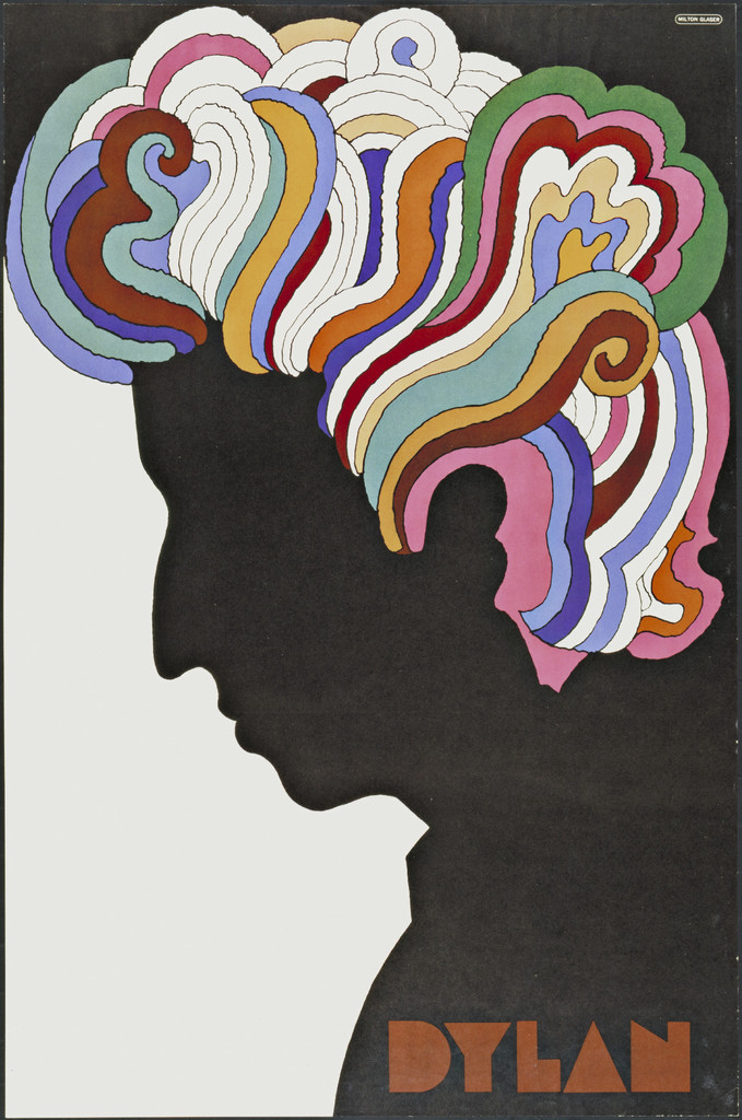
Marcel Duchamp — self-portrait as the literal source for the silhouette on the Dylan poster (documented, MoMA)
a folk street sign in Mexico City — source for the Baby Teeth typeface (documented, Fonts In Use)
Influenced
generation of American illustrative-eclectic design after the 1960s — Glaser's departure from Push Pin in 1974 is treated in the profession as a generational turning point (documented, Steven Heller, Eye 1997)
Paul Rand — same city, same generation, opposite ideology
Reid Miles — same New York music business, mid-to-late 1960s
Who he studied under
Cooper Union, New York — basic design and drawing discipline. Fulbright scholarship, Accademia di Belle Arti, Bologna: engraving (etching) under painter Giorgio Morandi — the only teacher named and confirmed in this note, and, by Glaser's own account, key to his way of thinking about form and patience.
What he steals
He doesn't hide his sources — he proclaims them. Personally, in the Eye interview (1997), he names art nouveau, Charles Rennie Mackintosh, the Arts and Crafts movement (Ruskin, William Morris, Frank Lloyd Wright) and the Vienna Secession as a "continuous chain of related ideas" he drew from — the Bauhaus is for him just one link in that chain, not the sole starting model the way modernists treated it. At the level of individual works, confirmed: the Dylan poster literally takes its silhouette from Duchamp's self-portrait (MoMA); the Baby Teeth typeface starts from a hand-painted street sign seen in Mexico City (Fonts In Use). The v1 text also mentions Islamic ornament, Persian miniature and Victorian wood type as sources for the body of work — this has not been confirmed in this session on any of the eight works examined; it remains open (see "Unresolved questions").
Who he influenced
Push Pin, by a documented reading of the profession (Steven Heller, Eye 1997), changed the course of American graphic design — so much that Glaser's departure from the studio in 1974 was treated as a generational turning point. Naming specific individual successors remains beyond the scope of this note without inventing anything; the general finding is that an entire generation of American illustrative-eclectic design after the 1960s worked in the shadow of that shift.
CBS Records (for the album Bob Dylan's Greatest Hits)
Technique
offset lithograph
Size
33 × 22 in (83.8 × 55.8 cm)
Type
Baby Teeth (the designer's own typeface; confirmed, Fonts In Use)
Colours (described, not measured): black silhouette on an ivory background; purple; turquoise; orange; dark red; green; pink — all within the outline of the hair
What it is — poster/insert for the album Bob Dylan's Greatest Hits, client CBS Records, 1966, offset lithograph, 33 × 22 in (83.8 × 55.8 cm); gift of the designer, MoMA 773.1983.
Composition — a single head silhouette in profile fills almost the whole format; everything that "happens" happens inside the outline of the hair, the rest is pure white.
Colour — strictly fenced in: it exists ONLY inside the hair line (purple, turquoise, orange, dark red, green, pink); the face, neck and shoulder remain a pure black silhouette on an ivory ground.
Typography — "DYLAN" in the designer's own typeface Baby Teeth, outside the silhouette, in an earth/rust colour.
Message — one singer, one word; the silhouette anonymises the face into an icon, the colour in the hair carries a psychedelic, "living" layer of message.
Why exactly this way — CBS needed positive publicity after Dylan's motorcycle accident (rumours of death); the silhouette avoids a photographic portrait of the injured man and offers a symbol instead.
What would kill it — a photographic face instead of the silhouette: the "face as icon" effect would disappear, and it would revert to an ordinary portrait.
Principles:istorijski-citat-kao-gradivni-materijalcrno-bijelo-prije-bojeTo verify against the image: the exact number and order of the colour bands in the hair (I did not count them individually); whether the MoMA copy (1966) is identical to the one at the Art Institute of Chicago (dated 1967) or whether it's a later edition — artic.edu was not accessible in this session (Cloudflare block, including through the embedded browser, first time the block has been recorded not to give way even like that).
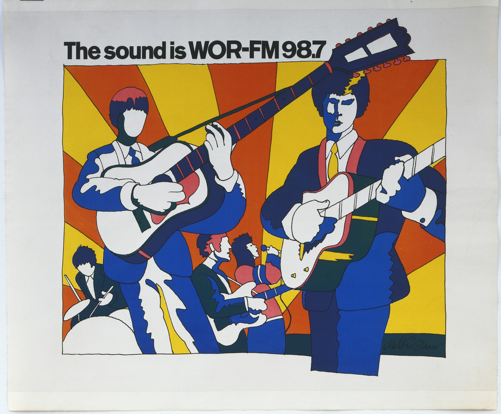
What it is — poster for the launch of radio station WOR-FM (RKO), 1966, lithograph, 45 1/8 × 58 1/2 in (114.6 × 148.6 cm); gift of the station, MoMA 705.1966. Plastered across New York subway stations, buses and billboards before the station went on air — fans tore it off the walls.
Composition — four musicians in a flat, illustrative cut, with guitars; diagonal sunbeams in the background break up the format behind the figures.
Colour — solid, flat areas (orange, yellow, red, blue) with no gradient — reads from platform distance.
Typography — bold hand-lettering, the station's name across the top of the composition; typeface not identified.
Message — "young, modern, stereo sound" translated into visual energy without a single photograph of equipment or people from the station.
Why exactly this way — the poster has to work from a distance and at a glance (platform, a moving bus) — hence the flat colour and diagonal beams instead of fine detail.
What would kill it — shading/gradient on the faces or guitars: at that scale and distance it would get lost in the noise, flat colour is the only thing that survives.
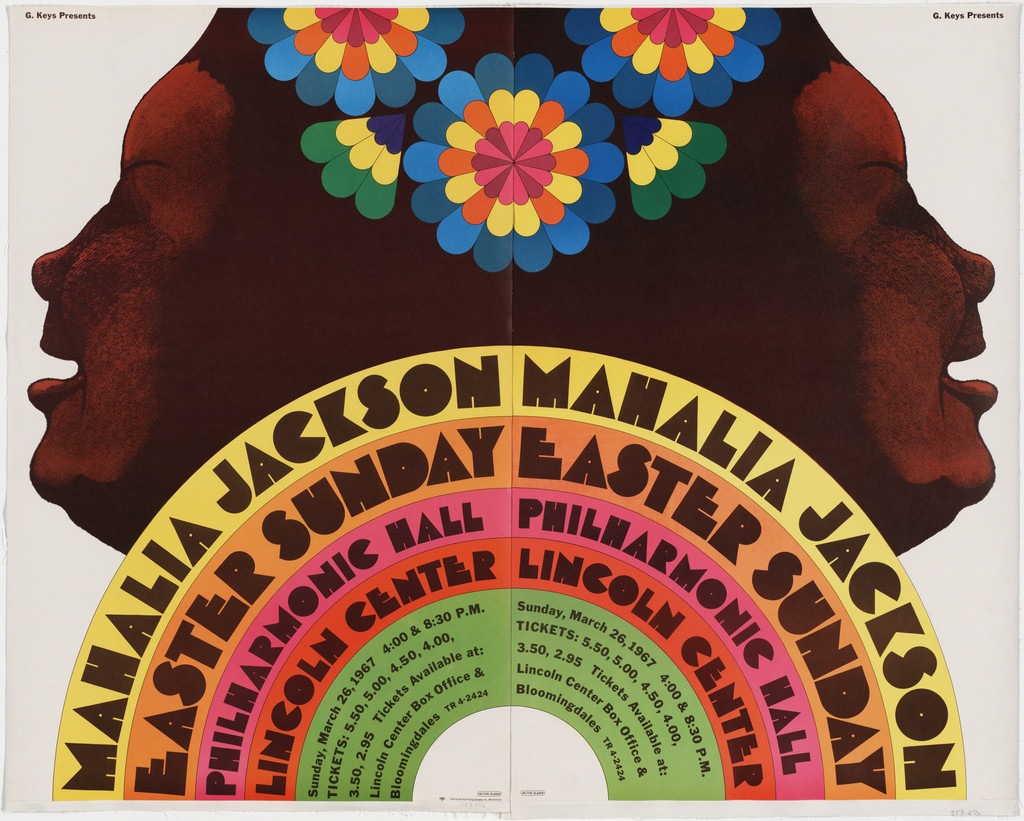
What it is — poster for Mahalia Jackson's Easter concert, Philharmonic Hall/Lincoln Center, 1967; offset lithograph in two sheets, 37 7/8 × 48 3/4 in (96.2 × 123.8 cm); printed by Security Printing Co., New York; MoMA 353.1967.a-b.
Composition — two mirrored profiles of the singer, facing each other, joined at the crown by a radiating flower-burst; below, concentric arcs of text follow the lower half of the circle like a rainbow.
Colour — each concentric arc carries its own colour (pink, orange, green, yellow) — colour here is the geography of information (name / place / time), not a hierarchy of importance.
Typography — capital letters rotated to follow the curve of the arc; the text is architecture, not a line.
Message — two faces of one singer in dialogue, the flower between them like a shared breath/voice; a religious (Easter) and musical (gospel) register in the same image.
Why exactly this way — the symmetry/mirroring carries the spiritual, doubled tone of the concert, while the multicoloured rainbow of text carries the worldly, promotional information (price, time, place) — two functions, clearly separated by zone in the image.
What would kill it — separating the profiles from the symmetry: the flower-burst loses its reason to exist, because it IS the axis of the join, not decoration.
Principles:simetricna-os-drzi-haosTo verify against the image: the exact typeface on the arcs; legibility of the price/time at the available resolution.
What it is — logotype for the "I Love New York" campaign, client New York State (Dept. of Commerce) via Wells Rich Greene agency; sketched 1976, presented to the public 15.7.1977; original sketch (on the back of an envelope) and presentation boards held by MoMA.
Composition — three units (I / heart / NY), in one or two lines; the heart is the only element that breaks out of the strict rectangular letter grid.
Colour — only two: black and red. Red is reserved exclusively for the heart — the only warm accent in a cold, geometric letter system.
Typography — ITC American Typewriter, but NOT straight out of the box: Glaser asked his collaborator George Leavitt to bolden the letters and correct the roundness — "he wanted a counterpoint to the lush, erotic nature of the heart" (Glaser, quoted in Fonts In Use). This is a correction of the common story that names the typeface as "plain" American Typewriter.
Message — the rebus forces the viewer to SAY the sentence rather than read it; that act of saying is an act of adopting the message as one's own.
Why exactly this way — a city on the edge of bankruptcy (1975/76) needs to win back trust and tourism; the sketch was made on the go, in a taxi, as an unpaid, almost incidental gesture.
What would kill it — replacing the heart with the word "love": kills the rebus effect, returns it to a plain, read-out sentence.
Principles:rebus-tjera-na-izvodjenjeistorijski-citat-kao-gradivni-materijalTo verify against the image: the exact difference in the length of the top serif of the Y between the single-line and double-line versions (noted in the source, not visually measured here). Note: the 2001 version "I Love New York More Than Ever" (after September 11) uses unmodified American Typewriter for additional text and Frutiger for small print text — see Other works.
What it is — mark for the small record label Bearsville Records, founded in 1970 by Albert Grossman (Bob Dylan's manager, a frequent Glaser client); seen on a record label (e.g. Todd Rundgren, Hermit of Mink Hollow).
Composition — the circular format of the label dictates the solution: a bear's head inscribed in a circle, the brand name in a band below, all in concentric colour rings.
Colour — layers of concentric colours (orange-pink outside, maroon inside) — the format is predetermined by the colour and shape of the vinyl label as a genre.
Typography — "BEARSVILLE" in capitals, fitted to the arc of the band, not to a straight line.
Message — the bear reduced to three circles (ears, head) and two dots (eyes) plus a small blue snout — geometric reduction to the threshold of recognisability.
Why exactly this way — a record label is small and spins at 33⅓ rpm — every detail not visible at that scale is noise; the shape must stay legible as a silhouette at just a few centimetres.
What would kill it — adding texture or fur to the bear: it would disappear at that size and at that rotation.
Principles: (none — no existing tag is confirmed ON this work; see the rule "a tag is proven on the work")
To verify against the image: the exact year the mark was made (PGDA lists 1970 — it's possible this is the label's founding year, not necessarily the year the mark was drawn); the specific typeface in the band is not identified.
What it is — poster for the tenth edition of the Montreux International Festival (folk / soul / jazz), Switzerland, 1976; reused in 1977 in different colours, with changes that, according to a local printer's comment on Fonts In Use, were probably made by Atelier Prisme Vevey, not by Glaser himself.
Composition — a woman in a floral dress reclining in a chair occupies the bottom half of the format; smoke from her mouth rises and curls into the top half like an arabesque.
Colour — warm yellow-orange background; the figure in black-and-floral pattern; the smoke stays in the tone of the background, distinguished only by line, not colour.
Typography — the title in Windsor Condensed, capitals (an Art Nouveau typeface with characteristic thickenings); smaller information in Helvetica — documented, Fonts In Use.
Message — relaxation and music translated into a single visual metaphor: smoke rising and curving like sound in space.
Why exactly this way — an international client wants a recognisable, "American" Push Pin look; the smoke-arabesque directly quotes the Art Nouveau line — the same vocabulary carried by the hair on the Dylan poster, a decade earlier.
What would kill it — a mechanical, straight line of smoke without organic curvature: the link to the Art Nouveau source would disappear, leaving only a cigarette illustration.
Principles:istorijski-citat-kao-gradivni-materijalTo verify against the image: the exact appearance of the 1977 version (described in the source as altered in colours and partly in the typography of the date block — Univers instead of Helvetica — not visually reviewed here).
What it is — an independent typeface, not a commissioned work; designed c. 1964 (Fonts In Use also notes 1966, per the monograph Push Pin Graphic, 2004); letterform execution by George Leavitt (confirmed, Milton Glaser: Graphic Design, 1973). Later licensed through Photo-Lettering (eight variants), Letraset (1974), and digitally through P22 (2021, complete revision by Richard Kegler).
Composition — bold, geometric capital letters with characteristic notched cuts at the stroke joins — hence the name ("baby teeth").
Colour — n/a; the typeface is black-and-white by the nature of phototypesetting technique.
Typography — the typeface is its own subject: the inspiration is a hand-painted street sign seen in Mexico City, but the execution is, in Glaser's words, "sharper and more Soviet" than the source.
Message — the typeface carries the whole tone of Push Pin without a single image: warm and handmade in origin, but geometrically disciplined in execution.
Why exactly this way — a folk/street source is taken as raw material and systematised into a full family (regular, outline, dotted, opaque × line/baroque) — the vernacular turned into a professional tool.
What would kill it — removing the notches at the joins: the typeface would become an ordinary bold geometric capital face, without a signature.
Principles:istorijski-citat-kao-gradivni-materijal (third time in this body of work — see 01 and 06)
To verify against the image: the exact year of origin (1964 versus 1966, unresolved between sources); whether the typeface was really used on MoMA's copy of the 1966 Dylan poster or only on the later 1967 edition (see note on work 01 — Fonts In Use explicitly ties the typeface to the "1967" poster).
08 · Mozart Sneezes — Mostly Mozart Festival (1982)
What it is — poster for the Mostly Mozart Festival, Lincoln Center, 1982; offset lithograph, 60 × 91 cm; client Lincoln Center for the Performing Arts.
Composition — a grid of nine square panels; the same pose (Mozart's profile with a wig) repeated with progressive enlargement and deformation of the shape, until the silhouette in the fifth/sixth panel breaks apart into a pure jagged explosion.
Colour — every panel carries the same palette (beige powdered wig, purple-maroon coat, turquoise sky, orange-green trees) — the transformation is carried by SHAPE, not colour.
Typography — the title in handwritten calligraphic italic ("Mostly Mozart Festival / Lincoln Center") — a deliberate contrast to the strict grid below.
Message — classical music given a physiological, comic moment (a sneeze), told as a film sequence condensed into a single sheet.
Why exactly this way — the festival ("Mostly" already in the name) calls for lightness and accessibility; Glaser deliberately chooses the LEAST "serious" possible moment to puncture the aura of classical music.
What would kill it — changing the pose (instead of only deforming it) between panels: it would lose the "same frame, just shifted" effect that makes the sequence read as motion, not as nine independent illustrations.
Principles:brzina-je-ponavljanje-i-pomaksekvenca-i-montazaTo verify against the image: the exact number of panels in the full grid (nine seen in the available frame; a tenth/eleventh panel outside the frame of the shot is possible).
Other works — evidence, no analysis
I Love New York More Than Ever (2001, after 11 September) — documented (Fonts In Use, SVA). American Typewriter (unmodified) for additional text, Frutiger for small print text; distributed as a poster by SVA students all over New York.
Give Earth a Chance (1970) — documented title/year (SFMOMA, PGDA); image not reviewed in this session.
Hugh Masekela — album and poster (1967) — documented title/year (SFMOMA); partially seen as a thumbnail image (PGDA).
Don't Eat Grapes: International Grape Boycott Day (1969) — documented title/year (SFMOMA); image not reviewed.
Sony Tape, Full Color Sound (1980) — documented title/year (SFMOMA); image not reviewed.
The World Health Organization's International AIDS (1987) — documented title/year (SFMOMA); confirmed also in the official biography (miltonglaser.com) as the WHO AIDS symbol/poster, 1987.
United Nations Day (1970) — documented title/year (SFMOMA); image not reviewed.
Juilliard Posters (1987–1990) — documented title (PGDA); image not analysed in detail.
Push Pin Graphic — "All Blue Issue", no. 81, Nov/Dec 1979 ("Old Blue") — documented (PGDA, L'Affichiste); the cover is a realistic portrait of a dog, not a collage — it shows Glaser as an illustrator-draughtsman, not just as a "builder of quotations".
Hairy Who, School of Visual Art (1969) and Part 1, California Funk (1969) — reading of the work (v1); artic.edu unavailable in this session (Cloudflare block, also through browser), images not reviewed.
Five unlabelled works from the SFMOMA collection (accessions 2016.318, .320, .326, .328, .332) — individual records not found; izvor_zapis leads to the artist's general page (https://www.sfmoma.org/artist/Milton_Glaser/), the same workaround as with Otl Aicher and Wim Crouwel. They probably correspond to some of the titles listed above (Give Earth a Chance, Sony Tape, AIDS, United Nations Day, Grape Boycott), but exact matching has not been established.
Bridge to practice: poster · graphic design · motion
Poster
Before drawing from scratch, find three unrelated historical or visual sources and try to fuse them into ONE legible form (not a collage) — that is Glaser's actual method, not "inspiration" in general. The rebus (I Love NY) is a directly applicable trick for any brief with a short slogan: turn one word into a symbol and force the viewer to speak the sentence.
Graphic design
Baby Teeth shows that a street-level, vernacular source (a sign, graffiti, packaging) can be raised into a full, systematic family — Illustrator does this directly: photograph/scan a local sign from Sarajevo, extract its stroke logic, systematise it into an alphabet.
Motion
Mozart Sneezes is a ready-made storyboard for a five-second study: same pose, progressive deformation of shape across nine frames, with no change of angle or palette — directly transferable into AE as a shape-morph sequence with fixed per-frame timing.
Bad imitation
Glaser himself (Eye, 1997) warns of the exact failure point: the surface qualities of historical quotation can easily be mastered without discipline or an understanding of their origin — the result "celebrates the decorative and expressive at the expense of everything else". Specifically, in Push Pin-style imitators:
- Quotation without separating origin — when art nouveau line, psychedelic colour and a capitals rebus are mixed into the same piece WITHOUT a reason for choosing exactly those three sources, the result is colourful, not coherent; the test from the principle (can the quotations be traced back to their origin and the result still feel like a whole) fails here.
- Rebus without discipline in the number of elements — I Love NY works with three units; imitations that cram four or five words into a rebus lose legibility within the three seconds a poster has available.
- A "Soviet" typeface copied as decoration, not as a system — Baby Teeth is a full family (regular/outline/dotted/opaque × line/baroque); copying just one cut as a "retro" accent loses exactly what makes the typeface usable as a system.
The brief through their eyes
Before drawing, ask: which three UNRELATED historical or street sources best carry this exact content? Sketch quickly, by hand, on whatever is at hand — the idea comes before the tool. If the brief calls for a short message/slogan, try the rebus first: which word can be replaced by a symbol without losing legibility?
Exercises
Pick one Sarajevo street sign (graffiti, an old shopfront, handwritten Cyrillic/Latin) and extract from it an alphabet of at least ten letters, as systematic as Baby Teeth — one typeface, one rule for repeating detail.
Make a rebus for a phrase of your own (a working motto, a project name) — replace exactly one word with a symbol, no more.
Take any finished poster of your own and try to find THREE unrelated historical sources that could carry the same message — you don't have to draw them, just name them.
Motion study
Mozart Sneezes as a five-second exercise: one character, one gesture (e.g. a blink, a yawn, a sneeze), broken down into 8-9 frames where ONLY the shape progressively deforms while the palette and angle stay fixed. Constraint: one shot, one event, no colour change.
Rebuilding the benchmark
The skeleton of the Dylan poster (1966) as .svg: profile position in % of format (the silhouette occupies roughly the left 2/3 of the width, the crown of the head touches the top edge), the hair contour as a closed curve with no interior detail, the "DYLAN" band in the bottom quarter, outside the silhouette. Task: rebuild the silhouette and layout in Illustrator in 45 minutes without looking at the original, add the hair colour only at the end, then compare.
Open questions
Year and founding lineup of Push Pin Studios — miltonglaser.com and PGDA give 1954 (Chwast, Glaser, Sorel, with Ruffins joining immediately or soon after); Eye Magazine (Heller, 1997) gives 1955, naming only two co-founders (Chwast, Sorel). Not resolved in this session.
Dylan poster — 1966 versus 1967 — MoMA (a gift from the designer, the primary museum record) dates it 1966; the Art Institute of Chicago dates it 1967; Fonts In Use links the Baby Teeth typeface explicitly to the "1967" poster. Artic.edu was completely unavailable in this session (Cloudflare block, first time recorded that it doesn't yield even through the built-in browser — the earlier rule from the skill, to work through the browser panel, was not confirmed here).
Exact source and origin of the borrowing beyond the eight reviewed works — v1 text and secondary reviews mention Islamic ornament, Persian miniature, comics and Victorian wood type as sources across the body of work; none of these is confirmed on a specific work reviewed in this session. This remains a direction for future verification if a ninth or tenth work is added.
Bearsville — the exact year the logo was drawn versus the founding year of the label (both 1970 per PGDA, but it's unclear whether they coincide).
Five unlabelled SFMOMA works (accessions 2016.318/320/326/328/332) — probably correspond to titles listed under "Other works", but individual matching has not been carried out (the same unresolved type of problem as with Otl Aicher and Wim Crouwel).
Notes on sources
Eight works fully analysed, all images seen (MoMA × 3, PGDA × 4, Fonts In Use as a supplement of text/typeface for four of the eight). Artic.edu completely unavailable this session — the first time the Cloudflare block doesn't yield even through the built-in browser (until now this had been the workaround for artic.edu/behance); this should be recorded in the skill as a change of state, not a one-off glitch. Eye Magazine provided a full interview (Heller, 1997) with direct quotes from Glaser about his own historical sources — the strongest possible confirmation for the "borrowing" field, better than any guesswork. Fonts In Use resolved and corrected two common errors (the I Love NY typeface is NOT plain American Typewriter but modified; Baby Teeth has a documented, not assumed, year and author of the letterform execution). Five SFMOMA works remain individually unmatched — the same type of open question as with Aicher and Crouwel.
Difference from those already covered:
Paul Rand ↔ Glaser — same city, same generation, opposite ideology: Rand reduces to a single witty mark and repeats it unchanged in every context; Glaser piles several historical quotes into one work and changes the whole visual system from project to project.
Henryk Tomaszewski ↔ Glaser — both build a language outside the Swiss systemic mainstream, but by opposite means: Tomaszewski reduces to a single uncertain, hand-led gesture (poverty of means as language); Glaser piles up several polished historical registers resolved into one coherent, precisely drawn object (richness of quotation, not gesture).
Tadanori Yokoo ↔ Glaser — both build visestruki-registar-kao-potpis (changing the whole system from job to job), but Yokoo holds several registers SIMULTANEOUSLY in one work without hierarchy (collage), while Glaser uses different registers IN SEQUENCE, project by project, and each time resolves them into one clean, non-collaged form.
Next: coritakent or another uncovered figure from the 1965 era (cieslewicz, lubalin, emorydouglas, chermayeffgeismar) — per the v2 method, image before text.