Basel School, pedagogy of form, poster in black and white
Professor, Schule für Gestaltung Basel (1947–1986); visiting professor, Yale Winterthur → Basel
Palette of the œuvre
„The problem isn't making a shape, but making a relationship."
Biography
Born 1920 in Winterthur. Learns the lithography trade and works as a lithographer in Basel and
Bern (1943–1948) — this is the key to everything that follows: a man who physically pulled tone
across stone has a different relationship to the grey scale than someone who drew on paper.
He trains at the Kunstgewerbeschule in Zürich; one source describes him as largely
self-taught during this period.
In 1947, at 26, he starts teaching at the Allgemeine Gewerbeschule (later
Schule für Gestaltung) in Basel. He stays there until 1986 and succeeds Emil Ruder
as head of the department. From the 1950s he also teaches abroad: Philadelphia College of Art, a long-running
guest post at Yale (until 1991), and he takes part in setting up the curriculum of the National
Institute of Design in Ahmedabad (1964).
In 1965 he publishes Graphic Design Manual: Principles and Practice — a book about
point, line and plane that is still today one of the rare textbooks that actually
teaches seeing, not style.
He dies in 2020, in his hundredth year.
Key difference from Müller-Brockmann: Müller-Brockmann is
systematic, Hofmann is perceptive. For one, the question is how to derive a
grid from typography; for the other, exactly where a shape stops reading as a letter and
begins reading as an object. Both are in Switzerland, in the same decade, and this is the
most useful pair to study in the whole body of material.
Caution with sources: the Kutztown Design Pioneers text gives the year of death as 1987.
That's wrong — he died on 18.12.2020. The rest of that text on pedagogy is usable.
Influences
Studied with
Kunstgewerbeschule Zürich (School of Arts and Crafts) — graduated
lithography trade, worked as a lithographer in Basel and Bern 1943–1948
note — one source describes him as largely self-taught during his schooling in Zürich; specific teachers (Ernst Keller / Alfred Willimann) are NOT confirmed, to verify
Borrows from
European avant-garde of the 1920s (Russia, Germany, Holland) and International Style architecture
lithography as a trade — hence the feel for surface, grain and tonal scale
photography — blur, texture and grain as compositional material
Japanese spatial culture (he makes posters for Basel exhibitions on Japan, 1955 and 1959)
drawing and typographic form at the edge of legibility (figure/ground)
Lithography workshop before school — craft as the foundation, tone as material.
Kunstgewerbeschule Zürich — diploma; specific instructors not confirmed.
The literature often assumes the circle around Ernst Keller and Alfred Willimann,
but this is not confirmed in verified sources — provjeriti.
What he plunders
1920s avant-garde (Russian, German, Dutch) and International Style
architecture — as a framework, not a quotation.
Photography as material: blur, grain, tonal transition. Not effects but
shapes with weight.
Japan — he makes posters for Basel exhibitions on Japanese architecture and form
(1955, 1959); space and emptiness as active elements.
Figure/ground from perceptual psychology — his entire pedagogy rests on this.
Who he influenced
Wolfgang Weingart (who will take the same language apart from the inside), April Greiman
(who carries it via Yale to California and into digital space), Steff Geissbühler,
Inge Druckrey, Kenneth Hiebert — and via Yale, practically the entire American school
of poster and identity design. His exercise "break down the letter until the identity
fractures" is, literally, the program for everything glitch and generative design do today.
The line is thus passable in both directions:
Basel → Weingart → Greiman → digital experiment of the 1980s.
Source class. Images were not sourced in this session. Catalogues (MoMA, People's GD
Archive) give the artefact, technique, dimensions and printer — that is dokumentovano.
Where it says citanje rada (v1), the description comes from RASTER v1, where the images were
visually reviewed; that is a weaker class than literature and is marked as such.
Everything else is provjeriti uz sliku.
monograph: Poster Collection 07 — Armin Hofmann, Lars Müller, 2003
What it is — exhibition poster on Japanese architecture, Gewerbemuseum Basel.
Print technique not given in the record.
Composition — reading of the work (v2): the entire poster is four lines of letters
TEMPEL / TEE- / HAUS / JAPAN, left-aligned, in the top ~55% of the format; the lower
half is empty except a small block of exhibition details bottom right. The letters are
built from horizontal slats — each letter is a bundle of parallel strips with
gaps, like a wooden lattice/shoji. No image: typography is the illustration.
The eye reads top to bottom, word by word, then drops into the emptiness — the emptiness below is the "garden".
Colour — reading of the work (v2) — correction: not black-and-white. One orange-
red (vermilion) for the letters + small black text on white. One colour, one
job: the letters. Nothing else is coloured.
Typography — reading of the work (v2): drawn letters, not typeset — capitals, wide,
constructed from strips; "TEE-" with a hyphen splits the compound so the words fit into
the same column. Small text: linear grotesque, not to be named.
Message — Japanese architecture shown through the construction of the letters, not a photograph
of a temple. Analogy instead of illustration: slat = beam. At three seconds: Japan, wood,
order. From five metres: four orange blocks and emptiness.
Why exactly this way — a museum poster, one colour. A constraint turned into an idea:
if there's no money for an image, the letter must be the image. That's why the letter is constructed, not
picked from a catalogue.
What would kill it — a photograph of the temple behind the letters. Or: the same letters in solid black
without gaps — the lattice disappears, leaving only a thick headline.
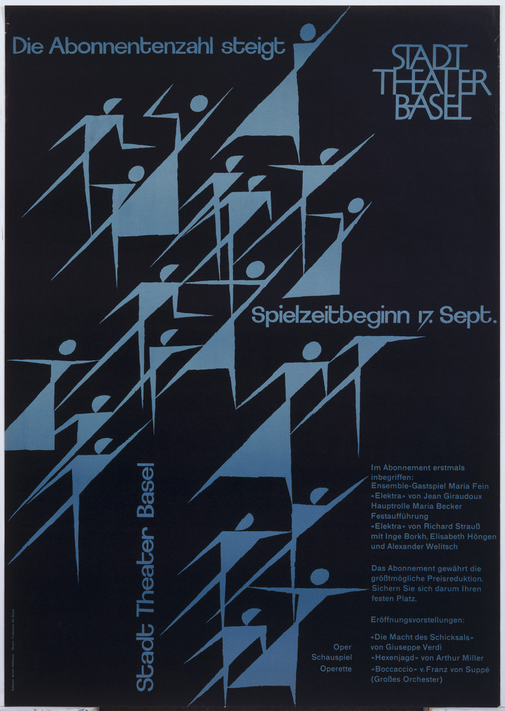
What it is — a poster for the Basel city theatre; the message is literally "the number of
subscribers is rising". Lithograph, 126.1 × 89.2 cm, printed by Frobenius AG Basel
(MoMA 1480.2000, gift of the designer).
Composition — reading of the work (v2): black background; a mass of angular human
figures (pictograms made of sharp strokes, arms raised, mid-stride) climbs diagonally
from bottom-left to top-right, in stepped rows that thicken and overlap toward the top.
"Growth" is neither an arrow nor a diagram but a multiplying crowd climbing — the audience itself
is the graph. The figures occupy ~70% of the surface; the text sits
in the corners the figures leave free. The eye follows the diagonal of the figures, then goes to STADT THEATER
BASEL at top right.
Colour — reading of the work (v2): black + one grey-blue for the figures + white text.
The figures are light on black: theatre = darkness, audience = light. One colour works both
as tone (grey) and as temperature (cool blue).
Typography — reading of the work (v2): linear grotesque, light cut, white;
"Die Abonnentenzahl steigt" top left, STADT/THEATER/BASEL in three lines top right,
"Spielzeitbeginn 17. Sept." centre right, small programme text bottom right, and
"Stadt Theater Basel" rotated 90° along the left edge — text as the edge of the format.
The typography doesn't compete with the figures: small point size, lots of space. Typeface not to be named.
Message — the institution boasts about a number. What's interesting is that it's not an advert but
a report — a poster as public announcement, a form that today practically no longer exists.
Why exactly this way — large-format lithograph, one colour pass, a theatre
with a consistent visual identity across seasons.
What would kill it — an arrow or a graph. Or: the figures evenly spaced —
without the thickening toward the top there's no growth, just a pattern. v1 correction: he
does use a pictogram, but a pictogram in multiplicity and in a density gradient — so it's
composition, not icon.
Principles:tacka-linija-plohabrzina-je-ponavljanje-i-pomakstrelica-i-dijagonala-kao-kretanjemnozina-kao-dijagramResolved v2: growth = sequence + density gradation, not a tonal gradient. Same principle as
Huber's Monza (repetition + shift) — here used for statistics instead of speed.
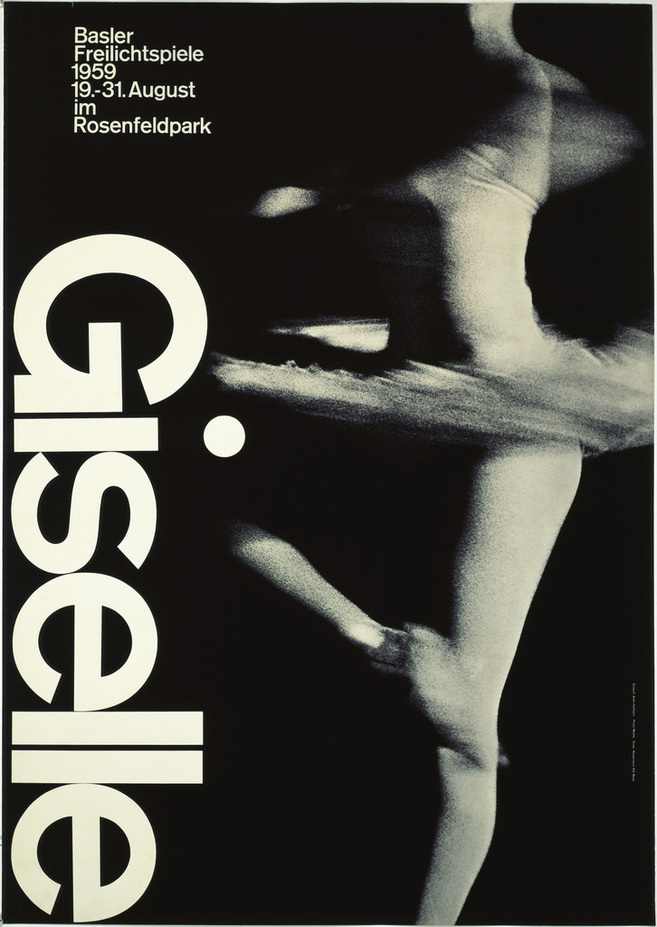
What it is — poster for a classical ballet (outdoor performance), Basler
Freilichtspiele, 1959. Photolithograph, 127.6 × 90.1 cm, printed by Wassermann A.G.
Basel (MoMA 380.1963, gift of the designer).
Composition — the archive describes it through point, line and shape, while
simultaneously carrying opposing ideas (simple/complex). From v1 (verified against the image):
blurred motion of the dancer's body as a soft grey gesture against hard typography.
The eye enters the soft, then stops on the hard — that is the whole piece.
reading of the work (v2) — addition on position: black ground; a blurred dancer occupying
roughly the right ~60% of the width, a vertical white trace running almost the full
height; the word "Giselle" rotated 90°, reading bottom to top, along the left edge,
large; small details (Basler Freilichtspiele, dates, Rosenfeldpark) top left. Two
verticals — soft (body) and hard (word) — stand side by side, not overlapping.
Colour — reading of the work (v2): black and white only, no other colour. The
grey scale comes solely from photographic blur.
Typography — reading of the work (v2): linear grotesque, capital G + lowercase, one
line, rotated — the rotation is what equates the word with the figure (both are "upright
gestures"). Typeface: Akzidenz-Grotesk — confirmed, Fonts In Use (uses/1328, Staff Pick).
Message — ballet, but not through a picture of a dancer: through the trace of
movement. At three seconds: motion. At five metres: a grey field against a sharp letter,
and it works.
Why exactly this way — long-exposure photography is a cheap way to get a shape
that cannot be drawn. The lithographic craft gives him confidence that the grey scale
won't fall apart in print.
What would kill it — sharpening the dancer. The piece becomes a photograph of a
performance, and the only contrast holding it together disappears.
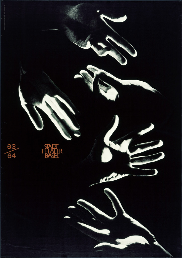
What it is — season poster for the Stadttheater Basel, 1963. Offset lithograph,
127.6 × 90.1 cm (MoMA 384.1963, gift of the designer).
Composition — reading of the work (v2): black ground; five photographed hands
in gestures (spread, pointing, grasping…), scattered across the whole format without
a grid, each turned differently. The hands are shot so that only the rim light
shows — outlines of white edges on black, the interior dark (solarisation or backlight).
No body, no face: theatre = gesture. The text is small, centre-left, in a "gap"
among the hands. The eye wanders from hand to hand — the composition deliberately has
no centre, like a conversation in hands. To be viewed as part of a series (63/64,
64/65, 1967).
Colour — reading of the work (v2): black and white + a single orange-red used
only for the text (63/64 and STADT THEATER BASEL). The colour doesn't touch the
image; it exists so the tiny text can be found at all.
Typography — reading of the work (v2): minimal. "63/64" with a slash as a fraction
and STADT/THEATER/BASEL in three short lines, linear grotesque, very small relative
to the format (~3% of height). A 127 cm poster with text meant to be read from a
metre away — because you recognise the image from twenty. Specific typeface not
named.
Message — the season, not an individual production. That changes the task: the
poster has to signal the institution, not the content.
Why exactly this way — a decade-long collaboration with the same client allows
each subsequent poster to build on the previous one. That's a luxury almost no one
has today.
What would kill it — putting in photographs from the season's productions. The
institution would disappear behind the programme.
Principles:serija-kao-identitetfragment-tijela-kao-institucijaboja-samo-u-tekstuResolved v2: see the series conclusion at work 06.
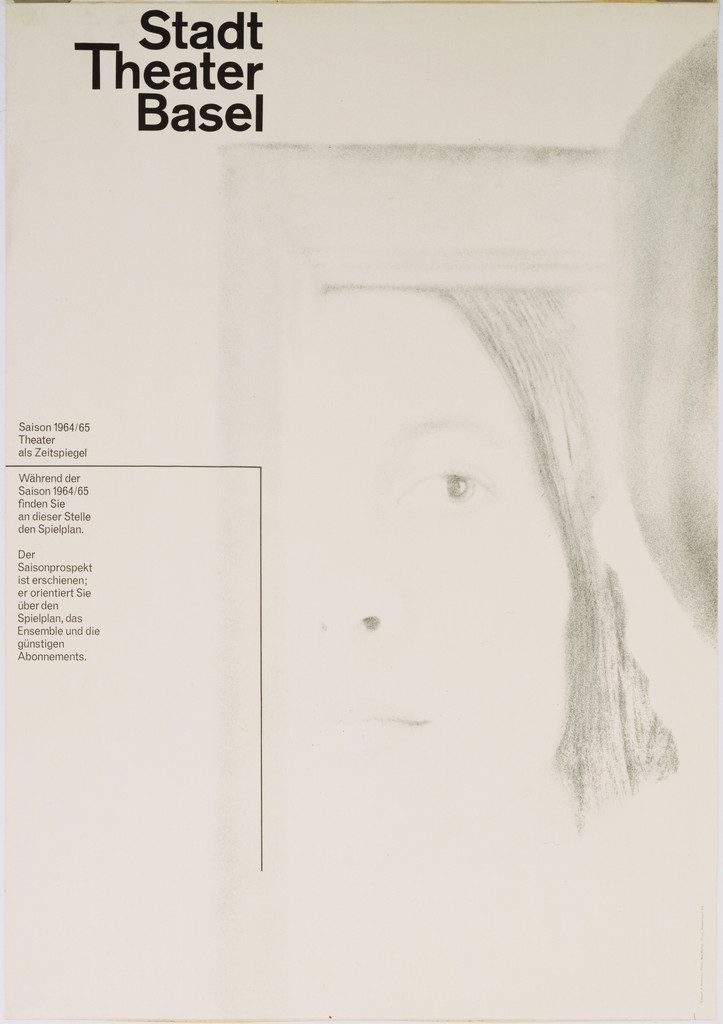
05 · Stadt Theater Basel, Saison 1964–65 — "Theater als Zeitspiegel" (1964)
What it is — season poster, photolithograph, 127 × 90.2 cm (MoMA 271.1965,
gift of the designer). Season slogan: theatre as a mirror of time.
Composition — reading of the work (v2): an almost white poster — the reverse
of 63/64. On a light ground, a barely visible, high-key photograph: a thin rectangular
mirror frame (right half, slightly tilted) and in/around it a face dissolving
into grey, large, cropped by the edge of the format. Mirror of time: the face isn't
clearly visible because it's time that is being mirrored. Text top left and in the
left column, everything left-aligned, the text column and the frame's edge sharing the
same vertical. The eye: title → down the column → frame → the face that only appears
once you stop.
Colour — reading of the work (v2): no colour. Only the upper half of the grey
scale — from white to mid-grey, with no black except in the title. Black is reserved
for three words; the image mustn't be darker than the text.
Typography — reading of the work (v2): "Stadt / Theater / Basel" in three lines,
semi-bold cut of a linear grotesque, top left, ~8% of height; below, in the same left
column, small season text ("Saison 1964/65 · Theater als Zeitspiegel" + a paragraph).
The text is the only solid element on the poster — everything else is fog. Specific
typeface not named.
Message — the season's abstract thesis, not a list of productions. This calls for
an image that is a metaphor, not a scene — the same problem as Müller-Brockmann's
concert poster, solved with photography instead of geometry.
Why exactly this way — technique: photolithography at this format allows a full
tonal range; he uses it as material, not as reproduction.
What would kill it — boosting the contrast of the image "so it can be seen." The
entire idea is that the face is barely visible; one click on Levels and it becomes
an ordinary portrait in a mirror.
v1 correction: the tension isn't "from white to black" but from white to grey —
the piece deliberately does not use the lower half of the scale.
Principles:zrno-i-zamucenje-kao-oblikfigura-podlogacitljivost-na-granicivisoki-kljuc-kao-porukaResolved v2: motif = mirror + a disappearing face; three tonal zones (white, light
grey, mid-grey) + black only in the title; text in left column.
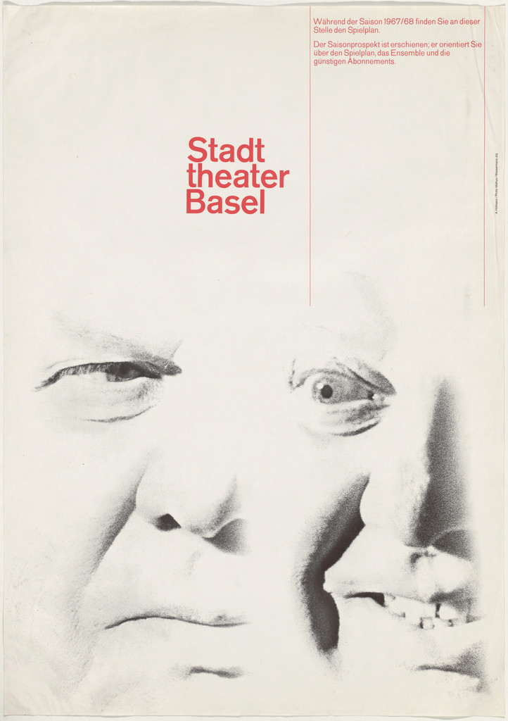
What it is — poster for the Stadttheater Basel. Offset lithograph, 127.6 × 90.1 cm,
printed by Wassermann A.G. Basel (MoMA 139.1968, gift of the designer). The shift from
lithography to offset across the series is visible as a technological trace — the
same hand, a different machine.
Composition — reading of the work (v2): light ground; a large actor's face in
a grimace (eyes bulging, mouth open) emerges from the bottom edge and occupies the
lower two thirds, cropped on all sides — the face appears doubled, as if two
exposures or a mask over a face. The grain is coarse, the contrast high: this is the
"lower half of the scale" that 64/65 avoided. Top third: air, small text at top and a
title centre-left, sitting exactly above the forehead — the title sits on the head.
A thin vertical line drops from the top along the title like a plumb line.
Colour — reading of the work (v2): black-and-white photograph + red used only
in the title (and the small text). The same formula as 63/64 (colour = text, image =
grey scale), except the ground is white instead of black.
Typography — reading of the work (v2): "Stadt / theater / Basel" in three lines,
a light cut of a linear grotesque, lowercase for "theater" (small letters, only
Stadt and Basel capitalised), red, ~7% of height; two small paragraphs at top. Specific
typeface not named.
Message — an institutional signature; by 1967, the Stadttheater is recognised by
Hofmann's hand before the name is even read. The face in grimace = the actor, not the
role; theatre as a body that contorts itself.
Why exactly this way — offset in 1967 means faster and cheaper, but also a
different treatment of tone than stone lithography; anyone looking at the series can
see how the pressure and grain change.
What would kill it — breaking the series with a redesign. The value lies in twenty
years of repetition, not in a single piece.
Principles:serija-kao-identitetjedna-osa-kontrastazrno-i-zamucenje-kao-oblikResolved v2 — what the series repeats and what it varies (63/64 · 64/65 · 1967):
- Repeats: format 127 × 90; a single photographic fragment of the body (hands / face
in the mirror / face in grimace) without a set and without costume; the grey scale
carries the image; text small, left-aligned, in three lines; colour only in the text
(orange/red) or none at all.
- Varies: the key of the tonal scale — black ground (63/64) → almost white (64/65) →
white with hard black (1967); the amount of body shown (five hands → one disappearing
face → one attacking face). The series is a single axis (hard/soft, dark/light) run
through three seasons. That's the answer to "what repeats": the rule, not the look.
07 · GM — Aus den Sammlungen des Gewerbe-Museums Basel (1964)
v2 correction: the work „GM" (1967, MoMA 110.2015) has no image or client in the record.
The same initials appear on a poster from 1964 with a full record and image — GM is
Gewerbe-Museum Basel, which resolves the client question for 1967 as well (as a very
likely, not confirmed, assumption). The analysis proceeds on 1964.
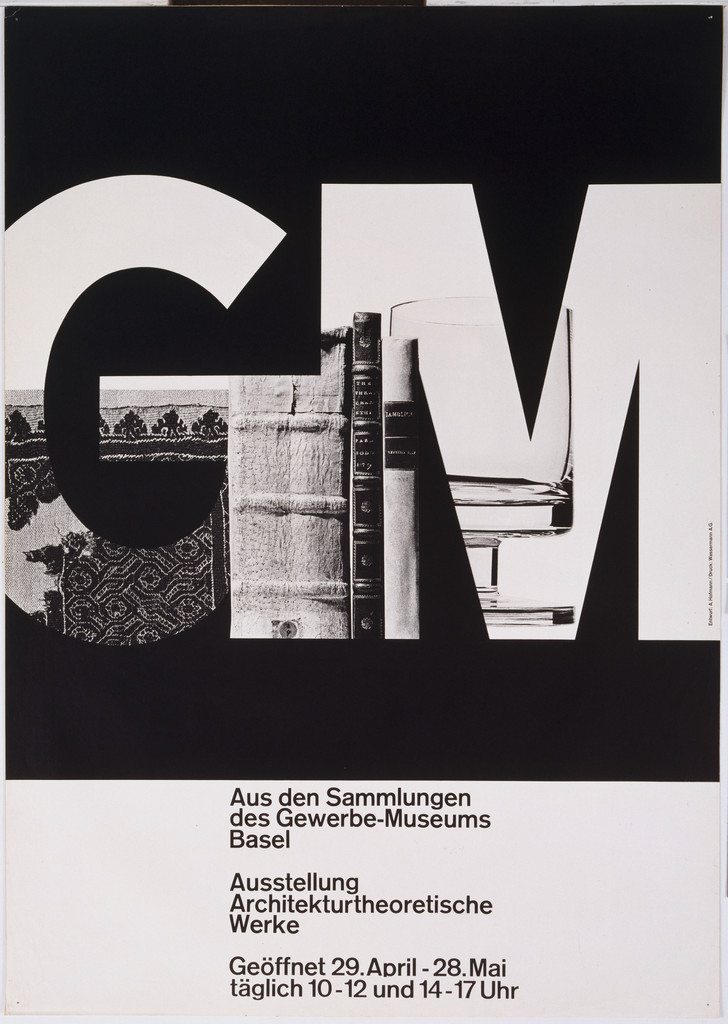
What it is — poster for the exhibition „Architekturtheoretische Werke"
from the Gewerbemuseum Basel collections. Lithograph, 127.6 × 90.5 cm, printer Wassermann A.G. Basel
(MoMA 1479.2000, gift of the designer).
Composition — reading of the work (v2): the upper ~70% is a black field, in it
enormous white letters G and M, both cut off by the edge (G on the left, M on the right) —
the letters are larger than the format. Inside the letters, as through a window, photographs of objects from
the collection (lace/textile in the lower part of the G, books and a glass in the M). The letter isn't
a sign but an opening through which the museum is seen. The bottom 30%: a white band, three short
blocks of text left-aligned to ~30% of the width. Eye path: G → M → objects within them →
text below. The letter is first recognised as a letter, and only then as an image — that's
its "threshold of legibility" put into practice.
Colour — reading of the work (v2): black and white only; photographs in greyscale
inside the letters. The black ground makes the letters light, the photographs give tone — three layers
of value without a single colour.
Typography — reading of the work (v2): G and M in an extra-black cut of a linear grotesque,
~55% of the format's height; small text below in a light cut, three blocks, spacing between
blocks equal to one blank line. Ratio of large to small size roughly 1 : 25. The specific typeface not confirmed.
Message — a museum of applied art shows its name and its collection
at the same time, in one stroke. From five metres: GM. From one metre: lace, books,
glass. Two posters in one, depending on distance.
Why exactly this way — the museum has objects but no budget for colour; the two-letter initial
is large enough to become a container for a photograph. Cutting it off with the edge is what
makes the letter monumental without enlarging the format.
What would kill it — whole letters within the format, with a margin. It would become a logo on
a poster; as it is, the poster is inside the logo.
Bridge to practice: poster · graphic design · motion
Poster
Work in black and white until the composition holds. Colour added afterward is a decision;
colour used from the start is a crutch. In practice: in Illustrator keep an adjustment/overlay
layer with desaturation and toggle it on every few minutes.
Choose one axis of contrast and push it all the way — hard/soft, dense/empty,
geometric/organic, photograph/drawing. Keep the rest neutral. This alone
fixes most "muddy" layouts.
Blur and grain are shapes with weight, not effects. If you can't draw a blurred field
as a silhouette, it isn't doing composition work for you — it's just blurring it.
Letter to the threshold. Take the headline and degrade it step by step (cut, crop, halftone,
shift) and find the exact frame where identity breaks. The work is interesting one step before
that.
Graphic design
The series is the unit of work, not the poster. For theatre, a festival, a publisher: define
what repeats across seasons and what alone varies. Hofmann held the Stadttheater together for decades.
Craft shapes the eye. He was a lithographer, so he knew what greyscale can survive in print.
Your equivalent is knowing halftone, dither and screen — use it as material, not as a filter.
Figure/ground is a checking tool. Invert the values on a finished
work: if the composition falls apart, you were relying on content, not on relations.
Motion
Contrast is animated, not just arranged. Instead of moving elements, change
one axis of contrast over time (sharp → blurred, dense → empty). That's Hofmann-style
animation and needs one keyframe fewer than actual movement.
Blur as shape in AE. If you animate Fast Box Blur or CC Force Motion Blur,
look at the result as a silhouette on every third frame. If the silhouette isn't legible,
the viewer sees mush.
Degrading the letter as a transition. Instead of a standard fade, build the transition through
breaking down the typography to the threshold of legibility and back — directly applicable to your glitch/halftone language.
Black-and-white animatic before colour. Same rule as for the poster, only more costly if
broken: colour is slow to fix in animation.
The five-metre test exists in motion too: play the composition at 25% size.
If the frame doesn't read there, it won't read on a phone either.
Bad imitation
"Swiss style" as a skin. Helvetica, left alignment, red-black — but the image is
stock photography of a play. What's copied is the look of the typography, not the rule (the image
is a fragment of a body without a set, the text is small because the image is doing the work).
Blur as a Photoshop filter. The whole photograph run through Gaussian blur 12 px. In
his work, blur has shape (a motion trace has a direction and a silhouette); an evenly
blurred image has neither.
Contrast "fixed". A high-key image (64/65) run through Auto Levels
to "see it better". The one decision on the poster is destroyed.
Letter decorated instead of constructed. Tempel/Teehaus imitated by adding a wood
texture onto a finished font. In his work the letter is built from slats —
the texture is structure, not a layer on top.
Series as a template. The same composition with the photograph changed every season.
In his work the rule repeats (body fragment, greyscale, small text), and the key
changes — from black to white.
The brief through their eyes
(enter the current job) — First move: strip out colour and ask which one axis
(hard/soft, dark/light, dense/empty) carries this job. Then find the fragment
(a hand, a letter, a trace) that shows that axis without a scene. Text only at the end, small, into the
space the fragment leaves.
Exercises
One axis. Same poster in three versions: hard/soft, dense/empty,
geometric/organic. Everything else identical. Compare which is stronger.
Breaking down the letter. Ten steps of degrading one initial; mark the step
at which identity breaks. Use the step before that as the logotype.
A month without colour. Everything you do for a month — black and white. Hofmann's reason:
colour must not carry the composition.
Three keys. (new, from the Stadttheater series) One motif, three posters: black
background / almost white / white with hard black. Text and position the same. That's a series.
Motion study — „Letter as Window" (5 s, AE)
Black background. Second 0–1: huge letter (client's initial), white, cut off
by the frame edge on two sides. Second 1–4: inside the letter (track matte) a
photograph/footage plays — the camera glides through the object, the letter stays still.
Second 4–5: the letter breaks down in three steps (raster, cutout, shift) and stops
one step before it ceases to be a letter. No colour. One event per second.
Rebuilding the benchmark — GM 1964
Format 127 × 90 (1 : 1,41). Black field for the top 70%, white band 30%. G comes
out from the left edge, M from the right; letter height ~55% of the format; text in three
blocks at 30% width, left-aligned. Task: 45 min in Illustrator — draw the skeleton (black
field, two letters as masks, three text blocks), insert any three of your own photographs
into the letters. Then compare with the original to see where the cut line through the
letters ended up.
Notes on sources
More provjeriti uz sliku than with Müller-Brockmann — for Hofmann the literature
gives pedagogy and catalogue data, but little analysis per individual poster.
This is expected (see the supplementary requirement: published analysis exists for ~5–10% of the works).
The monograph Poster Collection 07 (Lars Müller, 2003) is the most likely source
for accurate readings of individual posters — not available online, obtain it.
v2 (06.09.2026): works 01–07 viewed in browser (PGDA, MoMA). All fields 2–4
filled in as citanje rada (v2). v1 corrections: 01 is not black-and-white (vermilion);
02's growth is a pile of pictograms in a density gradient; 05 uses only the upper half
of the scale; 07 replaced with the work GM 1964 (MoMA 8777) — GM = Gewerbemuseum Basel.
The conclusion of the Stadttheater series entered under work 06. Portrait found (PGDA / Poster
Collection 07).
New local tags (awaiting a second author): slovo-kao-konstrukcija,
mnozina-kao-dijagram, tekst-rotiran-kao-figura, visoki-kljuc-kao-poruka,
fragment-tijela-kao-institucija, boja-samo-u-tekstu, slovo-kao-prozor,
odsjeci-rubom-za-mjerilo.
Template (23.09.2026, session 22): fm brought to the template — izvor_slika,
slika_lokalno, font, paleta (measured, paleta_browser.js on the MoMA og:image)
for all 8; stampar merged into tehnika; ostali_radovi moved from fm into the table.
Deviations: (a) 01 Tempel und Teehaus — PGDA 1955, MoMA 6787 1957, relief print,
Buchdruckerei VSK; year left as 1955 (exhibition), unresolved.
(b) 03 Giselle — MoMA 6775 gives 1959, Basler Freilichtspiele, photolithograph,
Wassermann; v1 „around 1959 / ballet" replaced. Typeface Akzidenz-Grotesk confirmed
(Fonts In Use 1328) — the only work with a named cut. (c) 04 — MoMA now gives
offset lithograph, 127,6 × 90,1. (d) 04 accent #713e26 is red text diluted with
black at 512 px — tone unreliable until the image is local. (e) 08 — the 1965 edition
format not confirmed; palette from a cover photograph (black page background excluded).
The Fonts In Use designer ID is 60 (8455 is Max Rawlins — don't guess the ID).