found photograph + one sentence in a label — an advertisement that speaks against advertising
a magazine designer (Condé Nast) who turned craft into art; the only one in the project whose "body of work" is a single series Newark, NJ → New York → Los Angeles
Palette of the œuvre
Notes: #D0181F red of the label and frame — measured from screenshot, not Pantone
„I'm someone who works with pictures and words, and people can take that to mean
anything they like.“ — Eye no. 5, 1991 (Karrie Jacobs). The v1 quote „I work with pictures
and words because they have the ability to determine who we are and who we aren't“ is
a paraphrase circulating online — no primary source was found, replaced.
Biography
Born 26.1.1945 in Newark, New Jersey (JWA). Syracuse, then Parsons 1965–66 —
one semester (Wikipedia) or nine months (Eye 5): Diane Arbus and Marvin Israel.
She did not complete her degree. Israel gets her a job at Condé Nast; at Mademoiselle she
is under AD Roger Schoening, who leaves after six months — „and I found myself,
so young, running a magazine“ (Eye 5); JWA: chief designer at age 22. Then
House and Garden under Liberman — twelve layout variants per double-page spread,
she moves into picture editing (House and Garden, Aperture), where she spends whole days looking at
slides: „until cropping, cutting and pasting became second nature“ (Eye 5).
1970–71 art director of Rags (San Francisco, Baron Wolman — PGDA; not verified
in another source).
Seventies: wall tapestries of yarn and beads (1969), Whitney Biennial 1973 (Marcia
Tucker), Berkeley 1976, break; 1977 architecture photographs; 1979 first works
combining photograph + text (P.S. 1) and the book Picture/Readings (Wikipedia). From 1981 a series
that doesn't change for forty years: a found black-and-white photograph, cropped, enlarged
to a visible halftone grain, and ONE sentence in a label. ICA London 1983; Artangel/Public Art
Fund billboards; 1988 first woman at Mary Boone Gallery; 1989 poster for the Women's March which
she pastes up herself with students because the organisation hadn't sorted it out (Eye 5); 1999–2000
retrospective MOCA LA → Whitney; 2005 Golden Lion Venice; 2012 Belief+Doubt
Hirshhorn (620 m²); 2021–22 Thinking of You. I Mean Me. I Mean You. AIC → LACMA →
MoMA. Teaches at CalArts, UC Berkeley, UCSD, UCLA (emerita). Lives between New York and
Los Angeles.
What matters here for a designer: she is not „an artist who uses design“ but a designer
who spent ten years making pages of women's magazines and knows exactly where an advert hooks
the viewer — so she turned the same grip around. Eye 5: „85% of my work as an artist comes from my work
as a graphic designer“; Walters (Eye 109): „everything she does is editorial design“. Her language
is tabloid (Broad: „tabloid, sensational, authoritative, direct“). The price of that
craft is well known: the system is so fixed that it became a brand, Supreme took it
literally in 1994, and when Supreme and Married to the Mob sued each other in 2013 over her
format, she replied: „What a ridiculous clusterfuck of totally uncool jokers. I make
my work about this kind of sadly foolish farce.“ (artnet).
Influences
Studied with
Parsons School of Design 1965–66, one semester / nine months (JWA / Eye 5) — Diane Arbus (photography) and Marvin Israel (graphic design, AD Harper's Bazaar) — Israel: "the first one who gave me the feeling that I was special" (Eye 5, 1991)
Roger Schoening, AD Mademoiselle — left after six months, she runs the magazine at age 22 (Eye 5; JWA: chief designer)
Alexander Liberman (Condé Nast, House and Garden) — a negative teacher: twelve layout variants per spread (Eye 5)
Borrows from
American advertising and tabloids — Daily News, Post, all sans-serif (Dinner Party Download); Eye 5: "85% of my work as an artist comes from my work as a graphic designer"
found photographs from magazines and books of the 1940s–50s, halftone enlarged — Eye 5: "I have no proprietary relationship to those images"
feminist film theory (Mulvey 1975) and structuralism — Artists Meeting for Social Change (JWA); Smarthistory on Your gaze
Jamie Reid and situationism — not confirmed as a direct influence, only an affinity (someone else's image + text strip)
Influenced
Supreme (box logo 1994 — Jebbia gave his designers her book, artnet); Guerrilla Girls (Tate offers them as related); MoMA/Roberts 2004: "countless graphic designers have adopted her visual style"
Fonts In Use tag "Barbara Kruger style" (342) — style as genre; Pro-Choice PEP campaign 77% (FIU 46739)
Contemporaries
Jamie Reid (1977 — someone else's official image + strip), Emory Douglas (slogan + face), Corita Kent (Sister Mary Corita) (someone else's slogan turned around), Jenny Holzer (text without image — not in the project), Cindy Sherman, Guerrilla Girls
Who she studied under
Marvin Israel (Parsons; AD of Harper's Bazaar after Alexey Brodovitch) — Eye 5:
„the first who gave me a feeling that I was special“; through him she enters Condé Nast. The lineage
runs Brodovitch → Israel → Kruger: layout as a sequence of images and text.
Diane Arbus (Parsons) — photographer; influence on the choice of IMAGE (frontal, without
beauty) likely, not documented per work.
Condé Nast as school — Schoening (Mademoiselle), Liberman (twelve variants —
a negative school), the darkroom and slides (picture editing). Craft: cropping.
What she steals
Advertising and tabloid, literally: the sans-serif headlines of the Daily News and Post from her childhood
(Dinner Party Download); the red-and-white label is the label with the PRICE from a shop window.
Found photographs from magazines and books of the 1940s–50s (Walters: „crude,
newsprint images“) — without ownership rights (Eye 5); Michelangelo (02), advertising
illustration (05), 19th-century anatomical photograph (06), studio portrait (07).
Theory: Mulvey 1975 (the male gaze) → 01; Descartes → 04; the title of a Tina
Turner song from 1985 → 05; the proverb „children should be seen and not heard“ → 03.
Kinship, not influence: Jamie Reid (official image + tape, 1977), Corita Kent (Sister Mary Corita)
(someone else's slogan, 1964–69), Emory Douglas (slogan + face). She herself cites
none of them — she takes directly from advertising, not from counterculture.
Who she influenced
Supreme (box logo, 1994 — Jebbia gave his designers her book, probably
Remote Control 1994; artnet) — the biggest and worst pupil.
The profession as a whole — MoMA/Roberts 2004: „countless graphic designers have adopted
her visual style“; Fonts In Use has the tag Barbara Kruger style (342) and the campaign
Pro-Choice PEP „77%“ (46739) in her format.
Candidates in the project: Paula Scher (Public Theater — word over image? to verify),
Stefan Sagmeister (sentence on the body — reversed direction, text IN the image, not ON the image).
Images viewed in this session (Art21 direct images, MoMA, Whitney, SFMOMA, PGDA).
Positions in % of the format measured from screenshots. Unlike Tanaka and Fukuda, here
analytical text EXISTS (museums) — fields 2–4 are documented wherever the source
gave a sentence, and the reading of the image supplements the measurements.
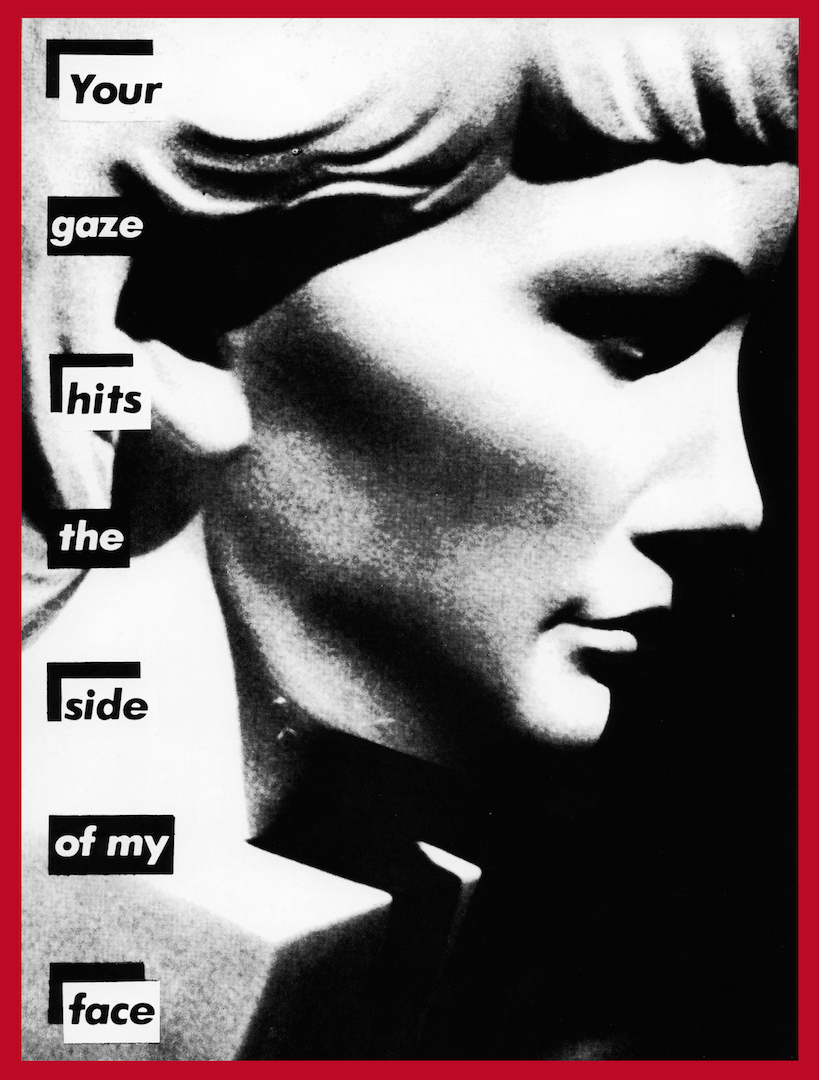
01 · Untitled (Your gaze hits the side of my face) (1981)
What it is — photograph, 55 × 41 in (Art21), portrait orientation; authored work, Mary Boone.
A found photograph of a classical bust of a woman's head in profile, „whose neck disappears into a block
of stone“ (Smarthistory), + seven words. First phase of the series: text BLACK on white
labels, red only as a border.
Composition — the bust takes up x 20–95%, looking RIGHT, the nose at x ≈ 78%; text in a
narrow left column x 10–24%, seven labels of one word each, evenly spaced y 10–90%
— Smarthistory: „in a vertical column, like a ransom note, to the left of the bust“.
Four labels (Your / hits / side / face) have a black L-bracket in the top left
corner, three (gaze / the / of my) don't — a 1-0-1-0-1-0-1 rhythm that pulls the eye down
the column. The eye enters at „Your“ top left, reads down the column, then the profile deflects it
right — the viewer is physically on the side the bust does NOT look toward: the sentence is exactly right
descriptively („your gaze hits the side of my face“).
Colour — black and white, halftone grain visible; red only in the border (2% of the format).
No red label — proof that the label was first a TYPESETTING device (black on white, as if
cut out from a newspaper), and red came later as a brand.
Typography — class: geometric grotesque, bold italic, lowercase with a tall
Y; each word on its own white label, label the width of the word (not of the column) —
which is why the right edge of the column „jumps“. Specific typeface not confirmed for this work (Fonts In Use has none);
Futura Bold Oblique documented for the body of work (Kemper, Eye 109), not for this sheet.
Message — Smarthistory: a direct response to Mulvey 1975; „you“ is the assumed
male viewer. Three seconds: face + „Your gaze“. Five metres: bust, column; words
not — the labels are small. This work demands half a metre, unlike 05 and 07.
Why exactly this way — profile facing RIGHT + text on the LEFT: so that a viewer reading from
the left stands exactly „to the side“. If the bust had looked left, into the text, the sentence would
be a lie.
What would kill it — a single label with the whole sentence at the bottom. The word-by-word column
is what creates the tempo (seven beats) and the „ransom note“ feel.
Principles:etiketa-preko-slikezamjenica-bez-antecedentadizajner-pise-naslovjeftina-tehnika-kao-jezikTo verify against the image: technique (Art21 only says „photograph“; 1981–82 sheets of the same
series are gelatin silver — Art21 for Your comfort); whether the border is painted or
photographed with the work; Smarthistory was not accessible in the browser (Cloudflare) — text from
WebFetch.
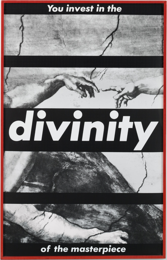
02 · Untitled (You Invest in the Divinity of the Masterpiece) (1982)
What it is — gelatin silver print, mounted and framed, 182.2 × 115.8 cm (MoMA, anonymous fund). Found reproduction of a detail from Michelangelo's The Creation of Adam (two fingers, cracks in the vault) + a sentence in five black bars.
Composition — FIVE black bars across the full width: y 2–8% ("You invest in the"), y 24–28% (empty), y 42–58% ("divinity" — enormous, one word across the whole format), y 76–80% (empty), y 92–98% ("of the masterpiece"). The image is cut as if through a roller blind: the fingers touch at y ≈ 33%, x 45–60%, exactly in the strip of image between the first empty bar and "divinity". Eye: top left → fingers → "divinity" (which stops everything) → down. MoMA: "juxtaposing the creation of man with bold text".
Colour — black and white; red only the frame. MoMA: contrast of "strident text" against "Michelangelo's soft luminosity" — the fresco's soft tone against the hard black bars.
Typography — white geometric grotesque, bold italic, on black; three sizes: "divinity" ≈ 14% of format height, the top and bottom phrases ≈ 3%. One word carries the image, the rest of the sentence is small — dva-rastojanja-citanja.
Message — MoMA: "You" pulls the viewer into "perpetuating the patriarchal narratives of religion and art history"; art as "a secularised religion that is bought and sold". Five metres: fingers + DIVINITY. Half a metre: "you invest" — investing money and investing faith at once.
Why exactly this way — the most famous image in Western art, which may not be altered; so the operation is EXTERNAL: bars across, nothing inside the image. The source's authority remains legible and works against the source — detournement-zvanicne-slike.
What would kill it — removing the two empty bars. Without them the image is "an illustration with a caption"; with them the image is TRAPPED, the fingers touch through bars.
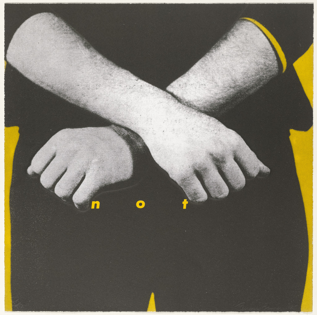
What it is — one of nine sheets in the portfolio; offset lithograph and screenprint with lithography and blind embossing, 52.1 × 52.1 cm; Peter Blum Edition, printed by Derriere L'Etoile Studios, NY; edition 50 + 10 AP; this print 37/50 (MoMA). The portfolio's title inverts the proverb "children should be seen and not heard".
Composition — square. Two crossed forearms with clenched fists occupy x 5–95%, y 10–65% — an X across the format; the eye enters on the fists (y ≈ 55%) and only then finds the word "n o t" BELOW them, y ≈ 60%, x 30–60%, small, yellow, letter-spaced. Above and below the forearms a flat yellow plane (not background — it outlines the arms like a silhouette). The gesture (refusal) is the message, the word only confirms it.
Colour — the only work in this selection without red: black-and-white halftone + a YELLOW plane (~#F2C21B) which is also the letter colour. Colour works as hierarchy: yellow = what isn't photograph (plane and word are the same layer). The portfolio has other colours per sheet — the whole portfolio has not been seen.
Typography — geometric grotesque, italic, lowercase, ~2% of format height, letter-spacing ≈ 4 em — three letters scattered under the fists. No label: letters sit directly on the image. razmak-usporava-citanje — the format's only word is its quietest element.
Message — MoMA on the portfolio: first person plural, "we", a call to question the media message. Five metres: the X of arms = "no". Half a metre: "not" — the word repeats the gesture, adds nothing to it; passes the cover test (Fukuda's criterion).
Why exactly this way — a nine-sheet portfolio needs the format recognised as a series without a red label; so here the operation is reversed: the word REDUCED, colour changed, gesture enlarged. Proof that the system isn't "a red-and-white label" but a RELATIONSHIP between large image and small word.
What would kill it — "NOT" in capitals on a red label. It would become a poster; as it is, it's a whisper below a blow.
Principles:razmak-usporava-citanjejedna-slika-jedna-rijecboja-kao-hijerarhija-ne-ukrasTo verify against the image: which of the three techniques (litho / screen / blind embossing) carries the yellow; the other eight sheets (MoMA 59845–59854) have not been seen — the portfolio's title is probably on one of them.
What it is — photographic screenprint on vinyl, 111 × 113 in (Art21, Mary Boone) — almost square; 1987. The Broad holds a 1987–2019 version: single-channel video on LED panel with sound, 350.2 × 350.2 cm. It also exists as a bag, T-shirt, key — an entire line of merch — the work is its own distribution. The PGDA record says "November 28th, 2019" and "Poster" — incorrect (that is the date of a version/release), the work's year is 1987.
Composition — found photograph of an open hand, thumb up left, holding a white card; card x 25–80%, y 22–65%, rotated ≈ −3° (being held, not lying flat); fingers extend above and below the card. Eye: card (brightest field) → text → hand. The card is a physical object within the image (the hand holds it), not a label OVER the image — the only one of the eight where the label sits inside the photograph's own space.
Colour — black-and-white halftone; card white; text RED on white (inverse of the standard white-on-red); frame red. Red = text + frame, nothing else.
Typography — geometric grotesque, bold italic; three lines: "I shop" ≈ 12% of format height, "therefore" ≈ 4%, "I am" ≈ 12% — the connective shrunk, subject and predicate large; the sentence reads as two slogans with a footnote between them.
Message — Descartes inverted: "cogito ergo sum" → I shop, therefore I am; slogan-u-novom-kontekstu — source recognisable, context (card in hand = credit card) shifts meaning. Five metres: hand + I SHOP. Half a metre: "therefore" — a philosophical connective in an ad. "I" without an antecedent: who's speaking, the hand or you?
Why exactly this way — the card in the hand is Kruger's only label with a REASON to be inside the image: a credit card. Hence red on white — the card is plastic, not a sign.
What would kill it — white text on a red label over the hand. It would revert to the standard and lose the object; the hand would be holding nothing.
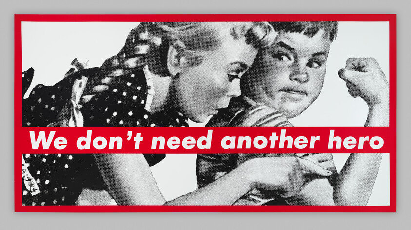
What it is — screenprint on vinyl, 276.5 × 531.3 × 6.4 cm (Whitney, Emily Fisher Landau). The same work on billboards across New York, Public Art Fund, 1 November 1988–31 January 1989 (eight photographs in the archive); installation Las Vegas 1987 (Art21). Found reproduction of an advertising illustration: a girl in profile touching the flexed bicep of a boy.
Composition — landscape format ≈ 1:1.92. A red bar across the FULL width y 55–72% (17% of height), on the lower third; girl x 5–50%, boy x 45–95%; boy's fist top right (x ≈ 85%, y ≈ 15%), girl's finger on the bicep y ≈ 80% — the bar passes BETWEEN the fist and the finger, cutting the scene exactly between the gesture (flexing) and the reaction (touch). The boy looks at the viewer; the girl at him. Eye: boy's face → bar (sentence) → finger. Whitney audio: enlargement makes the halftone dots visible.
Colour — black and white + one red (bar, frame). The illustration was probably in colour originally — reducing it to black and white is the operation (Walters: "crude, newsprint images").
Typography — geometric grotesque, bold italic, white, ONE line, ≈ 9% of format height, running the whole width of the bar with small margins — legible from the street on a billboard.
Message — title of a Tina Turner song, 1985 (Mad Max Beyond Thunderdome), used as a slogan; Whitney: a question about stereotypes of who gets to be a hero. "We" without an antecedent: the viewer is drawn into a plural that refuses. Five metres: two children + sentence; passes the test as a billboard — the work IS a billboard.
Why exactly this way — the 1950s advertising illustration already speaks the language of advertising (muscle = masculinity, admiration = femininity); the bar doesn't illustrate but REFUTES the image in the same tone of voice. The image must not be cropped closer — both the finger and the fist need to be visible.
What would kill it — the bar moved to the top. It would then be a headline (image illustrating text); as it is, the bar is a VERDICT that comes after the image.
What it is — photograph and screen[print] in a coloured wooden artist's frame, 130.3 × 173.5 ×
4.6 cm (SFMOMA, Fisher Collection). Found photograph, 19th century: bearded man in
a coat, hand raised, standing over a naked body laid on a table covered with cloth;
on the wall a shelf with bottles — an anatomical/medical scene.
Composition — landscape format 3:4 (inverted: 1.33 width). Man x 5–30%,
body diagonal x 15–90%, y 55–80%; the words "N o R a d i o" at y 42–48%, x 30–75%,
in the space BETWEEN the raised hand and the body — in the spot where a headline would sit
in an advertisement. Eye path: the man's face → hand → word → body. Frame red and thick (≈ 3%).
Colour — black and white + red: letters and frame. The letters are red DIRECTLY
on the photograph, without a label — the only one like this in the selection; the frame is coloured wood (documented), part
of the work.
Typography — geometric grotesque (sans serif), bold italic, spacing ≈ 3 em, ≈ 5% of height —
two words stretched across 45% of the width. razmak-usporava-citanje: the inscription
reads letter by letter, like a sign in a shop window.
Message — "No Radio" is the sign New York drivers left in their car window in the 1980s so
a thief wouldn't smash the glass (Washington Post 1989 "No radio, nothing in
trunk") — this context is not in the SFMOMA record, it's taken from a newspaper source about the
phrase itself, not about the work; the connection to the body on the table (nothing to take) is a READING, not
documented fact. Five metres: scene + red dots; half a metre: the words.
Why exactly this way — the spacing. If "No Radio" were set normally on a label, it would be a slogan;
spaced out and small it becomes an INSCRIPTION ON AN OBJECT — like on a car.
What would kill it — a white label on red across the middle. The body would disappear under the
band, and the work lives on the whole body being visible.
What it is — photographic screenprint on vinyl, 284.48 × 284.48 cm (Broad; Art21 112 × 112
in). Made as a POSTER for the Women's March on Washington, April 1989, against the wave of
laws that were dismantling Roe v. Wade (Broad); Eye 5: "I got frustrated and did it
myself. I went out with my students… putting up the posters". Found studio
portrait of a woman (1950s), frontal.
Composition — square. Face divided EXACTLY at x = 50%: left positive, right
negative (Broad: "split in positive and negative exposures"). Three labels: "Your body"
y 12–22%, x 22–78%; "is a" y 44–52%, x 40–60% — sitting at the root of the nose, right on the
dividing line, between the eyes; "battleground" y 78–88%, x 15–85%, across the mouth and chin.
Eye path: eyes (y ≈ 32%, one dark, one white) → "is a" → down to "battleground" →
back up to "Your body". Broad: the face "without a body, divided and obscured by
text, signals a sharp division".
Colour — black and white + red label. The negative on the right is half the image "in
colour" without colour: halftone dots on the right half light, skin black — one operation
(jedna-operacija-po-radu: invert half) creates all the contrast; red only
carries the words. crno-bijelo-prije-boje literally: the composition stands in positive and
negative, colour is added as text.
Typography — geometric grotesque (sans serif), bold italic, white, three lines, widths of the
labels = width of the word (hence three different widths, centred) — "is a" is narrow so as not to
cover the eyes. Letter height ≈ 7% of the format — legible from 20 m.
Message — Broad: "simultaneously art and protest"; "you" here is a WOMAN (unlike
in 01, where it's a man) — the same pronoun, a different audience, the same indeterminacy.
Five metres: face + battleground. Half a metre: "is a" between the eyes. Walters (Eye 109):
today it works as a "statement of fact" for all sides.
Why exactly this way — a street poster: square (can be pasted anywhere), one face
(recognisable from across the street), split down the middle (an argument without words — the body
is already divided). The words only name what the image is already doing.
What would kill it — moving the dividing line off x = 50% or replacing it with a soft
gradient. The division has to be a CUT, not a fade — it's a battle line.
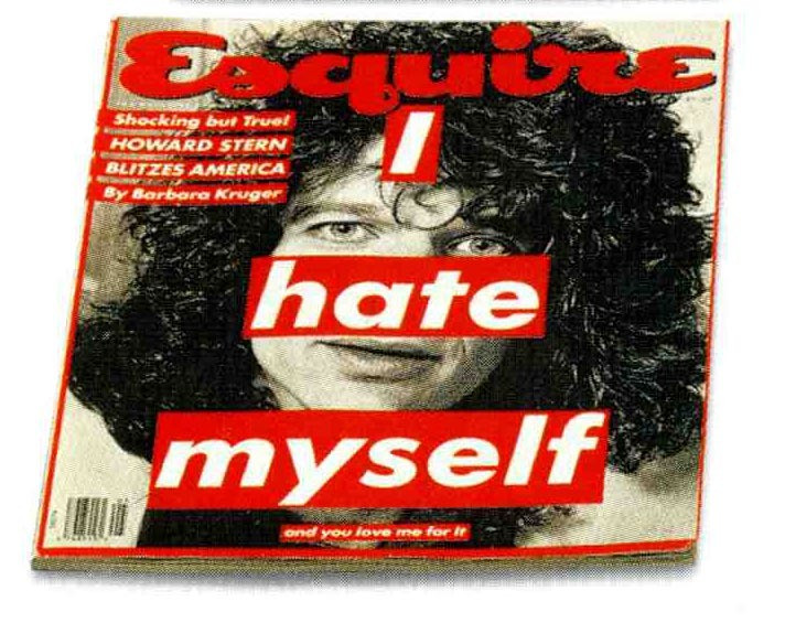
What it is — offset lithograph, 27.3 × 22.9 cm, Hearst Corporation (publisher and
printer), mass edition (MoMA SC731.1995). Cover of Esquire, Howard Stern.
Roberts (MoMA 2004): visual strategies "appropriated from the mass media were
returned to their sources on covers she made for Newsweek and Esquire".
Composition — portrait of Stern centred, hair filling the upper two thirds;
three labels in a step that WIDENS downward: "I" y 15–22% / x 47–58%; "hate"
y 36–47% / x 33–67% (across the nose and mouth — the eyes remain open above); "myself"
y 55–68% / x 20–80%; below, small, "and you love me for it" y 72–75%, x 40–65%.
Top left, house cover lines in red labels ("Shocking but True! HOWARD
STERN BLITZES AMERICA By Barbara Kruger") — and these too in HER format: the whole cover became
her work. The Esquire masthead (the house script) remains.
Colour — black and white portrait + red labels; the same red for the masthead — the magazine and
the artist share the colour, so it's not visible where one stops and the other starts.
Typography — geometric grotesque (sans serif), bold italic; "myself" ≈ 13% of height,
"I" ≈ 7%, the small line ≈ 2% — three sizes: dva-rastojanja-citanja (from the news-stand: I
HATE MYSELF; from the hand: "and you love me for it" — the second message is a MOCKERY of the first, as
with Jamie Reid).
Message — is "I" Stern? her? the reader? A label across the mouth: speaking in his place.
Five metres: face + hate. Half a metre: the sentence that blames the buyer ("you love me
for it") — the magazine's buyer is the ADDRESSEE.
Why exactly this way — the magazine is her home turf; this is proof the system works even when
turned back on its source — and that at that point it becomes indistinguishable from advertising. The small line is the only
difference between her cover and an ordinary one.
What would kill it — removing the small line. What would remain is "I hate myself" as a shock headline —
a tabloid without the twist.
Untitled (Don't tread on me / Don't tempt me), 1989–90 — photographic silkscreen on
vinyl, 140 1/4 × 92 1/4 × 2 5/8 in, Kemper Art Museum. The ONLY record naming the
typeface: Futura Bold Oblique ("a simple, strongly geometric sans-serif, common
in advertising"); the snake (bull snake) cropped, red border, red text boxes top and
bottom; Kruger: "I work circularly… around certain ideational bases, motifs and
representations". Image not viewed (Cloudflare in browser). — traka-kroz-cijeli-format
Untitled (You are not yourself), 1982 — photograph 72 × 48 in (Art21); shattered
mirror — not viewed.
Untitled (Your comfort is my silence), 1981 — gelatin silver 60 × 40 in (Art21).
Untitled (When I hear the word culture, I take out my checkbook), 1985 — 138 × 60
in (Art21); Göring's line turned around — slogan-u-novom-kontekstu, not viewed.
Untitled (Can I Help You?), 1987 — lenticular photograph 58,4 × 127 cm, SFMOMA
97.770 — the image changes with viewing angle (motion principle in print).
Untitled (If you're so successful, why do you feel like a fake?), 1987; Untitled
(You are a very special person), 1995; Untitled (Hate like us), 1994; Roy Toy,
1986; Have Me Feed Me Hug Me Love Me Need Me, 1988; Twelve, 2004 — all Broad.
We Will Not Become What We Mean to You, 1983; Untitled (Perfect), 1980 — v1 via
artic.edu (dead 07.09.) — not verified.
Rags magazine, 1970–71 — art director (PGDA 8349: Kruger AD, R. Crumb, Baron
Wolman; single source).
Willi Smith t-shirt, 1984 — "I can't look at you and breathe at the same time" (Wikipedia).
Consolidated — Business of Punishment, 1994, CD sleeve (PGDA 16470); bandana,
WOW towel, matchbox (PGDA 14720, 14719, 18585) — MoMA: "matchbooks, coffee
mugs, shopping bags" — artefakt-nosi-distribuciju.
Barbara Kruger & Kim Kardashian on W, 2010 — Fonts In Use 12: Futura + Benton
Modern (only FIU record).
Belief+Doubt, Hirshhorn 2012 (620 m², vinyl on floor and walls); MetroCards
2017 (50,000); Untitled (Questions) MOCA façade.
Bridge to practice: poster · graphic design · motion
Poster
Label the width of the word, not the column. Her labels are always exactly as wide
as the word + margin ≈ 0.4 em — that's why three lines read as three HITS, not as a
block. Illustrator: not Area Type; Point Type + Appearance → Fill under the text with
Offset Path (Effect > Convert to Shape > Rectangle, relative 0.4 em) — the label grows
with the word.
Eyes always free. The label goes on the mouth, forehead, nose — never over the eyes (07,
08). The face must be looking for "you" to work. Check: cover the eyes — if the sentence
still works, you didn't put it on the face, you put it on the picture.
Full-bleed band or label inside the image — two different decisions (05 vs 04). A band
to the edge is a VERDICT (belongs to the frame); a label inside the image is an OBJECT (a
hand is holding it). Decide before layout which one it is.
Halftone as proof of origin. Scan from a printed source, enlarge without
smoothing, no Image Trace — the raster must stay visible from half a metre away (Whitney).
Red only where there's text. One red (~#D0181F), two places: label and border.
A third place = decoration.
Graphic design
Write the sentence before the image, or at the same time (Eye 5: "almost simultaneous") —
never lay out first and then "drop in a title". For YT gaming: episode title as a
pronoun without antecedent ("You paid for this") — only then the frame.
Cropping is authorship. Her craft from the darkroom: make five crops from the same
photograph and choose the one where the gesture remains but the context disappears.
Practise this on every found image before any text.
System = three decisions that DON'T change (typeface, colour, label) + one that
changes every time (image + sentence). LØADERRØR: which are the three constants? If they
don't exist, neither does the series.
Motion
Label as a Hold, not a fade. Her words don't "appear" — they stand. In AE:
Opacity Hold keyframe 0 → 100 in a single frame, no easing; three labels = three
frames spaced 8–12 frames apart (rhythm 01: 1-0-1-0).
Positive/negative as a cut (07): Invert effect on a duplicate with a Linear Wipe mask at
50%, Hold — never animate the wipe, only cut it.
Spacing as a whisper (03, 06): Tracking on the text layer from 0 to +300 over 2
frames, then Hold — the word "spreads out" and quietens; the reverse direction from Brody
(with him spacing is a breath in before the title, with her it's a breath out after the image).
Lenticular (Can I Help You?): two frames, Time Remap Hold that switches with the
camera angle — a motion principle she was already doing in print.
Bad imitation
Label as style, not as sentence (Supreme and "Barbara Kruger style" on Fonts In
Use): red-and-white Futura with no pronoun and no borrowed image — it stays a logo.
What gets copied is the LOOK (colour + typeface), while the rule was the RELATION (found
image + a sentence that contradicts it). Test: strip the text — if the image says
nothing against the text, it's decoration.
A sentence that explains the image. Her sentences CONTRADICT the image or
accuse it (05: muscle + "we don't need a hero"). The imitation puts "Strength" under
the muscle — a gym poster.
Label over the eyes, or more than one red. The face stops looking → "you"
has no one to hit. Two reds (label + accent) → the hierarchy collapses, because
red was ONLY the voice.
A polished image. High-resolution stock photography instead of newsprint
halftone — the origin disappears ("this is from an ad"), and only the ad remains.
The brief through their eyes
My current job: YT gaming animations — thumbnail and title card. Kruger would first
take the game's OFFICIAL key art (not my drawing), crop it down to a single gesture
(hand on controller, face lit by the screen), convert it to black-and-white halftone,
and put a single label over the mouth with a second-person sentence that tells the
player what they're doing: "You call this winning". Colour: only the label. No
animation except three Hold frames.
Exercises
Five crops, one sentence (45 min): one found photograph from a printed
magazine, scanned 1-bit or halftone; five crops of different gestures; on each
the same second-person sentence on a word-width label. Choose the one where
the image and the sentence contradict each other the most.
Eyes free (30 min): a portrait, three labels (top, middle, bottom) — all
positions except the eyes; then one version OVER the eyes for comparison. Note
what happens to "you".
System in three decisions (one evening): for LØADERRØR or the YT series write
three unchanging decisions and one variable one; make three cards under that
rule. If the third isn't recognised as a sibling of the first — the system wasn't
in the decisions, it was in taste.
Motion study
5 s, AE, one frame: black-and-white portrait (halftone), static. Frame 0–1.5 s nothing;
1.5 s: label 1 Hold; 2.0 s: label 2 Hold; 2.5 s: label 3 Hold; 3.5 s: right
half of the frame Invert cut (Linear Wipe 50%, Hold). No easing, no fade.
Principle: the verdict comes after the image, in hits.
Rebuilding the benchmark
Benchmark: 07 Your body is a battleground — 1000 × 1000 square. .svg skeleton:
split axis x = 500 (left positive, right negative); eyes y ≈ 320; label 1 x 220–780,
y 120–220; label 2 x 400–600, y 440–520 (on axis, below the eyes); label 3 x 150–850,
y 780–880; border 20 px. Task: 45 min in Illustrator with no original — any
frontal portrait; check: does "is a" land BETWEEN the eyes, not on them.
Notes on sources
Typeface: Futura Bold Oblique documented only for Kemper 1989–90 (essay) and generally
(Wikipedia, Eye 109, v1); Fonts In Use has only W 2010 (Futura + Benton Modern); Eye 5
— Kruger: when the setting must be tight she uses Helvetica Extra Bold caps, "it cuts
through the grease". None of the eight works has a per-work typeface record → class.
v1 "Helvetica Ultra Condensed" (later) — Wikipedia the same; not verified on the work.
Quote v1 replaced (source not found); replacement from Eye 5.
PGDA 17305 (I shop) dates it "2019" and calls it "poster" — ignored, year is 1987 (Art21).
05 image source — Whitney says only "from a magazine or book"; do NOT claim Rockwell
(v1 doesn't claim this, but it's often copied). Tina Turner 1985 — song title,
confirmed as a song (Wikipedia), the connection to the work is common knowledge, not in the museum record.
06 meaning — "No Radio" as a sign on a car: context of the phrase confirmed (Washington
Post 1989), application to the work is a reading. SFMOMA has no text.
Mademoiselle: JWA "chief designer at 22."; Eye 5 Kruger herself "doing the magazine"
after six months; Kemper "art director" — the role isn't the same across three sources;
taken from Eye (her own words). Parsons: semester (Wikipedia) / nine months (Eye 5).
Rags 1970–71 — PGDA only (one source, user-submitted).
Smarthistory and Kemper — Cloudflare in browser, text via WebFetch; images for these
works: 01 via Art21, Kemper not viewed.
Tate P77166 — no image and no text (copyright). Broad — curatorial text
only for 07; 04 record only.
Portrait — Commons File:Barbara_Kruger.jpg found, not opened.
The other 8 sheets of the 1985 portfolio (MoMA 59845–59854) not viewed.
Difference from its pair
Jamie Reid ↔ kruger: both use someone else's image + a text strip — Reid's strip ABOLISHES the gaze
(censorship, paper edge, scissors) / Kruger keeps the strip AWAY from the eyes so the face still looks
and accuses; Reid against the state, Kruger against advertising in advertising's own language.
Corita Kent (Sister Mary Corita) ↔ kruger: both use someone else's text — Corita takes a READY-MADE slogan and turns it into
a prayer, the seam shows / Kruger WRITES a sentence in the form of a slogan and pastes it on as
a label, the seam is the label itself; Corita is for the one who comes close, Kruger for the one who passes by.
Emory Douglas ↔ kruger: slogan + face in both — Douglas draws HIS OWN face and
the slogan in the first person plural "we" / Kruger takes SOMEONE ELSE'S face from an advertisement and writes "you";
Douglas builds community, Kruger splits it into speaker and addressee.
Roman Cieślewicz ↔ kruger: both make one operation on a found photograph —
Cieślewicz operates WITHIN the image (halftone, mirror, wound) to show that it lies / Kruger
operates ON the image (label, strip, inverting a half) to show WHO speaks.
Neville Brody ↔ kruger: both space out a single line — Brody's spacing is an inhale BEFORE the headline
(magazine tempo) / Kruger's spacing is an exhale AFTER the image ("not", "No Radio" — the only
word of that format being the quietest); Brody draws a typeface for one job, Kruger uses one typeface for everything.
Herb Lubalin ↔ kruger: both write the headline — Lubalin with a copywriter, to SELL, and the letter
becomes an image / Kruger alone, to ACCUSE, and the letter stays a letter on a label.
Peter Saville ↔ kruger: both jedna-operacija-po-radu invert — Saville the whole sleeve
white-on-black to PRESERVE the image / Kruger HALF of the face to SPLIT it.
April Greiman ↔ kruger: same era 1985, same LA — Greiman stretches a single layer down to the pixel,
depth and shadow / Kruger flat, two planes (image, label), zero depth; both take
reproduction as material — one to show the tool, the other to show the owner.