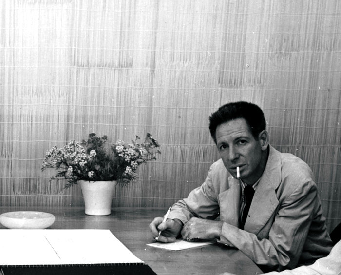
Photomontage, photography as typography, identity through light
Photographer and designer; Swiss Tourist Office, Knoll (1946–66), professor at Yale (1951–76) Engelberg (CH) → Geneva → Paris → New York
Palette of the œuvre
„A designer must not work only with the camera and for the camera — he must work
with the printing press and for it."
Biography
Born 25.4.1907. in Engelberg, in the Swiss Alps — a place he would later
advertise. He studies painting at École des Beaux-Arts in Geneva (1925–27).
Paris, 1929–1932: works with A. M. Cassandre on posters and with
Le Corbusier on architecture and exhibition installations. This is an unusual
combination and explains everything that comes later: the poster as one stroke
(Cassandre) plus spatial thinking (Le Corbusier).
1932–1935: photographer and designer for the Swiss Tourist Office. This is
where the poster series he's remembered for comes from — photomontage with extreme
difference in scale.
December 1935 he travels to America with Trudi Schoop's dance company and
stays in New York. Freelancer for Harper's Bazaar (1936–38) under
Brodovitch, then Condé Nast (1946–57). 1939. designs the
Swiss pavilion at the World's Fair. 1941. begins working with Container
Corporation of America. 1943–1946: Los Angeles, photographer and designer at the
Eames Office (Sandhaus, Earthquakes, Mudslides, Fires & Riots, p. 58) — in the
same circle as Entenza, Lustig, Arts & Architecture.
1946–1966: Knoll. Twenty years — not a logo, but a system: photographic style,
mark, typographic grid, catalogues in colour.
1949–50. directs the film The Works of Calder for MoMA. 1951–1976. teaches
at Yale (full professor from 1961). 1953–68. consultant to the Guggenheim.
1960–79. photographs Giacometti's work. Dies 1984.
Why he matters: in his work photography stops being an illustration inserted
into the layout and becomes the layout itself. This is one of three or four
truly original ideas in this entire body of material.
Influences
Studied with
École des Beaux-Arts, Geneva — painting, 1925–1927
Paris — work alongside A. M. Cassandre (poster) and Le Corbusier (architecture and exhibition design), 1929–1932
note — v1 also lists Léger and Ozenfant as teachers in Paris; not confirmed in the official chronology, to verify
Borrows from
cubism and purism (painting school before design)
Cassandre — poster as one stroke
Le Corbusier — space, exhibition design, relationship between body and plane
surrealism — disproportion and frontal juxtaposition (explicitly stated by Cooper Hewitt)
photo lab — enlargement, cropping, montage with scissors
Influenced
Chermayeff & Geismar (through Yale)
American modernism of the 1940s — brings a Swiss feel for the plane a decade before the International Style arrives
every later photomontage with extreme scale difference (which is today the default language of ads and covers)
product photography as carrier of identity — everything that furniture, hardware, and technology do today
Charles and Ray Eames (the Arts & Architecture circle)
Who he studied under
Geneva, painting — the eye before the craft.
Cassandre — the poster as one blow, not as a composition of details.
Le Corbusier — exhibition design; a body moving through space, not an eye that
looks at a page.
v1 also lists Léger and Ozenfant as teachers; the official chronology does not confirm this
→ provjeriti. (Léger appears as the subject of his photograph, 1927/84,
Art Institute — maybe that's the source of the confusion.)
What he steals
Surrealism — Cooper Hewitt explicitly speaks of a surreal quality due to
frontal juxtaposition. The disproportion is not a compositional trick but a
borrowed painterly strategy.
The photo lab — enlarger, scissors, glue. What compositing software does
today, he did by hand — and that's why it's edited down to the last detail.
Purism and Cubism — plane, cut, plan.
Who he influenced
Through Yale (25 years) — Chermayeff & Geismar and the generations after
them. More broadly: every photomontage with an extreme difference in scale
today traces back to this source, as does product photography as a carrier of
identity.
Caution: The Graphic Design School claims that Michael Bierut also
studied at Yale under him. This is very likely incorrect (Bierut studied in
Cincinnati). Do not copy this until verified.
Class of source. Images were not downloaded. Work 02 (Engelberg–Trübsee) is the only one in
the whole project so far where the museum record gives a description of the composition — hence
its analysis is the most complete. The rest: catalogue data dokumentovano,
descriptions from v1 citanje rada (v1), the rest provjeriti uz sliku.
What it is — a poster for the Swiss Tourist Office. Photogravure,
101.6 × 63.8 cm (MoMA 153.1968, gift of the designer). The technique matters:
photogravure gives a full, continuous photographic tone that lithography of
that era doesn't achieve.
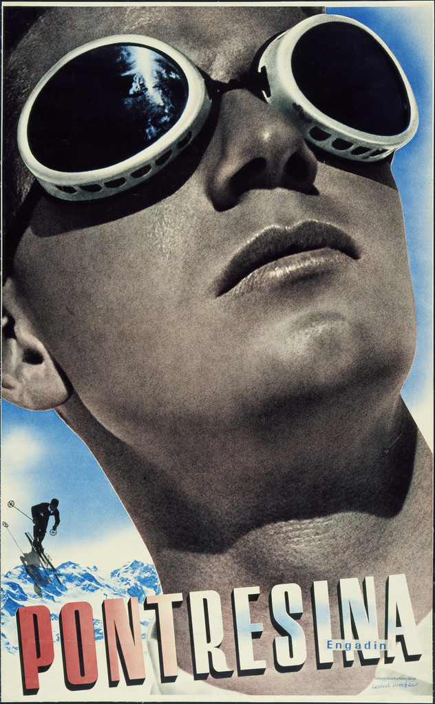
Composition — reading of the work (v2): a face wearing ski goggles takes up
nearly the whole width and the upper ~75% of the height, tilted, gaze up and to
the right; the goggles sit in the upper third and the mountains are reflected
in them — the landscape is inside the face, not behind it. A small skier
descending at bottom left (~5% of the height) on white snow; the scale ratio of
face to figure is about 15:1. The eye enters the goggles (the darkest, brightest
point), slides down the nose and chin to the lettering, and only then "finds" the
skier. Depth without perspective — only difference in size; everything is
frontal.
Colour — reading of the work (v2): three tones, not two. The face in a warm
brown-ochre monochrome (photographic tone), blue only in the goggle reflection
and the band of sky on the right, red only in the lettering. The snow white.
Colour is scarce and thus works as hierarchy: blue = distance/cold, red = the
word, brown = body.
Typography — reading of the work (v2): PONTRESINA in the bottom sixth, over
the chin — heavy, condensed capital letters, red with a white edge/shadow
(dimensional, drawn letters, not typeset); "Engadin" small, white, below to the
right. The lettering overlaps the face, so it reads as part of the montage, not
as a caption. Do not name the typeface/cut — this is lettering.
Message — not "beautiful mountain" but the face of the person who was
there. Tourism sold through experience, not through landscape. The five-metre
test: it works because of the face.
Why exactly this way — photogravure with few colours is cheaper than full
colour, and it treats photography better; photomontage is the only way to bring
two distances into the same plane. Constraint and idea line up. The reflection in
the goggles is a trick that saves one image: the landscape is there, and it
hasn't taken up a single piece of the format.
What would kill it — equalising the scales. It becomes a postcard with two
motifs. Or: colouring the face naturalistically — the unity of tone that holds
the montage together disappears.
Principles:ekstremna-nesrazmjera-mjerilafotografija-je-layouttip-na-savu-montazev2 note: the typography here is not on the seam but over the face — the
seam (face/snow) runs diagonally down to the left. The tag tip-na-savu-montaze
is weak for this work; it's stronger for 02.
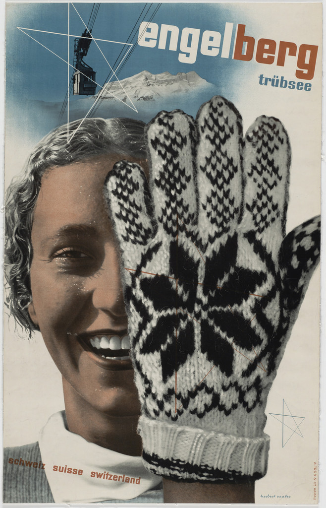
What it is — poster for the Swiss Tourist Office; the location is his birthplace.
Two-colour photogravure on white wove paper, 101,9 × 63,7 cm.
Composition — reading of the work (v2) + note: a huge knitted glove, palm
toward the viewer, occupies the right half and partially covers the smiling face of a young
woman (left half) — peek-a-boo, not montage for montage's sake. Top left:
silhouette of a cable car cabin and alpine peaks against a blue sky; from the cable car thin
white cable lines spread out, cutting across the sky and leading the eye from the title downward toward
the face (explicitly stated in the Cooper Hewitt text). Below: a narrow band with "schweiz suisse
switzerland" across the collar. Everything frontal, nothing in perspective — that's why the difference
in scale reads as surreal, not as depth. Cooper Hewitt: the montage "does not read
as a single coherent image but as a series of concentric ideas".
The glove carries a Norwegian selbu motif (eight-pointed star) — a sign for wool and cold,
borrowed from knitting, not from graphic design.
Colour — reading of the work (v2): MoMA lists two-colour photogravure, but the print
shows four values: blue sky, brown-sepia face, grey-white glove
with a black motif, and orange-red in the typography. Either it's a matter of two colours
plus paper and black, or the record is simplified — to verify, not to be resolved silently.
What's certain: each plane has its own value (sky cool, body warm,
glove neutral), and that's what holds three separate photographs together as one image.
Typography — reading of the work (v2): "engelberg" large, lowercase, across
the top — and cut through by colour in the middle of the word: "engel" light, "berg"
orange-red. Cooper Hewitt reads this as an echo of the Swiss flag (red-white);
in practice it is also a double reading of the word (angel / mountain). "trübsee" below right,
smaller, also lowercase. Below in small type "schweiz suisse switzerland" — three languages in
one line, a solution for the export market without a second version of the poster. Heavy blocky
grotesque (sans serif); specific typeface not to be named.
Message — a greeting with a gloved hand, with the star as a recurring motif.
In three seconds: winter, joy, closeness. Not a single sentence of explanation.
Why exactly this way — two-colour photogravure: the whole palette is one colour plus
black, so everything has to be resolved through tone and scale. The star on the glove is
an ornament that connects the planes — cheap, an already-existing motif from the weave.
What would kill it — equalising the values of the planes (all in the same tone or all in
full colour). Or: placing the glove beside the face instead of over it — the
peek-a-boo disappears, leaving only a collage. A third killer: shrinking the glove in perspective toward the arm.
Principles:ekstremna-nesrazmjera-mjerilafrontalna-jukstapozicijarijec-presjecena-bojomlinija-kao-putanja-okaornament-iz-predmetaResolved v2: the glove is ~45% of the surface; the star does not repeat (one,
on the palm); the typography is not on the seam but in the sky above the
montage.
Use this work as the benchmark — the only one where technique, measurements, museum
description, published analysis (Cooper Hewitt blog), and a visible print all exist together.
Open question: MoMA 5333 dates the print to 1936 and calls it "two-color gravure",
Cooper Hewitt 1935. Two years and the number of colours — do not resolve without a third source.
Measurement 23.09.2026 (MoMA 5333 image, k-means): only ~20% of pixels are saturated;
the sky blue #547585 and the "berg" orange #96583a are muted, the rest is a warm
grey photographic tone — the print measures as two colours + black + paper, which is
compatible with "two-color gravure". This doesn't resolve the question, but it narrows it.
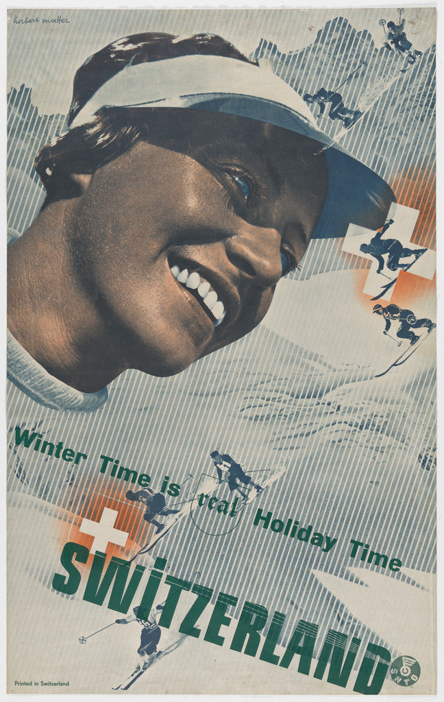
03 · Winter Time is Real Holiday Time — Switzerland (1936)
What it is — a poster from the same series, but in English — so for the export market.
Photolithograph, 101 × 64,1 cm (MoMA 169.1950). Different technique from the gravure
of 1935 — the tone is coarser, but it allows more colours.
Composition — reading of the work (v2): a smiling woman's face with a white visor
occupies the upper left half (~60% of width, ~55% of height), looking down-right toward
the text. The entire background is diagonal hatching (slope/snow rendered as a pattern, not as
a photograph). Along a diagonal from top-right to bottom-left, five-six
tiny skiers are scattered — this is how "distance" is built without perspective: not by the
scale of space but by the number of small figures. One skier is caught inside a circle (like a lens/target) — an anchored
point around which the diagonal turns. A white Swiss cross sits left of centre.
Eye path: smile → down the diagonal of skiers → SWITZERLAND. The face is mass, the text is vector.
Colour — reading of the work (v2): the face in a brown duotone (as in 01), a cold
grey-blue hatched background, green only in the word SWITZERLAND, red in traces (the cross,
the glow around the skier). Warm/cold is split by object: the person warm, the mountain
cold; green as a third, "neutral" colour for the word so it doesn't compete with either.
Typography — reading of the work (v2): two layers — "Winter Time is Real Holiday
Time" in a white italic grotesque with a dark outline, set along the slope's incline
(the text follows the diagonal of the hatching); SWITZERLAND large, a heavy green grotesque, slightly
rising left→right across the bottom third. He solved the longer English sentence by
setting it on the diagonal — so the longer text doesn't cut across the format but "skis" it.
Specific typeface not confirmed.
Message — the same formula translated for a different market. The key question for my work:
what stays the same in the system when the language changes — for him it's the image, because the image
needs no translation.
Why exactly this way — the tourist board is targeting the British and American market;
photomontage is the only language that works without translation.
What would kill it — setting the sentence horizontally. It would immediately need two lines,
it would cut through the face or the skiers, and the only link between text and image (the incline) would disappear.
Second killer: a photographic mountain instead of hatching — the tiny skiers would get lost.
Principles:ekstremna-nesrazmjera-mjerilastrelica-i-dijagonala-kao-kretanjetekstura-umjesto-fotografije-pozadineResolved v2: the longer English sentence is set along the diagonal of the slope.
Remains open: who drew the hatching (by hand or a screen tint film) — important for my dither language.
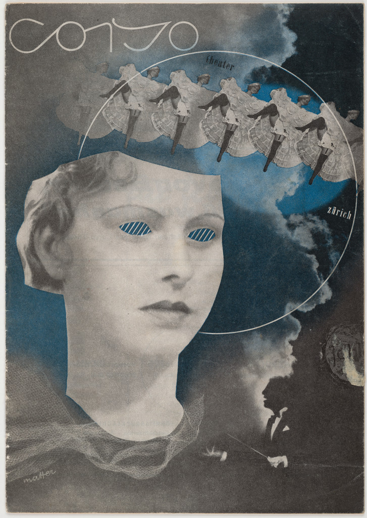
What it is — v2 correction: not a poster. A programme/flyer for Corso Theater, Zürich —
letterpress, 21,3 × 14,9 cm, printed by Buchdruckerei Zum Gutenberg
AG. From Jan Tschichold's collection (MoMA 723.1999) — so a piece Tschichold
considered worth keeping. Wide dating (1930–40), the Swiss phase.
Composition — reading of the work (v2): a photomontage of a woman's head (lower two-thirds,
centred), eyes replaced with blue hatched blotches — a surrealist move;
across the forehead/hair a row of six-seven tiny dancers (chorus line) like a crown.
Over everything a thin white circle (~60% of width) — geometry that ties the head,
the dancers, and the lettering into a single mark. Background: dark smoke/clouds, photogram-like
in character; below, a dark mass (landscape or curtain). Eye path: circle → dancers → eyes → down.
Colour — reading of the work (v2): grey photographic monochrome + one blue
(eyes, hatching). One colour in two small places — enough for the whole page
to gain a temperature. Same recipe as 01 (blue only in the glasses).
Typography — reading of the work (v2): "Corso" hand-lettered, white, upper left,
loose like a neon sign; "Zürich" small, right of centre. There's no typesetting in the classical
sense — the word is drawn, as in 01. Do not name the typeface.
Message — a nightclub, a revue, a dream: the head with dancers in the hair is literally
"what's on her mind". Entertainment, not landscape — a useful contrast with
Hofmann's Basel theatre posters (he would never have replaced the eyes).
Why exactly this way — small format and letterpress: the photograph has to be a single
block, so everything is solved in the montage before printing, not in the printing. One extra colour
= one extra pass — hence the blue kept to a minimum.
What would kill it — removing the circle. Without it the head, the dancers, and the lettering are three
separate things on a dark background.
Principles:fotografija-je-layoutjedna-boja-na-dva-mjestageometrija-veze-montazuNote v2: the piece is also valuable as proof that the same method works at 21 cm and at 100 cm.
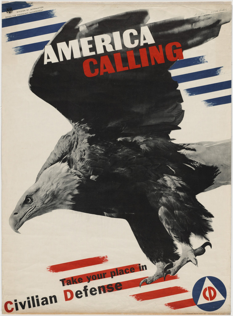
05 · America Calling — Take Your Place in Civilian Defense (1941)
What it is — a war poster for Office of Emergency Management.
Offset lithograph, 102,5 × 75 cm (MoMA 118.1944).
Composition — reading of the work (v2) — correction: there is no scale
mismatch here, v1 got it wrong. One element: a black-and-white eagle with spread wings
fills ~80% of the format, on the diagonal (head bottom left, wing top right), on
a white background. The photograph of the eagle is the poster — everything else is flag stripes
in the corners (blue top, red bottom right) and text. Eye path: AMERICA top left →
down the wing → beak → Civilian Defense at the bottom. The eagle's diagonal is the only "line".
Colour — reading of the work (v2): black-and-white photograph + red and blue only
as stripes and words — the flag broken into pieces and scattered across the corners,
never whole. CALLING and "Defense" in red; AMERICA white on the black wing. Colour carries
only two things: the state (stripes) and the verb (CALLING).
Typography — reading of the work (v2): heavy grotesque, capitals; AMERICA / CALLING
in two lines top left, set on the black wing (white on black, red on
white — each line on its own ground); below, "Take your place in" small, "Civilian
Defense" large, with a faint slanted rhythm of stripes behind it. The Civilian Defense emblem (blue
circle, white triangle) bottom right like a stamp. Specific typeface not confirmed.
Message — five years after arriving, a Swiss émigré makes the poster with which
America calls its citizens. The eagle isn't a symbol but an animal attacking —
the photograph delivers a threat that a drawn crest wouldn't. In three seconds: danger + flag.
Why exactly this way — offset instead of gravure: wartime print run, speed, lower cost.
Offset doesn't give the tone of gravure, so there's no montage with soft gradations — one hard
photograph on white is what offset does well. The method adapted to the technique:
the photograph is still the layout, but without the scale mismatch.
What would kill it — the whole flag in the background. The stripes work because they're a fragment;
a full flag would turn the eagle into an illustration on wallpaper.
What it is — covers of the magazine by John Entenza, the bulletin of the Case Study House
programme, 10 × 12 in. dokumentovano (Louise Sandhaus, Earthquakes, Mudslides,
Fires & Riots: California and Graphic Design 1936–1986, p. 58, cited in PGDA):
Matter came to Los Angeles in 1943 to work as photographer and designer for Eames
Office, stayed until 1946; at A&A he works alongside Lustig (who in 1942 designed
the magazine's logo) and John Follis. → Add Eames Office 1943–46 to biography.
Composition — citanje rada (v2), two different solutions:
April 1945 — a large child's face (black-and-white photograph, big eyes) takes up
the right two thirds; over it thin red lines — ellipses/orbits around the head and
a red hand/plant at bottom left. Photograph + drawing in the same plane, no shadow.
May 1948 — white ground, one thick black band winding across
the whole format (cut paper or photographed tape), with tiny black leaves next to it and
one small red figure at bottom right. No face photograph — pure shape.
Common ground: one large element edge to edge, logo on top as the only "page".
Colour — citanje rada (v2): both black + one red on white. 1945: red
is a drawing over the photograph; 1948: red is one small accent on the black mass.
Same two-colour discipline as Trübsee, three years and one continent away.
Typography — citanje rada (v2): the logo "arts & architecture" in narrow lowercase
letters (Lustig's logo from 1942 — not Matter's), across the top; date small in red.
All other text zero — the cover is image and masthead, nothing else.
Message — a cover that doesn't show a house even though the magazine is about houses.
Same principle as Lustig's cover: a sign for the subject, not a picture of the subject.
Why exactly this way — small magazine, small budget, an audience already inside the subject —
abstraction is allowed.
What would kill it — a photograph of a house. The magazine would become a catalogue.
Principles:fotografija-je-layoutfizicka-montaza-tjera-na-rezznak-za-temperaturu-ne-slika-radnjeResolved v2: two-three elements per cover; the logo belongs to someone else (Lustig) and stands as a
fixed header — Matter works below it, not around it.
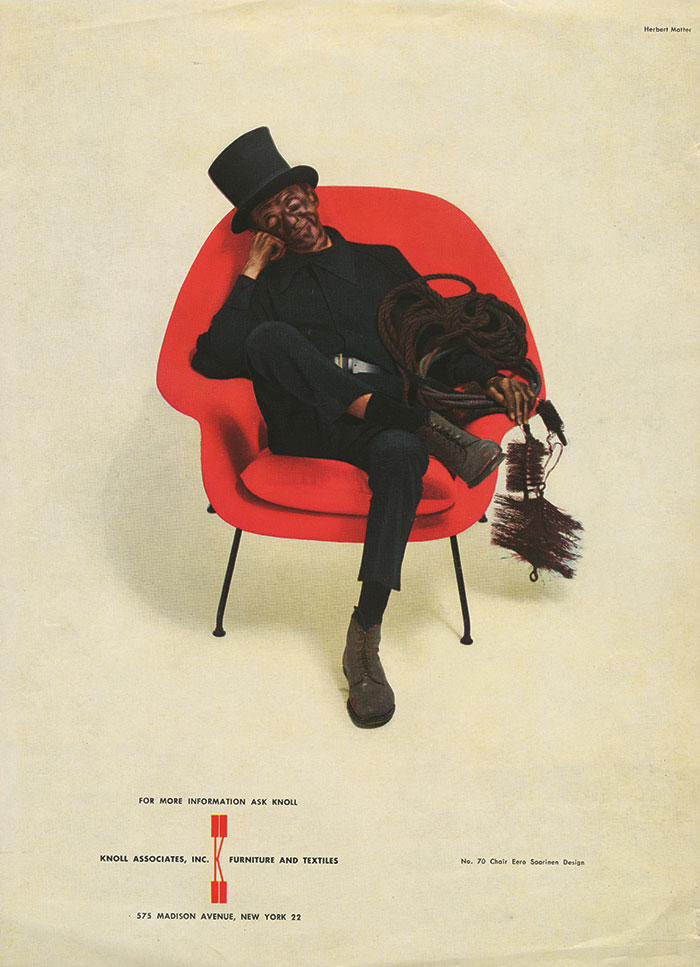
07 · Knoll Associates — identity through photography (1946–1966)
What it is — a twenty-year collaboration with a furniture manufacturer. Delivered:
photographic style, wordmark, typographic grid, catalogues with a colour code —
a system, not a mark.
Composition — reading of the work (v2) on a specific advertisement, the "Chimney Sweeper
(1950)", the best known of the series: light empty background, a red Womb chair
(Saarinen) right of centre, in it a chimney sweep in a sooty work suit, relaxed
and slumped, tool in hand; legs crossed, dirty from head to toe. The object and
figure occupy the central third; everything around is empty. At the bottom centre a small
text block with a thin red vertical accent. No setting, no room —
studio, not interior: the chair is isolated like an exhibit.
Source: Knoll — "Herbert Matter: Defining Knoll"
(image from the Knoll archive). 23.09.2026 correction: the earlier PGDA 13664 link now leads to
a completely different record (logo for Flint Local 432) — PGDA reassigned the ID; link removed.
Colour — reading of the work (v2): white/light is the base "colour", one red
carries both the product and the typographic accent — so the colour of the product is
the palette of the advertisement. Everything else is black-and-white (the sooty clothing). In catalogues colour serves for coding,
not decoration.
Typography — reading of the work (v2): a small block centred at the bottom, grotesque (sans serif), maybe
3–4% of the ad's height — text deliberately too small for an ad, because the photograph carries the whole
message. Specific typeface not to be named without confirmation.
Message — the product isn't described, it's proven. A chimney sweep covered in soot on a
light upholstered chair is a material-durability test performed as an image —
one photograph replaces a paragraph about the fabric. A dirty body in a clean form is both
a joke and an argument. The ad ran in The New Yorker for thirteen years running —
now confirmed also by the company's own source (knoll.com); Florence Knoll didn't like it
at first, Hans Knoll pushed it through.
For your work: that's the cheapest copywriting there is — find the situation
that proves the claim, instead of writing the claim.
Why exactly this way — Knoll sells furniture to professionals; for that audience
light and camera angle are the argument. Hence his most useful conclusion:
lighting is identity.
What would kill it — ambient photography with décor. The object disappears into the scene,
and the system falls apart because every photograph is shot differently.
Principles:svjetlo-je-identitetfotografija-je-layoutsituacija-umjesto-tvrdnjeboja-proizvoda-je-paletaResolved 23.09.2026: the engagement in 1946 (Florence Knoll personally recruits him in California)
and 13 years in The New Yorker — knoll.com. New discrepancy: knoll.com dates the ad to
1947, this note previously said 1950, and the Womb chair goes into production in 1948 —
1947 is probably premature; not to be resolved without a third source (New Yorker archive).
Remains open: a rulebook for photography, if one survives.
What it is — documented (Calder Foundation):
20 minutes, 16 mm, colour, sound, produced by New World Film Productions for
MoMA. Direction and camera: Herbert Matter (both roles his — confirmed also in
the credits themselves). Music: John Cage — earlier to verify, now confirmed
both by the source and by the credits frame („Music / John Cage"). Narration and production:
Burgess Meredith. Footage: YouTube, Calder Foundation channel.
Composition — reading of the work (v2): the shots are poster-like — a single object,
frontal, centred, on a neutral background, shallow depth of field. Example seen:
Calder's wire spiral fills the entire frame like a drawing on a flat plane,
with no other element present. Same procedure as his photographs for Knoll: the subject
isolated so it reads as a diagram of itself. With Calder, movement itself is the content,
so film is the only medium that can describe it.
Colour — reading of the work (v2): the film is in colour (16 mm), but the credits are purely
black and white, and the shots of objects run on neutral backgrounds — the colour comes
from Calder's own planes, not from the set design.
Typography — reading of the work (v2), the most interesting finding: the credits are not
grotesque (sans serif) but hand-lettered with a brush — soft, faintly shimmering white letters
on black („THE MUSEUM OF MODERN ART FILM LIBRARY", „A New World Film presentation",
„Music John Cage"), and then reversed: dark brushed letters on a light ground
(„Photography & Direction Herbert Matter"). A man whose posters are block grotesque chooses
handwriting for film — because Calder's work is bent wire, not a
constructed form. The letter follows the material of the subject, not the author's manner.
Message — a sculpture that moves cannot be photographed; it can only be filmed.
This is a rare, clear case where the medium chooses the content, not the other way around.
Why exactly this way — a photographer who works his whole life with fragment and cut
naturally moves into editing in time. For you this is his most important work —
the same hand on the poster and on the film.
What would kill it — grotesque credits. Sounds minor, but it would turn the whole film
into industrial documentation; the handwriting is what tells the viewer that the object
was made by hand. Second killer: explanatory narration over every shot.
Principles:kretanje-kao-temafotografija-je-layoutslovo-prati-materijal-temeResolved v2: Cage confirmed, running time 20 min, film available on the Calder
Foundation channel. Remains open: to watch the full 20 min for editing rhythm (cut on the music
or on the mobile's movement?) — one hour, worth it.
Other works — evidence, no analysis
Work
Year
Source
Gebr. Fretz A.G. Zürich
1933
MoMA 7552
Foto 5 / Typographische Monatsblätter
1933
MoMA 7555
Tea-room dancing: Engelberg
c. 1935
V&A O1438728
En Route Pour La Suisse; Für schöne Autofahrten die Schweiz
1935–36
MoMA 6242, 5462
Swiss Pavilion, New York World's Fair
1939
chronology
Container Corporation of America
from 1941
chronology
Condé Nast — staff photographer
1946–1957
chronology
"One of Them Had Polio…" — typeface Franklin Gothic (confirmed)
Bridge to practice: poster · graphic design · motion
Poster
Two elements, extreme scale difference, one plane. That's the whole poster.
Everything else (colour, typography) can be ordinary. Check on your next poster:
is the size ratio drastic enough? If it's "a bit bigger", it isn't.
Frontal, no perspective. The disproportion works only if everything is parallel to
the plane. As soon as you introduce perspective, the brain reads it as distance and the
effect disappears.
Two colours by tonal zones, not by objects. His trick from the Trübsee poster:
one object in a brown tone, the other stays black and white — the montage becomes one image.
That's directly applicable to duotone and to screenprint.
Drop the typography onto the montage seam. The edge between two images is a natural
shelf for text; use it instead of hunting for "empty space".
Graphic design
Limit yourself to three elements. He cut with scissors, so he couldn't have twelve
layers. In Photoshop/Illustrator that's a discipline you have to impose on yourself.
Lighting is identity. If you're doing a visual identity for someone who has a product
(anything physical — furniture, food, equipment), first lock down how it's shot,
only then draw the mark. Knoll held its identity together for 20 years largely through this.
Colour as code, not as decoration. Catalogues with a colour code: colour carries
information about category. Cheap, useful, and it instantly looks systematic.
Motion
Scale disproportion is also a cut. A cut from close-up to wide shot within
the same frame composition (without moving the camera) is Matter's poster
translated into time — strong, and cheap to produce.
The montage seam is also temporal. The place where two images join in the frame is
a natural place for text to enter — in AE: mask the text's entrance exactly along that edge.
Movement as subject, not as decoration (the Calder film). Before you animate, ask:
is there something here that has to move to be explained? If not,
the animation is decoration — and that's legitimate, but know which of the two you're doing.
Physical constraint as a tool. Deliberately limit yourself: three layers per frame, two
colours, no gradients. The same discipline that made his montages sharp.
Bad imitation
"A bit bigger." Face 2× larger than the figure instead of 15×. The brain reads that
as a badly cropped photograph, not as a montage. Cause: the motif was copied (face + landscape),
not the rule (the disproportion has to be absurd).
Perspective sneaks in through the back door. Figure in the distance slightly blurred, face
sharp, shadow under the face — and the disproportion turns into "depth", which is exactly what
he avoids. Cause: the Photoshop reflex to join the montage "convincingly".
Colour by objects. Face in natural colour, landscape in natural colour, text in
a third. Three worlds on one sheet of paper. Cause: it wasn't understood that two-colour
gravure forced him to use tone as glue; with full colour you have to impose that yourself.
The seam as a mistake. The edge between two photographs is hidden with a soft mask instead of
being acknowledged and used as a shelf for text.
The brief through their eyes
(fill in the current job) — First move: which is the one photographic element that
can carry the whole format, and which other one can be twenty times smaller. If both are
drawings, shoot one instead. Colour: one on the body, one on the word, the rest greyscale.
Exercises
Two elements. A poster from exactly two photographs, size ratio at least 1:6,
everything frontal, text on the seam. Two colours. One evening.
Duotone by zones. Take a montage of two photographs and unify them by
giving one colour and leaving the other a neutral tone — don't colour everything the same.
Light as identity. Shoot the same object three times with three different lights and
decide which one is your brand. Write down the setup so it can be repeated.
Motion study — "Disproportion as a cut" (5 s, AE)
One shot, fixed camera, white background. Second 0–2: a small figure (5% of height)
walks left. Second 2 (one frame, no easing): a face cuts into the frame at 90% of the
height, frontal, the figure stays the same and keeps walking. Second 3–5: the word enters
masked exactly along the edge of the face. Rule: nothing scales smoothly — the scale changes
by a cut, not by animation. Two colours (Tint effect on the face, flat colour on the word).
Rebuilding the benchmark — Engelberg–Trübsee 1935
Format 1 : 1.6 (63.7 × 101.9 cm), portrait. Layout (estimated from the print, v2):
- top ~25%: sky, cable car upper left, cables as thin lines running right-down;
- title across the sky, in lowercase, ~12% of height, cut by colour through the middle
of the word;
- face left half, from ~25% to ~90% of height;
- glove right half, palm in the centre of the format, ~45% of total area, overlaps
the face by about a quarter of its width;
- bottom ~7%: one line of small text in three languages.
Task: 45 min in Illustrator, four elements (sky+cable car, face, glove, text),
each plane in its own value — without looking at the original. Then compare two things:
where your title ended up and whether you placed the glove over the face or beside it.
Notes on sources
Léger and Ozenfant as teachers come from v1; the official chronology lists
Cassandre and Le Corbusier. Don't claim Léger as a teacher until it's confirmed.
Michael Bierut as his student at Yale (claimed by TGDS) — very likely incorrect.
Don't copy this over.
~~John Cage as composer of the music~~ — confirmed v2 (Calder Foundation + film credits).
Work 02 (Engelberg–Trübsee) is the benchmark: the only one with a documented description
of composition, colour and typography.
v2 (06.09.2026): all eight works seen — no more blank fields in the form.
Sources: MoMA, PGDA, the Cooper Hewitt blog, Calder Foundation, a film recording on YouTube.
v1 corrections: 04 is not a poster but a 21 × 15 cm leaflet (letterpress, Tschichold's
collection); 05 has no scale disproportion; 02 is not "two colours by tonal zones" as
v1 claimed but four values by plane. New: Eames Office 1943–46 (Sandhaus);
Cage confirmed; Knoll got a specific ad (Chimney Sweeper 1950).
Cooper Hewitt is unreachable for the agent (Cloudflare loop, even for a human on the panel).
Workaround: MoMA has the same poster (5333), and the cooperhewitt.org blog works through
WebFetch — it's a better source than the record because it contains analysis.
Remaining: a .svg skeleton for Trübsee (needs a local image and measurement); 20 min of film
for the montage rhythm; the date 1935/1936 and the number of colours on 02.
New local tags (not yet in _PRINCIPI, awaiting a second author):
tekstura-umjesto-fotografije-pozadine, jedna-boja-na-dva-mjesta,
geometrija-veze-montazu, fragment-simbola-umjesto-simbola,
frontalna-jukstapozicija, rijec-presjecena-bojom, linija-kao-putanja-oka,
ornament-iz-predmeta, situacija-umjesto-tvrdnje, boja-proizvoda-je-paleta,
slovo-prati-materijal-teme.
Primary source for all dates: herbertmatter.org/welcome/timeline (the estate site).
Brought to template 23.09.2026 (session 21, step 2a): status gotovo;
ostali_radovi removed from the frontmatter (all entries already in the "Other works" table,
supplemented with Condé Nast and two works with typeface confirmed on Fonts In Use); the
ekipa field on 08 merged into tehnika. All 8 works got izvor_slika, slika_lokalno,
font (no specific typeface confirmed — only class or "lettering"), paleta. Palette
measured in the browser (k-means, 4 tones + up to 3 saturated accents) on MoMA / PGDA / Knoll
images — no screenshots, except one control (02) and one that revealed an error (07).
Portrait: knoll.com (Knoll Archive). 08 (film) palette intentionally empty.
Error found 23.09.: PGDA item 13664 (previously "Chimney Sweeper") is now the logo of
Flint Local 432 — PGDA IDs aren't stable; the source for 07 moved to knoll.com.
New discrepancy: Chimney Sweep — knoll.com 1947, this note 1950, Womb chair 1948.