Swiss International Style, grid systems, concert poster
Designer for Tonhalle Zürich; professor at Kunstgewerbeschule Zürich; co-founder of the journal Neue Grafik Rapperswil → Zürich
Palette of the œuvre
„The grid is an aid, not a guarantee."
„Subjective interpretation leads to falsifying the message."
Biography
Born 1914 in Rapperswil on Lake Zürich. Learns the trade as an apprentice under
designer Walter Diggelmann, and alongside that studies architecture, design and art
history at the Kunstgewerbeschule and the University of Zürich. Opens his own studio
in 1936, and for the first fifteen years does what was then normal work:
illustration, shop windows, exhibition displays, posters with drawn figures.
The break comes around 1950. He abandons illustration entirely — not because he
doesn't know how, but because he concludes that an author's hand distorts the
message. From then on he works only constructively: geometry, photography, one
typeface, the grid. Concert posters for Tonhalle Zürich (1950s) and a series for
Automobil Club der Schweiz on traffic safety make his name.
In 1958, with Lohse, Neuburg and Vivarelli, he launches the magazine Neue
Grafik — trilingual, precisely gridded, and practically the only channel through
which the Swiss method was exported to the world. That same year his wife Verena, a
violinist, dies in a traffic accident; in the literature this is cited as the moment
after which he turns even more firmly to objective work. He teaches in Zürich, works
for SBB, is a design consultant at IBM Europe (1966–1988), and also teaches in
Japan.
In 1981 he publishes Raster Systeme für die visuelle Gestaltung — a book that
turned the method into a teaching subject. He dies in 1996.
Essential for reading his body of work: he is not a stylist. For him neutrality
is an ethical stance — the poster should speak for the concert, not for the
designer's mood. Everything that looks like the "Swiss look" in his work is a
consequence, not a goal.
Influences
Studied with
Walter Diggelmann (apprenticeship at a design studio, Zürich, until 1936)
Kunstgewerbeschule Zürich + University of Zürich (architecture, design, art history)
Borrows from
Russian and European constructivism (geometry as a carrier of content, not decoration)
Bauhaus — names Klee, Schlemmer, Itten, Kandinsky
{'concrete art (Zürich': 'Bill, Lohse)'}
music — structure, rhythm, interval as a model for composition
Japanese Noh theatre and zen gardens (taught in Japan; restraint and the tension of emptiness)
reportage photography instead of illustration (after 1950)
Walter Diggelmann — studio practice, craft before theory.
Kunstgewerbeschule Zürich / University of Zürich — design and art history,
but also architecture; from there the habit of dividing the surface like a floor
plan, not like a picture.
As mentors and role models he himself names Max Bill, Richard Paul
Lohse, Hans Neuburg and Carlo Vivarelli — later he launches Neue
Grafik with them. This is a rare case where the role models became
collaborators.
What he plunders
Constructivism — geometric form as a translation of content, not decoration.
Bauhaus — namely Klee, Schlemmer, Itten, Kandinsky. His sentence:
„Dostignuća avangarde su me probudila i natjerala da razmišljam." [The
achievements of the avant-garde woke me up and forced me to think.]
Concrete art from Zürich (Bill, Lohse) — series, progression, a rule carried
through to the end.
Music — the most important source. Rhythm, interval, theme and variation are
literally his compositional model for concert posters.
Japan — Noh and Zen gardens; restraint and the tension of emptiness as an
active element.
Photography (Heiniger and others) instead of drawing, from 1950 onward.
Who he influenced
Wim Crouwel, Massimo Vignelli, Otl Aicher (a parallel line of
systemic thinking), the systemic direction after 1970 down to Muriel
Cooper, and — most directly — today's design systems, component libraries,
CSS grid and tokens. When someone today defines a spacing scale in Figma, they
are doing Müller-Brockmann's 1981 book.
The opposite reaction is equally important to the lineage: Wolfgang
Weingart takes the same system apart from within in the 1970s, and Karl
Gerstner replaces it with a programme instead of a rule.
Note on the class of sources. In this session images were not retrieved (the
computer was off), so there is no citanje rada class. Everything below is from
literature and museum records. Where the literature does not cover one of the
seven fields, it says provjeriti uz sliku — those spots are filled in once
the images are available locally, and only then get the citanje rada label.
Nothing has been invented just to fill a field.
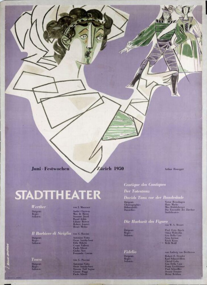
What it is — poster for the summer opera and ballet festival, client
Stadttheater Zürich. Offset lithograph, 133 × 85 cm. This is a work before the
break — it's worth including precisely because it shows where he started from.
Composition — citanje rada (v2): the upper half is a drawing of three
stylised figures (a singer in a white fan-shaped dress, a dancer in green, a
third figure to the right) with sharp angular folds; the lower half is a list
of programmes in four columns, small, with "STADTTHEATER" in spaced
capitals over it. The division is literal: image on top / information
below — a classic split he will abandon within five years. The figures and the
text share no common geometry; they live in two worlds on the same sheet.
Colour — citanje rada (v2): a cold grey-violet background, white, green
and black in the figures, black text. The colour is decorative — chosen for the
scene, not for hierarchy. This is the biggest difference from everything after
1953.
Typography — citanje rada (v2): a mixture — spaced capitals for
"STADTTHEATER", small serif/grotesque in the programme columns, and a
handwritten date above. Not a single typeface; there is no system yet. Do
not name specific typefaces.
Message — the festival as an event, with figuration as the bait. The
three-second test works through the figures, not through structure.
Why exactly this way — in 1950 the poster is still an heir of the
illustrated poster of the 1930s; the client (the city theatre) expects a scene.
What would kill it — nothing dramatic; the work is conventional. The
interesting thing is the reverse: he "killed" it himself by rejecting this
whole method.
Principles:prije-prelomaResolved v2: the palette (grey-violet + green + white), multiple typefaces,
the image-on-top/text-below split without shared geometry.
For learning: this is the only work in the material that shows what the
author looks like before he finds his method — worth putting next to Musica
Viva on the same screen.
What it is — a traffic safety poster, Automobil Club der Schweiz.
Black-and-white photomontage; photograph by Ernst A. Heiniger. Part of a
campaign running 1953–1960.
Composition — citanje rada (v2): an enormous front wheel of a
motorcycle, shot close and from below, fills the right two-thirds and
charges toward the viewer; a small figure of a running child is at the
bottom right, right at the edge, on a yellow strip. The scale relationship is
brutal (wheel : child ≈ 10:1) — the same tool used by Matter for
tourism, here for a threat. At the top a narrow band with the client, below it
the headline; the image fills the rest.
The tension lies in the fact that two speeds and two sizes occupy the same
plane.
Colour — citanje rada (v2): black-and-white photography + a yellow strip
below on which the child stands. Yellow is the only colour and carries
exactly one meaning: warning. The photograph remains evidence, the colour is
a sign.
Typography — citanje rada (v2): "schützt das kind !" in lowercase,
grotesque, white in a narrow dark band at the top, calm and small relative
to the image. The typography doesn't explain the image, it just names it. The
exclamation mark is separated by a space. Dimensions per record: 35 × 50
in, lithograph.
Message — at three seconds: nearly. At five metres it works because the
carrier of the message is the relationship between the two shapes, not
text.
Why exactly this way — a public campaign must be indisputable. A drawing
would be someone's opinion; a photograph is a witness. This is the same reason
he abandoned illustration in 1950.
What would kill it — adding colour (especially red on the child). It would
become melodrama, and the threat would turn into decoration.
Principles:fotografija-umjesto-ilustracijeekstremna-nesrazmjera-mjerilaboja-kao-znak-ne-kao-tonposljedica-umjesto-pojaveResolved v2: the text is at the top in a band; the shot is a close-up of the
wheel; the child is small at the bottom right. v1 correction: it is not "a
collision of two trajectories in emptiness" but a disproportion of scale — the
same procedure as with Matter, but with the opposite sign.
What it is — concert poster for Tonhalle-Gesellschaft Zürich. Lithograph.
Composition — reading of the work (v2): concentric arcs of varying thickness
trace almost a full circle whose centre is outside the format, bottom left; the arcs
are black on white in the upper part and invert to white on black in the lower —
same figure, two modes. The arcs' thicknesses and spacing grow outward (progression,
not equal spacing) — that is the visual translation of a crescendo. No scene, no
portrait: structure of sound instead of image of sound. The text sits inside the black
field below, in two-three tiny columns, and doesn't interrupt a single arc.
Colour — reading of the work (v2): black and white only. Two values; the whole
hierarchy is in contrast and line thickness.
Typography — reading of the work (v2): "beethoven" in lowercase, white, in the
centre of the black field, small size — the composer's name is not a headline but a label.
Below it, the programme in tiny columns. The literature cites Akzidenz-Grotesk;
the typeface name is the only thing taken from the literature, not from the image.
A grotesque without character is deliberate: the typeface must not have an opinion about Beethoven.
Message — at three seconds: a concert, serious, modern. From five metres away, you
recognise the series before you read the name — that was the goal too, Tonhalle got
its identity through these posters.
Why exactly this way — lithography and a small print budget favour few colours and
clean forms. On top of that: the client is an institution with a season, hence a series,
and a series demands a rule, not per-piece cleverness.
What would kill it — putting in a portrait of Beethoven. The work stops being an
analogy and becomes an illustration; the whole argument collapses.
Principles:analogija-umjesto-ilustracijeserija-kao-identitetprogresija-debljinaizvrtanje-vrijednosticentar-izvan-formataResolved v2: the arcs grow outward (progression); the circle's centre is outside
the format; the text sits inside the black zone and doesn't cut the arcs.
Remaining: whether the progression is arithmetic or geometric — requires measuring on the image.
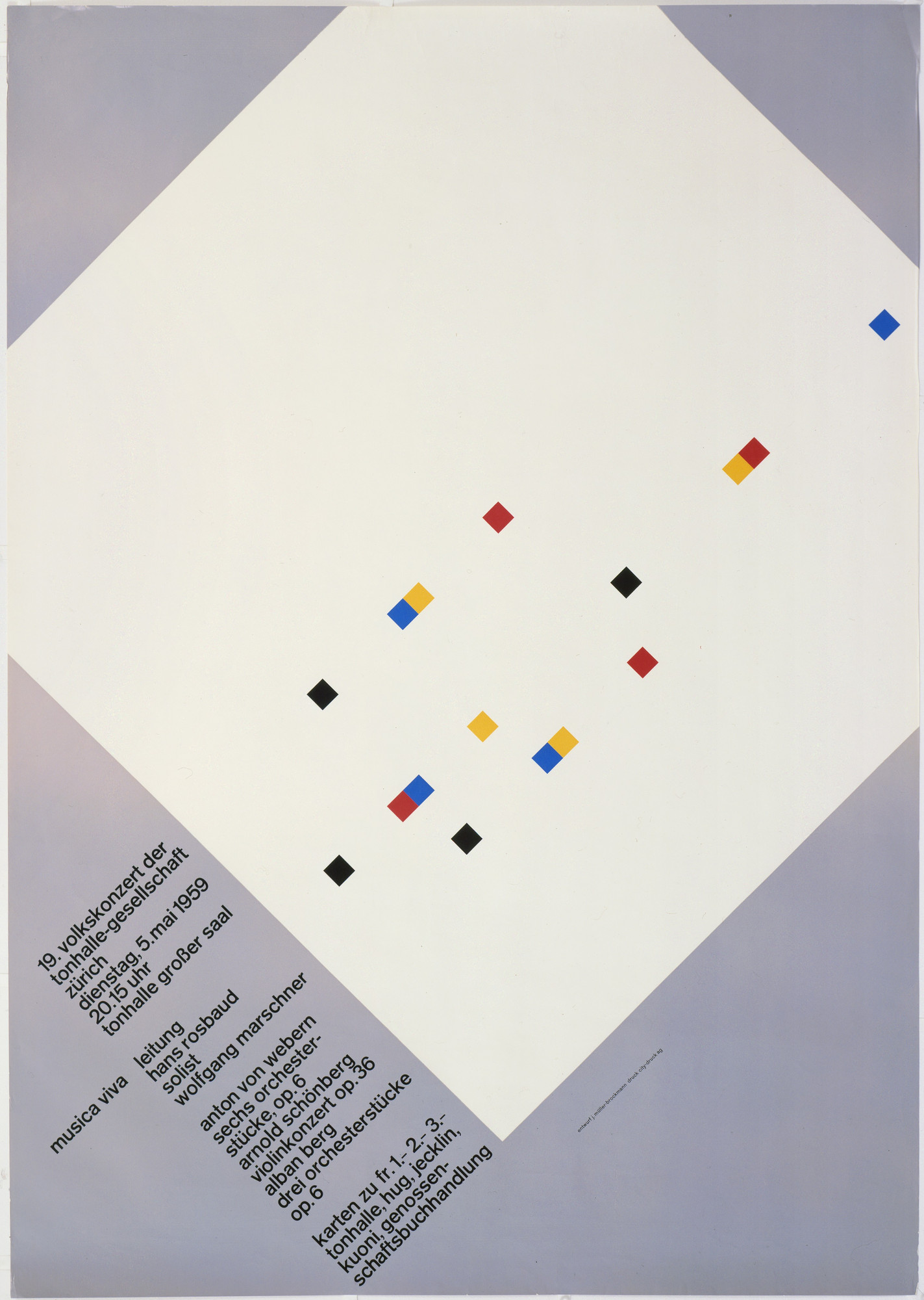
What it is — poster for a contemporary music cycle at Tonhalle Zürich.
Linocut and letterpress, 128 × 90.5 cm, printed by City-Druck AG Zürich
(MoMA 491.1987, gift of the designer). The technique matters: a linocut means a
hand-carved block — the geometry did not come out of a machine.
Composition — reading of the work (v2) — v2 correction of v1, which described
a "progression of squares/circles": the poster actually shows one enormous white square
rotated 45° (a diamond) that fills almost the whole format and runs off it left and
right; the ground is a cold grey-violet. Across its surface about fifteen tiny squares
are scattered, also rotated 45°, of varying sizes, in black, red, blue and yellow; some
overlap in pairs (yellow behind red, blue behind black) giving depth. They're denser
toward the bottom left corner, sparser toward the top right — density is rhythm,
not progression. The text sits in the bottom left corner, laid parallel to the diamond's
edge (45°). The relationship is "large silent plane : many small events" — literally
a score. Kimberly Elam deconstructed the poster geometrically (source in literatura).
Colour — reading of the work (v2): black + three primaries (red, blue, yellow)
on the white diamond and grey-violet ground. No colour carries meaning on its own;
they're all the same size and weight — colour is the difference between voices,
not hierarchy.
Typography — reading of the work (v2): grotesque, lowercase, very small size,
the whole text block rotated 45° and broken into five-six short groups that step
down along the diamond's edge. The text is the base of the system, not its peak;
it too is placed on the geometry, not against the edge of the format.
Message — at three seconds: something strict and contemporary. From five metres
it works better than up close — this is a poster made for the street and for scale,
not for a monitor.
Why exactly this way — linocut and letterpress reward large flat surfaces and
punish fine detail. The constraint of the technique and the idea of proportion coincide
here perfectly — that's why the work looks inevitable.
What would kill it — aligning the diamond with the format. The whole poster stands
on one large shape being turned, so everything else (the little squares, the text) lives
on that slant. Second killer: enlarging the text — the small events would stop being events.
Principles:analogija-umjesto-ilustracijerotacija-nosi-cijelu-kompozicijugustina-kao-ritamserija-kao-identitetResolved v2: four colours (black + three primaries); overlaps exist and are
planned (pairs of small squares); text at 45°.
Remaining: whether the white diamond is printed or is the paper.
04b · Musica Viva — version with circles (concert 7.1.1958)
Finding v2, important: under the same title and the same year there are two
different posters. The one Kimberly Elam measured is not the diamond one (MoMA)
but the version with circles — for the concert of Tuesday, 7 January 1958.
Source: Elam, Behance
(works in browser; the 403 was only from the cloud container).
Compositioncitanje rada (v2): four dark grey circles of decreasing size
on white; the largest enters from the top right corner and exits the format, the smallest is
tiny. The centres fall along a diagonal from top-right towards bottom-centre; the circles
touch, do not overlap. Bottom fifth: three columns of small text and "musica viva"
on the right, at a larger size.
Measured geometry (Elam, dokumentovano): the circle diameters stand in a
2:5 ratio; the construction is derived from a square inscribed in the format
(the square's diagonal is the axis on which the centres lie), and the lines connecting the centres intersect at
90°; the format's divisions are at 1/2. So: the sizes were not chosen by eye, but
derived from a single ratio — exactly what he claims in his books.
Why this is the most useful finding for the project: it's a ready-made skeleton — square,
diagonal, 2:5 sequence, two vertical divisions. Directly transcribable into .svg and into
a reconstruction exercise, without a single measurement on our part.
For motion: the 2:5 sequence is a ready-made scale for stagger and for sizes — the same logic as
the spatial progression, only in time.
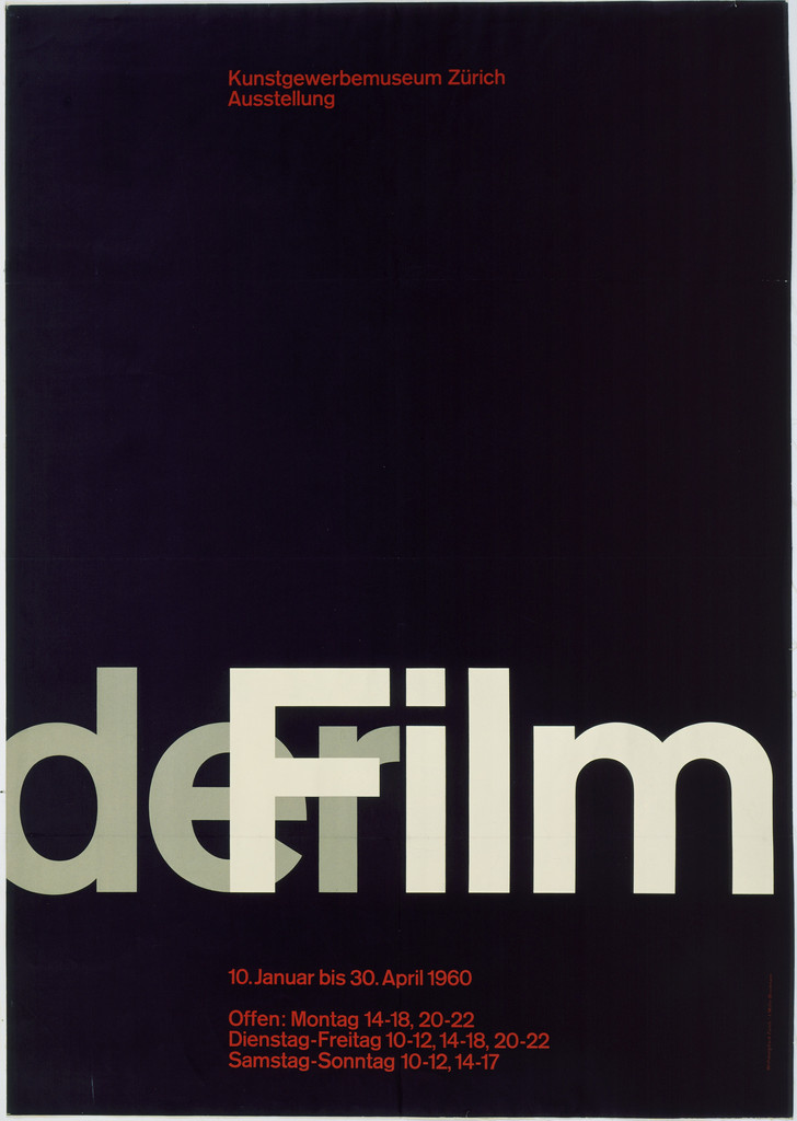
What it is — poster for a film exhibition, Kunstgewerbemuseum Zürich. Offset lithograph.
MoMA record.
Composition — reading of the work (v2): an almost black (dark violet) plane; in the
bottom third the word "derFilm" in one stroke, enormous, light grey, edge to edge —
"der" and "Film" joined with no space, so they read as one word and as one shape.
The letters are semi-transparent: where they cross the ground it stays darker, so you
can see the word is printed over, not cut out. Top right, a tiny red museum name;
below the word, red date and venue details. The top 60% of the format is an empty dark
plane — emptiness is the main move here. The literature (I Love Typography) cites a
measured division: format 3:5, 15 modules, the word occupies two units.
Colour — reading of the work (v2): dark ground, light grey for the word,
red only for the tiny details. Three values; red is the only true colour and it's
given to what's smallest.
Typography — reading of the work (v2): grotesque, lowercase, a drastic ratio of
sizes (word : details ≈ 20:1). Typography here isn't text but shape: the large block
organises the surface, the tiny red blocks decode it.
The letters' transparency is a technical move that binds the word to the ground
instead of placing it on top of it.
documented (Barbara Junod, via Fonts In Use 6396): the headline in Akzidenz-Grotesk
was exposed onto photo paper in multiple positions and degrees of sharpness, then
overprinted with opaque white until it produced the effect of a film leader sliding
horizontally. Collaborators: Jörg Hamburger, Serge Stauffer. For motion this is a
ready-made recipe: multiple exposure + blur = movement within a still image.
Message — at three seconds: FILM. Everything else is for whoever steps closer.
That's the correct hierarchy for an exhibition poster.
Why exactly this way — the mathematical division of the surface was his argument
that harmony isn't a matter of taste. Here that argument is carried through to the end
and visible to the naked eye.
What would kill it — centring it. The whole tension lies in the blocks sitting on
the modules, not in the middle.
Principles:zlatni-reztipografija-kao-slikamodul-i-proporcijapraznina-kao-glavni-potezprozirna-slova-vezu-podloguResolved v2: the word is in the bottom third, joined, semi-transparent; red only
in the tiny text; the top ~60% is empty.
Remaining: whether the 15-module division is 3×5 or 5×3 (requires measuring).
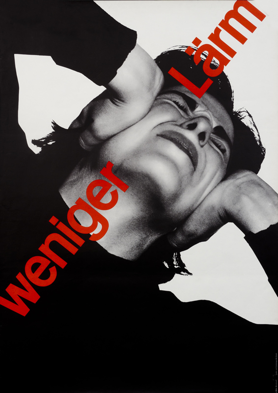
What it is — poster against traffic noise, Automobil Club der Schweiz.
Offset lithograph, 127.7 × 90.1 cm, printed by Lithographie & Cartonnage A.G.
Zürich (MoMA 513.1983).
Composition — citanje rada (v2) — v1 correction: no engine, no pedestrian.
The poster is a close-up of a human head, tipped back and rotated nearly upside
down, with hands pressed against the ears — white fists as sharp planes on
black. The face is cropped by the edges, eyes closed, expression of pain. Nothing
depicts noise; what is shown is a man suffering it. The system here is not
tame — proof that restraint and neutrality are not the same thing.
Colour — citanje rada (v2): black-and-white photograph + one red, only in
the lettering. Same formula as Hofmann's Stadttheater: the image is tonal, the
colour is a word.
Typography — citanje rada (v2): „weniger Lärm" set on a diagonal from
bottom-left to top-right, across the face, large, red, lowercase except the
noun. The slant of the text runs against the tilt of the head — two
directions collide, and that is the whole tension of the poster. Specific
typeface not confirmed.
Message — in three seconds: it hurts. Only then do you read less noise.
The message hits the body before the head — this is the strongest type of
poster there is. Important: noise is an invisible phenomenon, so it cannot
be depicted; what gets depicted is the consequence. This is close to a rule
for any abstract content (pollution, interest rates, stress).
Why exactly this way — public campaign, large format, street, viewer passing
by. Photograph + two words is the only construction that works under those
conditions. Rotating the head also solves a practical problem: the face fills
the entire vertical format, which an upright portrait would not.
What would kill it — straighten the head and the text. What's left is a
portrait with a headline. Or: add red into the image too — the word would lose
the only role it has.
Principles:fotografija-umjesto-ilustracijesistem-moze-biti-nasilanposljedica-umjesto-pojavedva-suprotna-pravcaboja-samo-u-tekstuResolved v2: the frame is a close-up of the head with hands over the ears;
no empty space — the image runs edge to edge; the text runs diagonally across the
face.
v1 correction: the tag dijagonala-kao-prijetnja here was based on the
assumption of an approaching engine; the diagonal exists, but it is typographic,
not threatening.
What it is — a magazine launched with Lohse, Neuburg and Vivarelli.
Trilingual (German, English, French), 18 issues, book printing. This is the
medium through which the method was exported — without it Switzerland
remains a local school.
Composition — trilingualism is not a problem but a generator: three
languages = three columns = a grid that imposes itself. The page structure is
the content of the magazine.
citanje rada (v2, cover no. 1, Design Reviewed): square format 255 × 280 mm;
the title in three lines (Ger./Eng./Fr.) large at top left, below it a small
subtitle in three columns; halfway down a huge number „1“, and below it
four columns — a narrow left one for editors and masthead, then one for
each language of content. The top third and the right side are empty. The
cover template is Vivarelli's (Fonts In Use), not Müller-Brockmann's — the
magazine is the work of four people.
Colour — citanje rada (v2): cover no. 1 is black on white only. The
v1 claim of "black plus one extra" for the cover is not confirmed; the interior
has not been examined.
Typography — dokumentovano (Fonts In Use 15395): masthead and issue
number in Akzidenz-Grotesk Medium; all body text in Monotype Grotesque
215/216, because Akzidenz did not exist for Monotype composing machines. So
even here "one typeface" is not dogma — the substitution is technical, and the
type class stays the same.
Message — the magazine looks like its own thesis. This is the strongest
possible advertisement for the method.
Why exactly this way — an independent publication with no budget: the grid
is both the aesthetic and a way to lay out pages fast, without per-page
decisions.
What would kill it — designing every issue differently. A system that
doesn't repeat isn't a system.
What it is — a textbook, Verlag Niggli. The book that turned the method into
a taught subject and is still in print and in use in teaching today.
Composition — the book is its own proof: every example is laid out according
to the rule it explains. Module, column, gutter, image fields.
Colour — black plus one, same as the magazine.
Typography — grotesque (sans serif); module height derived from a whole
number of baseline units. This is the central sentence of the whole book and
the most useful thing in it.
Message — this can be taught. Hence its global reach.
Why exactly this way — didactic; the book has to be workable by hand, without
a computer. That's why all the procedures are arithmetic.
What would kill it — illustrating it with "nice" examples instead of derived
ones. The book lives on the fact that every example can be repeated by you.
Bridge to practice: poster · graphic design · motion
Poster
Derive the grid from the typeface, not from the format. Module height =
a whole number of baseline units. In Illustrator: set the leading first, then
build horizontal guides from it, only then divide the width into columns. The
reverse order (divide a B2 sheet into four) is what produces those "almost
Swiss" posters that never sit right.
Before you draw — ask which abstract structure is analogous to the content.
For a concert: interval. For a play: repetition and interruption. For an
exhibition: sequence. If you start from the motif, you've got an illustration.
Two values before a third colour. In his work, hierarchy is almost always
carried by contrast, and colour is a signal. Test: convert your poster to
grey — if the hierarchy falls apart, the colour was doing the composition's job.
For a series (festival, season, cycle): a rule, not a single piece. Define
what repeats and what alone is allowed to vary. Tonhalle got its identity from
exactly that.
Graphic design
A technical constraint is a tool, not an obstacle. Linocut forced him into
large flat areas; risograph, screenprint, or bad printing do the same today.
Choose the constraint before you start.
Overprint as a third value — with relief printing and screenprint, overlapping
two colours gives you a third one for free. This is directly applicable to your
raster/dither language.
Multilingualism as a grid generator (Neue Grafik). In a Bosnian/Herzegovinian
context, bilingual or dual-alphabet material isn't a layout problem — it's a
reason for columns.
Document the system as you build it. His reach doesn't come from the poster
but from the fact that he wrote the method down. The same applies to your
LØADERRØR system.
Motion
The grid has a time axis too. What is a spatial module for him becomes a
module in duration in AE: if the base unit is 6 frames, all pauses and durations are
whole multiples of that unit. It's the fastest way to stop an animation from looking
"almost right".
Proportional sequence instead of hand-tuned easing per element. Derive stagger
delays from a sequence (e.g. 1, 1.618, 2.618), not by feel. Same argument as his
circle layout.
Analogy instead of illustration works in motion too. Animate sound or music
material as structure (interval, repetition, break), not as a scene —
that's Musica Viva translated into time.
Two values first, colour after. Make the whole animatic black and white.
If reading the frame depends on colour, the composition isn't finished.
Series > single piece. For YouTube/gaming animations: define a system
(intro template, type scale, tempo) and repeat it. Repetition is identity,
and it's cheaper too.
Bad imitation
Grid drawn, not derived. The format gets split into 12 columns because 12 is a nice
number. For him, module height = a whole number of base lines; the test from
_PRINCIPI: shift the leading by 1 pt — if the grid doesn't change, it wasn't derived.
Circles "by feel". The look of Musica Viva gets copied, sizes picked by eye.
Elam measured them at a ratio of 2:5. Without a rule that's decoration with an alibi.
Helvetica as proof of Swissness. A neutral typeface is picked and the job is
considered done. For him, typeface neutrality is a consequence of the stance that the designer doesn't
comment on the content — and the stance shows in the structure, not the font.
Analogy that's actually illustration. For a concert, "sound waves" get drawn
that look like sound waves. His Beethoven doesn't depict sound but crescendo
as a progression of thicknesses. Test: can you say what the image depicts? If you
can, you've missed the point.
System without a series. One "systemic" poster gets made and that's it. A system
that doesn't repeat at least three times isn't a system, it's the style of one piece.
Neutrality as an excuse for boredom.weniger Lärm is a violent poster.
Restraint isn't the same as mildness.
The brief through their eyes
(fill in current job) — First move: which abstract structure is analogous to
the content (interval, progression, repetition, break)? Draw that, with no motif.
Second: derive the grid from the base line of the text, not from the format. Third: everything in two
values; colour enters only at the end and carries exactly one piece of information.
Exercises
No motif. Make a concert poster using only concentric
arcs or a row of squares, two values, one typeface, two sizes.
Forbidden: any kind of image. Time: one evening.
Grid from the typeface. Take one of your existing posters, measure the leading, derive the module
from it and re-lay-out the piece. Compare.
Motion module. Take a 10-second animation and re-quantize all durations to
multiples of one base unit (e.g. 6f). Change nothing else.
Invisible phenomenon. (new, from weniger Lärm) Make a poster for something that
can't be photographed — noise, interest rates, fatigue. Forbidden to show the phenomenon;
show the effect on the body. One photograph, one word, one colour.
Motion study — "Crescendo as progression" (5 s, AE)
Black and white, no colour. One arc appears at second 0. Every half second the
next one comes, thicker and further out by the 2:5 rule (not by feel), up to second 4.
At second 4 the whole image flips values (black↔white) in a single frame and stops there.
Rules: all durations are multiples of one unit (6f); no easing by feel;
the only "effect" in the study is the flip.
Rebuilding the benchmark — Musica Viva 1958 (version with circles)
The skeleton has already been measured (Elam): a square inscribed in the format, circle centres on
the square's diagonal, diameters in a ratio of 2:5, lines connecting the centres at 90°,
format divisions at 1/2. Task, 45 min in Illustrator: draw the construction
(square, diagonal, four circles at 2:5), then add your own text in three columns
at the bottom. Without looking at the original. Check: do the circles touch exactly, or do they
overlap — for him, they touch.
Notes on sources
v2 (06.09.2026): works 01–06 seen in browser (V&A, PGDA, MoMA, Behance);
07 and 08 are books/journal and remain dokumentovano. No field is empty anymore.
v1 corrections — two major:
04 Musica Viva is not "a progression of squares and circles" but a large
diamond with scattered small squares in four colours. v1 described a different poster.
06 weniger Lärm has no motorcycle or pedestrian: it's a close-up shot of a head with hands
over the ears, the caption in red diagonally across the face.
02 Schützt das Kind! is not "a collision of trajectories in emptiness" but a scale
disproportion (huge wheel, tiny child on the yellow stripe).
Most important finding: two different Musica Viva posters from 1958. The diamond one (MoMA) and
the one with circles (concert 7.1.1958). Elam measured the one with circles — v1
attributed her geometry to the diamond one. Recorded as 04b.
Elam's geometry has been entered (2:5, square, 90°, 1/2) and Behance works through the
browser — the old note about 403 applies only to the cloud container.
Remaining: measurements that require a local image (progression of arcs in Beethoven
arithmetic or geometric; 15 modules in der Filma 3×5 or 5×3); portrait.
New local tags: rotacija-nosi-cijelu-kompoziciju, gustina-kao-ritam,
progresija-debljina, izvrtanje-vrijednosti, centar-izvan-formata,
posljedica-umjesto-pojave, dva-suprotna-pravca, praznina-kao-glavni-potez,
prozirna-slova-vezu-podlogu, boja-kao-znak-ne-kao-ton.
Template (23.09.2026, session 24): fm brought to template — status: gotovo,
all 8 works have izvor_slika, font, paleta (k-means from image), principi aligned
with v2 corrections from the body (02, 03, 04, 05, 06 were on old v1 tags); ostali_radovi
removed from fm (all in the table). Opus palette measured (7 colours).
Confirmed typefaces (Fonts In Use, designer 61): Akzidenz-Grotesk for 02 (ACS campaign),
03 (Tonhalle, Beethoven in the image), 05 (der Film). 06 weniger Lärm — only via
a collective post 1329 (a comment mentions it, image is collective) — with reservation. 04 Musica Viva
is not individually confirmed. 08 — PGDA states Helvetica; not verified.
Neue Grafik (07): the cover format is Vivarelli's; cover no. 1 black on white,
four columns; Akzidenz Medium + Monotype Grotesque 215/216 (Fonts In Use 15395).
Discrepancies: der Film — MoMA measurements 90.1 × 127.6 cm (landscape), image upright;
Schützt das Kind — PGDA/Swann 35 × 50 in (order, same problem). The 08 image is the
orange cover of the 1996 edition, not the 1981 first edition. The 06 image is a trade
photograph (International Poster Gallery) — the MoMA record has no image.
Musica Viva — third version: MoMA 4885, 1957, photolithograph (Bollman AG) — added to
Other Works; not seen.
Small accents from MoMA og:image (512 px) — red/blue/yellow in 04 at 0.2% each, red in 05
comes out dark maroon — unreliable, to repeat on the local image.