the making process is the message — text cut, written, built and photographed
Sagmeister Inc. (New York, 1993–), Sagmeister & Walsh (2012–2019) Bregenz (Austria) → Vienna → New York (Pratt) → Hong Kong → New York
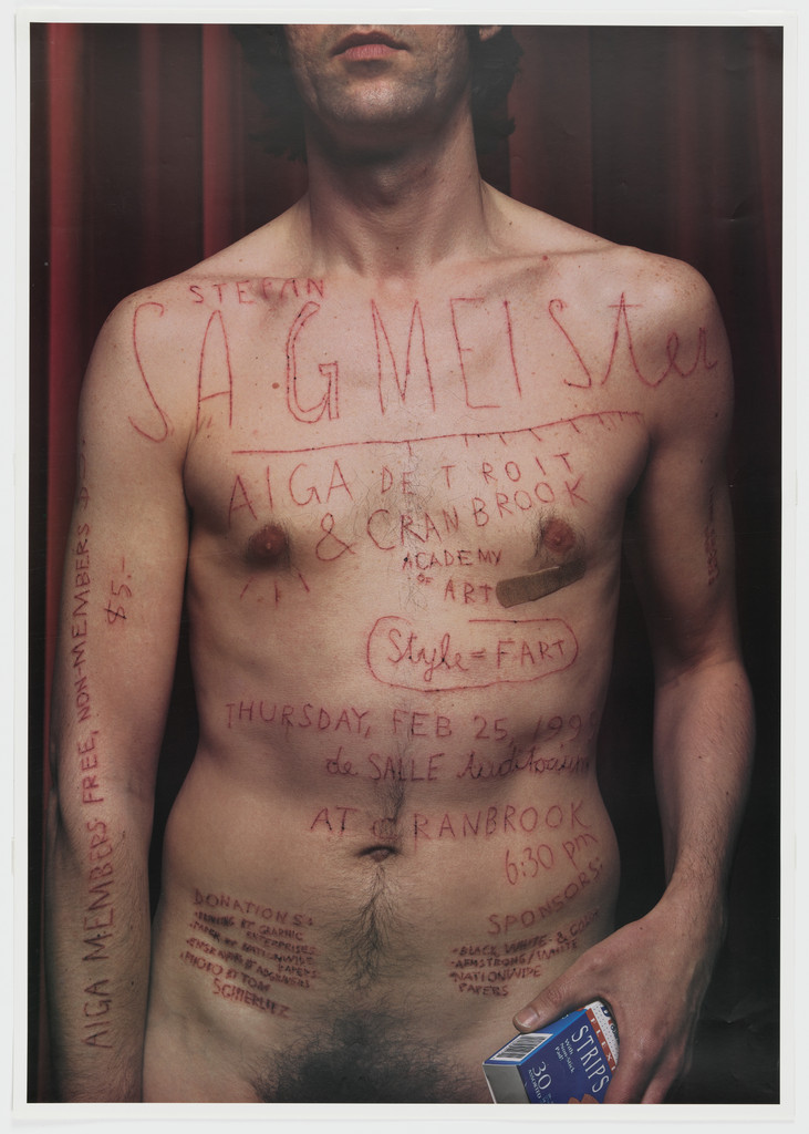
„Style = Fart“ — carved into his own skin on the poster AIGA Detroit 1999 (MoMA 469.2006; AIGA medalist 2013 cites the same). This is the only quote confirmed ON the work; the v1 quote „Style is not neutral, but it is also not the enemy“ was not found in any source — do not use.
Biography
Born 6 August 1962 in Bregenz (Vorarlberg, Austria). Does his first design at fifteen for the youth magazine Alphorn (Wikipedia). Graduates in 1986 from the Hochschule für angewandte Kunst in Vienna; a Fulbright scholarship takes him to Pratt in New York (MFA). In 1991 he works at Leo Burnett's design group in Hong Kong — an advertising agency, not a studio; this is the only commercially "big" job in his biography and remains the negative against which he will later measure everything. In 1993, briefly with Tibor Kalman at M&Co in New York, and that same year opens Sagmeister Inc. — deliberately a small studio (AGI: „deliberately small“), with two to three designers.
The first ten years of work are the music industry: Lou Reed (1996), David Byrne (1997), Rolling Stones (1997), Pat Metheny (1997), Aerosmith, Skeleton Key; two Grammys (Talking Heads box 2005; Byrne/Eno 2010, Wikipedia). In parallel, pro bono posters for AIGA (Fresh Dialogue 1996, New Orleans 1997, Detroit 1999) — it is exactly these posters, not the sleeves, that enter MoMA (of 15 MoMA records online, 10: posters AIGA ×3, Zürich 2003, SVA 2004, Punctuation 2004, Chaumont 2004, Stealing Eyeballs 2001 and two Casa da Música — not a single sleeve; the sleeves are in the Cooper Hewitt: Feelings, Imaginary Day). A year-long sabbatical without clients every seven years (v1, AIGA: sabbatical 2008 in Bali; the first, 2000–01, is not confirmed by a source in this session). Around 2003 he concludes that the CD as a format is dying (AIGA 2013) and shifts focus to his own text: the series Things I Have Learned in My Life So Far (2004–2008, book Abrams 2008 with 15 different covers), The Happy Show (ICA Philadelphia 2012), Beauty (2018–19). 2012–2019 Sagmeister & Walsh with Jessica Walsh. AIGA medal 2013; National Design Award 2005; "Austrian of the Year" 2018 (Die Presse). Teaches at SVA (MFA Design).
Working conditions worth knowing: he chooses his own clients, writes his own text (diary → maxims), and appears in the work himself (body on the Detroit 1999 poster). From Eye 41 (Walters on Made You Look): in the book he grades every piece of work with a school mark of 1–5 and states the hours spent — Print cover 1996 mark 4 with a large fee, Pat Metheny Imaginary Day mark 1–2 with 298 hours for a four-figure fee, and a welcome poster for a schoolmate a flat one. This is not an anecdote but a method: he measures the value of work by hours invested and personal stake, not by fee.
Influences
Studied with
Hochschule für angewandte Kunst, Vienna — diploma 1986 (Wikipedia; AIGA states MFA)
Pratt Institute, New York — Fulbright scholarship, MFA (AIGA, Wikipedia; years unconfirmed)
Tibor Kalman / M&Co, New York — 1993, briefly; AIGA calls him a mentor
Borrows from
Shirin Neshat — handwriting on the face/skin as the source of the typography for Lou Reed 1996 (sagmeister.com, stated by the author himself)
telephone doodles and turn-of-the-century Art Brut — Jambalaya 1997 (sagmeister.com, stated by the author himself)
Assyrian relief (lion) — Bridges to Babylon 1997 (sagmeister.com)
grandfather, calligrapher/sign painter — origin of the maxims built in material (creativepro, stated by the author himself)
Edward de Bono — the random-object method as a starting point (creativepro)
Koolhaas's Casa da Música building — the building's geometry taken as the logo (sagmeister.com)
Martin Woodtli — designer on AIGA Detroit 1999 (Cooper Hewitt); later independent in Zürich
Hjalti Karlsson — designer of Bridges to Babylon, Feelings (sagmeister.com); later Karlssonwilker
Matthias Ernstberger, Ralph Ammer, Richard The — Casa da Música, Things I Have Learned (sagmeister.com)
Contemporaries
David Carson — same decade, same music industry; hand and marker versus knife and model
Barbara Kruger — text on the body/face as accusation (Kruger) and as confession (Sagmeister)
Paula Scher — Pentagram, same city; identity as behaviour (Public Theater / Casa da Música)
Who he learned from
Angewandte Vienna (until 1986) and Pratt (Fulbright) — institutions confirmed (AIGA, Wikipedia), professors are not named in any source; do not attribute.
Tibor Kalman / M&Co, 1993 — AIGA calls him a mentor; the stay was short (v1: „briefly“). What was visibly taken over: concept before style, humour as a tool, text as the main material.
What he steals
Shirin Neshat — photographs with Persian script over face and hands; Sagmeister himself cites her as the source of the typography for Lou Reed 1996 (sagmeister.com). Difference: with Neshat the text is someone else's (poetry) and calligraphic; with him it's the singer's own and scrawled.
Telephone doodles and Art Brut (he cites this himself, Jambalaya 1997) — "scribbly type" that MoMA calls his signature.
Assyrian relief — the lion on Bridges to Babylon 1997.
His grandfather, a sign painter and calligrapher (creativepro) — the origin of the idea that a sentence is MADE in material, not typed.
Architecture as a ready-made mark — Koolhaas's Casa da Música taken literally as a logotype.
Edward de Bono — a random object as a starting point (creativepro).
Who he influenced
Jessica Walsh (partner 2012–19); Martin Woodtli, Hjalti Karlsson (Karlssonwilker), Matthias Ernstberger, Ralph Ammer, Richard The — all passed through the studio (credits sagmeister.com, Cooper Hewitt).
More broadly: the current of "make a letter from objects and photograph it" in the 2000s (lettering from food, thread, objects) — not documented as a direct lineage in any source; remains a hypothesis.
Opposite direction: David Carson and Paula Scher are contemporaries, not students — see Pairs.
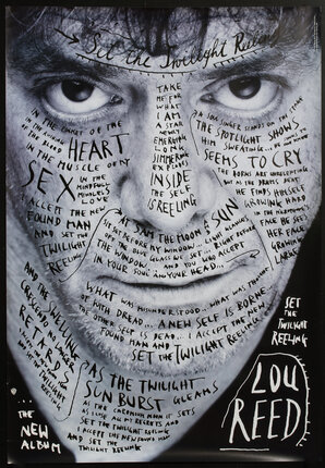
What it is — poster (99 × 68 cm) and CD booklet cover for Lou Reed's seventeenth studio album, Warner Bros., February 1996. Photography by Timothy Greenfield-Sanders; design by Sagmeister and Veronica Oh; song lyrics handwritten across the face. CD: "a deep blue-toned jewel case combined with a very bright portrait" (sagmeister.com); the back, the disc, and the tray card together form a diagram of an eclipse — "twilight". Typefaces on the sleeve (Fonts In Use): Bank Gothic, ITC Franklin Gothic, Shelley Script, ITC Kabel — but on the POSTER there is no set typeface, it's all handwriting.
Composition — the face fills the format edge to edge: cropped at the hairline above and below the chin, no shoulders. The eyes sit at y ≈ 28–33%, exactly in the upper third, and are the ONLY thing clear of text — everything else is written over. The text doesn't follow the format but the face: across the forehead it runs in arcs that repeat the eyebrows, down the cheeks in upright columns, around the mouth in short lines, under the chin it gathers into a funnel. The album title in cursive script sits at the very top of the forehead (y ≈ 22%); "LOU REED" in outlined capitals lower right (x 60–80%, y 78–90%); "the NEW ALBUM" lower left; the title repeated upright along the right edge. The eye enters the eyes, descends over the text as over topography, and stops at the name — the only element with an outline.
Colour — the poster (Chisholm scan) is black and white: grey photograph, black handwriting, black background that swallows the bottom (y > 88%); the PGDA photograph of the same poster on a wall is distinctly blue. The CD is documented as blue (toned case). A conclusion that must be left open: there are at least two versions of the tone — black-and-white and blue-toned; do not claim which one is "correct" (see Notes on sources). The effect is the same: a single tonal image, no other colour, so the handwriting remains the only contrast.
Typography — the whole poster is handwriting, fast, uneven, capitals and lowercase mixed; key words from the lyrics (HEART, SEX, INSIDE, SKIN, "SEEMS TO CRY", "SET THE TWILIGHT REELING") are 2–3× larger than the rest and scattered across the face as accents — hierarchy by size, not by position. The source is Shirin Neshat (he cites her himself): text on skin. The difference from Neshat — hers is calligraphy, his is scrawl; it's precisely this carelessness that makes the text read as "his own" rather than as decoration.
Message — the singer IS the text; the lyrics are not next to the portrait but on it. The three-second test: face + name = a poster for a musician, passes. The five-metre test: only the face, the eyes, and "LOU REED" read — everything else is texture; the handwriting doesn't have to be read to work (it works as skin).
Why exactly this way — according to sagmeister.com, on this album Reed was moving out of a "dark" image toward renewal; the design had to solve how to show change without illustration. The answer: the singer carries his own words, literally. The constraint of the format (a portrait is mandatory for music promotion) turned into a carrier for text.
What would kill it — arranging the lyrics into a tidy block next to the face. The moment the text moves off the skin onto the format, the poster becomes an ordinary ad with a portrait and a quote. Second: colouring the words — a single colour of handwriting is the condition for the face to remain a face.
Principles:tip-na-tonskoj-masi-ne-na-formatu (second author after David Carson — here the cleanest case: the text sits on none of the edges of the format, only on the masses of the face) postupak-je-poruka (local — the hand on the skin is the content, not the style)
To verify against the image: who physically wrote on the face (Sagmeister in the photograph or on the skin?) — no source says; the tone of the original poster (b/w or blue).
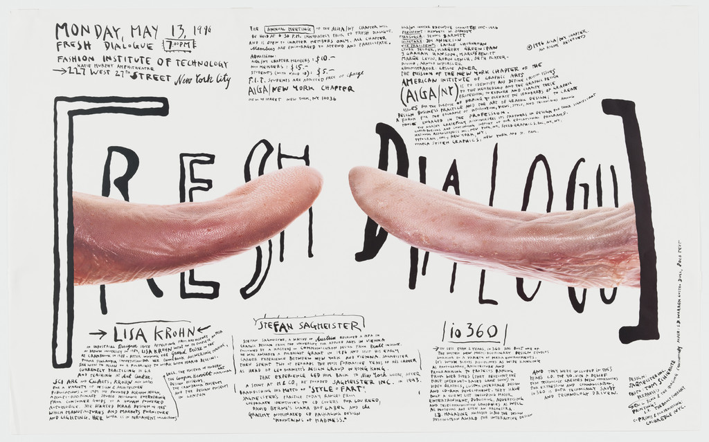
What it is — poster for the AIGA New York lecture series "Fresh Dialogue", 1996; lithograph, 61 × 99.1 cm, landscape format. Photographer Tom Schierlitz shot two beef tongues from a nearby market with a large-format camera (MoMA). MoMA: "the somewhat obscene effect of the elongated wagging tongues" — the studio accepted it, some AIGA members did not.
Composition — white plane; two tongues enter from left and right and almost touch tips at the centre (x ≈ 48–52%, y ≈ 55%) — that's the only point of tension. Across the full width, BEHIND the tongues, large outline letters FRESH DIALOGUE drawn in marker (y ≈ 30–75%), so the tongues cover the middle of the letters. Small handwriting (date, place, speakers' names) in the upper left and lower left corners, like notes in the margins. The eye moves: tongues → gap between them → title that completes itself in the head.
Colour — two: pink-red of the meat and black marker on white. There's no third; white is the paper, not print. The meat gives the only saturated colour and that's why it holds the centre.
Typography — outline capitals drawn by hand, uneven height, like a quick sign on cardboard; small text pure handwriting. Not a single letter is from a font. Opposite register: technically perfect large-format photography against deliberately clumsy marker — gest-rukom-nasuprot-rezu.
Message — "dialogue" = two tongues; "fresh" = raw meat. A rebus literal to the point of discomfort. Three seconds: two tongues, the word DIALOGUE — it works, even from five metres. Up close: the unease (obscenity) is intentional and documented (MoMA).
Why exactly this way — low budget and pro bono work (MoMA: pro bono AIGA series); one photograph, one marker, white paper. MoMA formulates the method of the entire body of work on this piece: "compelling concept … executed with a raw and straightforward technique".
What would kill it — setting FRESH DIALOGUE in a clean grotesque; then the tongues would be an illustration next to the title, not the title itself. Or: spacing the tongues apart — the tension is in the fact that they almost touch.
Principles:nadjeni-predmet-kao-rijec (fourth author — tongue = dialogue, cut out on white without background, exactly the C&G vitrine) gest-rukom-nasuprot-rezu (sixth author) postupak-je-poruka (local)
To verify against the image: speakers' names in the small text — not read (too small in the panel).
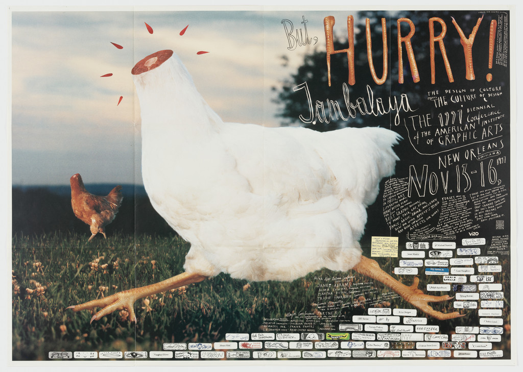
What it is — poster for the national (biennial) AIGA conference in New Orleans, 1997; lithograph, 67.3 × 95.3 cm, landscape format, double-sided (programme on the back — MoMA has both sides). Design, illustration and lettering by Sagmeister. Eye 41 calls it a "'headless chicken' poster / programme".
Composition — a large white headless chicken occupies the left two-thirds and the full height, running to the right; legs on a brick wall that forms the bottom third (y ≈ 65–100%); above the wall, grass and dark sky. A small brown chicken in the field on the left (x ≈ 15%, y ≈ 45%) gives scale — the large one is monstrous. The text is squeezed into the upper right quadrant (x 60–98%, y 5–45%): "HURRY!" in red, "Jambalaya", the dates "NOV 13–16" and small handwritten questions. The eye: chicken → headless neck → HURRY! → small text.
Colour — photographic: white feathers, red legs and the red cut of the neck, ochre brick, green grass, dark blue sky; text red and black. Red connects the wound and the word HURRY — the only colour that appears in both image and text.
Typography — marker scribbles, capitals and lowercase with no order; MoMA: "Sagmeister's signature scribbly type"; the author himself: "telephone scribbles and turn of the century Art Brut". Nothing from a font.
Message — MoMA lists four readings the work offers simultaneously: a metaphor for the profession (we're running around like headless chickens), a call to stop running and come to the conference, a voodoo symbol tied to the city, and a "statement against the abuse of technology and the over-sleek graphics of the 1990s". The poster itself WRITES OUT these questions in small text ("Is it a metaphor for the profession? …") — the image poses the question, the text doesn't answer it but repeats it. Three seconds: the headless chicken — memorable. Five metres: white mass on brick, HURRY! — it works.
Why exactly this way — 1997 is the peak of digital "slickness"; the poster deliberately looks like a photomontage made with scissors and marker (the brick, grass and chicken don't share light). Pro bono, one image, one hand.
What would kill it — giving the chicken a head. Or: setting "Jambalaya" in a nice script — the joke would become decoration. Or: removing the small chicken — the large one would lose its scale and become just a photograph.
Principles:analogija-umjesto-ilustracije (headless chicken = the profession; doesn't depict the conference) gest-rukom-nasuprot-rezuslika-kao-pitanje (local — the work itself writes out possible readings and leaves them open)
To verify against the image: the back (programme) hasn't been reviewed; whether the chicken was photographed or composited from two photographs.
Luaka Bop / Warner Bros. (art direction David Byrne)
Technique
printed paper and plastic; doll modelled on Byrne (clothing by Adelle Lutz with Michael Daube); photography Tom Schierlitz; letters built as a model then photographed (Cooper Hewitt)
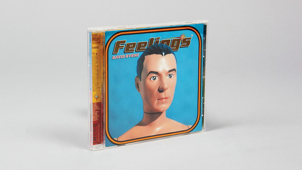
What it is — CD cover, 1997; creative direction Sagmeister, art direction David Byrne, design Sagmeister and Hjalti Karlsson, photography Tom Schierlitz; doll clothing by Adelle Lutz with Michael Daube (Cooper Hewitt). Printed paper and plastic, jewel case, 6-page booklet; manufactured in the USA. Cooper Hewitt: "The type was made as an actual model and then photographed."
Composition — front: head and shoulders of the Byrne doll (plastic face, straight hair) centred on a blue field, looking straight ahead; the title "Feelings" arcing across the top fifth, below it small DAVID BYRNE; the image has rounded corners like a card (Cooper Hewitt: "rounded corners"). Back: the whole doll on a pink field with a mood colour next to each song. Inside: a smiling doll on a yellow field; on the disc and below it, "David Byrne Mood Computer" — a circle with a pointer (arrow) over coloured fields.
Colour — blue (front), yellow (inside), pink (back) — three solid fields, one for each side; plus a mood scale "from blue through green and red to yellow" (Cooper Hewitt). Colour here isn't decoration but CONTENT: each song has a feeling-colour, and that code is read on the disc.
Typography — the title is a physical model of the letters (three-dimensional, cast shadow, as if made of vinyl or rubber), photographed — not a font; the other lettering is small, not read.
Message — the album is called Feelings, so the cover is a feeling-measuring device: four dolls (happy, angry, sad, content) and a mood computer — the listener turns the disc and "reads" how they feel. Three seconds: plastic Byrne, it works. The interaction requires holding it in your hand — this is a cover that can't be reproduced as a thumbnail without losing half of it.
Why exactly this way — Byrne is the art director (sagmeister.com), the theme is emotional, and Sagmeister's response is a cold, mechanical colour code (see creativepro: personal content deliberately put into "cold typography"). The jewel case and disc are treated as a moving part, not as packaging.
What would kill it — a real Byrne instead of the doll. The doll allows four faces of the same man without acting; a photograph would turn it into a portrait of the singer.
Principles:slovo-je-napravljeno-pa-snimljeno (local — documented by Cooper Hewitt) program-umjesto-artefakta (sixth author — the colour code per song + mood computer are a rule the listener executes; a borderline case, the system is small)
To verify against the image: the colour arrangement per song on the back; how the disc rotates relative to the scale below it (Cooper Hewitt doesn't describe the mechanism).
05 · The Rolling Stones — Bridges to Babylon (1997)
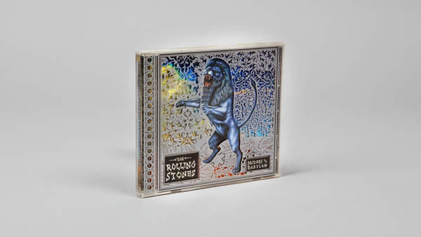
What it is — CD packaging, 1997 (Virgin); creative direction Sagmeister, design Hjalti Karlsson, photography Max Vadukul. sagmeister.com: „an Assyrian lion embedded into a special manufactured filigree slipcase“; interior with a desert band that follows the tour's stage design. Not in MoMA or Cooper Hewitt (not verified in the Cooper Hewitt collection — locked).
Composition — slipcase: metallic silver with a die-cut filigree ornament over the whole surface; in the centre a rearing lion in profile, facing left, blue-grey metallic (x 30–70%, y 15–85%); band name in a small dark plate (tablet) bottom left, title bottom right. Inside: a digipak that unfolds into a continuous desert — orange dunes, blue sky, lion in the same pose; disc in the centre with the lion. Eye path: ornament → lion → name plate.
Colour — outside monochrome metal (silver + blue-grey); inside two saturated complementary fields (orange desert, blue sky). The outside/inside contrast is both thermal and material: cold metal → warm sand.
Typography — band name in capitals inside the plate, like an inscription on a relief; typeface not named. Typography is small and subordinate to the ornament — the opposite of 01–03.
Message — Babylon (Assyrian lion, filigree) + „bridges“ (desert that unfolds into a band). Three seconds: lion in silver — luxury, antiquity. Five metres: metallic shine; name doesn't read — doesn't need to, the Stones sell on shine. A rare Sagmeister piece without handwriting and without a joke.
Why exactly this way — the budget of a stadium tour allows for manufactured packaging (the filigree slipcase is „special manufactured“); the task was to connect the packaging to the stage, not to express the songs. Hence packaging, not image.
What would kill it — printing the filigree instead of cutting it. The whole argument is that through the holes you see what's underneath; as an image, the packaging would be kitsch.
Principles:istorijski-citat-kao-gradivni-materijal (Assyrian relief + Arabic filigree + desert — unconnected sources into one object; seventh instance, closest to posudjeni-vokabular-autora since all citations are „Babylonian“) omot-nastavlja-scenu (local — packaging is part of the tour's stage design)
To verify against the image: exact material of the slipcase (plastic with metallisation or metal?); dimensions; whether the lion is Vadukul's photograph of a sculpture or a drawing.
What it is — poster for Sagmeister's lecture at AIGA Detroit at Cranbrook Academy of Art, 25. 2. 1999; offset lithograph (SFMOMA; MoMA: lithograph), 99.1 × 69.9 cm. Art direction Sagmeister, designer Martin Woodtli, photography Tom Schierlitz (Cooper Hewitt). The text is carved with a scalpel (X-Acto) into Sagmeister's torso — sagmeister.com: cut by intern Martin. Cooper Hewitt: shown from the mouth down, holding a package of Duane Reade band-aids, on red fabric; a real band-aid below the right nipple.
Composition — torso full frame; head cut off at mouth height (y ≈ 0%), arms at the sides, hands below — one (in the image bottom right) holding a blue package of band-aids (x 68–85%, y 85–98%). Text follows the anatomy: name „SA·GMEISTER“ across the chest (y 20–32%), „AIGA DETROIT & CRANBROOK ACADEMY OF ART“ below, „Style = Fart“ in an ellipse on the left ribs (x 45–70%, y 45–52%), date and time around the navel (y 55–68%), small print conditions running vertically down the left arm („AIGA MEMBERS FREE, NON-MEMBERS $5“). Background red curtain, darker at the top. Eye path: name → Style=Fart → band-aid → package.
Colour — skin (warm ochre-pink) on dark red fabric; text is red because it IS the cut — the same colour as the background, so the letters read as a wound, not as lettering. The blue band-aid package is the only cold colour and the only printed object — hence it's the final stop for the eye.
Typography — carved capitals, trembling, uneven heights, with lowercase in the date; no typeface and no „designer's“ hand — the hand is the intern's, the body is the author's. Contrast: the photograph is clinically sharp, the letters are swelling.
Message — Lecture theme: the pain of the design process; the poster is pain, not a story about pain (v1: „Form and content are the same object“). „Style = Fart“ is a summary of a position that AIGA repeats in 2013 as his programme. Three seconds: a naked body with text — shock, memorable forever. Five metres: torso and red — reads as a body, the text doesn't read; close up: the text reads, and only then do you realise it's carved.
Why exactly this way — invitation for ONE lecture, audience of designers; the only way for a poster to speak about process is to show the process. Sagmeister himself says: „we tried to visualize the pain that seems to accompany most of our design projects“.
What would kill it — Photoshop. If the viewer suspects the cut isn't real, the piece is a lie; hence the band-aid and the package of band-aids — proof that the cut is a wound. Second: putting it on a shirt — text on a t-shirt is merch.
Principles:postupak-je-poruka (local — benchmark instance) slovo-je-napravljeno-pa-snimljeno (local) dizajner-pise-naslov (third instance after Herb Lubalin and Barbara Kruger — „Style = Fart“ is his own sentence; different title = different poster)
To verify against the image: how much of the text is actually carved versus subsequently reinforced with colour — no source says; Cooper Hewitt states „inscribed with an X-acto knife“.
07 · SVA — Thinking that life will be better in the future is stupid. I have to live now. (2004)
School of Visual Arts, New York (creative direction Silas Rhodes)
Technique
lithograph (MoMA); letters made of twigs with caterpillars and butterflies, photographed; design Sagmeister, Irina Thaler, Paul Rustand; retouching Steve West
Size
116.8 × 76.2 cm (MoMA 471.2006)
Type
letters built from twigs — no typeface; small program in handwriting
What it is — poster for the School of Visual Arts, New York, 2004 (SVA poster series creatively directed by Silas Rhodes); lithograph, 116.8 × 76.2 cm, portrait orientation. Design Sagmeister, Irina Thaler, Paul Rustand; retouching Steve West (sagmeister.com). The sentence is from Sagmeister's diary — one of the maxims from the series Things I Have Learned in My Life So Far. The letters are twigs; living on them are caterpillars, pupae and butterflies — „the whole life cycle“ (sagmeister.com).
Composition — six horizontal branches as lines of text (y ≈ 8, 20, 32, 45, 58, 70%), each carrying two-three words made of twigs; words grow towards the centre: THINKING LIFE / WILL BE BETTER / in the FUTURE IS / STUPID / I HAVE TO LIVE / NOW — „STUPID“ and „NOW“ largest. Below, „SCHOOL OF VISUAL ARTS“ on two branches (y 75–85%) and a small handwritten programme in the bottom tenth. Butterflies and caterpillars distributed along the branches as punctuation (x 10, 40, 70%). The eye reads top down, line by line, because the branches are lines.
Colour — one field: warm sienna/orange-brown with scattered yellow spots (lichen?); branches dark brown to black; butterflies orange and white. Practically monochrome in a warm key; the contrast is tonal (dark branch on light brown), not chromatic.
Typography — capitals made of twigs, with lowercase „in the“; the letters read because the branches are straight and the twigs short; there's no typeface. This is „lettering made of things“ in its purest form — a sentence about time written in a material that grows and rots.
Message — the maxim is literal and personal; the image adds meaning to it: a butterfly lives briefly, the whole cycle is visible — „live now“. Three seconds: the sentence reads through to NOW (the largest words are at the end) — it works. Five metres: STUPID and NOW, branches, orange — it works; SVA isn't visible, and that's fine (the school buys the attitude, not the logo).
Why exactly this way — SVA posters in the New York subway are a tradition where each designer gets the whole surface and a brief brief; Sagmeister isn't advertising the school but publishing his own sentence and signing the school below — the client accepts this because the audience is young and looking for an attitude.
What would kill it — setting the sentence in a typeface, and leaving the branches and butterflies as illustration. Then it would be a poster with a nature motif, not a sentence that is itself nature. Second: equal word sizes — without the growth towards STUPID and NOW the sentence has no rhythm.
Principles:dizajner-pise-naslov (sentence from the diary) slovo-je-napravljeno-pa-snimljeno (local) postupak-je-poruka (local — the slow building of letters from twigs = „live now“)
To verify against the image: whether the branches and insects are photographed or painted (retouching by Steve West suggests photography, the panel doesn't distinguish); exact text of the programme below.
08 · Casa da Música — identity and logotype generator (2007)
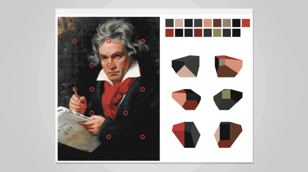
What it is — visual identity of the concert hall Casa da Música in Porto (building by Rem Koolhaas / OMA), 2007; creative direction Sagmeister, design Matthias Ernstberger, Ralph Ammer, Quentin Walesch. In 2011 MoMA acquired the software itself — "Logo Generator" — as a work (medium: Software). Applications: posters, programmes, business cards, cakes, flags (v1).
Composition — the logotype is the building: an irregular polyhedron with 17 faces (v1) shown in six rotations, each as a flat silhouette with white edges; next to each, a lowercase caption "casa da música" in a light rounded grotesque, always to the right of the mark, at the same height. The mark is never the same twice, the caption always is. On applications: a portrait (Beethoven, Philip Glass, Lou Reed) → a palette of six swatches → the polyhedron's faces coloured with those swatches. The eye: recognises the shape of the building, then the colour, only then the name.
Colour — there is no house colour. The software samples colours from the image the logo is paired with (a performer's photograph, a concert poster) and distributes them across the faces — v1: "an algorithm derives a palette from any image by sampling it". For institutional use the mark is black. The palette is therefore a PROCEDURE, not a list.
Typography — one grotesque, lowercase, light, with rounded terminals; it never changes. Typography is the only constant of the system — the opposite of David Carson, where the typeface changes and the position stays fixed; here the MARK changes, the typeface is fixed.
Message — sagmeister.com: "the building itself is a logo"; the system "transforms itself like a chameleon from application to application", "dice-like by displaying different views and facets of music". Three seconds: the building is recognised (if you know it) — Porto knows it. Five metres: a solid black shape — reads as a mark. Risk: outside Porto the shape is nothing; that's why the caption never goes missing.
Why exactly this way — the architecture was more recognisable than any mark that could be drawn, and it covered every genre (classical, rock, electronic) because it is an empty form. Colour taken from the image solves how one mark can serve both Beethoven and Lou Reed without clashing with their images.
What would kill it — a single fixed rotation and one house colour. Then it's just a logo shaped like a building — boring, and in conflict with every performer's photograph. The argument lies in the generating, not the result.
Principles:program-umjesto-artefakta (fifth author — the software IS the work, MoMA holds it as such; the most literal case since Karl Gerstner) identitet-je-ponasanje-ne-znak (third author after Neville Brody and Paula Scher — the mark rotates and recolours, the rule is a list of what's permitted) paleta-uzorkovana-iz-slike (local — colour isn't chosen but taken from the content)
To verify against the image: MoMA 378.2011 (poster, 2nd anniversary) has no image online — no printed application has been reviewed in the museum record; the figure of 17 faces is from v1, not confirmed by a source.
Other works — evidence, no analysis
Pat Metheny Group — Imaginary Day, 1997 — CD packaging, Warner Bros. / WEA; triple cardboard, 10-page booklet; the entire package is a „symbolic system to be deciphered“ — pictogram code in 5×9, 10×23, 13×23, 17×38 grids, photography in cells and on the disc (Cooper Hewitt 2000-61-9). Eye 41: rated 1–2, 298 hours. Tag: sifra-umjesto-teksta (candidate — not reviewed). to verify against the image.
AIGA New Orleans, programme (back), 1997 — MoMA 468.2006 second image; not reviewed.
Pro-Pain — The Truth Hurts, circa 1998 — cover with an autopsy image („cut-up chick“); 135 hours; the author later (after Columbine) writes that it was wrong as a cover (Eye 41). No image. to verify.
Move Our Money, 2002 — campaign (client not given in source); Eye 44: the argument is made by pouring 150,000 pellets into a bucket — data as sound and duration. documented with reservation (lecture footage only).
Sagmeister Zürich, 2003 — poster, MoMA (works/102920; accession not verified); not reviewed.
Punctuation, 2004 and Chaumont, 2004 — posters, MoMA (works/102922, 102923); not reviewed.
Everybody Always Thinks They Are Right, 2007 (year per Six Cities Design Festival; sagmeister.com does not give a year) — six white inflatable monkeys, 10 m (33 ft) tall, in six Scottish cities for the Six Cities Design Festival, each holding one word; illustration Monika Aichele, production Sportogo (sagmeister.com). The author himself: „the maxim itself wound up a bit overpowered by the sheer massiveness of the animals“ — a documented failure by his own assessment. Tag: postupak-je-poruka (negative case: when the object outweighs the sentence).
Trying To Look Good Limits My Life, undated on sagmeister.com — leather belt, design Richard The; pixel letters are also the belt's holes (sagmeister.com). Tag: slovo-je-napravljeno-pa-snimljeno in functional form.
Things I Have Learned in My Life So Far, 2008 — book, Abrams, 256 pp., 15 different covers; design Sagmeister and Matthias Ernstberger, photography Henry Leutwyler (sagmeister.com; Design Reviewed has a cover image).
The Happy Show, ICA Philadelphia 2012 — Eye 83 (Joan K. Smith): invitation of salami with the word „Happy“ laser-cut into it; „Step Up to It“ — letters as towers of sugar cubes; infographics in yellow-black „caution tape“; gumball machines with yellow balls as a happiness scale; „roughly hand-drawn wall texts … as if Sagmeister is whispering in your ear“. Tag: postupak-je-poruka in space.
Rejected, checked against the work:nedovrsenost-kao-poziv (Carson's local tag; a candidate from the earlier logo for Detroit) — the cut in the leather is FINISHED and healed over with a plaster, nothing is left for the viewer to complete; masthead-mijenja-pismo-svaki-broj — there is no series with a changing typeface, Casa da Música changes the MARK, not the typeface; tekst-na-mjestu-pogleda — on the Lou Reed piece the eyes are the only place WITHOUT text; postupak-citljiv-kao-poziv (Reid) — the process is visible, but no one is meant to repeat it (a knife cut into leather is not an instruction).
Bridge to practice: poster · graphic design · motion
Poster
Text on the masses, not on the format (01): take a portrait, Image Trace at 2 colours just to see the masses of the face, then write by hand over those masses (Wacom, one brush, no corrections) — leave the eyes empty. Delete the trace. If the text still stands, it works.
Procedure is the message (06, 07): before sketching, answer the question "what is it made of, and why exactly that". A poster about waiting — letters made of dust; about deadlines — letters made of burnt matches. The material has to be in the subject, not in taste.
Analogy + question (03): an image that can't be explained in one sentence, and the poster's fine print itself offers three readings. Text doesn't close it off, it opens it up.
Graphic design
Identity as a programme (08): for LØADERRØR — instead of a fixed logotype, a rule: one shape (e.g. a glitch block), colours sampled from the image it's paired with (script: sample 6 colours from the image → assign to faces). What's delivered is a generator (p5/JS), not a PNG.
Colour code as content (04): when the job is "about feelings" (playlist, choice of episode), colour is data — one per item, the legend is part of the design.
Letter made then photographed (04, 06, 07): headline in physical material, shot on a phone under flat light — a 3D render never gives the same result (v1 note: "everyone can tell").
Motion
Handwriting as growth (01, 07): write-on across the masses of a face/object, not across the screen; in AE, Trim Paths along a path that follows the image's contour (Auto-trace a mask, then Trim). The text enters where the mass is dark.
Procedure visible in time (06): an animation that shows the MAKING, not the result — the cut, building from twigs, stacking cubes. One shot, one gesture, no editing.
Generator as a shot (08): an identity that spins within the motion (a 3D polyhedron in Cavalry/AE) and changes colour against the background — the logo doesn't "fly in", it rotates and recolours.
Bad imitation
Shock without content. The naked body and scalpel get copied, but the poster isn't about pain — so it's just provocation. What's copied is the look (the wound), not the rule (process = subject). Test: can you say what subject the material LITERALLY carries? If not, miss.
Handwriting as "authenticity". Scribble over everything, over both the layout and the image, because "it looks honest". Sagmeister's handwriting sits only on one mass (face, skin) and leaves empty spots (eyes). What's copied is the gesture, not the placement.
Letters made of things as a trick. A headline made of spaghetti for a pizzeria, of thread for a tailor — literal, without a joke and without a subject; that's illustration of the word, not process. Sagmeister's twigs aren't "about nature", they're about time.
Generator without a constant. An identity that changes EVERYTHING (shape, colour and typeface). Casa da Música changes shape and colour, but never the typeface and position of the lettering. Without a constant there's no recognition.
The brief through their eyes
For the current job — gaming animations (short humorous episodes about gaming culture) — Sagmeister would first write a sentence from his own gaming experience ("Rage quitting never improved my score") and only then ask what to make it from: broken controllers, cables, printed Game Over screens — and he'd PHOTOGRAPH it, not render it. The thumbnail would be that photograph, without any font at all. The channel would have a rule instead of a logo: one shape, colours taken from each episode.
Exercises
Portrait with text on masses (01) — one black-and-white photograph of a face, one text of 200 words; write it by hand (tablet) only over the dark and mid masses, leave the eyes and highlight points empty; three words 3× larger. Constraint: one colour, no layers for corrections. 60 min.
Sentence made of material (06/07) — write your own maxim (one sentence from a diary); choose a material that's ON TOPIC (not "nice"); build it on a table and shoot it with a phone by the window. No retouching. 90 min.
Mark generator (08) — in p5.js or Cavalry: one polyhedron/shape, a function that samples 6 colours from a loaded image and colours the faces; the lettering fixed, on the right, same height. Test with three completely different images. 60 min.
Motion study
5 s, AE: photograph of a face, static. The text is written in handwriting (Trim Paths over hand-drawn paths) only over the shadows of the face, the eyes stay empty; in the last second one word 3× larger "grows" across the cheek. One frame, one event: the principle is text on the mass, not the motif of the face. No easing on the write-on — the hand speed is constant.
Rebuilding the benchmark
Benchmark: AIGA Detroit 1999 (99 × 70 cm, portrait). Skeleton .svg: format 7 : 10; the torso fills the width (x 8–92%), head cropped at y = 0%; navel at (50%, 68%); name block y 20–32%, "Style = Fart" ellipse x 45–70%, y 45–52%; date y 55–65%; band-aid pack x 68–85%, y 85–98%; tonal zones — background dark red (almost black at the top), skin mid warm tone, text red at the same value as the background. Task: 45 min in Illustrator without looking at the reference — the body as two-three planes, text as hand-drawn lines on those planes, one cool blue rectangle bottom right. Compare the position of the ellipse and the pack.
both tip-na-tonskoj-masi-ne-na-formatu, music 1996 — Carson pastes someone else's typeface onto a found photograph (Ray Gun 24) / Sagmeister writes by hand over a commissioned photograph of a face (Lou Reed); for Carson the text is debris on the image, for Sagmeister the text is skin
text on the body — Kruger: a bold italic grotesque (sans serif) on someone else's photograph, the sentence accuses the viewer (Your body) / Sagmeister: a cut in his own skin, the sentence confesses the author (Style = Fart); the pronoun "your" / the pronoun "my"
both dizajner-pise-naslov — Lubalin writes the headline so that ONE letter can become an image / Sagmeister writes the sentence so that the WHOLE thing can be built out of material; letter / material
portrait of a musician with text, 1966 / 1996 — Glaser: profile as a silhouette, hair as a historical quotation, name in his own drawn typeface / Sagmeister: face en face, text as skin, name by hand; quotation / confession
both identitet-je-ponasanje-ne-znak — Scher: a rule about wood type, colour fixed (Public Theater) / Sagmeister: a rule about rotation, colour from the image (Casa da Música); behaviour of the type / behaviour of the mark
both program-umjesto-artefakta — Gerstner writes the programme in 1964, ahead of the machine / Sagmeister DELIVERS his in 2007 as software and MoMA acquires it as exactly that; theory / product
both nadjeni-predmet-kao-rijec — C&G: the object replaces one word, the rest is in type (Between the Wars) / Sagmeister: the object (tongues) is the whole word, and the rest is marker (Fresh Dialogue); display case + type / display case + hand
Notes on sources
Colour of the Lou Reed poster (01): the Chisholm Larsson scan is black-and-white; the PGDA photograph of the same poster on a wall is blue; the CD is documented as blue (tinted case). It's not resolved whether the poster exists in two versions or the PGDA shot is just lit blue. Don't assert.
Who wrote on the face (01): no source says whether the text was written on the skin and then photographed, or on the photograph; sagmeister.com only says the typography was inspired by Neshat.
Angewandte / Pratt dates: Wikipedia gives the diploma as 1986; AIGA cites an "MFA" in Vienna; the Pratt years are nowhere given. Unresolved.
Sabbatical 2000–01: from general knowledge, not from a source in this session; AIGA confirms only 2008 (Bali).
Number of polyhedron faces (08), 17: v1 only; not confirmed. MoMA 378.2011 (2nd-anniversary poster) has no image online — one screenshot was discarded.
Bridges to Babylon (05): no museum record (not in MoMA; the Cooper Hewitt collection is locked, not found through si.edu); the dimensions and material of the slipcase are unknown.
Analytical text per work: Cooper Hewitt (Detroit, Feelings, Imaginary Day) and MoMA labels (Fresh Dialogue, Jambalaya) give a description — 5 of 8 documented; Lou Reed, Bridges, Casa da Música — only sagmeister.com (the author's own description, not analysis) + v2 reading of the image. Eye has no Reputations piece on Sagmeister; Peter Hall's Made You Look (2001) is the main literature and isn't online.
v1 quote dropped (not found). v1 list of works: 22 items, 16 from sagmeister.com without a title, 1 artic (dead link), 5 PGDA — 1 usable (Lou Reed). Roster built from MoMA (10 online) + Cooper Hewitt + sagmeister.com/work (89 projects).
Typeface: only the Lou Reed CD has confirmed typefaces (Fonts In Use); the posters are handwriting/material — the "font" field is descriptive.