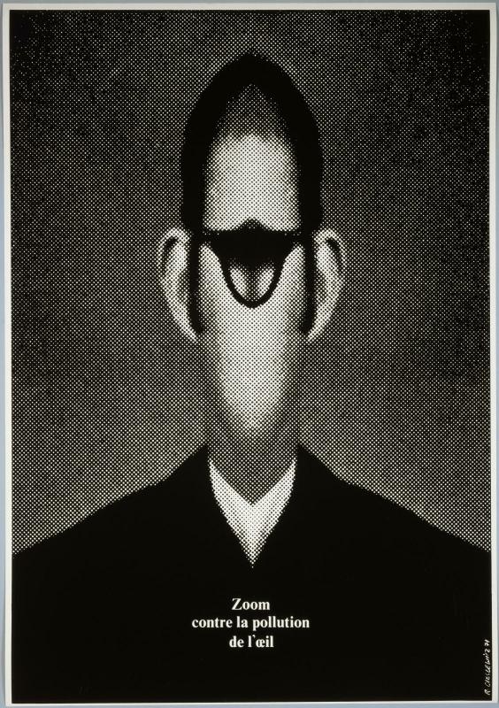
photomontage, enlarged halftone, mirroring — the image as an attack on the image
poster artist of the Warsaw school; AD Elle (1965–69), Opus International, Kamikaze; Centre Pompidou Lviv → Kraków → Warsaw → Paris (from 1963)
Palette of the œuvre
„It was my dream to make public pictures that could be seen by as many people
as possible. Hence the top importance of the poster — the street picture."
(MoMA, label for Ksiądz Marek, Polish Posters 1945–89 exhibition, 2009)
„I see myself not as an artist, but as a graphic designer." (Eye 9, 1993)
Quote from v1 „The image must be attacked" — not confirmed in either Eye or MAD
texts; do not use until a source is found.
Biography
Born 13.1.1930 in Lviv. Finishes his first school (School of Art Industry, Lviv)
in the middle of the war, 1943–46; after 1946 the family is relocated to Opole, where
he works in a cement plant. Kraków: art lyceum 1947–49, then ASP, poster
department, 1949–55 — four years of graphic composition under Jerzy Karolak, typography
under Gardowski, and stage design classes with Tadeusz Kantor. Kantor matters:
from him comes a feel for the figure as an object on a stage, not as a portrait.
1955–63 Warsaw. Works for the Central Film Distribution office, for the state agency
WAG (Eye: about a hundred offset posters a year — that is the rhythm in which one learns
to decide fast) and for the Polish Chamber of Foreign Trade. In 1956 he takes part in
shaping the magazine Projekt; 1959–62 art editor of the monthly Ty i ja
(the Polish „Elle" in a socialist edition). Awards: Grand Prix for film poster,
Karlovy Vary 1964.
In the early 60s he works in Genoa for Eugenio Carmi (Italsider) — large photomontages
in industrial promotion; first encounter with a format that the poster in Warsaw did not offer.
In 1963 he goes to Paris (MAD: he wanted to „check how the poster holds up under the neon
light of the West"; that same year in Poland socialist-realist legibility is again
demanded of posters). French citizen in 1971. AD of the magazine Elle
1965–69, Vogue 1966, Opus International from 1967; in 1968 Christian Bourgois
gives him the cover of the 10/18 pocket edition. 1969–72 member of the MAFIA agency (Maïmé Arnodin,
Denise Fayolle). 1973–76 teaches at ENSAD, from 1975 at ESAG Penninghen. Works
for the Centre Pompidou from its opening (exhibition posters: Paris–Berlin 1978,
Paris–Moscou…). In 1976, with the Panique group (Topor, Arrabal, Jodorowsky)
he makes Kamikaze — „revue d'information panique". From 1989 advisor at
Libération. Dies in Paris 21.1.1996.
He was married to the sculptor Alina Szapocznikow (died 1973) — documented in
the literature about her; included here as context, not verified in the sources of this note.
How he worked (Eye 9, 1993): he doesn't draw — photography, collage, watercolour, but no
drawing. Sketches at 1:10 scale, then enlargement; deliberately
unbalanced composition, nothing in the centre. He enlarged the offset halftone of a photograph until
the dot became visible, and when the repro camera couldn't go any further, he filled in
the dots by hand with a marker — a mechanical texture, hand-executed. Colours:
black and red; „lemon yellow, paired with black, has a striking effect". Typefaces he
likes: Block (Berthold), Milton (Glaser), Rockwell. „The circle is an obsession that
carried over into my work."
Influences
Studied with
Jerzy Karolak — ASP Kraków, poster department, 1949–1955 (four years of graphic composition; graduated under Karolak and Maciej Makarewicz) — Eye 9, culture.pl
Gardowski — typography, ASP Kraków — Eye 9
Tadeusz Kantor — attended stage design classes, Kraków — Eye 9
Zbigniew Pronaszko, Czesław Rzepiński, Mieczysław Wejman — painting/graphics, ASP Kraków — culture.pl
Borrows from
Mieczysław Berman and the Blok group (Polish constructivism) — he names them himself, Eye 9
Rodchenko and John Heartfield — photomontage he admired, Eye 9
19th-century engravings (popular illustrations) — collage period 1955–64, MAD 2018
Max Ernst — the principle of collage without glue, MAD 2018
mass media, advertising, print — pop period 1964–69, MAD 2018
Renaissance and medieval painting as hyperrealism — photomontages from 1975, MAD 2018
Alberto Korda (photograph of Che Guevara, 1960) — direct source for Che si
Contemporaries
Henryk Tomaszewski — same Warsaw school, opposite tool (brush versus repro camera); Tomaszewski praised his Mona Lisa — MAD 2018
Herbert Matter — photomontage and disproportion of scale, a generation earlier, in the service of selling
Karl Gerstner — enlarged halftone as a parameter (Opjekte 1966), not as an attack
Eugenio Carmi — Genoa, Italsider, large photomontages of the early '60s — Eye 9
Who he studied under
karolak (Jerzy Karolak, ASP Kraków — graphic composition), Gardowski
(typography), kantor (Tadeusz Kantor — stage design). He himself says: „I don't
think anyone influenced me", then in the same breath names Karolak, Kantor,
Berman and the Blok group. Take this literally: he had no stylistic teacher,
he had teachers of attitude.
What he loots
Polish constructivism — Mieczysław Berman (photomontages of the 30s) and the
Blok group; through them rodchenko and heartfield, whom he explicitly valued.
From there: photography as material, not as witness; an image that gets cut.
19th-century engravings — the collage period 1955–64 (MAD): anatomical atlases,
armour from an encyclopedia, popular illustration. Max Ernst as method („it's not
glue that makes a collage").
Mass media — from 1964 (MAD, „pop period"): photography from the press,
advertising, Korda, Mona Lisa as a disposable icon. This is a source he shares with
Corita Kent (Sister Mary Corita) and Warhol, but with the opposite sign: he doesn't celebrate, he dissects.
Renaissance and medieval painting — from 1975 (Changement de
climat): the old painting as „hyperrealism that replaces today's
photography".
His own technique — enlarged halftone, mirroring, repetition: the tool becomes
the motif. This is the point where his body of work touches yours.
Who he influenced
Individual names are not confirmed in the sources of this note — only institutions
(ENSAD 1973–76, ESAG from 1975) and the fact that MoMA's copy of Dziady is a
gift from Mirko Ilić (160.2016), which says something about who bought and looked at his work. The curator of
the RCA 2010 retrospective, Andrzej Klimowski, is a student of Henryk Tomaszewski — not
Cieślewicz. This remains open; check when processing Wolfgang Weingart and Neville Brody whether
the enlarged halftone as a language can be linked directly.
What it is — a poster for the state fashion house Moda Polska; photolithograph,
68.6 × 47 cm (MoMA 330.1961, gift of the artist). MoMA: after 1956 the regime
turns toward mass-consumption goods for foreign currency; the poster is a homage to the surreal fashion of Elsa
Schiaparelli (shoe-hat, lobster-hat).
Composition — a black plane; a woman's head in profile, turned left,
cut out of a grey photograph/engraving, placed in the lower half; on the head,
instead of a hat, a huge red rose taking up the top third. The eye enters
the rose (the largest, brightest mass), runs down the profile, stops at the lips. Bottom
left corner: a red-and-white halftone ornament as a „dress".
Colour — three: black background, grey head, red rose. Red is the only
saturated one and so the only one carrying „fashion"; the head is deliberately colourless —
the model is a carrier, not the subject.
Typography — in the reproduction seen there is almost no text; if a
logotype exists, it is small. To verify against the original.
Message — three seconds: „rose as hat = elegance that's a bit mad". Five
metres: a red flower on black, readable from the street. There's no fashion (no
dress, no cut) — there is a sign for fashion.
Why exactly this way — a state house with no product range to show;
the poster has to sell the idea of elegance, not a product. The collage is cheap
(one photograph plus one cut-out), and the surreal gesture is legitimate because it
references Schiaparelli, not the West directly.
What would kill it — a rose at natural scale. The disproportion is the whole work.
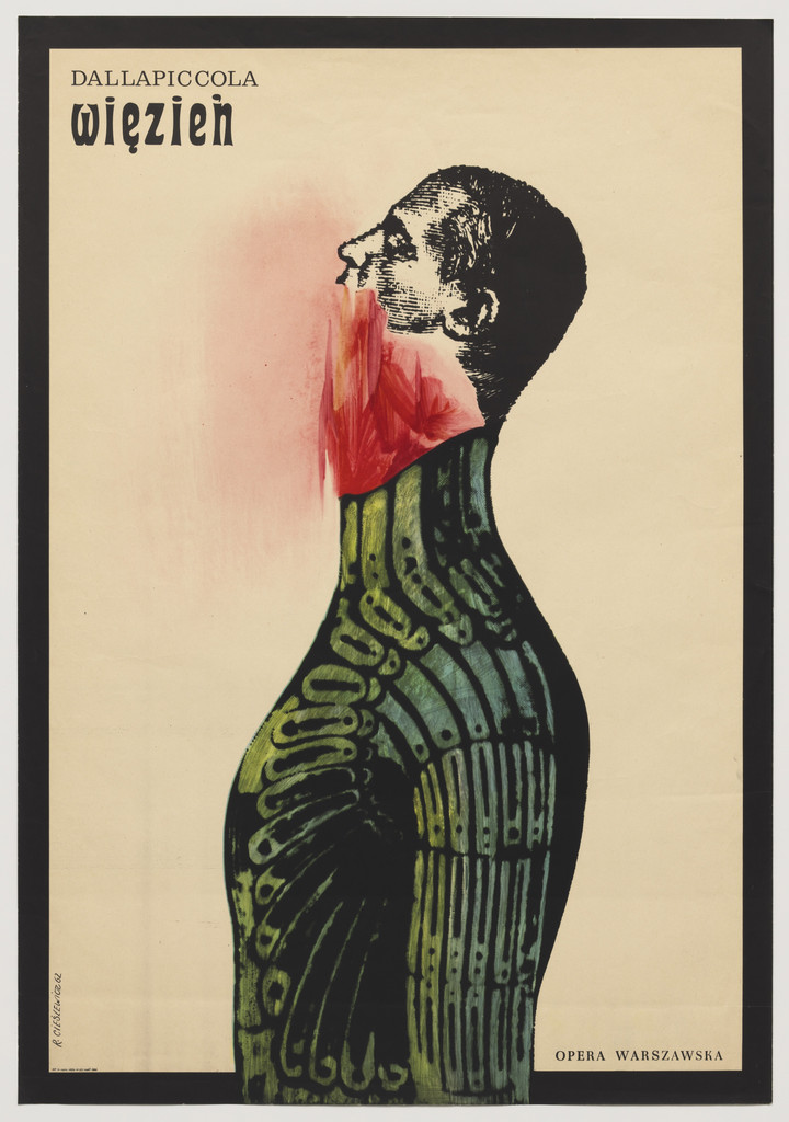
What it is — a poster for the Warsaw staging of Luigi Dallapiccola's opera
Il prigioniero (1944), Opera Warszawska; lithograph, 97.2 × 67.3 cm
(MoMA 1787.2008). MoMA: a figure bound in an armoured shell, suffocating in an
eruption of flame and blood — pessimism, betrayal, the entrapment of Cold War
Europe.
Composition — a light, dirty-white background. A figure in profile,
turned left, shifted right of centre, taking up ~70% of the height. The body is an
engraving of armour (cut out of a 19th-century encyclopedia, tinted olive),
the head bare, in a fine engraving halftone. From the neck/mouth, at the join of head and
armour, a red flame — the only movement in the image. The eye enters on the red,
climbs the profile, descends the ribs of the armour.
Colour — three: olive (armour), black (engraving), red (wound). Red is the
only warm one and sits exactly where man and shell meet — colour is a
diagnosis, not decoration.
Typography — top left „Dallapiccola" small, „więzień" in a heavy,
condensed typeface (egyptienne/grotesque class — not confirmed); „Opera
Warszawska" small at bottom right. The text stays at the edge, the image carries everything.
Message — three seconds: „a man in armour burning inside". Five metres: a
black silhouette plus a red stain. The plot of the opera (Spain, the Inquisition) is not shown —
what is shown is a state.
Why exactly this way — a ban on drawing he imposed on himself: everything is
found material (engraving of armour plus photograph of head). The collage is honest about
its origin; the armour is literally an old illustration, and this makes the
imprisonment historical, not psychological.
What would kill it — the flame in more than one place. One wound, one colour.
What it is — poster for the drama by Juliusz Słowacki (1843) at the Teatr Dramatyczny,
Warsaw; offset lithograph, 85.4 × 60.3 cm (MoMA 377.1963, gift of the author).
The MoMA label carries his quote about the "street image" and a note: under socialist realism the theatre poster
was allowed to be more abstract and psychological than propaganda.
Composition — cream background; one black silhouette — a fist clenched over
the crown of a bowed head/body — descends from the middle to the bottom, with a wide,
blotchy lower part like a cloak. Behind the fist, above, a magenta halo
applied with spray, soft. The eye enters on the magenta (the only colour), slides to the fingers,
then down the black mass. Top band: title left, author right, in one line.
Colour — two: black and magenta. Magenta is at once holiness (halo) and
pain (at the place of the head). The soft edge of the spray against the hard edge of the silhouette — that is the
entire axis of contrast: hard/soft.
Typography — capitals grotesque, two cuts (Ksiądz Marek heavier, Juliusz
Słowacki lighter), "Teatr Dramatyczny" small. Typeface not confirmed. The text
sits in a band like a newspaper headline — it does not mix with the image.
Message — three seconds: "a man holds his head, something burns". Five metres:
black blot + pink circle. The play (the priest of Bar, messianism) is not
illustrated; it is temperature — prayer or torment, the viewer chooses.
Why exactly this way — two colours (budget and technique), a ban on drawing (the silhouette
is cut, not drawn), and censorship that tolerates abstraction in theatre.
What would kill it — a face in the silhouette. As soon as an expression is visible, the halo becomes
illustration.
What it is — poster for the first Polish release of Hitchcock's Vertigo
(1958), 1963; offset in colour, 84 × 58 cm (Sotheby's; another source gives 83.3 × 59,
print run 8500 — to verify). Client, as a rule, CWF — to verify.
No museum record found; Eye lists it as one of his two
"most famous" (along with Katastrofa) and included it in the exhibition Uncanny: Surrealism
and Graphic Design.
Composition — white background. Three bands: above a typographic block
(actors' names + HITCHCOCK across the full width), middle a skull from
an anatomical engraving, frontal, with a concentric target on the forehead; below
the film title and a photograph of a suit with a tie in halftone — the skull wears
the suit. The eye enters the target (the only colour), falls to the teeth, reads the title.
Symmetrical axis, but the target is pushed slightly above the centre of the skull — it spins.
Colour — black on white + three colours only in the target: blue, green, red
rings. Colour is concentrated in one place and that place is
vertigo. Everything else is engraving and halftone.
Typography — HITCHCOCK in a massive slab-capitals of the Clarendon class,
the actors' names in a heavy grotesque, the film title in a condensed grotesque. Three
registers of type, all "fairground", like a 19th-century circus poster — deliberate,
alongside the engraving. Typefaces not confirmed.
Message — three seconds: "death with a target on its forehead, in a suit". Five metres:
black skull + colourful target. Sotheby's calls it a "bizarre" interpretation
of the film — it is not: Vertigo is a film about a man watching a dead woman, and about
a spiral; Cieślewicz took the spiral (Bass's title-sequence motif) and death and
fused them into one body. This is Bass's Vertigo retold as collage.
Why exactly this way — the Polish distributor has no photographs of the actors nor
rights to the American key-art; the designer has an engraving, a process camera and three colours.
Constraint produces the icon.
What would kill it — a photograph of Kim Novak instead of the skull. It would become
an American poster, and a worse one.
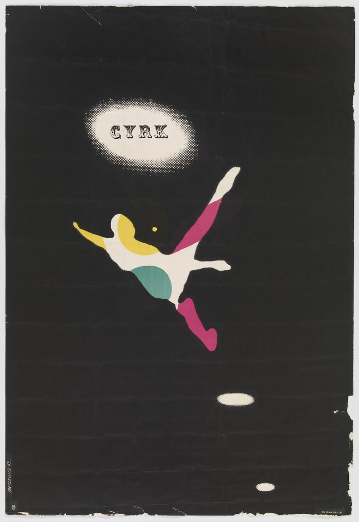
What it is — poster from the state circus series (ZPR, via WAG — client
to verify), lithograph, 99.1 × 68.6 cm (MoMA 352.2014, gift of the author).
The CYRK series is a Polish institution: same title, dozens of authors, never
a programme, always an authorial image.
Composition — a black field to the edges, with a rough, brush-stroked edge. Top
left a white oval beam of a spotlight with the word CYRK; left of
centre a tiny white figure of an acrobat in flight, diagonal; bottom right
a second, smaller light oval (a second spotlight or a net). The eye travels spotlight →
acrobat → lower oval: the trajectory of the leap. The figure occupies maybe 8% of the surface —
the emptiness is the arena.
Colour — black, white, and on the acrobat three spots: yellow, green, magenta.
Colour is only on the body that is flying; everything else is darkness. The cheapest possible
split: one plate of black, three dots of colour.
Typography — CYRK in a Tuscan circus serif with ornament, inside
the oval — the typeface is a costume, not information (not confirmed).
Message — three seconds: "someone is flying through the dark". Five metres: a white dot in
black. The circus is not depicted (no tent, clown, lion) — what is depicted is the
moment of the circus: fear and light.
Why exactly this way — the CYRK series requires each author to state their own circus;
his is black. The black field is both technically cheap and conceptually accurate
(the auditorium is dark).
What would kill it — a bigger acrobat. Once the figure exceeds 20% of the surface, the darkness
becomes a background, not a space.
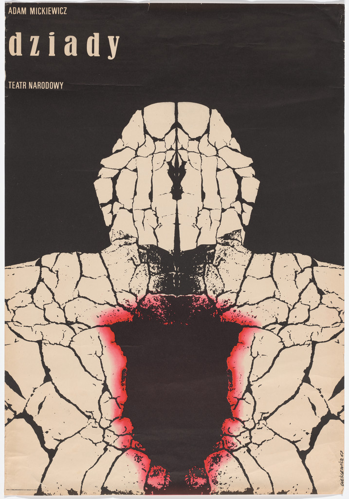
What it is — poster for Mickiewicz's Dziady at the Teatr Narodowy, Warsaw,
1967; lithograph, 96.8 × 67.3 cm (MoMA 160.2016, gift of Mirko Ilić).
If this is Dejmek's staging (premiere 25.11.1967), it concerns the production
whose ban in January 1968 triggered the March protests — to verify
whether the poster is for that staging; MoMA does not state this.
Composition — a black field; within it a bust (head and shoulders, frontal)
built from a photograph of cracked earth, mirrored on the vertical
axis — the cracks meet in the middle like the seams of a face. At the centre of the chest
a black hollow rimmed with a red glow. The eye enters the red (the only
warm colour), climbs onto the "face" of cracks, exits onto the title top left.
Colour — three: black, cream (earth), red (the edge of the wound). The red is halftone
or spray, a soft transition — the only soft edge in an image made entirely of sharp cracks.
Typography — "dziady" in lowercase, a heavy egyptienne (Rockwell class —
Eye lists Rockwell among his typefaces; not confirmed for this piece);
"Adam Mickiewicz" and "Teatr Narodowy" small above and below. Top left, outside
the axis of symmetry — the only asymmetry in the piece.
Message — three seconds: "a dead man made of earth, his heart is a hole". Five metres:
a light bust on black with a red stain. Dziady is a rite for the dead —
the poster does not illustrate the rite, it is the dead man returning. The mirroring
makes a face that belongs to no one.
Why exactly this way — one photograph (cracked earth), one operation
(mirroring), one accent (red). Constraint: no drawing, no actor,
no set. This is the beginning of the Figury symetryczne series (1971–74) four
years early.
What would kill it — two different photographs for the left and right
halves. The mirroring is what makes it inhuman.
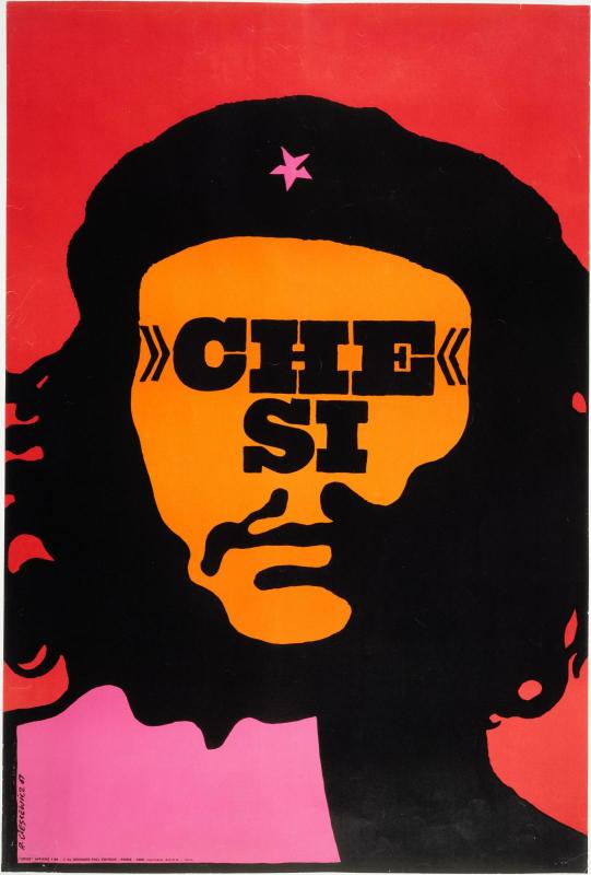
What it is — poster for the magazine Opus International no. 3, 1967; printer
Georges Fall; photolithograph 81.9 × 54.9 cm (MoMA 1788.2008) / offset
84 × 57 cm (Pompidou AM 2009-1-148, signature "R. Cieslewicz 67"); 1968.
also as a numbered screenprint edition (Georges Fall Éditeur). MAD: Korda's
1960 photograph reduced to a line drawing; "the absent gaze is symbolically
exchanged with the name of the revolutionary" (Pierre Fresnault-Deruelle);
the dead guerrilla turned into a Christ-like icon.
Composition — red field; black mass of hair and beard as a frame; inside
an orange face as a flat plane with no tone, facial lines in black; where
the eyes should be, »CHE« / SI in two lines. Magenta star on the beret,
magenta shoulder lower left. Frontal, symmetrical, face fills ~60% of the
width. The eye enters the word (darkest on the lightest), then the star,
then the beard.
Colour — four flats: red, black, orange, magenta. No tone,
no screen — everything is cut. Red/orange/magenta are adjacent on the
colour wheel, so they vibrate at the edge (an op-art effect MAD mentions as one of
his tools); black settles them down.
Typography — heavy, condensed egyptienne/grotesque with angled
guillemets »« (class Berthold Block — Eye lists it as his favourite typeface,
Fonts In Use confirms it only on the 1993 poster; not confirmed for this work).
The word is physically standing in for the eyes, the same width as the gaze.
Message — three seconds: "Che, yes". Five metres: face + word, legible
even without eyes — precisely for that reason. The poster says the name has
replaced the man; that is affirmation and critique at once, and that is what
sets it apart from Fitzpatrick's Che from the same year.
Why exactly this way — an art magazine in Paris in 1967, a year before
May; Korda's is the one image everyone knows. The only intervention that adds
instead of decorating is subtraction — of the gaze.
What would kill it — the eyes. Bring the eyes back, you get a T-shirt.
What it is — cover of the monthly Ty i ja ("Luty" = February; issue number and
year 1968 per the cover masthead), offset; magazine format —
to verify. Cieślewicz was art director there 1959–62; a 1968 cover
means he was still working for them from Paris — circumstance to verify.
No museum record.
Composition — white ground; a woman's leg, from knee to thigh, in
coarsely enlarged halftone (dot ~1 cm at this scale), diagonally across
the whole page; on the knee, as on a slope, a tiny skier in black
silhouette. Above, "ty i ja" in enormous lowercase, to its left the table of
contents in a boxed table. Lower left a coloured patch (pink/orange).
The eye enters the title, slides down the leg with the skier — the poster is
a ski slope.
Colour — black and white + one coloured patch in the corner, like a leftover
of the "real" cover; colour here is a joke at fashion's expense, not hierarchy.
Typography — "ty i ja" in heavy grotesque lowercase, full page
width, letters spaced out (not confirmed); table of contents in tiny serif —
a 1:30 contrast.
Message — three seconds: "skier on a knee". Five metres: black diagonal
made of dots + title. Up close the leg dissolves into dots and you see the
print, not skin — the enlarged halftone is the argument: you're looking at
the medium, not the woman.
Why exactly this way — a process camera and one photograph; the skier is
cut from another. The scale mismatch is Matter's trick (Herbert Matter,
Swiss tourism posters of the 1930s), but Matter sells the mountain, while Cieślewicz
sells a magazine about couples and simultaneously shows that the image of the
woman is made of dots.
What would kill it — a fine screen. Once the dot disappears, all that's left is
the leg and the skier — a joke, without a thesis.
What it is — advertising poster for the photo magazine Zoom (publisher Georges
Fall), 1971; screenprint mounted on card, 101 × 71.2 cm (Pompidou
AM 2009-1-156, signature "R. Cieslewicz 71"). MAD: a portrait surgically cut and
reassembled into a cyclops; Cieślewicz defines the designer as a "guide of the retina"
against image saturation. Wlassikoff: the point where he crosses from advertising
into authored work.
Composition — black and white, white frame; the bust of a man in a suit,
frontal, head mirrored so that the two profiles meet in one eye
in the centre of the forehead; below the eye, nose and mouth doubled into a symmetrical
seam. All in a coarse screen. Text below, centred, small, three lines. The eye
enters the eye — and stays there; nothing else in the image has any claim on the gaze.
Colour — none. Black and white in halftone; grey does not exist as a tone but
as dot density. For a poster against "eye pollution" colour itself would be pollution.
Typography — book serif, small, centred, three lines: "Zoom / contre
la pollution / de l'oeil" (not confirmed). The text is a caption under the image,
like in an anatomical atlas — cold.
Message — three seconds: "a man with one eye is watching you". Five metres:
black symmetrical mass + white eye dot. The thesis is literal: one eye =
reduction, against too many images. The poster is an advert speaking against
advertising and does so without irony of form.
Why exactly this way — one photograph, one operation (mirroring around the
axis through the eye), one technique (halftone). Screenprint on card = an exhibition
object, not a street poster; Fall also issued it as an edition.
What would kill it — a fine tone instead of a screen. The cyclops would become
horror; the halftone keeps it in the category of a printed image, hence an argument.
Eroica (1957, film by Andrzej Munk) — centrally placed black-and-white
sign (face), a play of light and shadow, typography fused with the image
(polishpostershop, with a caveat); image not seen. jedna-slika-jedna-rijec
Operacja Konieczna (1956) — MoMA 5145; not seen.
Warszawa (1956) — MoMA 8746; not seen.
Stracone złudzenia (1958) — MoMA 4844, no image in the record.
Inspekcja pana Anatola (1959) — MoMA 200027; not seen.
Strawiński: Persefona (1961) — MoMA 5191; not seen.
Cyrk Radziecki (1963) — MoMA 6767; not seen.
200 lat Teatru Narodowego (1965) — V&A O1314753 (v1); not seen.
Proces / The Trial (1964) — culture.pl; not seen.
CCCP / USA — Superman (1968, Opus International) — Pompidou cpgb84E;
enlarged halftone, Supermen with two flags; not seen.
Figury symetryczne / Figures symétriques (1971–74) — series of mirrored
photomontages; Dziady and Zoom are its starting point. zrcaljenje-pravi-cudoviste
Amnesty International (1975) — culture.pl; not seen.
Les Mystères d'Udolpho (1975, illustrations for Ann Radcliffe) — Eye blog:
collage from engravings; "A Gothic Night", "Mrs. Lacleur".
Kamikaze (1976, 1991, 1993) — magazine of the Panique group; "photographism":
unprocessed archival photographs across double spreads, without montage (Wlassikoff).
dvostrana-je-jedinica (candidate)
Changement de climat (1977) — photomontages, old image + newspaper
photograph, in colour; "Suspendu malgré lui".
Paris–Berlin 1900–1933 (1978, Centre Pompidou) — Fonts In Use: Helvetica.
Amis! Protégez! (1993, AIDS) — Fonts In Use: Berthold Block, ITC Franklin
Gothic; polishpostershop: the sign "screams off the poster".
Local (new, awaiting a second author):
- jedna-operacija-po-radu — every work is one verb applied to one
image: enlarge (08), mirror (06, 09), subtract (07), replace (01).
Test: can you name the operation with one verb? If it needs two —
the work is a mess. (v1 had this as a craft note; here proven on four works.)
- zrcaljenje-pravi-cudoviste — a photograph mirrored on the vertical axis
gives a being that is symmetrical like an icon and impossible as an organism (06, 09,
the Figury symetryczne series). Related to simetricna-os-drzi-haos (Tadanori Yokoo,
Milton Glaser), but with the opposite goal: there the axis organises a crowd, here the axis
produces a figure from a single image. Test: did the mirroring produce
something that didn't exist on either half (a third eye, a facial seam)?
- boja-samo-na-rani — the only saturated colour in a black-and-white work sits exactly
on the site of the wound/emotion (02 neck, 03 crown, 06 chest, 04 forehead). Related to
ukrstanje-je-fokus (Max Huber) — there focus comes from overlap, here from
placing the single colour. Test: cover the colour — can you tell where it hurts?
- tekst-na-mjestu-pogleda — the word occupies the position of the eyes, so it reads as
a gaze (07). Test: does the face still "look" even without eyes?
Bridge to practice: poster · graphic design · motion
Poster
One operation. Before the sketch write down a verb: enlarge / mirror / repeat /
subtract. If you find yourself in Illustrator with two operations on the same image —
cut one.
Halftone as material, not effect. Effect › Pixelate › Color Halftone on
a photograph, but with a radius that gives a dot of 5–10 mm at the format's size; then
rasterise and vectorise (Image Trace, black-and-white) so the dots become
shapes you can move and erase by hand — that's his felt-tip pen.
Colour only on the wound. Black-and-white poster, one colour, one place. If
you don't know where the "wound" of the message is, you don't have a message yet.
Mirror around a point, not around the middle. The axis through an eye, through the mouth, through the wound —
not through the centre of the format. Reflect tool with a manually placed axis.
Graphic Design
Cover = one image + one operation + logotype. Ty i ja is
the pattern: halftone to the limit + a tiny borrowed element (the skier). For a YT thumbnail:
one enlarged halftone frame + one tiny figure.
Engraving + photograph is a cheap and legal historical quote (public
domain); combine with a modern halftone, like Vertigo.
Motion
Enlarging the halftone is an animatable parameter. AE: Color Halftone (or CC
Ball Action) with a keyframe on the radius — the image breaks apart into dots and reassembles.
This is Zoom as a temporal operation.
Mirroring as an event. AE Mirror effect, Reflection Center animated
from the edge to the eye — the cyclops "is born" from a normal face over 12 frames.
Colour enters last. The whole frame black-and-white, the only colour lights up on
the wound in a single frame (no fade).
Bad imitation
Halftone as a filter. Halftone over the whole image "for the retro look." For him
the halftone is enlarged until the image breaks apart and that breakdown is the message;
a filter at 50% is just texture. Cause: the look copied, not the threshold.
Mirroring for symmetry. You mirror the whole image around the centre and get
an ornament. For him the axis runs through an organ (eye, mouth), producing a being.
Cause: axis placed according to the format, not the content.
Multiple wounds. Red on the neck, then more on the hands, then more in the text. One
colour, one place, or none.
Political collage without subtraction. Che with eyes, with a flag, with a slogan —
addition. His gesture is always subtraction (eyes, colour, tone).
The brief through their eyes
Job: thumbnail and a short intro for gaming animations (YouTube). First
move: he would take one frame from the game, enlarge the halftone until the character breaks apart into
dots the size of a fingernail, and place a single word over the character's eye. Colour: none
except a single dot at the place where the character "bleeds." When the frame turns into the intro,
the halftone reassembles into an image over 10 frames — one event.
Exercises
One verb (45 min): take one of your own photographs; make four
A3 posters, each with only one operation — enlarge, mirror, repeat, subtract.
No text except one word. Then stick all four on the wall and see which one
"looks."
Colour only on the wound (30 min): black-and-white collage of an engraving (public domain) and
a photograph; one saturated colour, one place, diameter no more than 10% of the format.
Ty i ja thumbnail (30 min): a frame from a game, halftone dot 8 mm at 1280 px,
one tiny figure on the character's "relief"; headline in heavy grotesque lowercase.
Motion study
5 seconds, one frame, one event: a portrait in a fine halftone; the halftone
radius grows 0 → 40 px over 3 s until the face disappears into dots; in the 4th second
mirroring around an axis through the left eye — one eye emerges; last frame: one
red dot on that eye. No music, no easing on the colour.
Rebuilding the benchmark
Benchmark: Che si. Skeleton .svg (once the image is local, measure it): format
3:2 portrait; oval face mask ≈ 60% of width, centre at ≈ 45% of height; block of
the word »CHE« / SI ≈ 50% of width, top edge at ≈ 40% of height; star ≈
5% of width at ≈ 22% of height; magenta shoulder in the lower left quadrant.
Four flat colours, no tone. Task: 45 min in Illustrator without looking at
the original, then compare where the word got away from you.
Notes on sources
Quote v1 „The image must be attacked" — not confirmed; replaced by
MoMA's and Eye's quotes.
Moda Polska — MoMA record without an image; image seen on culture.pl (press
materials). Text on the poster unverified.
Vertigo — no museum record; dimensions differ (84 × 58 Sotheby's
/ 83.3 × 59 blog), print run of 8500 from an unverified source; client assumed (CWF).
Dziady — the connection with Dejmek's production and the 1968 ban is not in the MoMA
record; very likely given the date and theatre, but to verify.
Che si — MoMA: photolithograph 81.9 × 54.9; Pompidou: offset 84 × 57;
MAD: sérigraphie. Probably three different prints of the same image (poster +
screenprint edition, 1968). Year: 1967 (Pompidou, signature) / 1967–68 (MoMA).
Ty i ja 1968 — number and format unconfirmed; not clear whether the cover
was made from Paris or is older. No museum record.
Typefaces — none confirmed for the analysed works; Fonts In Use has only
1978 (Helvetica) and 1993 (Block, Franklin Gothic). Eye gives his favourites
(Block, Milton, Rockwell) — use as a class, not as a specific typeface.
Alina Szapocznikow — the marriage is not verified in the sources of this note.
Influenced — empty; no source gives the names of students.
Portrait — Commons TIFF; licence unverified.
Difference from its pair
Henryk Tomaszewski ↔ cieslewicz: same city, same poster school, same years —
Tomaszewski draws by hand, awkwardly, to be warm and human; Cieślewicz never
draws, he cuts and enlarges the photograph to be cold and mechanical — and
both thereby speak against the official image: one with laughter, the other with a wound.
Herbert Matter ↔ cieslewicz: same photomontage, same disproportion of scale — Matter
uses it to sell (a mountain, a chair), Cieślewicz uses it to show that the image
is made of dots, therefore that it lies.
Karl Gerstner ↔ cieslewicz: both enlarge the halftone to the point of breakdown (Opjekte 1966 /
Ty i ja 1968) — for Gerstner it's a parameter in a programme, for Cieślewicz
an attack on the image.