Lester Beall
source

Era 1945 · 1903–1969

Lester Beall

American modernism, public poster, corporate identity as a system

Independent designer; REA posters; early corporate identity programmes
Kansas City → Chicago → New York → Brookfield, Connecticut

Palette of the œuvre

„Design is not a philosophy of the moment, but a way of thinking."


Biography

Born 1903 in Kansas City, grew up and educated in Chicago: Lane Technical School, then a degree in art history from the University of Chicago, alongside the Art Institute. He did not study design — AGI lists him as a self-taught designer, and that is the accurate nuance: an educated man, but without the craft training of a school. He learns from European magazines — Bayer and Moholy-Nagy are explicitly named as his models.

He opens practice in Chicago in 1927, moves to New York in 1935. Between 1937 and 1941 he does posters for the Rural Electrification Administration — the work he is remembered for.

v2 correction — primary document. AGI (and a heap of texts after it) states that Beall was the first designer with a solo exhibition at MoMA, 1937. This is not true. MoMA's own press release of 15.11.1937 describes a "small exhibition of government posters", opened 16.11.1937 for two weeks, with two groups of works: 13 posters for the Spanish government (Melendrera, Bisquert, Lozano, Oliver, Canavate, Subirats, Mauricio Amster) and six Beall American posters. Director Alfred H. Barr Jr. explicitly speaks of "these two groups of posters". So: a group exhibition, not a solo one — and a two-week one at that. Beall's significance does not diminish because of this (at MoMA in 1937, at age 34, as the only American), but the claim must be corrected before publishing on the site. Confirmation from the collection (23.09.2026): MoMA holds first-series REA posters with accession numbers 218.1937–223.1937, gift of the designer (Radio 218, Heat-Cold 219, Light 220, Rural Electrification Administration 221, Running Water 223) — that is exactly the six posters from the press release, kept after the exhibition.

After the war he does what is actually his greatest contribution: corporate identity as a system — Connecticut General (1956), International Paper (1960), Caterpillar Tractor (1967). For International Paper he delivers a graphic standards manual; he is one of the first to treat the manual as the main tool, not as an appendix to the logotype.

He works from a farm in Brookfield, Connecticut (Dumbarton Farm). He dies in 1969.

Discrepancy in sources: Cooper Hewitt gives the purchase of the farm as 1950, AGI gives the move to the farm as 1955. Wikipedia mentions Wilton, Connecticut 1936. These are likely three different events — to verify before publication. 23.09.2026: Communication Arts confirms the studio move in 1955 (as AGI); a memorandum from May 1951 (work 07) carries the address 580 Fifth Avenue, New York; MCB dates memoranda with the address Brookfield Center "around 1952". So: farm bought around 1950, studio in New York at least until May 1951, full studio move 1955 — the date of the Brookfield memorandum is an estimate, not a document.


Influences

Studied with

  • Lane Technical School, Chicago
  • University of Chicago — degree in art history
  • Art Institute of Chicago
  • note — no formal design education; AGI lists him as a self-taught designer, educated but not in design

Borrows from

  • European avant-garde and Bauhaus — explicitly Herbert Bayer and László Moholy-Nagy
  • dada — collage, cut-out, typographic disorder as material; "intuitive placement of elements" (AGI, Communication Arts)
  • Jan Tschichold, The New Typography (AGI, Communication Arts)
  • American wood type of the 19th century (AGI, Communication Arts) — visible in LIGHT (01)
  • Russian constructivism — arrow and diagonal as a mark of movement (in v1 attributed to El Lissitzky; as a direct influence provjeriti)
  • documentary photography of the 1930s (photomontage, silhouette)
  • American advertising — persuasion technique applied to public service

Influenced

  • corporate identity discipline — standards manual as a tool, not as an appendix
  • American postwar modernism in general
  • every later "design system" — International Paper 1960 is the precursor

Contemporaries

Who he studied under

No one, in the design sense. Art history gives him an apparatus for looking, and European magazines the material. This is important: his modernism is imported through reading, without a teacher and without the ideology that went along with it in Europe.

What he steals

Who he influenced

Less an individual, more a discipline: the standards manual as an identity tool became the norm through him. Every present-day design system, brand guideline and component library is a descendant of International Paper from 1960. The line connects with Müller-Brockmann's Raster Systeme (1981) — two sides of the same development: he supplies the institutional, the Swiss the methodological part.


Linked from other profiles

Chermayeff & Geismar (Ivan Chermayeff, Tom Geismar)Corita Kent (Sister Mary Corita)Emory DouglasMilton GlaserIkko Tanaka (田中一光)Alvin LustigPeter SavillePaula ScherBradbury ThompsonHenryk Tomaszewski

Key works — full analysis

Source class. documented = museum/archival record (MoMA, LoC, AGI, Merrill C. Berman Collection). reading of the work (v2) = image viewed by the agent (06.09. and 23.09.2026). All eight works have an image (23.09.2026); local copies await harvest.


01 · REA — Light (1937, first series)

Light — Rural Electrification Administration (prva serija)
documented + reading
Year
1937
Client
Rural Electrification Administration, US Department of Agriculture
Technique
poster in colour; MoMA has two copies — 220.1937 lithograph and 753.1983 screenprint; MCB collection: screenprint
Size
101 × 76 cm (LoC); 101,6 × 76,2 cm (MoMA 5733)
Type
LIGHT — heavy condensed capitals with slab serifs (wood-type slab serif); agency line — condensed grotesque (sans serif) capitals; specific typefaces not confirmed

jedna-slika-jedna-rijec ravna-boja-na-daljinu

record ↗ · original image ↗

LoC zapis · slika 1024 px

  1. What it is — a poster for the government agency bringing electricity into the American countryside. Audience: rural households, some of them barely literate. The series runs 1937–1941. 101 × 76 cm (LoC, gift of Beall). The technique differs by source: MoMA has two copies — 220.1937 listed as a lithograph, 753.1983 as a screenprint; the MCB collection as a screenprint. Signature "BEALL" upright in the upper left corner.
  2. Composition — reading of the work (v2, verified 23.09.2026 against LoC 1024 px): the plane is divided horizontally into two fields — upper blue (sky), lower red (ground), the dividing line at about 56% of the height. Across the divide stands a huge light bulb in white, upright, right of centre, about 60% of the format's height; the black socket enters the red field. The house sits ON the horizon line, left of centre — a tiny black silhouette with white windows, and from it thin white rays fan out to the right (LoC: "light beaming from its windows"). The scale relationship house : bulb is about 1:8. The agency's lettering is white condensed capitals directly on the red, with no separate band. Everything is frontal, without perspective and without modelling. The construction is: two colours, three elements, one word.
  3. Colour — reading of the work (v2): exactly three — blue, red, white (paper). No halftones or shadows. The patriotic tricolour also works doubly here: national programme and maximum contrast at a distance.
  4. Typography — reading of the work (v2): "LIGHT" inside the bulb itself, dark blue — the word does not sit beside the image but within it. Correction 23.09.: this is not a grotesque but a thick condensed capital with slab serifs — a wood-type-style egyptienne of the American type (AGI and Communication Arts explicitly cite "19th-century American wood type" as Beall's material). Below, "RURAL ELECTRIFICATION ADMINISTRATION" — white condensed grotesque capitals, running the full width. Two typefaces: an old wood one for the object-word, a modern one for the signature. Specific typeface not to be named.
  5. Message — light. Not "electrification programme" but the thing a person receives. The three-second, five-metre test here is not an exercise but a condition of the brief.
  6. Why exactly this way — an audience that may not read, a space without urban context, cheap colour printing. Each of these three constraints pushes toward the same solution.
  7. What would kill it — a sentence. As soon as an explanation is added, the poster turns into a leaflet and loses the only audience it has. Second killer: drawing a glowing bulb (yellow, glow, gradient). It does not glow — it is light, because it's a white plane on a dark ground. The effect would kill the sign.

Principles: jedna-slika-jedna-rijec ravna-boja-na-daljinu ekstremna-nesrazmjera-mjerila rijec-unutar-slike Resolved v2: three colours; the word is inside the bulb; the house is a tiny silhouette with rays. v2 correction: strelica-i-dijagonala-kao-kretanje does not apply — the composition is strictly vertical and horizontal. Movement is carried by rays, not a diagonal. 23.09 corrections: the house is on the horizon (not "lower left"); there is no white band — the lettering is white on red; LIGHT is an egyptienne, not a grotesque. Remains open: lithograph or screenprint — MoMA has both records (probably two print runs).


02 · REA — second phase, photomontage (1939–1941)

REA — druga faza, fotomontaža (etalon: Here It Comes)
documented + reading
Year
1939–1941
Client
Rural Electrification Administration, US Department of Agriculture
Technique
poster in colour (LoC); the series also includes screenprint (It's Fine for Us 1939 — MCB) and lithograph (When I Think Back 1939 — MoMA 8280)
Size
101 × 76 cm (Here It Comes, LoC); 97,1 × 75,7 cm (When I Think Back, MoMA)
Type
Here It Comes — heavy grotesque (sans serif), words with capital initials; signature block — wide heavy antiqua/slab serif capitals + letterspaced small capitals; specific typefaces not confirmed

fotomontaza-plus-plakatna-boja dizajn-za-nepismenu-publiku strelica-i-dijagonala-kao-kretanje

record ↗ · original image ↗

LoC zapis — Here It Comes · slika

  1. What it is — continuation of the series, but with photography instead of a flat sign: Here it comes, When I think back, Our lines, It's fine for us, Now I'm satisfied. The titles are the user's own words, not a message from the state. LoC blog (2024) divides the REA posters into three series: first — benefits (flat sign); second — progress, photomontage of real people; third — electricity at work. Technique within the series varies: It's Fine for Us (1939) screenprint (MCB), When I Think Back (1939) lithograph, 97.1 × 75.7 cm (MoMA 8280); Here It Comes 101 × 76 cm (LoC).
  2. Composition — reading of the work (v2) (series reviewed on Wikimedia Commons; e.g. Here it Comes, LOC LCCN2010650609, 101 × 76 cm, colour): a fixed pattern throughout the whole second phase — (a) the surface divided into two or three flat fields of colour (often unequal, one dominant); (b) over them a cut-out black-and-white photograph of a man in the field — no background, silhouetted, like a sticker; (c) a diagonal banner/ribbon in a contrasting colour with a first-person sentence; (d) below, a narrow strip with the agency's name. In a few posters a flag motif (stripes) also appears as one of the colour fields. Benchmark Here It Comes, checked 23.09.2026 (LoC 1024 px): an orange field cut by a white diagonal wedge widening to the right; the cut-out lineman (black and white, full figure, in climbing boots) pulls a wire — a black line running diagonally across the whole format, from the left edge to the right. The ribbon with the sentence is here horizontal yellow, not diagonal — the wedge and the wire carry the diagonal. A small orange bird on the white field. Below, directly on the orange, the agency's signature in two lines. Here strelica-i-dijagonala-kao-kretanje holds — the wire is literally a vector: it "arrives" from left to right, in the direction of reading. The photograph does not blend into the background — it is deliberately pasted on, and that is what gives it its energy.
  3. Colour — reading of the work (v2): two to three saturated flat colours (orange, yellow, blue, red) + a black-and-white photograph. The photograph stays grey; colour is always graphic. The same separated job as in work 03.
  4. Typography — reading of the work (v2): the sentence in a ribbon; the agency's name in spaced capitals. In Here It Comes (23.09.) the sentence is a thick black grotesque, each word capitalised (not "light"), and the signature is a wide bold serif/ slab-serif capitals + below, small spaced capitals "U. S. DEPARTMENT OF AGRICULTURE". 23.09. correction: the rule is narrower than v2 claimed — the sentence always lives in a ribbon, but the agency's signature stands free on the colour field (as in Light). Do not name the specific typeface.
  5. Message — the shift from here's what you get to here's what your neighbour says. That is a change of rhetoric, not of style: testimony instead of promise.
  6. Why exactly this way — by 1939 electricity had already reached some; now the experience of early adopters is being sold. The task changed, so did the means.
  7. What would kill it — a retouched, idealised photograph. The witness must look like a witness.

Principles: fotomontaza-plus-plakatna-boja dizajn-za-nepismenu-publiku izrezana-figura-bez-pozadine tekst-uvijek-u-obliku serija-kao-identitet strelica-i-dijagonala-kao-kretanje (only Here It Comes — the wire) Resolved v2: one photograph per poster; the sentence is tied in by living in the ribbon. Bridge to my practice (a series!): this is a ready-made series template — colour fields + cut-out figure + sentence ribbon + signature in a fixed spot. The figure, colour, and sentence change; everything else stays fixed. Exactly what's needed for a YouTube series: variable and fixed separated from day one.


03 · A Better Home — REA (1941)

A Better Home — Rural Electrification Administration
documented + reading
Year
1941
Client
REA (New Deal)
Technique
offset lithography and screenprint
Size
101,6 × 76,2 cm
Type
A Better Home — italic setting in lowercase; agency signature letterspaced capitals; specific typefaces not confirmed

ravna-boja-na-daljinu jedna-slika-jedna-rijec

record ↗ · original image ↗

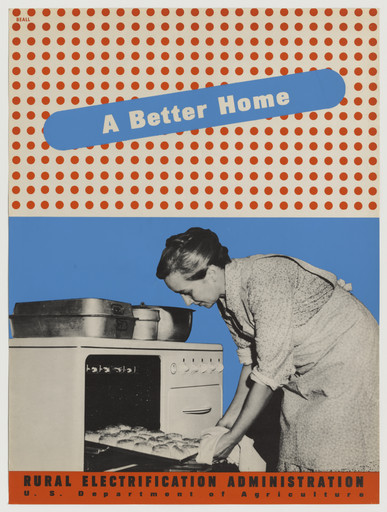
  1. What it is — a poster about kitchen electrification. Offset lithograph and screenprint, 101.6 × 76.2 cm (MoMA SC157.2010, gift of the designer). MoMA note: the goal was to convince households to switch from traditional fuels to electricity, and REA deliberately borrowed techniques from commercial advertising.
  2. Composition — reading of the work (v2): a black-and-white photograph of a woman taking a tray out of an electric stove fills the bottom two-thirds; behind and above her, across the whole surface, a regular grid of large red dots on white — a decorative ground that reads like wallpaper or a kitchen tile pattern. Over the top third lies a blue ribbon tilted ~8° with the title. Below, a narrow red strip with the agency's name. So: photograph (evidence) + grid (home) + ribbon (message) — three layers, each with its own job. This is the most important finding on Beall for your work: the dot grid is not a reproduction but a drawn ornament, used as flat colour.
  3. Colour — reading of the work (v2): red, blue, white and black-and-white photography. A patriotic tricolour; museum note: modernisation framed as national interest. The photograph stays uncoloured — colour belongs to the graphics, not to the evidence.
  4. Typography — reading of the work (v2): "A Better Home" white in the blue ribbon, lowercase with capitalised initials, slightly slanted, a soft "handwritten" feel but it is set type; below, "RURAL ELECTRIFICATION ADMINISTRATION" in spaced capitals and below that, small "U.S. Department of Agriculture". Do not name the specific typeface.
  5. Message — a better home, not better infrastructure. The benefit translates into the kitchen, and specifically through a woman at work — the audience recognises itself in the scene, not in the programme.
  6. Why exactly this way — two techniques in one sheet (offset + screen) mean that the flat solid areas were printed by screen and the fine grid by offset. That's the technical trace explaining why the colours "sit" flat as if cut out.
  7. What would kill it — a pastel palette. The message depends on colour being hard and unambiguous, like a sign.

Principles: ravna-boja-na-daljinu raster-kao-ornament fotografija-je-dokaz-grafika-je-glas traka-nosi-poruku Resolved v2: the motif (woman and electric stove), the three-layer arrangement, the grid's role. Still open: which surfaces are screen and which are offset (need to check an original print). Bridge to my rasterised language: here the grid is used as decoration, not as tone — the dots are too coarse to reproduce an image, and that's exactly why they work as material. That's the same move you make with dithering; this one is from 1941.


04 · Cross Out Slums (1941)

Cross Out Slums
documented + reading
Year
1941
Client
United States Housing Authority
Technique
lithograph
Size
100,3 × 74 cm
Type
Cross Out Slums — light grotesque (sans serif), words with capital initials; specific typeface not confirmed

jedna-slika-jedna-rijec fotomontaza-plus-plakatna-boja

record ↗ · original image ↗

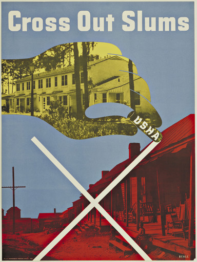
  1. What it is — a poster by the United States Housing Authority against housing poverty. Lithograph, 100.3 × 74 cm (MoMA 89.1944, gift of USHA).
  2. Composition — reading of the work (v2): two photographs in one frame. Bottom half: a red-toned photograph of rundown houses (a slum street, posts, mud). Over it, in the top half, a cut-out shape in the form of a large hand/latch within which one sees a yellow-toned photograph of a tidy housing building with a tree-lined street — so the new home is "cut out" of the old one. Over the bottom half a thick white X from edge to edge. At the top, the title, and "USHA" written into the cut-out shape along its edge. Construction: before/after in one image, plus one stroke over what is being cancelled.
  3. Colour — reading of the work (v2): duotone by zones — the old is red, the new is yellow, the sky blue, the X and title white. Neither photograph is in natural colour; colour here is a judgement, not a description. (The same procedure as Matter's duotone, but here with a moral charge.)
  4. Typography — reading of the work (v2): "Cross Out Slums" at the top, white light grotesque (sans serif), lowercase with capitalised initials, spaced out, in one line across the full width. The title is calm — all the pressure is carried by the X. Do not name the specific typeface.
  5. Message — the simplest possible graphic move (one X over a photograph) carries the whole political message. In three seconds: something needs to be removed. It matters that the X is drawn over the bad, not over the good — and that the good is inside the cut-out, as what remains once the bad is crossed out.
  6. Why exactly this way — a state campaign, an enormous print run, one extra lithographic plate costs more; the move has to be a single one.
  7. What would kill it — two interventions instead of one. Two signs = none.

Principles: jedna-slika-jedna-rijec duotone-kao-ocjena prije-poslije-u-jednoj-slici izrez-kao-prozor-u-drugu-sliku Resolved v2: the crossed-out part is the old neighbourhood; the X is white, thick, over the bottom half; four colours (red, yellow, blue, white). A great exercise from this: the same photograph in two tones = two judgements. Try it on your own material — one shot, two treatments, without a single word of explanation.


05 · Scope — magazine for Upjohn (covers 1944–1948; benchmark "cancer", 1948)

Scope (časopis za Upjohn) — etalon: korica „cancer“
documented + reading
Year
1948 (cover, AGI); Beall works on the covers 1944–1948 (Heller); the magazine runs 1941–1957
Client
The Upjohn Company (editor dr. A. Garrard Macleod)
Technique
magazine, four-colour offset, wire-stitched (PGDA)
Size
22,9 × 28,6 cm (9 × 11 1/4 in; PGDA, MCB)
Type
SCOPE logotype — mixed letters: solid and outline capitals, different heights and colours; "cancer" — letterspaced italic lowercase; specific typefaces not confirmed

providni-sloj-kao-dubina rebus-tjera-na-izvodjenje fotomontaza-plus-plakatna-boja

record ↗ · original image ↗

AGI zapis · slika 1600 px · PGDA, broj 2

  1. What it is — quarterly biomedical journal published by Upjohn for physicians and pharmacists, ran 1941–1957; 9 × 11 1/4 in, four-colour offset, wire-stitched (PGDA). Heller (PRINT): Beall does the covers 1944–1948, and editor Dr. A. Garrard Macleod gives him freedom to experiment — photography, montage, illustration and custom typography. Benchmark: the cover on the cancer theme, AGI dates it 1948; signature "Lester Beall" by hand, bottom right — authorship of the cover is his. Caveat from v2 stands: PGDA for issue 2 lists Will Burtin and Lester Beall as art directors; MCB also holds issues 1949–1951 (Scope: Basic Science Review). Who did which issue after 1948 — open.
  2. Composition — reading of the work (v2, 23.09.2026, AGI 1600 px): three layers. Base covering the whole plane: dense collage of 19th-century engravings of human heads (portraits, profiles, hairstyles), pale grey-green. Over that, in the middle, a thin black wire globe — meridians and parallels, almost full width. Over the globe two crabs, red and yellow, overlapped like transparent plates — where they intersect, orange results. On the equator of the globe the word cancer. Right, a green arc as a segment of the sphere. Top left the logotype. The eye enters on the red crab (the most saturated mass, left of centre), slides across the yellow to the right and lands on the word. Reading of the layers: people (who it hits) → world (where) → cancer (what).
  3. Colour — reading of the work (v2): the base is document tone (grey engraving); red and yellow are flat, saturated and belong only to the sign. The overlap gives a third colour without a third plate. The same separated job as on the REA posters: the document stays uncoloured, colour is the voice. Green in the logotype and arc (measured below threshold).
  4. Typography — reading of the work (v2): the logotype SCOPE is a typographic collage — S solid green, c red outline, smaller and dropped, O solid green, P solid black, E green outline; different heights, no shared baseline. Dada and wood-type feel across five letters. Against that, cancer is a calm, letterspaced lowercase italic, black. Loud logotype, quiet headline. Do not name the specific typeface.
  5. Message — cancer is a world problem and it has a face. The name of the disease is the name of an animal (cancer = crab) — Beall draws the word, not the tumour. To the professional audience he gives an idea, not a diagram.
  6. Why exactly this way — physicians don't need an explanation of the disease; the cover must be an intellectual signal that the journal is serious and current. The editor gave him freedom (Heller).
  7. What would kill it — medical illustration (cell, tumour, anatomy): it becomes a textbook. Second killer: opaque colours — the crabs would hide one behind the other; the overlap is what gives depth and the third colour.

Principles: providni-sloj-kao-dubina rebus-tjera-na-izvodjenje fotomontaza-plus-plakatna-boja From v2 (issue 2, PGDA 250 px): a black boomerang-like shape with about ten coloured "little windows" — jedan-nosac-mnogo-jedinica boja-kao-razlika-ne-kao-atmosfera; authorship of that issue shared with Burtin. Remains open: the Beall/Burtin split of work after 1948.


06 · S.S. United States — World's Fastest (United States Lines, circa 1952)

S.S. United States — World's Fastest (United States Lines)
documented + reading
Year
around 1952 (MCB); work for United States Lines from 1951 through J. Walter Thompson
Client
United States Lines Company (through the agency J. Walter Thompson)
Technique
lithograph
Size
76 × 55,5 cm (MCB)
Type
condensed heavy grotesque (sans serif) capitals (headline, UNITED STATES LINES, FASTEST) + letterspaced small capitals; specific typefaces not confirmed

ravna-boja-na-daljinu strelica-i-dijagonala-kao-kretanje drasticno-kadriranje

record ↗ · original image ↗

MCB zbirka · slika

  1. What it is — poster for the ocean liner SS United States, lithograph, 76 × 55.5 cm, circa 1952 (MCB). Auction descriptions (Swann, Poster Group) cite Beall's monograph: from 1951, through the agency J. Walter Thompson, for four years he does all promotional material for the line — posters, menus, napkins, bed linen; for the line he made at least six posters. (Secondary source — the monograph not seen.) The ship sails from 1952; the v2 year 1951 is the year of the contract, not the poster.
  2. Composition — reading of the work (v2, 23.09.2026, MCB 1750 px): five horizontal zones: top, black band with the ship's name and route; cream field with text; fragment of the ship — only two tilted red funnels and a piece of white superstructure with a row of windows; black mass of the hull; bottom, a blue band with the line's name. Over the middle a thin red- orange line runs down left, loops around the text and exits as an arrow up right, over the edge of the black band. The loop frames the claim, the arrow throws it out of the format.
  3. Colour — reading of the work (v2): cream, near-black, red-orange, blue — again the American tricolour. The funnels and the arrow are the same colour — speed belongs to the ship.
  4. Typography — reading of the work (v2): all condensed bold grotesque capitals; hierarchy in four steps — FASTEST largest, then the ship's and line's name, then LESS THAN 5 DAYS TO EUROPE, then letterspaced small lines (route, air conditioning). One typeface, wide range. Do not name the specific typeface.
  5. Message — fastest, and immediately proof in a number: less than 5 days to Europe.
  6. Why exactly this way — in 1952 the ship is already competing with the aeroplane; the poster sells speed, not comfort. Beall doesn't draw the ship but movement: tilted funnels and the arrow carry direction, the ship is only the cropped proof that it's real.
  7. What would kill it — a realistic view of the whole ship in profile. It becomes a postcard. Confirmed against the image: Beall precisely avoids this — the ship is a fragment.

Principles: ravna-boja-na-daljinu strelica-i-dijagonala-kao-kretanje drasticno-kadriranje Resolved 23.09.: all seven fields against the image; the arrow is literal (loop → arrow).


07 · Studio letterhead — letter to Alvin Lustig (11.5.1951)

Memorandum studija (pismo Alvinu Lustigu, 11.5.1951)
documented + reading
Year
1951
Client
own studio (580 Fifth Avenue, New York)
Technique
letterpress; Elaine Lustig Cohen Collection, MoMA 1153.2015
Size
25,4 × 18,4 cm
Type
LB monogram — high-contrast classicist antiqua, very heavy; address — italic lowercase along the left edge; typewritten letter; specific typefaces not confirmed

identitet-je-prirucnik

record ↗ · original image ↗

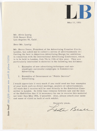
  1. What it is — letterhead of his own studio, letterpress, 25.4 × 18.4 cm (MoMA 1153.2015, Elaine Lustig Cohen Collection), preserved as a letter to Alvin Lustig. Brodovitch has the same kind of item, also a letter to Lustig. The content of the letter is itself the document: Beall for the Advertising Creative Circle, London is collecting American ads for an exhibition alongside the International Advertising Conference (7–13.7.1951) and asks Lustig for four examples — Beall as curator. Address on the letterhead: 580 Fifth Avenue, New York — in May 1951 the studio is still in the city (see "Notes on sources").
  2. Composition — reading of the work (v2, 23.09.2026, MoMA): only two elements. Top right, a large monogram LB. Along the left edge, upright bottom to top, the address in a single line. Between them an empty sheet for a typed letter. The mark top right and the address bottom left hold a diagonal balance across the emptiness — no element is centred.
  3. Colour — reading of the work (v2): two — L black, B blue; the address blue. Paper covers about 80% (measured).
  4. Typography — reading of the work (v2): LB — a very bold classical roman of high contrast (thin serifs, massive upright strokes); the address — italic, all lowercase, including the name ("lester beall"). Body text typed. Do not name the specific typeface.
  5. Message — one's own identity as proof of ability. For an independent designer this is the only portfolio that arrives by post.
  6. Why exactly this way — two colours, small format, frequent use: the system is tested on the cheapest carrier. The upright address doesn't steal width from the letter — all the space stays for the content.
  7. What would kill it — the address centred in a header below the mark. The sheet would gain a "head" and lose tension; the letter would start lower down.

Principles: identitet-je-prirucnik Resolved 23.09.: layout, colour, typeface and format against the image.


08 · International Paper — mark and standards manual (1960)

International Paper — znak i knjiga standarda
documented + reading
Year
1960
Client
International Paper Company
Technique
identity + printed manual
Type
mark without letters; manual's typography unknown

identitet-je-prirucnik

record ↗ · original image ↗

AGI zapis · znak 1600 px

  1. What it is — identity for International Paper Company: mark plus graphic standards manual. Cooper Hewitt explicitly credits him as the author of that manual; AGI calls him an early innovator of the manual as the primary tool of identity.
  2. Composition of the mark — reading of the work (v2) (AGI record): a thick black circle, and inside it a single unbroken line that simultaneously draws a tree (a triangle for the crown with a trunk) and the letters I and P. The crown is a triangle; the trunk is an upright stroke that is also the "I"; the left diagonal line closes the "P". Everything is of the same stroke weight and everything touches the circle. So v1 was close: it is indeed a monogram of tree and letters, but there are two letters, not one. The mark works in one colour, at small size and in negative — which was exactly the brief.
  3. Colour — one (black/solid). to verify against the manual for the system's palette.
  4. Typography — to verify against the manual.
  5. Message — the company as a single voice across a hundred locations. The message isn't in the mark but in consistency.
  6. Why exactly this way — a large corporation with many plants and printers cannot rely on taste; it must rely on rule. Hence the manual.
  7. What would kill it — delivering only the mark. Without the manual the identity falls apart by the twentieth application — and that's the only application that counts.

Principles: identitet-je-prirucnik jedan-potez-dva-znacenja znak-radi-u-jednoj-boji Resolved v2: the mark is a circle + one line that is simultaneously a tree and IP. Remains: the content and format of the manual (Smithsonian NMAH.AC.1278). Note: the mark was in use for decades; International Paper has more recently abandoned it — useful as an example that not even the best mark is eternal. provjeriti the exact year if this goes on the site.


Other works — evidence, no analysis

Work Year Source
REA first series — Radio (screenprint, 102 × 76,2 cm, U.S. Government Printing Office) 1937 MoMA 5724
REA first series — Heat-Cold, Running Water, Rural Electrification Administration (screenprint, 101,6 × 76,2 cm) 1937 MoMA 5729, 5745, 5737
REA first series — Wash Day, Farm Work (screenprint) 1937 MCB
REA second phase — When I Think Back (lithograph, 97,1 × 75,7 cm) 1939 MoMA 8280
REA second phase — It's Fine for Us (screenprint) 1939 MCB
REA — Now I'm Satisfied, A Turn of the Hand, Farm Work — LoC blog
Power on the Farm (REA; lithograph, 101,6 × 76,2 cm) 1941 MoMA 5020; NARA 515200
Slums Breed Crime (USHA; offset lithograph, 100,3 × 73,9 cm) 1941 MoMA 5111; NARA 515429
Don't Let Him Down (USHA) around 1941 NARA 514153
Scope: Basic Science Review — issues Oct. 1949, Dec. 1950, May 1951; Orthoxicol proof 1949–1951 MCB
S.S. America — United States Lines (lithograph, 76 × 55,5 cm) around 1952 MCB
Memoranda "Lester Beall Designer" and "LB", Brookfield Center (embossed and perforated paper) around 1952 MCB
Connecticut General Life Insurance — identity 1956 AGI
Titeflex — identity 1958 AGI
Caterpillar Tractor — identity 1967 AGI
Container Corporation of America — AGI
PM, vol. IV no. 3 — special issue on Beall (cover linocut) 1937 MCB
Chicago Tribune (Consider Chicago!, 15 Drawings… Travel Bureau), Time, Collier's, Hiram Walker, Abbott 1930s/40s MCB; Wikipedia

Principles — summary

jedna-slika-jedna-rijec · ravna-boja-na-daljinu · strelica-i-dijagonala-kao-kretanje · fotomontaza-plus-plakatna-boja · identitet-je-prirucnik · dizajn-za-nepismenu-publiku


Bridge to practice: poster · graphic design · motion

Poster

Graphic design

Motion


Bad imitation

  1. Flat colour without dividing the plane. Two bright colours get taken and put "in the background". With him the plane is always divided into clear fields with one dominant; colour without division is just a colourful backdrop.
  2. Photograph blended with the background. A soft mask, a shadow, a "nice" join. With him the cut-out figure is deliberately pasted on — you can see the cut, and that's the energy.
  3. Free-floating text over an image. With him text almost always lives inside a shape (a band, a banner, a field). Text that floats over a photograph has no anchor.
  4. A lightbulb that glows. Effect instead of sign: gradient, glow, yellow. With him the object is a white plane on dark and by that it is light.
  5. A logo without a manual. The mark gets delivered in five formats and that's called identity. His contribution is exactly the opposite: the rules are the product, the mark is the consequence.
  6. Halftone as tone. Dots are used to simulate grey. With him (A Better Home) the halftone is too coarse to be tone and that's why it works as ornament and as material.

The brief through their eyes

(fill in the current job) — First move: which is the one word and which is the one image? If there are two of either, the job isn't defined yet. Second: divide the plane into two colour fields before you put anything in them. Third: where does the text live — in which shape? Fourth (if it's a series): what is fixed, and what changes from piece to piece.

Exercises

  1. Reduction to a mark. Take one of your existing posters and reduce it to one silhouette, one word, and two colours. Compare readability from 5 m.
  2. A manual for yourself. Write a two-page spread with rules for LØADERRØR: mark, minimum size, colours, typeface, what's not allowed. One evening.
  3. Direction. Take three of your compositions and in each draw the arrow of eye movement. Where you can't draw the arrow, the composition has no direction — fix it.
  4. Two tones, two grades. (new, from Cross Out Slums) Take one of your photographs and make two duotone versions — one "bad", one "good". Without a single word of explanation. Then check whether someone else can tell which is which.
  5. Series template. (new, from REA's second phase) Define four elements: colour fields, cut-out figure, sentence band, signature band. Make three pieces using the same template. It's forbidden to change the layout — only the figure, the colour, and the sentence.

Motion study — "One event per frame" (5 s, AE or MOHO)

Flat colours, no gradients, no blur. Five seconds = five frames of one second each, and in each exactly one thing happens (a colour field flies in / a figure gets pasted on / a band enters / a word appears in the band / signature). Never two at once. Rule: every entrance is a cut or a slide along a straight line, never scaling and rotation together. Check: play it without sound at 25% size — every frame has to be readable.

Rebuilding the benchmark — REA "Light" (1937)

Format 2 : 3, portrait. Skeleton: horizontal division at ~55% of the height (cold above, warm below); one huge upright object that cuts across that line, right of centre, ~60% of the format's height; a tiny silhouette on the horizon line left of centre, scale ratio at least 1:8; rays as thin straight lines fanning out from the silhouette to the right; at the bottom, the signature sits directly on the warm field, across the full width. Task, 45 min in Illustrator: draw that skeleton with your own object and your own word inside the object. Three colours, no shadows. Check: shrink to 5% and look — it still has to read.


Notes on sources

  • Dates of the move to Connecticut vary by source (Wilton 1936 / farm 1950 / 1955) — recorded as uncertain.
  • El Lissitzky as a direct influence comes from the v1 text; Bayer and Moholy-Nagy are confirmed. Do not claim Lissitzky until confirmed.
  • ~~MoMA 1937 solo exhibition~~ — DISPROVEN v2 by a primary document. MoMA's press release of 15.11.1937 describes a group exhibition of government posters (13 Spanish + 6 Beall's), opened 16.11 for two weeks. See biography. This is the biggest correction in the whole note — the claim gets copied throughout the literature, including AGI.
  • v2 (06.09.2026): works seen 01, 02 (series on Commons), 03, 04, 05, 08. Additional corrections:
  • 05 Scope is not his alone — PGDA lists Will Burtin as an equal art director of issue 2;
  • 01 Light has no diagonals or arrows (the composition is rectangular; movement is carried by the rays);
  • 08 International Paper — the mark is a circle + one line that is simultaneously a tree and the letters I and P (v1 spoke of "a tree and the letter I").
  • The most useful finding for my work: A Better Home uses an oversized dot screen as ornament, not as tone — a direct precursor to my dither language, from 1941.
  • ~~Remaining: 06 SS United States (no good record with image found)~~ — resolved 23.09. Remaining: manual contents (Smithsonian NMAH.AC.1278), Lissitzky, Scope Beall/Burtin split after 1948, lithograph or screenprint for Light.
  • Template (23.09.2026, session 26): fm brought up to template — all 8 works have izvor_slika/font/paleta (measured), portrait (Arnold Newman 1950, MCB), body-of-work palette. Seen for the first time: 06 (MCB), 07 (MoMA), 05 benchmark replaced — cover "cancer" 1948 (AGI 1600 px, signed) instead of issue 2 (PGDA only 250 px, joint authorship with Burtin). Corrections against the image:
  • 01 Light: the house stands on the horizon with white windows (not "bottom left"); the agency line is white on red, without a white band; LIGHT is a wood-type slab serif, not a grotesque (sans serif) (agrees with AGI/Communication Arts: "American wood letter");
  • 02: "text always in shape" applies only to the sentence — the agency signature stands free; Here It Comes has a horizontal band, and the diagonal is carried by the wedge and wire (strelica-i-dijagonala-kao-kretanje applies here);
  • 05 Scope: Beall works on the covers 1944–1948 (Heller); the magazine runs 1941–1957;
  • 06: the poster is circa 1952 (MCB), 1951 is the start of the contract via J. Walter Thompson;
  • Technique of Light: MoMA lists the two copies differently (lithograph / screenprint).
  • Primary source for Beall: mcbcollection.com/lester-beall (Merrill C. Berman Collection — technique, measurements, images 1750 px, portrait).
  • New local tags: rijec-unutar-slike, raster-kao-ornament, fotografija-je-dokaz-grafika-je-glas, traka-nosi-poruku, duotone-kao-ocjena, prije-poslije-u-jednoj-slici, izrez-kao-prozor-u-drugu-sliku, izrezana-figura-bez-pozadine, tekst-uvijek-u-obliku, jedan-nosac-mnogo-jedinica, boja-kao-razlika-ne-kao-atmosfera, jedan-potez-dva-znacenja.